25 Top Web Design Trends 2025: From Neubrutalism to Dynamic UI
Are you struggling with low engagement and conversions on your website? The reason may be outdated design. Statistics say that first impressions are 94% design-related. Simply put, the look of web pages determines whether visitors continue exploring or close them right away. By taking care of design, you improve not only the aesthetics but also the functionality and user experience, which is vital in online business.
To help you unlock the hidden potential of your website, we’ll share the leading web design trends for 2025 and insights into what will dominate the digital landscape. From bento grid and neubrutalism to WebAR and dynamic UI, discover how you can wow and captivate visitors in seconds. Check out our custom collection and find cool design ideas to make your website stand out!
We’ve compiled a handy thematic infographic to make exploring web design trends even more user-friendly. Download it right now and review it whenever you need inspiration for creating an engaging and modern website design.
Web design trends 2025
1. Dynamic UI
Personalization has long been the gold standard in modern web design, but dynamic user interfaces (dynamic UIs) take it to new heights. It’s about creating a unique experience for each user, adapted to their needs and preferences. Brand websites such as Amazon, Netflix, Airbnb, and Spotify are excellent examples of how dynamic UIs can literally predict what users want, boosting their satisfaction and motivating them to come back again and again. Since we live in the era of AI-powered personalization, dynamic UIs are not just a temporary web design trend, but a must-have for efficient audience engagement.
2. Emotional design
Emotional design is the creation of a visual narrative that evokes an emotional response from the viewer. The fact is that emotions determine people’s everyday decisions more than logical thinking. By recognizing this connection, web designers pay attention to the feelings their projects trigger. As a result, we see more and more websites designed with emotional appeal. The best part is that you have many options to achieve this effect, from strategically using colors that bring out different feelings to telling stories with visual content.
Looking for images to deliver a cool design and build deeper connections with your audience? Discover Depositphotos’ thematic collections full of hand-picked visuals featuring timeless topics and trendy concepts.
3. Functional minimalism
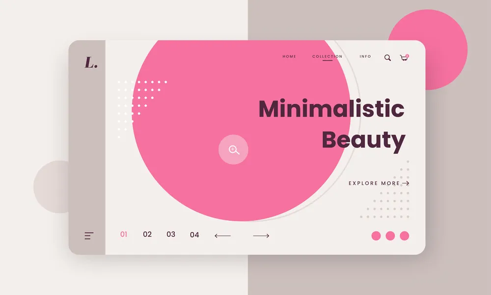
When we think of modern website design, minimalism is the first thing that comes to mind. This style, which embodies the principles of less is more, is focused on simplicity, clarity, and functionality. It uses a limited range of elements so that nothing distracts user attention from the main points. Minimalism offers many advantages, from fast loading to ease of use, so it’s rarely disregarded when it comes to web design trends. Top brands such as Apple, BMW, or Zara choose a simple website design, and for good reason. 84.6% of users prefer clean and uncluttered webpage layouts. Rely on minimalism to not only meet trends but also enhance usability and encourage visitors to spend more time on your website.
4. WebAR
The development of VR and AR has paved the way for WebAR technology. It allows the transfer of various 3D models from the virtual world to the physical through a smartphone browser—without the need to download and install specific software. This approach fundamentally changes the way brands interact with consumers, from virtual makeup or clothing try-ons to interactive real estate tours. Revolutionary innovations like Apple Vision Pro promise to turn online shopping into an immersive adventure, and brands such as Lowe’s and J.Crew have already jumped on board. Clearly, WebAr is the future of website design in e-commerce.
5. Sustainable web design
As business responsibility is one of the most crucial factors influencing customer choices, sustainable practices are gaining popularity. More and more brands are turning to sustainable web design with the well-being of people and the planet in mind. They are developing websites with low environmental impact to adapt to an increasingly eco-conscious market. You can also easily embrace this web design trend by choosing green hosting, optimizing your website, and streamlining the layout. In the visual dimension, it is manifested in images of nature, organic textures, and colors like green or brown.
6. Dynamic cursors
Not ready to fully update your website design? You don’t have to, as user experience can be improved with something as small as a cursor. Dynamic cursors replace the usual arrow icon, creating a surprise moment and inspiring visitors to stay on your page longer. These are not just alternative images, but cool design effects. For example, you can add a custom cursor with a zoom, wave, or color change feature on hover. The main thing is that it should support the character of your brand or product and fascinate users, not distract them.
7. Bento grid
Bento UI, which has become widespread in recent years, will continue to dominate modern website design. This approach’s simplicity and efficiency make it a staple among designers and users. The bento grid is based on visual hierarchy and structuring, which have been the cornerstones of UI design from the beginning. Its other benefits include high adaptability, minimalist look, and intuitive interfaces, all appreciated by market leaders such as Apple, Microsoft, and Pinterest. Bento UI provides both usability and a contemporary feel, so it’s here to stay.
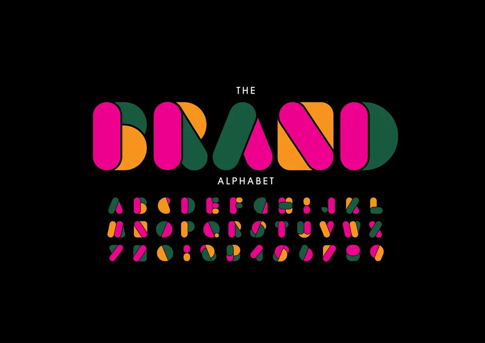
8. Experimental typography
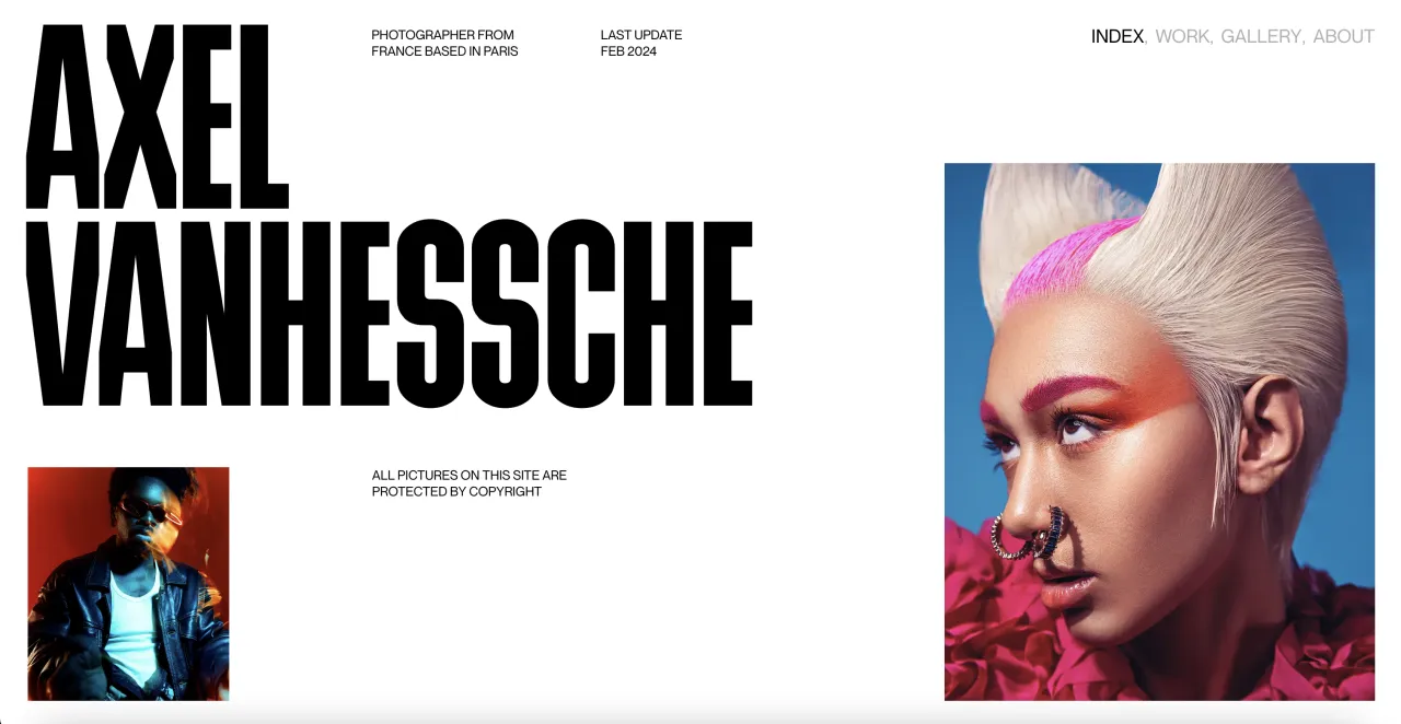
Unconventional typography remains in the spotlight. Web designers will use experimental and hand-drawn fonts to add uniqueness and character to their projects. They will intentionally break the rules by choosing typefaces with intricate shapes, different sizes, or randomly arranged letters. Such typography-centered design helps create visual intrigue and captivate users. At the same time, it goes beyond aesthetics, reinforcing messages and evoking an emotional response from the audience.
9. Claymorphism
Claymorphism became the successor of neumorphism, which addressed the latter’s weaknesses. Rounded corners distinguish both web design styles, but the main difference is the use of light and shadow. Claymorphism is based on combining two inner shadows (light and dark) and an outer shadow (darker), which creates depth and a 3D effect. It makes this style work perfectly with any background color. If you’re worried about making your website look too childish, apply claymorphism for buttons or icons to add more dimension.
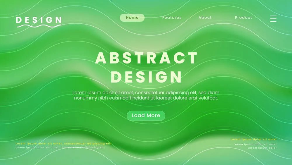
10. Gradients
Like any other trend, web design trends evolve cyclically. Although gradients have not disappeared, we expect to see them more often next year. This eye-catching, distinctive, yet versatile creative technique suits multiple design purposes. Gradients can add deepness, texture, and dynamics, making designs more engaging. They are also great for practical purposes, such as darkening the background under text to enhance readability.
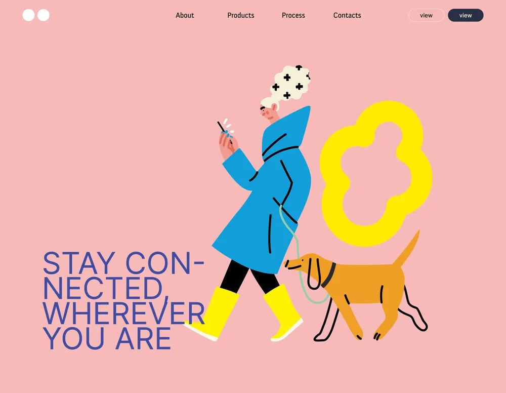
11. Custom illustrations
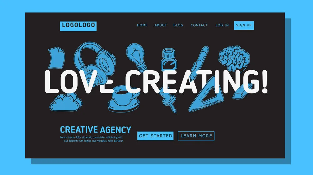
If you are looking for modern web design ideas with a touch of artistry and playfulness, give custom illustrations a shot. They are excellent options for showing your brand’s individuality and human face. In addition, illustrations work perfectly for visual storytelling, which helps build a deep emotional connection and makes designs more friendly. Take inspiration from the visual communication of Notion and Airbnb, or even doodles.
The Depositphotos library has creative illustrations on any topic. Whether you’re working on a web page design or a creative campaign, we have exactly what you need.
12. Kinetic typography
In 2025, web designers will rely on text animation to hypnotize viewers and make a lasting impression. In the near future, we expect even more kinetic typography with a variety of effects. Text will move, rotate, transform; change color, size, transparency; and more. That said, kinetic typography is more than just a visual hook for website visitors. Use it to emphasize essential elements or to guide users’ journeys.
13. Micro-animations and micro-interactions
Micro-animations are small, primarily functional animated elements that provide visual feedback to users and make interfaces more understandable. Meanwhile, micro-interactions are tiny system responses to user actions, such as tooltips, progress bars, or response bubbles. These web design trends greatly enhance UX, creating a feeling of a live and responsive interface. They also make interaction with websites more fun and engaging, which improves visitor satisfaction and the likelihood of their return.
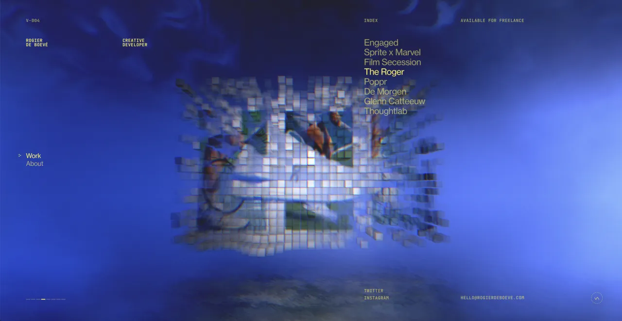
14. Immersive 3D
3D has gained a strong presence in the design scene with various manifestations in web and mobile interfaces, illustrations, animation, and advertising graphics. If you are tired of flat design and want to offer users something different, choose 3D elements. Create an immersive environment by incorporating dimensional objects, scenes, typography, interactive animations, and parallax effects. With 3D, you can also deliver a first-class e-commerce experience by allowing customers to view products from different angles.
15. Glassmorphism
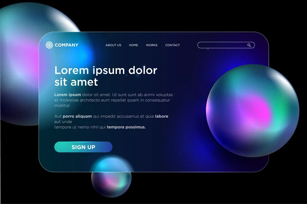
As the name suggests, glassmorphism creates a stunning effect of frosted glass surfaces. It’s characterized by opacity, layering, and background blur. In modern web design, glassmorphism is often applied to soften the contrast between light and dark elements. With this approach, you can place white text on a bright background while ensuring high readability. Glassmorphism improves usability and creates a sleek and cutting-edge look, which is why tech giants, including Microsoft and Apple, favor it.
16. Gamification
From IKEA’s “The Co-Worker” simulator game, which allows users to experience the role of an employee in the company’s stores, to Gucci’s fascinating product landings—in 2024, brands turn to gamification to grab their audience’s attention. Given the technique’s impact, we will see this web design trend around for a while. And although the integration of game mechanics usually requires costs, it can increase your page traffic multiple times and provide unmatched engagement. The best thing is that such a deep dive into branded worlds natively wins users’ hearts, as it’s based on entertainment and positive emotions.
17. Isometric design
Isometric design creates a three-dimensional effect in a two-dimensional environment. It combines the simplicity and minimalism of flat design with the depth of 3D, taking the best of both worlds. This approach allows web designers to show objects from different angles, avoiding optical distortion. Isometry works great for visualizing complex concepts, maps, or infographics, making them much easier to comprehend. It helps create entire universes in small spaces. This web design style is also widely used for icons, which makes them draw extra attention.
18. Neubrutalism
Neubrutalism has become one of the hottest web design trends in 2024, and it definitely won’t disappear soon. This distinctive style brings together good old minimalism and bold brutalism. It takes accuracy, logic, and utility from the former, as well as originality, impressiveness, and unconventional character from the latter. Neubrutalism also draws inspiration from the plain web design of the early noughties, which brings us back to the Y2K aesthetic. It offers an excellent alternative to classic website layout ideas thanks to the daring use of contrasting colors, clear block separation, custom illustrations, and spectacular typography.
19. Geometry
As a key element of creating structure and organizing content, geometry remains a winning approach in modern website design. Moreover, It works for several purposes at once. Firstly, precise shapes simplify navigation by guiding users through a website. Second, geometry provides visual hierarchy, highlighting crucial parts of designs. Plus, it’s a proven way to achieve a minimalist aesthetic that’s pleasing to the eye without looking overwhelming. Want to add more visual intrigue to your website? Combine various geometric shapes and patterns or blend them with photos.
20. Broken grid
If your aim is to create striking designs that captivate at first glance, check out the broken grid web trend. Despite the visual chaoticness and fragmentation, not a single element in such compositions is random. The key difference from the standard grid design here is the use of asymmetry and block placement, resulting in a unique and dynamic layout. The most common ways to create a broken grid include unusual alignment, layering, breaking borders, and strategic use of white space.
21. Video backgrounds
Video backgrounds can transform your website into a visual storytelling powerhouse. Web designers often turn to this medium to instantly bring static designs to life and create an interactive experience. For good reason: people spent, on average, 1.4 more time on webpages with video. Video content is also significantly better at delivering messages and evoking emotions than images or text. Maximize your website’s engagement with high-quality background footage that shows your product, share’s your brand story, or reflects its core values.
You don’t have to spend your budget and time on video production, as Depositphotos has a huge library of 4K and HD footage at reasonable prices. Find fascinating backgrounds; slow motion, aerial, and time-lapse materials;, as well as 2D and 3D animations.
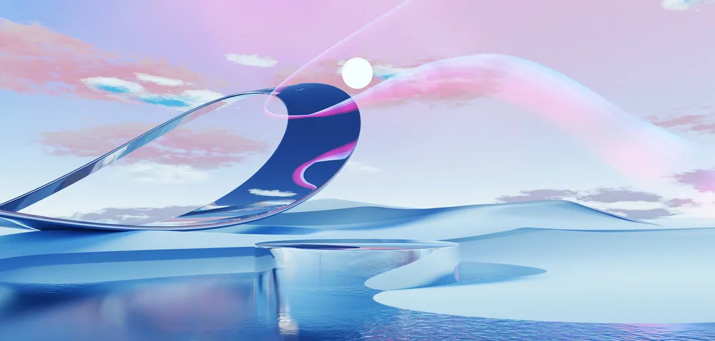
22. Organic shapes
Sometimes, web design trends may seem to contradict each other, but in fact, they coexist harmoniously, meeting different needs. Along with geometric shapes, we expect to see plenty of cool designs with organic shapes. Incorporating curves, waves, or swooshes is a proven way to fill your website with a sense of approachability and comfort. These elements appeal to users by connecting to the natural world. They are also very versatile: you can add organic shapes to emphasize crucial parts of your web page, such as key messages and offers, or design collage-style graphics by mixing different shapes.
23. Full-page headers
Full-page headers have become one of the most trendy practices in modern website design. Such striking banners immediately grab attention upon visiting a page. Full-screen headers act as the first touchpoint with users, so they usually feature the essential elements, including catchy copy and CTA buttons. In addition to text, you can also add impressive images or videos to wow your audience further. But make sure that the main message and button are located on the header’s left side, as the page’s top left section attracts the most attention.
24. Retro vibes
Besides cutting-edge solutions, the 2025 web design trends offer a retro touch. The best thing about this approach is that it’s not only aesthetically appealing, but also elicits associations and a sense of nostalgia. Such design is aimed to evoke emotions and foster a meaningful connection with the audience. Next year, the focus will be on the 70s, 80s, and 90s. By using old-school web design elements, visual references, and color palettes from a particular decade, you can create a website that throws users back to the good old days, and they will definitely appreciate it.
25. New maximalism
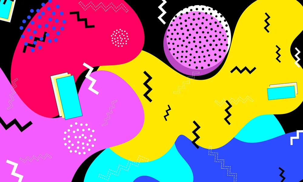
If a simple website design seems too dull and you want to make an impact at first glance, go for maximalism. Unlike the previous waves of this trend, it’s not about mixing everything at once, but rather about visual diversity providing a profound emotional experience. To achieve this, web designers will apply each element with purpose, whether it’s bold colors, rich patterns, unconventional typography, or exciting multimedia. Maximalist design will succeed in finding a golden mean between organized complexity and accessibility.
Web design features to improve your website performance
Following web trends is the answer to boosting brand competitiveness and winning new customers: modern website design appeals to users and shows that you are on top of the game by adopting the best practices and technologies. At the same time, there are many well-established and always relevant ways to enhance the user experience on your web page, which we will cover next.
1. Responsive design
According to Statista, 93.7% of worldwide users browse the internet with smartphones. To meet audience demand, ensure that your website is mobile responsive, meaning that it adapts seamlessly to different screen sizes. Providing a hassle-free experience regardless of the gadget is a primary factor in user satisfaction. A big advantage of responsive design is its affordability compared to developing a mobile version of a website. In addition, an adaptive layout is a must for better ranking, given Google’s mobile-first indexing approach.
2. Intuitive navigation
Users spend an average of 6.44 seconds exploring your website’s navigation menu. Therefore, it is vital to have an intuitive navigation system that allows visitors to quickly find what they are looking for; otherwise, they may simply leave. To ensure a user-friendly search, rely on simplicity and hierarchical organization of information with clear subheadings and categories. Keep the navigation interface clean and uncluttered. You can improve usability by integrating standard navigation layouts that users are comfortable with, such as drop-down or hamburger menus.
3. Fast loading time
Every second counts in the competition for audience attention, especially regarding loading times. 47% of users won’t wait longer than two seconds for a website to load. Website speed directly affects user retention and conversion rates. It’s also a significant factor for SEO rankings. Make sure your page doesn’t keep users waiting. To do so, compress all large media files (PDFs, E-books, images, etc.), minimize code, and utilize caching techniques like CDN to deliver content more quickly.
4. Accessibility
Accessibility is one of the best web practices that contribute to an inclusive digital environment. It involves ensuring that websites are accessible to all users, including people with disabilities. Web designers’ main tools to create such experiences include assistive technologies (screen readers or voice recognition software), accessible navigation, and media captioning and transcription. Websites developed with accessibility in mind are more comfortable for everyone. Moreover, they usually load faster and perform better on different devices, facilitating a pleasant user journey.
5. Engaging content
Relevant and high-quality content is one of the main reasons users want to spend more time on websites. Here, you have a wide range of options, from text formats such as articles, surveys, or case studies to multimedia. Want to maximize engagement? Integrate content that involves interaction, like quizzes or games. Remember that visuals are the first thing to stand out. Enhance the impact of your design by using premium, trendy images that you can easily find in the Depositphotos library.
Common web trends of the past that have become standard
Some web design trends come and go, while others remain and become common practices. Let’s explore design techniques that were hot a year or more ago and have now taken a permanent place in web designers’ toolkits.
1. Dark mode
One of the features that is often found in modern website design is dark mode. It has become widespread for several reasons. First, it serves the practical purposes of saving battery power, reducing strain on users’ eyes, and enhancing readability. Statistics show that users spend 23% more time on websites and apps with active dark mode. Second, people often choose such a design because of its aesthetic appeal, which evokes associations with professionalism, technology, and status. Thus, high-profile brands like Amazon or Spotify prefer dark mode as the default mode on their websites.
2. Parallax scrolling
The parallax effect occurs when you scroll through a web page and the background images move at a different speed from elements in the foreground. This design approach creates the illusion of depth and adds interactivity to websites. It works great for visual storytelling and product demonstrations, captivating users and making a lasting impression. In addition to visual impact, parallax scrolling can improve website navigation by adding exciting transition effects between different sections and pages.
3. White space
White or negative space is widely used in minimalistic and simple website designs. It helps separate layout elements such as text, images, forms, and buttons to provide them with the best visibility, thus impacting users. Web designers like to employ white space to create inviting and easy-to-scan interfaces. It’s also a powerful tool for establishing visual hierarchy and directing the user’s eyes to emphasize essential parts of a design, like marketing messages or calls to action. Examples of top brands that have masterfully utilized negative space on their websites include Uber, Dropbox, and Apple.
4. Animation
Modern users strive for exciting interactions with digital products that go beyond a seamless experience. To captivate and retain audience attention, brands are adopting multiple design approaches, one of the most successful of which is animation. Not only does it effectively engage, but it also drives sales. According to Forbes, motion graphics can help businesses increase their income 49% faster. The best part is that animation has many uses in modern web design, from logos and UI elements to dynamic menus and backgrounds.
5. Chatbots
Chatbots have already become an integral part of web development, as their capabilities allow solving various tasks such as customer service, data collection, and sales. It turns out that chatbots bring 67% of revenue growth to businesses. In addition to automation of routine processes and cost-effectiveness, these technologies provide highly personalized experiences to users based on their preferences, browsing history, and behavior. The great news is that chatbots are becoming more human-like, promoting a smoother interaction and increasing customer satisfaction.
Web design predictions for 2025 and further
Looking ahead, we anticipate that advanced technologies will greatly influence web design. From AI tools to Web 3.0 taking user experience to a brand new level, interactions with digital environments will become more innovative and fascinating.
1. AI-driven design
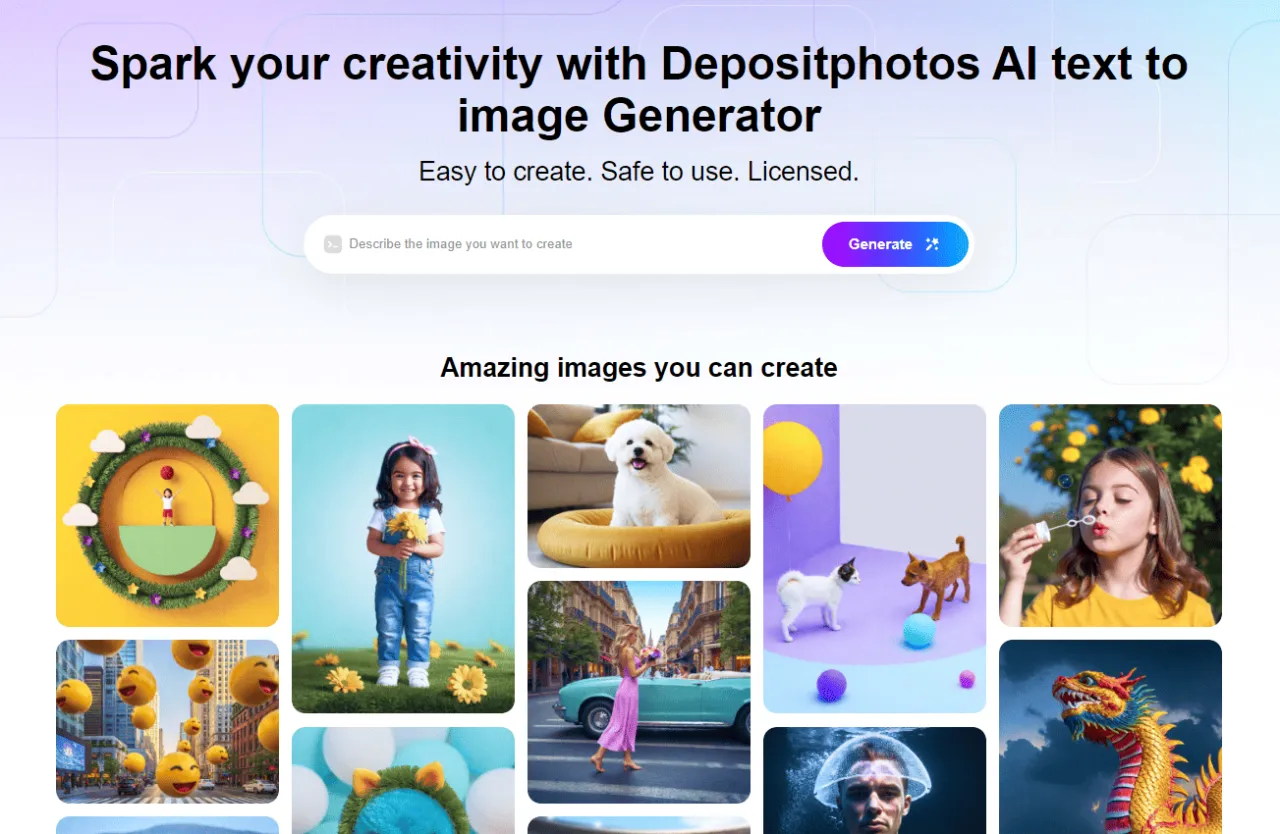
Thanks to its groundbreaking and comprehensive nature, AI is fundamentally changing the digital world, offering not only great efficiency but also new creative horizons. It doesn’t replace web designers, but becomes their assistant, relieving them of routine tasks such as adjusting layouts while offering data-driven design solutions. Thus, AI helps create websites that are both visually compelling and in line with users’ expectations. It’s also a powerful source of fresh ideas and inspiration. We believe that AI is the future of website design. However, there are great intelligent tools that can already enhance your production today. One is the AI Image Generator by Depositphotos, enabling you to create commercially safe images in seconds. Try it for yourself!
2. Voice UI
The flexibility of voice technology encourages users to switch to this method of online searching. It’s not only more convenient, but also faster: voice search results load half as fast as text ones. This type of search is currently used by 50% of adults worldwide. Moreover, it’s a powerful shopping tool that provides a customer-friendly experience and high accessibility. Consider implementing voice technologies in your website interface to set yourself apart and attract new customers.
3. No-code and low-code
According to Gartner, the use of no-code and low-code will almost triple by 2025. As the name implies, such tools enable the creation of websites and apps without the need to write code. They are highly accessible and user-friendly, so anyone with no programming skills can easily develop their own cool design. The most popular no-code platforms include website builders such as Webflow and Wix. For example, with 1500+ Webflow templates, users can quickly create any website, from a business page to a portfolio.
4. Web 3.0
Web 3.0 is the next stage of Internet development, with decentralization, transparency, and security as its main features. While Web 1.0 allowed only reading information, and Web 2.0 added the ability to create and share content on platforms and applications, Web 3.0 will revolutionize the digital landscape. AI algorithms will analyze individual data and provide a tailored experience for each user. It can already be seen on platforms like YouTube, Facebook, and Netflix. However, the rise of Web 3.0 has yet to come.
Final thoughts
The future of web design promises to be an exciting journey where technology innovations drive unmatched personalization and immersive experiences, and cutting-edge solutions go hand in hand with natural and retro themes. With so many options, you will surely find one or more for your brand. But there is no need to wait until 2025. Start implementing web design trends today. Provide your audience with cool design and upgraded experiences, and watch your website performance grow every day.
More articles about web design
Your Advanced Web Design Guide: Definitions, Examples, & Best Practices
