Bento UI: Design Examples, Trend Explanation, and Creative Tips
After appearing a decade ago as another trending online style, Bento Box design is now more than just a way to make your layouts look organized and aesthetically appealing. The Bento design style is a universal grid system that saves time for designers and developers working on websites and apps. In addition, this card-based style makes interfaces more intuitive and handy for users.
In this article, we’ll explain the critical components of Bento UI, teach you how to build a Bento design landing page or app, and give you dozens of diverse Bento examples to spark your creativity.
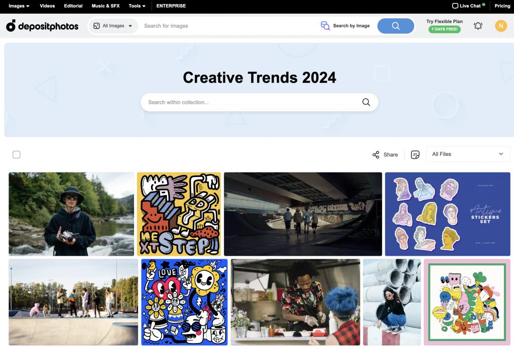
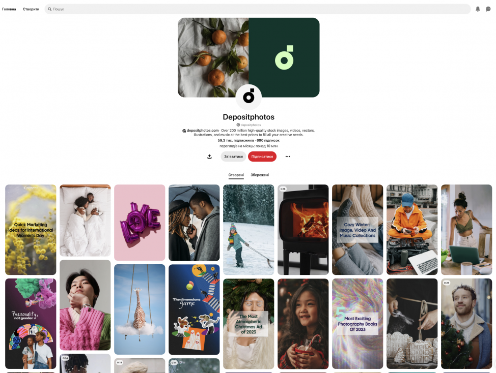
Depositphotos applies the Bento design system to displayed content.
What is Bento UI and the Bento Box style?
The term Bento originated in Japan and was initialy used to describe ready-to-eat meals carefully packaged into small boxes. Besides being convenient to consume, products from bento boxes look satisfying and playful, which adds additional value and made customers want to buy them.
Regarding Bento UI, designers often mean layouts that follow principles of smart compartmentalization when it comes to icons, buttons, and other elements. Moreover, Bento design is about the clear hierarchy of elements and their balance—however, most layouts of this type are asymmetrical.
Because Bento turned into the most successeful way of organizing elements within responsive layouts in 2024—with Apple and Microsoft as its main ambassadors—it is now often quoted outside of the UI world. In particular, Bento Box design can be spotted in posters, commercials, and even works of art. In this case, we’re referring to the visual Bento style, not the UI approach aimed at being functional and intuitive.
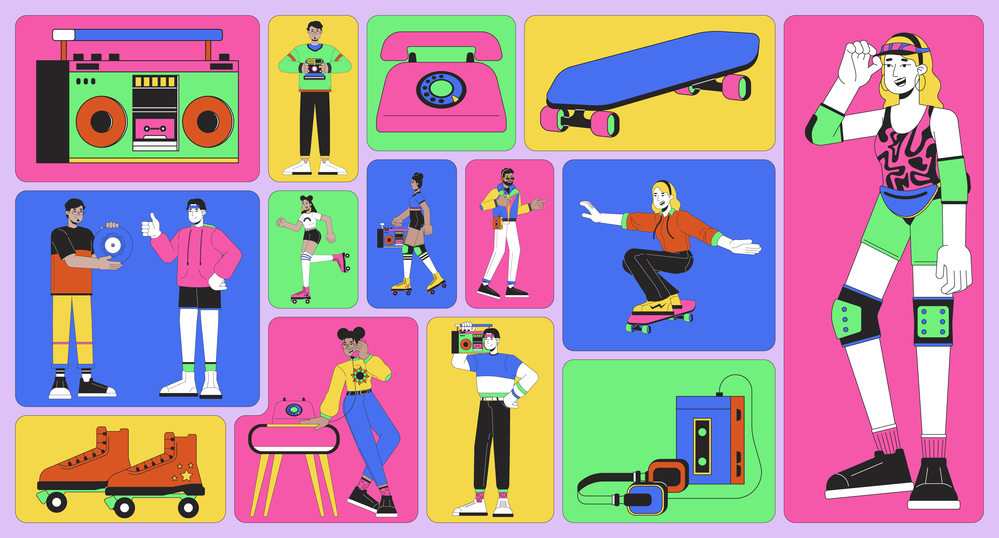
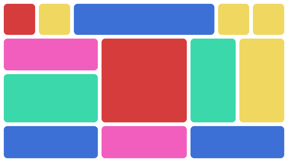
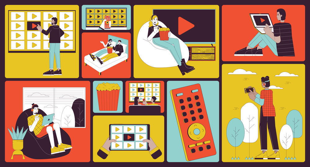
If you look at Bento UI examples, you’ll easily recognize what unites all of them. Any Bento layout looks like a set of squares and rectangles with rounded angles forming a visually balanced grid. These shapes of various sizes contain text information, images, or clickable elements and are grouped by function or topic. The background is monochrome and (most often) either white, black, or customizable; Bento UI Apple has day and night modes.
Learn more about why microinteractions in UI are important—Details Matter: How Microinteractions Enhance Interfaces & User Experience.
Why should one use Bento grids? Bento UI design advantages
In 2024, Bento grids are a golden standard of modern responsive web design. Pinterest was the first social media platform to introduce them to a global audience. Check out the Depositphotos page on Pinterest to see.
As for global software players, Bento first appeared in web design as an initial element of the Metro Design Language (MDL) used for Windows Phone 7. Since 2010, Microsoft has also incorporated their MDL interfaces in other products, including Xbox 360 and Microsoft 365.
Apple started using Bento UI design for iPhones and iPads and gradually applied the approach to their web design too. You can also see Bento UI and UX in smart TV and smart watch interfaces, as well as blogs and news platforms. Apart from this, Bento works well for dashboards that don’t overwhelm users with information, which made it a number one soluyion for SaaS startups.
So why are designers, engineers, and clients obsessed with Bento UI? Here is an impressive list of Bento design advantages:
- Adaptivity with less effort.
The Bento style enables you to create designs for various devices in minutes. Moreover, with modern Bento grid CSS, developers can build card-based interfaces much faster.Explore more in our blog—Your Essential Guide to Adaptive Design: Key Principles and Techniques. - Intuitive interfaces.
Bento UI helps you create highly-organized layouts with a clear hierarchy, where similar elements are grouped and more important ones are bigger. This means that user will spend less time in search of the buttons and sections they need. - Minimalist, light, and truly universal.
You can apply Bento design to any interface, regardless of the type of your digital product or branding.
Depositphotos on Pinterest, the first social media that leveraged the Bento grid.
- High accessibility.
Create designs anyone can use! Bento gives you the opportunity to scale elements without compromising on the overal style of your layouts. - Maintain consistency across interfaces.
Bento-based design systems are easy to work with at a larger scale. You can add or update elements anytime without confusing customers. - Diversity and dynamics.
It’s not true that you can’t create distinctive designs with Bento. Just as Japanese Bento Boxes can contain colorful and diverse meals, you can add some spice to yours using fonts, multimedia files, or custom illustrations.
Want to boost your knowledge even more? Check this out—Your Advanced Web Design Guide: Definitions, Examples, & Best Practices.
How to create a Bento UI website or app: Bento UI examples and principles
The Bento UI trend started booming over a decade ago and soon began dominating UI design for portable and wearable devices. In particular, you can spot it in phones, multimedia players, tablets, watches, visual-based social media, news platform interfaces, as well as various dashboards and tools for analytics. On the contrary, Bento doesn’t work well for complex websites where visual hierarchy is hard to achieve, including online stores and custom projects like Depositphoto’s Creative Trends 2024.
If it’s your first experimenting with Bento design, here are simple steps we advise following in order to avoid common mistakes:
Step 1. Form a grid
Choose a grid where squares are the basic unit. Any squares or rectangular shapes you plan to work with should contain a certain number of complete units. If you are working on a responsive design, take the smallest and biggest screen size into consideration to understand the scale of elements.
Step 2. Distribute content
Create a first layout draft by filling your grid with content elements like images, text block, buttons, or dynamic graphs. Your content can be anything. Make sure you have a full list of items that need to be included in your design.
Step 3. Play with scales and group elements
Remember, the main rule of a Bento UI website is hierarchy. This means that you should group elements according to the same principle, like topic or function (example: all tools for editing are placed to the right and all account settings to the left). Moreover, frequently used functional elements or the most important content should be bigger than everything else. Following this, work on several design drafts.
At this stage, sketching skills might come in handy. To develop them, read our big explainer: Doodle It! A Big Guide to Quick Sketching with Tips, Examples & Collection.
Step 4. Round corners and color it!
Bento design UI is based on squares and rectangles placed on solid background. It is minimalistic and organized, but this doesn’t mean it is dull or that it lacks individuality. Challange yourself and try to make your Bento UI special by choosing the shape of the corners, background color (check out our Spring Color Trends 2024 for inspiration), and add custom elements to empty squares to make your design coherent.
Explore some of the brightest Bento Box designs: Pinterest, Google search by image, Dribbble, Depositphotos website.
Wrapping up. Is the Bento design style for you?
The Bento design system is a time-proven way to make your interfaces or informational products look stylish and maintain clarity thoughtout their functions and elements. The approach might be a cost-saver for startups working on apps or cross-platform projects, as well as individuals with blogs or small client-oriented businesses.
At the same time, Bento design websites have their disadvantages. First, your ability to classify information and functional elements is limited. The second issue is over-segmentation. Adding too many components and small blocks will negatively affect user attention and make your design messy. Third, the Bento design style is not suitable for presenting big pieces of information and displaying complicated data such as animated multilayered schemes or eCommerce catalogs.
However, if the Bento design style is a perfect fit for you, we highly recommend making the most of its advantages to acheive your communication goals!
Read more on trending design approaches:
Graphic Design Trends 2024: Nostalgia Rewind, Surreal Dimensions, and More
Doodle It! A Big Guide to Quick Sketching with Tips, Examples & Collection
15 free AI tools for design and creative tasks
7 Main Hand Lettering Styles and How to Start Practicing Them