White Space in Design: Using Negative Space to Create Harmony in Your Visuals
Creating impactful design is all about maintaining a balance between different elements. While color, shape, and typography are all important, white space is an often-overlooked aspect that can significantly impact any visual’s effectiveness. Understanding different types of white space and how to use them effectively can help create designs that immediately capture attention and deliver the right message.
Whether you’re designing a website, creating marketing materials, or developing a logo, this article will help you master the art of white space and take your designs to the next level. So, without further ado, let’s jump right in.
What is white space?
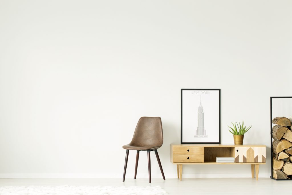
White space, also known as negative space, is part of a design or layout that is left blank or unmarked. Essentially, it’s the space that surrounds or separates design elements, such as text, images, and graphics. White space can be intentional or unintentional, but in both cases, it plays an essential role in a design, affecting its overall look and feel.
When used effectively, it creates a clear visual hierarchy, with important elements standing out and less important elements supporting them. This can help draw viewer attention to the most important parts of a design and make it easier for them to understand the message that you’re trying to convey. In addition, white space can help you create balance, clarity, and order in your visuals, making them more cohesive and organized.
What are the types of white space in graphic design?
There are different types of white space that designers use to create a specific effect. Let’s take a look at some of the most common ones:
Micro vs. macro white space
Micro white space refers to the space between individual characters, lines of text, and words. It affects the legibility of a design, and it is often adjusted by designers to make text more readable. For example, you can adjust the line spacing in a block of text to create more micro white space and improve the readability of the text.
Macro white space is the space between design elements, such as paragraphs, images, and headlines. It affects the overall composition of a design and is used to create visual balance and hierarchy. Macro white space can separate headlines from body text or secondary elements from the main components of a design.
Active vs. passive white space
Active white space is intentionally left blank to create a specific effect. Designers use it to draw attention to a particular part of a design, add some movement and energy to a visual, or highlight the main message of a design. Active white space can be a powerful tool to make your designs more engaging, dynamic, and memorable.
Passive white space is the unintentional space that occurs between design elements. It can be caused by design elements that are not properly aligned, creating a cluttered and confusing design. You need to be aware of passive white space and take steps to eliminate it if you want to create a cohesive design.

How can you benefit from white space in your designs?
White space is a crucial design component that can be used to achieve a variety of things. Let’s go over a few:::
1. Create visual hierarchy.
Visual hierarchy is crucial in effectively communicating a particular message. White space can establish a clear separation between different design elements, helping communicate a particular order of importance.
2. Direct viewer attention.
Effectively directing the viewer’s attention to an object or design element is often the most important part of creating any design. White space can create visual contrast and draw the viewer’s eye to the most important elements, such as a call-to-action button or a product image.
3. Improve comprehension.
When it comes to text-heavy designs, readability is essential. White space can improve comprehension by providing more space between lines and paragraphs. This reduces visual clutter and makes text easier to read and understand. It creates a more pleasant reading experience, encouraging viewers to engage with the content.

4. Connect individual elements.
A successful layout is all about unity and harmony between individual design elements. White space can connect separate elements, reinforcing the overall design aesthetic and ensuring that each element is intentional and viewed as part of a cohesive whole.
5. Build a certain aesthetic.
White space can help you create various aesthetics, from minimalist to dynamic and everything in between. Adjusting the amount of white space in a design can create a visual tone that reinforces your brand’s messages and resonates with your target audience.
Top tips to successfully leverage white space in your designs
To successfully use white space in your designs, it’s important to keep a few key points in mind. Let’s take a look at some tips for using it effectively:
1. Know your purpose.
Before you start your project, it’s important to understand the purpose of your design. Is it to sell a product, communicate information, or simply capture viewer attention? Depending on your goals, you may need more or less white space. Once you know your objective, you can use white space strategically..
2. Look at the whole picture.
When designing, it’s important to look at the whole picture, not just individual elements. Take a step back and consider how the design as a whole will be perceived. Is there enough white space to maintain balance? Are there any areas that feel cluttered or overwhelming? By looking at the whole picture, you can ensure that using white space benefits your design.
3. Consider the composition.
Consider the placement of text, images, and other essential design elements, and use white space to harmonize them. Create clear separations between different elements to make the design more readable and visually appealing.
4. Balance positive and negative space.
When designing, it’s important to consider the balance between positive and negative space. Too much white space can make a design feel sparse and empty, while too little can create a cluttered and confusing image. You need to find the right balance to create a design that is both appealing and effective.
5. Focus on legibility.
While white space helps you improve legibility, ensuring that text is still easy to read is important. Make sure there’s enough contrast between the text and the background, and avoid using fonts that are too small or difficult to read.
6. Experiment with different levels of white space.
When it comes to white space, there’s no one-size-fits-all solution. Some designs may require more white space to create a minimalistic layout, while others may benefit from less white space that adds more movement. By experimenting with different levels of white space, you can find a combination that best communicates a particular message to your audience.
7. Don’t be afraid of asymmetry.
While symmetry can be visually pleasing, it’s not always necessary for effective design. Asymmetry can add visual tension, drawing the viewer’s attention to different parts of a design. Use white space to balance asymmetrical elements and create a more appealing visual.
8. Make sure the white space is intentional.
It’s important to remember that white space is a deliberate design choice, not a lack of effort. Make sure that the white space in your design is intentional and supports your design goals. Avoid unintentional gaps, and ensure the white space is consistent throughout the design.
9. Maintain consistency.
Consistency is key in design, which also applies to the use of white space. Make sure white space is consistent throughout your design and supports the overall aesthetic and style. Avoid using different levels of white space in different parts of the design, as this can create confusion.
To wrap up
While it may seem counterintuitive, white space is a critical component of effective design. It’s a secret tool that can help you achieve perfect visual harmony and clearly communicate a message. By following these simple tips on using white space, you can create captivating designs that stand out from the crowd.
Other articles you might find interesting
Spring Color Trends 2023: Palettes, Design Ideas, Stock Visuals, and Mockups
Achieving Harmony: A Guide to Balance in Art and Design
The Color White: Symbolism, Theory and Design Tips