Designing with the Color Brown: Its Origins, Symbolism, and Color Combinations
More often than not, creators prefer using bold colors in their projects to grab the attention of their audience. Against such vibrant palettes, the color brown with its earthy tones appears to be an underutilized choice. Yet brown suits a variety of projects, including branding, social media ads, product packaging, and website design.
Dive into the origins and symbolism of brown, and discover tips on integrating this deep hue into your designs. Read on for a curated collection of visuals showcasing the diversity of brown, including free files!
To get free downloads, click the banner above, switch to «Annual Upfront» subscriptions, and press the «Free 7 Day Trial» button.
What does the color brown symbolize?
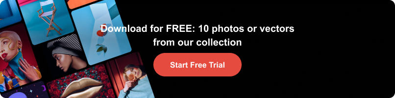
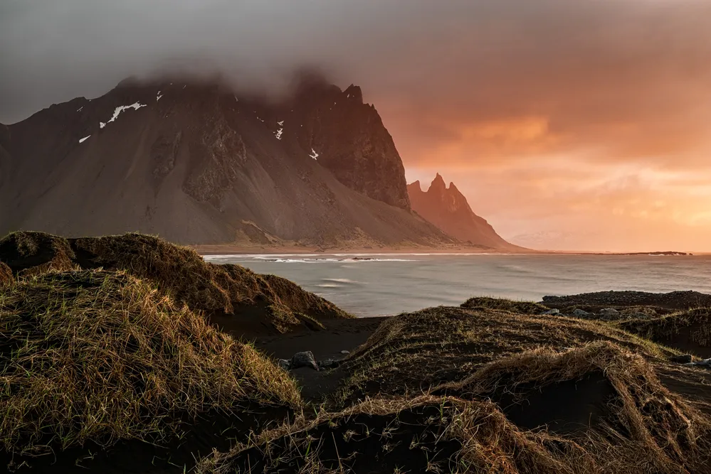
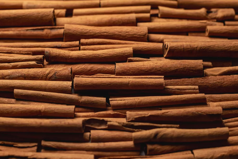
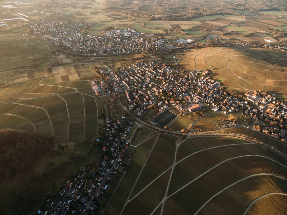
The color brown is originally found in natural pigments derived from soil, clay, and plant extracts. It can be seen in the world around us: tree bark and fall leaves, sandstones and mountain rocks, or animal fur and feathers. Considering such a rich array of natural sources, the meaning of brown color is closely connected to the elemental world, resonating as grounded and rooted. Throughout history, brown has been used to symbolize natural elements, often mimicking wood, stone, and leather.
From the prehistoric era and ancient civilizations to contemporary fashion and design, brown has maintained its timeless charm, appearing as a practical color associated with durability and utility. Moreover, brown is a prominent autumnal hue that symbolizes the changing seasons, harvest, and the cycle of life. It often exudes comfort, simplicity, and reliability.
Discover the Brown Collection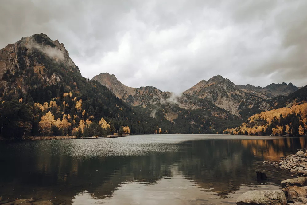


Where is brown on the color wheel?
Being a composite hue, the color brown is not typically present on a traditional color wheel. The three primary colors red, yellow, and blue combine to make brown. On a contemporary color wheel, you can find brown as one of the darker orange shades. Blue, being a complementary color for orange, is also a complementary color for brown.
Depending on the specific color mixing ratio, you can make lighter or darker shades of brown—from sandy tan and caramel to deep chocolate and walnut. For the lighter hues, you must mix more yellow with a touch of purple; for darker hues, add a bigger proportion of red and blue.
Additionally, you can create cooler or warmer brown tones. Adding more blue to the mixture will give you a more neutral, cooler undertone to the brown, instilling a sense of calm, sophistication, and stability to your projects. Alternatively, reducing the proportion of blue and increasing the red and yellow will allow you to achieve a warmer, more vibrant brown, perfect for adding richness and energy to your designs.
Types of brown
Traditional brown
This is a deep and rich brown shade with red and green undertones. Being a traditional, warm, and classic brown color, it exudes timelessness and sophistication, perfect for refined luxury products and packaging designs.
HEX #964B00
RGB 150, 75, 0
CMYK 0, 50, 100, 41
Tan
Tan is a light and neutral hue with slight yellow undertones. Often perceived as a pale, elegant brown, it evokes a sense of warmth and simplicity, creating a cozy and inviting atmosphere.
HEX #D2B48C
RGB 210, 180, 140
CMYK 0, 14, 33, 18
Caramel
Caramel is a medium brown tone with hints of orange and red. It projects calm and tranquility, perfect for adding depth and familiarity to your design compositions. Paired with blue, it creates a balanced aesthetic of serenity and elegance.
HEX #B18775
RGB 177, 135, 117
CMYK 0, 24, 34, 31
Burnt sienna
Burnt sienna is a vibrant and earthy brown, created by mixing red and yellow pigments. With its strong red undertones, it radiates energy and captures the essence of sun-drenched landscapes, rustic pottery, and terracotta architecture.
HEX #E97451
RGB 233, 116, 81
CMYK 0, 50, 65, 9
Dark chocolate
Dark chocolate is a deep, intense brown hue with red and green undertones. Being such an opulent and refined shade, it is perfect for creating bold, dramatic, and rich design compositions. Combined with ivory and forest green, it forms a nature-inspired palette.
HEX #332421
RGB 51, 36, 33
CMYK 0, 29, 35, 80
Coffee
Coffee brown is a warm, muted shade with a balanced mix of red and yellow undertones. Paired with cream or beige hues, it is associated with simplicity and comfort. To achieve a more dynamic composition, you can incorporate metallic accents like bronze or gold.
HEX #6F4E37
RGB 111, 78, 55
CMYK 0, 30, 50, 56
How to design with brown
The color brown can convey a rustic charm or a sophisticated elegance, depending on its shade, context, and paired hues. The following three color schemes can help you find your desired style:
- Monochromatic: includes several shades in the same brown family (light to dark), creating a cohesive and elegant look. You can add white as a neutral accent to create contrast within the brown spectrum.
- Analogous: involves pairing brown with neighboring warm red and yellow tones. White can balance out the intense vibrancy of this brown color scheme.
- Complementary: combines brown with complementary blue and green colors, creating a dynamic look. To minimize the overwhelming contrast of bright hues in your designs, you can add neutral white elements.
What colors go with brown?
When pairing brown with other colors and hues, decide on the desired aesthetic, mood, and style you want to convey in your design. Whether integrating brown as a neutral background color or a rich accent that catches the eye, choose a tone and intensity that matches the other hues to produce a cohesive and well-balanced color scheme.
Here are some color options that go well with brown:
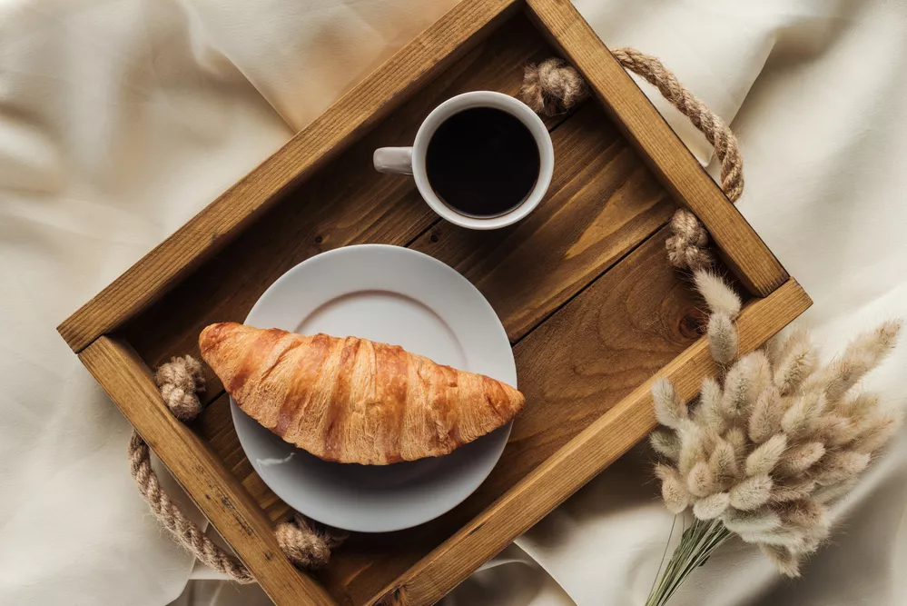
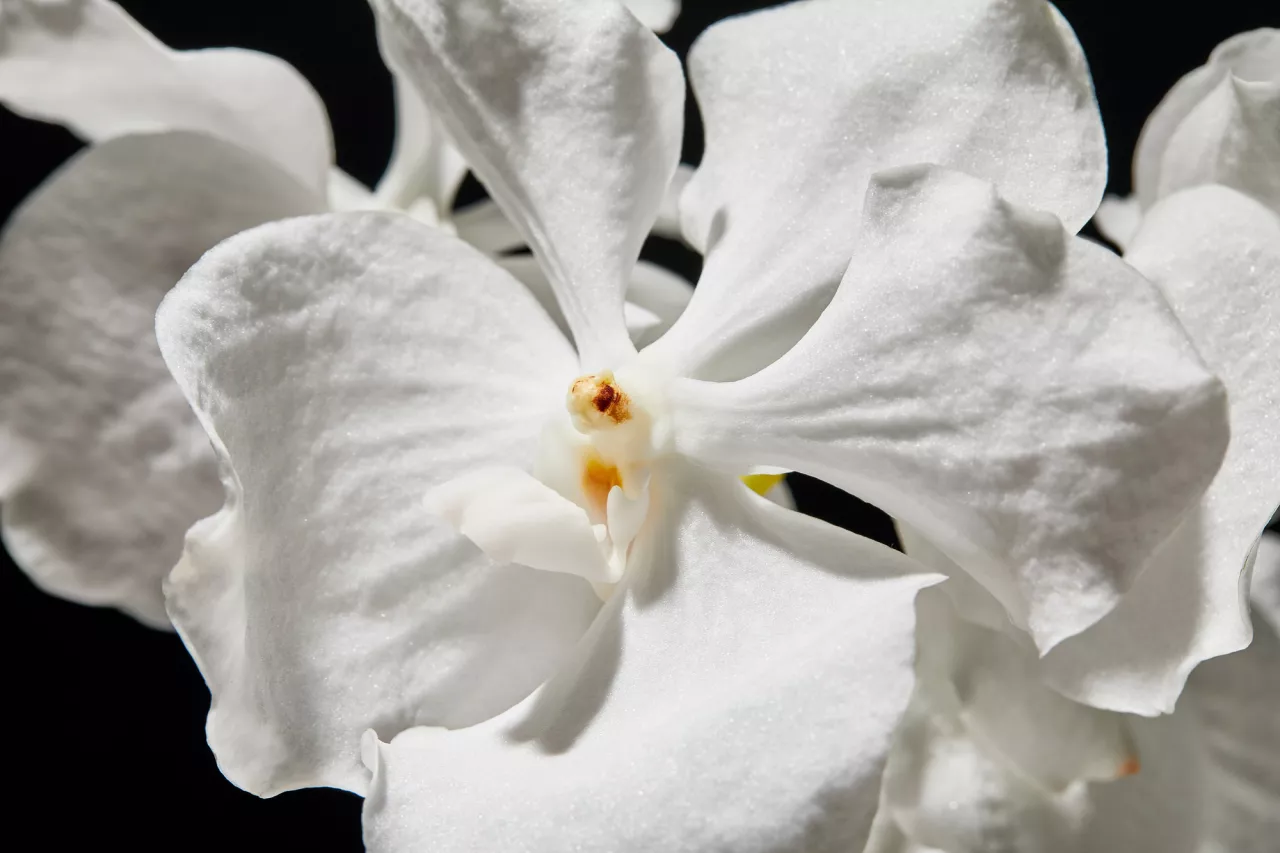
- White, cream, or beige. Combined with brown, these shades create a warm, light palette and instill refinement into your designs, making them inviting and soft.
- Pink. Soft, blush, and pale pinks can go well with brown, creating a delicate, feminine ambiance.
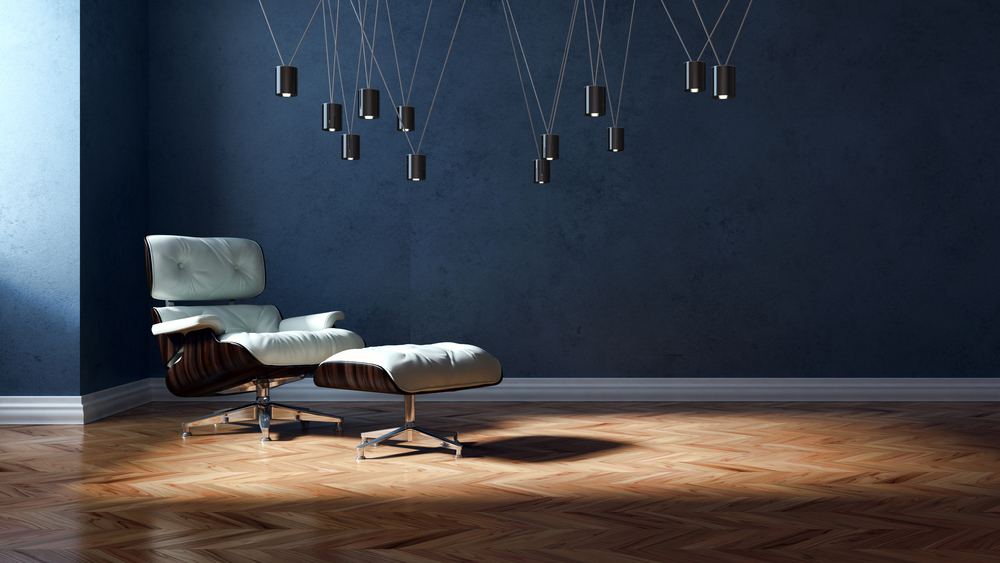
- Blue. Lighter blue shades and teal hues can create a striking contrast with brown, establishing a calming and balanced feel.
- Green. Earthy greens like olive, sage, moss, or forest boost the natural, serene, outdoorsy ambiance when paired with brown.
- Red. In combination with brown, deep red colors like burgundy or bordeaux create a rich and bold design atmosphere, evoking a sense of luxury and drama.
- Orange. Terracotta shades boost the warmth and vibrancy of brown, creating a lively and energetic combination.
- Purple. Deep purples like plum or black raspberry in combination with brown exude a sense of mature sophistication and luxury.
To wrap up
Brown is a versatile, timeless color perfect for various creative purposes and design projects. It conveys warmth, simplicity, and connection to natural elements. Being one of the prominent autumn hues, it can add a rustic feel to your compositions, boosting the cozy seasonal ambiance. At the same time, when paired with neutral tones or vibrant accents, brown can induce sophistication, elegance, and enduring style.
Discover the Brown Collection
FAQs
What two colors make brown?
Brown is typically made by mixing two complementary colors, such as purple and yellow, green and red, or orange and blue. Depending on the color mix ratio, you can achieve a wide range of different shades of brown, from light tan to dark chocolate.
What colors complement brown?
There are two colors that complement brown the most—blue and green. You can achieve different design aesthetics depending on the shades and tones you go for in the blue and green spectrum. Lighter shades create an airier, more relaxed feel, while deeper tones add richness and intensity to your composition.
What color goes best with brown?
One color that goes exceptionally well with brown is cream or beige. This pairing creates a classic and elegant look, where brown provides warmth and depth, and cream adds a touch of luminance and softness. This combination is perfect for creating a quiet luxury ambiance in modern and traditional designs.
What does the color brown symbolize?
Brown is frequently associated with earthiness, stability, and practicality. It symbolizes warmth, comfort, and a connection to nature. Brown can convey authenticity, simplicity, and timelessness.
What is the opposite color of brown?
Blue is the opposite color of brown on a contemporary color wheel. Pairing these two shades in your projects can boost dynamism and contrast, producing eye-catching, balanced compositions.
Other articles you might find interesting
Fall Color Trends 2023: Captivating Palettes, Curated Collections & Design Inspiration
The Color White: Symbolism, Theory and Design Tips
Exploring the Charm of Pastel Colors: Definitions, Color Theory and Design Tips


![Gradient Color Palettes for Your Next Design Project [Infographic]](https://depositphotos-blog.s3.eu-west-1.amazonaws.com/uploads/2019/08/Gradient-Color-Palettes-for-Your-Next-Design-Project-Infographic.webp)

