Why Green Should Be Your New Favorite Color in Design
A symbol of growth, nature, and the cycle of life itself, green’s presence in our surroundings is profound. Yet, what deeper meanings does this color hold? How do its shades shape the world of design, from the latest fashion trends to the layouts of our favorite magazines?
In this article, we delve into the symbolism of green, uncovering its vast spectrum of shades and their applications in design. Learn how to incorporate green into your work and immerse yourself in our exclusive collection of visuals inspired by the shades of green to elevate your designs.
See Collection
What does the color green symbolize?
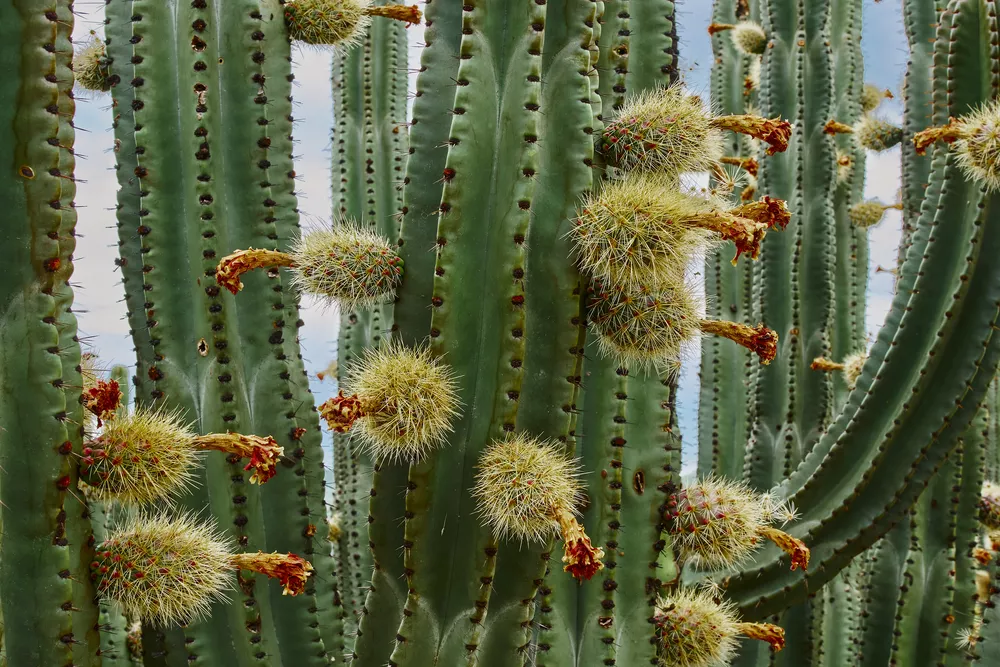
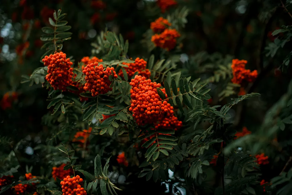
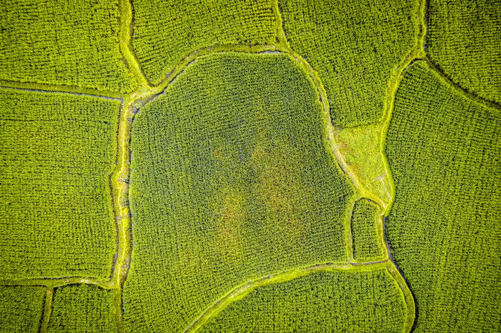
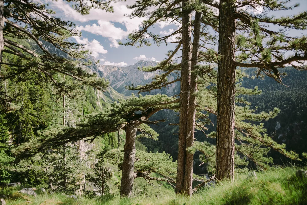
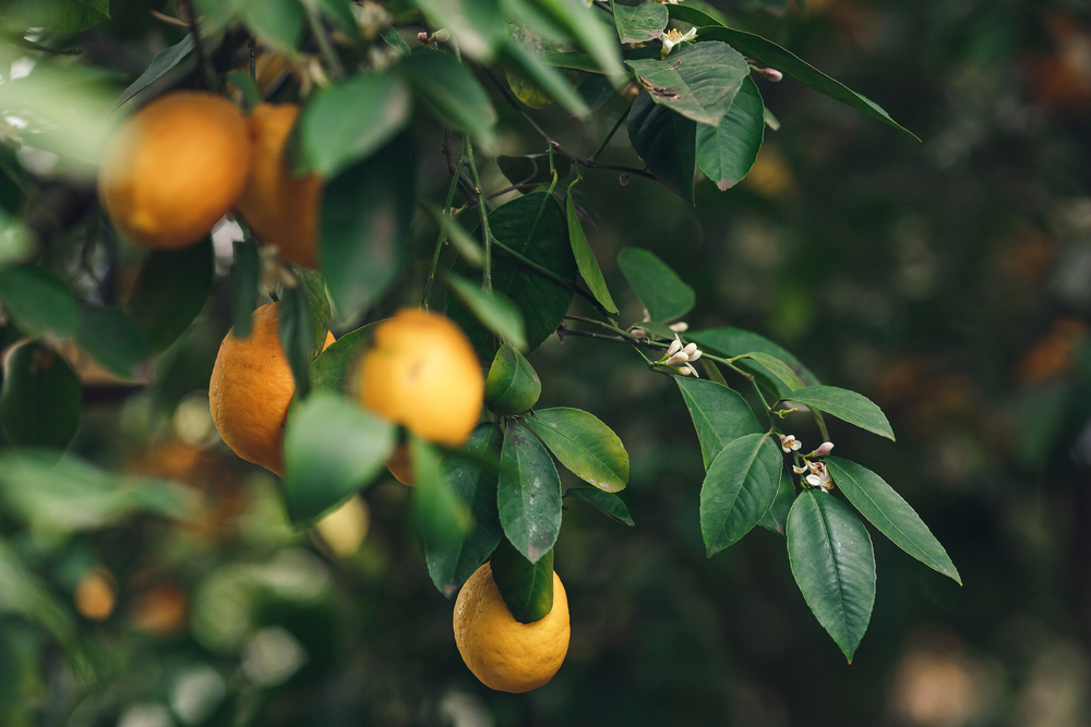
Green is deeply rooted in the natural world, symbolizing growth, fertility, and renewal. This association is likely due to green’s omnipresence in nature—forests, fields, and plants, which are essential for life on Earth. Historically, green was also emblematic of wealth, stability, and prosperity, particularly in societies where agriculture was central to the economy and social hierarchy.
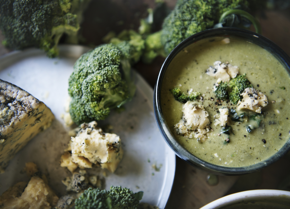
Green is the color most commonly associated with environmentalism and the global movement towards sustainability. It’s closely linked to health and wellness, partly because of its prevalence in nature and its association with freshness. This symbolism extends into the realm of safety or approval, where green, for example, signals go in traffic lights and other informational signals. However, green’s symbolism is not universally positive—it also has historical associations with envy and illness.


Types and shades of green
Mint Green
HEX #98FF98
A pale, refreshing shade that conveys a sense of freshness and lightness. Mint green is often used in designs aiming for a youthful and clean aesthetic.
Emerald Green
HEX #50C878
Rich and vibrant, emerald green is associated with luxury and sophistication. This deep shade is frequently used in high-end branding and fashion to convey elegance.
Olive Green
HEX #808000
A darker, more muted shade of green that draws its name from the natural color of olives. Olive green is commonly associated with military and outdoor gear, symbolizing durability and reliability.
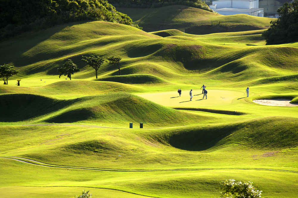
Lime Green
HEX #32CD32
Bright and bold, lime green stands out for its high visibility and energetic feel. It is often used to attract attention in marketing materials and digital designs.
Seafoam Green
HEX #93E9BE
A light, soft green with a hint of blue, reminiscent of the ocean’s edge. Seafoam green is popular in interior design and branding to create a calming and restorative atmosphere.
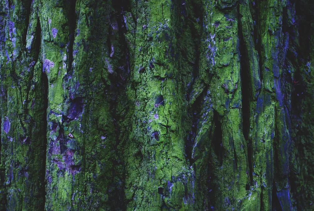
Forest Green
HEX #228B22
Deep and dark, this shade evokes the dense leafage of forest areas. It’s often associated with nature, environmental causes, and outdoor products.
Neon Green
HEX #39FF14
Extremely bright and impossible to ignore, neon green is used when the goal is to make a bold statement. It’s frequently seen in sportswear and tech product marketing to convey energy and innovation.
Sage Green
HEX #B2AC88
A gray-green shade that exudes tranquility and sophistication. Sage Green is popular in interiors and branding focused on wellness, natural beauty, and minimalism.
How do you design with green?
Green is positioned on the color wheel between blue and yellow, making it a secondary color. This placement is due to the fact that green is created through the mixture of these two primary colors in equal parts. It’s located opposite red, making them complementary colors, meaning when used together, they create strong contrast and visual interest.
Green harmonizes with a diverse array of colors due to its adaptability and potential to either stand out or blend in, depending on the chosen combination:
- A monochromatic color scheme. This scheme emphasizes the versatility of green by exploring its different shades and tints within the same color family, creating depth and interest through subtlety. Use light or pastel greens alongside deep or forest greens to achieve a cohesive and soothing palette.
- A complementary color scheme. Pair green with shades of red, its direct opposite on the color wheel, to craft a scheme with vibrant contrast. Try variations like lime green with burgundy or forest green with pink for a modern twist on this classic complementary pairing.
- An analogous color scheme. Combine green with its neighboring colors, such as yellow and blue, for a harmonious and visually pleasing arrangement. This scheme is natural and easy on the eyes, making it suitable for spaces that aim for a relaxed and cohesive atmosphere.
- A triadic color scheme. Create a balanced design by using colors that are evenly spaced around the color wheel from green, such as orange and purple. Utilizing shades like emerald green, tangerine, and lavender can provide a sophisticated yet playful palette.
To get more out of the color green, you may want to consider the following:
Play with saturation and brightness
Adjusting the saturation and brightness of green can significantly affect the mood of a design. A bright, saturated green can be lively and bold, while a desaturated green can be more refined and professional. Experiment with different levels to achieve the desired effect.
Try different materials and textures
In physical designs, such as interior design or product packaging, the material and texture can influence how a shade of green is perceived. A glossy finish might make a green appear more vibrant, while a matte finish can soften the color. The choice of material can also affect the color’s impact, with natural materials like wood and stone complementing green well.
Use for focal points and accents
Green can create impactful focal points or serve as an accent color to draw attention to specific design elements. Use brighter shades of green to highlight important features or messages and softer shades to create background elements or subtle accents.
What colors go with green?
- White. Green and white create a clean, fresh look. This pairing is often used in spaces aiming for a minimalist aesthetic, with green providing a pop of color against a crisp white background.
- Black. Combining green with black can convey sophistication and depth. This pairing works well in designs seeking a modern, elegant feel, with the contrast between dark and vibrant tones creating a striking visual effect.
- Grey. Green and grey together offer a muted palette that’s both contemporary and soothing. This combination is ideal for creating a refined space, with the neutrality of grey allowing the green to softly stand out.
- Blue. Green paired with blue creates a harmonious atmosphere reminiscent of nature. This pairing is perfect for designs aiming to evoke tranquility and natural beauty.
- Yellow. When combined, green and yellow exude energy and vibrancy, making this pairing well-suited for spaces and designs that aim to stimulate and uplift. This combination is often used in designs that seek to be fun, playful, and energetic.
- Pink. Pairing green with pink brings a soft, romantic quality to designs. The contrast between the traditionally feminine pink and the freshness of green creates a charming aesthetic that works well in sophisticated and creative designs.
- Gold. Green paired with gold evokes elegance and luxury. The richness of gold alongside the vibrancy of green creates a refined and distinguished look, perfect for upscale branding and interior design.
- Pastels. Green paired with pastel tones can help balance a design. Pairing it together to enhance the vibrancy of green without overwhelming the visual space. This approach is particularly effective in interior design, where too much color can become chaotic.
To wrap up
Positioned between blue and yellow on the color wheel, green stands as a unique intermediary, blending the cool and warm tones. This placement gifts green with remarkable versatility in design applications. Whether you’re aiming for a monochromatic look, the dynamic contrast of a complementary palette, or the soothing effect of an analogous scheme, green provides a solid base for creative exploration. Dive into our carefully selected collection of green visuals to spark inspiration for your upcoming projects.
See CollectionOther articles you might be interested in
How Strategic Color Choices Can Skyrocket Your Brand Identity
How to Design with Gold: Its Meaning, Symbolism, and Complementary Colors
The Pink Palette: Discovering the Significance and Symbolism of an Iconic Color
The Color White: Symbolism, Theory and Design Tips


![Gradient Color Palettes for Your Next Design Project [Infographic]](https://depositphotos-blog.s3.eu-west-1.amazonaws.com/uploads/2019/08/Gradient-Color-Palettes-for-Your-Next-Design-Project-Infographic.webp)