20 Powerful Color Combinations to Use in Display Ads
Comforting blue, energizing red, cheerful yellow—each color brings its own emotion and meaning to design. In marketing communication, the choice of shades and colors that go together is a particular focus. The fact is that 62–90% of initial impressions are based entirely on color. The saying that you never get a second chance to make a good first impression is especially true in this case.
Since marketing graphics use a variety of colors depending on the desired effect, knowing how to create the best color combos is a must for success. In this article, we’ll walk you through the basics of color science, from color theory with clear rules for creating harmonious shade mixes to color psychology, which explains the impact of hues on people’s emotions. Check out color palettes used by top brands in their ads and find inspiration for your campaigns in ready, eye-catching color combinations.
A brief history of color science
Colors surround us everywhere. They are not just a backdrop for our daily lives, but potent emotional triggers that affect our mood and behavior. Not surprisingly, this topic has been of interest to scientists since ancient times—from Aristotle with his treatise “On Colors” to Leonardo da Vinci, who created his own color system connecting hues with the elements of matter: white (light), yellow (earth), green (water), blue (air), red (fire), and black (darkness).
One of the most significant advances in understanding the nature of color was Isaac Newton’s discovery in 1676. He split sunlight into a visible spectrum by experimenting with a prism and identified seven colors: red, orange, yellow, green, blue, indigo, and violet. Newton recorded these on a circular map, which became the first color wheel.
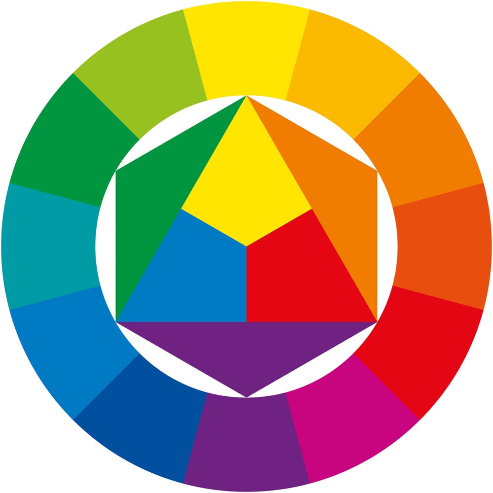
The person who developed detailed principles of working with color in the early 20th century was Johannes Itten, a Swiss artist and a teacher at the Bauhaus school. His fundamental work, “The Art of Color,” is among the most famous handbooks in the design world, and Itten himself is considered one of the founders of color theory. Furthermore, he is a creator of the 12-sector color wheel, the most handy tool for choosing colors that go well together.
Understanding color theory
One of the primary aims of color theory was to define clear rules for color combinations. It led to the categorizing of colors into primary, secondary, and tertiary. Primary colors are the foundation for all other shades. According to Johannes Itten, red, yellow, and blue (RYB system) are the primary colors that generate all existing hues by mixing in different proportions.
Secondary colors are derived from blending primary colors equally. They include green (a combination of blue and yellow), orange (a combination of red and yellow), and purple (a combination of red and blue).
And finally, tertiary (or intermediate) colors are created by mixing primary and secondary colors. There are six of them: red-orange, red-purple, blue-purple, blue-green, yellow-green, and yellow-orange.
Advanced color circles also display key color features, such as hue, saturation, and brightness. Hue is defined by the position of a color in the spectrum that distinguishes it from other colors. For instance, primary red and yellow colors are hues, as are derived colors gold and brown.
Saturation (or chroma) characterizes the intensity or purity of a color. For example, adding some gray to a bright green color will make it less saturated. In other words, the lower a color’s saturation, the closer it is to pure gray. The colors of the rainbow are the purest, with maximum saturation. However, they are not equal: yellow is the less saturated color, and intensity increases closer to the edges of the spectrum (red and purple).
Brightness (or value) indicates how bright or dark a color appears. It changes depending on whether you add white or black to a color. Simply put, high brightness means a color is closer to white, and low brightness means it’s closer to black.
Another essential aspect of creating the best color combos is color temperature. The color wheel can be divided into warm and cool zones. Red, orange, and yellow are considered warm colors, while blue, green, and purple are cool. Orange is supposed to be the warmest and blue the coldest. However, not all reds are warm, and not all blues are cold (the exception is always warm orange). Each color family has warm and cool hues depending on their undertone.
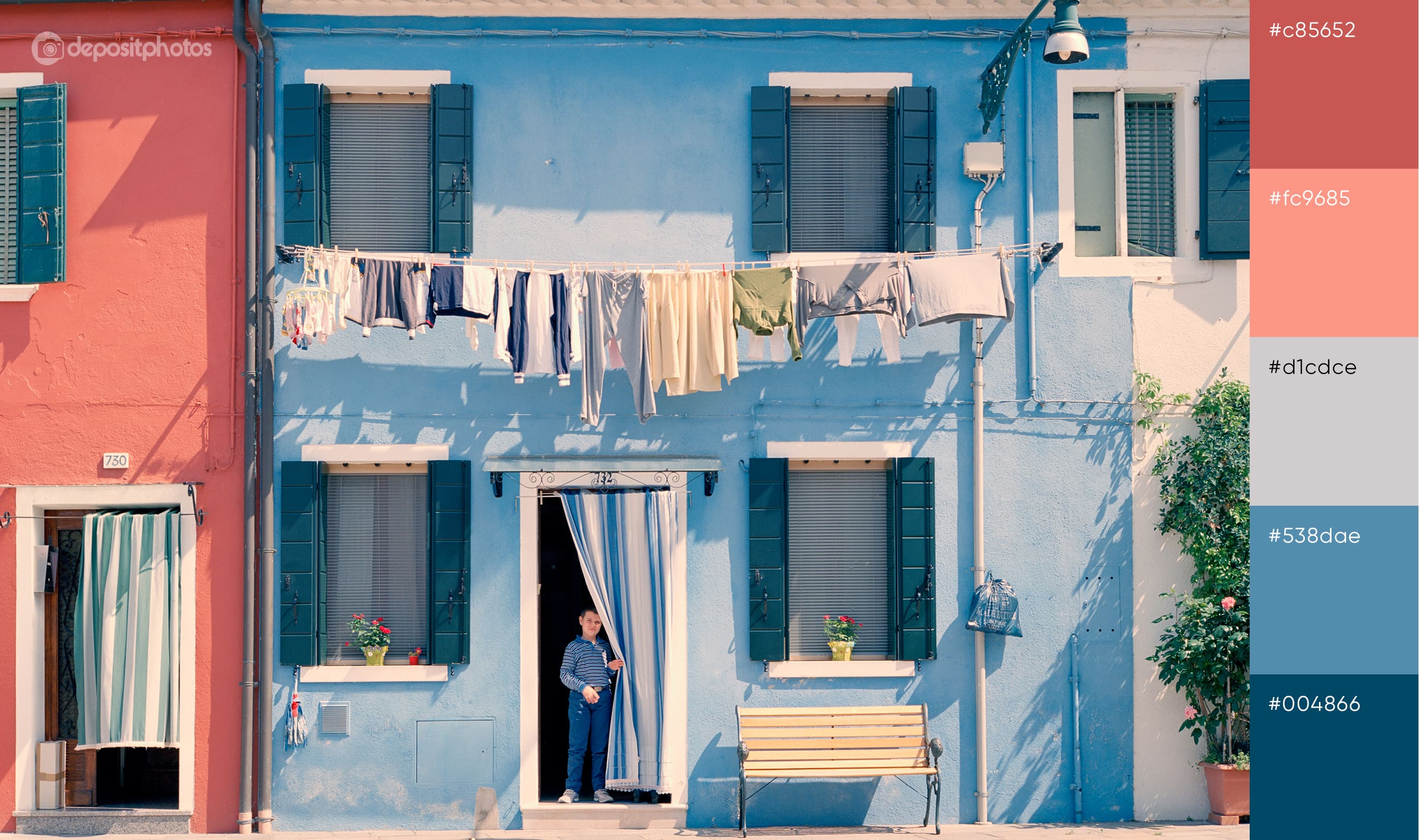
In addition to warm and cool shades, there are neutral colors, such as black, white, or gray. These hues are actually colorless and not represented on the color wheel. The versatile nature of neutrals makes them a great option to balance designs and complement other inviting colors, as they don’t steal the spotlight but allow the rest of the shades to pop. Not surprisingly, they are integral elements of most color palettes, as shown in the examples below.
Essentials of color combining: schemes and rules
Looking for colors that go together is something that designers deal with all the time. From crafting a spectacular logo or app icon to developing a brand identity or advertising campaign—in the right hands, color palettes become a powerful mix of emotions and meanings that resonate with target audiences. How do designers achieve this? The secret is in color schemes that help to find harmonious and eye-catching color combinations.
There are seven color schemes in total, which we described in detail in the following thematic article. Here, we’ll mention the most common ones: analogous, complementary, and triadic.
- An analogous color scheme suggests using adjacent hues on the color wheel. An example is a combination of yellow, orange, and red, or blue, cyan, and green. This color scheme is great for clean designs that create a sense of depth.
- A complementary color scheme uses shades opposite each other on the color wheel to create contrast. For instance, red and green, blue and orange, and purple and yellow are complementary colors. These colors provide vivid and striking graphics, as the contrasting combination of shades immediately draws viewer attention.
- A triadic color scheme relies on three hues equidistant from each other on the color wheel. Primary red, yellow, and blue, or secondary green, orange, and purple are examples of such color combinations. Usually, in a triadic color scheme, one color is dominant, and two others are used for accents, creating a bold yet balanced look.
These schemes are great cheat sheets for finding the best color combos. Choose various options depending on the effect you want to achieve. For example, you can experiment with different shades and tones, such as pastels or neons.
When picking colors that look good together, you can also rely on the following percentage rules:
- The 80/20 rule states that you should combine 80% of a dominant color with 20% of a complementary color. It is a go-to way to create a visually appealing image, like a light blue sky with white clouds.
- The 60/40 rule: blend 60% of one color with 40% of another to get a well-rounded look. Think of it as a muffin with berry jam inside.
- The 50/50 rule: take two colors in equal amounts to balance each other. These can be complementary colors or shades matching your brand palette.
- The 60/30/10 rule: if you’re working with three colors, combine 60% of the primary, 30% of the secondary, and 10% of the accent color. This approach creates a harmonious design and highlights key elements.
Tips on choosing colors for ads
1. Consider the emotion you want to evoke
Thanks to color psychology, you can choose shades strategically, creating not only eye-catching color combinations, but also efficient ones. The key is to decide what emotion you want to convey in your ads. Is it excitement or a sense of urgency? Then rely on red. Looking for associations with femininity and childhood? Choose pink shades.
The key emotions and meanings behind different colors are as follows:
Red: energy, passion, love, strength, action
Orange: optimism, freedom, creativity, pleasure
Yellow: joy, warmth, happiness, curiosity
Green: health, nature, harmony, prosperity
Blue: trust, confidence, security, power
Purple: imagination, art, mystery, royalty
Pink: sensitivity, charm, romance, playfulness
Brown: stability, comfort, foundation, security
White: purity, innocence, simplicity, perfection
Gray: reliability, intellect, compromise, neutrality
Black: elegance, authority, protection, sophistication
Remember that along with positive effects, each color also has negative ones. For instance, blue can trigger feelings of depression, and red can be associated with aggression. That’s why finding colors that go together and enhance each other’s best features is vital.

2. Match colors to your brand personality
Once you understand how different colors affect consumer perception and behavior, you can choose the best options for your brand personality. What are your fundamental values and traits? What do you want to be in the eyes of your audience—professional and reliable or creative and fun? To make this easier, refer to the common classification of brand personalities with dominant traits:
- Sincerity: honesty, kindness, family values, sustainability, thoughtfulness (Disney, Amazon, Oprah)
- Excitement: energy, creativity, boldness, adventurousness (Nike, Coca-Cola, MTV)
- Competence: reliability, efficiency, innovation, intelligent, hard-working (Google, Volvo, Microsoft)
- Ruggedness: toughness, authenticity, durability, resilience (Jeep, Timberland, Patagonia)
- Sophistication: elegance, timelessness, confidence, prestige (Rolex, Apple, Mercedes-Benz)
Coca-Cola is a perfect example of the strategic use of color. The signature red fits the concept of excitement and helps ensure consistency that enhances brand awareness.
3. Be mindful of your audience
Each person perceives color differently. This is influenced by many factors, from genetic characteristics to cultural environment. For example, there is a difference in color perception between women and men, since women are more sensitive to color nuances. Moreover, gender also affects color preferences. While blue is an absolute favorite for both women and men, purple is in second place among women and not popular among men at all.
Preferences are also very dependent on age. Young people, in particular, often favor bright colors like red and orange associated with energy and fun. At the same time, people over the age of 70 prefer calm and dark hues such as blue, olive green, and black. It’s equally important to learn how different cultures perceive the same colors, especially if you target various local markets. Researching your audience will help you find the best color combos for any marketing materials.

Tools for choosing colors that go well together
Online color wheel
An online color wheel is one of the easiest ways to find harmonious color combinations. This tool allows you to set a desired color scheme and immediately get a ready-made palette that meets your requirements. You can also use an online color wheel as a source of ideas and inspiration.
Brand book
A brand book is a document that provides a detailed overview of a brand, from its philosophy to its visual representation. Brand books are usually created by branding agencies that bring together professionals such as marketers, art directors, designers, and copywriters. They are well-thought-out guides that embody a brand’s identity, manifested in a unique color palette among other elements.
Color palettes
Color palettes are sets of hues harmoniously mixed according to different color schemes. You can create them with online tools such as Coolors, Khroma, and Color Space or find ready-made combinations on the web. For instance, we regularly share up-to-date palettes in articles related to different colors and seasonal color trends. Check out our latest fall hues research with various color mixes.
What are the best color combinations for display ads?
To help you streamline your color selection and speed up the design process, we’ve put together 15 exclusive palettes featuring the most popular hues in marketing communication, as well as real-life examples of display ads from top brands. Explore them to find fresh ideas for your campaigns.
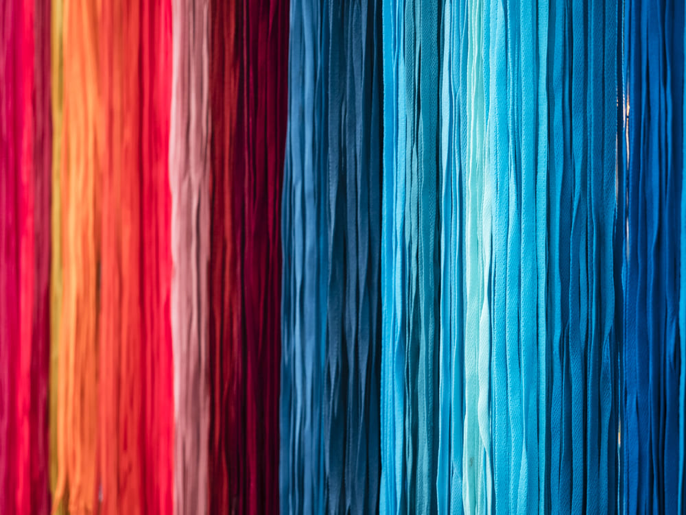
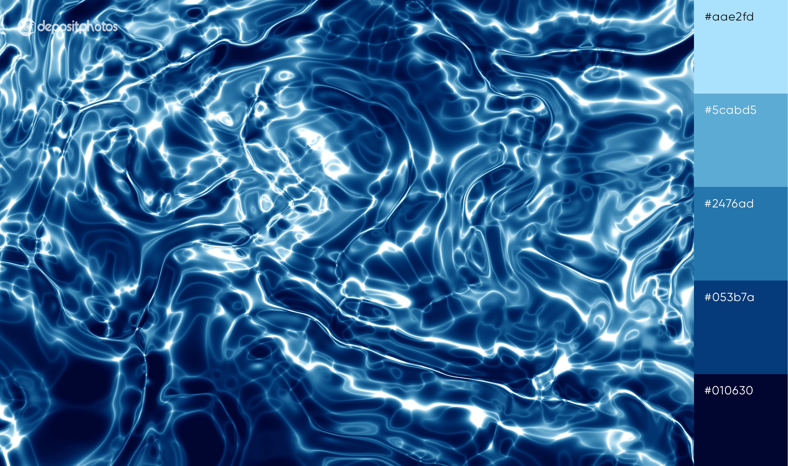
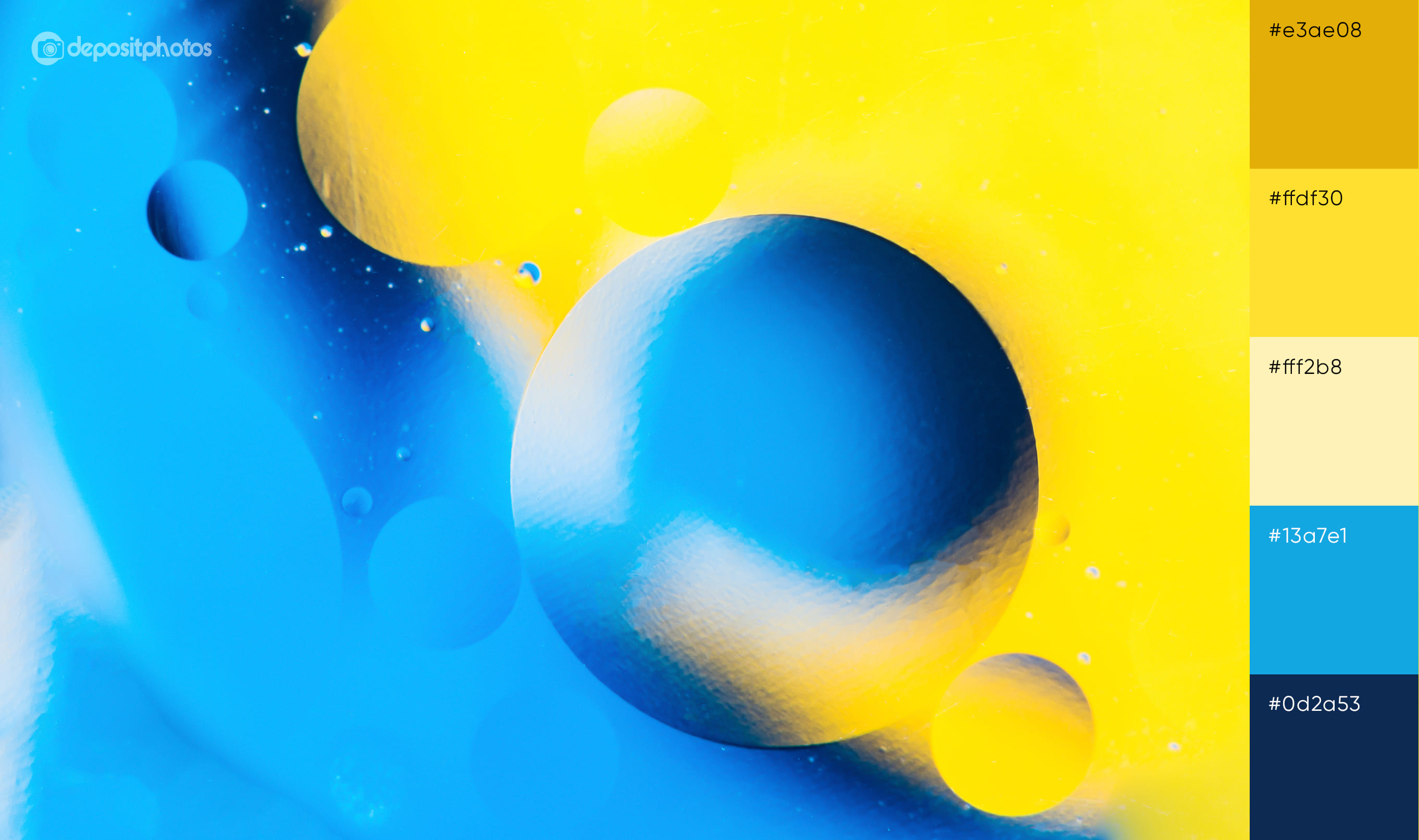
1. Eye-catching color combinations with blue
Let’s start with everyone’s favorite color: blue. This color is popular in various business sectors. The desire to communicate reliability, professionalism, and quality, which blue represents, explains this. Blue is also a highly versatile color that fits perfectly into marketing materials. As you can see in the Google Chrome ad below, light blue is used as an accent color to highlight key points and even as a background color for the CTA button, which is usually red.

Discover our ready-made palettes with different shades of blue—from subtle light blue to impressive navy.
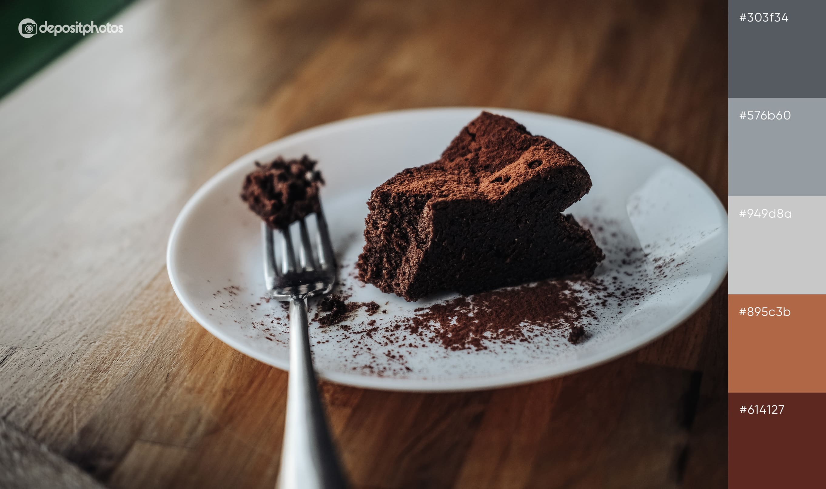
2. Harmonious color mixes with gray
Gray is perfect for minimalistic designs. As a mix of black and white, it embodies neutrality. At the same time, gray is not as plain and boring as it may seem. It has many shade options—from elegant dark gray to glamorous silver. Look at this Nike ad, which uses steel gray as a background color. It goes well with light yellow and black, and appears appealing due to its glowing effect.

Find other ideas for beautiful combinations with gray:
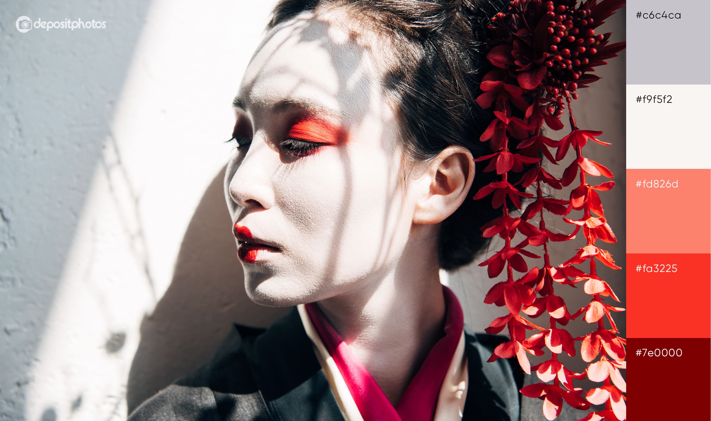
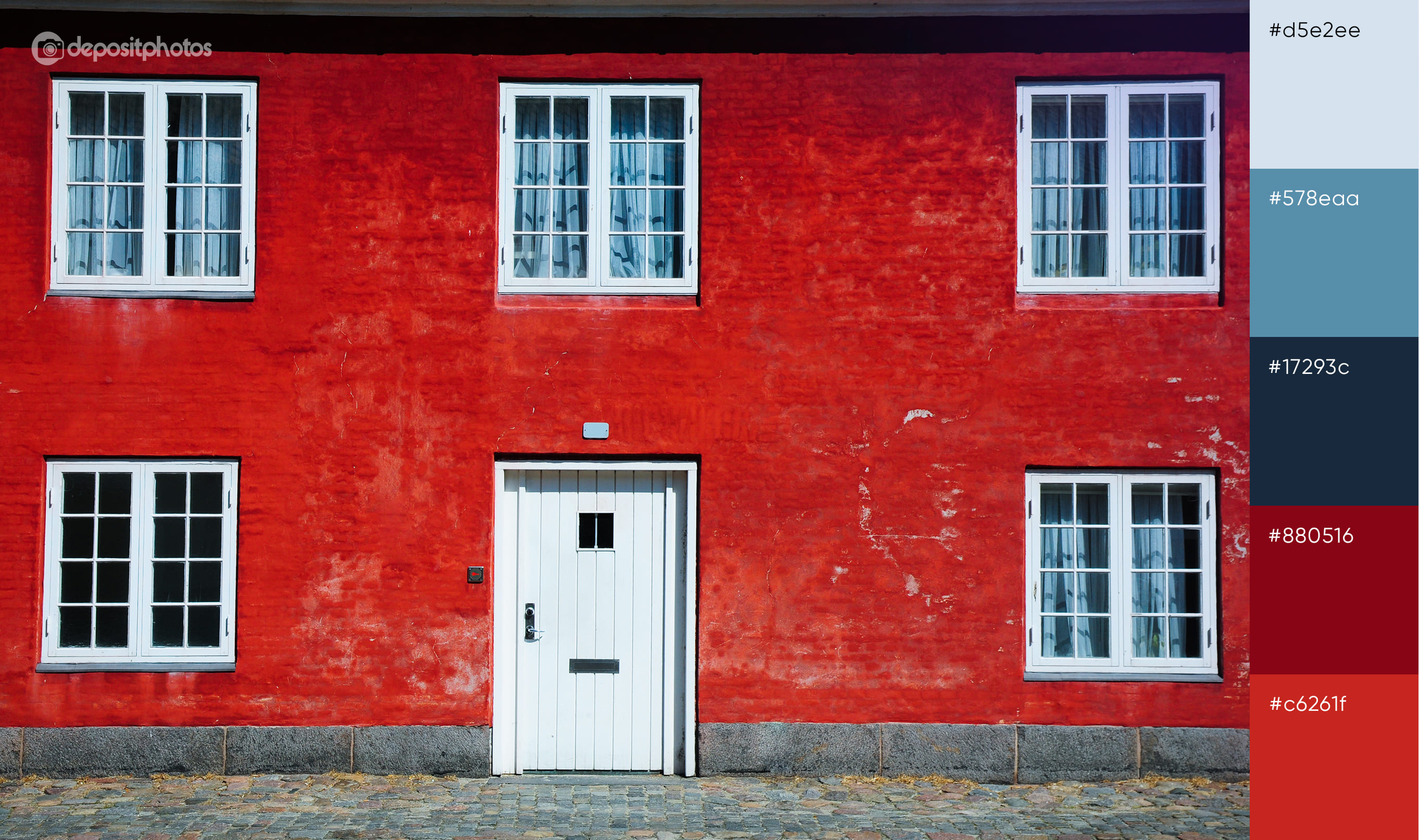
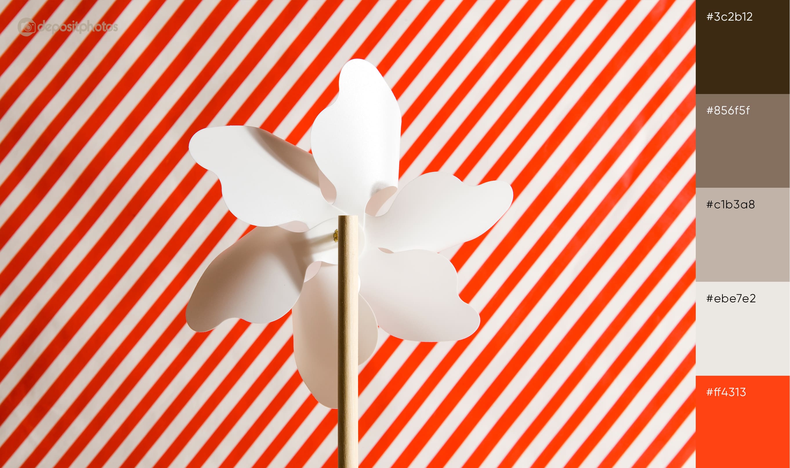
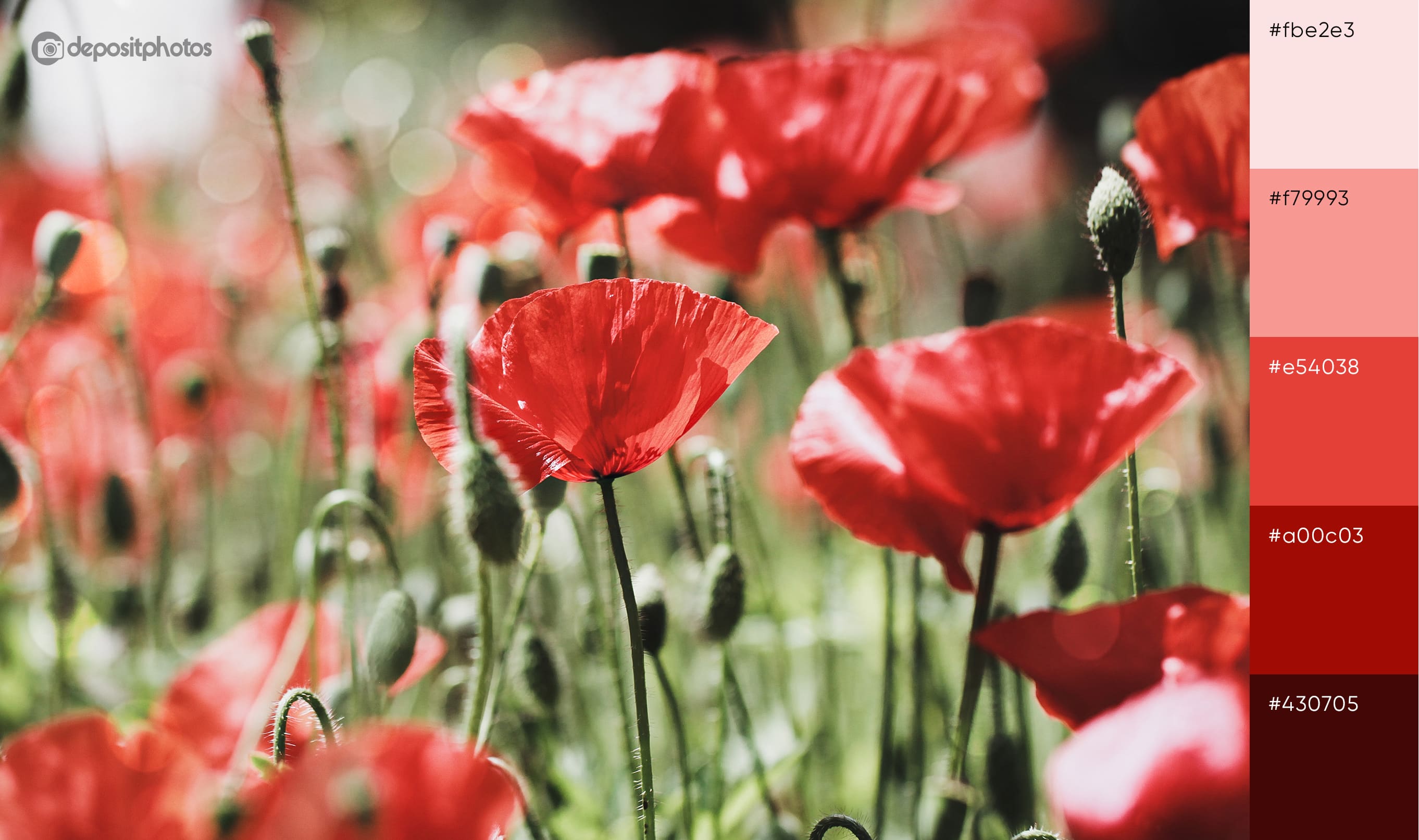
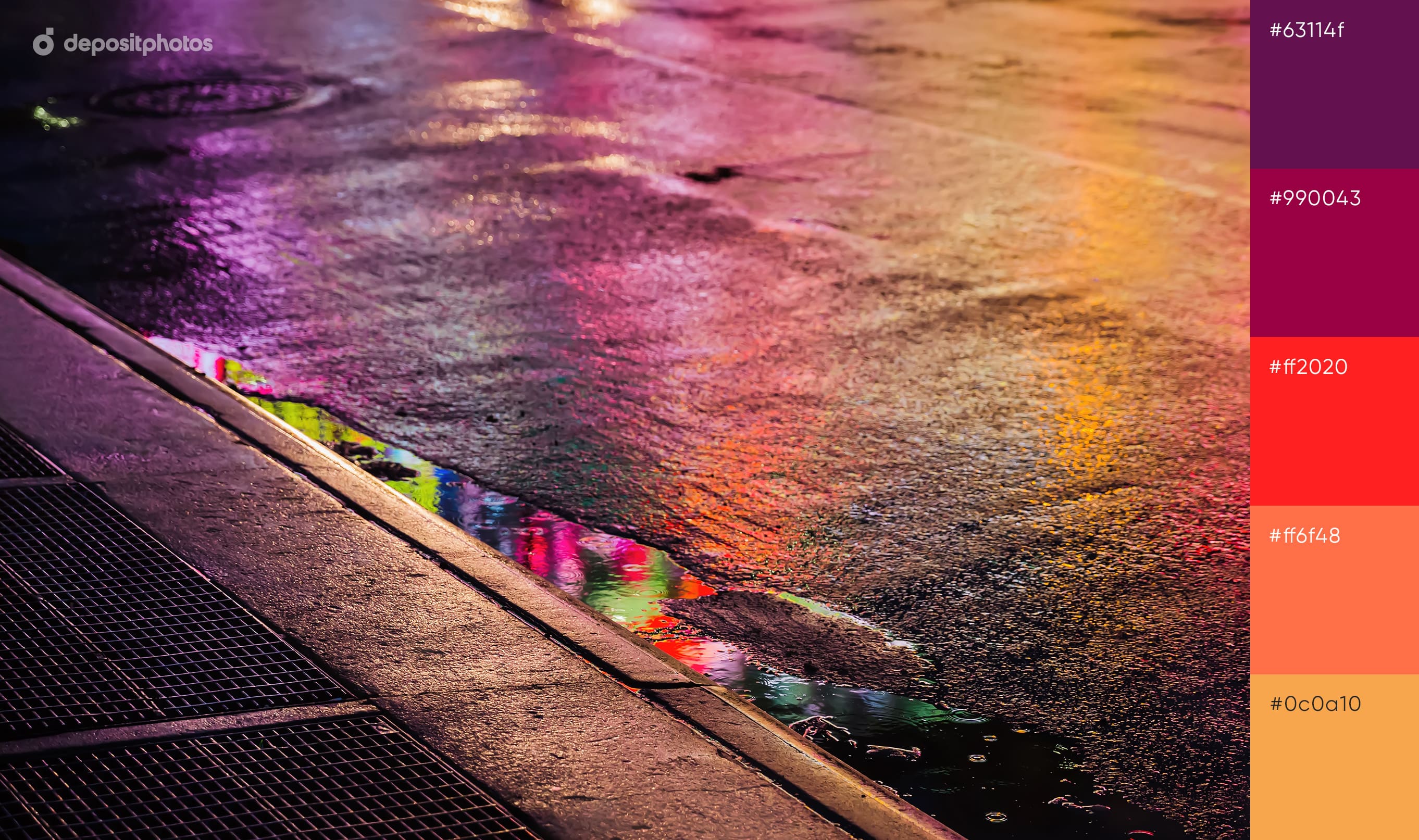
3. Inspiring color blends with red
Red is an absolute must-have in display ads due to its ability to instantly grab attention and create a sense of urgency. It’s often used not only for buttons, but also for main graphics to convey energy and excitement. Despite its dominant nature, red goes well with other bright colors. This Netflix ad shows a striking mix of red and orange that will not go unnoticed.

Check out our red palettes, revealing the variety of this mesmerizing and empowering hue.
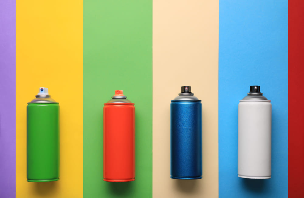
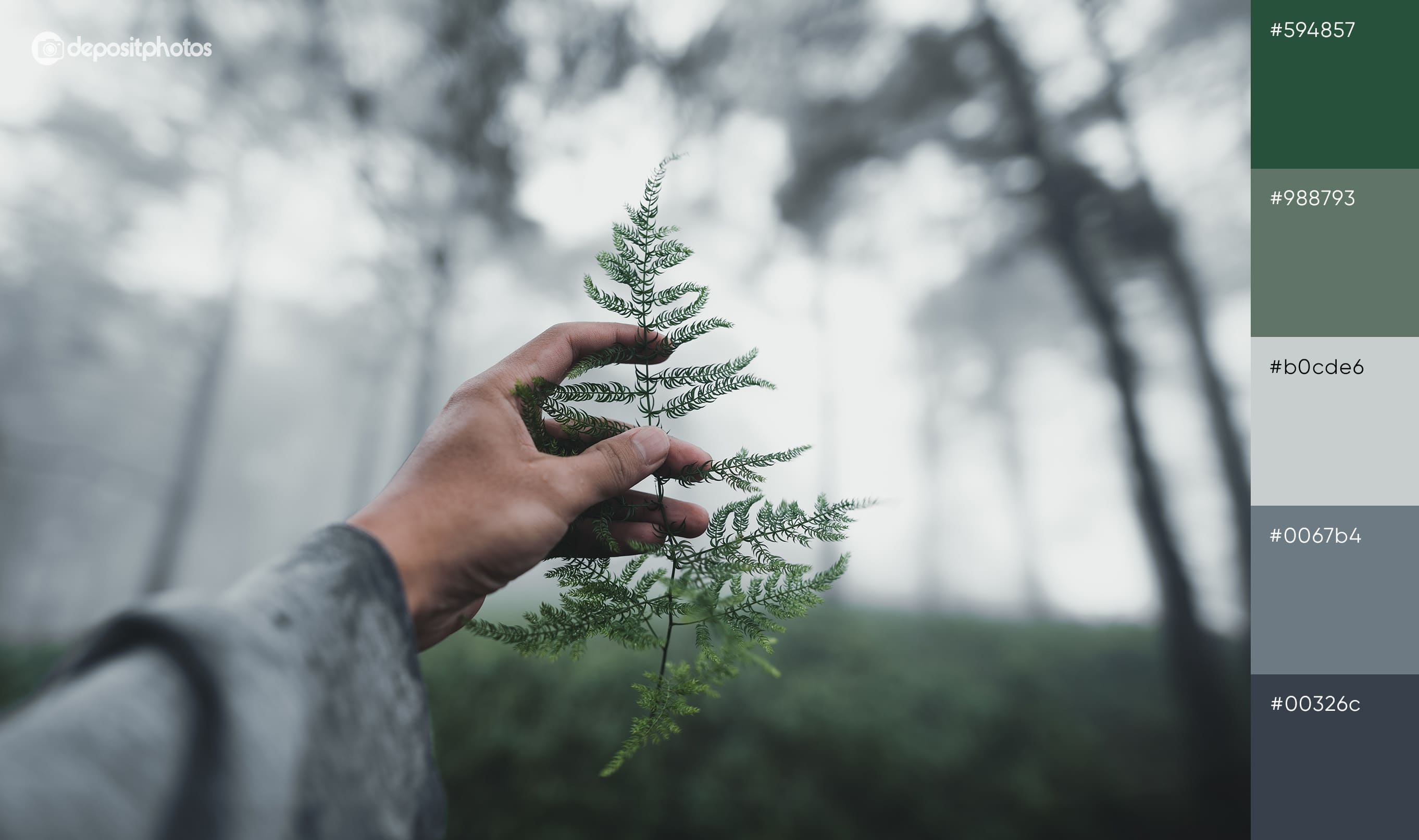
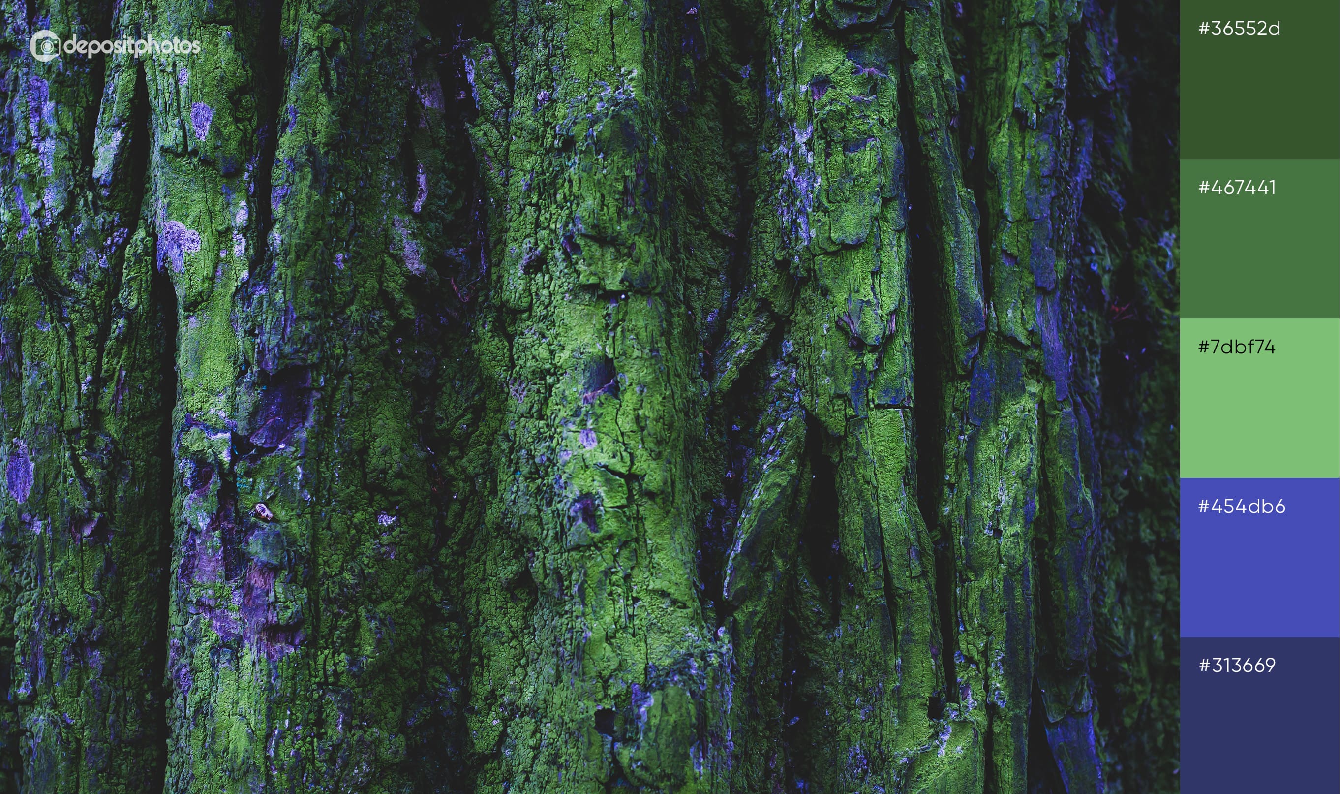
4. Spectacular color combinations with green
Green is another popular choice for marketing materials. It’s not necessary to be an eco-brand to benefit from this color. Green is quite versatile as it sets different moods depending on the shade—from refreshing mint to luxurious emerald. It works well as a background and accent color. Check out an example of how Apple has creatively integrated green into marketing communication. The complementary combo of green and red-brown instantly draws attention to the ad.
Find other colors that go together with green in our curated palettes:
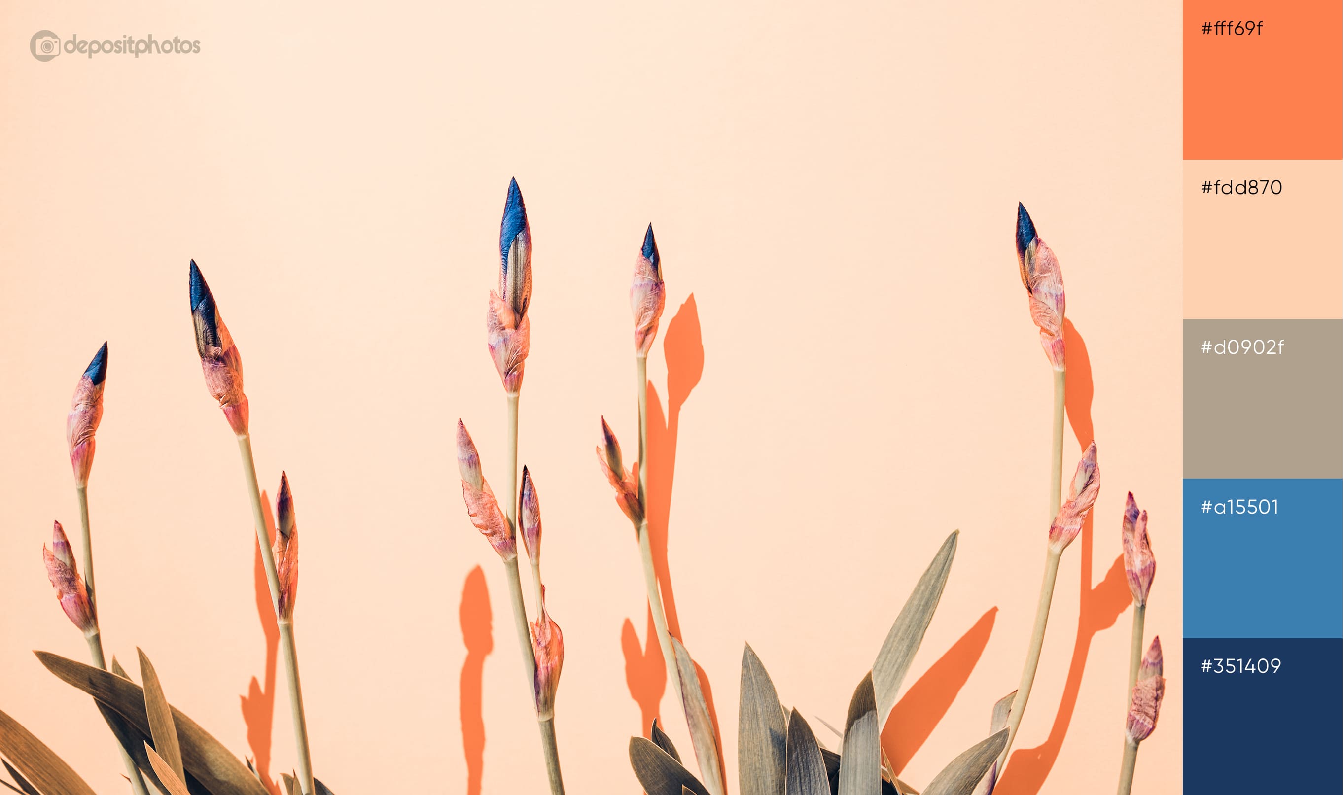
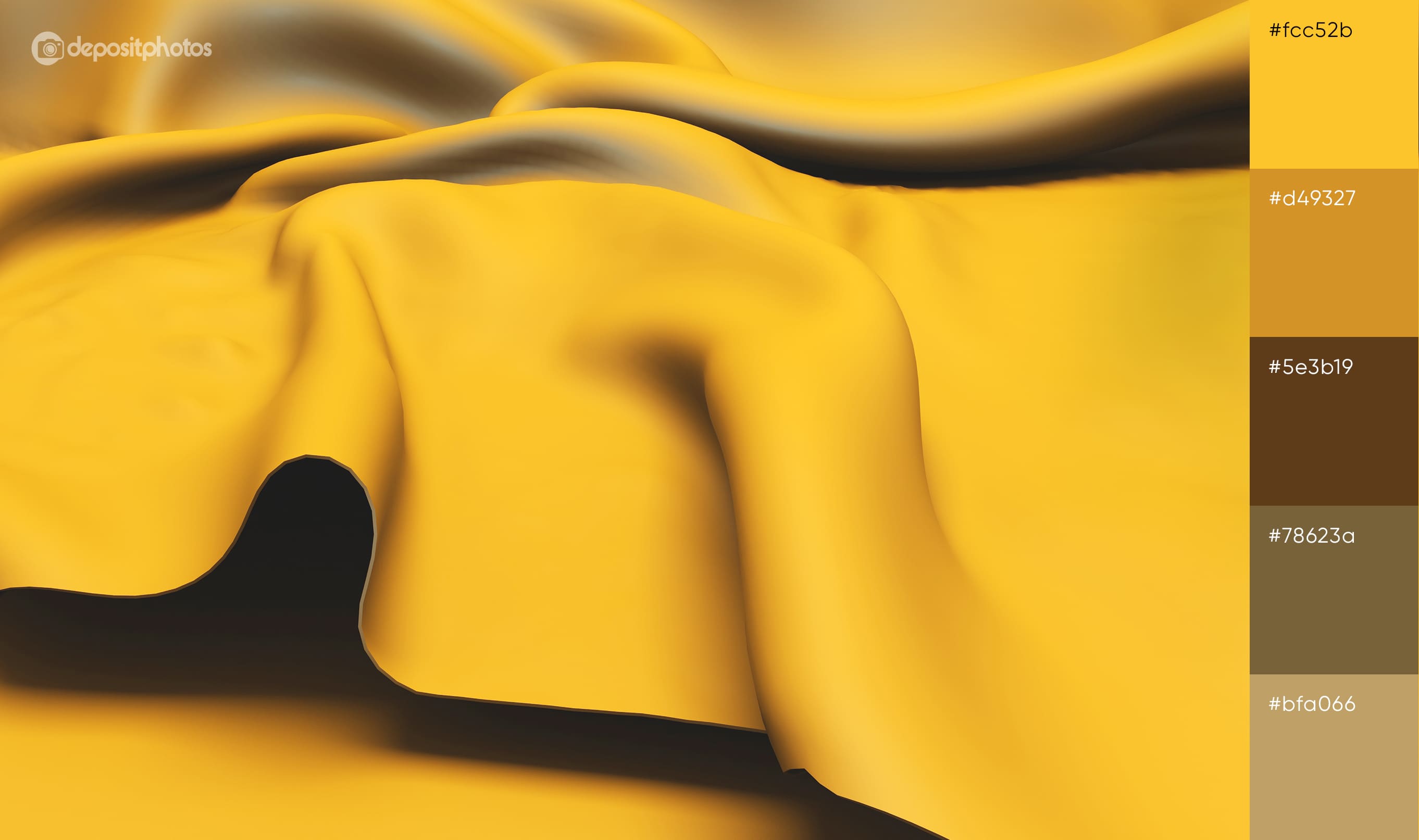
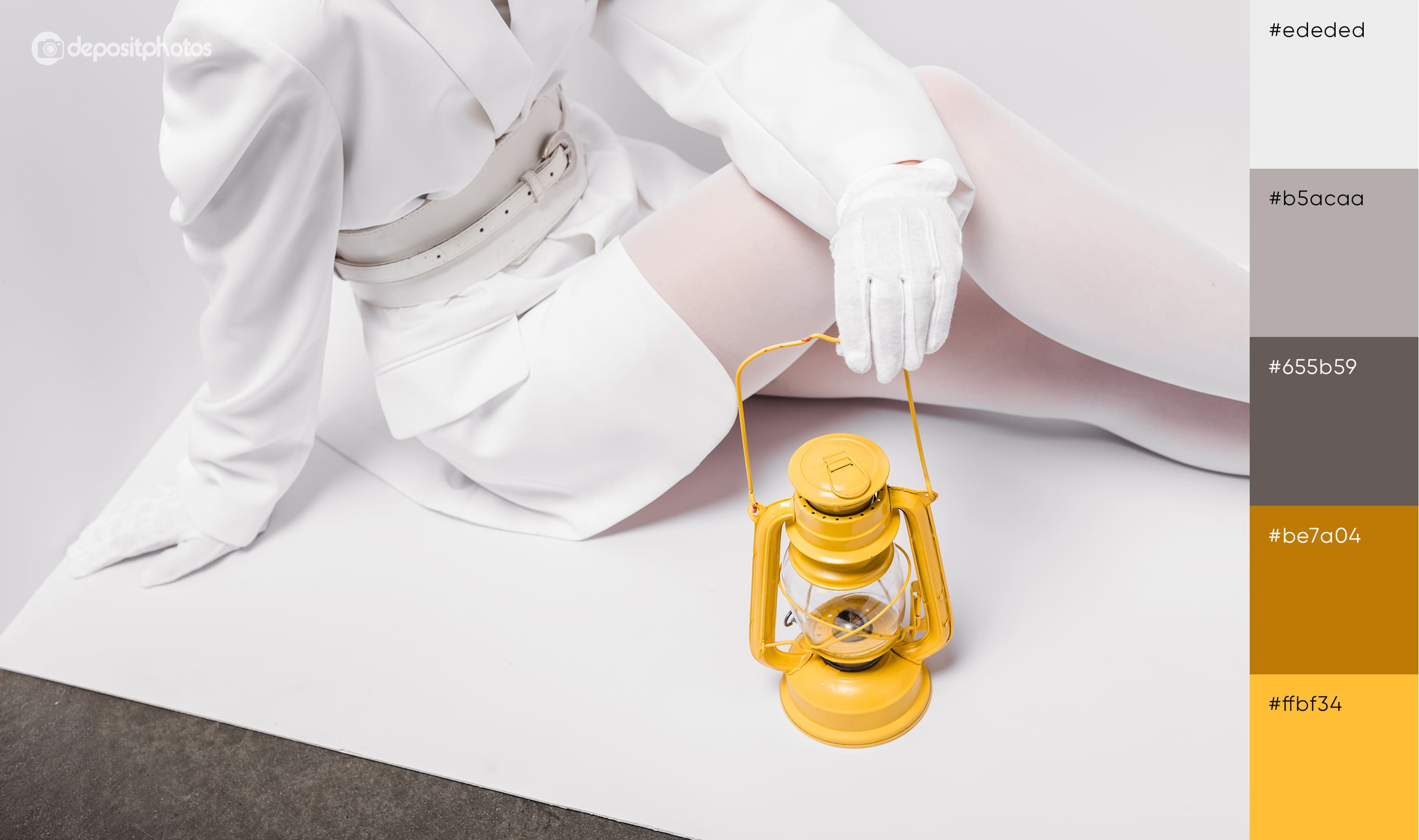
5. Best color combos with yellow
Yellow is often used in ads due to its optimistic and friendly nature. As the brightest color in the spectrum, it stands out without being overwhelming in the way that red can be. It also creates eye-catching color combinations with many other hues—from the analogous harmony of yellow and green or red to the complementary pairing with purple. In this McDonald’s ad, yellow plays a leading role, creating a vibrant yet balanced look alongside neutral beige and black.
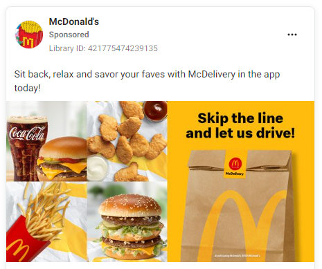
Browse the following palettes for other beautiful combinations of yellow and its shades:
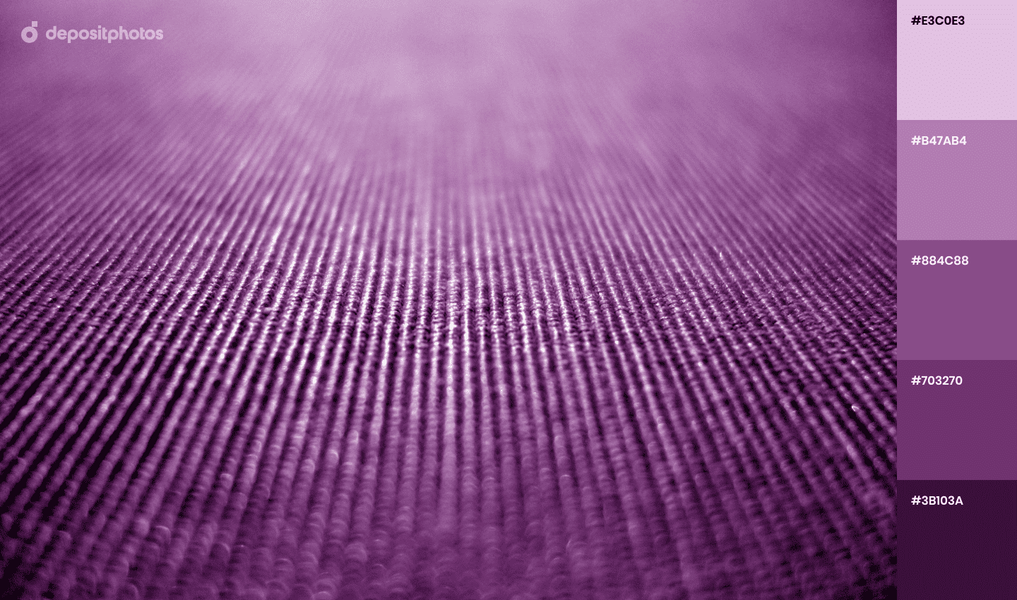
6. Impactful color mixes with purple
Purple adds a distinctive character to a design depending on the chosen hue: light tones like lavender create a dreamy image, while plum embodies mystery. Purple can also be an excellent alternative to black in ads. Its darker shades create enough contrast against a light background and look softer at the same time. Below is an example of an Amazon display ad with a harmonious combination of a dark purple font and pink background.

We have more options for fascinating combinations with purple:
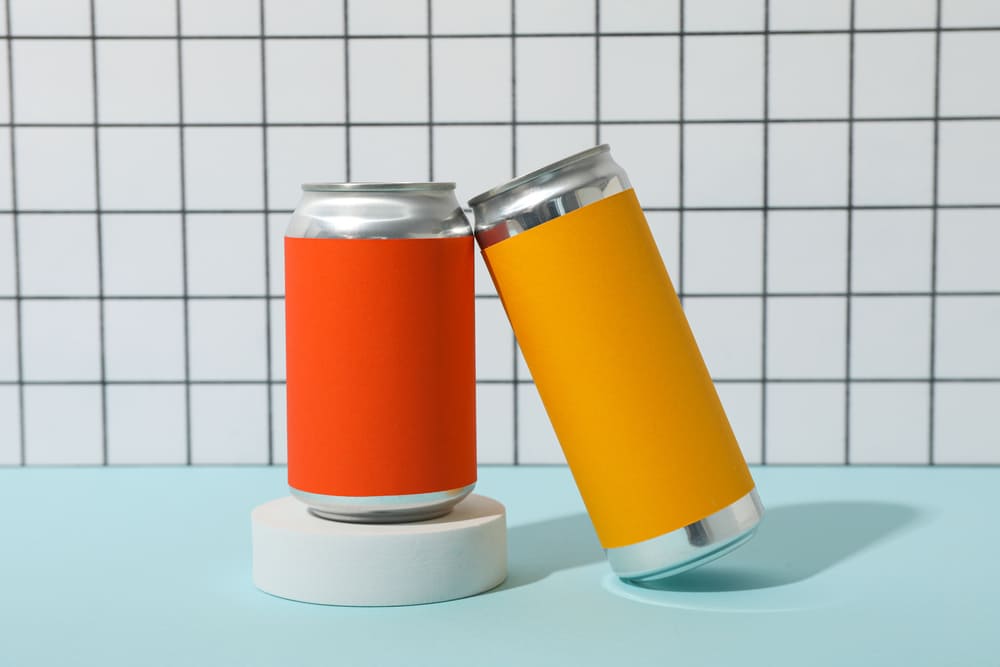
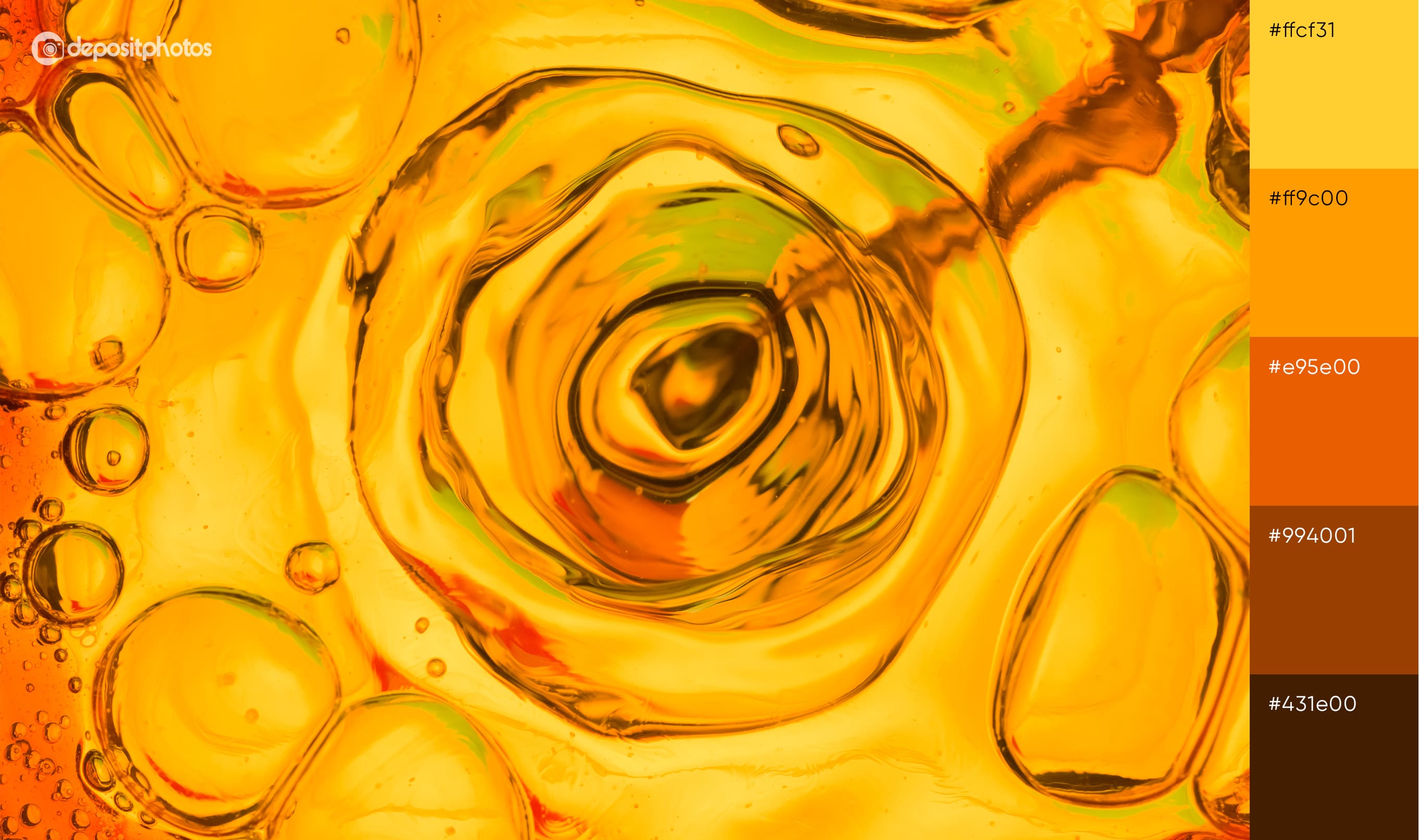
7. Striking color blends with orange
Similar to red, orange is also an effective attention-grabber while being softer and friendlier. Businesses in a variety of industries choose orange, from entertainment (Nickelodeon) and beverage (Fanta) to luxury apparel (Hermes). It is often used in advertising as a primary and accent color. Looking for the best color combos with orange? Pair it with blues, as in this Calvin Klein ad.

Find more beautiful blends with various orange hues:
To sum up
The role of color in marketing communication goes far beyond its aesthetic function. They become a practical tool that helps to achieve certain goals. Grabbing attention, making messages easy to perceive, and even driving consumers to buy are all made possible by using the right colors that go together. Use our tips and tricks to facilitate your choice of color combos and streamline the design process. Find inspiration in ready-made palettes and check out the latest fall trends report.
More articles about colors:
Color-Blocking: How to Mix and Match Bold Colors Like a Pro
Color Psychology Explained: How Hues Can Evoke Emotions and Influence Decisions
How Strategic Color Choices Can Skyrocket Your Brand Identity
Your Essential Guide to Color Schemes: Definitions, Examples, and Tips


![Gradient Color Palettes for Your Next Design Project [Infographic]](https://depositphotos-blog.s3.eu-west-1.amazonaws.com/uploads/2019/08/Gradient-Color-Palettes-for-Your-Next-Design-Project-Infographic.webp)