Your Essential Guide to Color Schemes: Definitions, Examples, and Tips
All creatives need to be familiar with color theory and the types of color schemes, whether it’s for artistic expression or design needs. Some already have an eye for combining hues, while others might need some more practice and advice on how to create visually pleasing designs.
A while ago, we wrote about color theory, shared resources and tools with color-related information, and the meanings of the most popular hues. It’s time to go further and explore which colors work well together.
Today, we will go through the definition of color scheme, as well as review the most popular types, examples, and tips on using one in your design. Are you ready to learn something new and immerse yourself in the world of color?

To get free downloads, click the banner above, switch to «Annual Upfront» subscriptions, and press the «Free 7 Day Trial» button.
What is a color scheme?
A color scheme is a combination of colors that work well together visually. It’s most commonly utilized in graphic design, interior design, fashion, and the arts. The purpose of using a color scheme is to create a unified aesthetic and appeal to the viewer. A well-chosen color scheme can evoke emotions and convey a design message on both visual and psychological levels. These combinations are often based on primary and secondary colors placed strategically on the color wheel to achieve visual harmony—a principle that also helps designers and photographers find images by color harmony when building cohesive visuals.
7 Types of color schemes
Let’s take a closer look at each scheme.
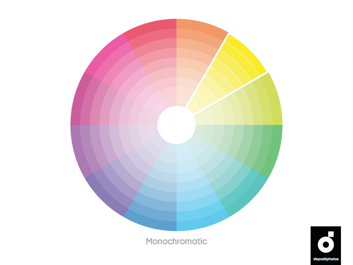
1. Monochromatic
A monochromatic color scheme uses all variations of a single hue. It comprises shades, tones, and tints created by mixing in black, gray, or white colors into a base hue. Despite the lack of contrast in monochromatic color schemes, creatives can experiment with hue intensity to find the best match for their designs.
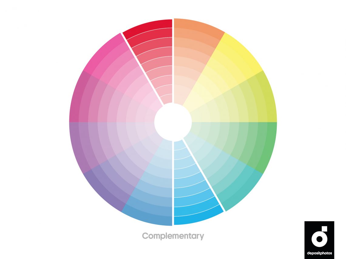
2. Complementary
A complementary color scheme is made up of colors opposite to one another on the color wheel. Usually, there are only two colors in the palette that are highly contrasting. They can be eye-catching but, at the same time, too intense for the viewer. Therefore, when employed in a design, a complementary palette is expanded with shades, tones, and tints of main colors. It allows a designer to create graphics that are captivating, but more pleasing to the eye.
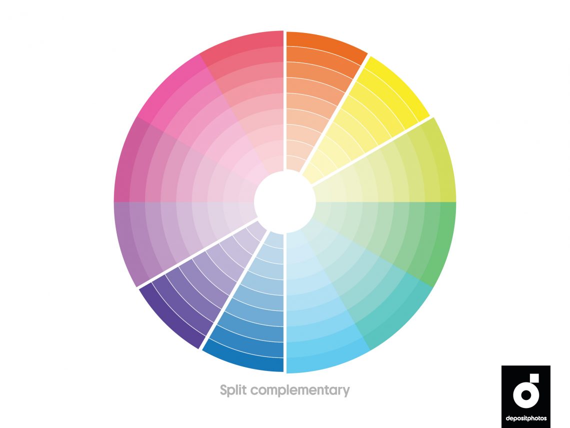
3. Split complementary
A split complementary color scheme is a three-color combination consisting of one base color and two complementary colors positioned opposite a base hue on the color wheel. The best way to use a split complementary palette in design is to utilize a base color as the primary color and complementary colors for accents. By employing a split complementary color scheme, creatives can add more complexity to their designs.
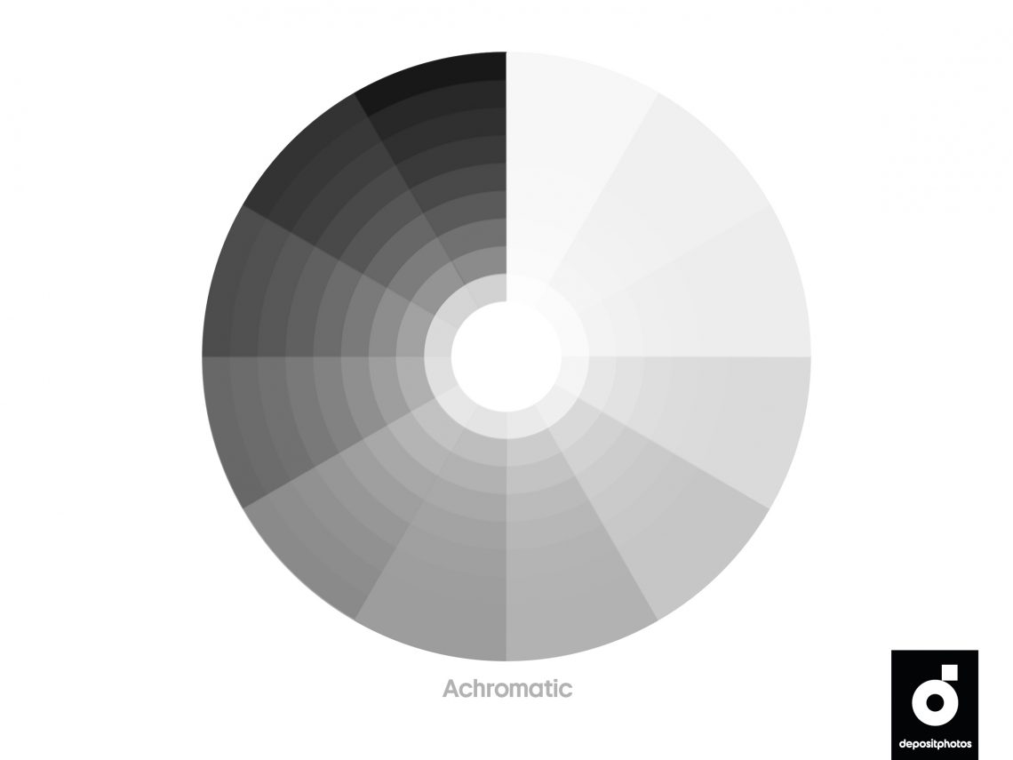
4. Achromatic
An achromatic color scheme contains no hues and uses only neutral colors, such as black, white, and gray. Achromatic color schemes are visually appealing and can make your design look clean and simple.
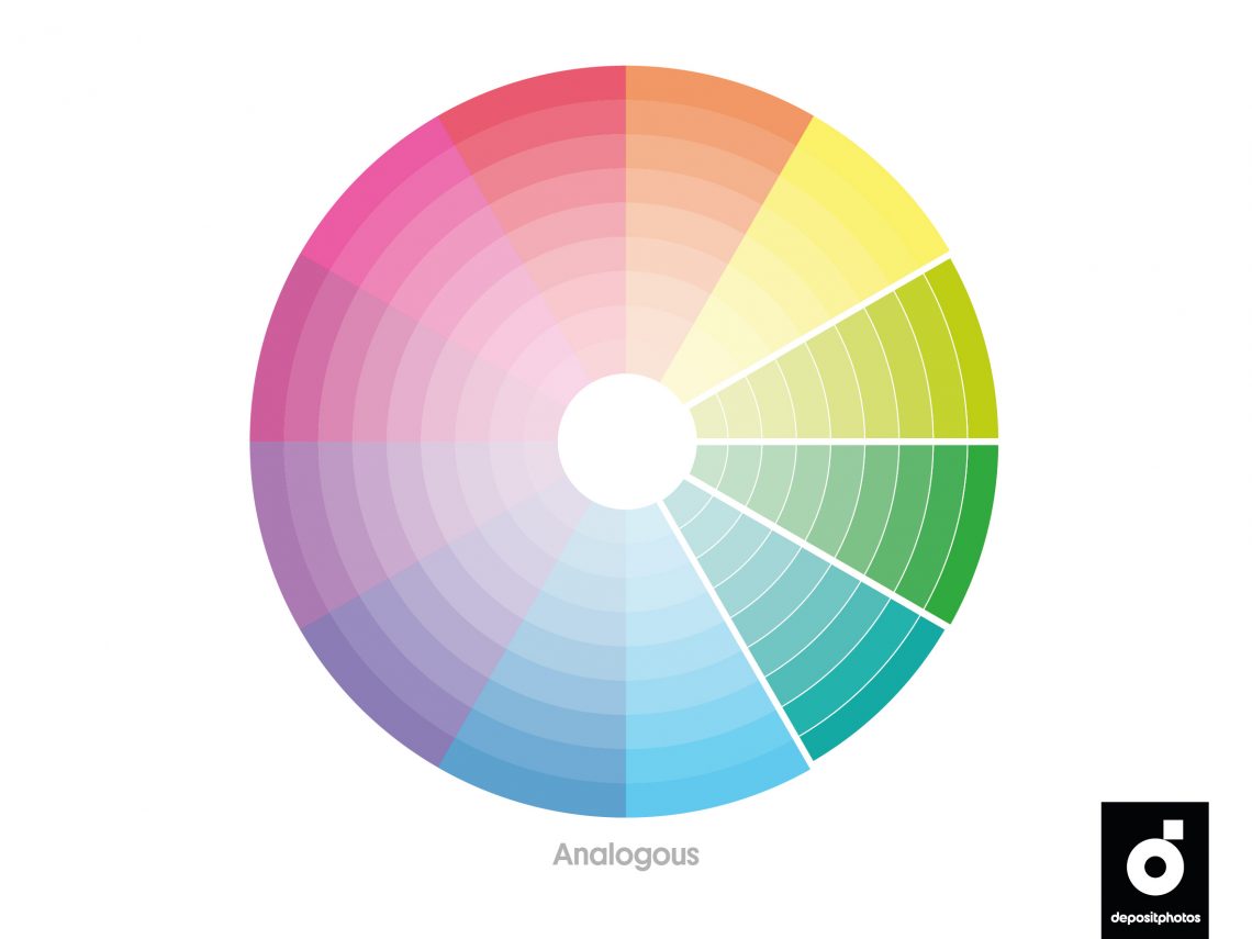
5. Analogous
An analogous color scheme consists of one base color and two colors that lie next to it on the color wheel. Analogous color schemes are easy to create; however, if you’re striving for a harmonious look, use either warm or cool hues in your palettes. Since all colors fall in line with one another in an analogous palette, consider whether the contrast level is sufficient for your design when selecting colors.
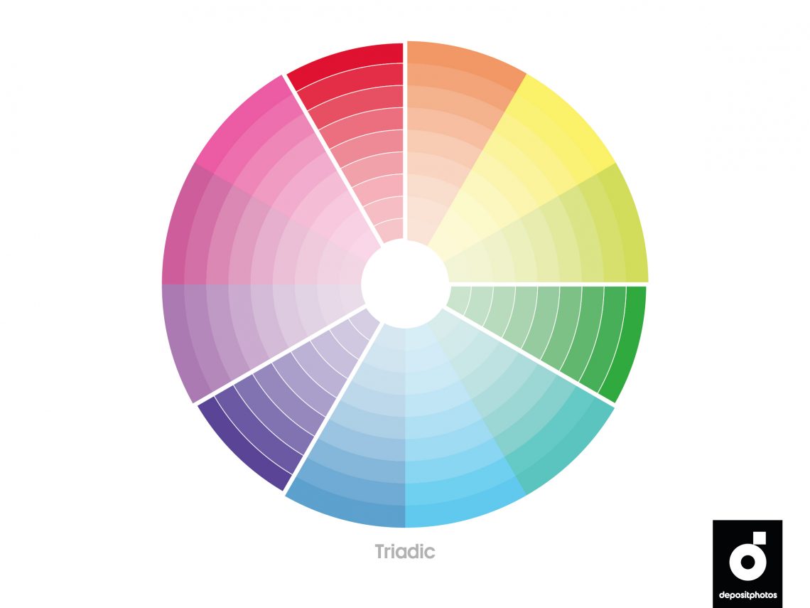
6. Triadic
A triadic color scheme is a combination of three colors that are equally spaced on the color wheel, forming a triangle. Triadic palettes are rich in color and allow visual artists to create contrasting, yet harmonious designs. The main trick is to balance composition with the help of color hierarchy—let one shade dominate and use the other two as accents.
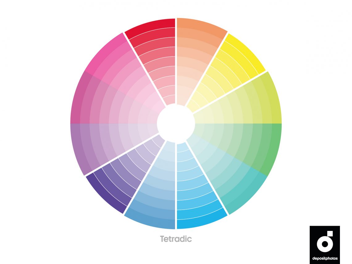
7. Tetradic
Also known as a double complementary or rectangle color scheme, this scheme comprises two complementary pairs of colors that form a rectangle on the color wheel. If you mix all the hues in a tetradic palette equally, your design may look unbalanced. For the best results, use one color as your primary color and the other three as accents.

To get free downloads, click the banner above, switch to «Annual Upfront» subscriptions, and press the «Free 7 Day Trial» button.
Tips for using color schemes
#1
A monochromatic color scheme is easy on the eye and works well for a minimalist design. To make your design stand out, use contrasting tones of the same hue.
#2
A complementary color scheme is best used for logos, posters, and product packaging, as it instantly catches the viewer’s eye.
#3
Try a split complementary color scheme if you are unsure about utilizing a complementary scheme. It is best used for websites, apps, and interior design.
#4
If you want to create long-lasting designs, use an achromatic color scheme. Neutral aesthetics never go out of style, and it’s hard to go overboard with achromatic colors.
#5
An analogous color scheme looks harmonious on posters, banners, and websites.
#6
To add visual interest to a composition, use a triadic color scheme. It is rich in color and provides a high degree of contrast. Still, designs in triadic palettes can look harmonious if the colors are properly balanced.
#7
A tetradic color scheme is considered the richest; therefore, you should be careful and not blend all colors in the same proportion.
To sum up
Whether you’re creating eye-catching images or harmonious landing pages, you don’t need to use all of the hues from your color palette. Sometimes, less is more, and picking only two colors from a palette is enough.
We encourage you to experiment with color schemes to find the best shades for your marketing campaign, creative project, or concept. For more ideas, check out our article on movie-inspired color palettes.
You may also be interested in these materials:
What You Need to Know About Color Theory and Color Meanings in Design
Graphic Design Trends 2022 [Infographic]
25 Examples of Graphic Design Portfolios and Useful Tips On How to Create Your Own


![Gradient Color Palettes for Your Next Design Project [Infographic]](https://depositphotos-blog.s3.eu-west-1.amazonaws.com/uploads/2019/08/Gradient-Color-Palettes-for-Your-Next-Design-Project-Infographic.webp)

