Exploring the Charm of Pastel Colors: Definitions, Color Theory and Design Tips
Bold and vibrant colors often steal the spotlight, while the elegance of pastel colors stays unnoticed. Yet, these muted hues can enrich almost any design. Imagine a palette that exudes a delicate and dreamy vibe, with hues that evoke memories of soft sunsets, blooming flowers, and the first blush of dawn. Pastel colors are a captivating choice in design, with their gentle and calming effects that transports us to a realm of tranquility.
It’s just a question of how you use their unique characteristics. Pastels are waiting to be mixed and matched with complementary or contrasting colors to create captivating designs. By considering context and exploring pastel color combinations, you can leave a lasting impression on your audience. Let’s dive into the enchanting world of pastels!
What are pastel colors?
Pastel colors, also known as tinted colors, are a group of light, muted hues that are created by adding white to pure and saturated colors. Due to their subtle and delicate nature, they are often referred to as “soft colors.” Pastels are characterized by low saturation levels, resulting in a gentle and dreamy appearance. However, pastels are not just visually appealing. They have a profound impact on the audience’s perception and emotions; these soft hues evoke specific feelings of calmness and relaxation. Pastel colors are also associated with elegance, sophistication, and a dreamy aesthetic.
Where are pastel colors on the color wheel?
Pastel colors can be found in various regions of the color wheel, depending on the original saturated color they are derived from. For instance, pastel shades of red are located in the pink and peach regions of the color wheel, while pastel blues and greens are in cyan and aqua. Similarly, pastel yellows are found in the lemon and pale yellow regions, and pastel purples in lavender and lilac.
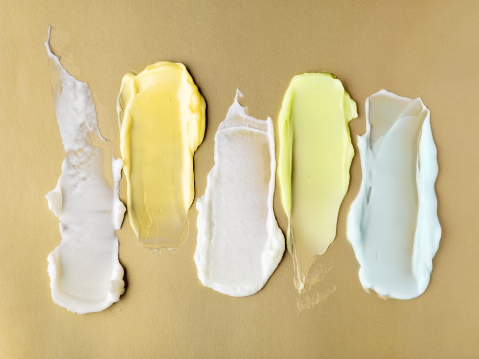
Types and shades of pastel colors
Baby Blue
Baby blue is a serene and soothing color that resembles the sky on a clear day. It’s often associated with innocence, purity, and calmness.
HEX #A2CFF0
RGB 162, 207, 240
CMYK 32%, 14%, 0%, 6%
Mint Green
Mint green is a refreshing and rejuvenating color that reminds us of the color of fresh mint leaves. It’s closely connected with nature, vitality, and a feeling of freshness.
HEX #BDFCC9
RGB 189, 252, 201
CMYK 25%, 0%, 20%, 1%
Lavender
Soft and romantic, lavender is named after lavender flowers that have a similar hue. It’s commonly associated with femininity, grace, and elegance.
HEX #D6B8FF
RGB 214, 184, 255
CMYK 16%, 28%, 0%, 0%
Peach
Resembling the color of ripe peaches, this color’s usually perceived as warm and inviting. Peach conveys feelings of warmth, sweetness, and playfulness.
HEX #FFDAB9
RGB 255, 218, 185
CMYK 0%, 15%, 27%, 0%
Pale Pink
Similar to blushing cheeks, pale pink is often associated with femininity, sweetness, and romance.
HEX #FDC1C5
RGB 253, 193, 197
CMYK 0%, 24%, 22%, 1%
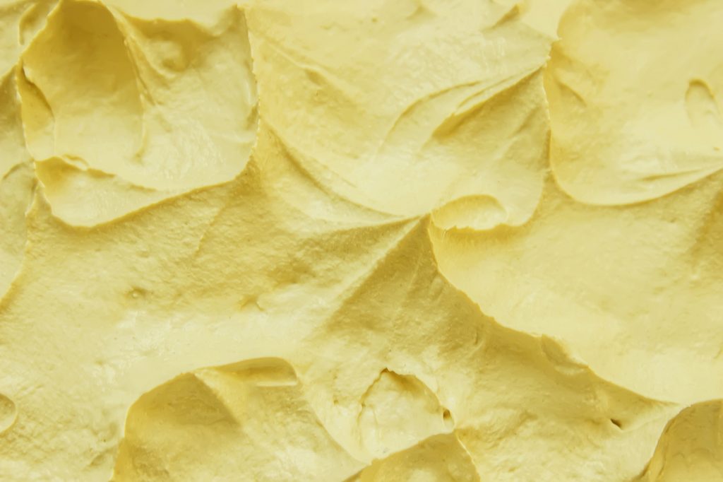
Light Yellow
Light yellow is a cheerful hue that resembles soft sunlight. That’s why it evokes feelings of warmth, happiness, and positivity.
HEX #FFFAE6
RGB 255, 250, 230
CMYK 0%, 2%, 10%, 0%
Soft Coral
Resembling coral reefs, soft coral conveys tropical vibes, playfulness, and lively ambiance.
HEX #FFA07A
RGB 255, 160, 122
CMYK 0%, 37%, 52%, 0%
Light Gray
As a subtle and sophisticated pastel color, light gray resembles light clouds on a gloomy day. It is often associated with neutrality, elegance, and minimalism.
HEX #D3D3D3
RGB 211, 211, 211
CMYK 0%, 0%, 0%, 17%
How do you design with pastel colors?
Designing with pastel colors requires careful consideration of color harmony, contrast, and balance. Here are some tips on how to use pastel colors in your designs:
1. Choose the right complementary colors.
Pastel colors work great when paired with complementary colors. Together, they can create a combination that’s needed for the right contrast and balance in your design. For instance, pastel pink can be complemented with soft mint or pale yellow, and pastel blue can be paired with peach or lavender.
2. Play with contrast.
Contrasting pastel colors with bolder, darker hues can make your designs more visually interesting. For example, pairing a pastel yellow with a dark navy blue can create a contrast that adds depth and dimension, while contrasting pastel pink with a rich burgundy or deep plum can add dynamism, while still maintaining the softness of pastel tones.
3. Consider contrast.
Contrast can make a huge difference in balancing your pastel palette. Try using pastel colors with varying levels of brightness or saturation. For example, pairing a soft pastel pink with a slightly darker pastel blue.

4. Create a monochromatic palette.
Another effective way to design with pastel colors is by creating a monochromatic palette using different shades of the same pastel color. This approach allows you to play with the nuances of pastel colors yet maintain a cohesive look. For example, various shades of pale pink, from the lightest blush to the softest rose, can create a sophisticated and cohesive look.
5. Use pastels as accents.
Pastel colors can also be used as accent colors to add pops of softness and charm to your design. For instance, incorporating pastel-colored accessories, such as cushions, throws, or decorative pieces, can instantly transform a space into a cozy and inviting haven. In graphic design, pastel-colored icons, buttons, or typography can add a touch of playfulness to a website or app interface.
6. Consider the context.
When designing with pastel colors, it’s essential to consider the context in which they will be used. They are a nice choice for designs in the fashion or beauty industries, but they can also be used in other contexts, such as branding for luxury or high-end products. If you’re working on a brand logo, try using a logo maker that is perfect for creating elegant branding with pastel tones.
7. Limit the number of pastel colors.
One of the keys to achieving a balanced pastel palette is to limit the number of pastel colors used in your design. Too many pastels can make your design cluttered and chaotic. Instead, choose a few colors that complement each other, allowing each pastel color to shine individually while working together as a whole.

8. Use neutral colors as anchors.
Incorporating neutral colors such as white, gray, or beige can help balance the softness of pastels. They can act as anchors in your design, preventing the pastel colors from overwhelming the overall aesthetic. Try using them when creating a neutral background or incorporating visual accents.
9. Test for accessibility.
When working with pastel colors, it’s essential to ensure that your design remains accessible to all users, including those with visual impairments. Some pastel colors may have low contrast, making it difficult for people to perceive. That’s why it’s crucial to test the contrast of your pastel palette and ensure that your design is inclusive.
10. Experiment with texture and pattern.
Experiment with different textures or patterns that complement your pastel colors, such as a subtle herringbone pattern, a soft floral motif, or a delicate lace texture. They can help you achieve a visually balanced and engaging aesthetic.
11. Pay attention to proportions.
Avoid using one pastel color that dominates over others, as it may throw off the balance of your design. Instead, distribute pastel colors proportionally throughout your design to create a sense of equilibrium. For example, you can use a larger area for a neutral color, and smaller pops of pastels to create balanced proportions.
To wrap up
Subtle and gentle pastels hues offer a refreshing change to the dominance of bold colors. They can bring calmness, elegance, and sophistication to almost any design project, whether it’s in fashion, interior, or graphic design. Understanding the different types and shades of pastel colors and how to balance them in your palette can help you achieve harmony in your designs. Consider the tips in this article to start experimenting with pastel color combinations and create visuals that truly stand out.
Other articles you might find interesting
Spring Color Trends 2023: Palettes, Design Ideas, Stock Visuals, and Mockups
Your Essential Guide to Color Schemes: Definitions, Examples, and Tips
The Color White: Symbolism, Theory and Design Tips
How to Design with Gold: Its Meaning, Symbolism, and Complementary Colors