How to Design with Gold: Its Meaning, Symbolism, and Complementary Colors
Whether you are a professional artist or a novice designer, finding the right color is crucial for creating a worthy visual. Even though choosing a color is usually straightforward, it’s not uncommon to find yourself in a situation where you need to add more specific accents. And there is no other color that is perfect for this than gold. It’s a deep hue of endless allure that holds multiple meanings and associations.
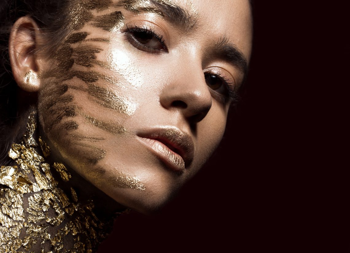
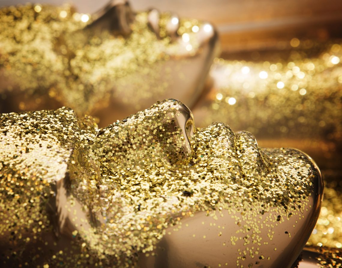
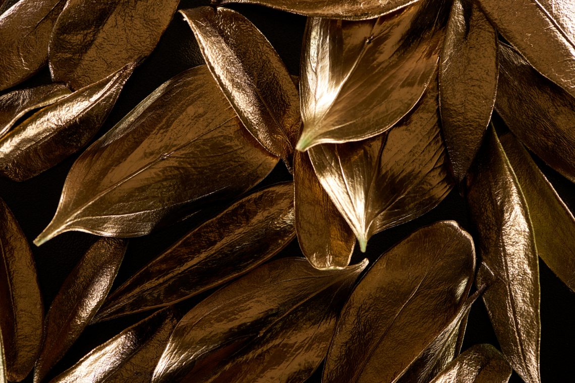
Gold is a universal color that you can adapt for particular needs: it can be warm, cheerful, somber, and dull. If used right, this complex color can enrich any type of visual and make it appear more high-end. Yet, you should be careful — too much gold can be considered tasteless.
Here’s our guide to the color gold! Dive into its history, symbolism, hidden meaning, and some practical tips on enriching your visuals with this stunning hue. Keep reading this article to find out more and discover a collection of images inspired by the color gold.
See collection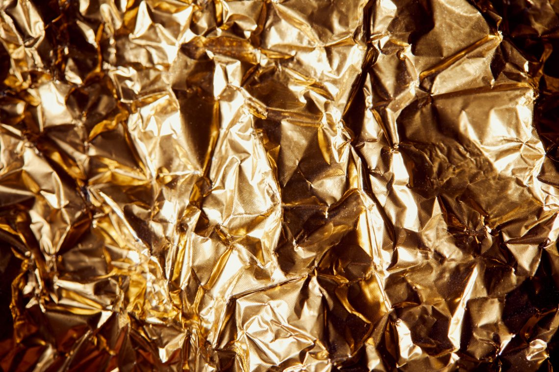
What does the color gold symbolize?
The color Gold is named after the valuable metal, signifying luxury, triumph, success, and accomplishment. Gold has historically been connected to royalty and elites, as it was generally accessible only to the wealthiest members of society. Due to its rarity and beauty, gold became one of the world’s most desired and highly-prized materials.
The color gold is multifaceted, often being a sign of divinity and power in many religious contexts, while also symbolizing generosity, compassion, and good luck. Gold is the first to express approval and signify high achievements, usually reserved for champions. It also shares some attributes of yellow, giving a playful, optimistic, cheerful vibe, and some characteristics of brown, giving a somber and conservative mood.
Yet, when used in excess, the color gold can come across as tasteless and pretentious. That’s why it should be used wisely and in small doses.
Types of the gold color
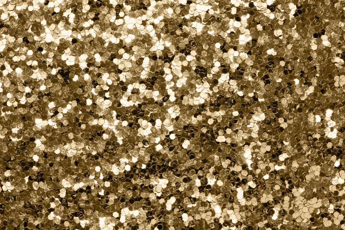
The hues of the valuable gold metal vary depending on its age and origin. The diversity of historically established shades and a variety of different touches make gold a highly complicated color. It ranges from playful and vibrant yellows to strong brown golds. The trick is to find the right shade. Among the most popular gold hues are:
1. Golden brown.
HEX #996515
RGB 153, 101, 21
CMYK 0%, 34%, 86%, 40%
Golden brown is a strong mix of yellow, orange, and brown. It is perceived as warm and comforting, looking nicely with baking and fried food.
2. Golden yellow.
HEX #FFB81C
RGB 255, 184, 28
CMYK 0% ,25%, 94%, 0%
Golden yellow is a vivid and highly saturated shade of gold. This shade is a blend of yellow, orange, and a touch of magenta. It creates a very optimistic, cheerful, and playful vibe.
3. Old or antique gold.
HEX #CFB53B
RGB 207, 181, 59
CMYK 0%, 13%, 72%, 19%
Old or antique gold is a dark yellow color ranging from pale olive to dark yellow or brown. This color is closest to gold metal, reminding us of luxury jewelry.
4. Light or pale gold.
HEX #F1E5AC
RGB 241, 229, 172
CMYK 0%, 5%, 29%, 6%
Light or pale gold is a low-saturated color that combines orange and yellow. It’s calmer, brighter, and softer than other shades of gold. As a wild wonder color, light gold is commonly associated with nature, peace, and inner balance.
5. Goldenrod.
HEX #DAA520
RGB 218, 165, 32
CMYK 0%, 24%, 85%, 15%
Goldenrod is a warming shade of yellow named after the goldenrod plant. It ranges from light yellow-green to yellow-brown shades, commonly associated with the sun, summer, and nature.
How to design with gold
Gold is located between yellow and orange on a traditional color wheel, although it features only a non-metallic version of gold. As a very warm, cheerful, and vivid color, gold can help you add a friendly tone to your visual communication. At the same time, gold is the perfect color to make your designs look more elegant and upscale. Yet, designing with gold can be tricky. It should be used cautiously to avoid cheapening your visuals and making them look too pretentious. Think of it as an accent color — it won’t take much gold to make your designs look extra-special and add some luxe aesthetics.
Gold pairs well with several other colors, depending on the type of color scheme you want to use:
- A monochromatic gold color scheme: with light or pale and old or antique gold for an entirely matching color palette.
- A complementary gold color scheme: with different shades of blue and green to create some contrast.
- An analogous gold color scheme: with yellow and orange as neighboring colors on a traditional color wheel.
- A triadic gold color scheme: with red and blue as equidistant from gold on a traditional color wheel.
To wrap up
The color gold is much less common compared to others, although it’s still a popular choice for many artists and clients alike. Having a number of meanings and associations, this complicated hue is perfect for attracting attention to almost any type of brand and product. Don’t be afraid to add a touch of gold to your visual communication — even a tiny splash of gold can enrich your designs.
Other articles you might be interested in
Winter Color Trends 2022-2023: Inspiring Palettes, Curated Collections & Ready-To-Use Mockups
2023 Color of the Year: Wild Wonder [Collection of Visuals]
The Pantone Color of the Year 2023 [Image & Video Collection]


![Gradient Color Palettes for Your Next Design Project [Infographic]](https://depositphotos-blog.s3.eu-west-1.amazonaws.com/uploads/2019/08/Gradient-Color-Palettes-for-Your-Next-Design-Project-Infographic.webp)

