Gradient Color Palettes for Your Next Design Project
This year gradients are everywhere. UX/UI designers have used them to add depth to user experience, graphic designers have experimented with color combinations to make their projects look more appealing and many others were eager to get their hands on the trend.
Although widely spread in 2019, creating gradients requires a lot of work. The wrong color combination can push the audience away, not only from a particular project but from the brand in general.
We also know how challenging it can be to find the right color combination for your project, especially if you are “suffering” from perfectionism. To help you out, we’ve created the infographic with the trendiest color combinations with three different levels basic, intermediate and advanced.
The basic level refers to one of the 2019 graphic design trends: duotone gradients. The intermediate pushes you to experiment and master your skills through achieving a smooth combination of three colors. Meanwhile, the advanced one is definitely for those who are more ambitious and can easily work out the blend of four or five colors.
The infographic features gradient examples and the solid colors you can extract with the eyedropper tool in any app and create your own color combinations. Enjoy!
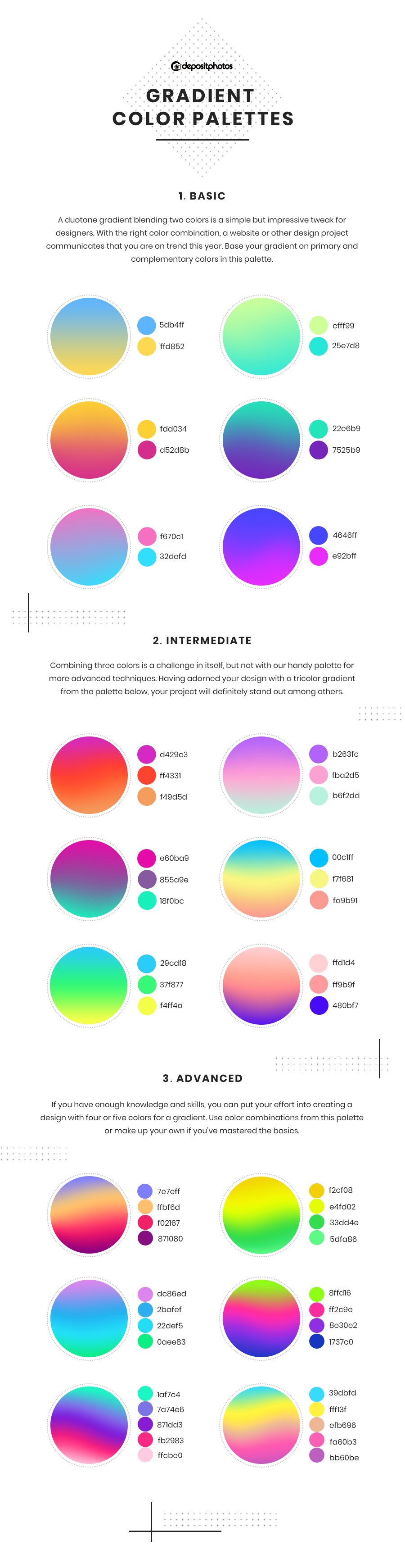
Keep this infographic at hand and remember that you can apply both our ready-to-use color combinations and mix and match your own ones.
Share this infographic on gradient color palettes to help out your fellow designers with trendy gradients.