What You Need to Know about Color Theory and Color Meanings in Design
Not sure about all designers, but many struggle with something as basic as choosing colors. Arguably, it’s one of the hardest decisions because we’re all fully aware that colors evoke emotions and quickly form associations. The meanings of color therefore become vital in design.
If you think we’re skipping the color wheel in today’s article, you’re wrong. We’re going to dive into this fully to emerge as more enlightened designers and enthusiasts. Not only do you need all the basic terminology, but we’ll make sure you come out of this understanding key concepts and meanings of color that differ depending on your target audience.
Do we have to talk about the color wheel?
Yes, this is color theory 101. The color wheel can be intimidating when you look at it, especially if it’s one of those advanced ones with 60 different hues of the same color. That’s precisely why we’ll briefly go over the color theory here, how the colors work together and for what purpose.
We’ll make this quick and painless – you need to know primary, secondary, and tertiary colors. Primary colors are red, blue and yellow and if you remember art class, you can create new colors combining two others. Secondary colors are formed by the combination of primary colors and tertiary colors are a mix of primary and secondary colors.
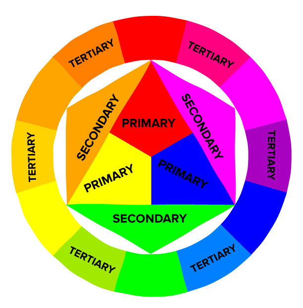
Image source: Hubspot
You might be thinking, ‘we’re not here to paint’, which is very valid and true but you need to understand words like tint, shade, tone and others to be informed. Here’s a quick way to absorb all these words:
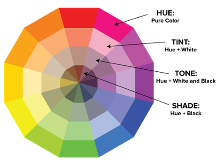
Image source: Hubspot
This is pretty much everything you need to know about the color wheel for now which allows us to move on to bigger topics like color meanings and color combinations.
We all have our preferences. The color combination I choose that I’ll find mind blowingly beautiful would not mean the same thing to you. It is a matter of taste in design, but some guidelines can help make more informed decisions on how to work with and choose colors.
Resources and tools for making the right color choices in design
Whether you are a design expert or an enthusiastic beginner, you can benefit from a variety of existing sources of information and relevant tools. VistaCreate Colors is a solution that we trust and highly recommend to anyone involved in design.
It’s a project that includes color and design theory, trendy and seasonal color palettes, curated collections, appealing color schemes, as well as universal ideas and tips that any brand can implement and benefit from. You can find hex codes, RGB values, and so much more color-related information in one place. It’s an opportunity to save time, resources, and make your design process as efficient and professional as possible.
Check out this palette generator tool or explore readymade palettes based on your requirements:
And now it’s time to move on and discover the meanings of the most popular colors. Some of them might surprise you!
Why are we on the topic of color meanings?
We’re going to unpack the meanings behind colors and take the angle of including all the possible meanings. The reason for this is that for example, black is associated with mystery in western culture but eastern countries can interpret it as rebirth. White can be typically about peace and purity but in asia it’s the color of bad luck and death.
This brings us to the point we bring up very often – who is your target audience? Who are you designing for? Because with colors you can’t create something universally likeable, you’ve got to work on appealing to your ideal clients and target audience.
Sorry to disappoint you, but there is no magic formula to attracting viewers to your design. It’s more about balancing your design in a way where the colors you choose beautifully complement and support your message. Lets get started.
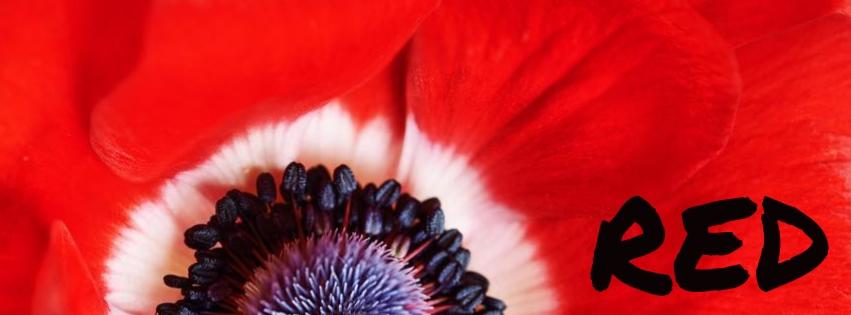
Red is a scary color (to me) but some find it very alluring. This goes to show that you can’t always win with choosing one color to appeal to all. Red has many associations and in branding, it’s usually the one color that makes a loud statement. It’s the color of danger, fire, blood, love, sexuality, passion and a million other things. It’s energetic and symbolizes strength, power and confidence. Precisely because it’s a color picked with so much meaning, it is to be used sparingly. Like the bridesmaid that steals the thunder with her bright red dress, you’ve got to be careful with red if you don’t want to stand out from the crowd too much.
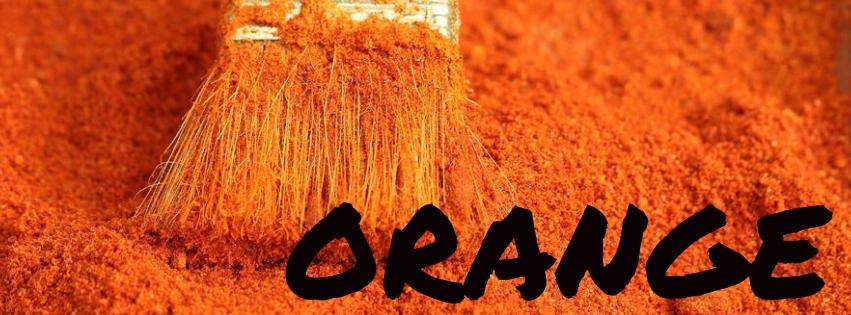
Orange is the happy union of red and yellow. It’s the color of ‘action’, associated with vitamins (think oranges of course). It’s therefore associated with healthy, freshness and positive energy. Generally orange is feared but only because it’s so youthful and ‘young’. It’s associated with fun, so not really the best color choice for traditional brands and luxury goods. Leave the fun colors to the youths.
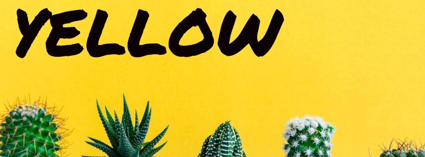
The meaning of yellow is sunshine for many cultures. It’s a bold, bright and happy color that’s easily detected from afar. It’s about energy, joy, cheerfulness, and ‘careful now’. What I mean by that is that yellow hues are used for life vests and hazardous signs. Another thing about yellow is that it can quickly look cheap. Design has to be impeccable to really wear the color yellow, so it’s another color to be used sparingly.

Green is a little contradicting. The common association with green is of course nature, but it is also wealth and finances. Green typically represents growth, the environment, sustainability and stands for ‘organic’. On the other hand, yes, it’s the color of money but closely tied to the USD. It’s the color of stability and wealth despite the paradoxical nature of it. You can work with this duality by using different shades of green – lighter and brighter shades for the first association and and richer greens for the later.
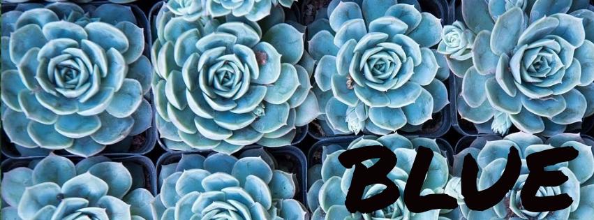
Did you know that blue is the most popular color in the world? Perhaps people take such a liking to it because we see every shade of it in the sky and reflections of it in the ocean, sea and rivers. Brands that want to communicate their trustworthiness often use blue. It’s a calming color, and quite an emotional one because it’s also used to express darker matters of the mind like depression or sadness. Choose your shade wisely, don’t just pick it because it’s a popular color.
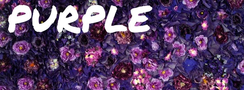
You might remember the hype last year when Pantone chose a shade of purple for color of the year. Purple is typically associated with royalty. Dark shades of the color can evoke the sense of luxury while lighter ones can be more sentimental and represent femininity. Interestingly, purple doesn’t rank well for men. It’s not a common color used by brands but it can work, depending on your target audience.
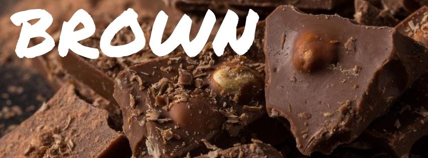
Brown is used often to represent stability, as it is also closely associated with nature (think soil). It’s a strong shade that reminds us of our roots, and brings good memories of sweets and other things that happen to be brown. It’s a great color for brands working with natural products.
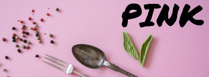
Some shy away from pink because it’s such a stereotypical color to associate with women. But like all other colors, pink is really rich and diverse. Pale shades can represent sweetness while lighter and darker shades can be more romantic. Hot pink is a really bold choice that represents youth and rebelliousness, energy and excitement. Interestingly, it’s a popular color with Generation Y.
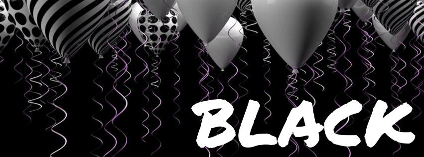
Black is classy, black is safe but you should never take it too far. It’s a memorable and sleek color choice for branding. Black represents sophistication above all and a sense of exclusivity. What’s great about black is that it can be easily paired with any other color out there. Black can also give off a different feel when glossy or black which changes the whole message.
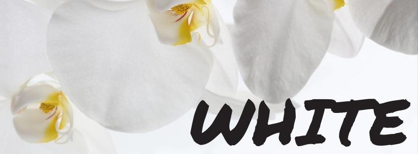
White is very much about minimalism. It’s the color of perfectionists. If you think about it, Apple has hogged the color and done very well for themselves to highlight the elegance and simplicity of their products. White helps ‘clean up’ design, and gives a more modern edge to branding. However, the drawback is that you don’t get to show too much personality with white so consider pairing it with some other color.
If you want to discover similar information about more colors, read these articles about the meaning behind blue green and maroon.
Wrapping up
We looked at some very general meanings and yes, this might be basic but often we overlook the basics. If you’d like to know more about this topic, let us know in the comments section below! Don’t forget to check out 20 great website color palettes for more inspiration.


![Gradient Color Palettes for Your Next Design Project [Infographic]](https://depositphotos-blog.s3.eu-west-1.amazonaws.com/uploads/2019/08/Gradient-Color-Palettes-for-Your-Next-Design-Project-Infographic.webp)

