Fall Color Trends 2024: Nature-Inspired Hues, Rich Palettes, and Curated Collections
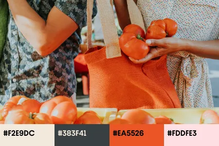
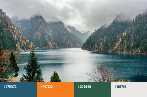
The heat of summer gives way to the crisp coolness of autumn, and the design world transforms with it. The Fall 2024 Color Trends celebrate earth tones, rich textures, and deep hues representing the latest global trends in fashion, interiors, digital and product design, and visual arts. With our carefully selected collections of images and mockups, it’s easier than ever to incorporate these colors into your visual communications and stay trendy.
Discover Fall Color Trends Collection
Four hues to enrich your designs this fall
Autumn often stands for transformation in mood, style, and tone. Seasons change, kids go back to school, and adults near yet another work-life-balance sprint before winter knocks on the door.
This fall, we’re embracing a warm, earthy, and deeply grounded palette that encourages a connection to nature, heritage, and authenticity. As we navigate the next three months of the year, these four colors—Sandstone, Saddle Brown, Pine Grove, and Midnight—will define the visual landscape. Integrate them into your brand palette to align with global design trends and tell compelling stories through your visuals.
The overarching aesthetic trends are leaning towards #oldmoney, #rustic, #vintagedecor, #sustainability, #hikingadventures, and #glamping. Expect an abundance of cozy knits, leather goods, time-tested denim, and immortal classics. These trends significantly impact the colors we’ll see across high fashion, street style, interior, and digital design.
Sandstone
#E5DEC9
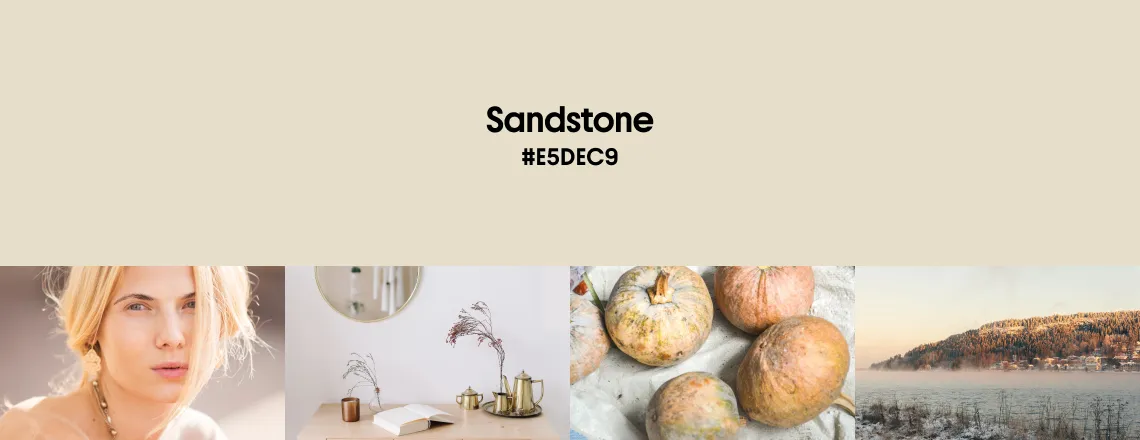
Sandstone is the quiet hero of the fall 2024 palette. In fact, not just fall. It’s also one of the most prominent shades of the year—greige—created from a gray and beige combination. Compared to a warmer Sand Castle hue from summer trends, Sandstone tilts towards a cooler side.
This soft, neutral shade, reminiscent of stone and linen, offers a sense of stability. It’s a versatile hue that blends effortlessly into various design contexts, making it an ideal choice for both minimalist and rustic designs. Sandstone brings a sense of calm and timelessness, perfect for designs that aim to communicate a subtle sophistication, as well as evoke a sense of nostalgia and natural beauty.
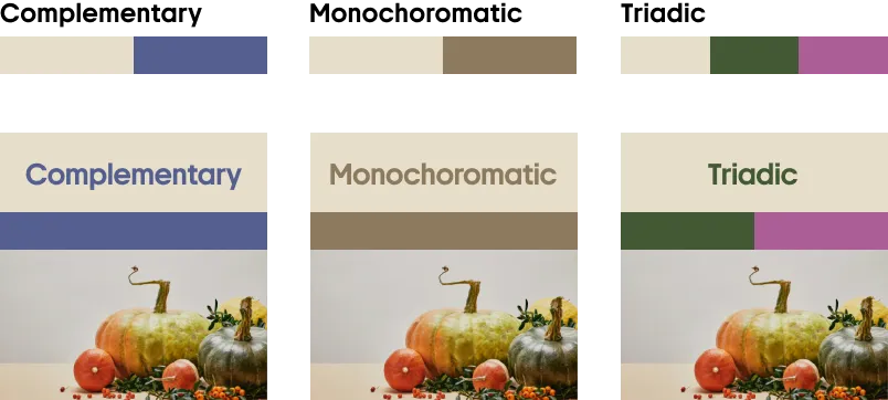
Sandstone serves as an excellent backdrop for both digital and physical visuals that doesn’t overpower but rather enhances other elements. It pairs beautifully with darker tones like brown and green, creating a harmonious and grounded look.
This color is also a great fit for textiles and paints, if you’d like to use it for interiors. But don’t forget about a pop of color like red, orange, or blue to keep things balanced. Sandstone can look dull when it’s your only shade.
Sandstone pairs well with deeper tones like blue, brown, and green, providing a balanced and serene aesthetic.
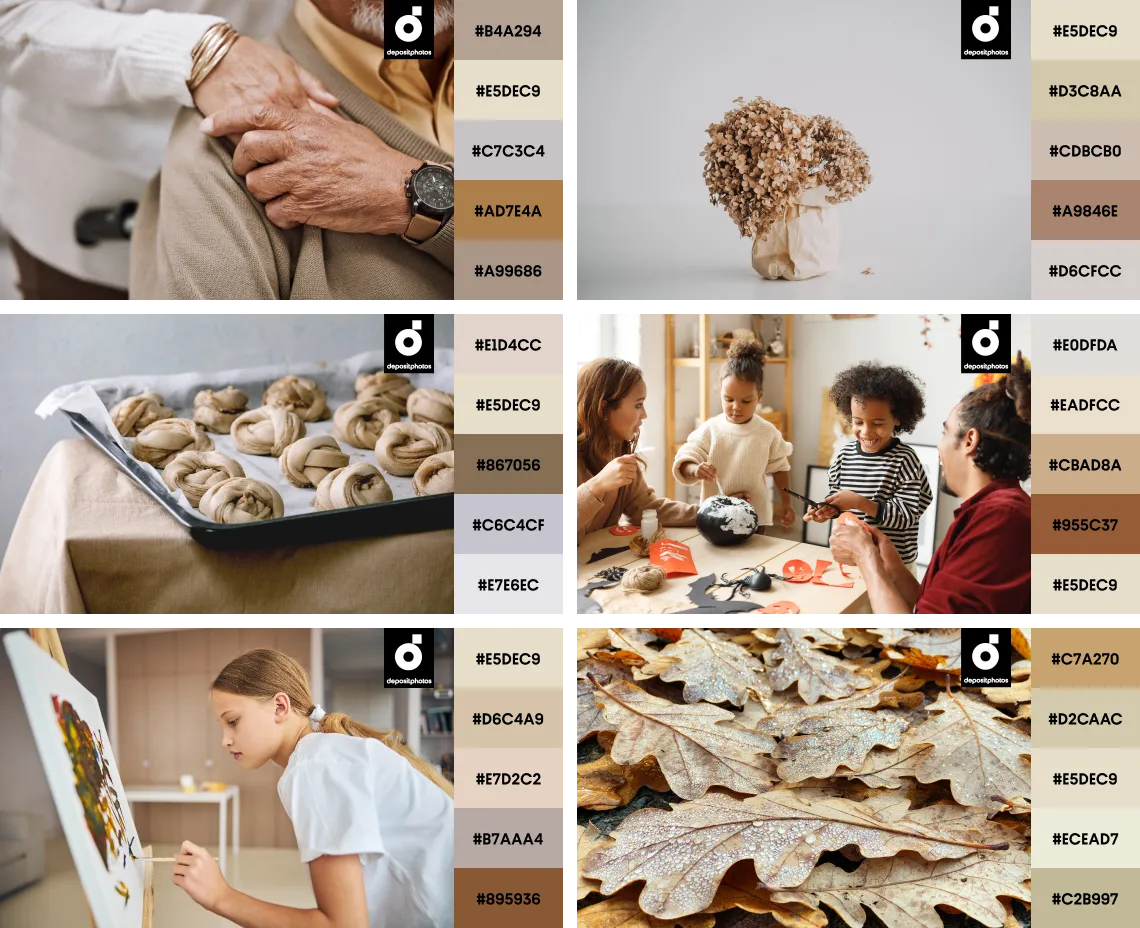
Combine Sandstone with other neutrals to convey nostalgia, warmth, and realness.
Saddle Brown
#824C2C
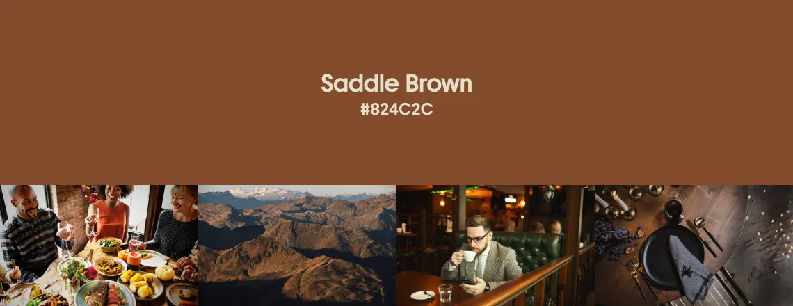
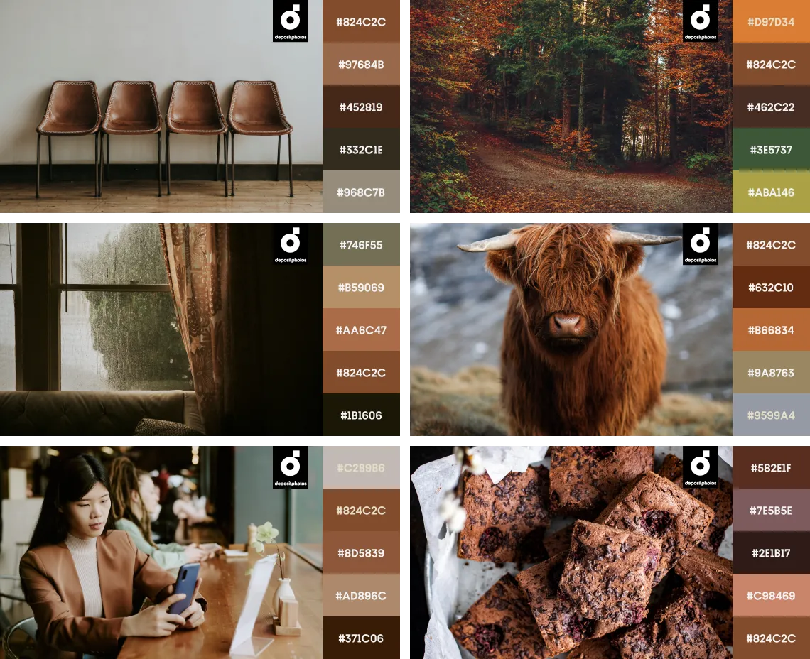
Now, let’s capture the essence of autumn as we move on to its second leading color—Saddle Brown. This rich orange-brown color reminds us of changing leaves, leather boots, and warm cider by the fire. It exudes comfort and a touch of unpolished elegance. Saddle Brown is perfect for brands looking to convey authenticity, tradition, and craftsmanship.
This earthy tone is already making waves in fashion with its prominence in accessories, outerwear, and footwear. Especially with #country and #cowboy hitting the popularity mark thanks to Beyoncé, Pharrell Williams, and more celebrities contributing to this aesthetic this year. Check out our piece on top microtrends of 2024 to learn more about popular styles.
In interiors, Saddle Brown adds a cozy, welcoming touch, whether through wooden accents, textiles, or leather furnishings. For digital design, this shade offers a striking contrast to lighter colors like Sandstone, making it ideal for creating visually interesting content.
Explore Saddle Brown Collection
Combine Saddle Brown with lighter neutrals like greige or contrasting blues and greens for a bold yet harmonious design.
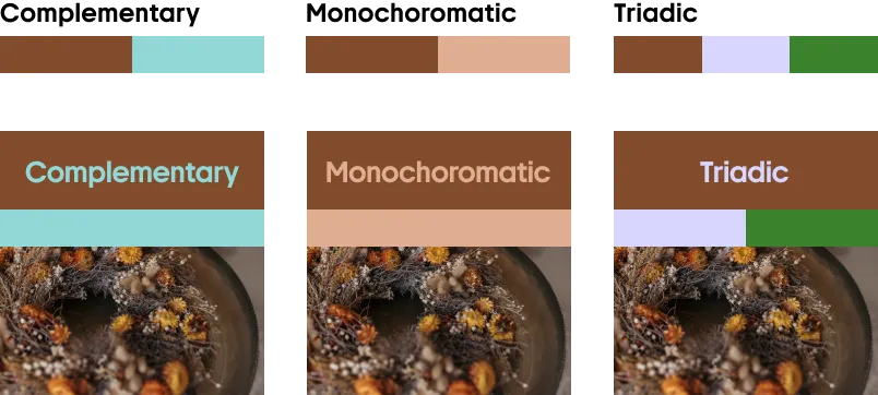
Pair Saddle Brown with darker browns, earthy greens, blues, and neutrals for a dimensional and truly autumn look.
Pine Grove
#024F47
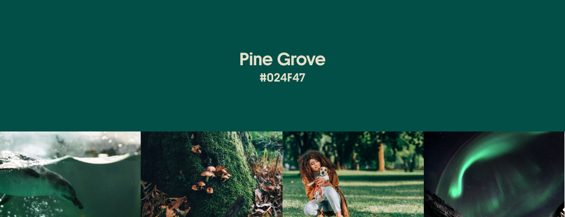
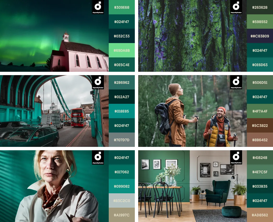
The third color on the list—Pine Grove—is both rich and mysterious green, perfect for adding depth and dimension to your designs. It resonates with themes of nature, sustainability, and resilience. Pine Grove is perfect for brands with an eco-conscious ethos or those looking to tap into the growing trend of biophilic design.
As the spirit of the great outdoors and #gorpcore, Pine Grove is making its mark in fashion with deep green fabrics, outerwear, and accessories, all inspired by the natural world. Being reminiscent of a forest, this color is used in interior design to create serene, grounded spaces that bring the outside in.
Pine Grove is also a powerful choice for digital design, where its dark green hue works well as a background color, providing a neutral yet impactful base that allows other design elements to stand out. Its versatility also makes it suitable for accent colors in logos, icons, and call-to-action buttons, which can draw attention without overwhelming the viewer.
Pine Grove pairs wonderfully with other earthy tones like brown, deep red, and lighter greens, creating an organic, grounded look.
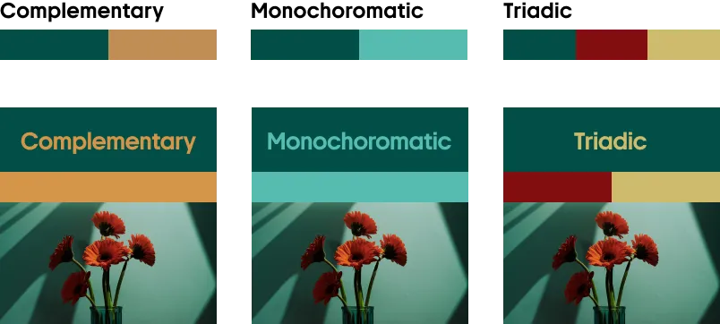
Combine Pine Grove with lighter and darker shades of green, gray, and brown for a deep, striking palette.
Midnight
#22024B
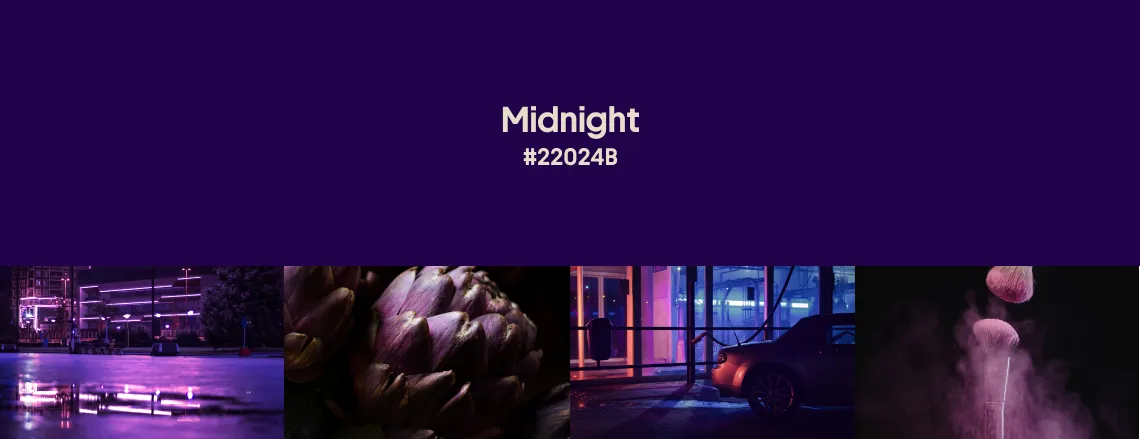
Midnight, a dark, almost aubergine purple, is the last and most enigmatic color in this season’s palette. It’s a shade that teeters on the edge of black and blue, with a hint of purple that slightly takes it out of the complete darkness. Midnight is perfect for designs that need a touch of drama and mystery.
Midnight creates a striking contrast with lighter colors, especially metallics and pastels. We notice a lot of this color in 2024’s high fashion, where it’s often seen in luxurious fabrics and evening wear. Midnight is also making its way into interior design, adding a sense of opulence to spaces with its deep, rich tone.
When applied digitally, Midnight is great as a primary background color for a modern, moody aesthetic. It can be used to create a sense of calm and focus, especially when paired with minimalist elements and clean typography. Midnight is also ideal for websites and applications that seek to project a sense of exclusivity or sophistication, such as luxury brands, high-end eCommerce platforms, and portfolio sites for creators.
Blend Midnight with brighter shades like lime, pink, or green if you’re aiming for an eye-catching look.
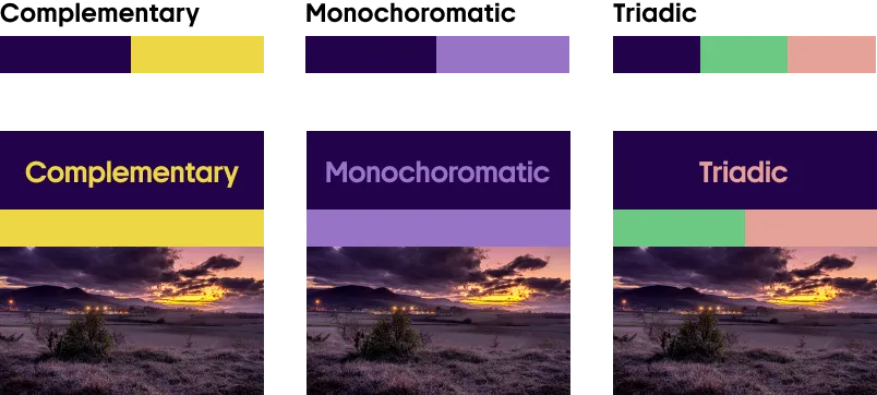
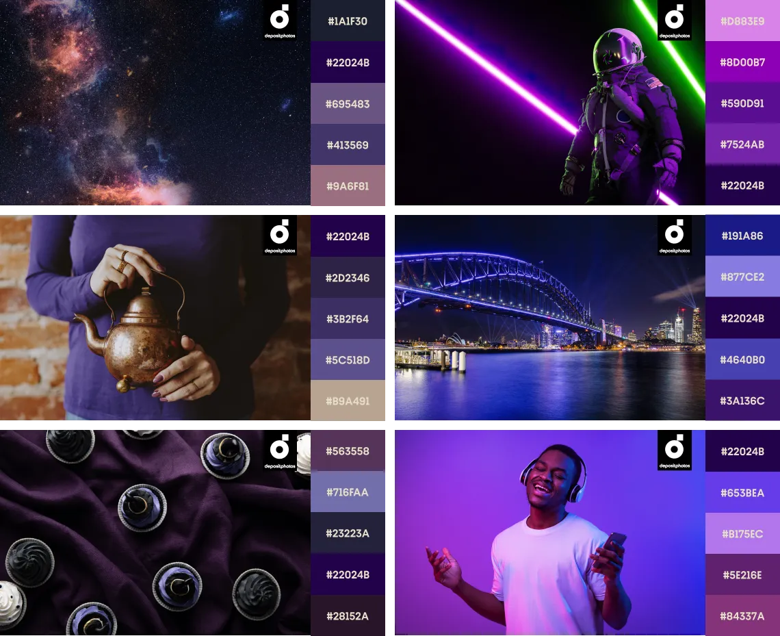
Paired with other dreamy purples and violets, Midnight brings both a dramatic and refined look to your designs.
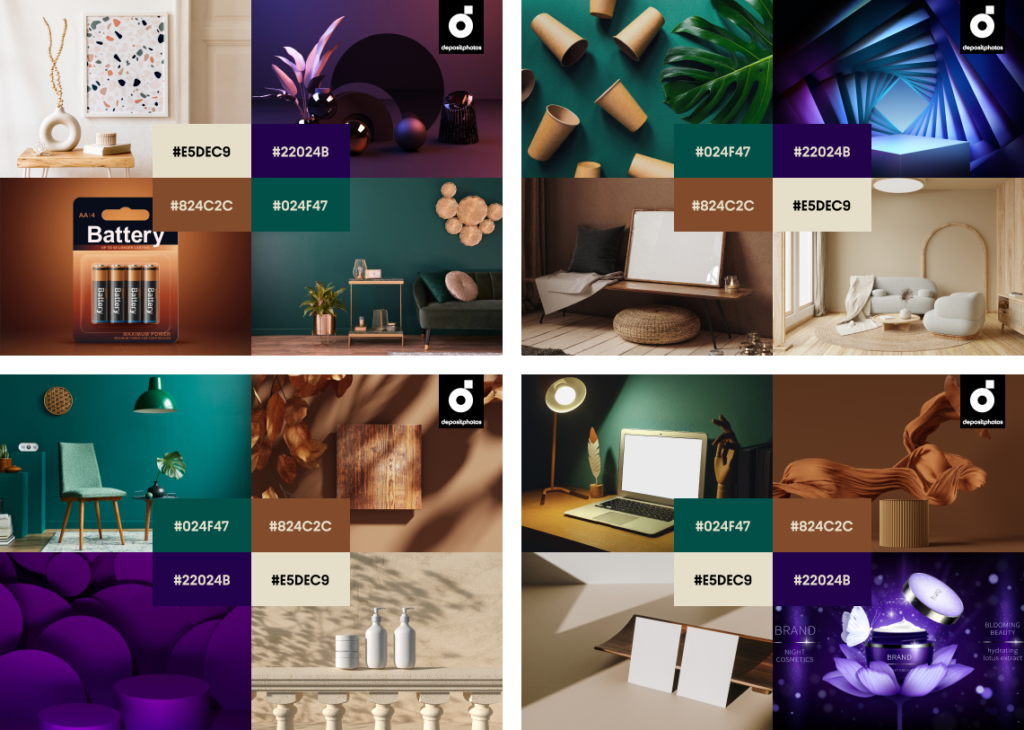
Ready toolkit with vectors and mockups in trending fall colors for your designs
Ready to use trending fall colors in your next creative project? Whether you’re revamping your website, planning a brand refresh, or crafting seasonal marketing campaigns, having the right tools is crucial.
Our team has meticulously curated a selection of vectors and mockups designed to align with the latest color trends of fall 2024. These audiovisual files are striking and versatile, allowing you to customize them to fit your unique design needs and brand identity.
With the help of this collection, you can effortlessly integrate fall colors into your digital and offline projects and keep your designs relevant. From product banners to social media graphics and print materials, these mockups provide a solid foundation to build upon, making your creative process more efficient.
Let’s sum up
As a marketer or creator, you know how important it is to resonate with current aesthetic movements while standing out. This fall, people are hunting for vintage Levi’s, rugged but original Wassily Chairs, and more offline time.
We’re seeing a shift towards a palette that’s earthy, grounded, and deeply connected to nature. From the warm hues of Sandstone and Saddle Brown to the deep richness of Pine Grove and Midnight, these colors evoke a familiar and dear appreciation for autumn’s beauty.
Our color trends collections are made to inspire you and bring the flexibility needed to breathe life into your ideas. As we look forward to what winter might bring, let’s embrace the warmth and depth of fall colors to tell compelling stories and create on-trend designs.
Discover Fall Color Trends Collection
More about color trends
7 Creative Design Trends in 2024
How Strategic Color Choices Can Skyrocket Your Brand Identity
