Color-Blocking: How to Mix and Match Bold Colors Like a Pro
Sometimes, keeping up with all the emerging trends in the design world can be challenging. That’s why time-tested approaches that allow you to grab audience attention and make your projects stand out are so valuable. One of them is color-blocking.
Let’s dive into this fascinating realm of color and discover simple tips and tricks for striking color combinations. Keep reading to make your designs look daring and vibrant!
What is color-blocking in design
Classic color-blocking is an artistic technique in which opposite hues on a color wheel are mixed to create complementary combinations. Due to contrast, color pairs such as red and green or yellow and purple look fascinating and easily capture attention. This approach is based on color theory, with clear principles for mixing different hues to achieve balanced and appealing color schemes. In a broader sense, color-blocking refers to various combinations of solid colors that are not necessarily opposite on a color wheel.
The development of color-blocking is often associated with the Dutch artist Piet Mondrian, who lived and worked at the turn of the 18th and 19th century. The master created an artistic movement called Neoplasticism and promoted the idea that the world’s harmony can be reflected through simple shapes and primary colors. This concept is embodied in Mondrian’s famous grid-based paintings, such as “Composition with Red, Blue, and Yellow.”
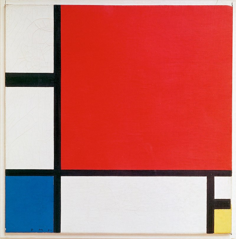
Source: Wikipedia
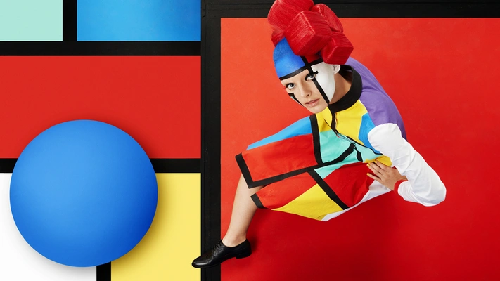
Although Mondrian is considered the “father of color blocking,” the growth of this movement was also greatly influenced by Georges Seurat, Claude Monet, and American pop art, which gained incredible popularity in the 50s. Since then, color-blocking has taken a solid place not only in art, but also in fashion design. Inspired by this iconic style, Yves Saint Laurent created the famous Mondrian dress in 1965 with a distinctive geometric print.
To this day, color-blocking is one of the most popular stylistic techniques found in different types of design, from graphic to interior. Modern designers often turn to it for inspiration when working on creative projects. For instance, one of the most renowned design agencies, Sagmeister & Walsh, used the aforementioned Mondrian painting as a reference for a constructivist and psychedelic ad campaign for Aïzone. Another great example is the work of the Swiss studio Wyler Werbung, which wittily integrated the famous piece into an ad for a logistics company.
Source: AndWalsh
What makes color-blocking so appealing
Color-blocking has proven to be the gold standard in design when it comes to effectively engaging audiences and leaving a lasting impression. This approach offers a number of advantages, making it a surefire choice for various projects.
- Creating visual interest. Color itself is a powerful way to influence viewers. Using it strategically and combining different hues in your design lets you instantly grab attention and set the right mood.
- Arranging the design. Usually, color-blocking involves the use of geometric shapes filled with color. It allows you to create a well-structured design that is easy to perceive and effectively conveys a message.
- Providing visual hierarchy. Color blocks can direct viewer attention and highlight key points in a design. For instance, you may use orange for parts that need to be emphasized and blue for secondary elements.
- Brand differentiation. Color-blocking is a great way to establish a distinct visual identity. Sophisticated color combinations can enhance brand recognition, set it apart from competitors, and evoke desired associations.
- Developing balanced palettes. Color-blocking is not about combining any hues. The secret of this approach is careful color selection, which allows you to get harmonious color schemes. It has its principles, which we will explore further.
How to color block like a pro
1. Start with color theory
Remember that color choice significantly affects the impression you create and the overall mood of your design. Different colors can evoke various emotions. For example, blue is associated with trustworthiness, responsibility, peace, and tranquility, but it can also cause sadness. Red is often perceived as the color of passion, love, strength, and power, yet it can represent danger.
When choosing a color, it’s essential to make sure that it will produce the desired effect, reinforce your message, and be correctly understood by the audience. Keep in mind that color interpretation can vary from region to region: yellow, which is usually associated with joy and optimism in the West, is a mourning color in Mexico, Egypt, and Ethiopia. Therefore, always consider the cultural specifics of the market you are designing for.
Discover color theory and the meaning behind main colors in our dedicated article.
2. Mix and match colors
Once you’ve picked the base color that best suits your message and design mood, it’s time to create harmonious combinations. At this stage, you’ll need a color wheel, which can be easily found online in a few clicks. The classic color-blocking technique suggests using two or three hues. To select them, you can follow one of the below schemes:
- Complementary. Choose contrasting colors that are opposite each other on the color wheel: red and green, yellow and purple, orange and blue.
- Split-complementary. In this case, we have a three-color combination with one base color and two complementary hues opposite it on the color wheel. For example, it can be a mix of red, blue-green, and yellow-green.
- Analogous. This scheme suggests complementing the base color with hues next to it on the color wheel. Mixing sister colors, such as orange and yellow or blue and purple, creates a harmonious and subtle look.
Explore other color combinations in our essential guide to color schemes with examples and tips.
3. Add some neutrality and airiness
Using multiple bright hues, especially if there are three or more, can make your design overwhelming. Try to limit yourself to a few colors. It will simplify your design process and prevent the composition from becoming too complicated to perceive.
If you have more than two colors, complement them with a neutral one, such as black, white, or gray. This way, you can tie everything together while creating contrast and emphasizing color blocks. You can see this approach applied in Mondrian’s iconic painting, where he uses neutral colors to create space around red, yellow, and blue blocks.
4. Establish visual weight
Visual weight determines the importance of a particular element in a composition. It is influenced by factors such as size, color, contrast, density, and complexity. In other words, large elements of simple shapes with a vibrant color or high contrast are visually heavier.
How can you manage visual weight within color-blocking? Start with hue saturation. To avoid overloading your viewers with clashing colors, reduce their saturation or contrast for a more balanced and pleasing look. For the same purpose, it is better to differentiate the size of color blocks than to leave them the same.
Find out the fundamental principles of effective visual hierarchy to engage your audience and clearly deliver your messages.
5. Fill the blocks
When you have a ready-made mockup of your future design, fill it with information and details. However, it should also be done thoughtfully. Simply cramming information into color blocks is unlikely to deliver a good result. Think of each block as a mini-layout that requires a strategy for arranging the details.
Since you already have active elements in the form of color blocks, try not to clutter a design. If you use more than two hues, choose neutral colors for the text and vary text size to differentiate it according to importance. Also, ensure sufficient contrast between the text and background to improve readability and make the message more accessible to the audience.
6. Separate colors in a creative way
When we think of color-blocking, we imagine simple geometric shapes like rectangles or squares. But you don’t have to limit yourself to the most obvious options. Try separating the colors with diagonals, zigzags, or any other unconventional shapes to make your design more unique and dynamic. You can go further and break the boundaries of a particular color block to add visual intrigue.
Real-life examples of color blocking from top brands
Microsoft logo
Since Microsoft was founded in 1975, the company’s logo has changed several times until the version known to most users appeared in 2012. The tech giant’s famous logo consists of four color blocks forming a single square together. This innovative design not only attracts attention, but also has an additional meaning, as each color represents a specific Microsoft service: blue for Windows, red for Office, green for Xbox, and yellow for Bing.
Learn more about the types of logos and how to use them in our thematic article.
![]()
United Colors of Benetton packaging
United Colors of Benetton is a fashion brand associated with bright colors and bold combinations. Naturally, the company remains true to its style in packaging design. The company logo and four vibrant colors mix to immediately grab attention and create a balanced look, thanks to a smart choice of shades.
Learn the secrets of successful packaging design that will make your product stand out.
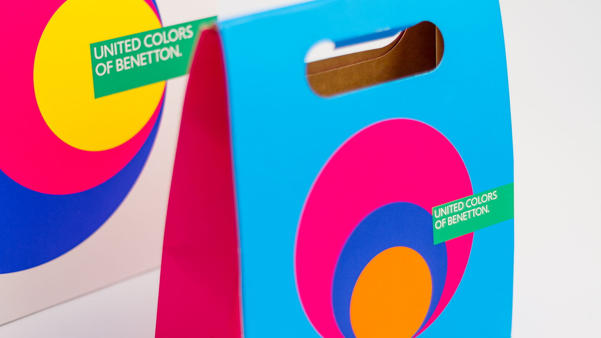
Source: Boxmarche
Spotify brand identity
Spotify understands the vital role of design in user experience. That’s why the company has developed its approach, which combines multiple design systems. Bold colors play a special role in Spotify’s visual identity and communicate key brand attributes, such as being diverse, adaptable, warm, and friendly.
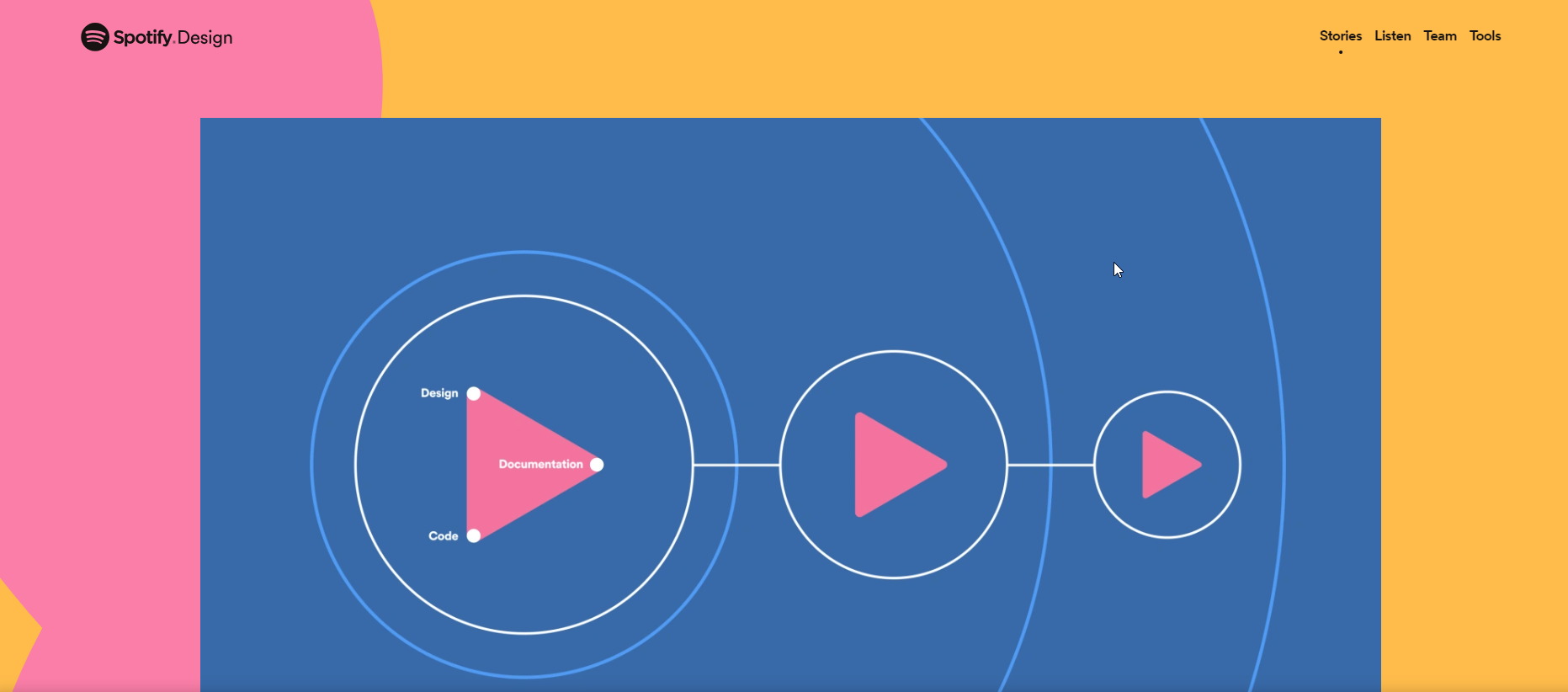
Source: Spotify Design
To wrap up
Despite its apparent simplicity, color blocking requires thoughtful consideration. At the same time, it can be a pivotal strategy for engaging audiences, drawing attention to your messages, and creating an impactful impression. So give it a try with our simple tips on how to color block to make a striking design.
Other articles you might find interesting
Your Essential Guide to Color Schemes: Definitions, Examples, and Tips
How Strategic Color Choices Can Skyrocket Your Brand Identity
Spring Color Trends 2024: Curated Collections, Inspiring Ideas, & Ready-To-Use Mockups
Color Psychology Explained: How Hues Can Evoke Emotions and Influence Decisions


![Gradient Color Palettes for Your Next Design Project [Infographic]](https://depositphotos-blog.s3.eu-west-1.amazonaws.com/uploads/2019/08/Gradient-Color-Palettes-for-Your-Next-Design-Project-Infographic.webp)