Winter Color Trends 2022-2023: Inspiring Palettes, Curated Collections & Ready-To-Use Mockups
Whether you’re creating a seasonal campaign, redesigning your product packaging, or putting together a weekly newsletter, color choice is crucial. It has the power to influence the perception of your visuals, evoke strong customer emotions, and affect the associations made with your brand. Even a slight makeover can help you appeal to an audience, get more traffic, or boost sales. With trends and seasons quickly changing, it’s not easy to keep up with currently relevant colors. But no worries, we’ve got you covered!
We prepared our latest color trends report, in order for you to visualize your ideas and stay on the same page with your clients. In addition to sharing the newest winter colors, we put together thematic collections of visuals, inspiring palettes, and a variety of ready-to-use mockups; all to save your time on relevant content search and demonstrate how you can create stunning designs with them. Dive in to find inspiration and add some winter vibes to your seasonal campaigns!
The trendiest winter colors in 2022-2023. Let’s have a look!
Every season, we aim to bring you the most recent color updates from all around the world! That’s why we do our trends research thoroughly, diving into the latest tendencies across a bunch of different spheres — from fashion and technology to interior and graphic design. Our team analyzes color choices by Depositphotos authors and the most popular search requests in our 240-million file library. We also examine choices made by reputable sources, such as Pantone, Dulux, WGSN, and more.
Picking hues that will dominate the season isn’t easy, but it’s always inspiring and insightful. This winter is no different! We’re excited to introduce you to four colors that will enrich your seasonal projects and appeal to your audience.
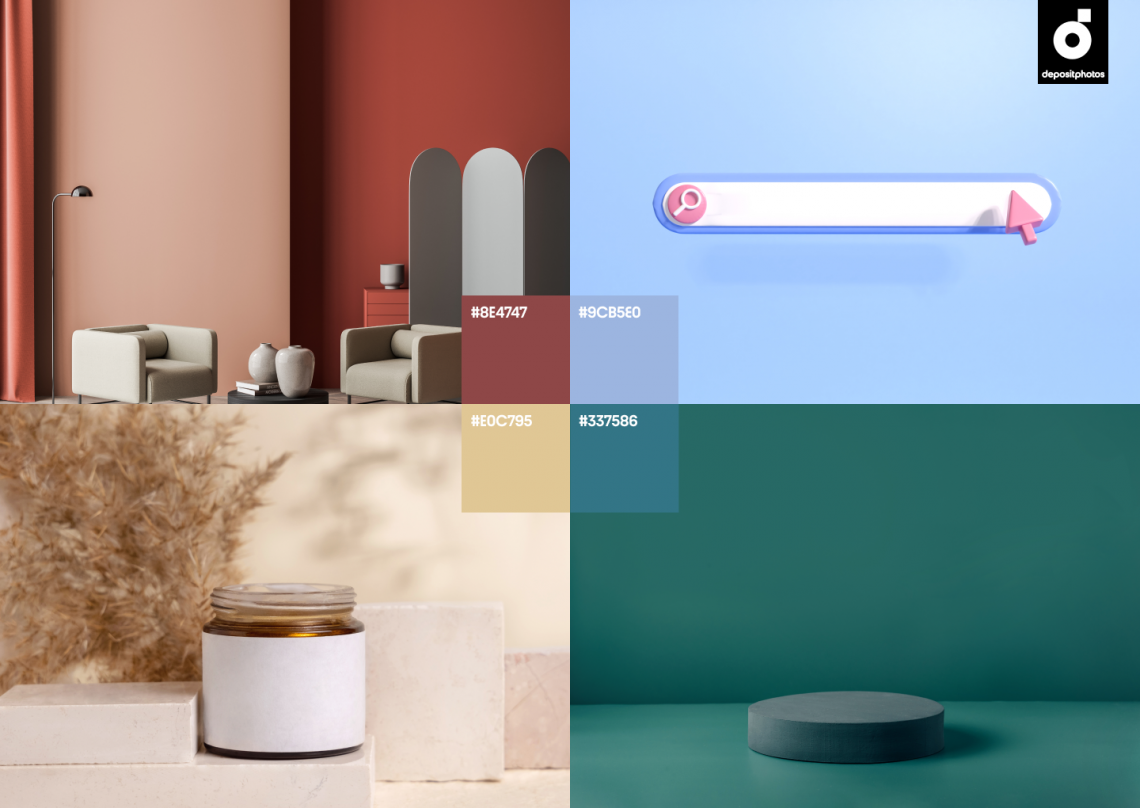
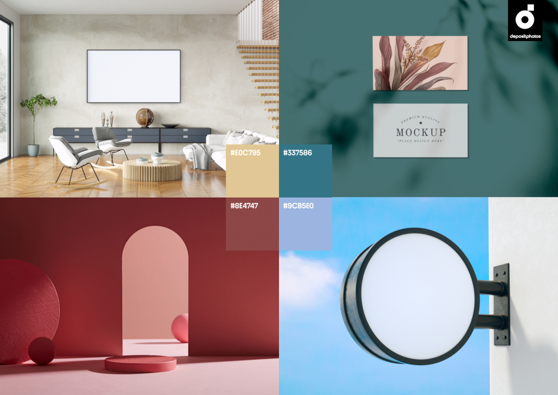
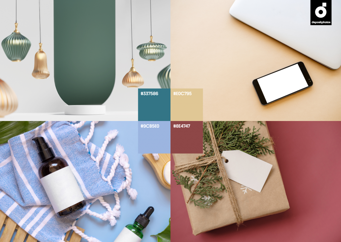
- Teal
- Marsala
- Light Steel
- Ecru
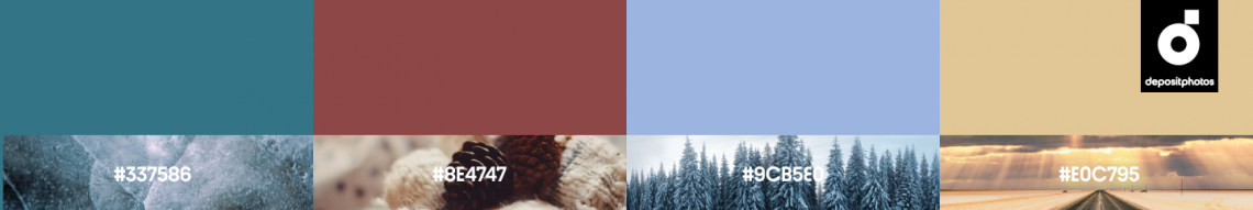
The inspiration behind trending winter colors
Teal (#337586)
Teal is a hybrid color that frequently occurs in nature. It brings together the serenity of green and blue, enriching every design with harmony and tranquility. This is explained by teal’s strong association with nature-related imagery, so if you aim to create nature-inspired visuals, this a must-have color to add to your palette. Teal also represents refreshment, revitalization, and clarity of thought.
Different shades of teal can help you create winter-themed visuals that evoke trustworthiness in your audience. Pair it with ecru, cream, and browns to create ever-popular color combinations. Teal can also enrich your designs in calm combinations with metallic shades and whites.
See collection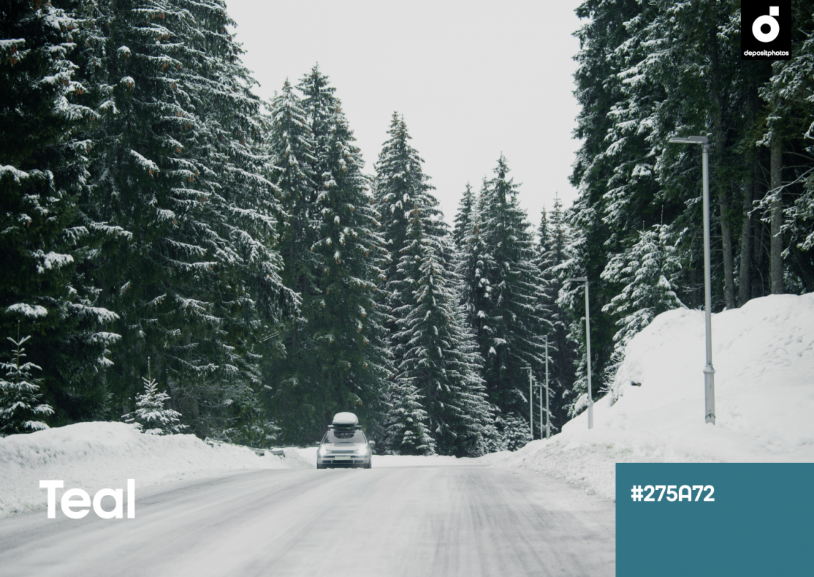
Marsala (#8E4747)
Marsala is a robust red and brown combination inspired by fortified Italian wine. Although it has red tones, Marsala is less overwhelming and demanding compared to other similar colors, but it’s still seductive and alluring. It channels complexity, power, and confidence. You can use it as a more elegant alternative to classic red and brown to embody feelings of warmth, comfort, and reliability in your designs.
Marsala became the Pantone Color of the Year in 2015, finding its way into all areas of design, fashion, and marketing. This winter, the rich Marsala hue is on the rise again. Use it with neutral tones, such as ecru, peach, and grays, to add extra ambiance to your campaigns. Make your audience feel cozy and comfortable during these cold winter months.
See collection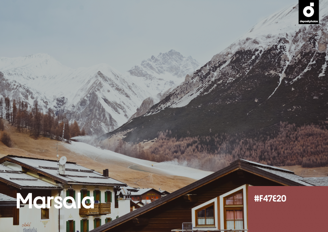
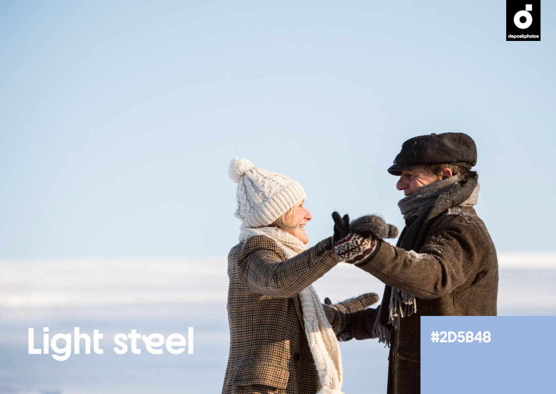
Light Steel (#9CB5E0)
Light Steel is a soft and pale shade of blue. It’s a versatile hue that can be used both as a background and dominant color, expanding across many types of designs. Light Steel evokes feelings of peace, calmness, and innocence. It brings an aesthetic of subtle sophistication and can translate the essence of winter through your visuals.
As a shade of blue, which is the top favorite color of most people in the world, Light Steel is a safe option for any design. You can mix it with complementary shades or add it to a mixed palette of contradictory colors. Light Steel is incredibly versatile and can adjust to almost any shade. Yet, it doesn’t lack strength, which can help you create an impression with your visuals.
Ecru (#E0C795)
Ecru is a beige color with brown undertones that is perfect for any background. Unlike whites, ecru adds depth, warmth, and softness to your designs. As we know, winters can be freezing and unwelcoming, but including ecru in your seasonal projects can help your visuals create a hygge atmosphere, conveying feelings of comfort and relaxation. Using it will suggest calmness, sincerity, and honesty through your brand.
The perception of Ecru can change depending on which shades you pair it with. It doesn’t clash with other colors and works well with any type of design. Use it with classic chocolate, chestnut, or taupe to create a sense of balance, or make a statement by combining ecru with more vivid and high-contrast tones.
See collection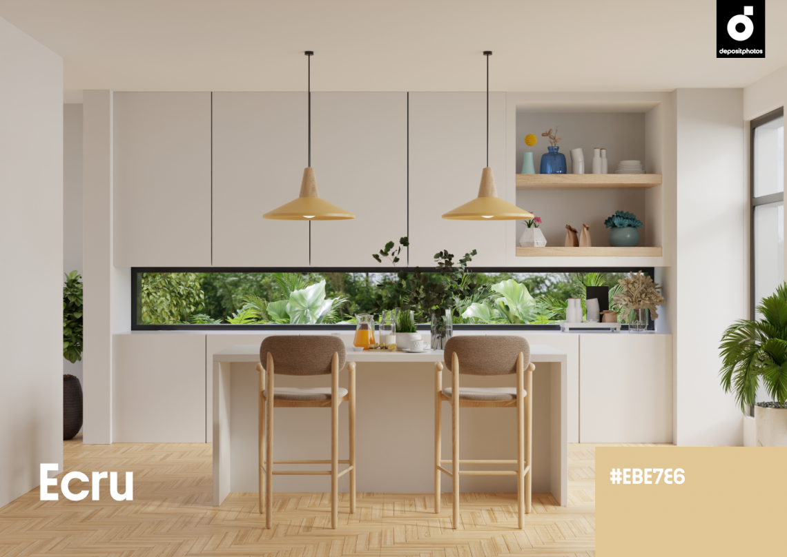
Winter color palettes for attention-grabbing visuals, creative projects, and seasonal campaigns
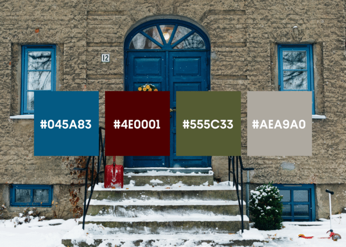
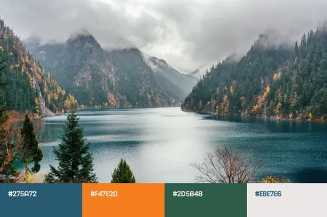
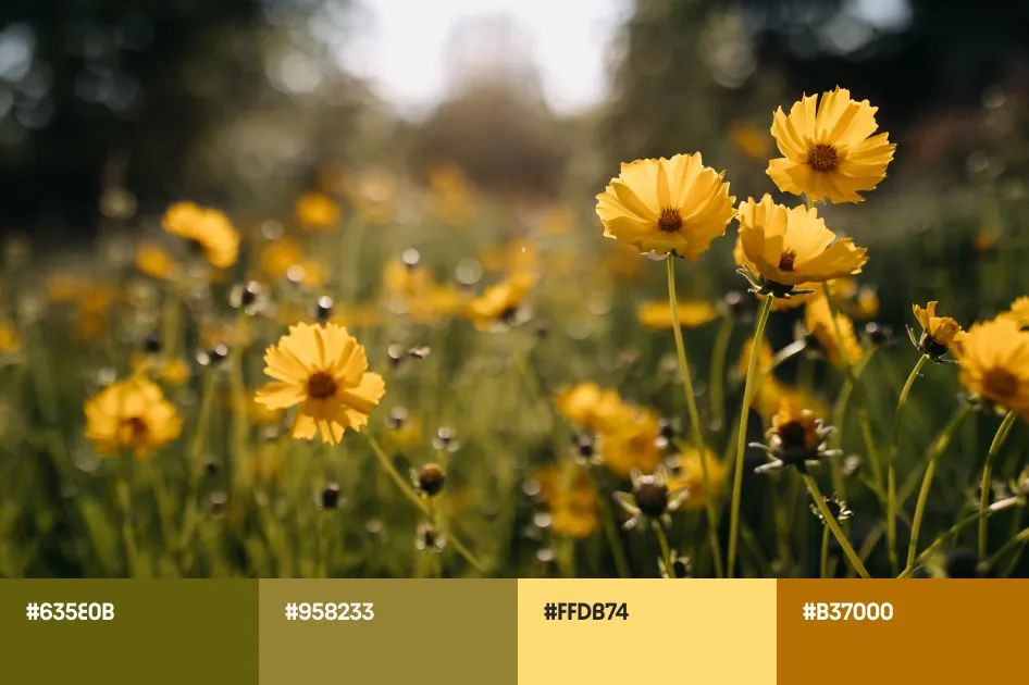
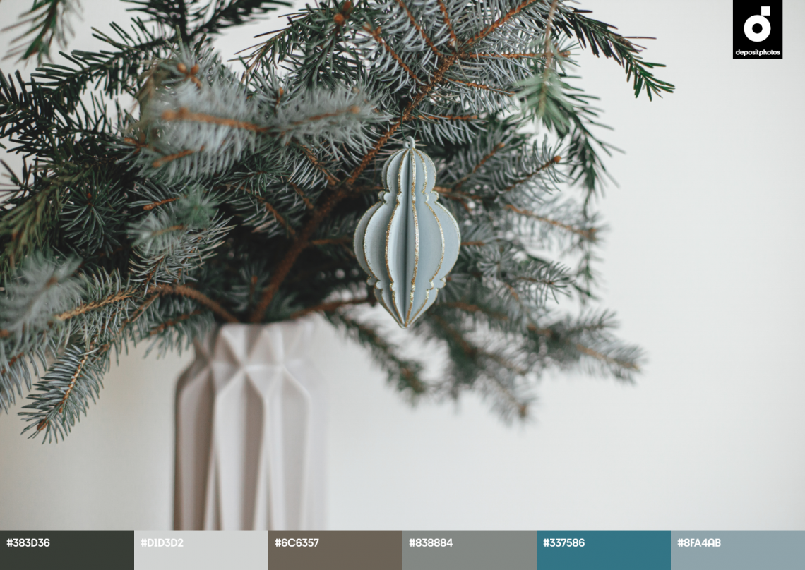
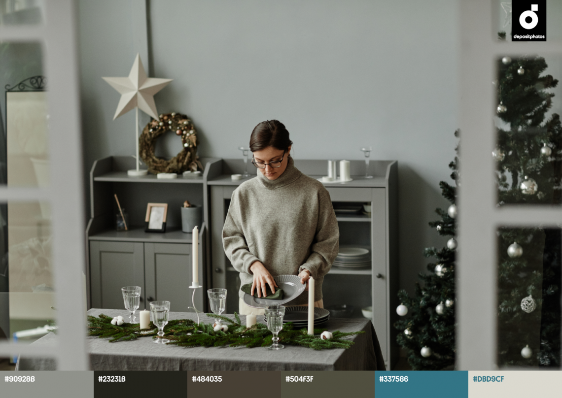
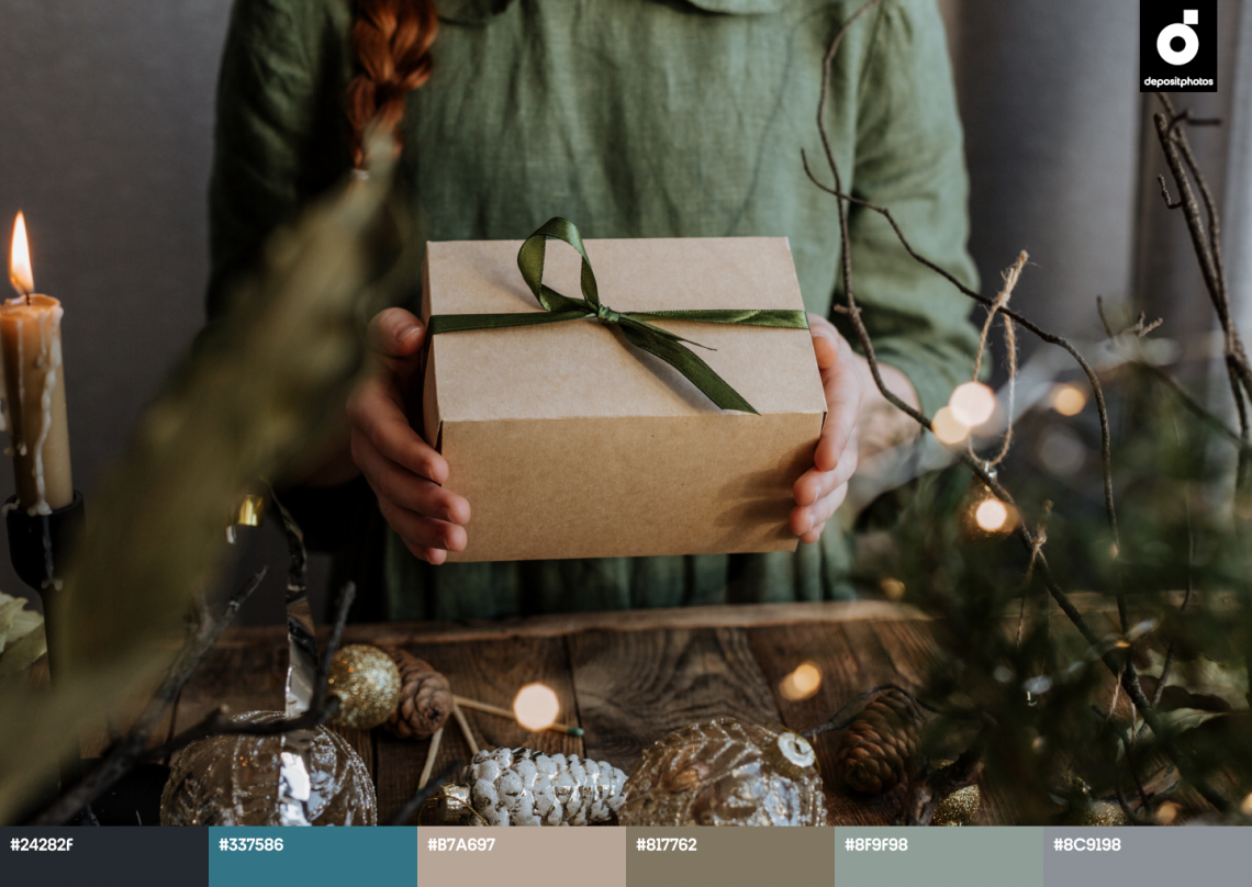
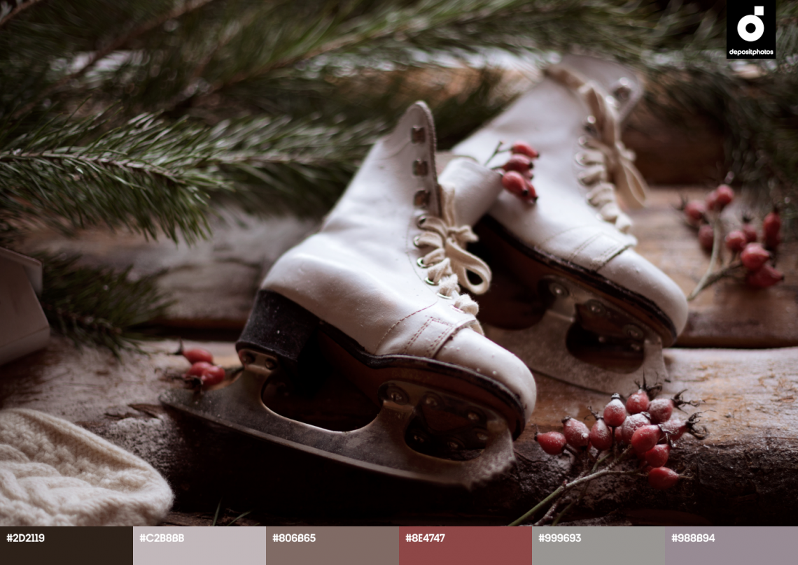
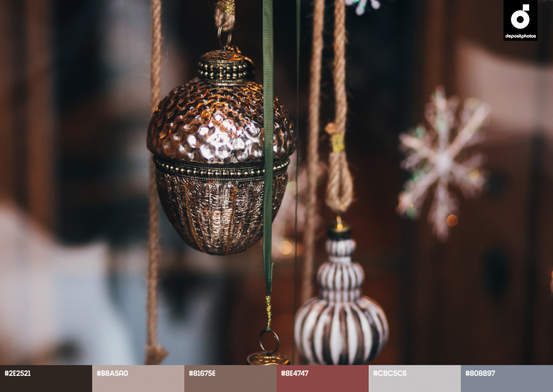
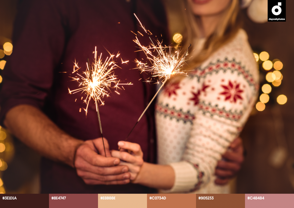
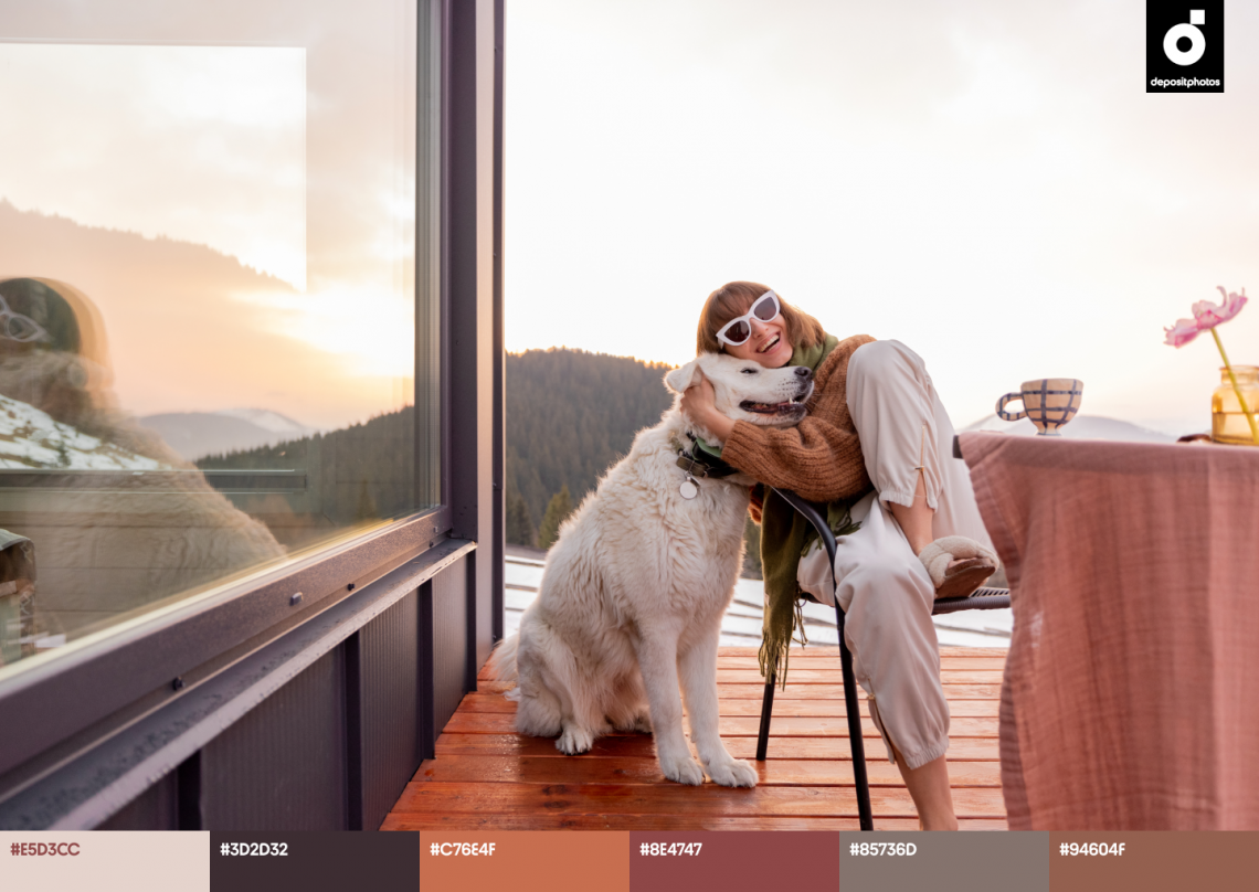
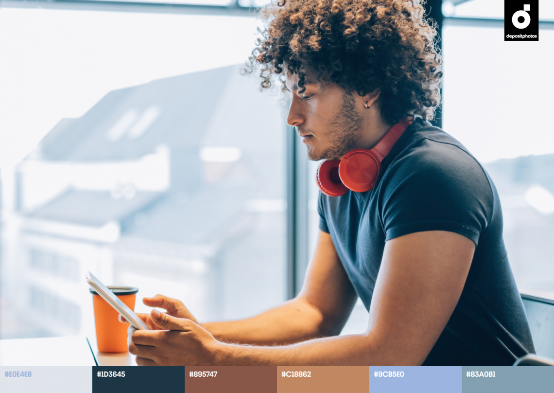
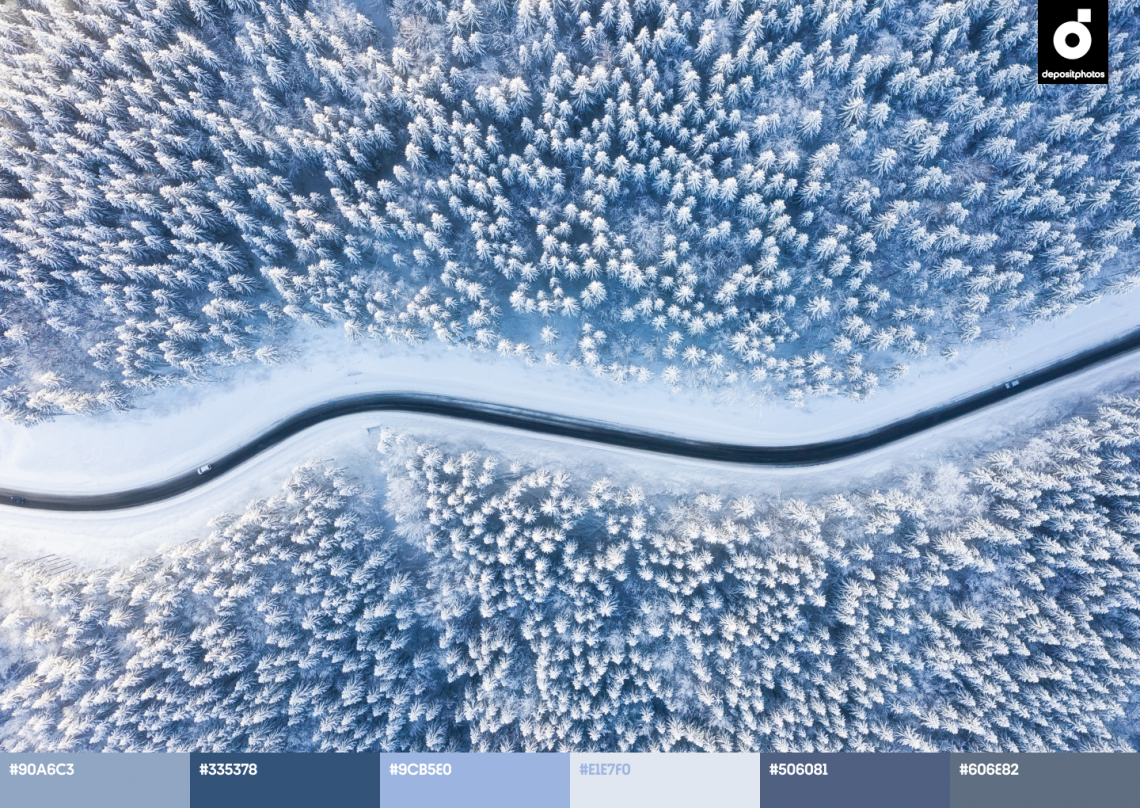
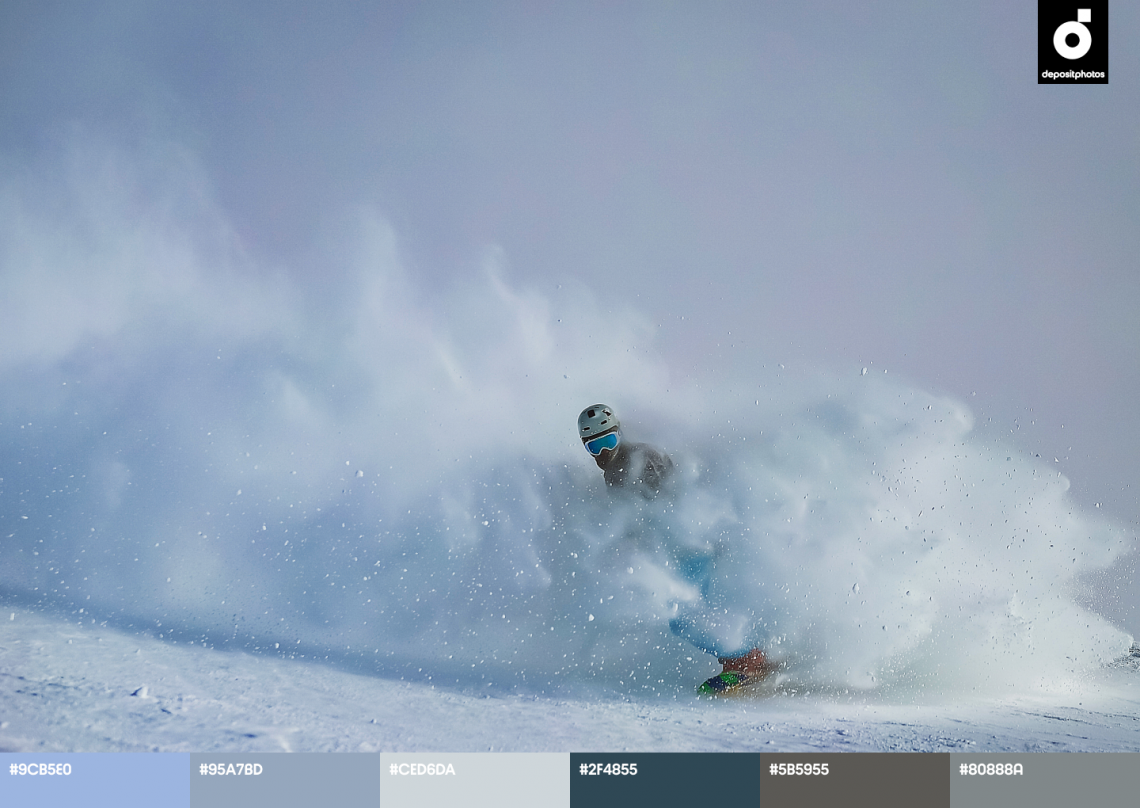
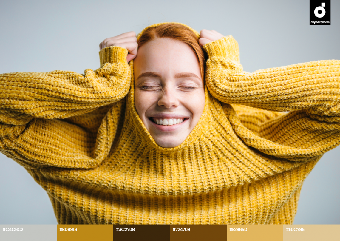
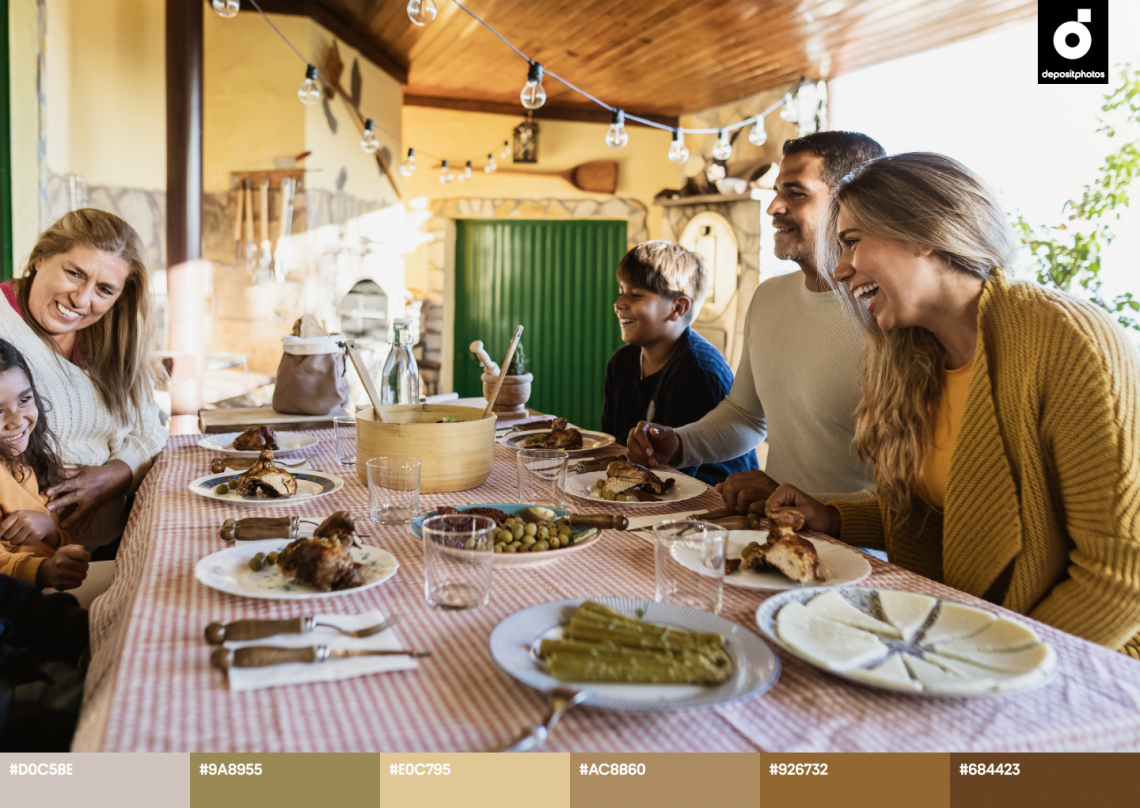
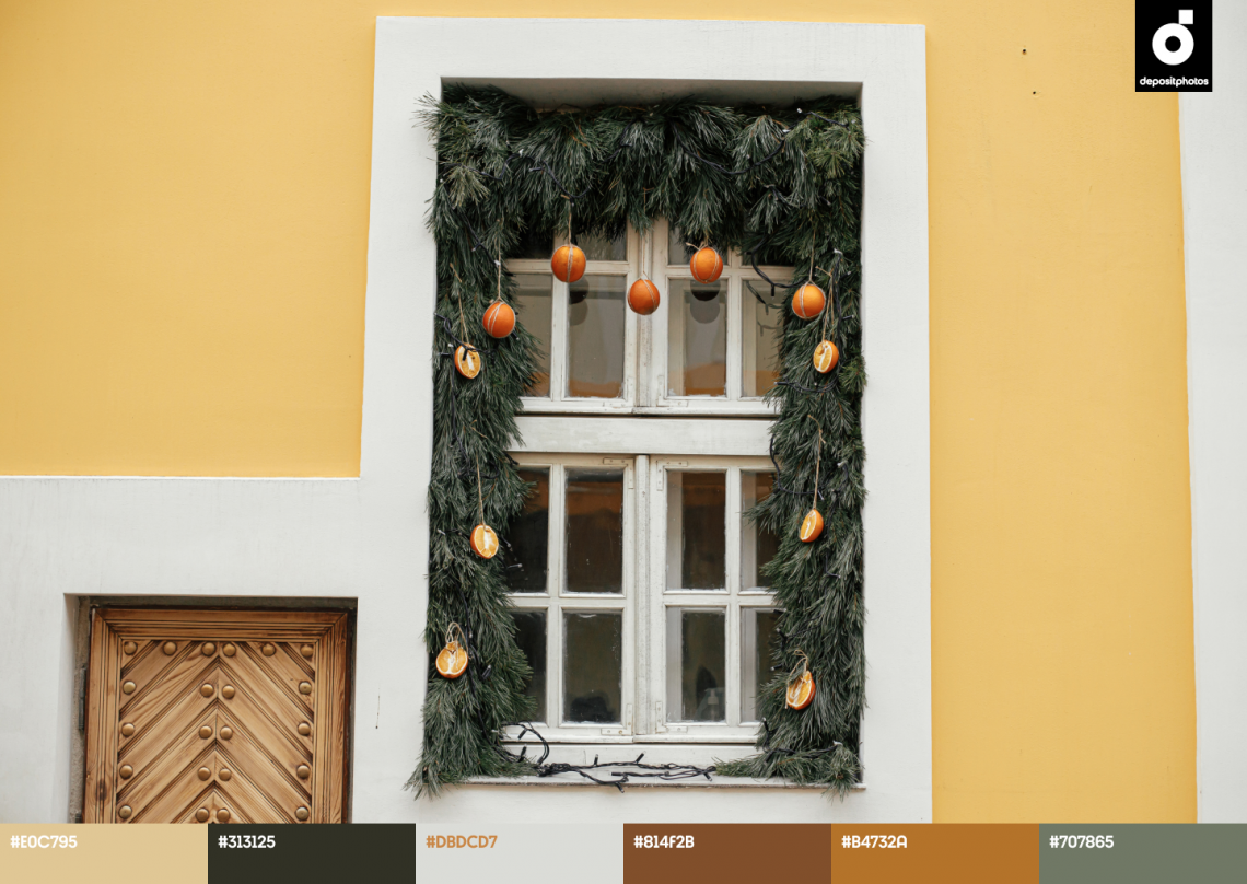
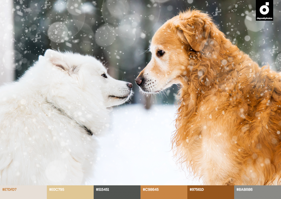
To save your time when it comes to searching for striking color combinations, we created a variety of palettes based on trendy winter colors. Keep them handy to find inspiration and pre-selected solutions for your future projects. Use their HEX codes to recreate palettes accurately, or play with different shades and combinations.
*By clicking on an image, you’ll be redirected to the Depositphotos website, where you can purchase them for use in your visual communication.
See all files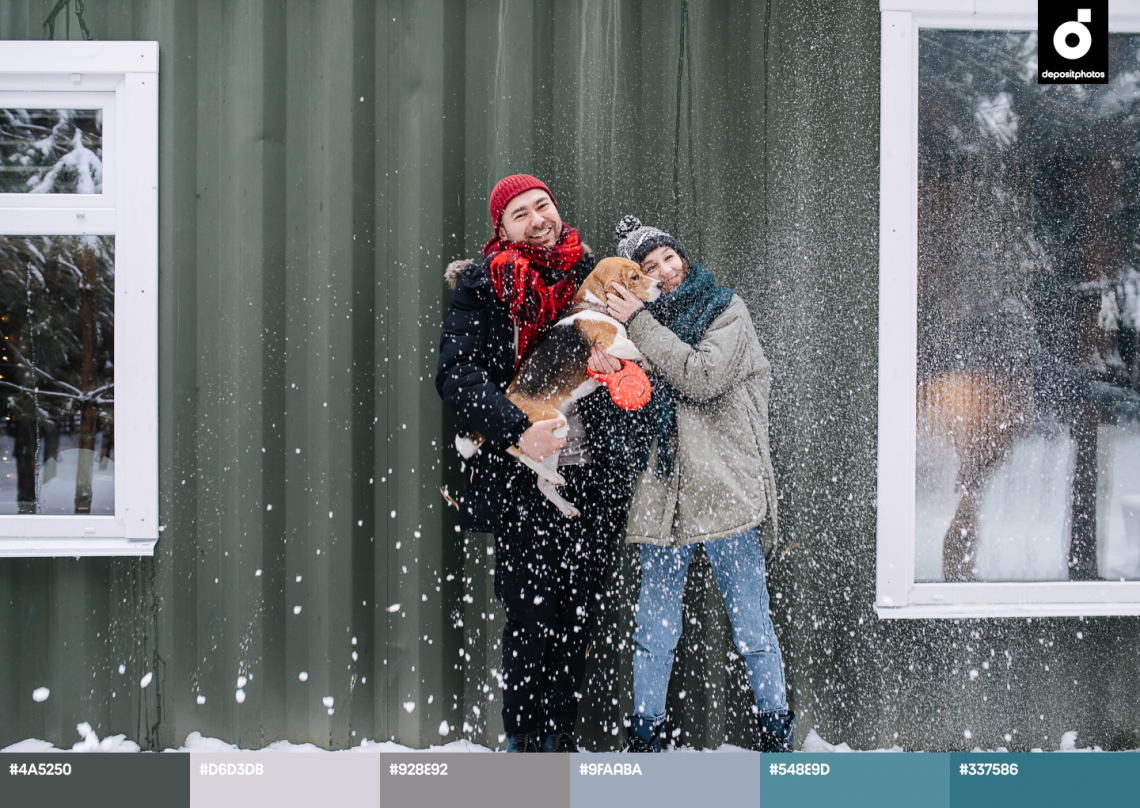
A large collection of ready-to-use mockups in trending colors
To demonstrate how you can use trending Teal, Marsala, Light Steel, and Ecru for packaging, presentations, and other promotional materials, we created a special collection of mockups. Use them to design trending campaigns even when you’re short on time!
Explore mockup collection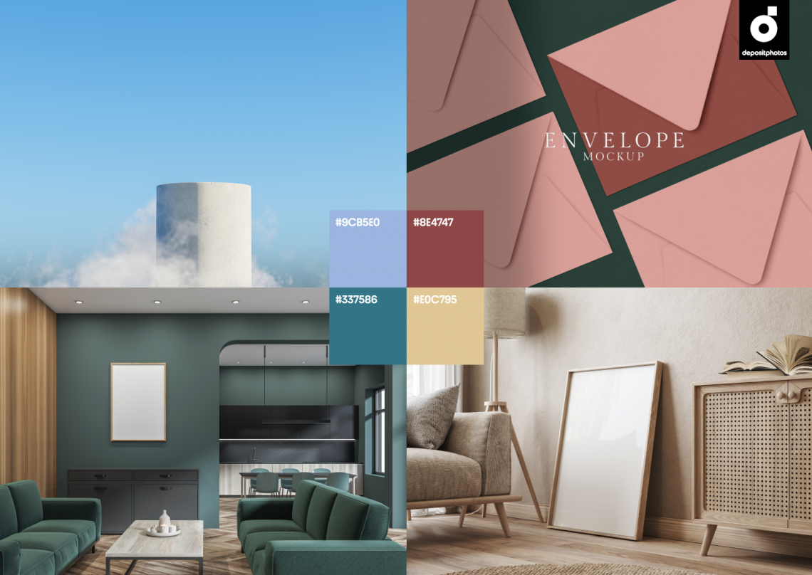
To wrap up
If you want to make your project stand out and captivate your audience, incorporating Teal, Marsala, Light Steel, and Ecru is your way to go! Use these trending colors in your seasonal projects to enhance and make your visuals even more relevant. Whether you want to use them separately in monochronic designs, mix them with other vivid or neutral colors, or pair them together—it’s all up to you. Don’t hesitate to experiment and try new combinations. It can help liven up your brand’s image, attract more attention, and boost your sales.
Get inspired by other articles you might find interesting
Photography Trends on Social Media in 2022
Graphic Design Trends 2022 [Infographic]
Color Palettes Inspired by Famous Ukrainian Movies
Movie-Inspired Color Palettes for Ambient Design Projects
20 Trendy Neon Color Palettes for Bold Designs