Summer Color Trends 2022: Attention-grabbing Palettes and Ready-to-use Mockups
Lying under the bright sun, going on long-awaited holidays, enjoying fresh fruit, and spending evenings on cozy terraces with friends are the things we look forward to each summer. Nonetheless, every year brings its own unique atmosphere and events that we’d like to remember forever.
To help you translate the ambience of summer in 2022, we’re introducing four main color trends, inspiring palettes, and ready-to-use mockups. With them, you can save time on preparing your seasonal campaigns, and showcase that you are on the same page with your clients.
Happy summer!
2022 summer color trends
Every season, when researching key trends, we turn to our Creative Trends Guide, draw inspiration from Pantone and WGSN reports, as well as analyze the most popular search requests in the Depositphotos library. The findings are always surprising and insightful, but there are general tendencies that we have been noticing over the last two years. The more challenging the events happening in the world, the brighter the colors present in visual communication.
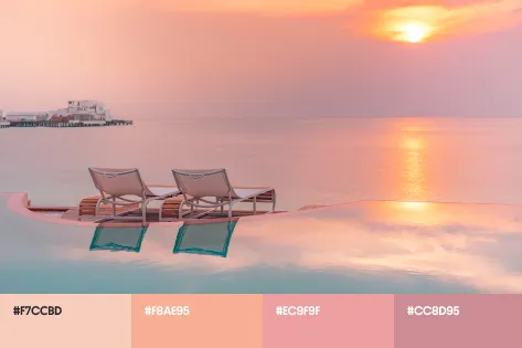
In summer 2022, eye-catching shades of red and pink take the scene to bring more passion, vigor, and playfulness to thematic designs. Tender blue and light beige inspired by the beach help strengthen relations with your audience. Below, we share the exact shades that will be trending this season.
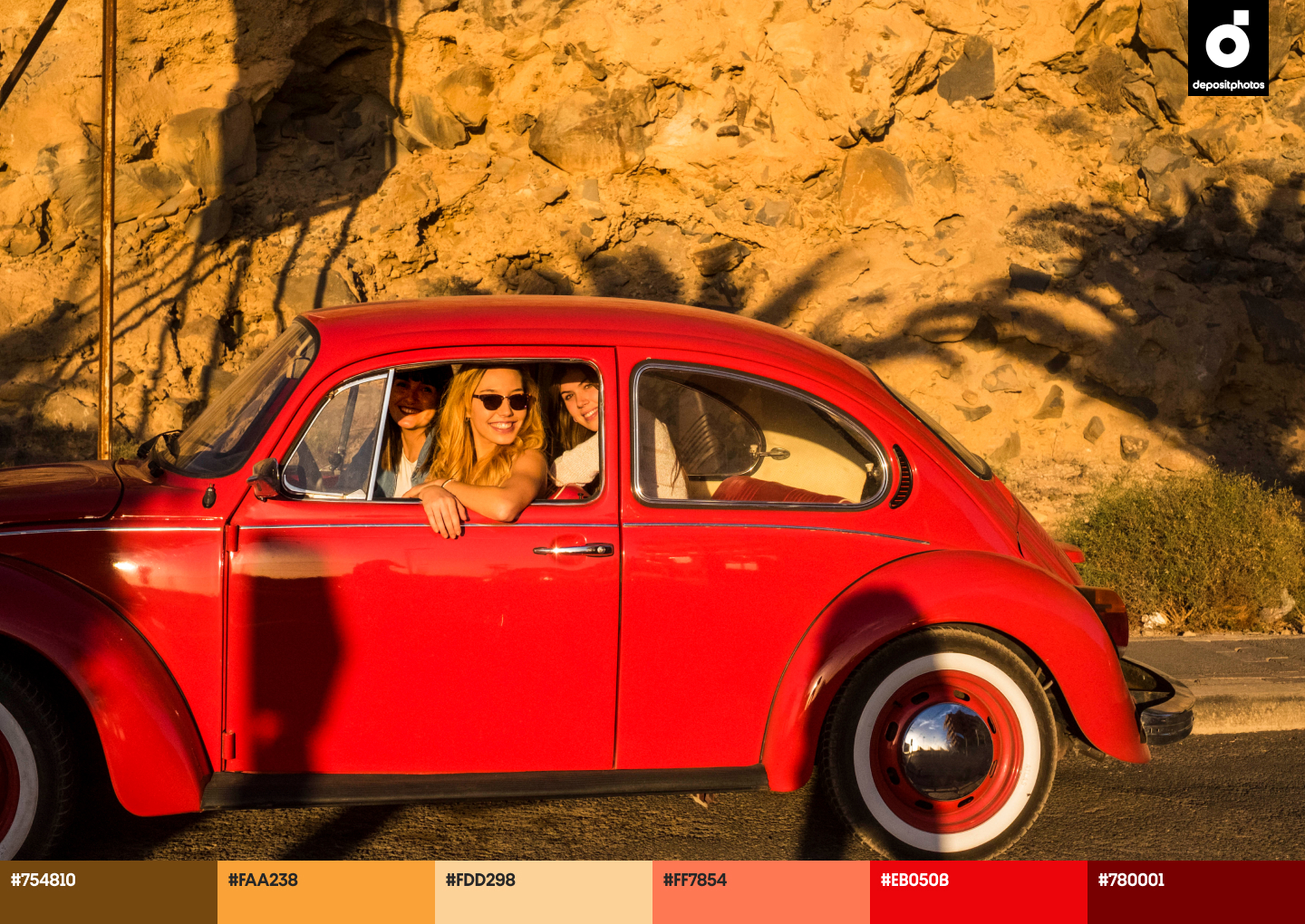
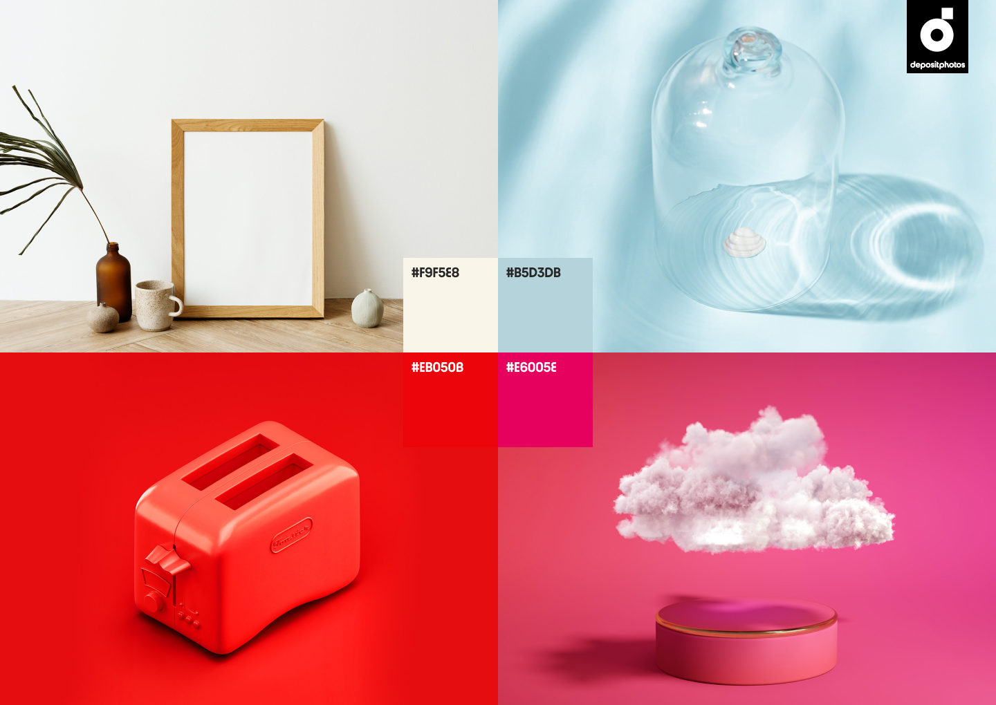
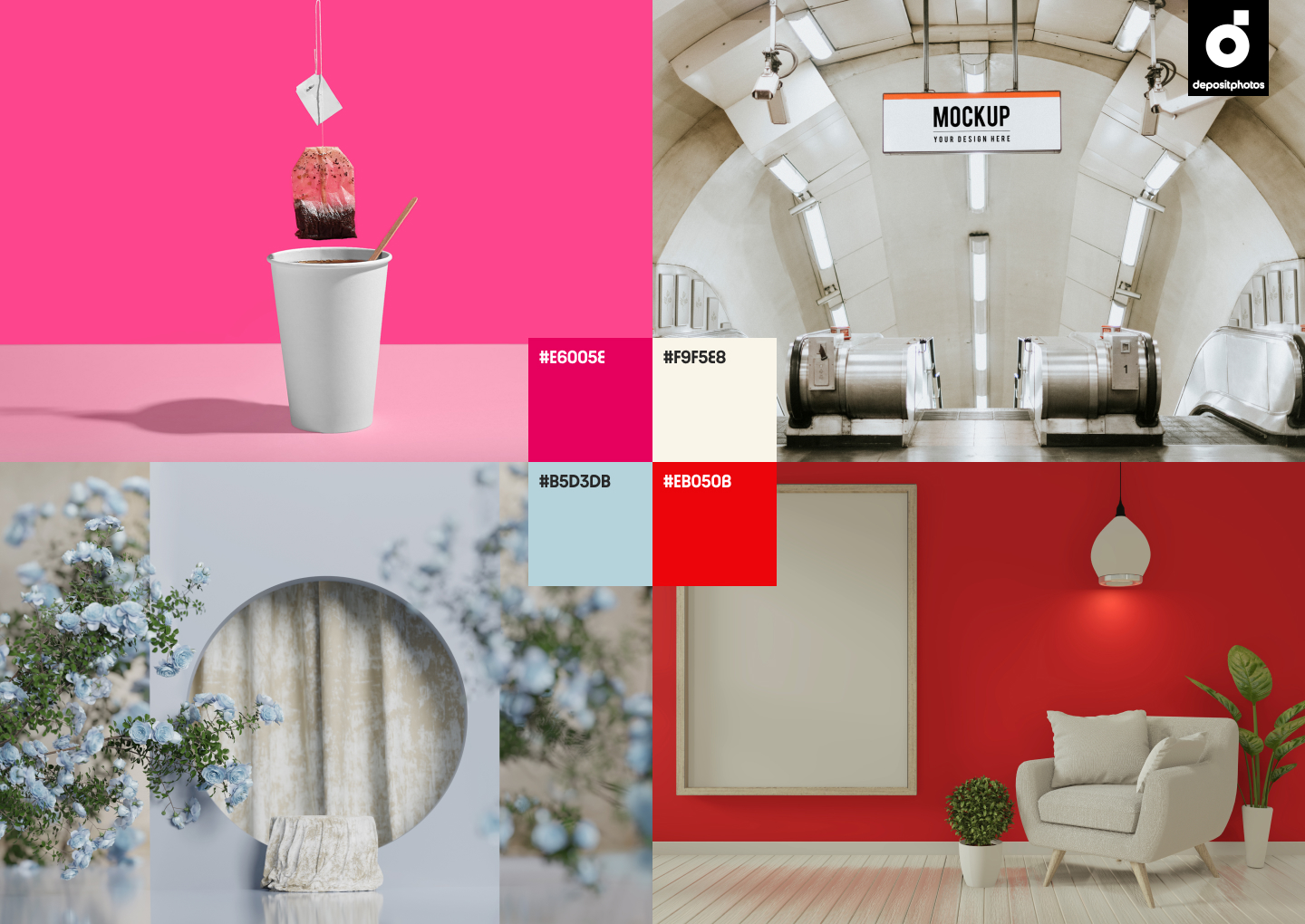
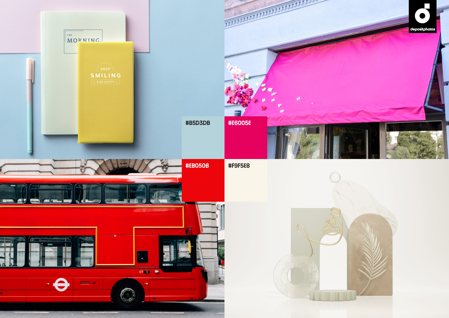
- Scarlet
- Blue Aquamarine
- Wildberry
- Alabaster
The meaning behind trending colors
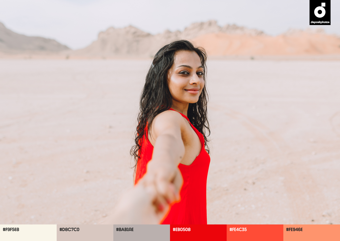
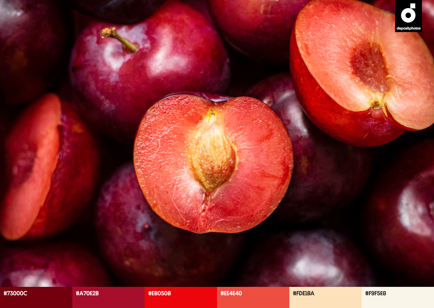
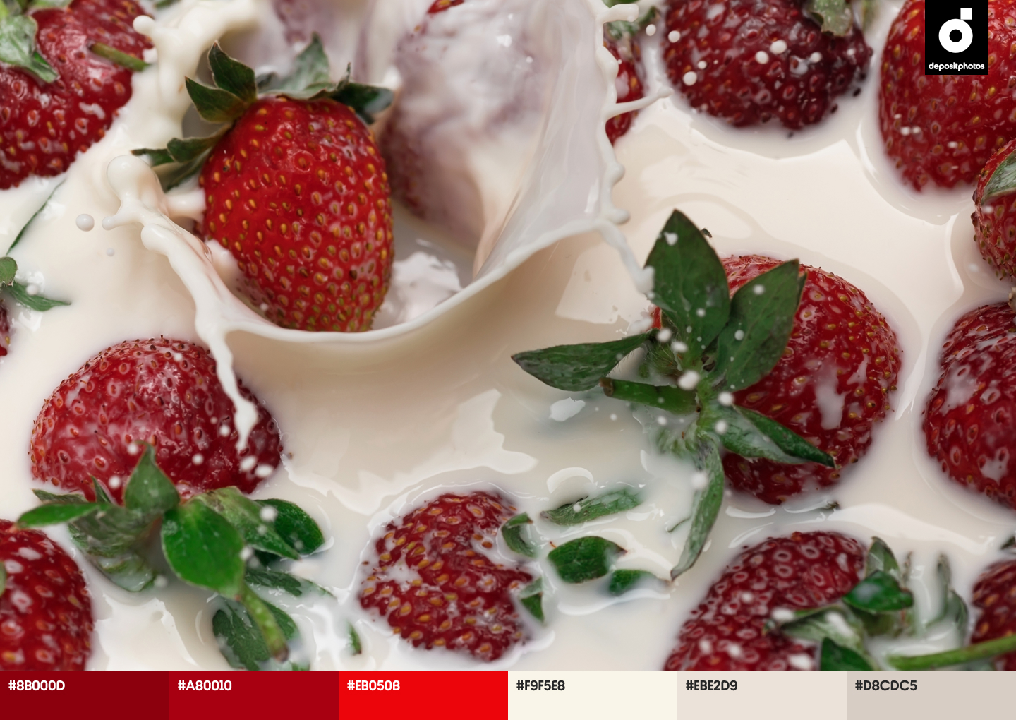
Scarlet (#EB050B)
The color red has different meanings in various cultures, but it symbolizes love, energy, and confidence in most cases. The scarlet shade of red demands attention and makes your designs look even more attractive. Longing for support, signs of hope, and inner strength, many eagerly engage with brands that help them feel more passionate about their lives. Netflix, Coca-Cola, and Marvel are great examples of brands universally loved by audiences and bold in their actions.
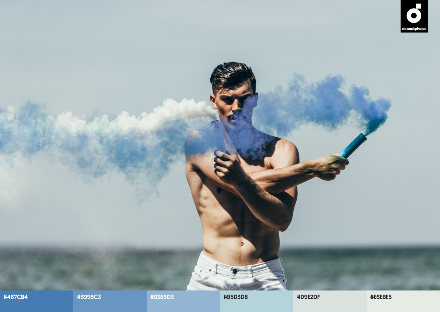
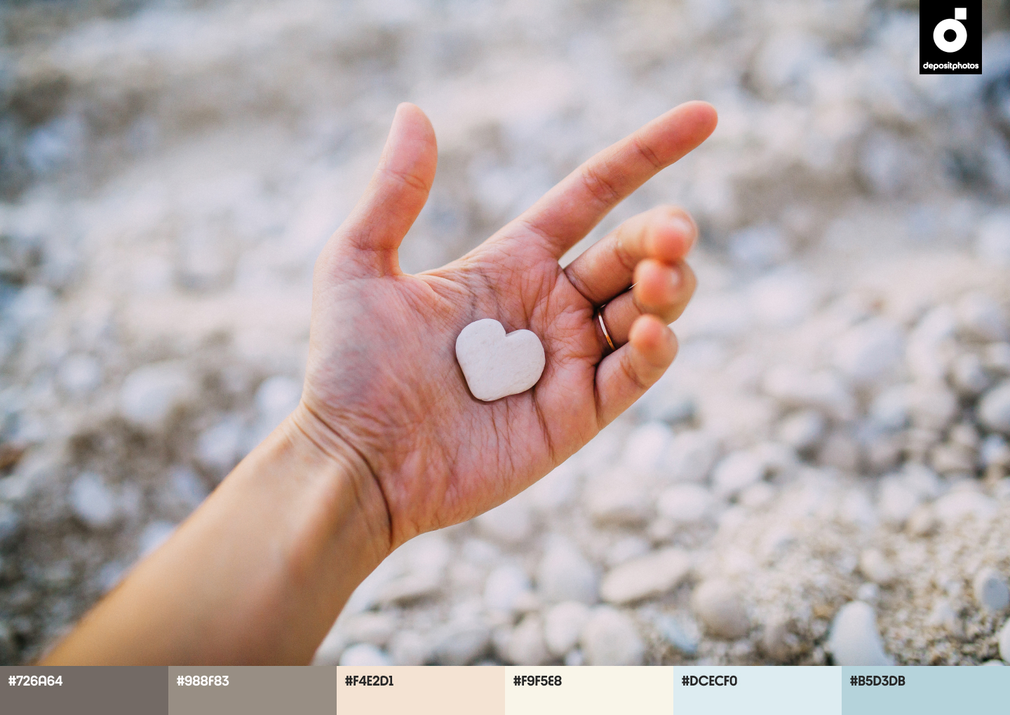
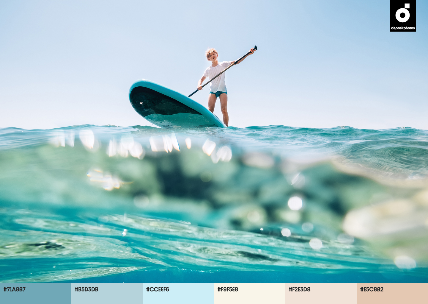
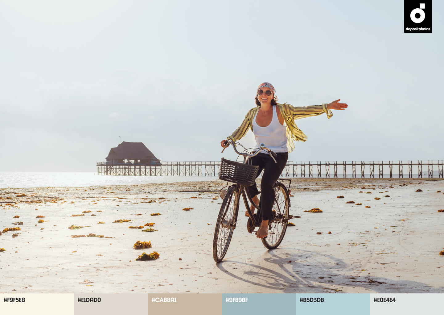
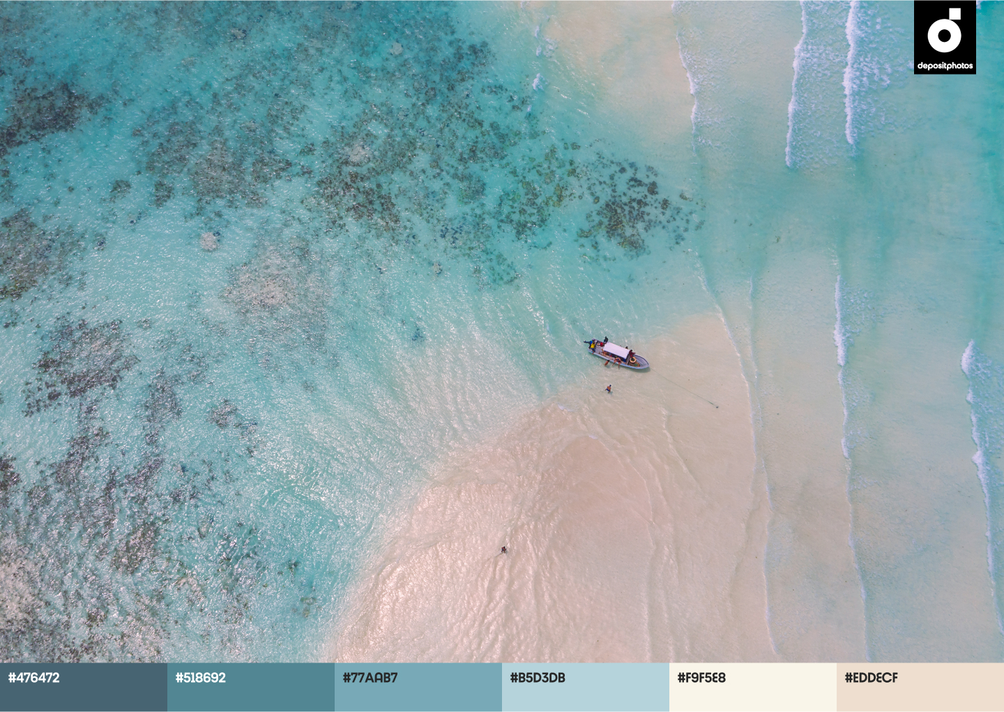
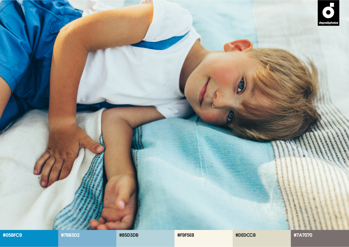
Blue Aquamarine (#B5D3DB)
Blue is the color most often associated with summer. It resembles the sea, blue sky, and serenity that are so appreciated in turbulent times. For instance, brands like Twitter and Vimeo use a light shade of blue as a basis for their designs, aiming to translate trustworthiness, honesty, and lightness. However, matching Blue Aquamarine with Scarlet or Wildberry can help you create unique projects that incite customers to take action while feeling secure about their future.
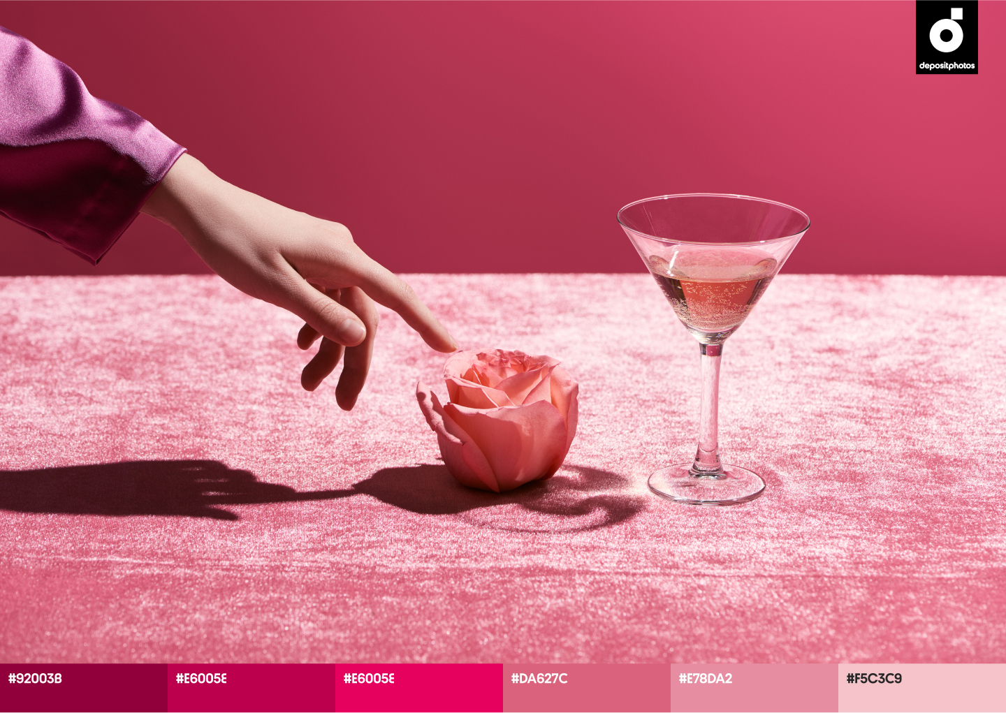
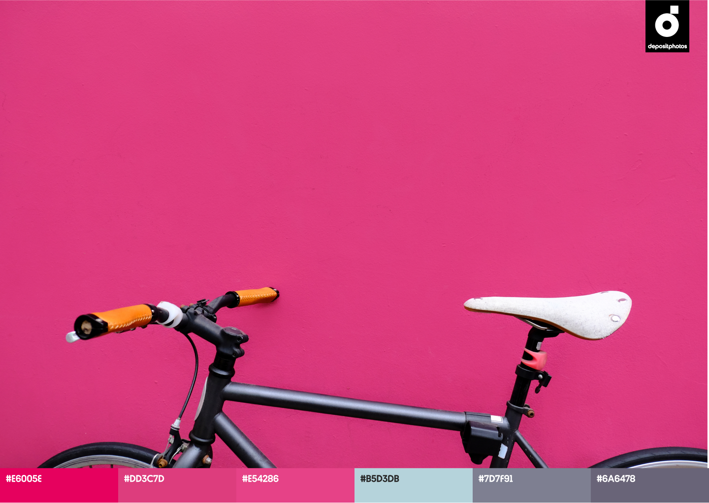
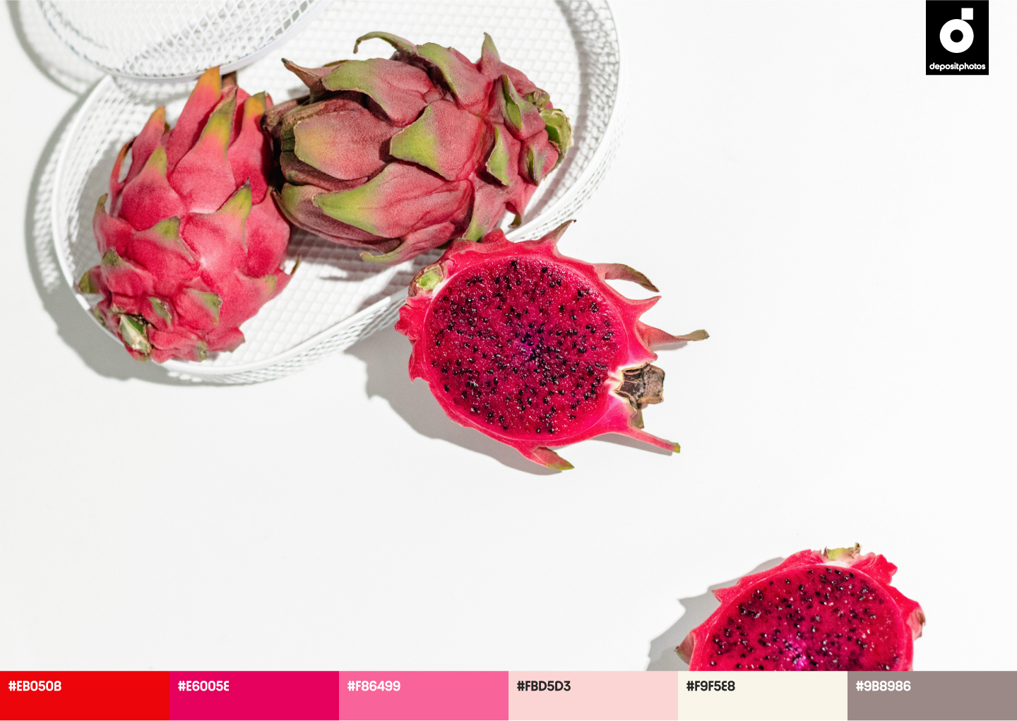
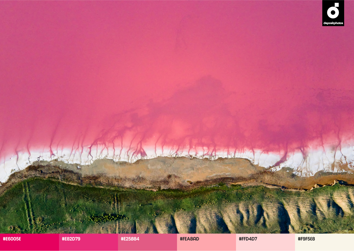
Wildberry (#E6005E)
Pink tones have been popular every season in 2022. This summer, this bright, berry shade is gaining traction to help designers add playfulness and vibrancy to their projects. Choosing Wildberry as a key color is also an opportunity to spark curiosity towards your brand. Often associated with positive emotions, childishness, and happiness, Wildberry is perfect for brands that would like to stand out. Revise the brand identities of Barbie and Roxy to draw inspiration for your seasonal projects.
Alabaster (#F9F5E8)
What do you usually associate summer with? For many, summer is a carefree time when you can enjoy yourself and spend more time with friends and family. Use Alabaster instead of pure white to share these vibes in your designs. This undertone of beige symbolizes calmness, balance, and spirituality. Many brands use this shade as a background to provide less contrast between primary and secondary colors when creating summer-related designs. Alabaster also matches every color from our report, especially Blue Aquamarine.
Summer color palettes for eye-catching ads, campaigns, and creative projects
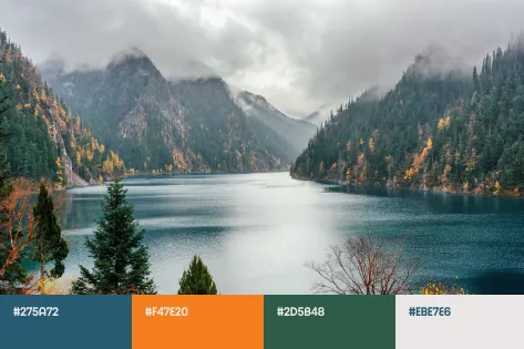
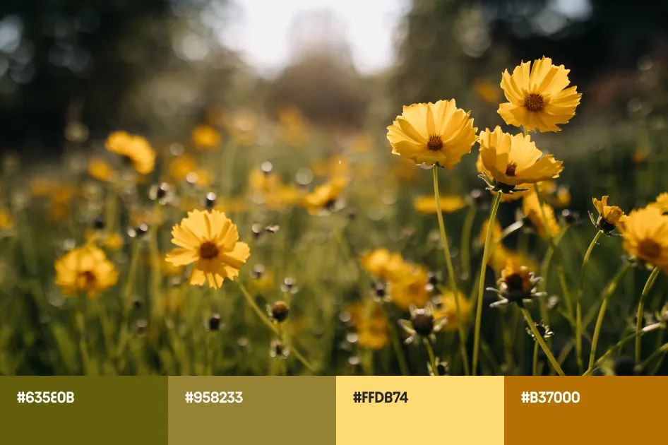
Finding standout color solutions is an art that requires spare time. However, when you work on multiple projects at the same time, there’s an ongoing need for pre-selected solutions that save time for more creative tasks. To help you out with that, we designed a series of trendy color palettes that can become handy when you’re short on time and need some inspiration.
A collection of ready-to-use mockups in trending colors
Consistency is critical in design, which is why we put together a special collection of mockups in Scarlet, Blue Aquamarine, Wildberry, and Alabaster. Find out which colors fit your ideas best and use them to create cohesive, attention-grabbing projects this summer.
Matching trending colors together
The Depositphotos seasonal color trends report is your guide to winning design solutions. Whether you’re planning an entire campaign or just a series of social media posts, you’ll find plenty of ideas on which shades to use, how to match colors, and what kinds of visuals will help you differentiate yourself on the market.
Those looking for unexpected solutions should go all-in by combining Scarlet and Wildberry together this season. This exciting match will make your campaign noticeable and bold. Blue Aquamarine and Alabaster also work perfectly together if you aim to increase your brand’s credibility and strengthen the connection with your audience. However, don’t forget that in 2022, audiences are craving bright emotions, so don’t be afraid to match three or more colors in your works.
Find more inspiration on the topic in these articles
— Graphic Design Trends 2022 [Infographic]
— 20 Best Website Designs from Awwwards
— Creative Trends Guide 2022: Merging the Future and the Past