Color Palettes Inspired by Famous Ukrainian Movies
Movies are an inexhaustible source of ideas, and many creators turn to them in search of storylines, narratives, artistic approaches, imagery, as well as aesthetics. When it comes to the latter, the main element is color, since the overall mood and emotional responses of the audience depend on what shades prevail in the frame. However, the same colors can evoke absolutely adverse feelings.
We’ve decided to turn to Ukrainian cinema and have chosen both iconic and modern films with distinctive color palettes. Learn how their creators used the magic of color. Perhaps you’ll find some interesting techniques and ideas for creating your own atmospheric projects.
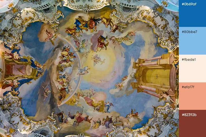
1. “Shadows Of Our Forgotten Ancestors” (“Wild Horses of Fire”)
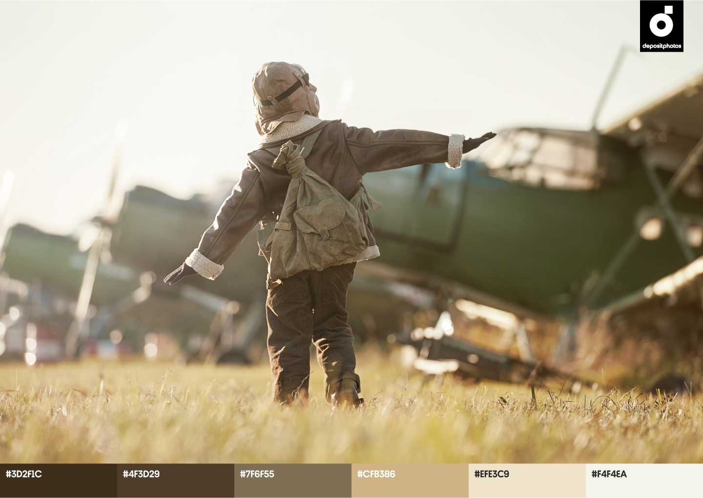
“Wild Horses of Fire” (originally named in Ukrainian as “Shadows of Our Forgotten Ancestors”) is at the top of the List of the 100 best films in the history of Ukrainian cinema. The motion-picture film by Sergei Parajanov became quite an event in the world of cinematic art. It received 28 awards from various film festivals (24 Grand Prix), including the award for color, lighting, and visual effects.
The shooting location of “Wild Horses of Fire” took place in the Ukrainian part of the Carpathian Mountains. Parajanov lived among Hutsuls, exploring their habits and traditions. By the way, all roles in the film, except for the main roles, are played by local villagers. The director managed to capture the authenticity and magic of this isolated world. Since the story is set in a Hutsul village, we see a harmonious natural palette: green — trees and grass, blue — sky and water, brown – wood and soil. According to the theory of color, these shades give a sense of peace and stability, but at the same time, blue is a “cool” color that symbolizes sorrow and depression. The color red is assigned a special role: the director used it as an expressive means to show the suffering of the characters.


2. “The Guide”
The film by director Oles Sanin follows tragic events in Ukrainian history – Holodomor of 1932-1933, as well as the persecution and liquidation of Executed Renaissance representatives (writers, poets, and artists in the Ukrainian Socialist Soviet Republic who became victims of Stalin’s terror).
The anxious mood in the film is achieved in particular through the use of dark colors. These are black, gray, subdued blue, and brown, which are prevalent in frames. Even nature in “The Guide” is shown as if it faded and lost all vibrant shades. Frames look like old photos, and this also enhances the aesthetic component and dramatic mood of the film. Bold colors appear only in a few scenes, mainly featuring female characters (red and burgundy symbolize life and love, as well as suffering and death at the same time).


3. “My Thoughts Are Silent”
This is another movie from the list of the best Ukrainian films (20th place). The protagonist of this comedy-drama film by director Antonio Lukich is a sound engineer, who records the sounds of animals. The key theme is the eternal problem of the generation gap, since the antagonist of the leading character is his mother.
The journey of the characters is full of adventures amid the picturesque landscapes of Transcarpathia. The visual imagery of the film is characterized by prevailing warm colors and natural hues like brown, beige, and green. They create a bit of a nostalgic atmosphere, as if you were looking through a family album. But there are some bold accents in the movie; the red car (and lipstick) of the protagonist’s mother as a symbol of vigor, bravery, and at the same time romanticism, as she needs love and attention.

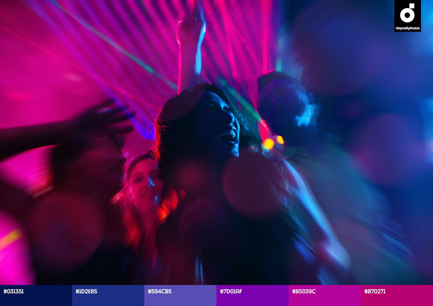
4. “Stop-Zemlia”
https://www.youtube.com/watch?v=Zunf1XQdNy4
This autobiographic movie by Kateryna Gornostai about first love and other teenage challenges received positive feedback both from critics and the audience, and won several awards including Crystal Bear at Berlinale. It’s interesting that the cast of the film are not professional actors, but ordinary Ukrainian teenagers. According to the author, she wanted to show that modern teenagers face the problem of living between real and virtual worlds. The film’s color palette also emphasizes this contrast. On one side, we see natural, low-key shades in the scenes showing school monotony: dull blue, red, green, brown, and gray. On the other side, there are neon colors of “nightlife”: orange, purple, green, pink, and blue.
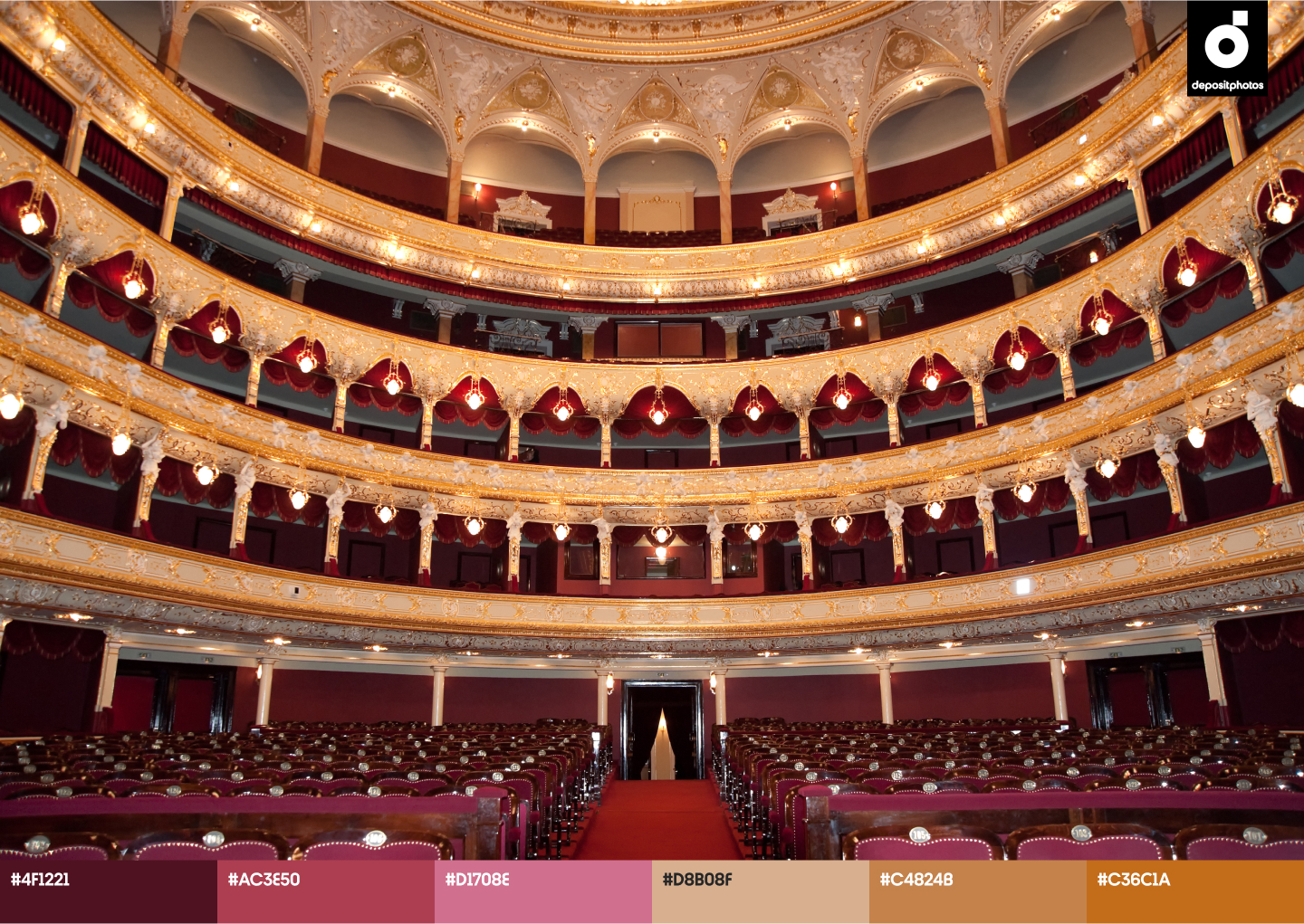
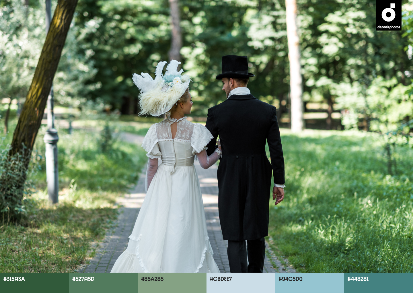
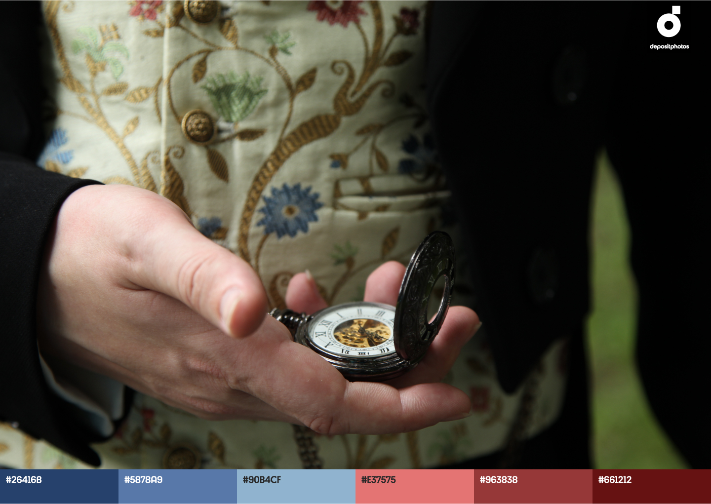
5. “Viddana”
“Viddana” – is a real aesthetic pleasure. This is the adaptation of the historical novel “Felix Austria”, and the story takes place in Ivano-Frankivsk (at that time – Stanislaviv) in the times of the Austro-Hungarian Empire. It’s worth mentioning the great work of wardrobe designers and set dressers that allowed us, the spectators, to get into the spirit of the age.
For the historical dramas, directors often opt for subduing color palettes to accentuate the atmosphere, but in “Viddana”, there are quite a lot of vivid colors. They can be seen in the dresses of female characters (blue, azure, red), as well as in the home interior (yellow, blue), and in the theater scene (burgundy, green, yellow). Moreover, here, the color is used as an artistic device to show the opposition between alive and dead. For example, in the scene where a black-and-white photo “comes to life” and begins to appear in color.
6. “Firecrosser”
The film revolves around the story of a Ukrainian military flying ace, who gets taken captive, becomes a prisoner at a Soviet concentration camp, and finally escapes to Canada where he becomes an Indian Chief. Despite the diversity of events, the film’s color palette is quite low-profile with prevailing gray, brown, yellow, and black shades. However, the color scale is warm, emphasizing the nostalgic mood of the story. While in dramatic scenes of warfare and air fights, the dominating colors are black and white. One of the few bright accents in the movie – spots of orange and red that symbolize danger (like explosions or fire).
Color is one of the most powerful expressive means in cinema. However, there is no single acceptable scheme as to how to use shades to achieve a certain effect. Through the example of the above-mentioned movies, we can see that even similar color palettes and color solutions can translate different moods. In professional filmmaking, the choice of color (or lack of it) always emphasizes an author’s idea and vision, and carries additional meanings and clues. No less important is color in design, as it affects the emotional response and associations of the audience. If you’d like to explore this topic in more detail, read our article on “What You Need to Know About Color Theory and Color Meanings in Design”.
You can find more ideas for design here:
Spring Color Trends 2022: Palettes, Collections, and Tips That Translate Freedom and Optimism


![Gradient Color Palettes for Your Next Design Project [Infographic]](https://depositphotos-blog.s3.eu-west-1.amazonaws.com/uploads/2019/08/Gradient-Color-Palettes-for-Your-Next-Design-Project-Infographic.webp)

