Fall Color Trends 2022: Palettes, Collections, and Mockups
New seasons encourage us to try new colors in design and communication. However, it’s important to know exactly what hues are in. For this reason, we’ve prepared the ultimate time-saver for your designs—our seasonal color trends guide.
To offer you the hottest colors of this fall, we did colossal research, which went far beyond search queries on Depositphotos: It covered all the key cultural, creative, and fashion-related events of the past months (including Fashion Week, the Biennale in Venice, Sundance, Cannes Lions, and more) and the newest trend studies by Pantone, 99designs, Google, and others.
We also looked through 30+ design magazines issued recently and explored 60+ social media accounts known for being visual trendsetters!
As a result, the Depositphotos color shortlist for fall 2022 includes 4 colors.
Scroll down to explore how to build a palette around them and what messages they carry. Large collections of photos, vectors, videos, and ready-to-use mockups—all at your service!
4 colors trending in autumn 2022. Let’s look at them closer!
In the fall of 2022, humanity will continue to gravitate toward nature.
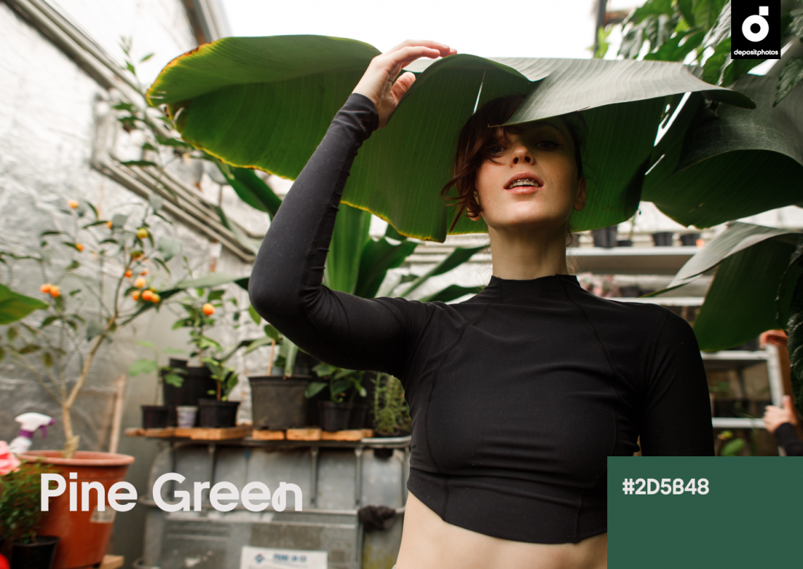
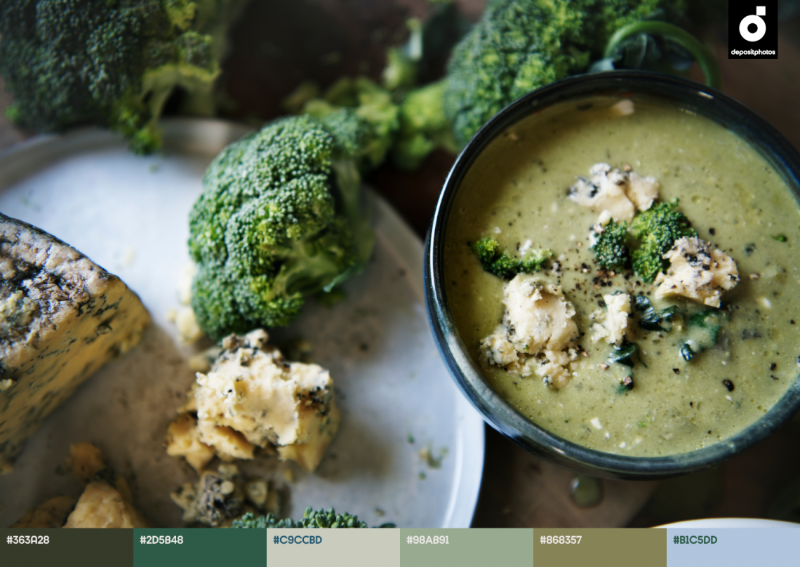
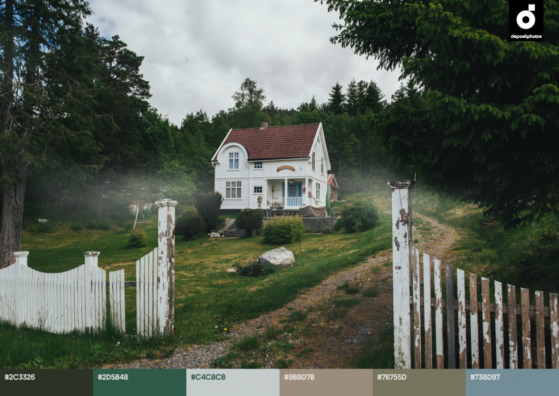
Shades of evergreen plants will now replace intense grassy hues that were trending in previous seasons. One of our newest shades—Pine Green—is dense and conveys calmness and confidence. It’s also a reference to the exquisite Ukiyo-e palette.
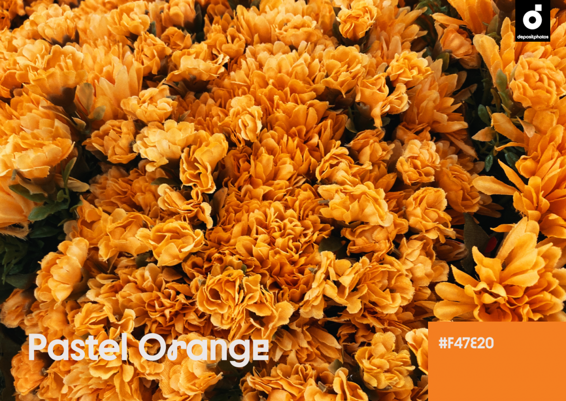
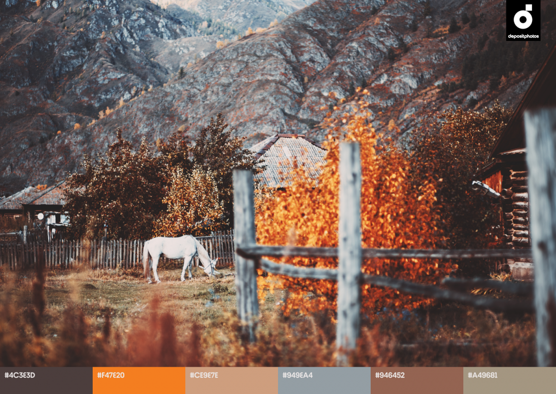
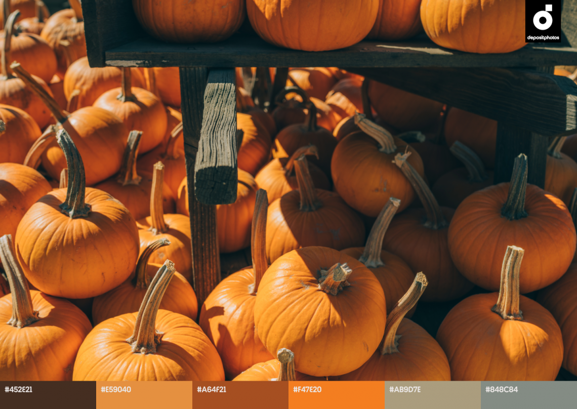
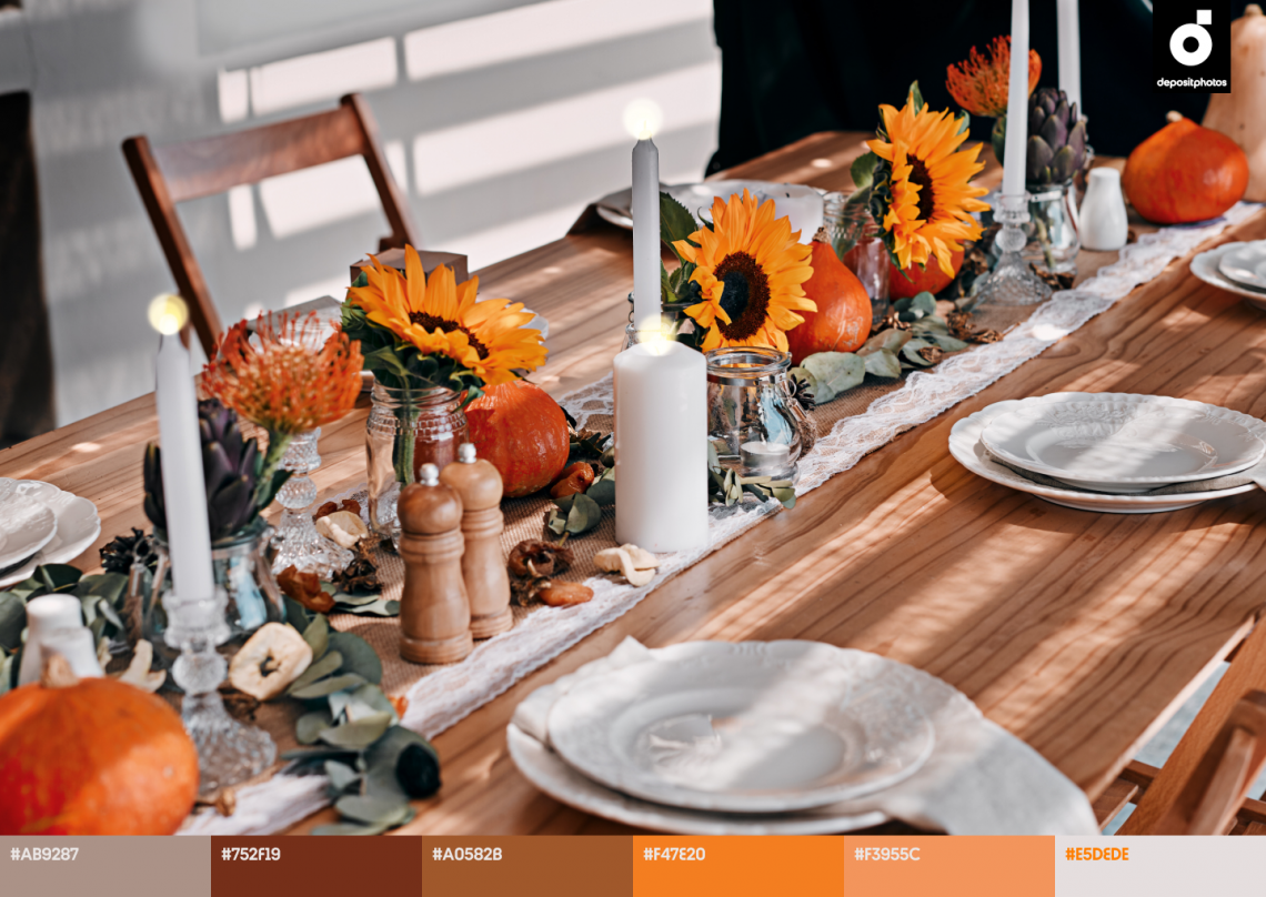
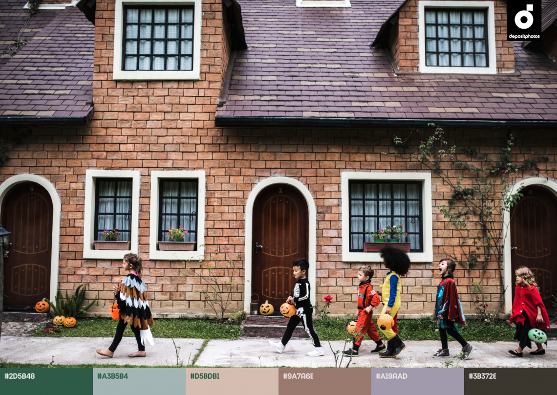
The tranquility of it is countered by a cheerful and energetic color—Pastel Orange. This season, designers and artists will favor its shade, which lies between the hues of gold autumn leaves and warm pumpkin pie. Be ready to spot this color in both fashion and interiors.
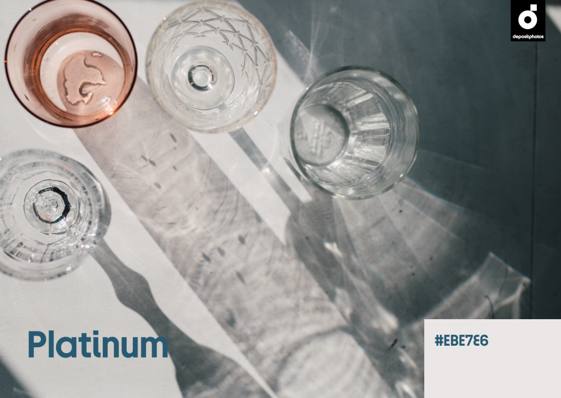
Our last two colors are an ode to digital progress. Platinum is a hue that inspires a future where machines take us to distant planets and perform routine operations.
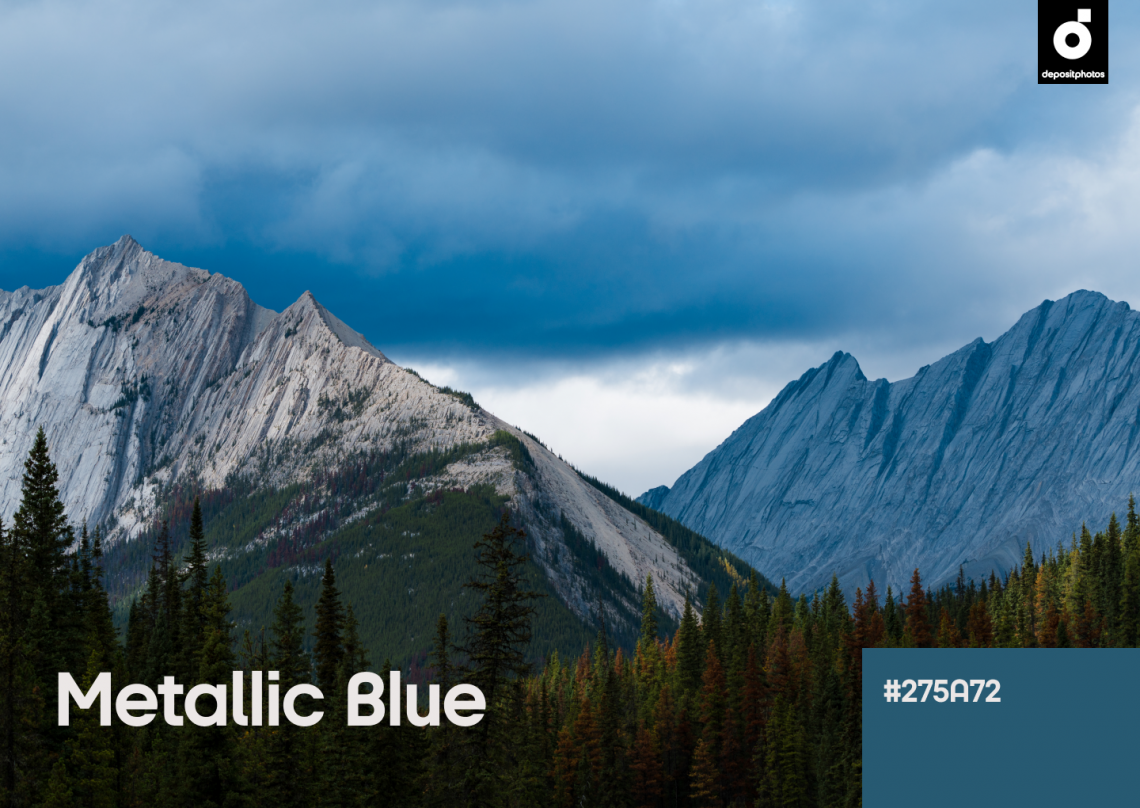
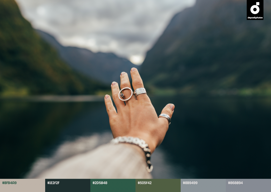
At the same time, the cool Metallic Blue looks stylish, glamorous—and more earthy. Being deep and thoughtful, this color is perfect for fall social media designs.
Fall color trends 2022 by names and HEX:
- Metallic Blue, #275A72
- Pastel Orange, #F47E20
- Pine Green, #2D5B48
- Platinum, #EBE7E6
Hidden color symbolism & Tips to use
Metallic Blue (#275A72)
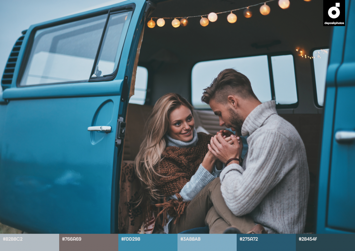
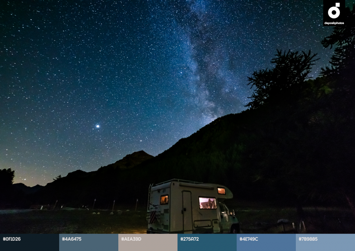
In the second half of 2022, we’ll see blue metallic everywhere: on posters for high-profile movies, in tech product design, interfaces, and fashion.
And it’s not only because blue is one of the most loved colors in the world. It is also the color of holiness, mystery, science, and the sky. And Blue Metallic, which is becoming relevant now, has an additional semantic load—It is the color of dreamy escapism.
Pastel Orange (#F47E20)
Pastel Orange is the perfect color to complement Metallic Blue. This year, it’s not as aggressive compared to previous years.
Pastel Orange can be spotted in mid-century Modern interiors, and it also dominates two of the most famous (and expensive!) paintings in human history—“The Scream” by Edvard Munch and “Las Meninas” by Diego Velázquez.
The color has a wide range of applications. In industrial design, it adds friendliness and appeal. And in interior design, it helps to create a chic, rustic vibe.
Pine Green (#2D5B48)
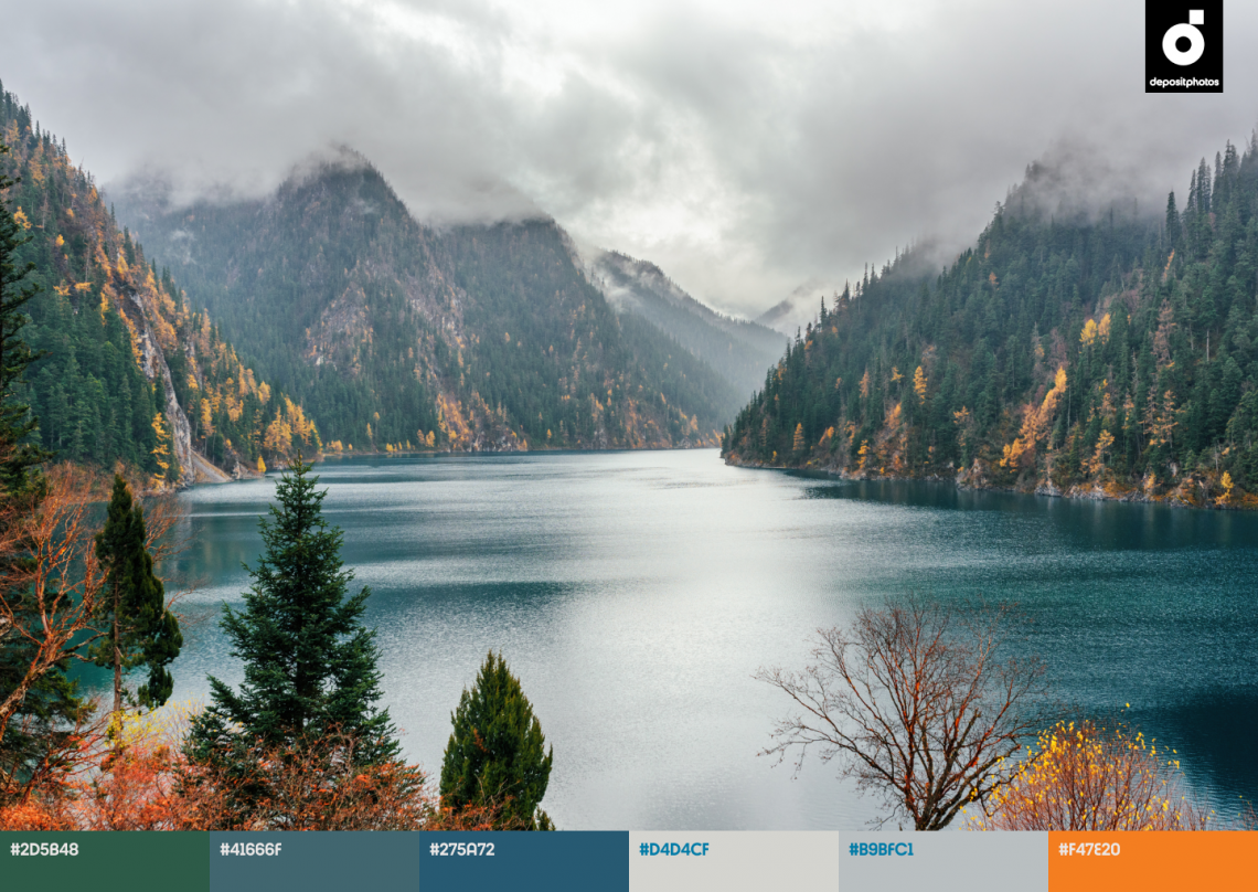
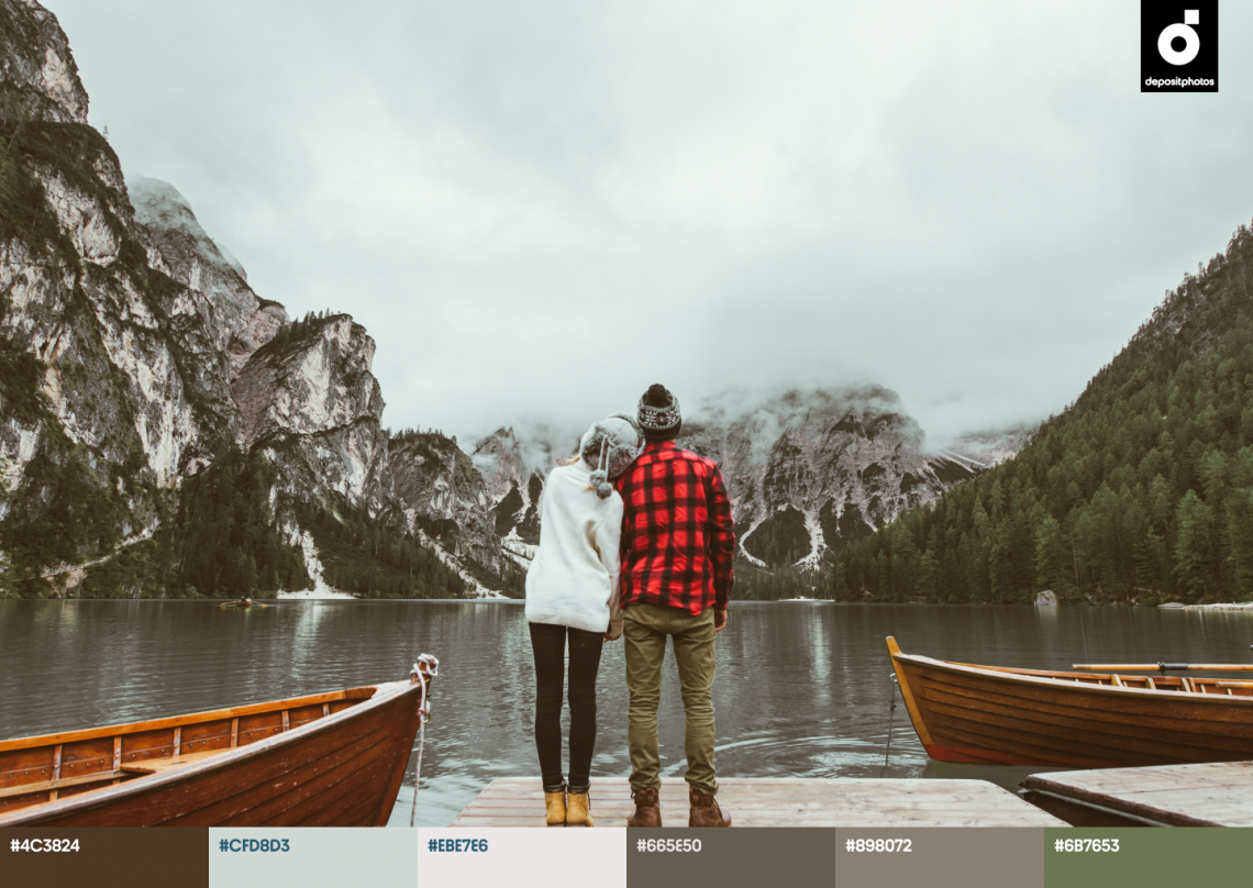
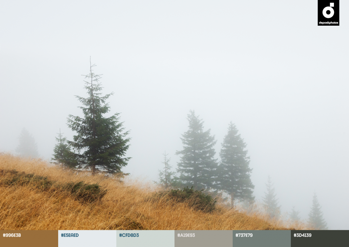
In autumn, nature’s hues start slowly losing their vibrancy. We start to appreciate houseplants for the comfort they bring, and are willing to pay for a mountain chalet with panoramic windows overlooking pines on mountain slopes.
In 2022, we will see Pine Green in store windows, movies, and art galleries. This color is calming and optimistic, so designers and artists will use it to overcome the stresses of 2022 and comfort their audience.
Platinum (#EBE7E6)
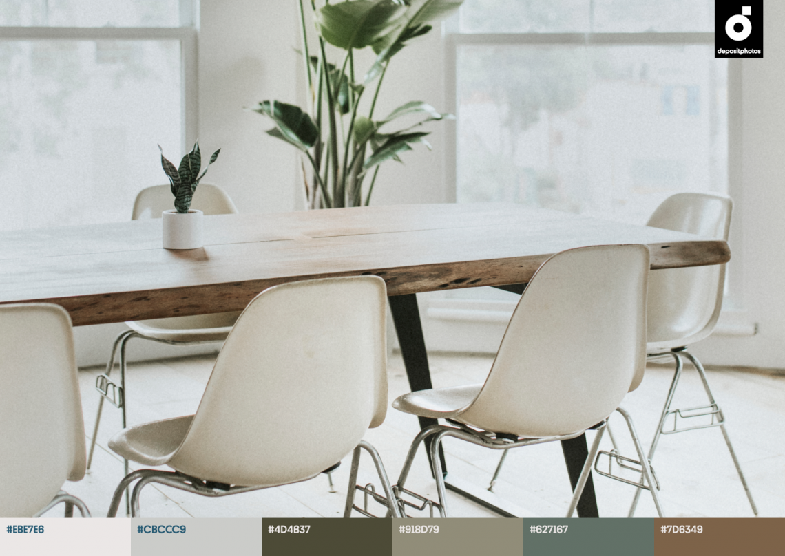
Noble and luxurious, the color Platinum is a brilliant solution for backgrounds. Platinum-colored photo backdrops highlight models and products. Platinum walls or columns in ancient temples create a more majestic feel compared to white. A platinum background also adds depth to your UI design.
We noticed the shade being used most in virtual designs (including those showcased on Awwwards), covers of new books and magazines, and tech products like personal gadgets or robotic assistants.
We highly recommend using Platinum for minimalist designs.
Fall color palettes for seasonal campaigns & Curated files to download
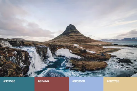
The 4 trending colors of this fall are just the beginning! Below, we’re offering a variety of palettes based on them, so you can start creating top-notch designs for your future creative campaigns immediately.
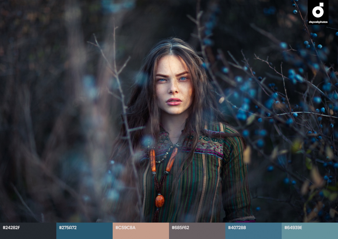
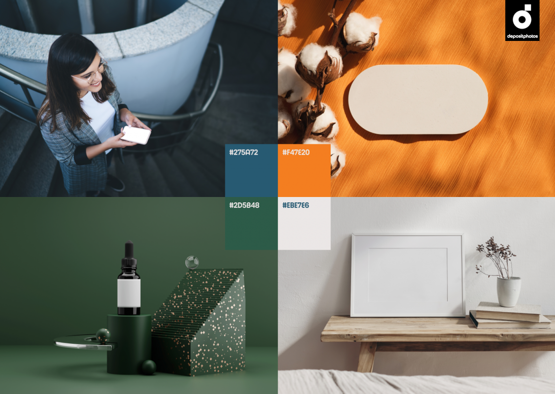
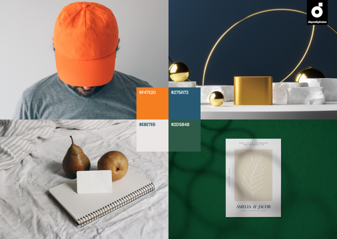
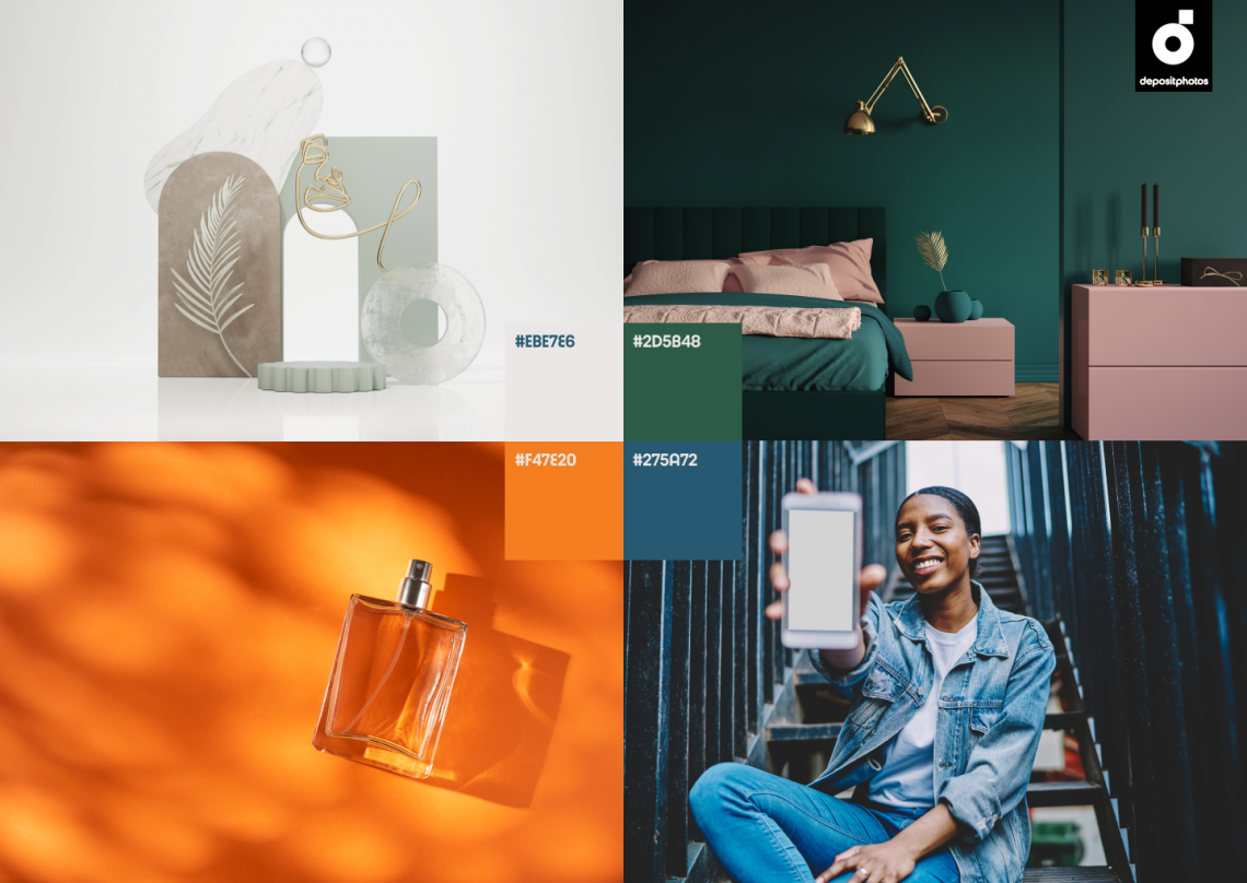
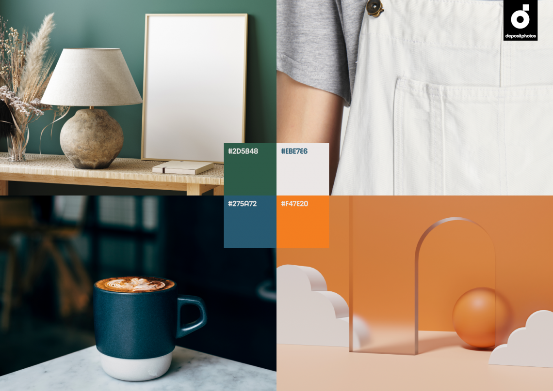
Remember successful combinations or use the suggested HEX codes to reproduce the palette precisely. Each image below can also be purchased for use in your social media posts, on your website, or in print.
The extensive collection of mockups in trending colors—Fall 2022
Mockups allow you to save time on nailing visuals for social networks, presentations, or booklets.
Enjoy a curated collection of mockups dominated by this fall’s trending colors: Metallic Blue, Pastel Orange, Pine Green, and Platinum. Simply download an image from our exclusive mockup collection and add your text or logo to it.
Together or individually—You decide!
Each of the 4 trending autumn colors can be the highlight of your seasonal designs.
Metallic Blue makes them dreamy and poetic, while Pastel Orange adds playful optimism. Pine Green strengthens the connection of your design with nature, and Platinum fills your image with confidence and luxury.
Building couples based on these color trends also brings results.
The most appealing are classic combinations made of blue and orange, as well as platinum and green. However, we encourage you to experiment. Use our tips and curated collections as a starting point, and build on that to find success in your creative work this fall.
Need more ideas for trending designs? Check out other articles:
Graphic Design Trends 2022 [Infographic]
Photography Trends on Social Media in 2022
Depositphotos Review 2022: Services, Pricing & Other Details

