Movie-Inspired Color Palettes for Ambient Design Projects
Color is one of the most important elements of every designer’s toolbox. It allows you to set a project’s mood, deliver a message, and influence people’s emotions, making your work memorable and relatable to them. Color is also used to create visual hierarchy, attract attention, and emphasize the meaning of your project.
Choosing from dozens of colors, tones, and shades, designers can create authentic and ambient projects on a regular basis. Popular movies and TV shows can serve as a source of inspiration and allow you to come up with well-tailored color palettes for your works.
To help you quickly find perfect color combinations, we’ve created movie-inspired palettes that you can use for your future design projects.
15 Movie-inspired color palettes for your inspiration
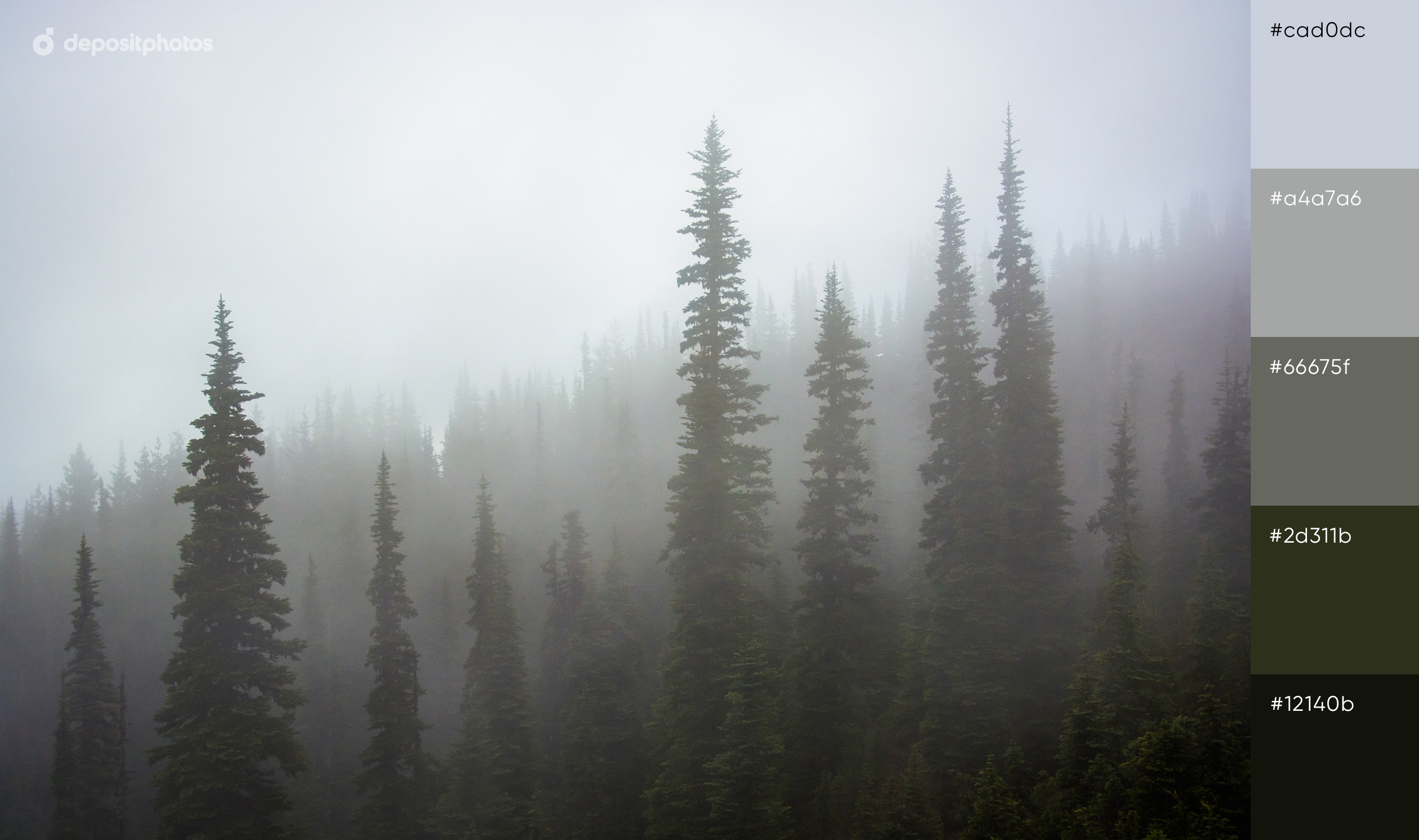
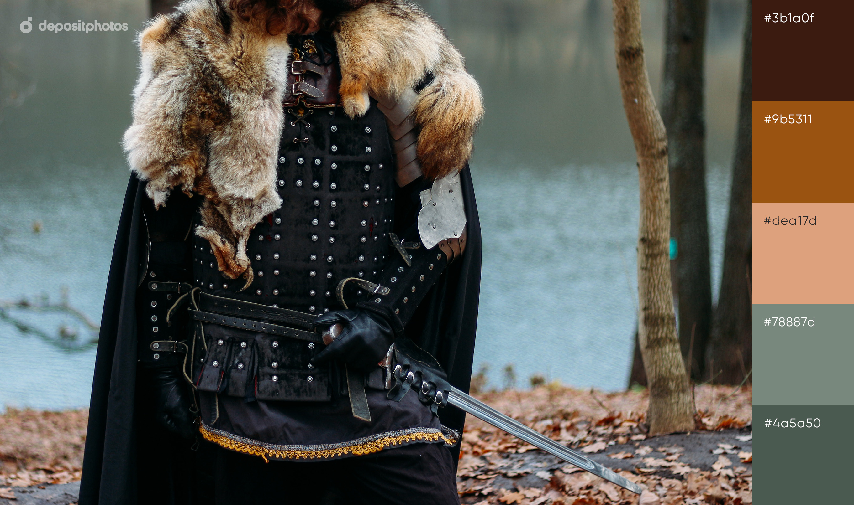
Twin Peaks
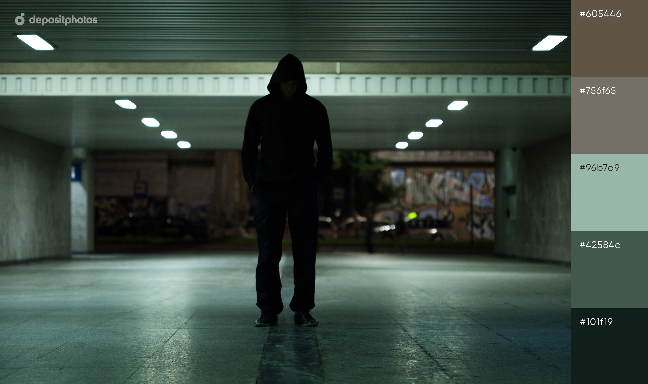
A color palette can tell a lot about your project based on the meaning that lies behind your choice. If you aim to translate the vibes of passion, danger, and adventure, you can use all the shades of red in your designs. To translate mystery, sophistication, or fear, black, brown, and other dark colors from the “Twin Peaks” color palette will perfectly fit your thematic campaign, ad, or social media post.
Colors to translate the aesthetics of “Twin Peaks”: black, cool brown, muted red, light grey, dark green.
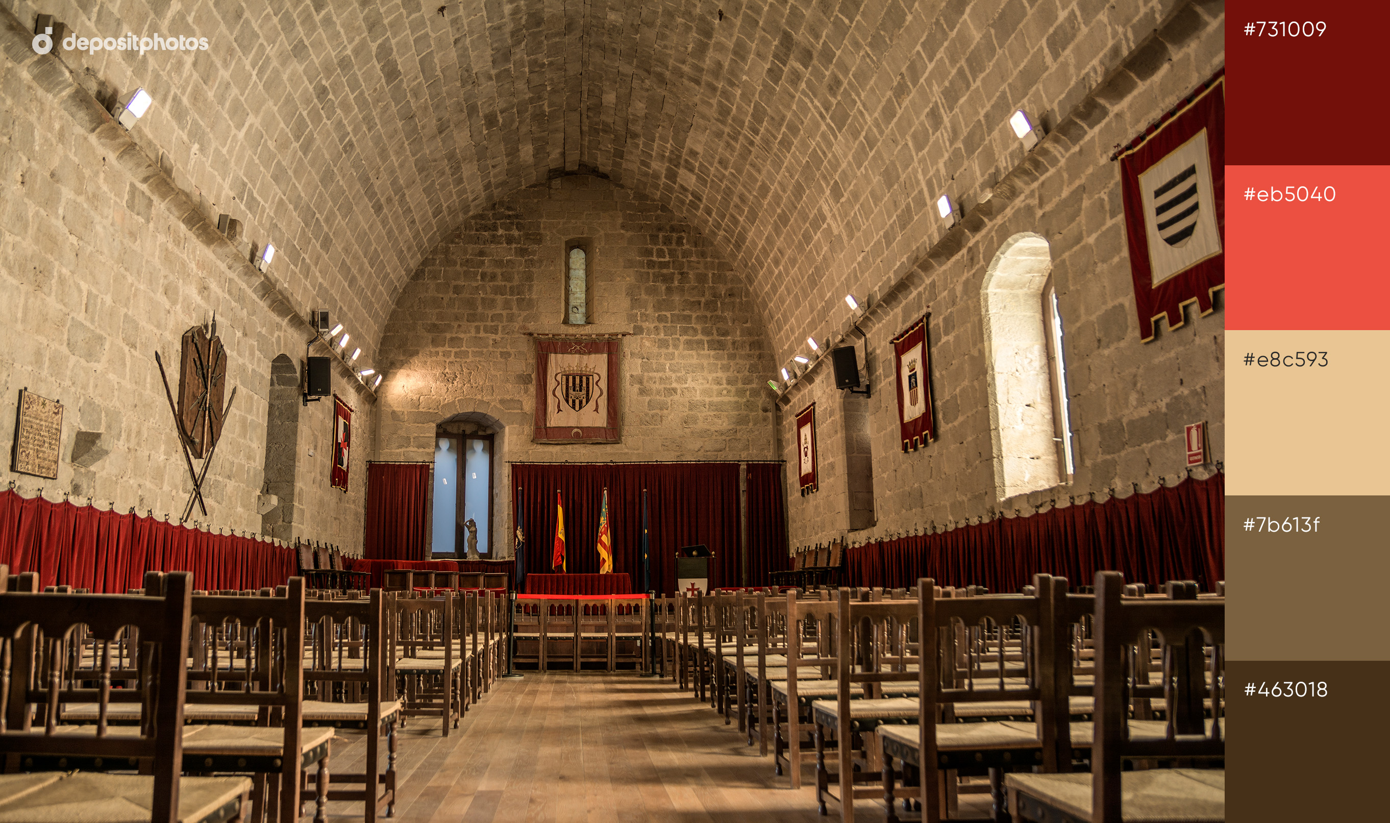
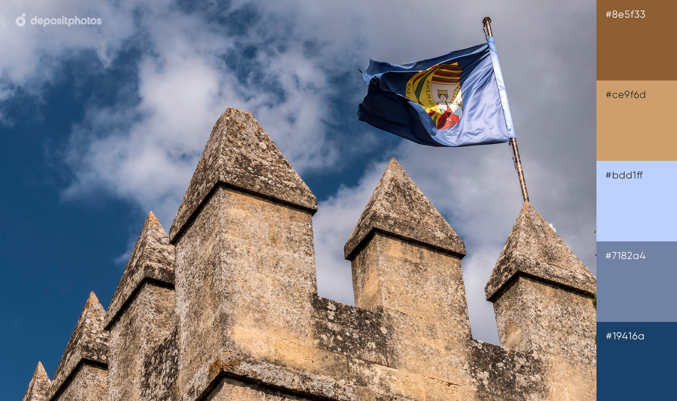
Game of Thrones
Although the color palette from the “Game of Thrones” TV show is also dark, it conveys a slightly different meaning to the audiences than the “Twin Peaks” one. The strong brown color that dominates most scenes of the TV show represents stability and reminds of the family roots, according to color theory.
Other colors like red, velvet, and emerald symbolize danger, blood, leadership, and anger that are perfect to narrate the rule of dynasties, conflicts, and power.
Colors to translate the aesthetics of “Game of Thrones”: strong brown, dark red, emerald, velvet, dark grey.
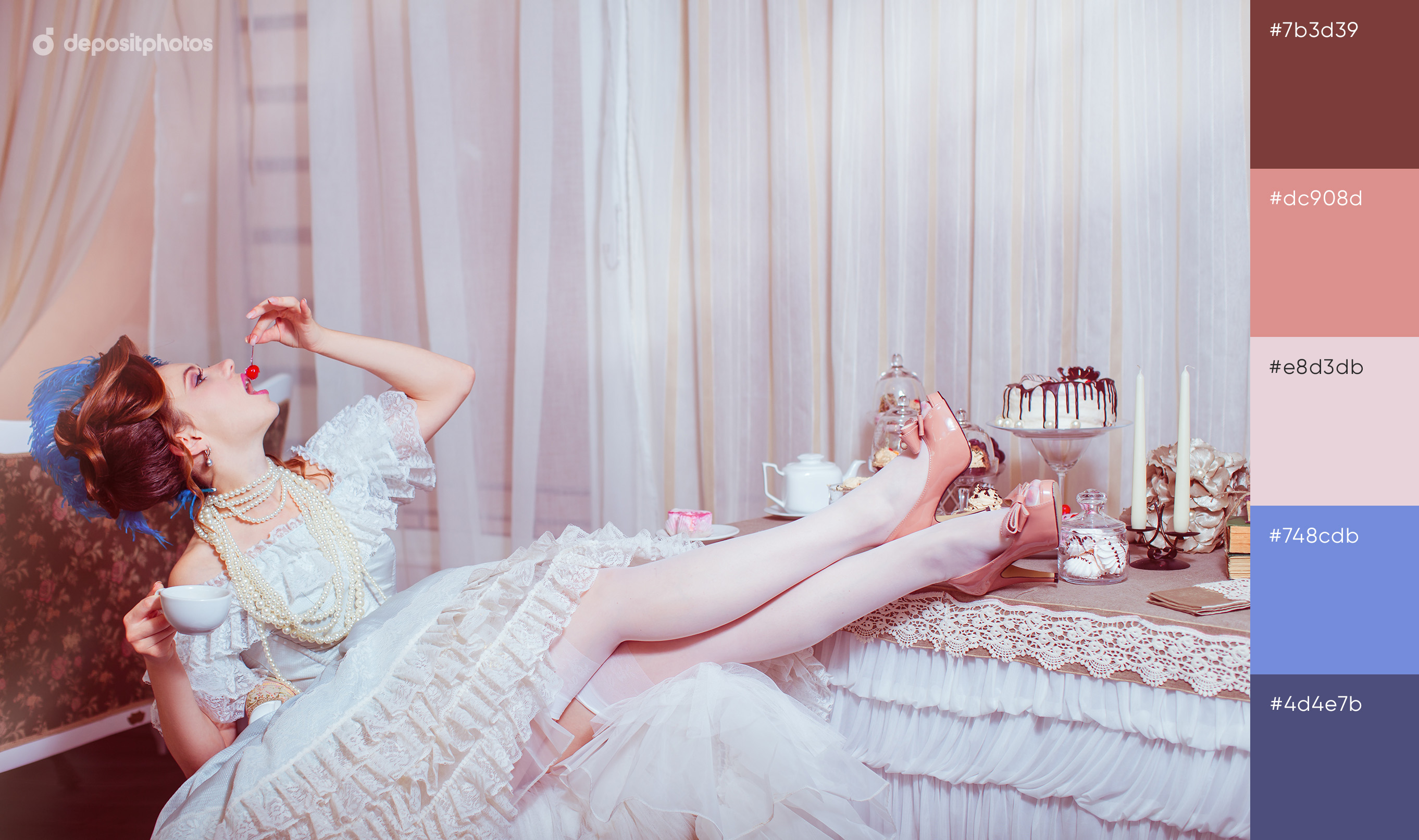
Marie Antoinette
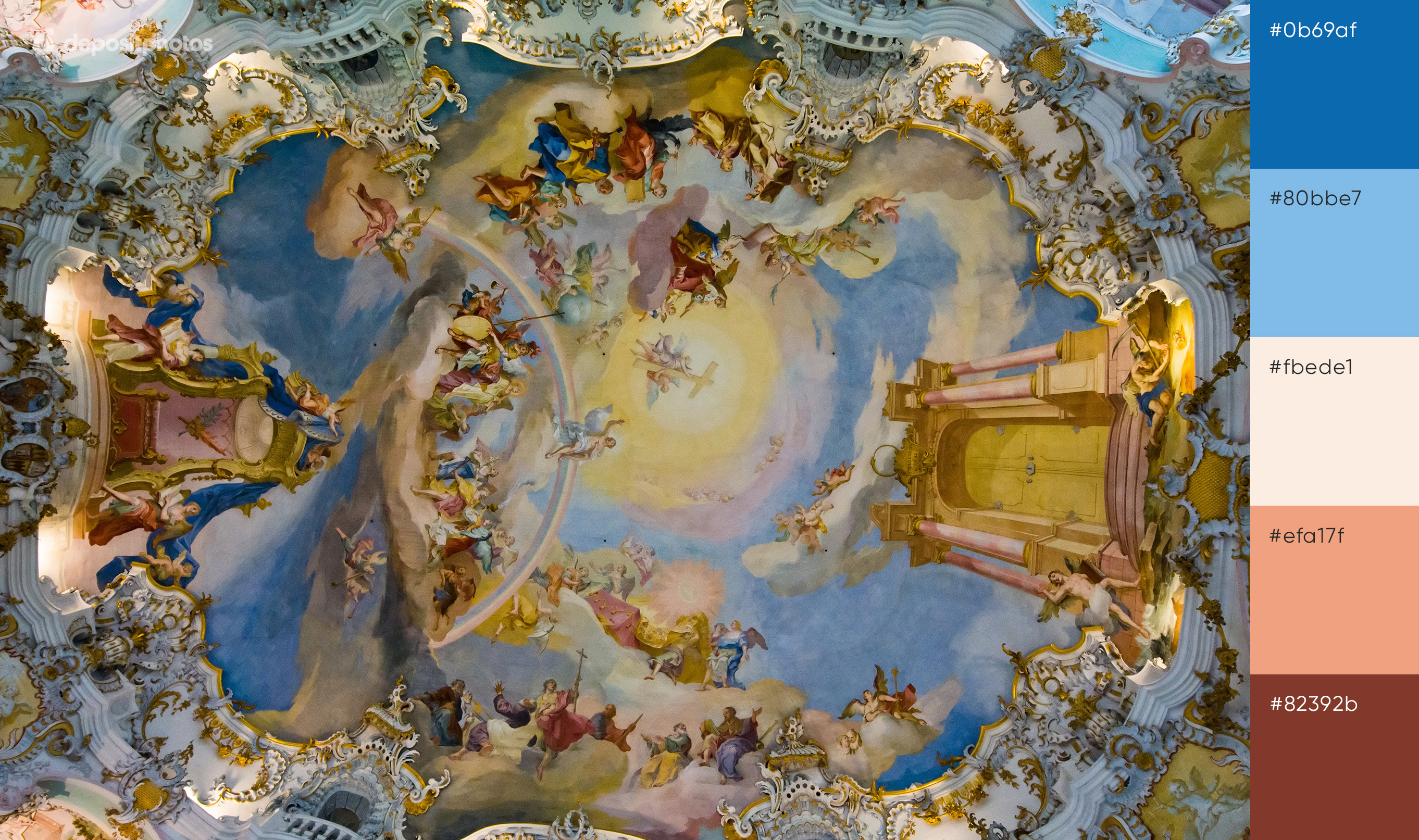
In juxtaposition to dark “Twin Peaks” and “Game of Thrones” color palettes come soothing solutions from Sofia Coppola’s movie “Marie Antoinette”. You can see a lot of pale pink that represents innocence and romance. It is also considered to be a color of femininity that is so relatable to young Marie Antoinette. Light blue stands for power and integrity, while white is the color of purity and softness.
A color palette from “Marie Antoinette” used in your design project can appeal to a younger audience like Gen Y.
Colors to translate the aesthetics of “Marie Antoinette”: pale pink, beige, light blue, milky white
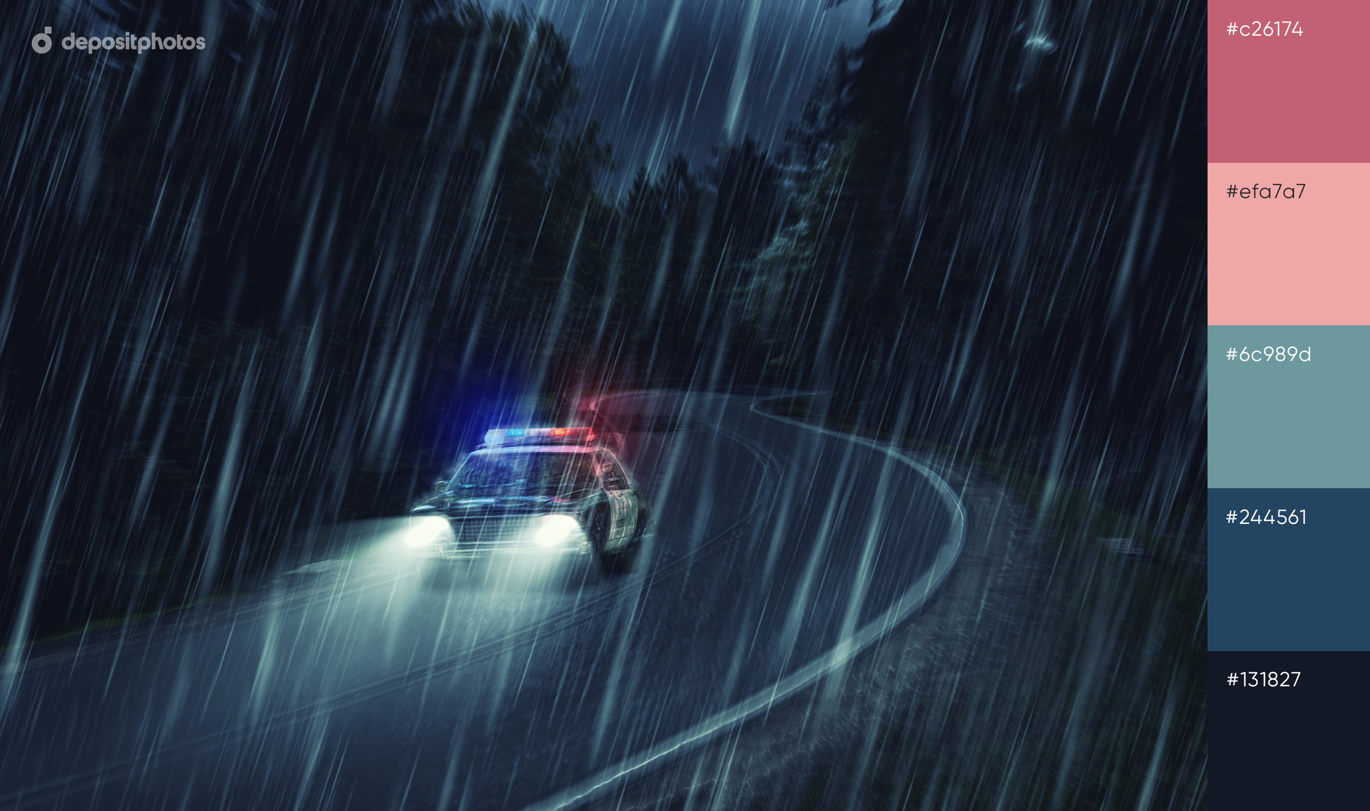
Moonlight
The color palette of the “Moonlight” movie mostly consists of black, blue, and purple colors. While black translates strengths and control, purple is more sentimental. It represents femininity, dignity, and ambition. Also, purple is a color of creativity and independence. It is a trendy choice for creatives that would like their projects to stand out.
In addition to black and purple, dark blue dominates in the movie’s color palette. It is associated with faith and confidence but also has a calming effect on the audience.
Colors to translate the aesthetics of “Moonlight”: dark blue, black, purple, emerald, cool brown
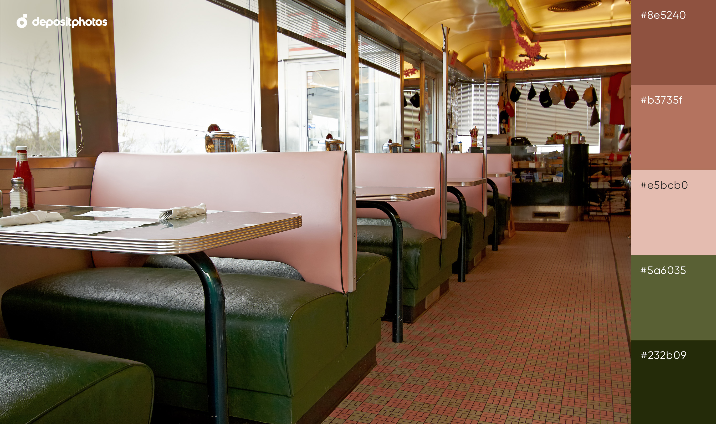
The Grand Budapest Hotel
Wes Anderson movies are full of color inspiration and “The Grand Budapest Hotel” is no exception. Its palette features pink and blue colors that are soothing and romantic. However, you can notice that the director is using yellow, orange, and warm colors alike as tools to translate nostalgic motifs in the dreamy framings.
While pink helps create a playful mood, orange and yellow are the colors of joy, fascination, and happiness. The colors from this palette match together well and allow you to set up a completely different mood with the muted palettes.
Colors to translate the aesthetics of “The Grand Budapest Hotel”: yellow, salmon pink, sky blue, warm orange
When you’re running out of time and have only a couple of hours to design a project, you can turn to these thematic movie-inspired color palettes for inspiration. Think of a meaning you’d like to translate. Based on it, choose a color palette that you believe would be the most fitting and effective in setting up the vibes and the mood for your designs.
Good luck!


![Gradient Color Palettes for Your Next Design Project [Infographic]](https://depositphotos-blog.s3.eu-west-1.amazonaws.com/uploads/2019/08/Gradient-Color-Palettes-for-Your-Next-Design-Project-Infographic.webp)

