Presentation Design Tips to Captivate Your Audience
When it comes to convincing your audience to invest in your business, become a customer or simply collaborate on a new project, presentation design is one of those things that can help you impress the audience and leave a long-lasting impression. The most important stages of presentation design are planning and preparation as you need to make sure all the elements and messages are relevant and justified.
A great responsibility also rests with the speaker, but for now, let’s take a look at the presentation design tips that will help you convince your audience to believe your words.

Start with the goal definition
Every presentation should have an aim. In most cases, it is about encouraging your audience to do something, starting from smaller goals like buying from you to the larger ones like investing in your business. Defining a presentation goal at the very beginning will help you better tailor your key message and come up with relevant presentation design.
A presentation goal will also guide you towards choosing the right presentation type. Maria Leonenko, a presentation specialist and art director, states that presentations can be divided:
- by purposes (to sell, to introduce, to educate, and to entertain)
- by audience (a client, a partner, an investor, and a viewer)
- by performance (business, fun, smart, and credible)
This typology is useful for any level of presentation, whether you plan to perform in front of hundreds of people or to share your plans for a month with a team of five.
Having decided with a goal, a message, and a presentation type, you should create a skeleton for your presentation using key storytelling techniques.
Stick to key storytelling techniques
A presentation is a story. But most importantly, it’s a story about your audience. How can you help them achieve their goal? How can the information be useful to them? What will they take away from all this?
For a successful presentation, you should keep in mind a very precise target audience for your presentation. You should know it’s pain points and offer solutions to problems based on insights about your audience.
Before creating a presentation in any kind of app, you should make a summary of it. All you need to do is to write down all the key points that you will later arrange in different slides. At this time, it’s very important to stick to storytelling techniques and follow the emotional arc of storytelling. In short, a basic presentation skeleton of the key points should look like this: despair -> hope -> despair -> hope.
For instance, if you were doing a presentation to introduce your new product to your potential investors, the structure would be the following:
- the problem statement (despair)
- the way it can be fixed with your new product (hope)
- another issue statement like not enough resources (despair)
- the bright future and finally problem solution if you get the resources (hope)
Such a structure is a great way to make your audience interested and ready to engage as you’ll share reasonable statements backed by actual solutions with your presentation.

One slide, one takeaway
As you’ll be writing down the key point of your presentation during the previous stage, you should also keep in mind the “One slide, one takeaway” rule. Sharing one important thought at a time will help your audience quicker digest your message and be less overwhelmed with information.
More visuals, less text
Text-heavy slides are the thing of a past so get rid of any information that does not complement or strengthen your message. You need your audience to be able to concentrate on the key points and any additional information that is written (not said) will look redundant.
Better advice is to have one thesis and one photo that perfectly go together. However, photos are not the only visuals you can include in your presentations. Stats, processes, timelines, and stages can be illustrated with the help of vectors that can be created by a designer for your presentation. If you don’t have a lot of time or need a quick solution, at Depositphotos we have a separate search category called “Vectors” that offers you thousands of high-quality images on various of topics that can be used as design elements.
Here’s a short example of how you can use vectors for better presentation design. Instead of writing the word “Facebook” in the last slide, you can simply add a clickable icon for aesthetic and readability purposes.
Don’t forget to make accents
Even if you’re not a designer by profession, it’s worth sorting out graphic design basics before moving further with your presentation. Learning principles such as alignment, visual hierarchy, and balance will give you an opportunity to impress your audience from the very first slides. Precisely, these design principles are used to justify your decisions, give a particular level of importance to different objects or points, and appeal to your audience in the most effective way.
Learn more about the fundamental design principles and elements in this crash course.

Carefully choose colors for your presentation design
It comes as no surprise that color choices play a crucial role in design. With tones, hues, and shades you can set a particular mood, create balance, and strengthen your message. You can also add consistency to your slides by sticking to two or three colors throughout the entire presentation.
If you have not decided on your brand colors yet or would like to experiment, you can turn to color theory for better choices. But you should also remember that the same color appeals to different people in different ways. Thus, before making final decisions, learn a little bit more about your target audience and the graphic design trends of this year to settle on a stylistic.
The choice of fonts is also important
As we’ve already said, learning design basics is important even if you’re creating a short presentation for your team. This knowledge will allow you to highlight your message but also to avoid common mistakes that only beginners make.
Using too many typefaces and mismatching fonts at the same time is one of these mistakes. Your audience is pushed away because of the chaos they see. They don’t want to waste their energy on reading and understanding messy designs, particularly when the font choice is not justified. Avoid lengthy paragraphs in your presentation at all costs.
It is also worth being careful with typefaces and fonts during presentation design for aesthetic purposes. The slides you share will speak on behalf of your brand and it’s more than likely that you don’t want to make a negative first impression.
In general, it’s good to stick to no more than three different fonts within one presentation and opt for minimalist ones that are legible for everyone.
10 cool presentation design examples
As we’re talking about presentation design here, we also stick to the “show, don’t tell” rule. We’d like to share with you a dozen interesting presentation designs that would inspire you to devote more effort to designing your slides but also to inspire you with your designs. Some of them are ready-to-use templates that you can download and use for your projects.
Orches Presentation
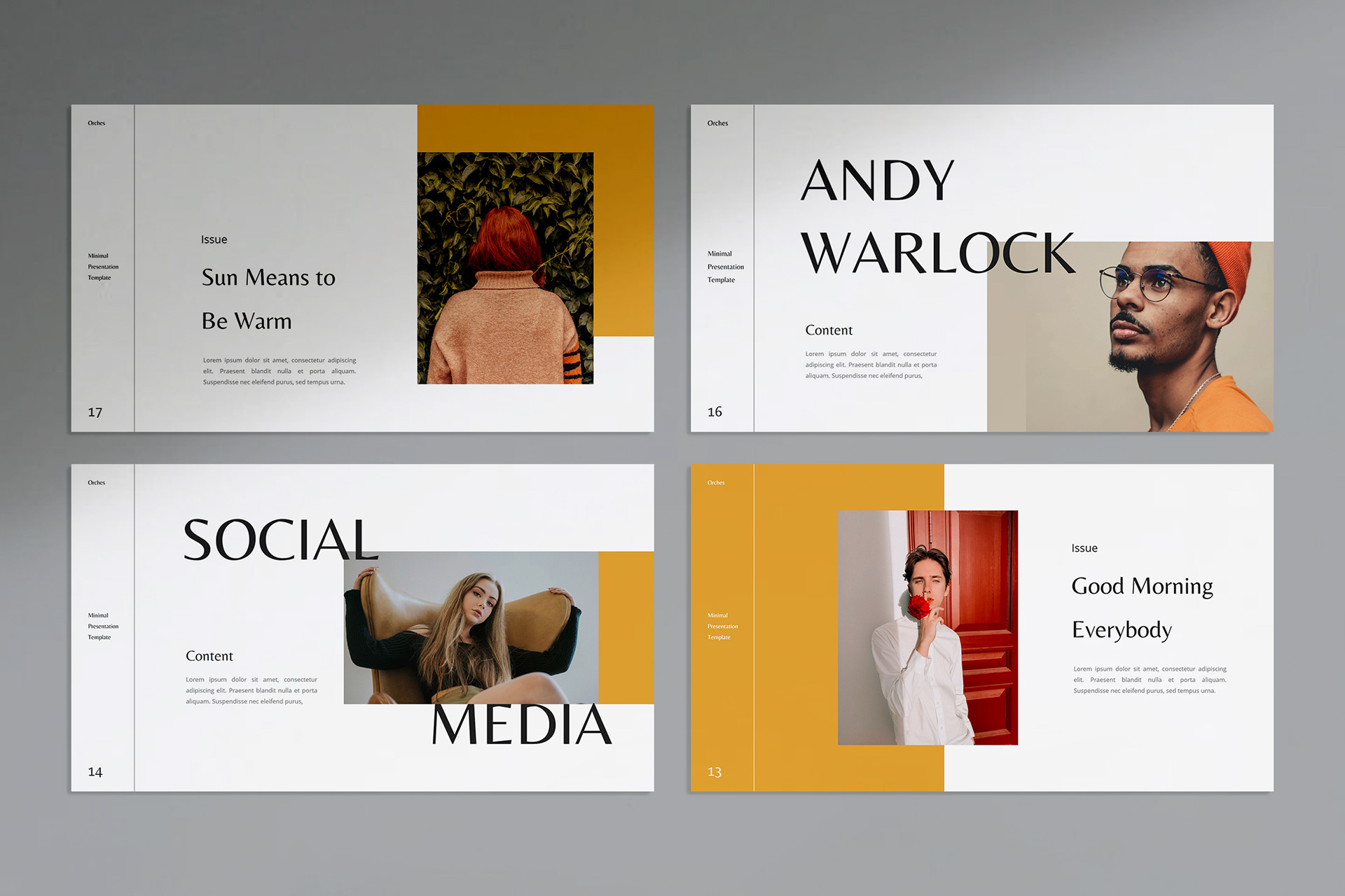
Source: Behance
Brand Template
Source: Behance
VAGABOND
Source: Behance
Odyssey Magazine

Source: Behance
Color Presentation
Source: Behance
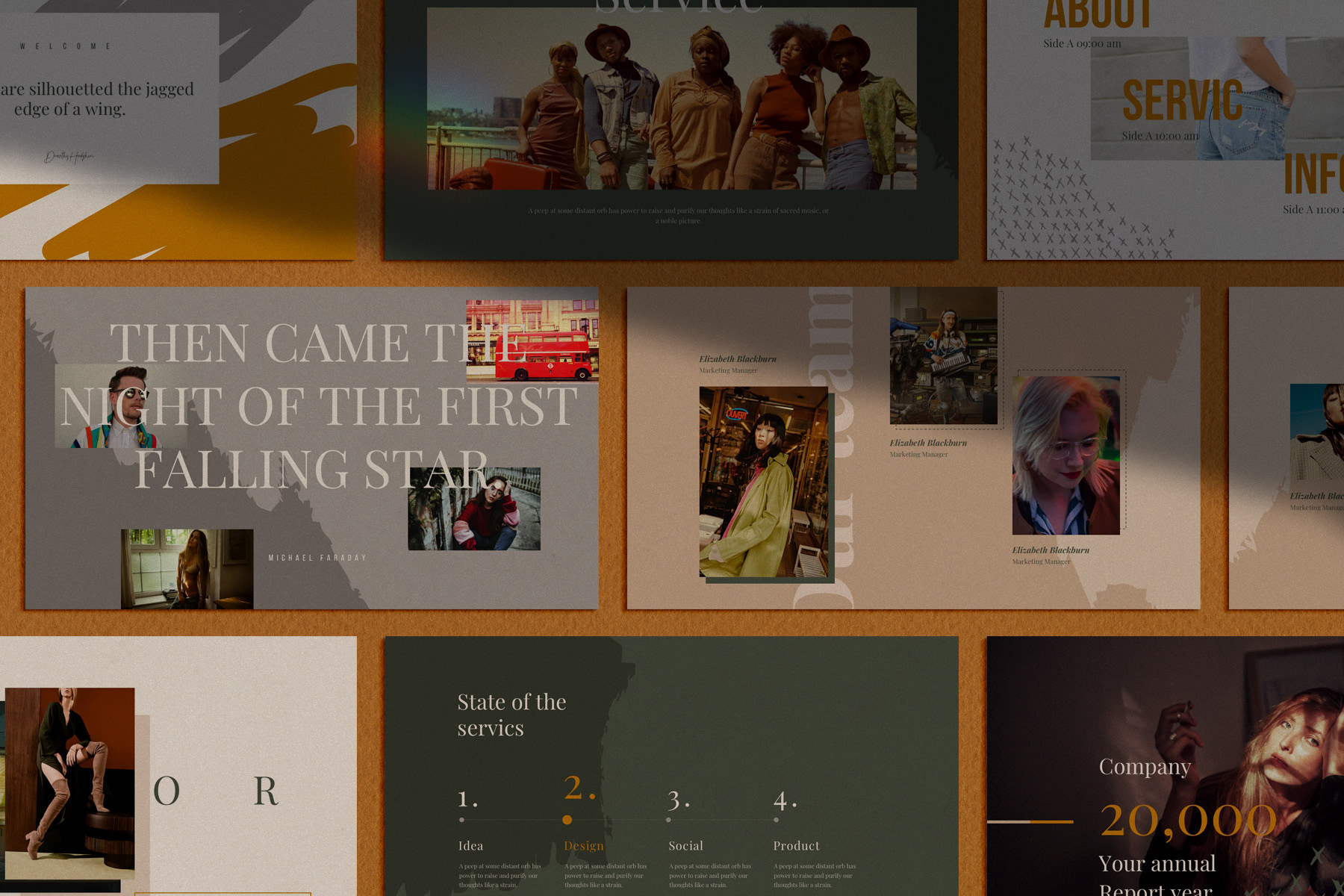
Giant Leap
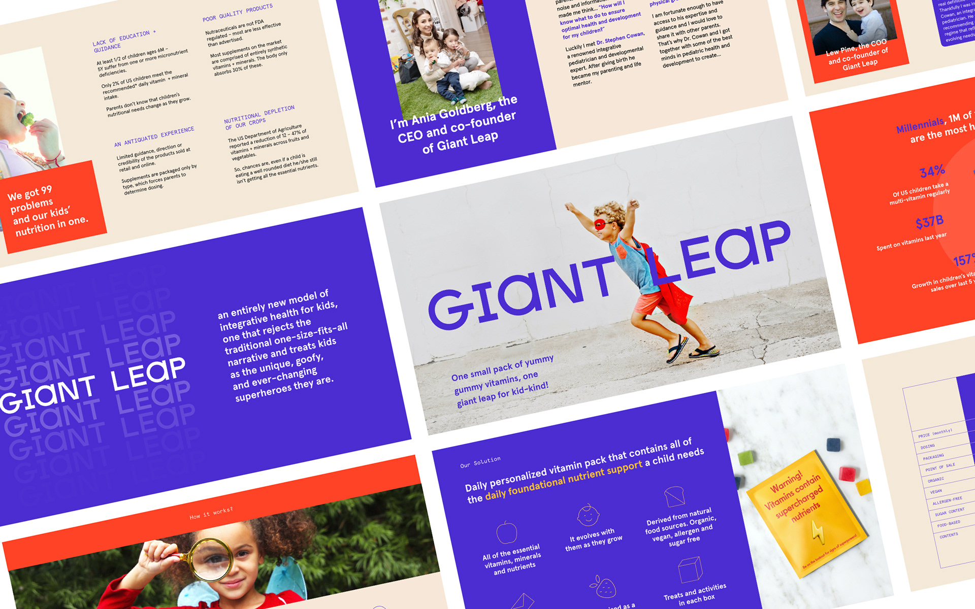
Source: Behance
Dopeline Keynote
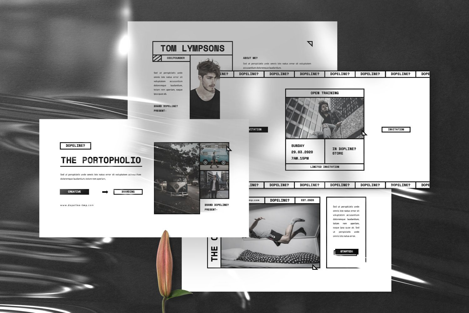
Source: Behance
Point Presentation Template
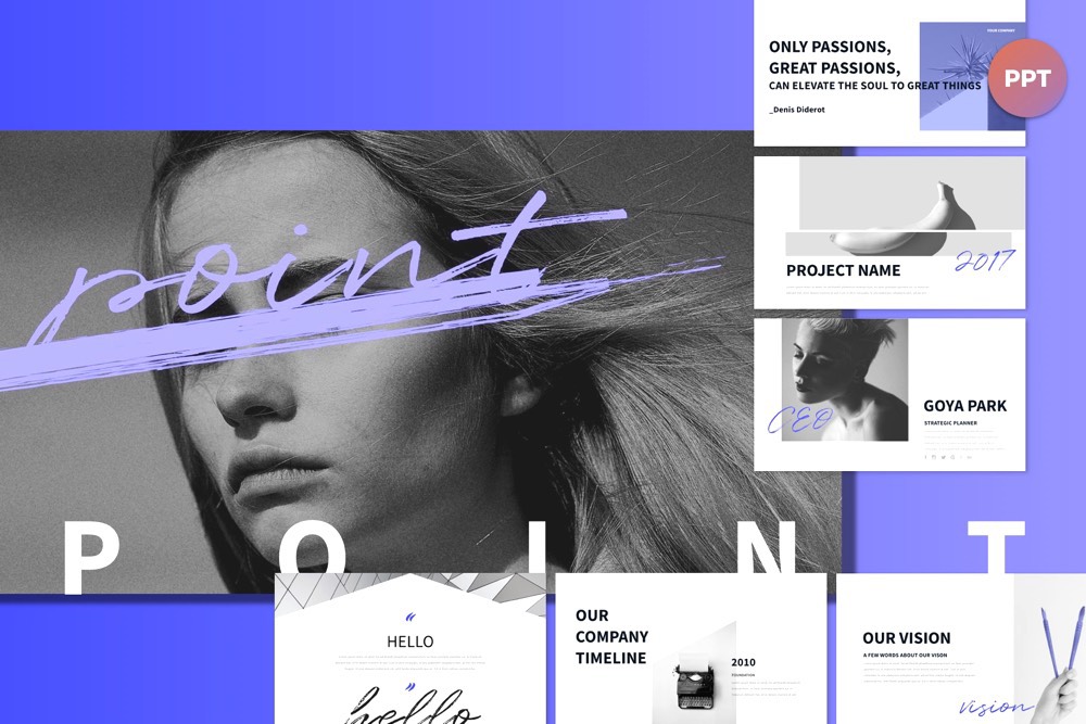
Source: Behance
Hindia
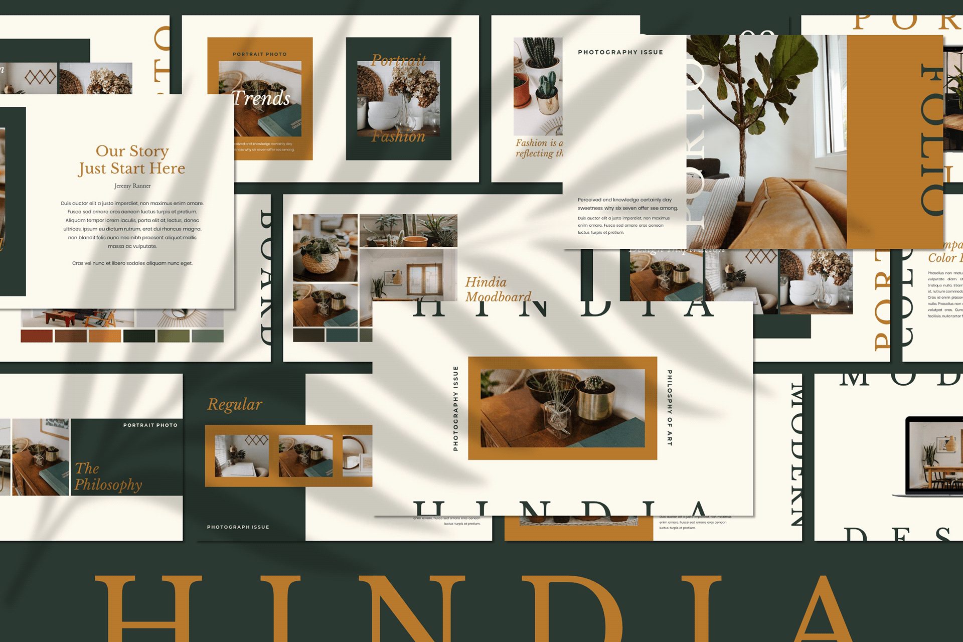
Source: Behance
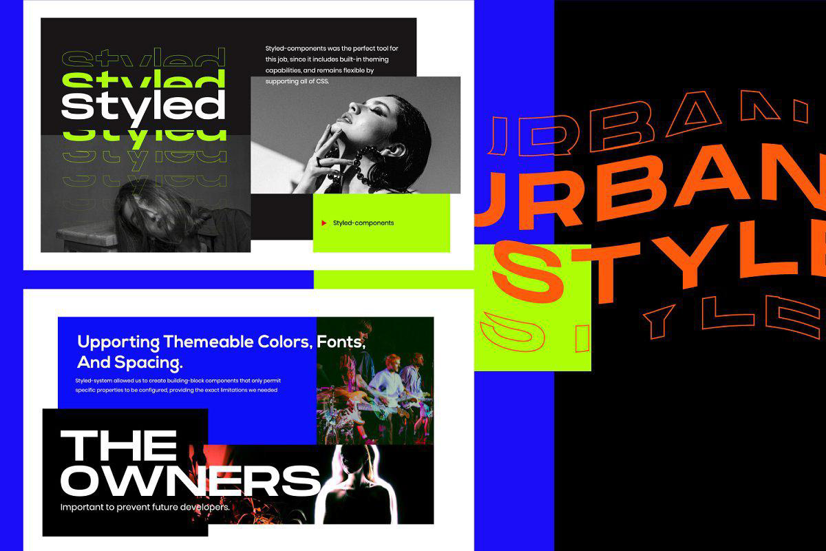
HYPESTYLE

Source: Behance
Don’t underestimate the power of presentation design. Indeed, it is among the things that help brands and individuals build a positive image, achieve solid goals with presentations, and make bold statements about themselves. Try not to rush with your presentation design and you’ll see that the time you spent choosing fonts, visuals, and tailoring messages will pay you off as a result.