15 Eye-catching Urban Posters and More Tips on Design
It is surprising how much inspiration can be disguised in a small design piece like a poster. For hundreds of years, a poster served as an important form of communication and was used to spread information and deliver messages to people.
With the advent of radio, television, and later with the beginning of the digital era, the popularity of printed posters has decreased. Nowadays, they are mostly used to advertise events and, less often, as a cultural or artistic manifestation hanging on the wall.
However, posters are still more fascinating and captivating for the contemporary audience than you might think. They look old-school, charming, and easily draw the attention of people overwhelmed with typical digital noise.
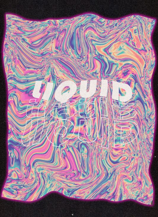
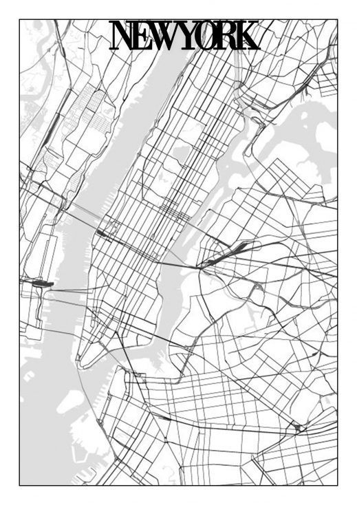
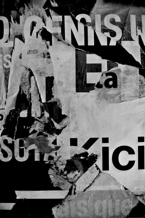
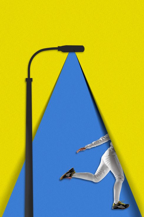
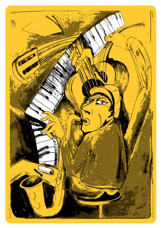
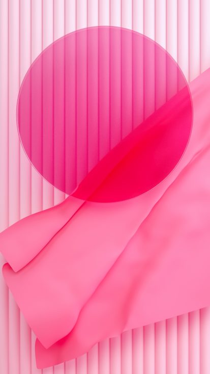
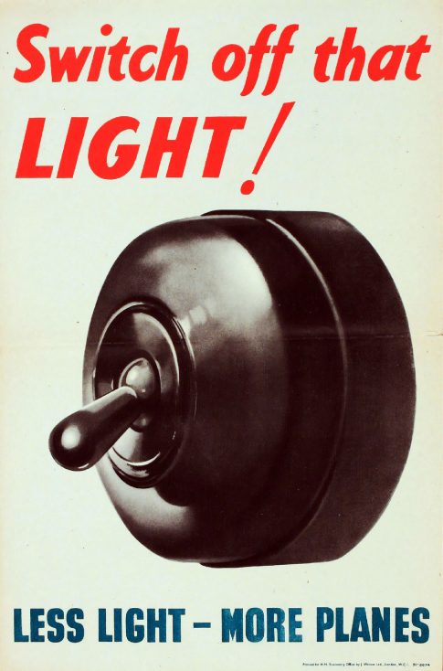
Explore these urban posters created by the Depositphotos talented contributors to get inspiration for your future designs and to find the motivation to experiment with print in 2020.
How to stay on top of graphic design trends with urban posters
Play with visual perception
Whether you’re working on a website, an infographic, or a poster design, try to push your artistic boundaries further and toy with the visual perception of your audience. As people have an extremely short attention span today, your aim as a designer becomes more complex than just delivering a message.
First, you should make your audience notice your artwork because it stands out. Get them interested enough to explore the intricacies (or simplicity) in your design to finally draw their attention to the text or message. Or alternatively, have your design be the starting point of a conversation for the sake of art.
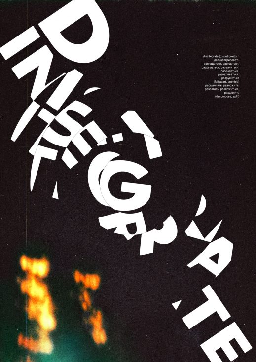
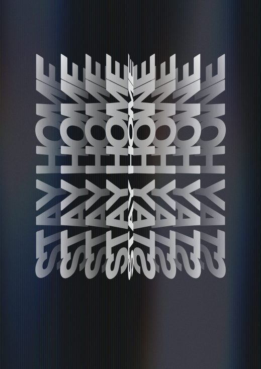
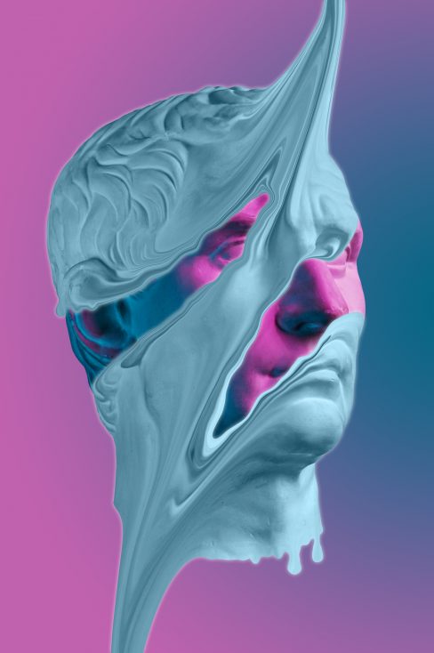
These goals can be achieved by appealing to your audience with unusual designs. You can come up with an unconventional composition that breaks basic design rules and use distorted type to add sophistication to your project. In general, any trick that allows you to play with your audience’s optical perception can make your design memorable. However, to break rules creatively, you need to learn the fundamentals.
Use bold typefaces
Bold typefaces have been popular for a couple of years already and this trend is not going anywhere. Designers continue to experiment with massive, brutal, and daring fonts and the audience seems to like it.
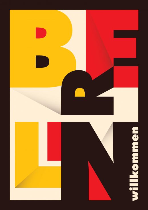
Although integrating this 2020 trend into old-school posters can be a tough task, the results will pay off. Just have a look at the Bauhaus-inspired poster below and imagine how they would look like hanging on your wall.
The bright and bold letters will definitely stand out with the grey concrete walls of a building as a background and make all the passers-by stop to observe. Or give your posters a contemporary touch! This could be something basic as a QR-code leading to the landing page of your event. But if you have more time and other resources at hand, you can provide your audience with more complex and interactive user experience. For example, you can create an augmented reality poster.
Pay tribute to the Bauhaus stylistic
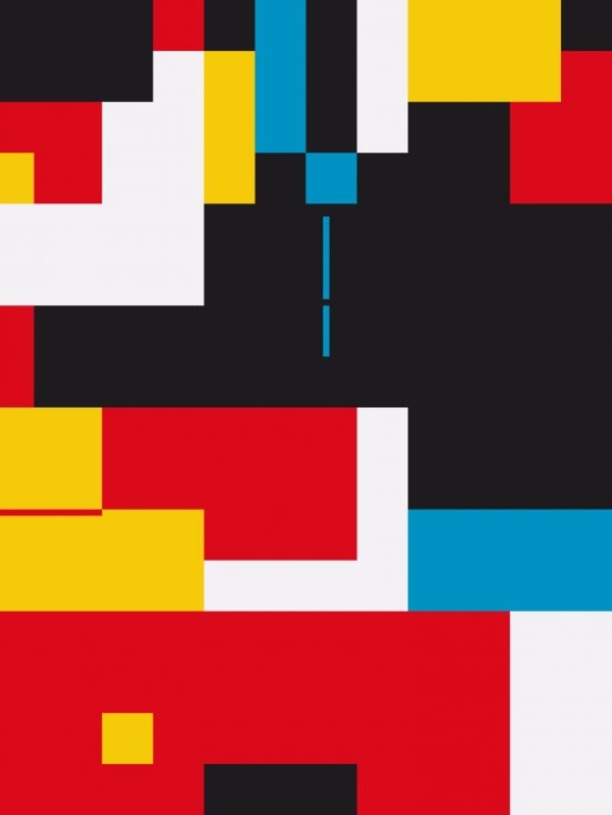
Last year, Bauhaus celebrated its 100th anniversary and the event sparked a great interest in the movement. With the abundance of information and events out there, the motto ‘less is more’ turned out to be relatable for designers and their audiences in 2019 and 2020. The idea to use a few colors, basic shapes, and narrowing in on the basic function of design helped professionals re-establish a nostalgia for Bauhaus inspired designs.
If you’re looking to design urban posters in a particular stylistic, explore the legacy of Bauhaus for inspiration. Think of design utility, deliver one message at a time, and, most importantly, make sure your poster translates the aesthetics or style you’re referencing.
Mixed media
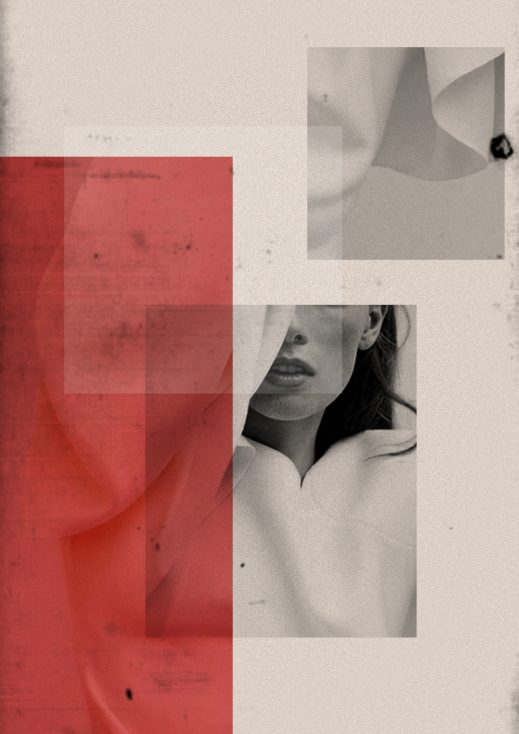
By-the-book designs don’t surprise anyone nowadays. They are easy to simply pass by without noticing. . However, designers that manage to think outside the box and experiment with different forms of media evoke curiosity from the public.
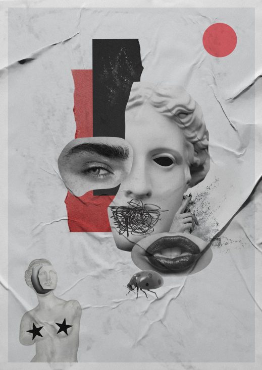
Not every designer is great at creating projects with XR elements but you can mix the media in a simpler way as well. For instance, a Polish graphic designer, Beata Śliwińska, has a passion for both contemporary technology and handmade art. She works with digital and analogue techniques at the same time. For her, paper collages are only the starting point. After coming up with a handmade draft, Beata digitalizes it and continues working on her project digitally.
Such an approach and interest in mixing different media paved Beata’s way to becoming an Instagram influencer and collaborating with world-leading brands like Spotify, Vogue, and Adidas.
Draw inspiration from the cyberpunk aesthetic
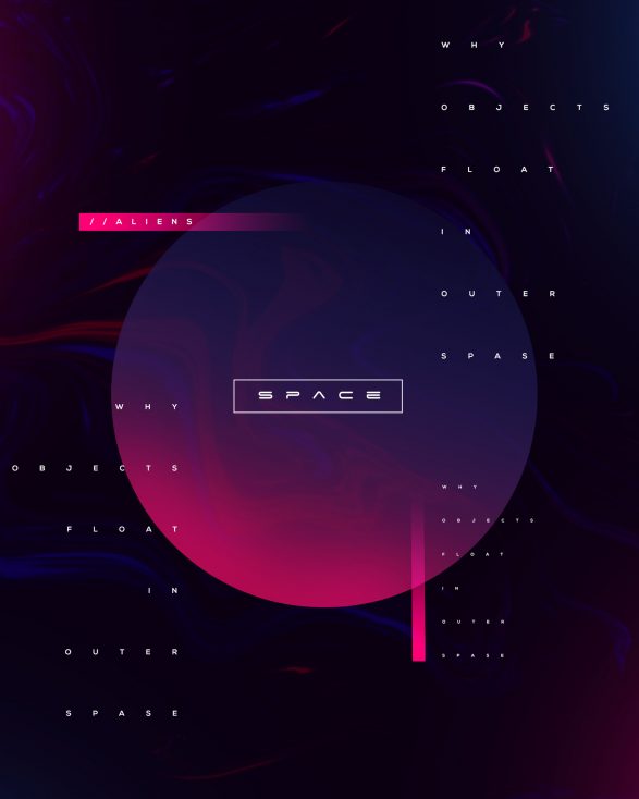
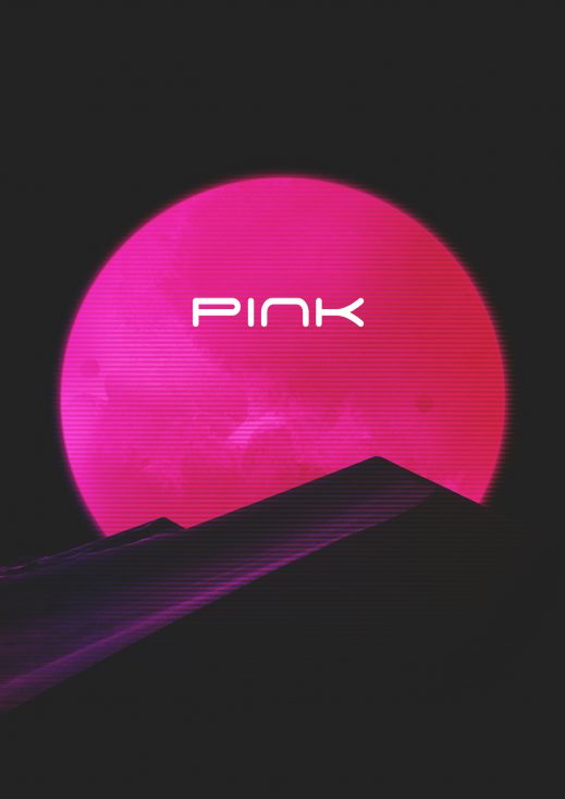
Although the release of the game “Cyberpunk 2077” was postponed a couple of times already, the dystopian aesthetic keeps thriving on the internet. It gives a glimpse into the possible future through creative means of illustrating it and in terms of poster design, gives works an ultra-contemporary look.
When working with the cyberpunk aesthetic it’s all about the colors and shapes particular. According to the book “Cyberpunk and Visual Culture”, the main attributes of the stylistic are geometric shapes like triangles, as well as dark and neon colors.
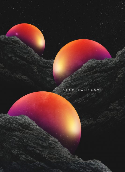
Inject your designs with futuristic motifs and find trendy solutions for an audience that craves it. Wherever you choose to display your poster, know that it’ll be an attention grabber both in digital and print.
15 urban posters for your design inspiration
Although creating urban posters might seem too old-school for you, experimenting with design might turn out to be very exciting. Step away from designs ‘by the book’ and use contemporary and trendy design solutions to get your audience to appreciate a new spin on old tricks.
Find more design inspiration in these articles:
— Inspiration for Swiss Style Poster Design
— Brutalist Website Design Inspiration for Your Upcoming Projects
