7 Do’s and Don’ts of Presentation Design
Everyone has sat through at least one bad presentation with too much information, clashing colors and awkward images. Although the mistakes are easy to spot, they’re also really easy to commit. Today’s article is a brief tutorial to help you elevate your presentation design.
One of the first things you have to prioritize when creating a presentation is aesthetics but also being considerate of your audience’s attention span. An engaging, simple but tasteful presentation can help you keep your audience at the edge of their seats.
Put yourself in the shoes of the audience. What can you do differently to ensure they pay attention? The answer is to never over think and overdesign, but rather to simplify. Keeping your information concise and your design effortless is a sure way to deliver a presentation everyone will remember.
1. Cover slide
Don’t dismiss aesthetics
Using too many images to try to capture your presentation is a big misstep. The cover slide of your presentation can result in disinterest from your audience.
Extra tip: The random order of images gives the cover slide a tacky quality. Using Comic Sans is another graphic design disaster.

Do start with a positive vibe
Use one powerful image to introduce your presentation. The cover slide sets the tone for your presentation and should be done tastefully, with simplicity in mind.
Extra tip: Keep it minimal and light. Choose an image that loosely relates to your topic so that you can make your audience think when they connect the title to your featured image.

2. Colors and background images
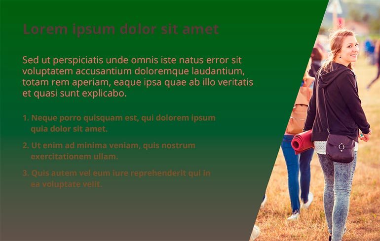
Don’t overwhelm with too many colors
The most common mistake is to use background colors and font colors that don’t compliment each other. Notice how the hue of the green is interrupting the readability of the text and how unnatural it looks when paired with the image on the right.
Extra tip: Do not overdesign your presentation. Stick to classic color combinations to avoid overwhelming your audience.
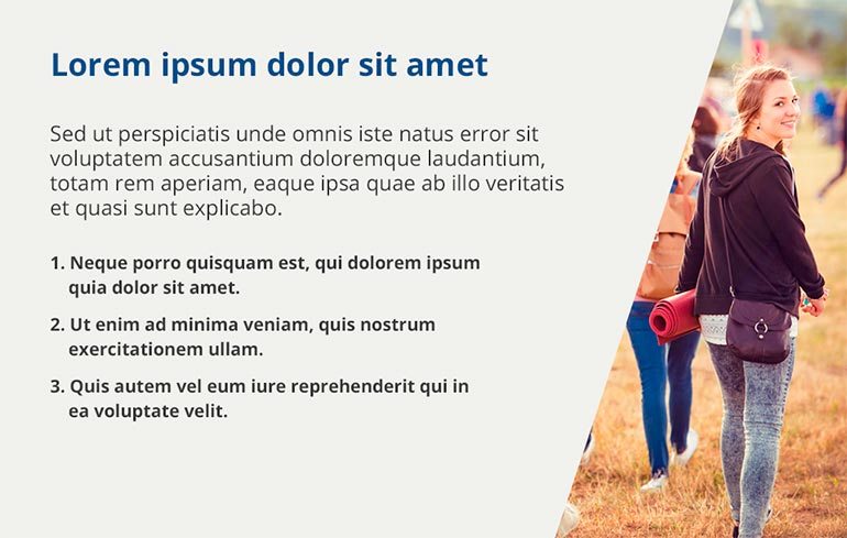
Do choose complimentary colors and be consistent
When you’re just starting to put together the first slides of your presentation, you need to pay particular attention to colors, background images and text. Note how the background colors in the image below are complementary to the color of the text and the image on the right.
Extra tip: If you don’t know what colors to choose, select colors from your image or visuals so that your background and font colors seem unified. Try to have at most, 3-4 colors throughout your presentation.
3. Creating contrast
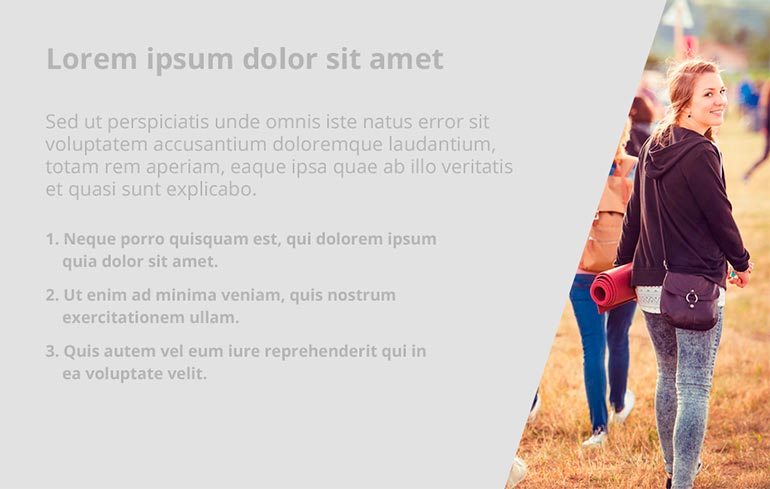
Don’t use opaque hues
When you’re over designing, chances are you will come up with something like this. With presentations, there is no room for experimentation. If your slides are not readable, like in the image below, you are defeating the whole point of your presentation.
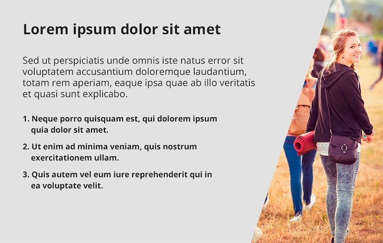
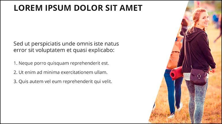
Do use contrasting colors for fonts and backgrounds
Use contrasting colors throughout your presentation. Black and white is a safe choice, but consider using hues of neutral colors for backgrounds and always a black font for contrast. One of your main priorities is the readability of your text which is why choosing background colors is so important.
4. Font readability
Don’t experiment with unreadable fonts]
Here is an example of the types of fonts that you shouldn’t use in your presentation – cursive caps of fonts like Ambarella, and outdated fonts such as Comic Sans, Times New Roman and Andale Mondo. To familiarize yourself with fonts that you shouldn’t use, refer to this article. These are the fonts that are illegible and nearly impossible to read or let alone understand the information before them.
Do use contemporary, readable fonts
It doesn’t take a lot of effort to find legible fonts. You can sift through libraries or the existing collection of fonts and choose something classic and easy-to-read such as Open Sans, Roboto and Helvetica.
Extra tip: Choose at most, 2-3 fonts that you will use throughout your presentation for aesthetic purposes.
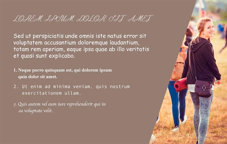
5. Text alignment and information to include
Don’t use odd spacing and sizing
It’s really easy to just put down chunks of information on your presentation. Avoid doing this as it will overwhelm your audience. Presentations are meant to enhance your speech and not include all of it on your slides.
In the example below, you can see how frustrating it is when there is awkward spacing. The presentation loses unity and an orderly quality.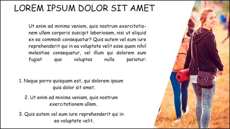
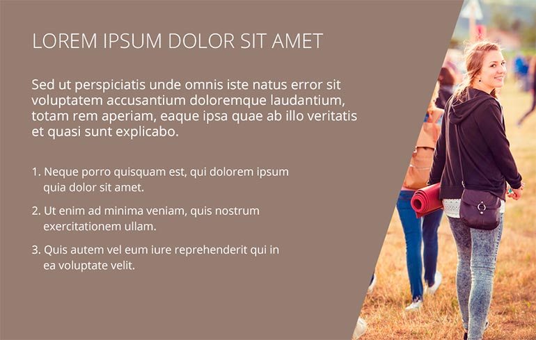
Do center your text and keep information at a minimum
Align your text in a way that will seem balanced and symmetrical. Note how in this example there is a title, a brief description and some points. This is how concise your information should be.
Extra tip: To cut down your information, choose sentences and keywords that summarize your main points.
6. Photos and images
Don’t opt for conventional stock photography
It is easy to choose images like the one below. They carry a message but is it necessarily the message you want to convey? Your presentation shouldn’t look generic so avoid photographs where the models are artificially jolly and posing.

Do use appealing visuals
Presentations are partially about design. This is why the visuals you use are so important and sometimes even crucial to your presentation. Choose images that are interesting visually, translate an aesthetic and help to make your point.
Extra tip: Choose unconventional composition and avoid cliche stock photography. Here is some extra information to help you in your choice of visuals: 7 Mistakes to Avoid When Using Stock Photography and Don’t Fall in the Trap of Cliche Stock Photography.

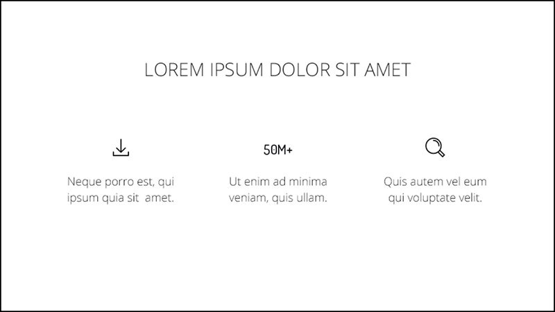
7. Show, don’t tell
Don’t write out the information when you can show it
In comparison to the previous slide, numbers simply won’t do. Use images and icons to help your audience absorb information faster.
![]()
Do use icons to help your audience absorb information
If you can show instead of tell, by all means do so. Little icons and images that go along with your text can be super helpful to your audience. Remember, majority of people are visual learners so if you can help them make your information more comprehensive, always choose to do so.
The key thing to take away from this is that you are designing for your audience. Always keep them in mind when putting together your work. Prioritize readability, quality and consistency. Working in one style can also help you achieve unity. Once you start paying attention to aesthetics, you will notice a peak in interest from your audience to the things you have to say.