The Simple Guide to Better Presentation Design
Presentations have one simple objective – to engage your audience. You’re probably thinking it’s easier said than done, but you’re wrong. Presentation design need not take up a whole day or require some advanced design skills. If you have the right tools and some basic knowledge about presentation design dos and don’ts, you’re all set.
Now you’re wondering if this is the type of article that will equip you with newfound knowledge that is going to take your presentations from average to amazing, and guess what? You’re right. This is exactly the kind of crash course that is going to elevate your presentation design.
Why does presentation design matter?
As this is the simple guide, the simple way of eloquently answering this question is – presentation design matters because you don’t want to be a snooze fest. Your audience has to be engaged and stay concentrated on your slides as you speak, all the while wondering what kind of an adventure they’ll be taken on with your next slide.
In truth, many people make the mistake of using the wrong color schemes, adding paragraphs of text on their slides and simply ignoring the design aspect of things. You’ll be wrong to assume no one pays attention or judges your presentation based on design. In fact, design is the first thing your audience judges you on as design sets the tone of your presentation.
Never overlook the power of good design
A presentation supports your claims, it illustrates ideas and shows that you care about your topic (which you should, no matter the theme). You are presenting and offering to take your audience on a creative journey to showcase your ideas. Presentations can be sophisticated, serious, funny and quirky, but rest assured that design is what will set the mood for the duration of your talk.
The power of good design really is a determining factor in how engaging your presentation will be. Know that you can achieve an extra layer of meaning with better design, and better communicate your idea to make sure you’re heard.
A new tool with a new format
If you haven’t used Crello yet, today’s tutorial will show you a new tool that will make the whole design process much simpler and way more enjoyable. Instead of working from scratch, you can use Crello’s ready made templates as a basis for your own design. Tweaking text and design elements is certainly something you can do, and that’s about all the work that goes into it.
Crello recently introduced a new format – presentation design. You can create multi page designs, working on one presentation on the same artboard. Multi page designs also allow you to create and duplicate your own designs, making consistency a much easier easpect to keep up throughout the design process.
Using Crello to create presentations
We promised to keep things simple, so here’s how you can quickly and easily create a presentation:
1. Go to the Crello homepage and select the “Presentation” format.
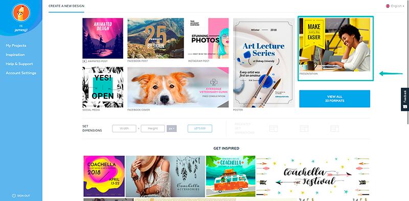
2. Select a template you’re going to work with from the “Designs” tab.
Once you select a design you like, a new selection of designs will pop up on the left hand side, as you can see below. Crello offers 5 slide options which you can add and modify as you’d like.

3. Select “Add new page” in the menu on the right and add your second slide.
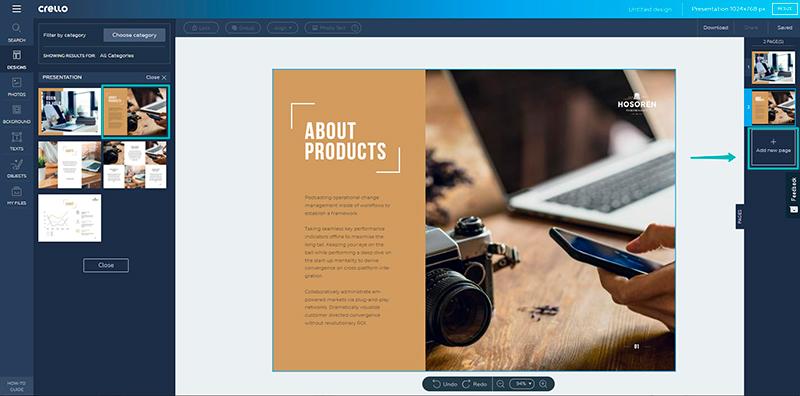
4. Continue adding new pages until you have enough slides for your presentation.
Our sample presentation has 6 slides, but you can add more or less, depending on the amount of information you have.
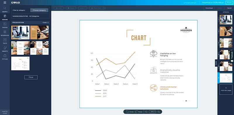
5. Customize text, images and other design elements.
You can upload your own images by clicking the “My files” tab on the left and clicking “Upload Image”.
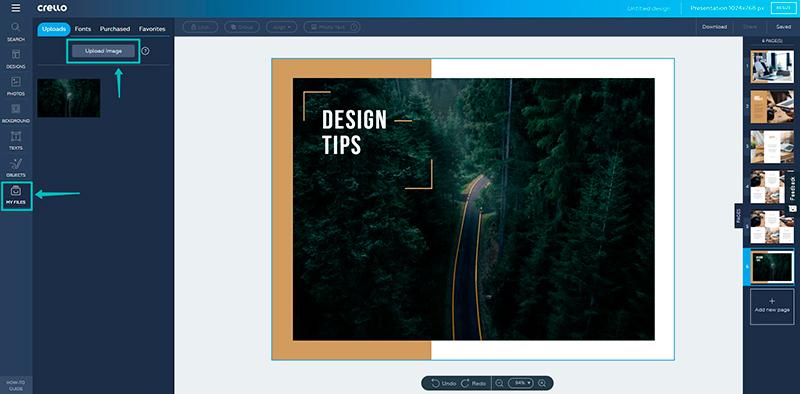
Continue adding your own elements to customize your design and make it your own. You can change colors and all the details in your presentation design. To find out more about working with multi page designs, deleting slides and duplicating them, see this article.
Tips for better presentation design
There are a few key points to keep in mind as you’re creating a presentation. We put together some basic tips to help you if you’re designing templates from scratch.
#1: Limit colors to 3 at most for a coherent color scheme
Be careful not to overwhelm your audience with crazy colors. You might think that would catch someone’s attention, but it actually borders chaos and creates distractions. For this reason, limit your color choice to 2 main colors and another color for emphasis. You will also have to select images that will harmonize with your chosen color scheme.

#2: Choose legible fonts
Like images and colors, fonts have personalities. You have to be selective with your fonts and generally avoid decorative fonts (except your cover slide) to make your presentation easily legible from different distances. More on font pairing here and a detailed guide on grasping the basics of typography.

#3: The art of being concise
Believe it or not, the layout of your text on slides is also part of the overall design. Remember that a presentation is there to prompt you and help people keep up and take away key points. This means that your writing on the slides has to be kept concise and to the point. Never pack whole paragraphs in your presentations – it’s one idea per slide.

#4: Opt for high quality images only
Another great throw off with presentation design is images that are blurry. Opt for high quality images, which you can find in Crello under the “Photos” tab. If any of your images are blurry, be sure to exclude them and prioritize those that are crispy clear because you want to come off as a professional. If you have text on images, make sure your images have plenty of negative space to fit text.

#5: Consistency in design
Your slides need some variety to keep your audience interested, but you should also use similar design elements in the seperate slides so that your overall presentation is consistent. It’s very important to keep the same grid for all your slides aside from the cover slide. This creates a visual balance. Also, you can use the same text frames in each slide for visual balance or the same background throughout your design. Repetition is key for a coherent presentation design.

#6: Compelling cover
Sometimes it’s a good idea to have all your slides ready and then take care of the cover design. Your cover should convey the feeling and the vibe of your presentation. Give people a reason to pay attention! Treat this slide with extra care because it’s your chance to make a good first impression. Use bold images that are in line with your presentation and make sure it’s one they’ll remember.

#7: Filters can save you
Another way to keep up consistency in your presentation is to use the same filters for your images. This is a design trick that can make your presentation look more put together. If all your images have the same filters, they can also help enhance the mood.

#8: Do you have a CTA?
You should. It’s also an important part of your design. Instead of opting for a “Thank you for listening” slide at the end, give your audience a way to take some action or take away some key idea. The last slide should answer the question “So what?” with a very clear CTA if you want a definitive action to follow as an outcome of your presentation

It seems like you’re equipped and ready to start designing! Remember, it’s aesthetics over a snooze fest – give your audience a reason to remember you. Presentation design is so important in getting your message across, so make sure you use the available tools and our tips to create something that you’re actually proud of, every time.
