The Complete Guide to Creating High-Converting Landing Pages
You may not realize it, but landing pages are integral to any online activity. Reached via ad clicks or call-to-actions, they share a common goal: turn a casual visitor into a prospective lead or potential customer. Thus, landing pages are essential elements of any successful digital marketing campaign.
Are you eager to learn more about high-converting landing pages? Through this article, we’ll empower you with the knowledge of how to create landing pages that leave a lasting impact and drive exceptional results.
What is a landing page?
A landing page is a specific page on your website where visitors “land” after they click on a link in an email, or ads from Google, YouTube, Facebook, Instagram, or any other place on the web. Unlike other pages on your website, which typically encourage exploration, a landing page is tailored for one specific action — give more details about a particular offer and convert web visitors into leads or customers.
Landing pages come in two main types:
- Click-through landing pages. Typically used in ecommerce, they have the goal of persuading a visitor to click through to another page (often the product or service page) and continue down the sales funnel towards making a purchase.
- Lead generation landing pages. Often used to capture user data, such as a name and email address. The sole purpose of the page is to collect information that will allow you to connect with a potential client later. To make users provide their details, companies usually offer value in return, like access to a free trial, a product discount, or content download.
What is a landing page used for?
Landing pages help increase the chances of visitors taking a desired action, making them an effective tool in achieving your business goals. Here are some of the most common uses of landing pages:
- Lead generation. One of the most common purposes of landing pages is to capture leads. This is usually done by providing a form that visitors fill out in exchange for something valuable.
- Sales conversion. Landing pages can be used to sell products or services directly. In this case, a landing page might showcase a specific product or offer, with a clear CTA for the visitor to make a purchase.
- Event registrations. For companies that host webinars, conferences, workshops, or any other types of events, landing pages serve as the registration hub. The landing page provides all the relevant details about the event and a form to sign up.
- Product explanation. If your product is complex and needs a detailed explanation, a landing page can provide that information in a format that is easy to understand.
- Collecting information. Beyond just generating leads, landing pages can be used to gather detailed information about existing customers or visitors, such as getting feedback on a product or conducting market research.
- Promote special offers. Landing pages can be created to promote limited-time offers or special promotions. They allow you to focus visitor attention on the offer without any distractions.
- Ad campaigns. When running PPC, social media, or other types of online ads, the clicks need to lead somewhere. Landing pages are usually the best destination because they can be tailored to match the messaging and purpose of the ad.
What makes a good landing page?
1. Powerful headline
The headline is arguably the most crucial part of your landing page. It’s the first thing a visitor sees, so it needs to be captivating, concise, and clear. It should quickly inform the visitor about the product, service, or offer, explain its value, and incite interest to keep reading.
Secrets to a winning headline:
- Keep your headline short and straight to the point. Aim to communicate your main message in about 10 words or less.
- Use simple and straightforward language to engage the reader. Add more action words and compelling language to encourage the visitor to stay on the page and learn more.
- Ensure your headline aligns with the ad, email, or link that led the visitor to the landing page to avoid confusion.
2. Engaging subheadline
A subheadline complements the headline by providing additional context or information. While the headline must grab attention and convey the main message quickly, the subheadline can provide additional details, highlight a unique value proposition, or add context to help convince the visitor to take action.
Tips for writing captivating subheadlines:
- Don’t repeat what’s already stated in the headline. Use the subheadline to complement the headline, offering additional insight, value, or context.
- Although you can provide more information in the subheadline, keep it succinct. Provide enough detail to create interest, but make it easy to read and understand quickly.
- Use persuasive language to encourage the visitor to move towards the call-to-action.
3. Irresistible call-to-action
The call-to-action (CTA) on a landing page is the part that tells the visitor exactly what action you want them to take. This could be “Buy Now,” “Sign Up,” “Download,” or any other directive that aligns with your landing page’s goal. An effective CTA guides the visitor toward conversion and is clear, concise, and compelling.
Discover the power of captivating CTAs:
- Use a contrasting color for your CTA button to make it stand out. It should be one of the most noticeable elements on your page.
- Keep the CTA text short, typically no more than five words. Opt for strong verbs that drive action.
- The CTA should unambiguously state what will happen when clicked. For example, “Download Your Free Ebook” is clearer than just “Click Here.”
- If applicable, create a sense of urgency or exclusivity in your CTA, such as “Limited Time Offer” or “Exclusive Download.”
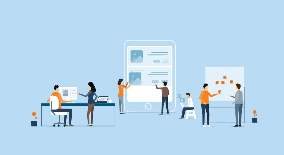
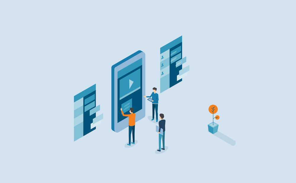
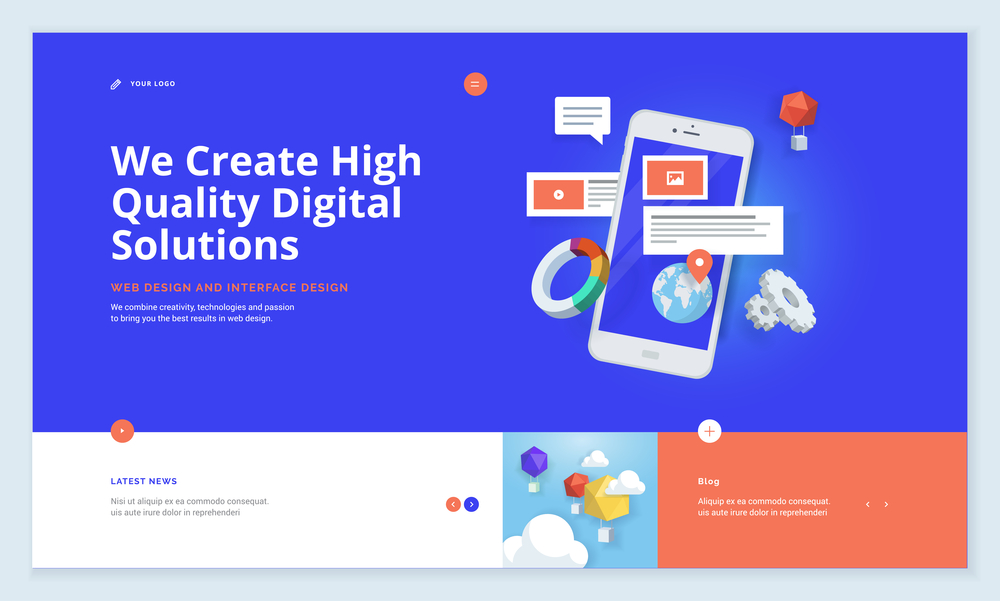
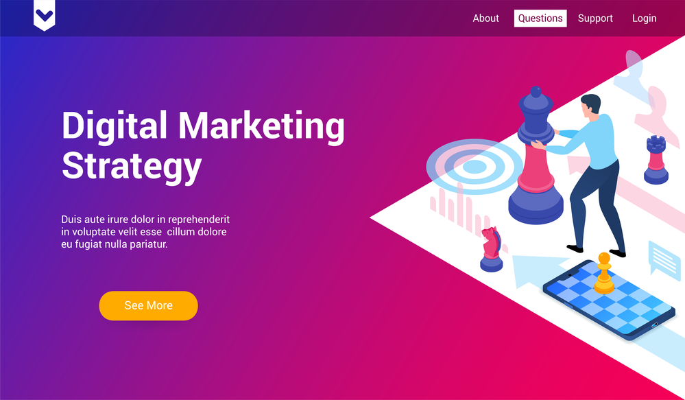
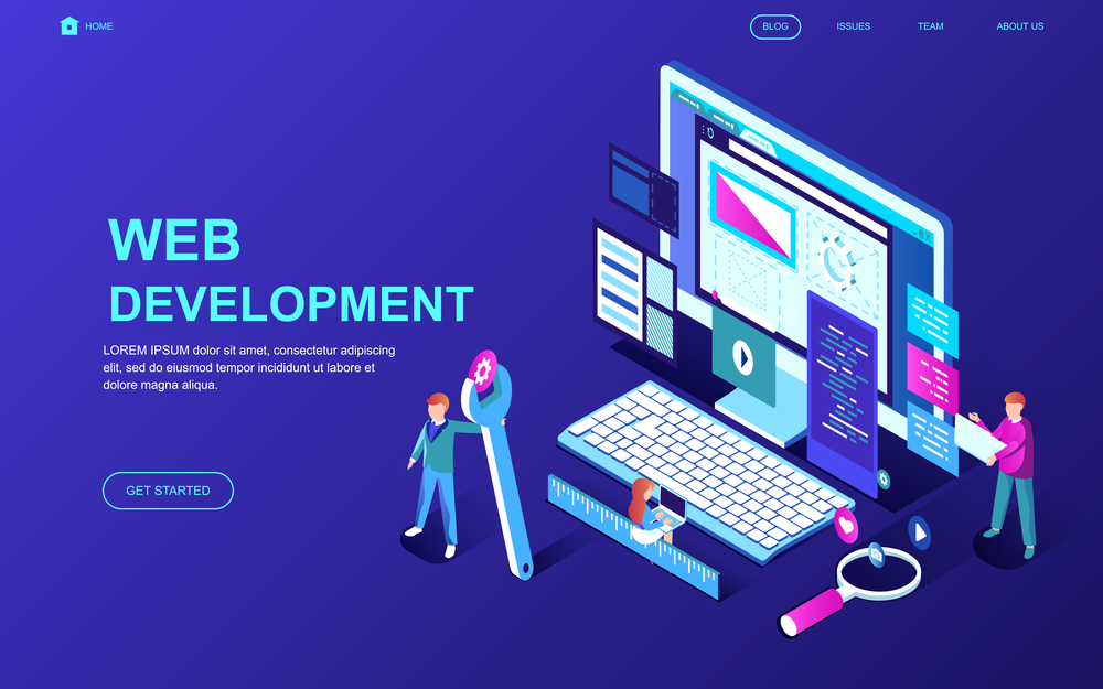
4. Captivating visuals
Visuals help make your landing page engaging, improve understanding of your product, and help generate more leads. This could be product photos, explainer videos, infographics, or any other visual content.
Unlock the power of engaging visuals:
- Ensure all visuals are high-quality and professionally done. Poorly made or low-resolution visuals can harm your credibility.
- All visuals should align with your brand identity and directly support the content and main message of your landing page.
- Avoid overly complex visuals that could confuse the visitor. They should clarify, not complicate your message.
- Consider using visuals that evoke emotion or tell a story, as this can help better engage your visitors.
5. User-friendly forms
If the goal of your landing page is lead generation, forms are a key component. It’s where visitors provide their information in exchange for the offer. A good form is simple, easy to fill out, only asks for necessary information, and respects the visitor’s privacy.
Master high-converting forms:
- Minimize the number of fields. The fewer of them a visitor has to fill out, the more likely they are to complete the form. And clearly label each field so that the visitor knows exactly what information is required.
- If you’re asking for personal information, it’s crucial to assure visitors that their data will be kept private and secure. Including a brief note about privacy and a link to your privacy policy can be very effective.
- Your form should have a clear CTA button, such as “Submit,” “Download,” or “Sign Up.”
6. Credible trust elements
Trust elements on a landing page is content that builds visitor trust in your product or company. This can include customer testimonials, reviews, case studies, certifications, or awards that reduce any concerns visitors might have.
Leverage trust elements:
- If you’ve worked with any well-known clients or brands, feature their logos (with permission) to increase credibility.
- If you’re featuring testimonials or reviews, make sure they’re real and relatable.
7. Compelling copy
Your landing page content should be relevant to your audience. Concentrate on your offer, its benefits, and how it meets the needs or solves the problems of your audience. Your content should not contain any extraneous information or links that might distract the visitor from the primary call-to-action.
Learn the blueprint for an enticing copy:
- Stick to one offer and avoid providing too many options that could distract the visitor from the primary CTA.
- Instead of just listing features, explain how your product or service benefits the user. Show them why they should care and how your offer provides value.
- Use bullet points, headers, and white space to break up text and make it easier to read.
- Always proofread your copy and ensure it’s free of errors, which can undermine your credibility.
Landing page best practices
1. Aim for goal-oriented design
It’s crucial to start with a clear goal in mind. Every element on the page should support this goal and guide visitors towards the desired action. And it doesn’t matter whether your goal is collecting email addresses for a newsletter subscription or driving sign-ups for an event.
How to ensure your landing page design is goal-oriented:
- Define your goal. It should be specific and measurable. For instance, “generate 500 new email subscribers in a month” or “sell 100 products in the first week.”
- Tailor your content. If your goal is to sell a product, your content should clearly explain what the product is, its benefits, and why the visitor should buy it. All elements on the page should focus on promoting the product and making sure the visitor makes a purchase.
- Design a landing page around the CTA. Your page design should highlight this CTA and make it stand out. Use color contrast, large font sizes, or central positioning to draw attention to your CTA.
- Remove distractions. Any element that does not support your goal or could potentially distract the visitor from the CTA should be removed.
2. Identify your target audience
Your target audience is the specific group of people you want to reach with your landing page. These are the people who are most likely to be interested in your offer.
Why it’s crucial to define your target audience:
- Message relevance. Knowing your target audience allows you to tailor your messaging to their needs, interests, and language. This increases the relevance of your landing page and makes it more likely that visitors will convert.
- Effective design. Different audiences may respond better to different designs, colors, images, and other visual elements. By knowing your audience, you can design your landing page in a way that appeals to them.
- Optimized marketing. By knowing who you’re targeting, you can optimize your marketing efforts to reach these people. This could involve targeting your ads to a specific demographic, choosing the right social media platforms, or using SEO keywords that your audience is likely to search for.
3. Maintain consistent messaging
Ensure that your landing page messaging is consistent with any ads or links that drive visitors to the page, and that your communication across different channels aligns with your brand positioning and offers a unified experience. Inconsistency can confuse visitors and lead to lower conversion rates.
How to ensure consistent messaging:
- Maintain visual consistency. Visual elements like colors, fonts, images, and logos should be consistent across your ads and landing pages. This visual consistency aids in recognition and helps reinforce your brand identity.
- Ensure consistency in tone and language. If your ad is casual and playful, but your landing page is formal and technical, it could create an unpleasant experience for the visitor.
- Keep offers and promotions consistent. If you’re advertising a specific deal, discount, or promotion, it should be clearly and prominently featured on your landing page.
4. Optimize for mobile users
With more people opening web pages on multiple devices, it’s essential that your landing page is mobile-friendly. This means ensuring that text is readable, buttons are easy to click, and the page loads quickly on mobile devices.
How to optimize your landing page for mobile:
- Responsive design. Use a responsive design that automatically adjusts the layout, images, and functionalities to fit the screen on which it’s being viewed. This ensures your page looks good and works well on all devices.
- Simplified navigation. On a small screen, navigation can be tricky. Limit the number of elements to ensure users can easily find what they’re looking for.
- Touch-friendly buttons. Make sure all buttons, links, and form fields are large enough to be easily tapped with a finger. The last thing you want is for users to struggle when they want to click your call-to-action button.
- Readable text. Ensure your text is large enough to read without zooming in, and that there’s enough contrast between the text and the background for easy readability.
5. Prioritize fast load times
Fast load times are critical for user experience and conversion rates. If your landing page takes too long to load, you risk losing visitors.
How to improve your landing page load times:
- Optimize images. Large, high-resolution images can significantly slow down your page. Optimize images, videos, and other media to ensure they load quickly and display correctly. Large media files can slow down your page load times and may not display properly on small screens.
- Minimize use of heavy scripts. Heavy files can slow down your page load times. Use GZIP compression to reduce the size of your HTML, CSS, and JavaScript files that are larger than 150 bytes.
- Leverage browser caching. Caching involves storing copies of files in a cache, so that they can be accessed more quickly. This way you can speed up load times for repeat visitors to your page.
- Use a content delivery network. CDNs can help speed up your page load times by storing copies of your page on servers around the world, so that users can load the page from the server that’s closest to them.
6. Design with visual hierarchy in mind
Design your landing page in a way that guides the visitor’s eye towards the most important points, such as the headline or CTA. Use different design elements to highlight these parts of the page and make them stand out.
How to create visual hierarchy on your landing page:
- Size and scale. Larger elements naturally draw more attention than smaller ones. Make your headline and CTA larger to make them stand out.
- Color and contrast. Bright colors and high contrast can draw attention to specific elements. For example, a bright red CTA button on a white background.
- Positioning and layout. Elements placed in the center or higher up on the page will be seen first. Position your most important elements there, like the headline and CTA.
- White space. White space, or negative space, can help highlight certain elements, prevent clutter, and create visual separation. Use it around your key elements to make them stand out.
- Typographic hierarchy. Choose different font sizes, weights, and styles to distinguish between elements like headlines, subheadings, body text, and CTAs.
7. Use AI to speed up testing and optimization
How to use AI for faster optimization:
- Generate multiple variations instantly. With AI landing page generators, you can quickly produce diverse designs and content to see what resonates with your audience.
- Personalize at scale. AI can adapt landing page copy and visuals to match different audience segments, improving relevance and engagement.
8. Regularly conduct A/B Testing
A/B testing, also known as split testing, is the method of comparing two versions of a web page or other user experience to determine which one performs better. Test different versions of your landing page to see what works best. Experiment with different headlines, CTAs, images, and form layouts to find the combination that maximizes conversions.
How to implement A/B testing for your landing pages:
- Split your audience. Divide your traffic between the original version (A) and the modified version (B). It’s important that the division is random to ensure the results aren’t skewed.
- Analyze the results. Use analytics tools to track the performance of both versions. The version that better achieves your goal is the winner.
- Implement changes. If the variant performs better, implement the changes on your landing page. If not, return to your original version and come up with a new hypothesis to test.
9. Develop a strong follow-up strategy
The follow-up process is what happens after a user has taken the desired action on your landing page. This could be a thank-you page, a confirmation email, or the delivery of a promised offer.
How to follow up effectively:
- Engage further. Use this opportunity to engage the user further. Suggest other relevant content, offer a discount on a product, or invite them to follow you on social media.
- Nurture campaigns. If the user’s action has entered them into a sales funnel, start a nurture campaign. This is a series of emails designed to educate the user about your product, build a relationship, and gradually guide them towards a purchase.
- Analyze and optimize. Are users opening your emails and clicking on your links? Use analytics to track the effectiveness of your follow-up process.
What needs to be considered to create an effective landing page
1. Landing page format
The format of your landing page plays a crucial role in determining how visitors interact with your content and whether they convert.
- Long-form landing pages. They are used when the product or service being offered is high-value, complex, or requires a significant commitment from the customer. They typically include:— Detailed product information
— Testimonials and reviews
— FAQs
— Multiple CTAs - Short-form landing pages. They are used when the offer is simple and low-cost, or when the goal is to generate leads rather than direct sales. They usually include:— Concise copy
— Strong visuals
— Limited fields
— Single CTA
2. Landing page colors
Colors play an integral role in the design of your landing page, as they can influence your visitors’ emotions, perceptions, and actions. Depending on the recent trends, they vary from season to season. Here’s what you need to know about strategic use of colors in your landing page:
- Color consistency. Your landing page colors should be consistent with your brand colors to help reinforce your brand identity. This will improve recognition and create a cohesive user experience.
- Color psychology. Different colors can evoke different emotions and reactions. For example, gold is perfect for attracting attention, while white is good for reducing visual clutter.
- Contrast. Contrast is key in landing page design. It ensures that important elements like your headline, CTA, and key benefits stand out. A high-contrast color can draw attention to your CTA and increase the likelihood of it being clicked.
- Color harmony. Harmonious colors create visual balance on your page. The use of complementary (colors opposite of each other on the color wheel) or analogous (colors next to each other on the color wheel) color schemes can make your landing page visually more attractive.
- Accessibility. Remember that not everyone perceives colors in the same way. Use color combinations that are accessible to people with color vision deficiencies.
3. Landing page images
Images play a vital role in landing page design. Not only do they make your page more visually appealing, they also help convey your message, guide the user’s journey, and get you emotional responses. Here are key point to keep in mind when selecting images for your landing page:
- Relevance. The images you use should be directly related to your offer and resonate with your target audience. They should help illustrate the benefits of your product or service, show it in use, or visually represent the problem it solves.
- Quality. The quality of your images can significantly impact how visitors perceive your brand. Pixelated or low-quality images can harm your credibility and turn potential customers away. If you need to upscale your images without losing quality, check out our free online image upscaler that instantly enlarges and enhances pictures with the help of AI.
- Directional cues. Images can be used to guide the viewer’s eye to key elements on your page. For example, an image of a person looking or pointing towards your headline or CTA can subtly draw attention to these elements.
- Emotional impact. Images can evoke emotions more quickly than words. Use images that create an emotional connection with your audience and reinforce the feelings you want your product to convey.
- Call to action. Weaving a CTA into the context of your image can be a powerful way to increase conversions. For example, an image showing someone using your product could be accompanied by a CTA encouraging visitors to try it for themselves.
Don’t make finding the perfect image for your landing page a challenge
Browse our extensive library of high-quality content to find professional visuals for every industry and theme. Use them to make your landing page more appealing and convert your visitors into customers.
Discover Depositphotos Library
To wrap up
Crafting effective landing pages is essential for achieving the goals of your digital marketing campaigns. By following the advice in this guide, you can create landing pages that engage your audience and inspire action. Since keeping your landing pages effective is an ongoing process, stay informed about the latest trends and industry practices, and always be open to testing and experimenting.
FAQ
1. Which attributes describe a good landing page experience?
- Relevance. The content of the landing page matches the promise made in the ad or link that brought the visitor there.
- Clarity. The value proposition is clear and compelling. The visitor should immediately understand what the page is about, why they should care, and what action they should take.
- Simplicity. A good landing page is clean and uncluttered. It focuses on one specific offer and minimizes distractions.
- Ease of use. The design and navigation is intuitive and user-friendly.
- Consistency. The design, tone, and messaging is consistent with the brand and the source that drove the visitor to the page.
- Trustworthiness. The page includes elements that build trust, such as testimonials, reviews, and a clear privacy policy.
2. What is not recommended for a landing page?
- Too many offers or CTAs. Including too many of them can confuse and distract visitors.
- Poor quality images or videos. Low-quality visuals can make your brand look unprofessional and negatively impact your credibility.
- Long text blocks. Long paragraphs or hard to understand content can be intimidating and off-putting.
- Slow load times. Slowly loading can frustrate visitors and lead to high bounce rates.
3. Why is it considered a best practice to include an image or video on a landing page?
Humans are visual creatures, and an image or video can make a page more engaging and appealing. Through them, you can convey information more quickly and effectively than through text alone. Visuals also help create an emotional connection with visitors and keep them on your page longer, which makes them more likely to convert and positively impact your search engine rankings.
4. How long should a landing page be?
The length of a landing page depends on various factors, including the complexity of your offer, the amount of information needed to convince visitors, and the preferences of your target audience. Some landing pages may be short and straightforward, only requiring a brief headline, a concise description of the offer, and a clear call-to-action. Others may be longer, providing more detailed information, testimonials, or additional sections to address potential objections. Generally, a good rule is to keep your landing page as long as necessary to convey your message effectively. Yet, it’s crucial to strike a balance between providing enough information to persuade visitors and keeping the page focused.
5. How long does it take to build a landing page?
The time it takes to build a landing page can vary depending on several factors, such as your technical skills, the complexity of the design, and the availability of your resources. With user-friendly landing page builders specifically designed for creating landing pages, you can often create a simple landing page within a few hours or even less. These tools typically provide easy functionality and pre-designed elements that can speed up the process. However, if you require custom design or complex integrations, building a landing page may take more time. This can range from a few days to a couple of weeks.
6. Do you need a domain for a landing page?
No, you don’t necessarily need a separate domain for a landing page. Landing pages can be hosted on a subdomain of your main website or within a specific directory on your existing domain. This means the landing page URL would look like “landingpage.yourdomain.com,” while hosting it within a directory would have a URL like “yourdomain.com/landingpage.”
Using a subdomain or directory allows you to keep your landing page connected to your main website, benefiting from its authority and brand recognition. However, some businesses may choose to use a separate domain for their landing pages to create a distinct identity or to track and analyze landing page-specific metrics. The decision to use a separate domain or a subdomain/directory depends on your specific needs, goals, and resources.
Other articles you might find interesting:
What makes a good website: checklist for entrepreneurs
60 Must-Have Digital Marketing Tools [Infographic]
Top 15 Web Hosting Services for Creators in 2023