10 Best Data Visualization Tools and Techniques in 2023
Data visualization is an integral part of journalism, science, education, as well as business management. Formats like maps, graphs, and charts allow managers to understand and depict the state of a company or market, and whether a certain campaign was, is, or will be successful.
With modern data visualization tools, processing any amount of data into clear infographics doesn’t necessarily require profound design or even analytical skills. All you need is a database and your understanding of what you want to show with your visualization.
To help you optimize your workflow, we’ll delve into the most powerful paid and free data visualization tools that you can apply to your data right away.
See Data Visualization Collection
What is data visualization?
Simply put, data visualization is about making your data easy to understand and analyze. Moreover, big data visualization tools can sometimes fulfill the tasks of an actual analysts, i.e., tell you what exactly the information in your databases indicates. AI-based tool like this may also suggest the best way to display your data.
What are data visualization tools? These are programs where you enter your data and receive visuals that are more digestible for both you and your audience. Popular data display formats include the following:
- Pie, bar, Gantt, waterfall, and area charts;
- Histograms and sparklines;
- Maps;
- Box-and-whisker, range, and scatter plots.
What is the main reason for using data visualization tools? The obvious answer—it’s a time-saving way to go through, present, or comprehend data. Graphs and diagrams are also more memorable than tables or texts. However, the bigger advantage of data visualization is that there are higher chances of you finding insights.
In 2021, the market of data analysis and visualization tools was estimated at $7.4 billion and expected to reach over $19 billion in the next ten years. The reason for such growth is the growing amount of data that you can collect online and, as a result, need to demand for automated data analysis.
The market includes automated and semi-automated tools that make it possible to transform existing data sets into statistical graphs, heat maps, charts, sparklines, and other forms of infographics. The best data visualization tools allow users to adjust infographic style (for example, layouts that match a corporate style) and create good-looking data visualizations.

What are data visualization tools?
Why use tools for data visualization and analysis? First, because they save time. Second, because they allow you to avoid making mistakes when preparing infographics and quickly edit settings when you notice parameter errors.
If you are a professional analyst with a design background and not a lot of data to display, most popular data visualization tools might not be as useful, since you can easily create a diagram manually using your favorite graphics editor (for example, Figma). However, if the answer to “Why use data visualization tools?” is a given to you, it’s time to discover which tool type you should master.
Most products in today’s infographic market are online data visualization tools, some of which have versions that work when you are offline. These tools leverage cloud technology, which means you can access your charts and maps from different devices and work on them in a team.
Top data visualization tools have both free and paid versions. A rare exception are high-quality tools that are completely free (Google Charts or ChartBlocks). However, in most cases, you enjoy free access to limited tool functions (data visualization tool examples: Zoho Analytics, Data Wrapper) or your charts and maps are made publicly available (Tableau).
When it comes to data visualization tool comparison, an important question is the accessibility of programs to people with low big data analytics, design, or programming skills. The simplest tool type — drag-and-drop tools, convenient for non-designers (like Infogram, Tableau). More complex and flexible tools allow you to access code, which makes it easier to edit diagrams and integrate them into projects (examples: Fusioncharts, Google Charts).
Code adjustment is a basic feature of interactive and dynamic data visualization tools, which help create programs, not static images. This approach is called data storytelling. Examples of data visualization tools that leverage AI for data processing include RATH, Tableau, and CRM Analytics.

Data visualization tools: Overview & comparison
Paid tools for data visualization (some offer free plans)
- Tableau (Tableau Public)
- Tableau Public—free; all free visualizations will be available publicly
- Entry level: low
Tableau, with tens of thousands of corporate customers (not counting millions of individuals), is one of the data visualization market leaders. Moreover, the tool has a creative community built around Salesforce (who developed it) and holds annual data visualization conferences. By being a part of the community, you can improve your infographic skills and quickly get into trends.
The advantage of Tableau is its comparably simple interface and a wide variety of data sources that you can use to generate visuals. Also, Tableau offers a huge selection of mobile-responsible formats.
https://youtu.be/YfE9jBq002s?list=PL_qx68DwhYA_55jz4HxlHJZC1p6kCZosn
- Zoho Analytics
- free version available; number of free projects is limited
- Entry level: you must understand marketing metrics
Zoho Analytics is another market leader among tools for data visualization. It was mostly designed to help users present business-related information to their teams, C-level executives, investors, or clients.
The tool allows you to create infographics on marketing topics such as profits, sales, revenue, money spent, and more. Zoho Analytics is used by over two million customers and hundreds of thousands of companies worldwide. However, mastering this tool requires practice and marketing knowledge.
Among its valuable features, you’ll find sending reports without leaving the editor, as well as smart big data analysis using various sources.
- Sisense
- paid
- Entry level: you must understand business processes
Sisense is among the greatest advanced data visualization tools used by business leaders and analytics teams. It is not only a tool for creating data visualizations, but also a powerful one for finding business insights.
Sisense can automatically detect future chart parameters and offer you a format for displaying data. The tool can also work with large databases from multiple sources and automatically look for data patterns valuable for business decisions. Visualizations that you generate can be easily customized to match your corporate brand book. More on this topic: What Is a Brand Book and Why Do You Need One?
- Datawrapper
- free version available; only attributed PNG file downloads
- Entry level: low, suitable for journalists
What are data visualization tools used for press? Datawrapper is a simple tool that allows you to create basic data visualizations based on information you enter manually.
The tool is mainly intended for journalists, bloggers, and researchers who create illustrations for scientific and other articles by themselves. Due to its simple interface, Datawrapper works well for fast infographic generation. It allows you create maps, common charts, scatter plots, and easy-to-understand tables. It is one of the most popular free online data visualization tools, meaning it also does not require installation.
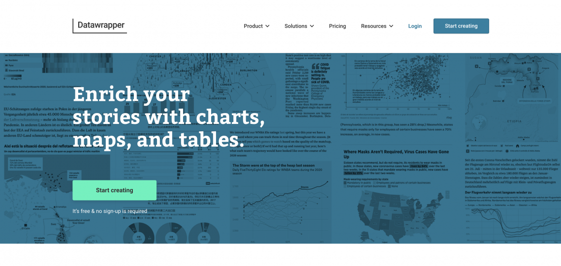
Source: Datawpapper
- Fusioncharts
- only paid options
- Entry level: requires JS programming skills
Fusioncharts is a powerful tool that gives you access to ready-to-use code that you can edit and add to your website pages. In addition, it has API access. The platform works with all popular JS frameworks, such as React, Angular, and many others.
It also supports common programming languages, including Java, PHP, and Ruby on Rails. Fusioncharts offers more than 150 data visualization formats, about a thousand chart types, and sets of infographic components.
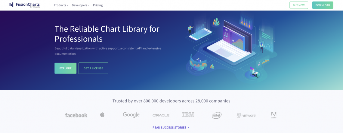
Source: Fusiouncharts
- Infogram
- free version available
- Entry level: low
How many data visualization tools does one need to create a presentation for investors or illustrations based on research? If you are completely new to data visualization, Infogram on its own should do the trick. It’s one of the most intuitive and powerful tools for creating infographics.
The tool is web-based and allows you to track interactions with your infographics if you publish them online. Infogram’s drag-and-drop editor offers you both ready-made templates and about 600 formats for data representation. Once you’ve created your infographic, you can publish or upload it as an image or HTML document.
Unlike other tools, Infogram allows you to customize layouts—You can change fonts, add logos, GIFs, or other images.
- ChartBlocks
- free version available
- Entry level: low
ChartBlocks can be listed among the real time data visualization tools. The critical advantage of this tool is that it enables you to export data from any sources, including social networks. You can utilize ChartBlocks using API integration. This way, you will be able to show your audience dynamic data.
It is a simple and affordable tool to create charts, but it does not work with maps. The visualizations you generate are responsive, so you can integrate them into your mobile-friendly sites or applications.
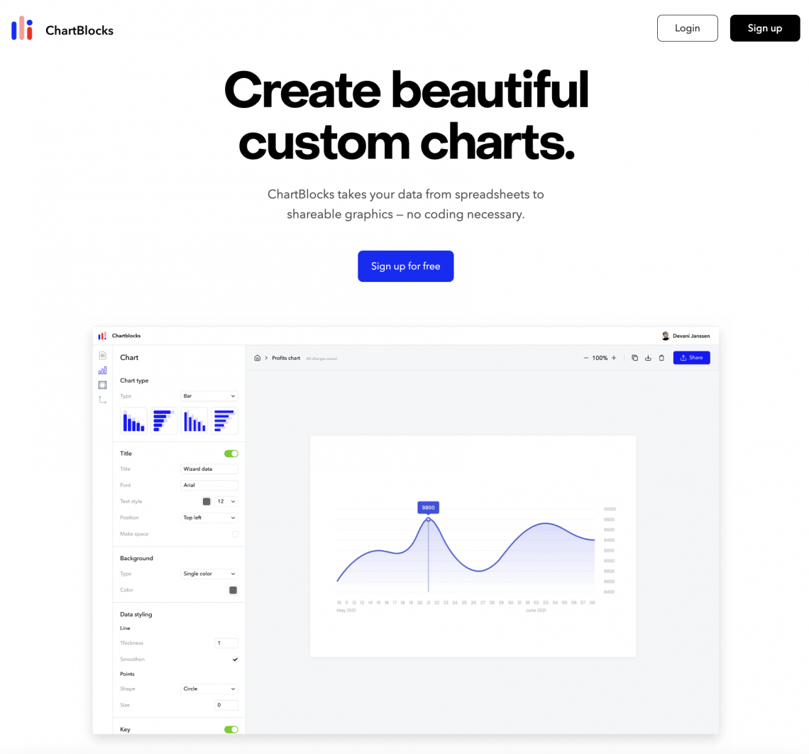
Source: ChartBlocks
Free data visualization tools
- Google Charts
- free
- Entry level: may require programming skills
Google Charts is one of the best free data visualization tools. This tool offers users about 20 chart formats and is capable of extracting data from a variety of databases and sources, including Google Sheets and Salesforce products.
Since Google has a wide and active community, new chart options are constantly added to the Additional Charts Gallery maintained by Google. Visuals created with Google Charts have cross-platform compatibility, as well as support for zooming in and out. The diagrams styles are minimalistic and therefore universal, but you can’t customize them.
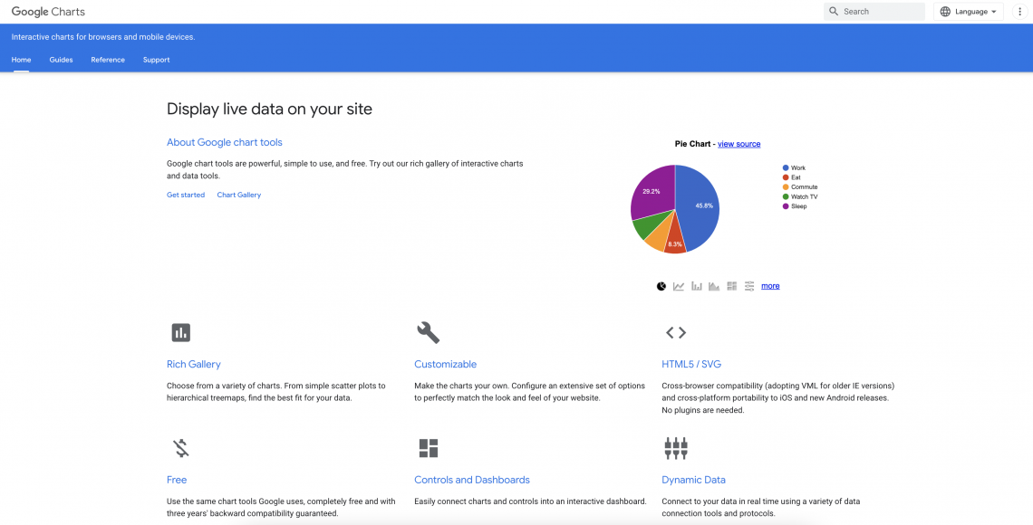
Source: Google Charts
- Polymaps
- free
- Entry level: requires JS programming skills
Previously, we discussed tools designed to create charts. However, Polymaps is a JavaScript library dedicated to mapping; it is open-source and free to use. The library makes it possible to create maps of any type, including rare ones such as cartogram maps. Designing maps can be done using CSS.
You can integrate a generated SVG map into your website or application. This way, users will see it correctly, regardless of the type of their devices.
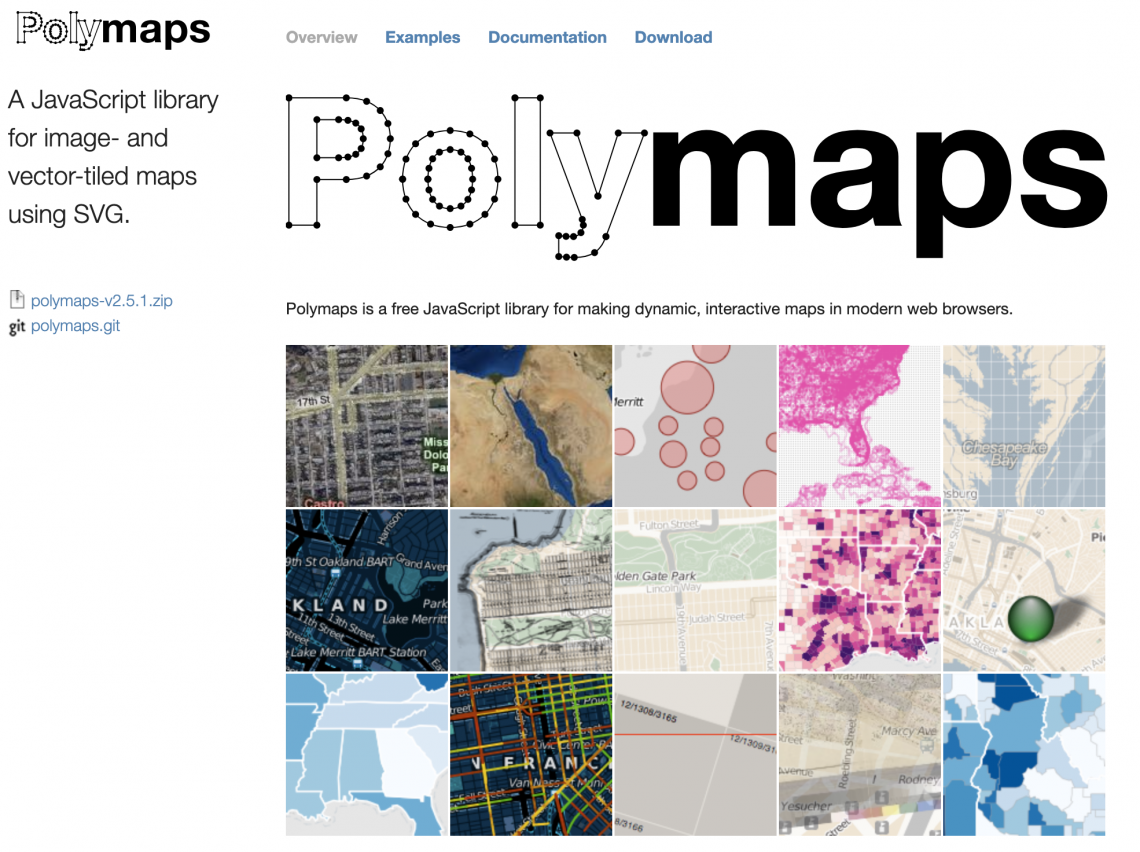
Source: Polymaps
- Microsoft Excel & Power BI
- Microsoft Excel—free online version
- Power BI—free desktop version
- Entry level: require analytical skills
If you started visualizing data more than 15 years ago, Microsoft Excel is most likely a tool you are familiar with. It is one of the most popular spreadsheet software in the world, as well as an easy data visualization tools.
Microsoft Excel uses the data you add to your spreadsheet. However, the Microsoft ecosystem has an advanced tool for creating infographics, Power BI. It allows you to use a variety of databases including Salesforce, Oracle, Google Analytics, and Github.
In both Microsoft Excel and Power BI, you can create tree maps, radar and pie charts, scatter plots, and histograms.
Improve your data visualizations with Depositphotos
Your tool for creating visualizations can be a basic graphic editor or a dedicated app. In particular, even the simplest drawing applications will allow you to create a basic flowchart. What’s more, you can use stock vector files as templates if you work with Sketch, Adobe products, Figma, or Affinity Designer. Browse our extensive collection of infographic vectors to find a template that fits your needs.
If you’ve taken a course to master one of the data visualization tools and techniques we mentioned, our powerful library of photos and videos will also come in handy. Most diagram and infographic platforms allow you to add your images (like icons, GIFs, SVGs, and even photos) to layouts.
By now, you already know the answer to “What are the top 10 data visualization tools?”, but we’re also inviting you to enrich your toolset with free tools by Depositphotos.
If you want to save time on making icons and collages for your data visualization, use Background Remover. This tool leverages AI algorithms to isolate objects in pictures and videos. In turn, Image Upscaler automatically improves your image quality and doubles their size. Use it if you need your data visualization to feature high-quality images.
See Data Visualization Collection
Wrapping up
In the internet-driven world, collecting data is not difficult. What’s really challenging is data processing and finding insights. Researchers, marketers, journalists, and future entrepreneurs all need data visualization to reach their professional goals.
What are the best data visualization tools for you specifically? In order to find the most fitting data visualization tools, we recommend using their free versions and processing small databases.
Note that some tools are limited to creating only certain types of visualizations (Google Charts and ChartBlocks are good for charts and Polymaps for maps). Some tools are only useful in certain fields (Datawrapper for journalism and Zoho Analytics for business).
Whichever data visualization tool you choose, focus on what question you want to answer using your visualization. Is it about ad campaign ROI? The quality of water within your region? Once you have a clear question in mind, creating visualizations becomes a simpler task.

Data visualization FAQs
What are the most popular data visualization tools?
Data visualization tools vary. You can use universal graphic editors (Figma, Sketch, Adobe products, CorelDraw Graphics Suite, and more) as well as special web applications (Tableau, Analytics or Datawrapper) to create charts, diagrams, and maps. Among the most popular free data visualization tools are Polymaps and Google Charts, but most paid data visualization tools like Tableau have free plans as well.
What are the best data visualization tools?
If you’re new to data visualization, start with popular tools with intuitive interfaces like Tableau, Zoho Analytics, Google Charts, Fusioncharts, or Datawrapper.
Why should you use data visualization tools?
2D and 3D data visualization tools are useful for composing marketing reports, presentations, lectures, articles for media, or scientific papers. Dedicated tools for creating data visualizations (like Tableau or Sisense) aim to help people turn their databases into digestible and informative data stories or discover insights.
More articles about data visualization:
Graphic Design Trends 2023 [Infographic]
How Do You Make Sense of Your Data? A Guide to Data-Driven Marketing
How to Make a Lead with the Right Images: Sales Funnel Basics