18 Brilliant 404 Error Pages
There’s close to nothing more annoying online than a 404 error page. Designers have gotten on board to make this accident seem less of a big deal, majority opting to put a smile on your face instead of feeding your frustrations. This is a kind of art form, to be able to engage users even when they’ve lost hope.
Today’s article is a collection of brilliant and funny 404 error page examples to show you some of the creativity around the web. Before we start, I dug up an interesting fact that 404 error pages came about from a room numbered 404 that housed the very first servers at CERN. Let’s take a look at how designers and brands are carrying on a legacy that started with something like this:

20 brilliant 404 error page examples from around the web
Here are some of the best 404 error pages from brands you know, and brands you might not to know and will want to after this scroll.
Kualo
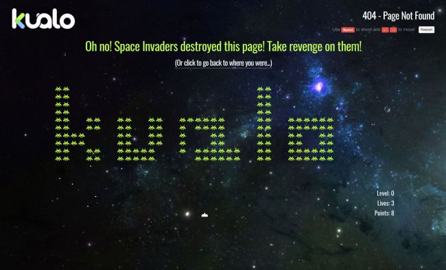
We start with one that entertained me for solid 10 minutes. Hosting company Kualo took 404 to new heights by presenting a game with space invaders. This is so much fun, and to make things more interesting is that you can get a discount with their services if you score over 1,000.
The Australian
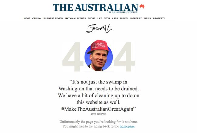
Count on newspapers to poke fun of politicians! The Australian redesign their 404 error page with a quirk, using politician personas, their language and general mess ups to explain their error page.
Dan Woodger
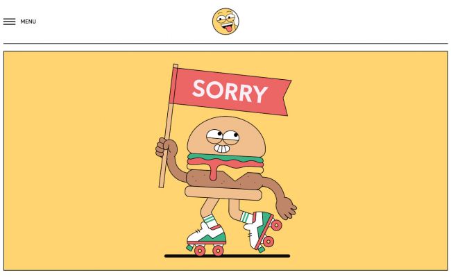
Dan Woodger’s fun 404 error page goes to show that a little design work can go a long way. A cheeseburger illustration with roller skates actually adds a layer of meaning by illustrating Dan’s style which gives a good sense of the type of work he does. Clever.
Bret Victor
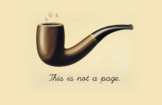
This is a personal favourite for the clever play on art. Bret Victor’s 404 error page integrates Rene Margritte’s iconic painting, proposing a more philosophical question to go with the piece. What are we looking at? If it’s not a page, what is it? What is a page even? Take your time embracing this one.
Bit.ly
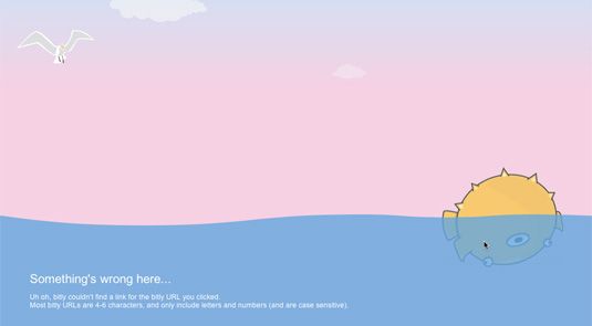
Simplicity and good design works as well. Bit.ly used a cute pufferfish that you can interact with on the page. It’s a simple idea that helps make the dysfunctional page somehow functional even if it keeps maybe 5 seconds of the user’s attention.
Blizzard Entertainment
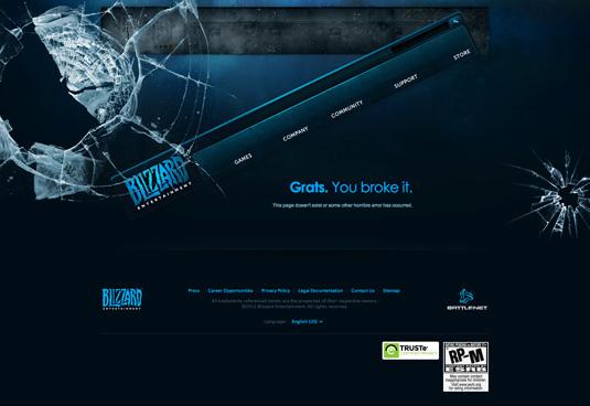
Broken glass = broken link, makes sense, right? Blaming the user is maybe not the best copy mood, but Blizzard Entertainment can afford it. It’s an example of how a simple visual can work well paired with plain copy.
Magnt
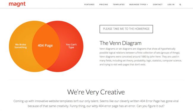
Now if anything, Magnt really put thought into their 404 error page. Users can certainly appreciate how clever and witty it is. The Venn diagram shows 2 reasons why you’re on this page – “we broke something” and “you can’t type”. To take it further, they pose a riddle-like statement that makes you wonder while you continue to other pages.
CSS- Tricks
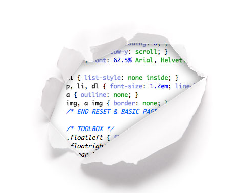
This page has been a favourite with many, mostly because in this example, no words are needed. You know your page is not found when you see code you can’t interpret. It’s a reference to the fact that this job is up to the developers to fix, who have to look behind the scenes of the webpages to fix the problem.
Kwarter
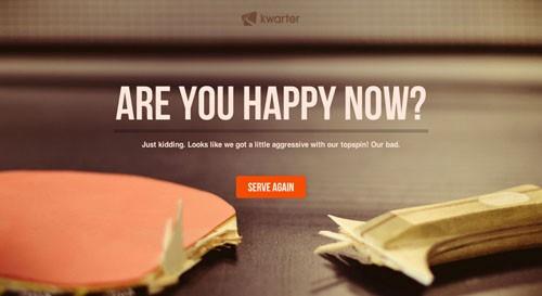
This mobile gaming app took a risk. They make you feel guilty about breaking the page in giant letters but then quickly transition to explain the problem that’s actually theirs. This can be one approach, to be a bit aggressive but funny which some users will appreciate as long as it’s funny aggressive.
Blue Fountain Media
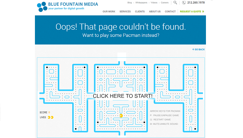
Another game but shaped in 404 numbers. Surely many will remember Pacman and engage in this fun short game for the sake of entertainment. Hands down, most of us will play at least one round before moving on.
EmailCenterUk.com
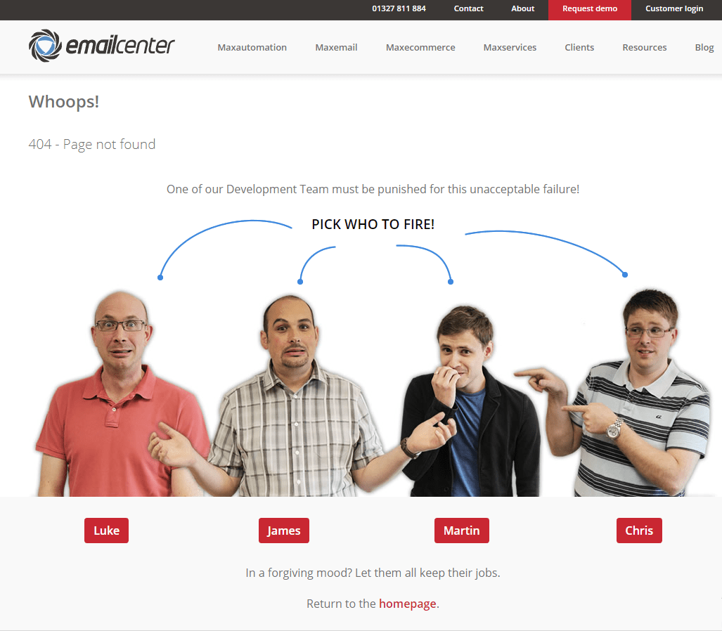
This one is hilarious! When you land on their 404 error page, you have a choice to fire someone from the development team with a click of a button. Clearly, it’s part of their inside joke but what a great way to engage users! See what happens when you choose someone to fire…
Amazon
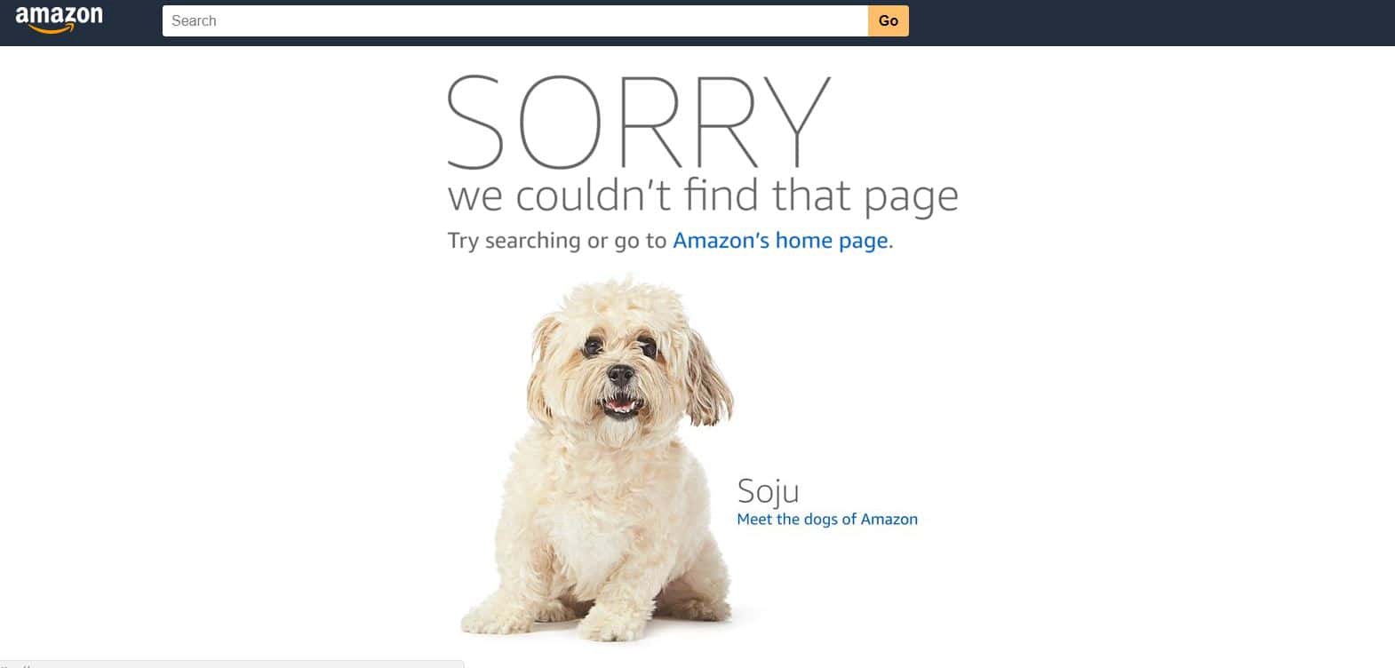
We jump from witty to adorable. Who can resist dogs? Amazon knows this too well and uses their 404 page to show you their office dogs. With an emphasis on the apology, you get to meet all the dogs of Amazon if you hand on the 404 at different times.
DashThis
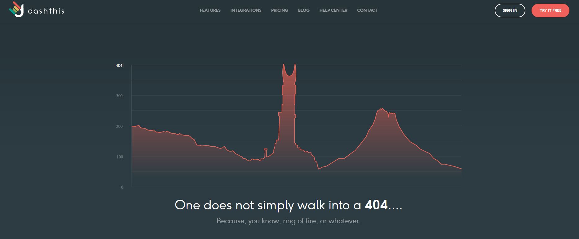
DashThis knows their target audience, and surely they’ll all get the Lord of the Rings reference. This 404 error page will make you want to laugh it off – as inconvenient as it is, it’s clever! The detailed graph of the Mount is just great design with excellent copy.
Huffington Post

Huffington post took the informal route, making the most of puppies we can’t resist. Their error page puts a smile on your face with the cheeky and simple copy. Can’t go wrong with this combo.
9gag
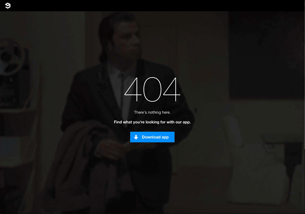
When humor is the driving force of your brand, you’ve got to surprise your users with even more humor. 9gag used to have this 404 error page from Pulp Fiction with John Travolta looking around in confusion with a line “there’s nothing here”. Now the page is some meme I actually can’t decipher but maybe you guys can.
Daily UI
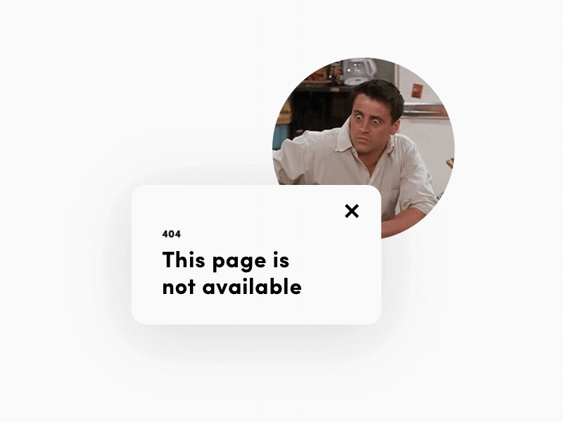
This is a drafted error page that simply had to be a part of this collection. Humorous animation of Joey from Friends and very simple text is enough to make someone smirk. It’s a good one for all the Friends fans out there that can appreciate the humor and maybe even remember the episode.
Team Coco
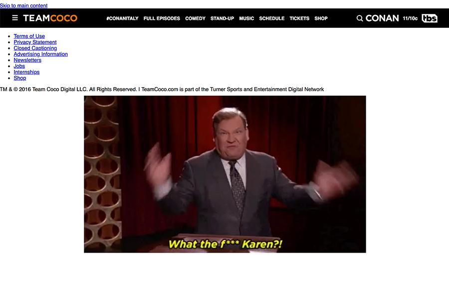
Conan O’brien’s site never fails to disappoint. The ever changing series of GIFs really highlight Andy’s best moments making their 404 error page actually something you want to see. But you really have to see this one in action…
Distilled
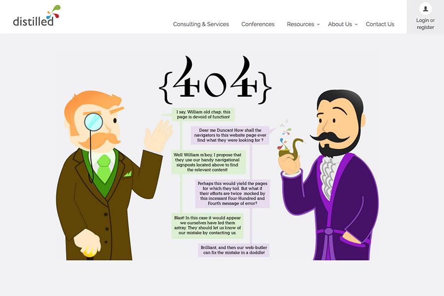
Lastly, this funny 404 page pitches a conversation between two ‘chaps’. As funny as the convo is in itself, it’s even more fun if you read it in a British accent.
Summing it up – what does a successful 404 error page need?
1. Clever, lighthearted copy
Everybody gets that ‘the page you’re looking for is unavailable’ when they see 404. Instead of stating the obvious, and giving your users a reason to yawn, opt for copy that is in line with your brand voice. This can be something lighthearted, unexpected, fun and simply amusing. The point is to add something unexpected and fun to the user’s experience and it starts with witty copy as stated in most of these examples.
2. The right visuals that communicate an idea
Your copy is important, but the images that compliment it make your message more memorable. Some brands have used gifs, some an interactive image. Take this opportunity to not just add a a visually appealing photograph, but a fun image or a fun visual element that elevates a boring 404 error page.
3. Excellency with design
If you have the aforementioned 2 nailed and approved, it’s time to move on to the design. The biggest tip with design is to opt for a touch of the unexpected. This can be done in an unconventional layout of your 404 error page, or something quite advanced that will engage the users as with the example of some games that were integrated into the error pages. Objective: be fun (funny) and memorable.
That’s about it! It’s been so much fun seeing the diversity or 404 error pages and studying how brands are investing their efforts into something as simple as a page that literally has no meaning other than to tell you someone’s messed up. Let us know what your favourite 404 pages were from the list in the comments section below.


