7 Design Principles Behind High Converting Landing Page
Your landing page is the portal that introduces your product to potential customers. It gets the prospects interested in what your business has got to offer, and it tells how they can become customers.
A poorly designed landing page will drive the traffic away from your website instead of converting prospects into customers. If you want to avoid that altogether, you must understand and implement the underlying design principles behind high converting landing pages.
To help you get started, here are the top seven design principles that will help you create a landing page that converts!
1. Minimalism
Sometimes, when you try to impress potential customers with elaborated design elements, you can end up with an over-designed landing page. Placing too many elements can distract users from the initial purpose of a landing page, which is to encourage leads to convert into customers. Minimalism and simplicity will help you achieve this goal.
The minimalist design allows you to highlight the most important product features while keeping your landing page clean and simple. That’s why the general rule of thumb is to keep your landing page as simple as possible.
Apple does a great job designing minimalistic landing pages that show products in action.
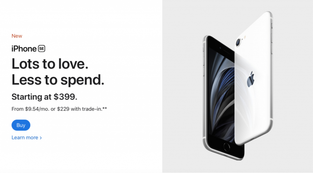
Image Source: Apple
2. Length
The length of your landing page is another crucial design factor. In general, there are two types of landing pages – long and short. The length type for the landing page depends on the industry you operate in, your objectives, and the kind of traffic you’re aiming to drive.
So, how do you know which landing page length will work best with your product? If your brand is recognizable and well-known, you can design a shorter landing page. Also, if you offer a low-risk product that requires customers to make pocket cash decisions, there is no need in a long landing page.
Here’s an example of how a shorter landing page for a fitness center website led to an 11% increase in conversion rate.
On the other hand, if your product is complex and requires detailed technical explanations, you should consider developing a longer landing page. This also applies to high-risk products and business websites that require prospects to make a money spending decision.
In this example, a more detailed product description and a longer landing page resulted in a 63% increase in conversions.
3. Consistency
The consistency of your landing page matters a lot. All design elements throughout your landing page and other website pages should match. This means that all fonts, headings, sub-headings, sizes, button styles, and other design elements must be consistent throughout all pages.
Make sure that all elements are both visually and functionally consistent. Visual consistency implies that all elements of your website are perceived the same way. In this example, you can see that the first Contact Us buttons are visually consistent, which means that they are perceived the same way, unlike the third button.
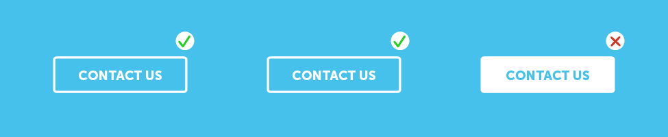
Image Source: Gofishdigital
Functional consistency implies that all web elements are located consistently throughout your website. For example, placing navigation buttons in the same places and placing consistent date format types throughout all pages will greatly contribute to the overall functional consistency.

Image Source: Gofishdigital
4. Readability
Readability is another design factor behind a high converting landing page. Trying to squeeze in too much information on the landing page is a common mistake that diverts website visitors from brands.
To avoid making this mistake altogether, don’t overwhelm readers with long paragraphs. Anyone interested in your product will click on the menu to find out links that lead to more information.
All fonts for your landing page (and the overall website) should be chosen carefully because some fonts don’t render properly, while others display well across all devices.
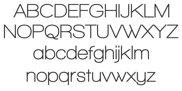
Image Source: Designmodo
The sans-serif family fonts are commonly used in web design. They are easier to read on mobile devices and are proven to display well across different devices.
5. Responsiveness
With more than half traffic being mobile, responsiveness (a.k.a. mobile compatibility) is another crucial design principle. To keep up with the increasing use of smartphones, tablets, and laptops, your landing page must support different screen sizes and browsers.
Design your landing page in a way that it’s skimmable and easy to navigate. Make sure that all elements of your landing page are responsive and display well regardless of the user’s device.
Here’s a great example of a responsive landing page by a handmade cosmetics brand Lush.
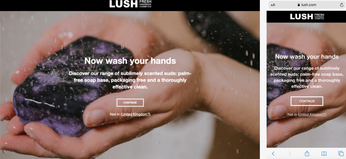
Image Source: Lush
6. Trust signals
For your leads to convert into paying customers, they have to trust your brand and what it does. That’s why trust signals are the next design principle worth implementing.
Trust signals refer to different visual clues and social proof that indicate that your brand is reliable and trustworthy. Including these trust signals can add reliability to your brand and ultimately increase the conversion rate of your landing page:
- A visible and well-designed logo
- Credentials and certifications
- Customer testimonials and reviews
- Logos of companies you’ve previously worked with
Here’s how Depositphotos uses social proof on their landing page to build trust.
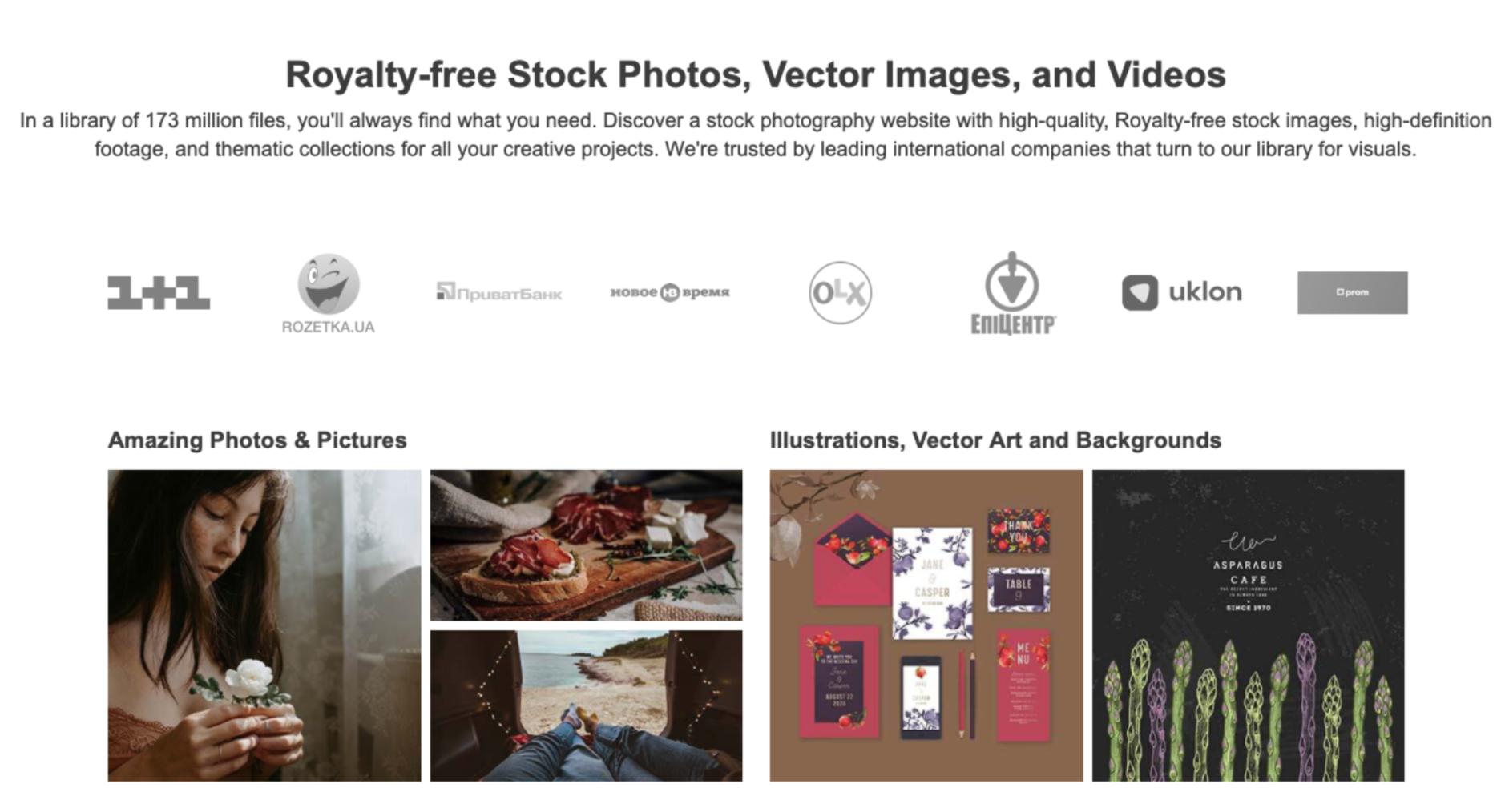
Image Source: Depositphotos.com
7. Visual appeal
Human brains are naturally attached to visual information as they can process images much faster than text. That’s why the best way to engage website visitors is by telling product stories through visuals.
The images you use should motivate your website visitors to complete actions by captivating the right emotions.
Many high converting landing pages use videos to illustrate product benefits and features. You can use videos to explain the complex or technical aspects of the product you offer.
The animation is a great way to explain your products and services, too. Here’s a great example of how to use interactive visuals on a landing page.
GIF Source: i.gyazo
When designing your landing page, don’t forget to use the white spaces to avoid visual clutter and mess.
Wrapping it up!
Before you go, let’s quickly wrap up what you’ve learned today about how to design a landing page that converts well.
- By keeping your landing page simple, you can highlight the most important information.
- Choosing the right length of your landing page will help you increase conversions.
- All elements of your landing page must be visually and functionally consistent.
- Avoid overwhelming website visitors with textual information.
- With more users browsing websites from mobile devices, it’s paramount to create a responsive landing page.
- By including trust signals on your landing page, you can prompt leads to convert more.
- Use visuals to drive attention to your products and encourage website visitors to convert into paying customers.
Building a landing page sounds like an easy task, and it can be if you follow along with these seven design principles behind high converting landing pages!