The Color White: Symbolism, Theory and Design Tips
In the fast-paced world of social media, everyone wants to stand out and make a powerful statement. However, in pursuing more followers, likes, and shares, it’s easy to get lost in a sea of visual noise and end up looking like everyone else. Creating balance is the key to making your designs powerful — and this is where color comes in.
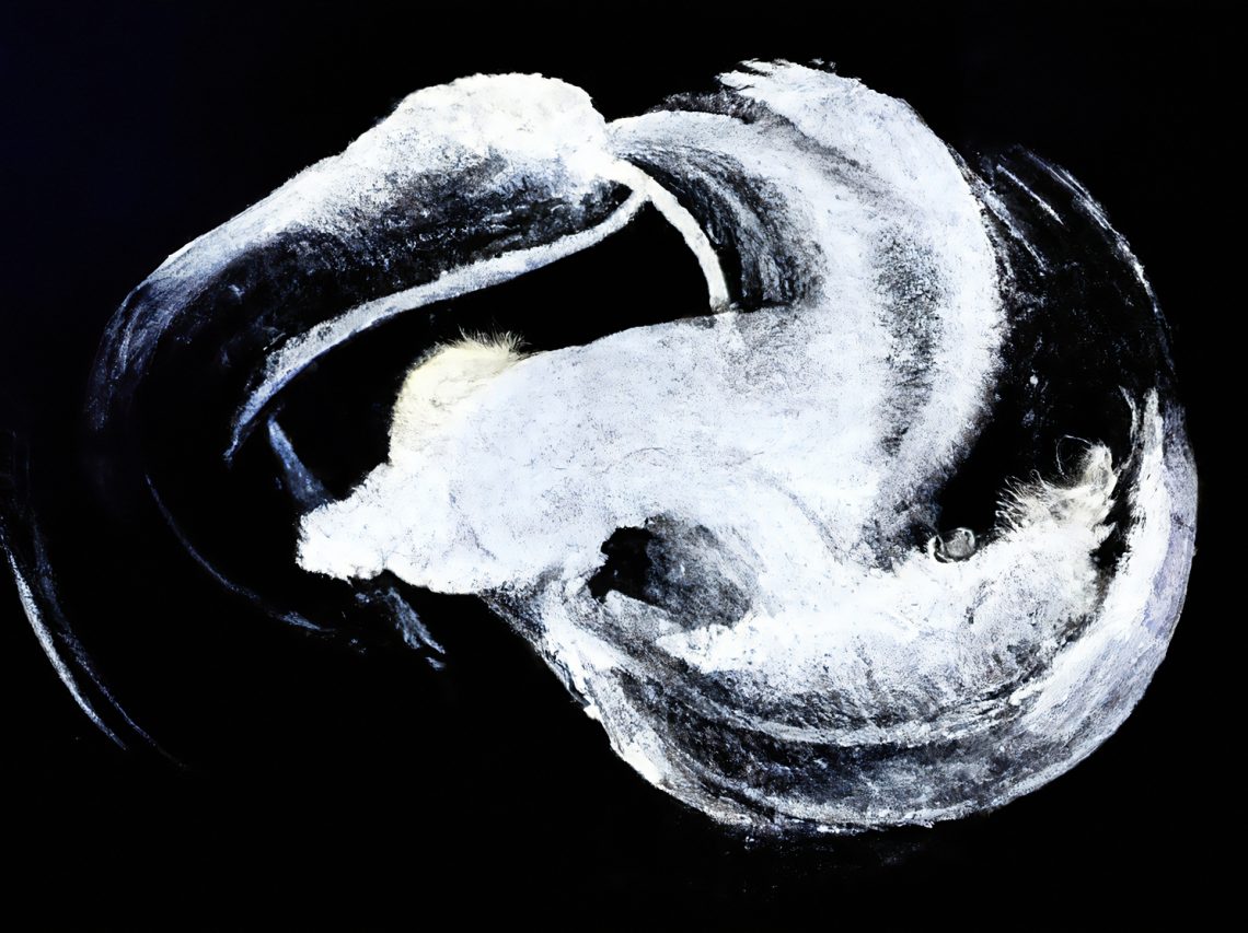
The color white has a universal appeal, making it a versatile and timeless choice for any design project. It has the unique ability to create a sense of space and openness, drawing attention to essential elements of design composition. Whether you’re creating a logo, a website, or a visual for social media, the color white can help you achieve a perfect minimalist look.
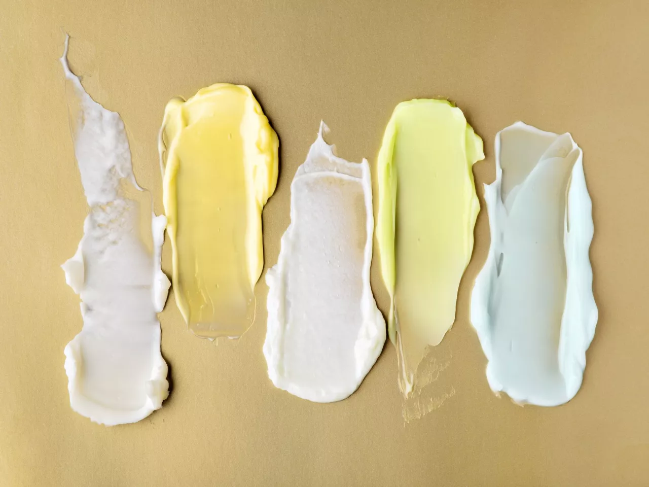
We prepared this guide to provide you with practical tips and insights on using white in your designs. Dive into a special collection of photos and videos inspired by it and choose ones that will draw the immediate attention of your audience. Let’s explore the world of the color white!
See collection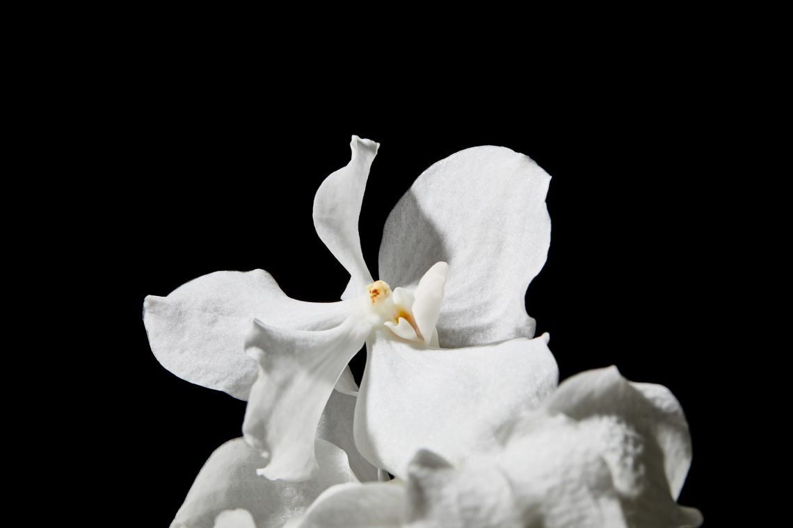
The origins and symbolism of white
The color white has a rich cultural and historical significance that can be traced back to the earliest days of human history. In ancient times, white was often used in religious and spiritual ceremonies since the color was associated with purity, innocence, and divinity. In ancient Egyptian art, white represented light, clarity, and truth, while in ancient Greek culture, it symbolized the gods and goddesses. In medieval Europe, white was the color of royalty and nobility, representing wealth and power along with gold. In Christianity, white was associated with the Virgin Mary, symbolizing her purity — it’s one of the reasons why white is a popular choice for wedding dresses.
The discovery of titanium dioxide in the early 20th century revolutionized the production of the color, allowing for a brighter, more opaque white that became a staple in modern art and design. This breakthrough led to the development of new materials and technologies that made it more accessible and affordable.

Beyond diverse cultural and historical associations, white also represents light, clarity, and truth. In design, it’s used to create contrast and draw attention to other elements of an image. It can add balance and harmony to composition or create a striking and memorable effect if accompanied with primary colors. White is often used to create a clean and minimalistic look, which helps emphasize the promoted product or message. It’s also associated with simplicity and transparency, and that’s why it’s a perfect representation of honesty and authenticity. Today, white remains a popular color choice in design thanks to its simplicity and timeless appeal.
Where is white on the color wheel?
White isn’t featured on the traditional color wheel, as it is considered a non-color. It’s achromatic, which means it’s not typically considered a hue. Unlike black, which absorbs all other colors, white reflects and scatters all visible wavelengths of light. This unique characteristic makes it a valuable tool in design, as it can create negative space, allowing other colors and elements to stand out. Whether used independently or combined with other colors, white is a versatile and powerful tool that can enhance any type of design.

Types and shades of white
Pure white
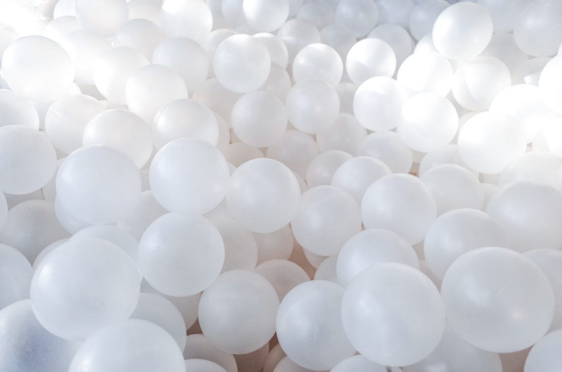
White may seem like a straightforward color, but in reality, there are a variety of different shades and types of white. The most common type of white is pure white, often referred to as “bright white” or “paper white.”
HEX #FFFFFF
RGB (255, 255, 255)
CMYK 0%, 0%, 0%, 0%
Off-white
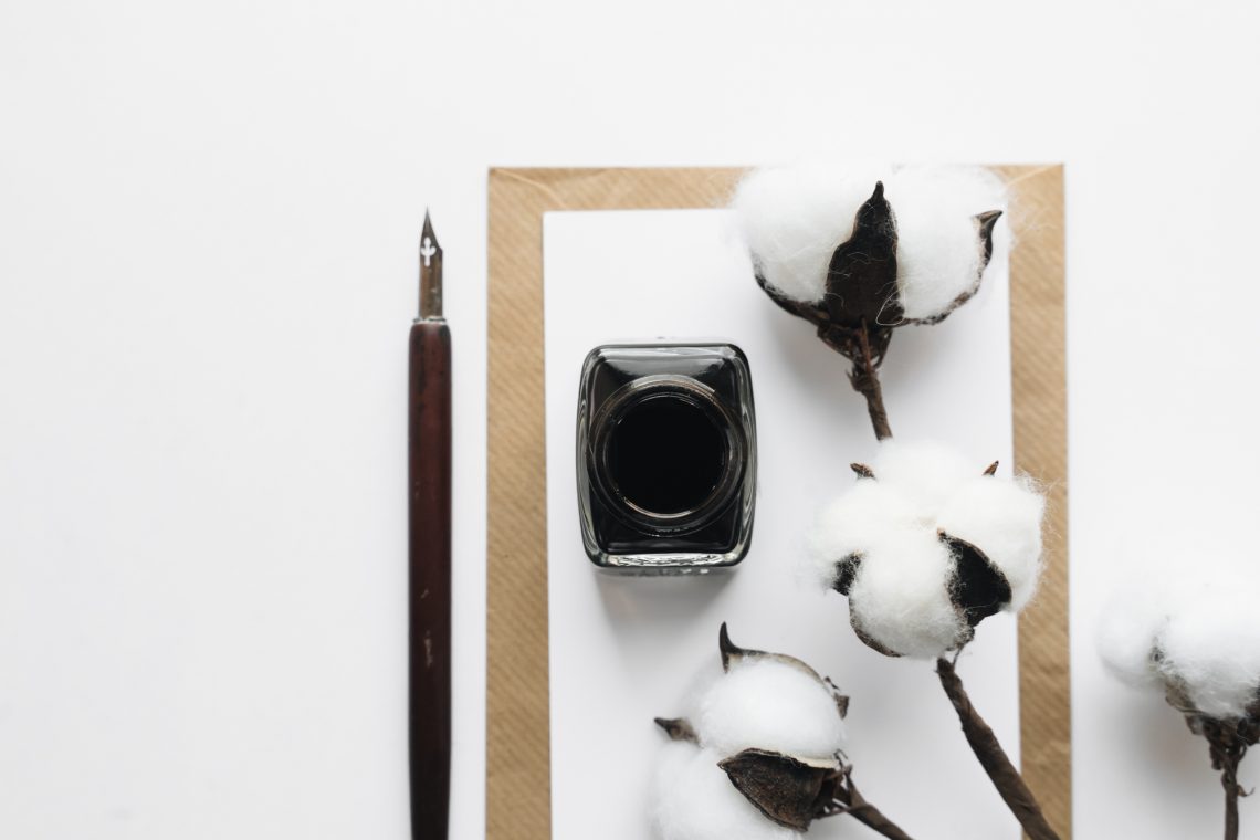
Off-white is a softer and warmer shade of white, achieved by adding a small amount of another color to the white base. Common variations include yellow, pink, or gray. It can also be used in graphic design and branding to create a more subtle yet memorable look.
HEX #FAF9F6
RGB 250, 249, 246
CMYK 0%, 0%, 0.02%, 0.02%
Warm white
Warm whites, including cream, ivory, and eggshell, are created by adding a small amount of yellow to a white base. It’s also a popular interior design choice, creating a cozy and inviting atmosphere.
Cream
HEX #FFFDD0
RGB 255, 253, 208
CMYK 0%, 1%, 18%, 0%
Ivory
HEX #FFFFF0
RGB 255, 255, 240
CMYK 0%, 0%, 6%, 0%
Eggshell
HEX #F0EAD6
RGB 240, 234, 214
CMYK 0%, 3%, 11%, 6%
Cool white
Cool white is achieved by adding a small amount of blue or green to a white base. These shades create a bright and refreshing look, particularly popular in branding and web design.
HEX #F4FDFF
RGB 244, 253, 255
CMYK 4%, 1%, 0%, 0%
Antique white
Antique white is a slightly yellow or beige white shade often used in vintage and rustic designs. It has a warm and cozy feel that works well with other earthy colors like brown and green.
HEX #FAEBD7
RGB 250, 235, 215
CMYK 0%, 6%, 14%, 2%
How do you design with white?
White is often used as a neutral color in color schemes, paired with other colors to create a harmonious and balanced look. Some of the most common color schemes that include white color are:
- Monochromatic. This scheme uses different shades of the same color, with white as the lightest shade.
- Analogous. This scheme uses colors next to each other on the color wheel, with white as a neutral color to create contrast.
- Complementary. This scheme uses colors opposite of each other on the color wheel, with white as a neutral color to create balance.
What colors go with white?
When choosing colors to pair with white, it’s essential to consider the overall mood and feel you want to create. Combining white with other colors can evoke different emotions and create various visual effects, so it’s important to choose colors that complement each other. Here are some colors that work well with white:
- Black. A classic combination of black and white creates a timeless and sophisticated look.
- Gray. Gray is a great way to complement white and create a modern and minimalist design.
- Pastels. Soft pastel shades like blush pink, baby blue, and mint green, in combination with white, create a fresh and airy aesthetic.
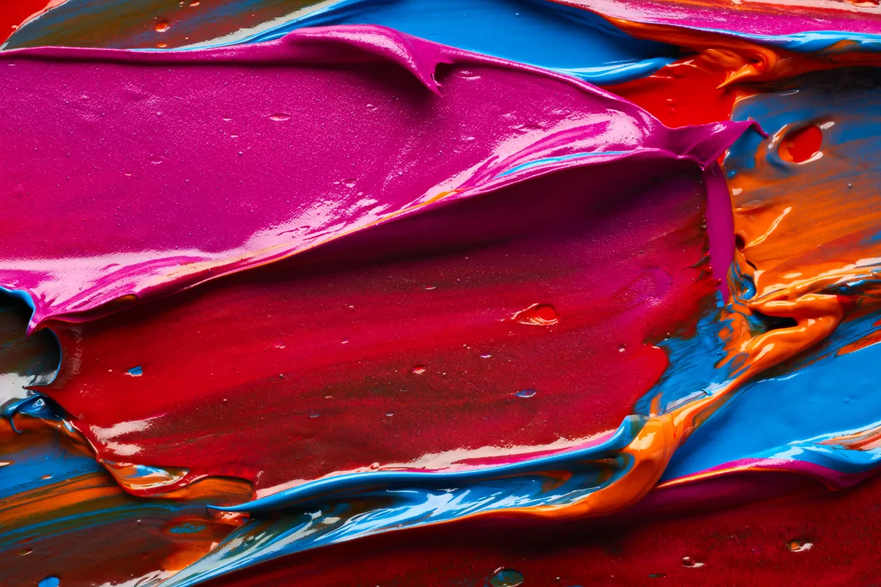
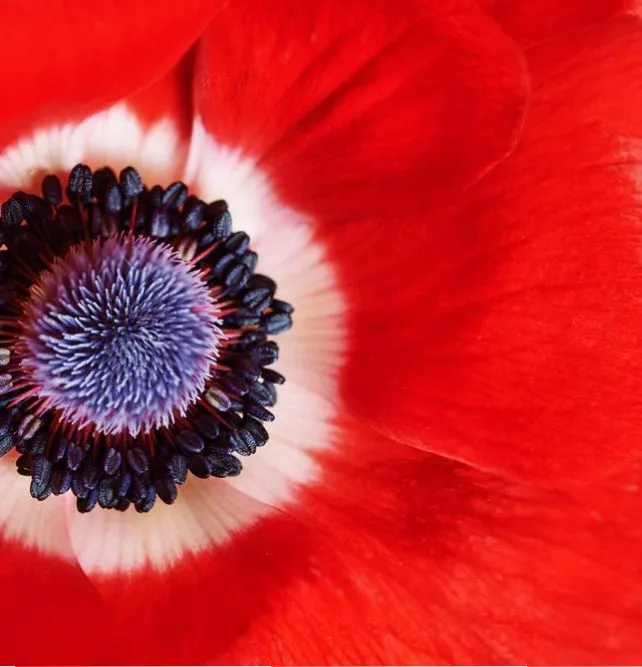
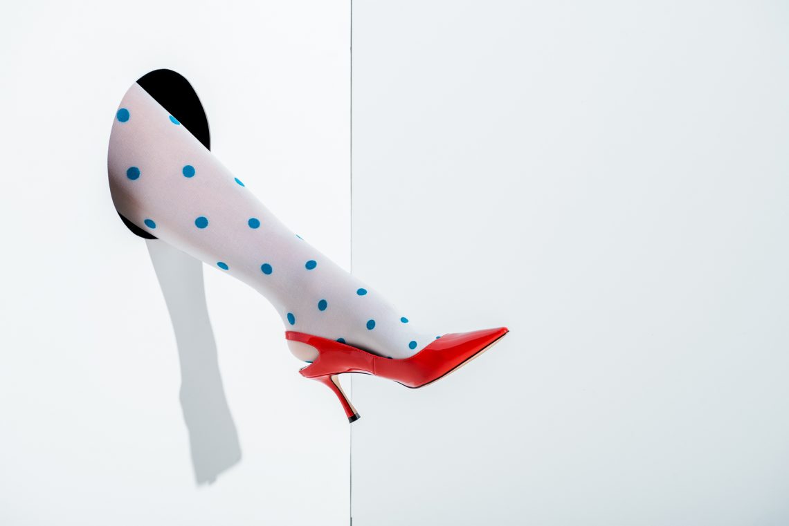
- Brights. Bold, bright colors like red, yellow, and blue, when used on white background, create a vibrant and energetic look.
- Metallics. Metallic shades like gold and silver in combination with white can add a touch of glamor and luxury.
- Neutrals. Neutral shades like beige, taupe, and brown, when paired with white, create a warm and inviting atmosphere.

To wrap up
White is a versatile color that can bring balance, simplicity, and elegance to any design. Its ability to complement and enhance other colors makes it an ideal choice for a wide range of creative projects. Due to its flexibility, you can use white in various design styles, from minimalistic and modern to classic and traditional. Whether as a primary color or as an accent, white can help you make your projects stand out!
See collectionOther articles you might find interesting
How to Design with Gold: Its Meaning, Symbolism, and Complementary Colors
Winter Color Trends 2022-2023: Inspiring Palettes, Curated Collections & Ready-To-Use Mockups
2023 Color of the Year: Wild Wonder [Collection of Visuals]
The Pantone Color of the Year 2023 [Image & Video Collection]