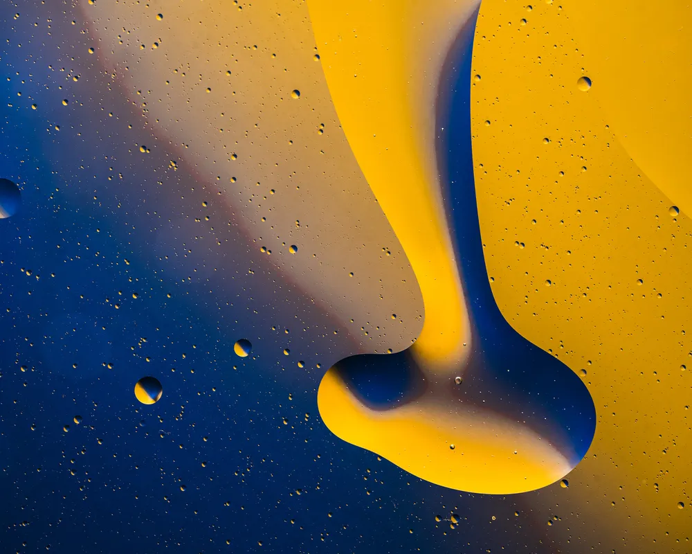
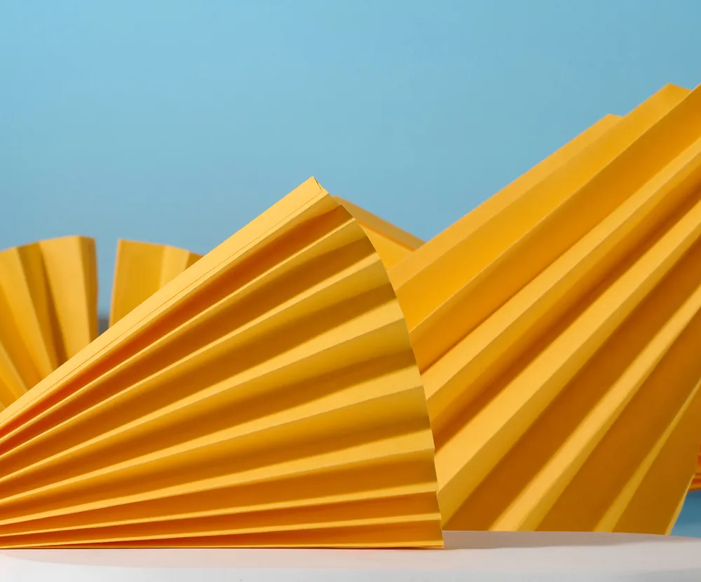
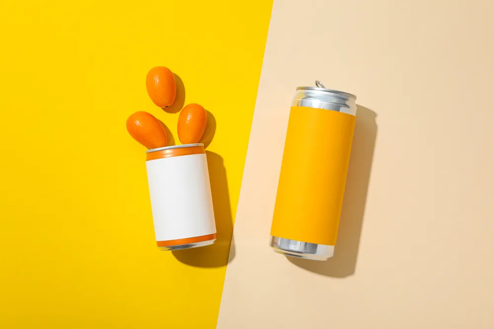
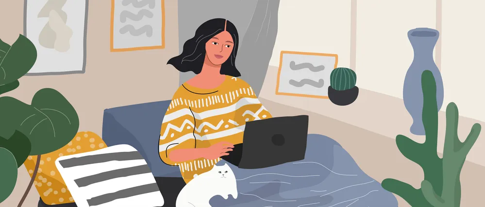
From True Joy to Future Dusk: Exploring 2025 Colors of the Year by Dulux and WGSN + Coloro
If you work in visual communication, you are surely as eager as we are for the announcement of next year’s top color. And while Pantone, the leading trendsetter in the world of colors, still keeps us intrigued, other well-known industry players have already revealed their predictions.
In this article, we present the shades that will prevail in the creative field in 2025, according to Dulux and WGSN + Coloro. Meet True Joy and Future Dusk, plus collections of ready-to-use images in these trendy colors.
Explore Dulux Color of the Year 2025 Collection
Browse WGSN + Coloro Color of the Year 2025 Collection
Headline color of the coming year from Dulux
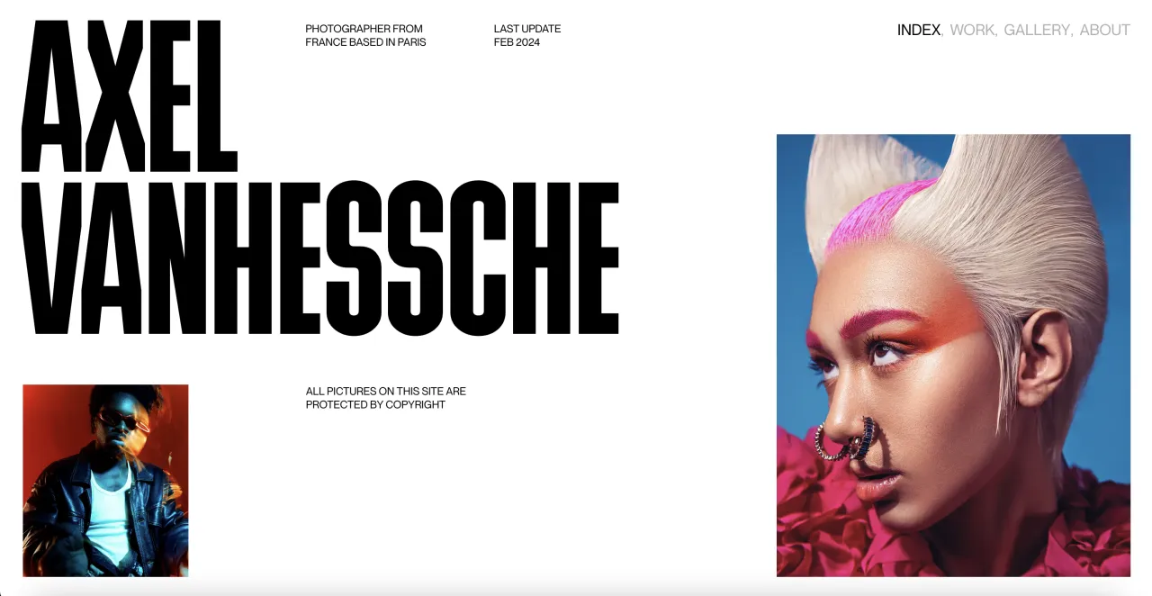
For those who crave vivid hues in trendy color palettes, the Dulux paint brand has prepared a true gift by announcing True Joy as the headliner for the following year. This dopamine-boosting shade of yellow is meant to bring cheerfulness and vigor. The brand claims that True Joy was created to fill designs “with creative energy, optimism, and pride.”
“This year, there’s a growing sense across the world that life must be better elsewhere. In times like these, there’s a desire to break free, press reset and welcome in the new. This was the feeling that came out of our Trend Forecast meeting. Our conversations led us to the theme ‘Just Leap’ and to the shade, True Joy.”
—Dulux
True Joy is a warm, saffron shade of yellow with a touch of orange, reminiscent of sunshine, marigolds, pumpkins, and mangoes. Its closest relatives are mustard and amber. Despite a bold look, this shade is balanced and versatile, making it suitable for various design applications.
How to integrate True Joy into your projects
1. Use it as a statement color
Want to convey a sense of excitement or create a welcoming environment? Use True Joy as a primary color to immediately grab audiences’ attention and evoke positive vibes. This shade will work great in any project, from web design to packaging.
2. Add some vivid accents
If you stick to a neutral palette, True Joy can bring striking pops of color and engaging accents to your designs. Moreover, by strategically using this trendy shade to emphasize essential elements, you will provide a visual hierarchy on your website, mobile app, or presentation.
3. Create daring color mixes
Follow Dulux’s “Just Leap” call and fill your projects with an explosion of color. True Joy works wonderfully when paired with analog green or complementary purple, as well as in more complex combinations such as a triad of yellow, red, and blue.
Pair True Joy with:
- Brown—to create a warm and comforting color palette.
- Purple or blue—to provide a temperature balance and striking contrast.
- White—for clean and minimalistic projects.
- Red or orange—to get an energizing monochromatic design.
- Shades of green—for a nature-inspired and harmonious look.
Bring True Joy to your audience by filling visual communication with images in the sunny hue. Check out our thematic collection and download hand-picked files for your next campaign.
The top color of 2025 from WGSN + Coloro
Since global trends reflect general changes in moods, preferences, and ways of thinking, it is not surprising that predictions from different brands or creative agencies can intersect. For example, Future Dusk, the shade announced by WGSN and Coloro as next year’s color, has a twin in our Fall Color Trends 2024 forecast—Midnight.
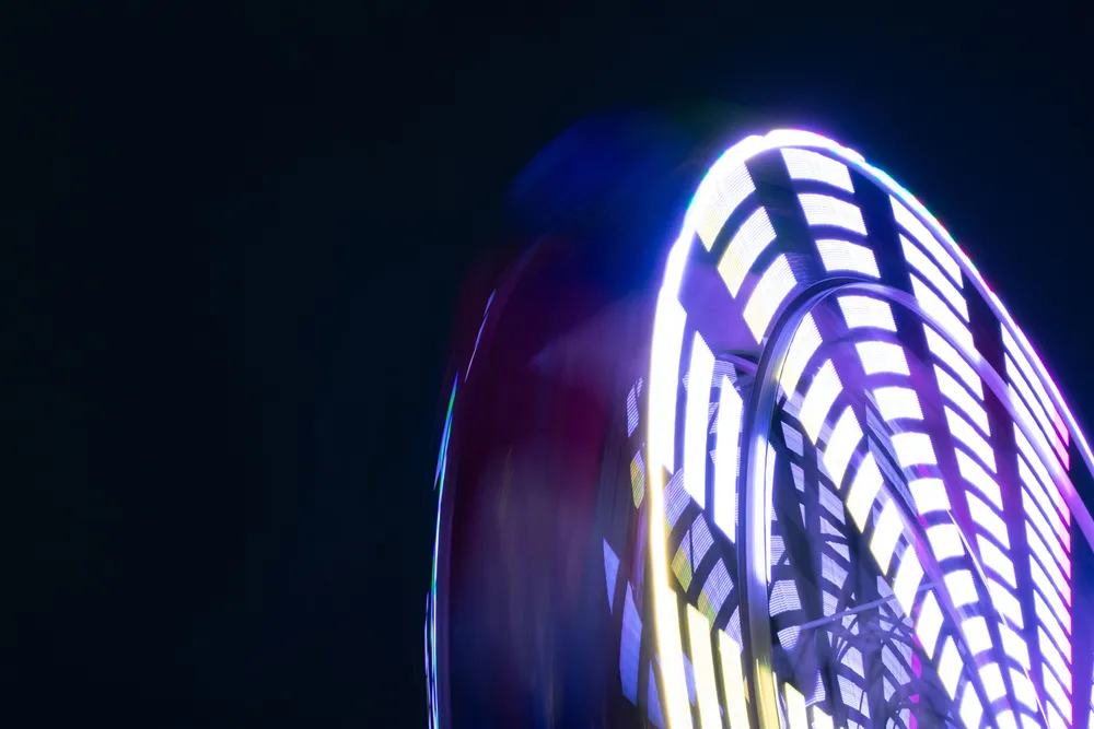
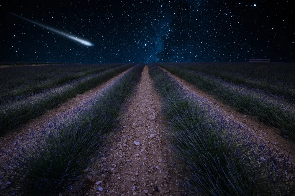
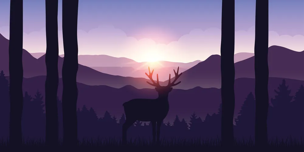
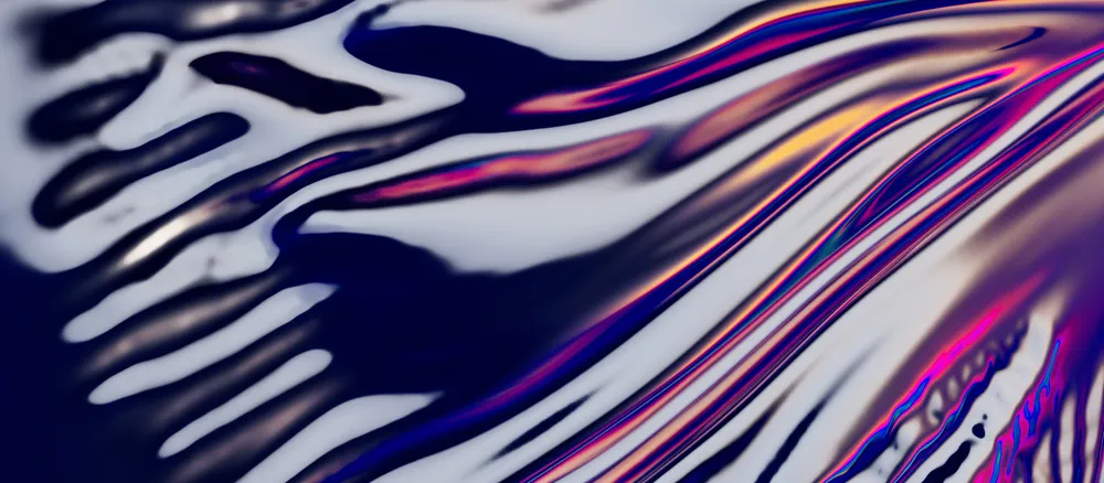
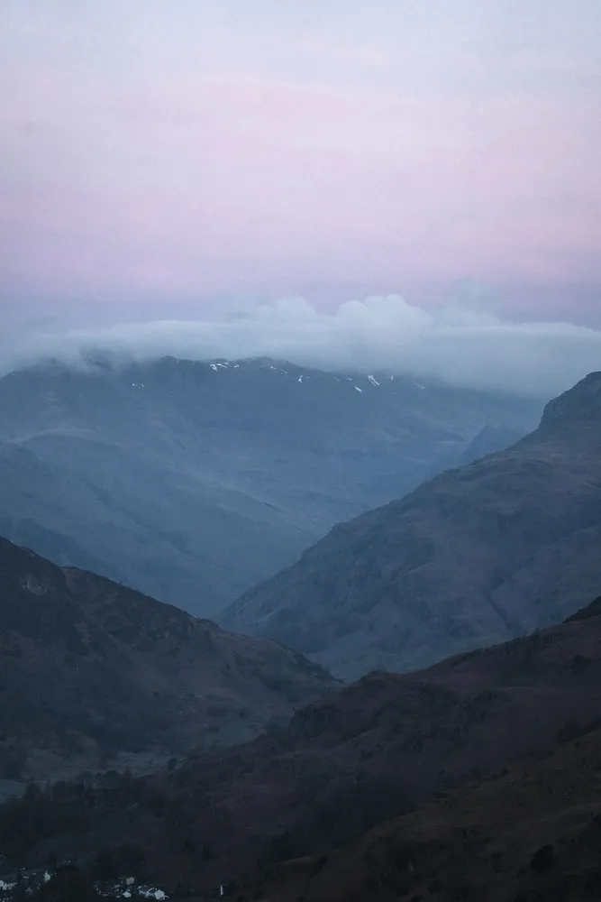
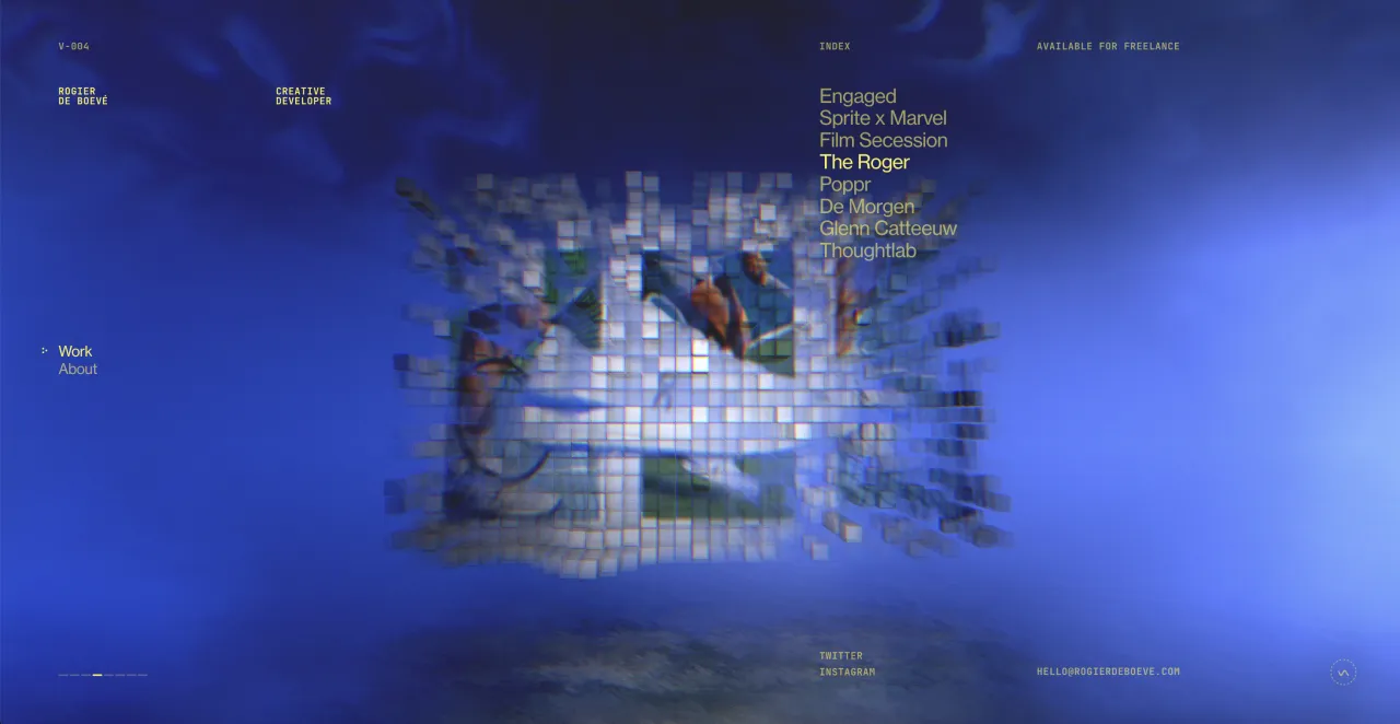
As a result of the collaboration between WGSN, a trend forecasting company, and Coloro, an innovative color system, we have another spotlight shade for 2025. Future Dusk is a robust, complex color combining navy blue with purple. It embodies mysticism, depth, and a note of escapism. The color was inspired by the theme of transition, from darkness to light or from dusk to dawn, which corresponds perfectly to periods of rapid shifts.
“As consumers continue to feel anxious in an era of polycrisis, colours that bring a sense of reassurance will be key in 2025, and we expect to see captivating tinted darks gain momentum.”
—the Color of the Year 2025 WGSN + Coloro announcement.
Future Dusk offers a fresh interpretation of dark blue, which looks familiar and reliable yet mysterious and futuristic. Such duality makes this shade versatile and gender-inclusive. It fits perfectly into both classic designs and ultra-modern projects.
How to use Future Dusk in design
1. Create dramatic and luxurious looks
Deep blue is associated with prestige and elegance, which makes it an excellent choice for premium brands and products. Use it as a base or background color to create an on-trend dark design that will be booming next year.
2. Bring futuristic aesthetics to life
Want to create a cutting-edge look? Future Dusk is your go-to solution for a futuristic, cyberpunk style. Combine it with metallics, holography, neons, and gradients to enhance the sci-fi vibe and create a spectacular effect.
3. Balance design with contrast
Too much dark blue can make your graphic look gloomy and unfriendly. Avoid this by complementing Future Dusk with other shades, from pastels to vivid colors like pink, yellow, or lime. You can also use midnight blue to highlight elements such as text or buttons on a lighter or brighter background.
Combine Future Dusk with:
- Pink—to create a dreamy and playful look.
- Cream or Ivory—to soften the richness of deep blue.
- Orange and yellow—for complementary palettes providing an eye-catching contrast.
- Violet and lilac shades—for a cohesive design with harmonious color transitions.
- Teal—to balance the visual weight of Future Dusk with vibrancy and energy.
Browse our themed collection to discover the abundant nature of midnight blue. Choose images that will add a touch of mystery and sophistication to your design.
To sum up
By sharing visual trends, we aim to streamline your creative process and add certainty to your decision-making. And since such tendencies resonate with the prevailing moods and current times, they will likely help you engage your audience effectively. Moreover, color trends are highly versatile: you don’t have to redesign your website or marketing materials completely. A few color accents are enough to show that you are ahead of the curve and emphasize your relevance. So, choose what is closer to you, True Joy or Future Dusk (or both), and have fun with your creative experiments.
Other articles about visual trends
Creative Design Trends 2025: From Wabi Sabi to AI-fueled Art
25 Top Web Design Trends 2025: From Neubrutalism to Dynamic UI
Fall Color Trends 2024: Nature-Inspired Hues, Rich Palettes, and Curated Collections
