Spring Color Trends 2025: Let’s Play! Ft. Bookmarkable Collections of Files and Palettes
Out with winter trends, in with spring! This season’s colors are playful and demand attention—two classic pastels and two bright hues that redefine nostalgia with a bold modern twist.
Want to add some energy to your visuals or design for a brand that wants to stand out? These curated collections are your creative arsenal for the coming season.
We’ve gathered insights from digital design, fashion, and interior aesthetics to bring you a curated report on the hues shaping the world this spring. Get ready to infuse your projects with captivating and inspiring colors.
Discover Spring Color Trends Collection
From palette to project: four go-to spring colors for your designs
Spring 2025 is painting the world in joyful shades with a hint of boldness. But not too much! The season invites us to reconnect with nature and jump straight into artistic expression.
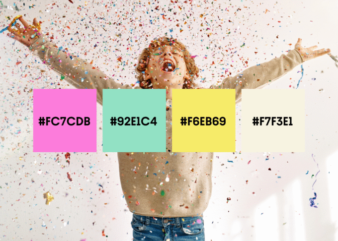
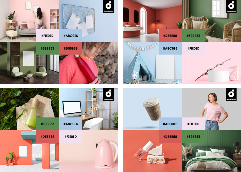
Say hello to the four defining colors of spring: Baby Blue, Peony, Coral, and Herb Garden. These shades set the tone for visual storytelling in digital design, branding, and fashion. Incorporate them into your projects to stay in tune with trends and create a captivating narrative that resonates with your audience.
How creative trends are shifting in 2025
What about key creative trends and aesthetic movements? With such a bright and cheerful color palette opening 2025’s color trends, you might think this year will bring back lots of childhood memories—retro posters, striped PJs, and nautical vibes.
It might, but this soft palette is actually a response to the uncertain and sentimental moods prevailing in 2025. They are what shapes high demands of the current generation of consumers.
Expect the decline of microtrend dominance. Some recent aesthetics like #cluttercore, #ecocore, #officesiren, #mobwife, and #blokette might be in their final months, while earlier ones like #quietluxury and #oldmoney are slowly fading.
A new era has begun, with all sorts of “-core” aesthetics being dethroned from our taste-making palettes. Consumers are shifting towards a #nobuy mindset, aiming to build a stable personal style that lasts for years.
Does it mean new explosive aesthetics like Brat don’t stand a chance? Well, they do, but for such a trend to take over this year, it would need to overpower consumers’ desire to save the planet after watching “Buy Now! The Shopping Conspiracy.” ?
So, when exploring ways to express yourself in 2025, think of individual style, vintage classics, timeless patterns, a pop of color, and a deep appreciation for handcraft and sustainability. We’re seeing these trends everywhere from product design to fashion and social media.
On this note, let’s begin with a breakdown of the spring colors.
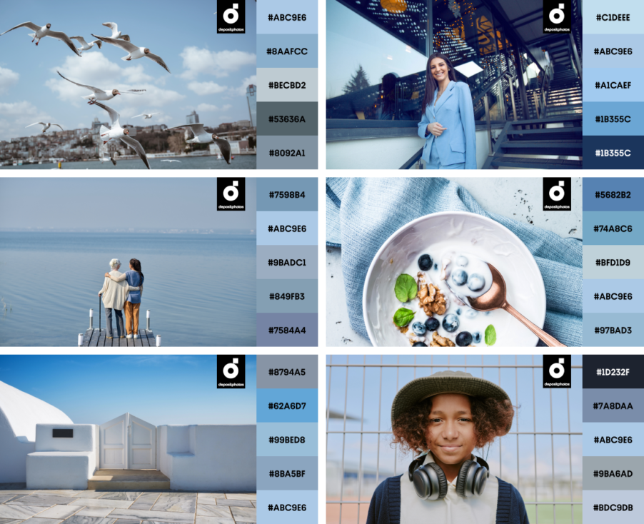
Baby Blue
#ABC9E6

Baby Blue is taking center stage as spring’s ultimate cool neutral. The color of skies and delicate flower petals, this soft shade carries an air of serenity and optimism. Baby Blue is often associated with freshness and cleanliness, similar to clear water, making it suitable for products or environments that aim to convey these qualities.
While mainly represented in healthcare, hygiene, and baby essentials, this color is a great design choice in general, thanks to its versatility and ability to combine with all sorts of shades.
Baby Blue is a good companion for digital and product design. It works perfectly for everything—from brand visuals to packaging. It’s often implemented as a base color or as an accent color.
In fashion, you can immediately recall Baby Blue from the timeless charm of washed vintage denim or a classic blue shirt. This shade was repeatedly noticed on Spring-Summer runways along with other pastels, with a great example being Chanel’s SS’25 Ready-to-wear show.
Baby Blue is often neglected in architecture and interiors because of its stereotypical childishness. In fact, if implemented smartly, this shade is a breath of fresh air, adding notes of nobility and sophistication. For example, to make things serious, dark wood is a perfect complement to the gentle blue shade, as excellently showcased in Rudy Guénaire’s PNY restaurant.
Contrast Baby Blue with burnt orange for a striking effect, or use quieter pastel tones like peach and lime.
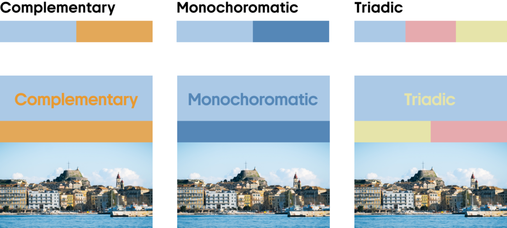
To create depth and contrast, pair Baby Blue with dark blues and browns or combine it with whites, soft pinks, and beiges for an ethereal look.
Read our design, marketing, and business reviews. Easily keep up with the latest trends!
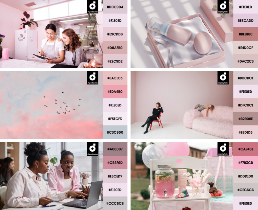
Peony
#F1E0ED
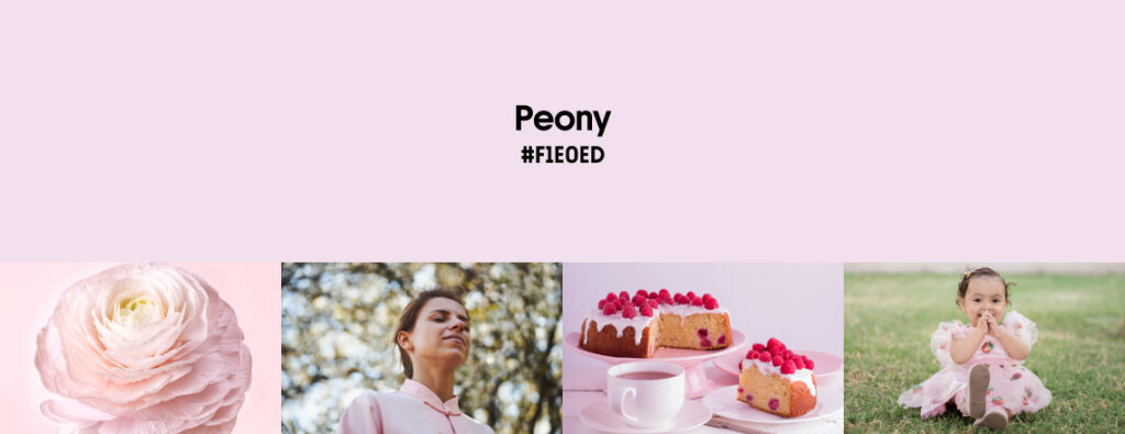
We survived the Barbie craze. Not just once! First, in the 90s-00s, when it was a hit childhood toy, and more recently, when Greta Gerwig premiered her Barbie movie and #Barbiecore exploded a whole aesthetic movement. Even though the -core part of it has almost shushed already, the soft Peony shade doesn’t intend to leave our color palettes any time soon.
Soft and dreamy pink—Peony can bring a touch of romance to your visuals and looks. Inspired by delicate petals and creamy desserts, this hue is elegant and nostalgic, reminiscent of old Hollywood glamour and modern-day minimalism.
Light shades of pink are a natural fit for beauty and wellness brands, with great implementation by Glossier and Benefit Cosmetics. Pink is also recognizable in soft editorial designs like those of Cosmopolitan, as well as fashion brands like Sophia Webster’s that lean into tenderness and grace.
But don’t underestimate Peony’s versatility! It takes on an unexpectedly bold persona when paired with deeper hues like charcoal or forest green. Check out how Peony is stunningly represented in recent digital, packaging, and interior design projects.
It might take a while until humanity finally agrees that pink is a unisex color, so bear with us when we boldly claim that pink is even more. It deserves a solid place in the palette of modern classic colors. On the lighter or darker side, it shows up among color trends every other season.
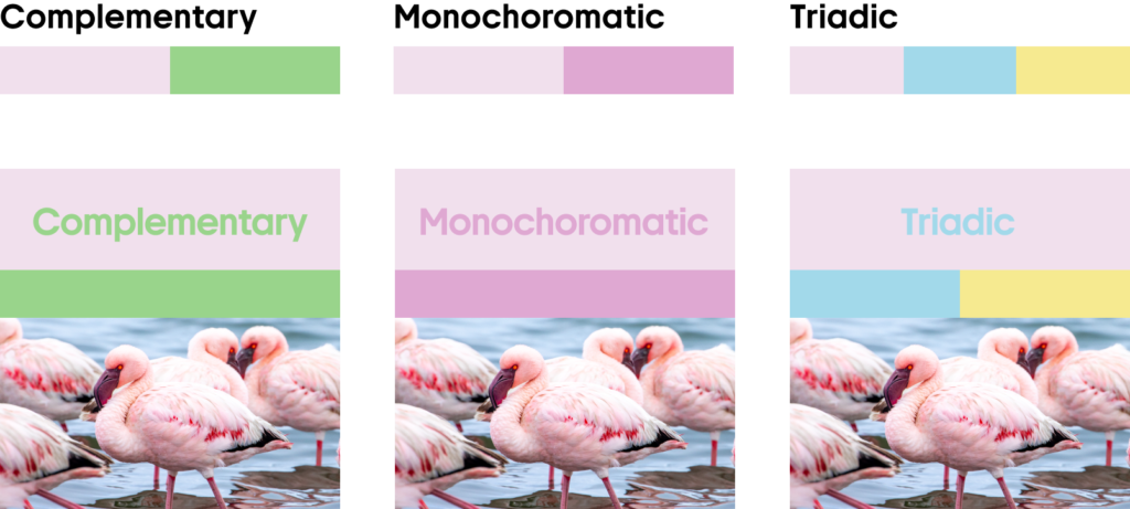
Pair Peony with greens for contrast, or layer it with darker pinks and other pastels for a whimsical, playful visual.
Peony works wonderfully with warm tones, neutrals, and grays, looking modern and sweet in any scenario.
Discover the colors of the year 2025 by Dulux and WGSN + Coloro
Coral
#D55B58
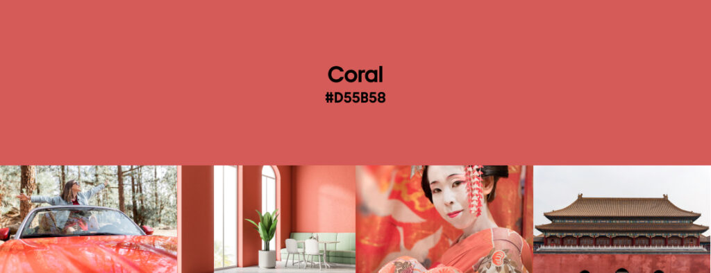
Vibrant, playful, and impossible to ignore—Coral is the boldest shade in this year’s spring palette. Sitting somewhere between red and orange, it channels the energy of sunset hues and vintage film posters. It’s dynamic yet surprisingly calm when paired with the right colors.
This intense sunset shade encourages resetting to prioritize life’s pleasures and speaks to the growing importance of escapism amid challenging times, as well as the rising influence of conscious hedonism, where moments of pleasure are fused with a sense of purpose.
—WGSN
This spring’s Coral is a red that was heavily influenced by Pantone’s Color of the Year 2025—Mocha Mousse. It is a perfect pop of color that isn’t screaming but is powerful enough to be a statement itself (or an attention-grabbing accent).
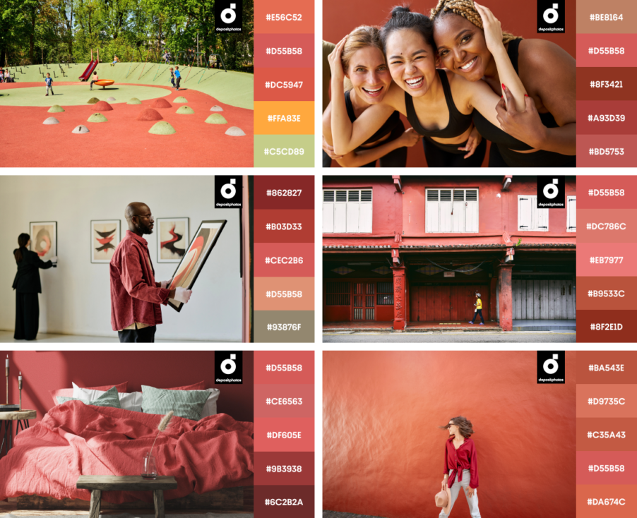
Coral is a favorite for brands that want to stand out. It’s a powerful shade in product design, illustration, and marketing campaigns. Want a contemporary feel? Surrender to even more red, orange, and pink, and make a gradient. Or, pair Coral with earthy neutrals like beige and taupe. For drama, set Coral against black, blues, or greens.
Complementary greens, blues, and yellow create a bold contrast, while soft pinks, grays, and beiges bring out Coral’s refined side.
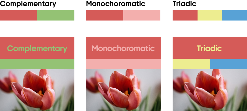
Pair Coral with light green, deeper shades of red, or neutrals to achieve completely different moods in your designs.
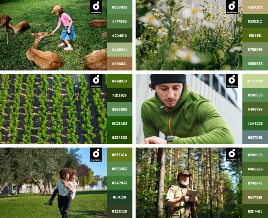
Herb Garden
#598B53
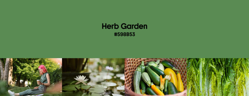
Remember Matcha Latte from our winter color trends? Well, like getting over pink, we just can’t get past green. The color is so versatile and universally adored that it holds top positions every other season.
Herb Garden is a rich, grounding green inspired by lush springtime landscapes and organic elements. With sustainability at the forefront of design trends, this natural shade makes waves in everything, from branding to product design and interior aesthetics.
Perfect for companies wanting to add a natural touch to their designs, Herb Garden works beautifully as both a dominant and accent color. It’s effortlessly unisex, timeless, and deeply connected to the real world when used alone. When applied next to contrasting bright hues such as orange, it becomes playful and pulls off a completely different look.
Herb Garden and similar greens were popular on multiple fashion runways of the SS ’25 collections, with Victoria Beckham’s iconic look for Gigi Hadid being one of them. Thanks to its Wicked-induced popularity, we will also see more green in apparel.
Explore Herb Garden Collection
Pair Herb Garden with darker greens and browns, or combine it with deep reds and muted purples for a stunning effect.
Earthy browns, whites, and warm neutrals enhance Herb Garden’s natural feel, while pink, orange, and yellow add a touch of playfulness.
Instant styling pack of mockups, vectors, and other ready-to-use files in spring hues
Want to integrate these spring colors seamlessly into your projects? Our team has created a collection of high-quality vectors, mockups, and design assets to make your creative process smooth and quick.
Whether you’re updating your social media templates, designing product packaging, or crafting your next advertising campaign, these assets are here to help. Bookmark this collection to check out versatile visuals in trending spring colors. Especially when you’re in need of a studio-quality file for your project or inspo for your next big idea.
Closing thoughts on spring design trends
This spring, we’re moving away from overly saturated, artificial hues and embracing timeless, nature-inspired palettes that blend nostalgia with modernity. We’re also ready to overthrow dark hues like Aged Wine and Saddle Brown from the pedestal because, in spring, it’s all about a balance of softness and vibrancy.
Spring offers endless possibilities for creative exploration with colors like Baby Blue, Peony, Coral, and Herb Garden. Whether you lean into pastels or go bold with deep contrasts, these are your go-to shades for everything—from digital to print design.
Compared to last year’s spring color trends, this year brings a fresh perspective on good old shades, making playful colors suitable for modern consumer’s demands. Read more about the clash of creative trends in our primary forecast for 2025, all based on in-depth research, data, and expert opinions.
Ready to bring these colors to life? Start experimenting today.
Read more about creative trends
Winter Color Trends 2024
Creative Design Trends 2025: From Wabi Sabi to AI-fueled Art
25 Top Web Design Trends 2025: From Neubrutalism to Dynamic UI
True Joy & Future Dusk: 2025 Colors of the Year by Dulux and WGSN + Coloro