Summer Color Trends 2025: Steal our Collections, Palettes, and Hearts with Four Radiant Hues
Pack away the grays! Summer 2025 is turning up the saturation and mood-lifting vibes. We’ve scanned the creative world: color connoisseurs, design awards, galleries, fashion shows, storefronts, social media, standout portfolios, and more. Color is making noise everywhere, and these are four hues leading the conversation.
Discover Summer Color Trends CollectionSay hello to four colors you’ll see everywhere this summer
Summer 2025 isn’t playing it safe. It’s showing up in four popping shades that tell stories, spark memories, and seriously know how to work any layout.
First, there’s Butter Yellow, soft and sunny like that bite of gelato on a hot afternoon. Then comes Green Punch, the zesty one and impossible to ignore. For balance, enter Navy Blue, the color equivalent of your most put-together look. Top it off with Cotton Candy—sweet, nostalgic, and just the right kind of extra.
Together, they’re crashing the party across web design, product packaging, fashion, and interiors. They’re loud in the best way, and we don’t mind seeing them everywhere. At least for the season.
Discover Summer Color Trends CollectionButter Yellow
#FEEA9E
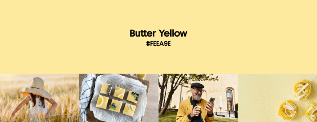
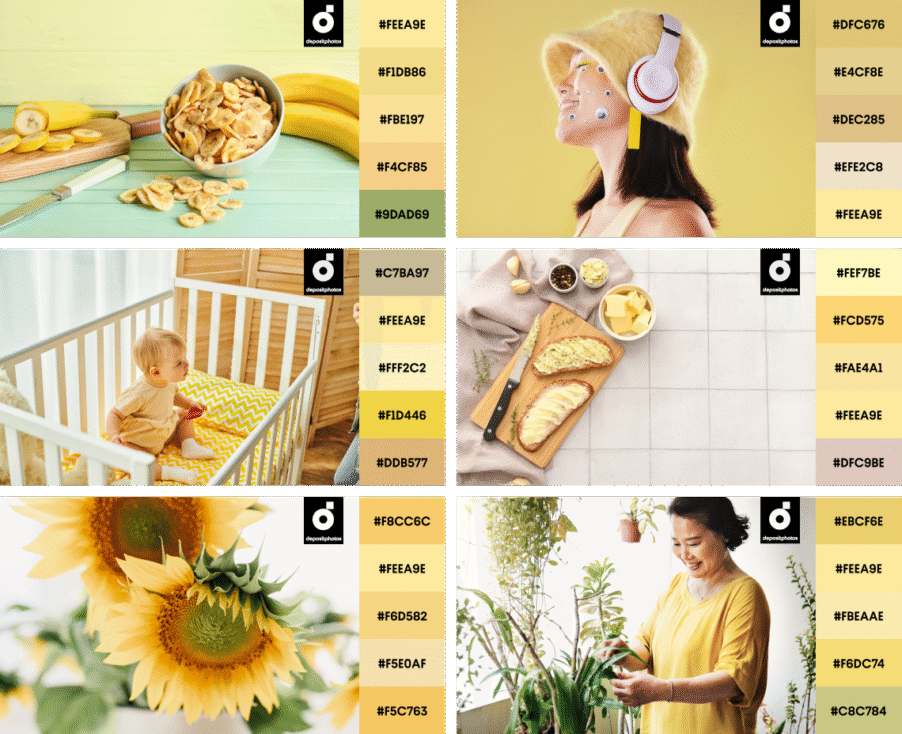
It’s official: Butter Yellow is the “new neutral” of 2025. Soft, creamy, and charming, this pastel has elbowed its way to the top of the light-shade podium. Gone are the days of Sand Castle beige and greige. Well, at least this summer, as the design and fashion worlds are leaning into something a little bolder. And little… tastier.
Butter Yellow hits that rare sweet spot between pastel and punchy. It’s bright enough to hold attention, yet soft enough to pass as a neutral. It complements other colors and carries precious warmth and optimism. We understand why designers across the globe are going all-in. We do too!
In digital design, Butter Yellow is showing up as both a bold background and a scene-stealing accent. There’s something about the way it fills space—like sunshine but without the UV warning. Product designers are on board too. For example, KitchenAid crowned Butter Yellow its 2025 Color of the Year, praising its nostalgic and comforting vibes.
Interior designers? Obsessed. Remember Martha Stewart’s iconic yellow kitchen? Still being moodboarded. Another example is Gwyneth Paltrow’s butter-hued living room. Effortless chic that inspires contemporary designs.
In fashion, we see stunning SS25 collections by Alaïa, Chanel, Loewe, Miu Miu, Jacquemus, and Tod’s—all serving Butter Yellow on the runway like it’s a luxury gelato. Celebrities Timothée Chalamet and Sabrina Carpenter have both been spotted in head-to-toe yellow with zero regrets and all the style points, which hugely contributes to the modern aesthetics and further solidifies shade’s status as a trendsetter of 2025.
Explore Butter Yellow CollectionPair Butter Yellow with cool lavenders, yellows, or candy hues for a true sugar rush.
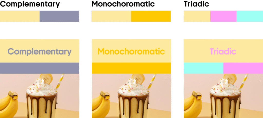
Stick with sunny vibes by layering Butter Yellow with richer golden tones and greens. It’s an instant mood booster!
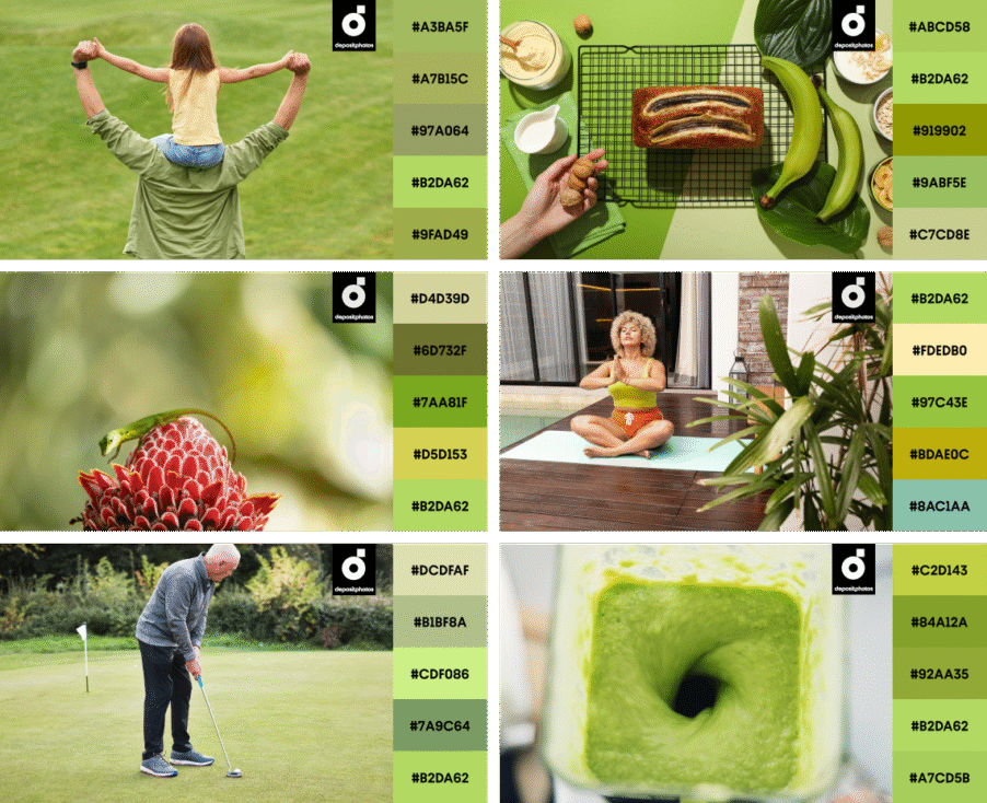
Green Punch
#B2DA62
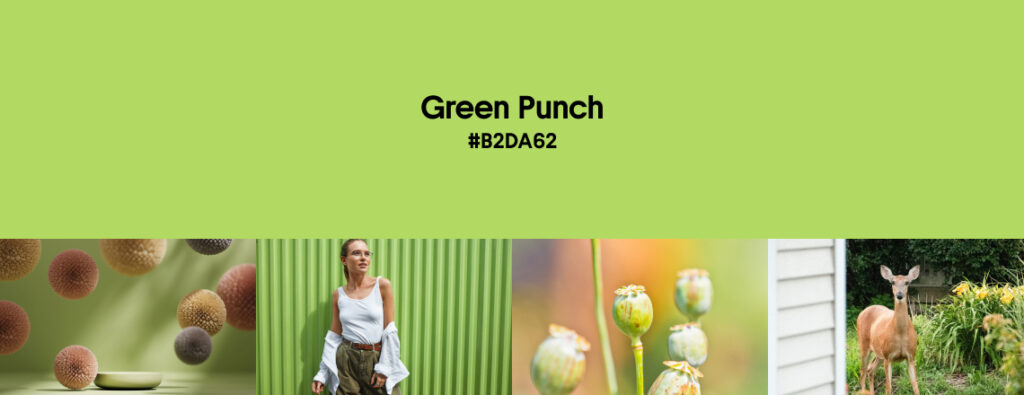
Meet Green Punch, your feisty and fresh color companion that is done with blending into the background. This shade is here to wake things up, and we’re not mad about it.
There’s something wildly energizing about this color. It’s the design world’s answer to a double espresso shot: invigorating and vibrant. Whether it’s commanding attention on the catwalk or breathing life into your latest branding project, Green Punch shouts impact (politely, of course).
Product designers love it because it works across the board. UI buttons, merch drops, packaging, you name it. Green Punch pairs effortlessly with neutrals if you’re keeping it chill, or with other brights when you’re going full-on dopamine.
In interiors, it’s mostly popping up as an accent, thanks to its naturally loud personality. But don’t rule out bold greens when it comes to filling a space. Zesty walls and statement cabinets? Yes, please. Or think smaller: splashes of bright green in everyday homeware and accessories still pack plenty of punch.
Need proof of color’s elegance? Look no further than Shazalynn Cavin Winfrey’s House, where green acts like a bright anchor. It’s got all the vigor you need without veering into kiddie territory.
The fashion world treats us to greens as well. Take a look at Dries Van Noten SS show, a parade of various green shades, smartly combined into elegant looks. Gucci, The Attico, Prada—everyone’s adding bold botanicals to the runway this year.
Explore Green Punch CollectionStick to the greens for a safe monochrome, or combine the hue with bold magenta, soft sky blue, and a juicy orange.
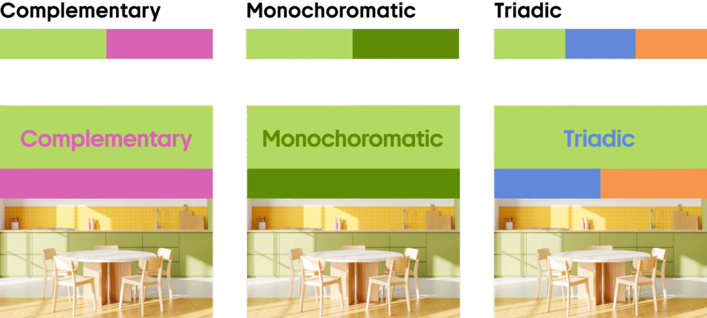
Layer lighter and deeper shades of green for a harmonious, nature-inspired palette that feels calm and easy on the eyes.
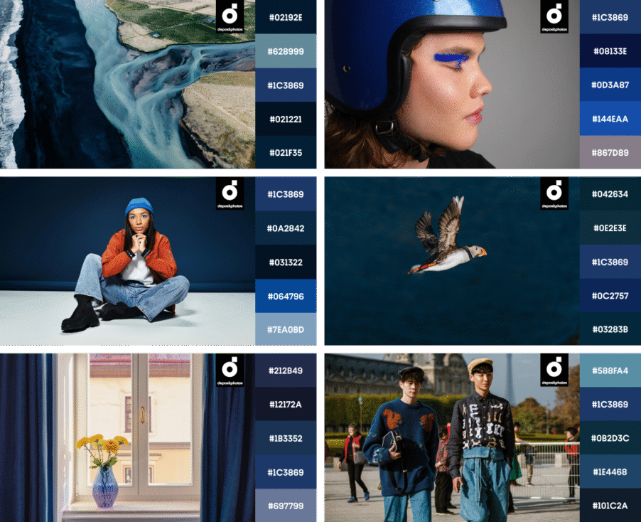
Navy Blue
#1C3869
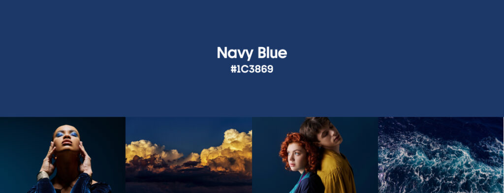
One word: timeless. And if you’re someone who can’t quite quit your darks even in summer, this one’s for you. Navy Blue is running the show when it comes to deep, saturated summer hues. It’s a staple in design for a reason: rich, elegant, and endlessly adaptable. It anchors even the boldest palettes and brings that grounding energy your brighter shades are screaming for. Whether you’re designing packaging, UI, interiors, or a wardrobe—it just works.
In digital design, Navy Blue is doing heavy lifting as a background shade. It’s readable, professional, and instantly calming. Bonus points if you’re going for anything ocean-inspired—it pulls nautical without screaming “beach house.” It’s also a solid wingman to high-saturation shades when you want a pop without chaos.
Inside the home, Navy’s going dual-mode: it’s either grounding light, airy spaces with that confident contrast, or going full-immersion. Applications are as versatile as the color itself. Think moody walls, luxe fabrics, and deep decor layers that say “yes, I read hardcover books.”
What about fashion? SS25 catwalks were flooded with many variations of blue, but the dark shade made a strong case for itself. Prada and Tommy Hilfiger both leaned into it hard, showing how this hue can feel polished and totally current. You can find even more applications of Navy Blue off the runway. Check out these sleek streetwear looks to inspire your own.
Explore Navy Blue CollectionCombine Navy Blue with a warm orange for drama, or play with mint green and red-orange for daring and contemporary looks.
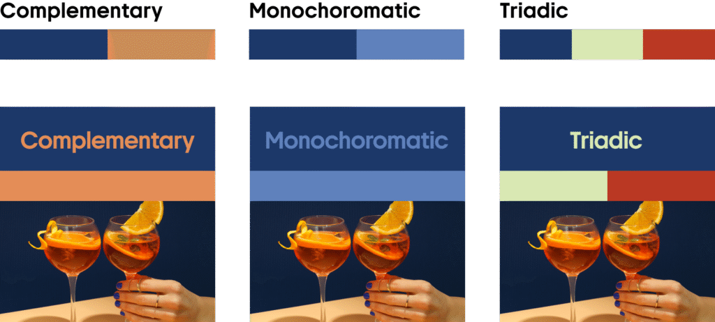
Play with navy, royal, and soft blues for a sleek aesthetic. This palette is sophisticated and works beautifully in many scenarios.
Cotton Candy
#FBA7BC
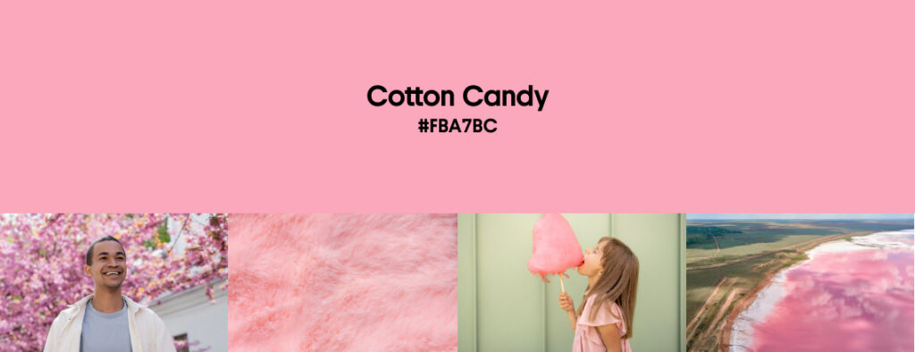
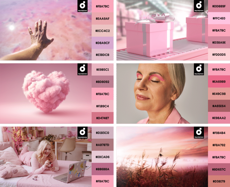
Cotton Candy brings even more playfulness and whimsy to the summer color trends. This soft pink hue echoes those carefree, sun-drenched days and adds a sense of joy to any design.
It’s popping up in branding and packaging to add a little spark and a whole lot of nostalgia. As a main color, background wash, or punchy accent, Cotton Candy delivers that soft-but-bold vibe modern consumers can’t get enough of.
Product designers are leaning in, too, and reminding us that pink isn’t just for loungewear and lip gloss. It’s showing up in home goods, tech accessories, and even the automotive world. Pink can be powerful and practical, so feel free to experiment with it this summer.
In interiors and architecture, Cotton Candy is doing what it does best: turning everyday spaces into eye candy. It’s helping designers reimagine walls, lighting, and even structural elements, proving that pink can shift the mood of a room faster than you can say “dopamine decor.”
And in fashion? Cotton Candy is making appearances on runways, and therefore retail racks, street style. It’s giving pastel a refresh, showing up in silhouettes and accessories with a playful twist that still feels grown-up.
Explore Cotton Candy CollectionWant contrast? Pair Cotton Candy with fresh greens. Craving whimsy? Mix it with deeper pinks and soft pastels for a playful, dreamy palette.
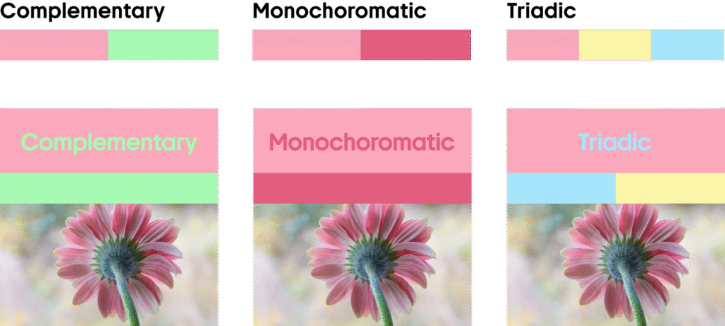
Whether combined with earthy warmth, muted neutrals, or sleek grays, Cotton Candy brings a sweet edge that feels effortlessly modern.
Ready-to-use styling kit of mockups and vectors in summer colors
Need to bring your summer visuals to life? We’ve got you. This curated collection of mockups, vectors, and ready-to-use design files is drenched in Summer 2025’s hottest hues: Butter Yellow, Green Punch, Navy Blue, and Cotton Candy.
Whether you’re building a campaign, refreshing your brand, or just experimenting with palettes, these assets are your shortcut to seasonal trends. Browse product mockups, web elements, packaging ideas—all color-matched.
Perfect for designers on a deadline, brands that love to stay current, or anyone hunting for scroll-stopping inspiration. Save the collection, use it when creativity hits (or when it doesn’t), and make your summer content shine without breaking a sweat.
Check Out Trending Mockups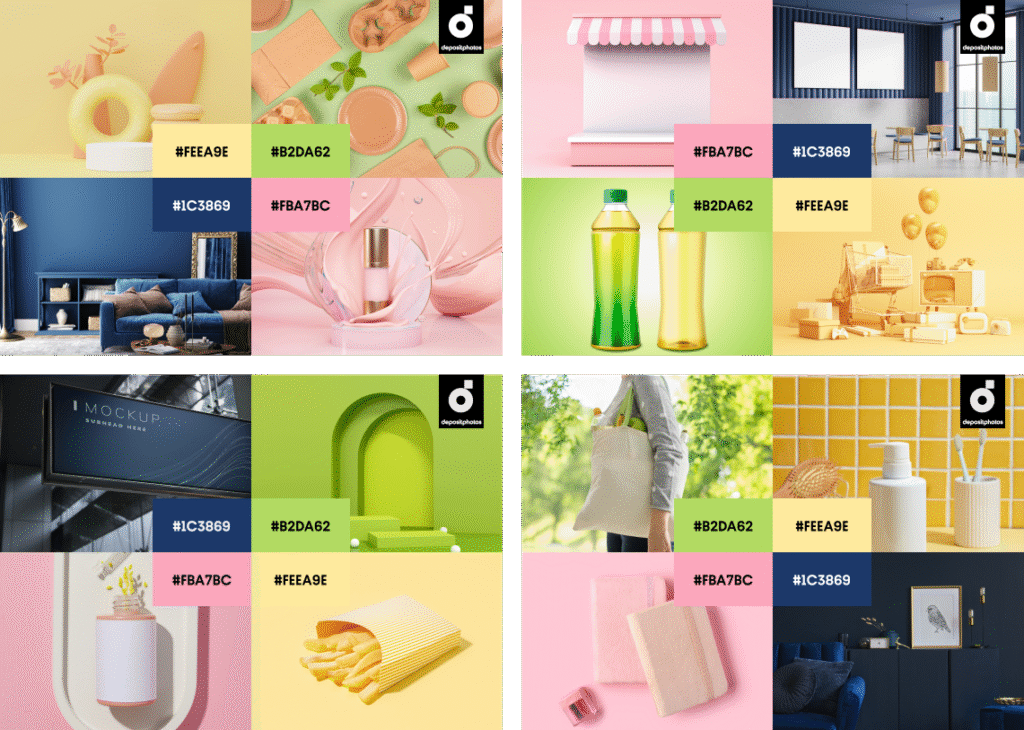
Beyond summer colors: read more about creative trends
Creative Design Trends 2025: From Wabi Sabi to AI-fueled Art
The New Contemporary: 2025’s Boldest Creative Trend
Crafted Harmony: Japanese-Inspired Trend for Mindful Communication
Look from Above: A Creative Trend for Spectacular Visual Stories