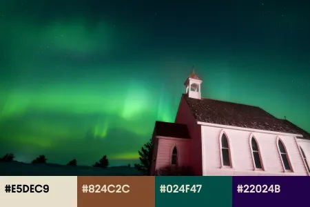
Spring Color Trends 2024: Curated Collections, Inspiring Ideas, & Ready-To-Use Mockups
Embrace the new season with a burst of color! Explore the must-have spring color trends that will revolutionize your designs.
Discover Color Trends Collection
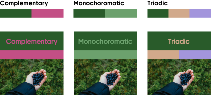
Spring in color: 4 hues redefining this year’s seasonal palette
With spring’s arrival, a transformation unfolds. It not only influences the world around us, but also the world of design. This season’s palette, drawn from the latest in Creative Design Trends and the forefront of fashion, art, and architecture, is set to dominate the creative landscape. We’re introducing Peachy Silk, Velvet Wine, Cloudy Blue, and Forest Green—each color reflecting what spring is all about! As we delve into every color in detail, uncover the potential of these colors to transform projects and create contemporary visual narratives!
Peachy Silk
FECEA2
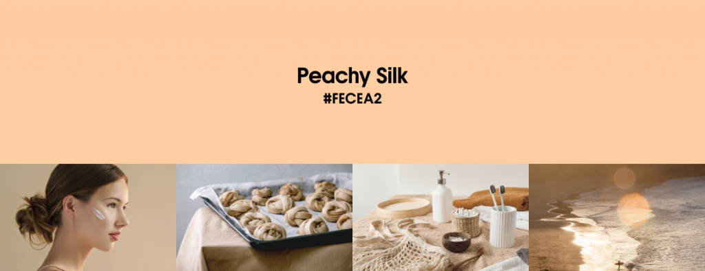
Peachy Silk elegantly occupies a sweet spot between warmth and gentleness, creating designs that are both inviting and polished. It has a remarkable capacity to introduce balance and harmony into any design. Its subtle elegance is ideally suited for use in backgrounds, where it establishes a cozy atmosphere without stealing the spotlight.
Peachy Silk shines as an accent color. Thanks to its gentle and appealing nature, it accentuates key aspects of a design without the need for harsh contrasts. It offers a delicate counterpoint to darker shades, injecting warmth into monochromatic palettes. Its compatibility with deep greens, blues, and grays is unmatched, setting a tender foundation that brings forward the visual strengths of other elements.
Explore Peachy Silk CollectionExperiment by pairing Peachy Silk with complementary colors such as cool blues, deep greens, or even rich browns.
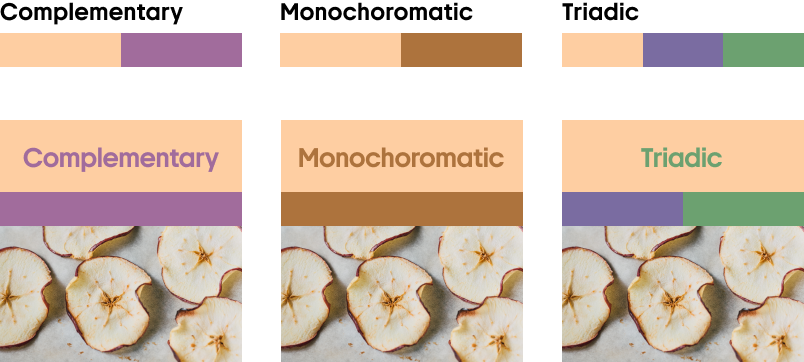
Applying textures over Peachy Silk can enhance its natural warmth, adding a tactile dimension that invites a closer look.
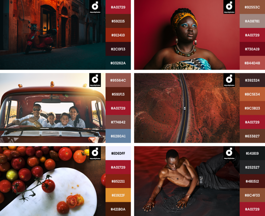
Velvet Wine
A01729
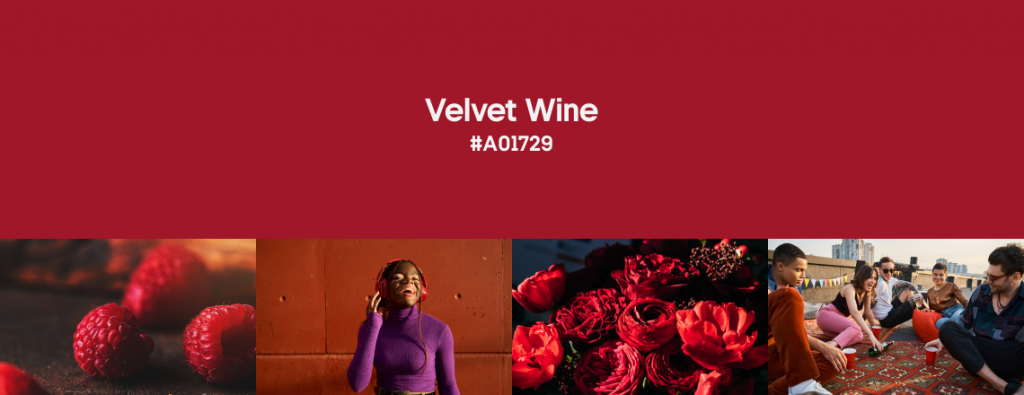
Velvet Wine masterfully blends the energy of red with the intensity of burgundy, creating a shade that’s both vibrant and deep. It’s particularly effective in designs that aim to convey luxury and exclusivity. Its use in branding, packaging, and promotional materials can elevate the perceived value of any product.
The opulence of Velvet Wine becomes even more pronounced when it’s paired with complementary textures that mimic velvet, silk, or leather. As a commanding hue, it can be used as a powerful accent to draw attention and emphasize focal points within a design. It’s exceptionally effective in logo creation, user interface design, and advertising, where it can spotlight essential features without disrupting harmony.
Explore Velvet Wine CollectionSoft pastels, such as peach or mint green, can offer a delightful contrast. This softens intensity while maintaining the richness of Velvet Wine.
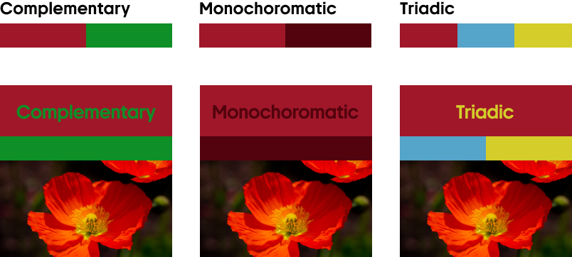
Pairing Velvet Wine with metallics like gold or silver is ideal for setting a dramatic and intense tone in your designs.
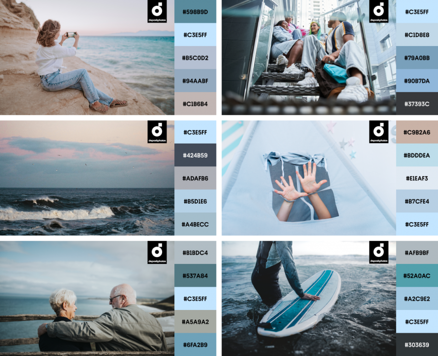
Cloudy Blue
C3E5FF

Cloudy Blue embodies a sense of spaciousness, seamlessly fitting into designs aimed at evoking serenity and clarity. Ideal for minimalist aesthetics, this color supports designs that value simplicity and functionality. Its modern and sleek character makes Cloudy Blue a go-to for tech and innovative projects. The hue also enhances branding and interfaces with its forward-thinking nature
Cloudy Blue’s airy quality can visually expand areas, making it perfect for design seeking to create an open, breathable environment and help spaces feel larger. Its ability to pair well with high-contrast text makes it the color choice for enhancing readability in educational content, web articles, and digital platforms, ensuring a user-friendly experience that maintains focus where it’s needed.
Explore Cloudy Blue CollectionWhen used alongside warmer tones, Cloudy Blue can provide a refreshing contrast that highlights key elements.
Combined with other cool hues, such as white or gray, Cloudy Blue enhances a design’s overall sense of harmony and balance.
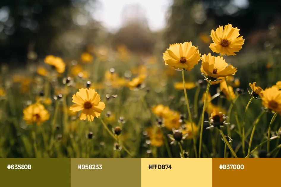
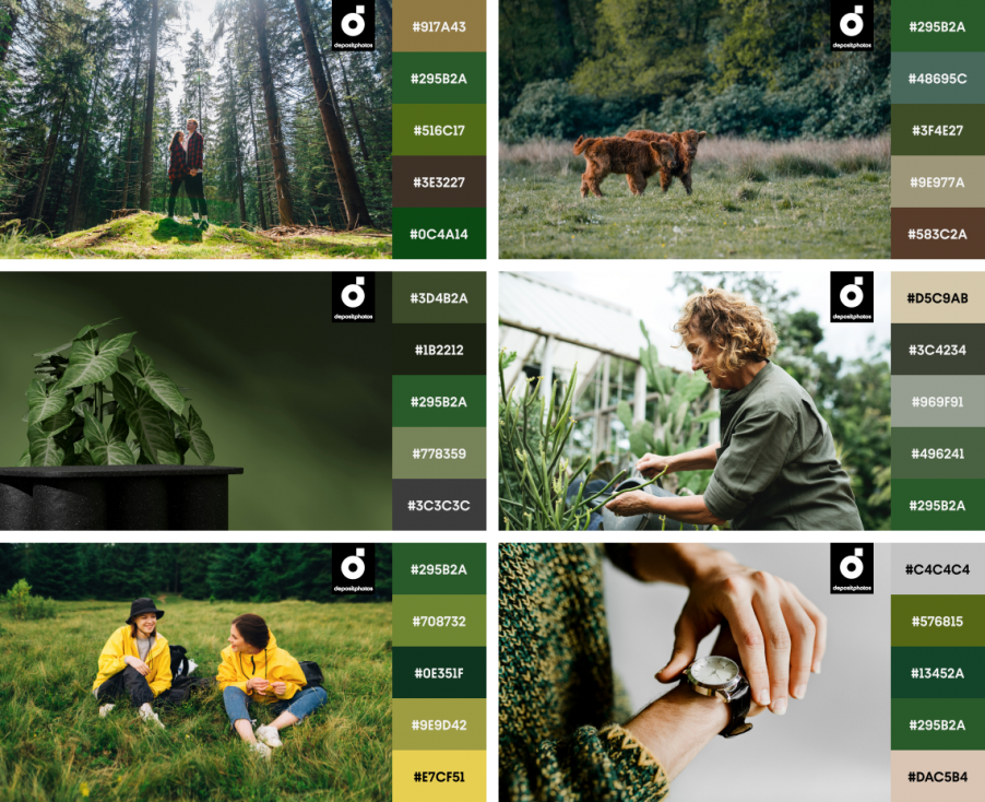
Forest Green
295B2A
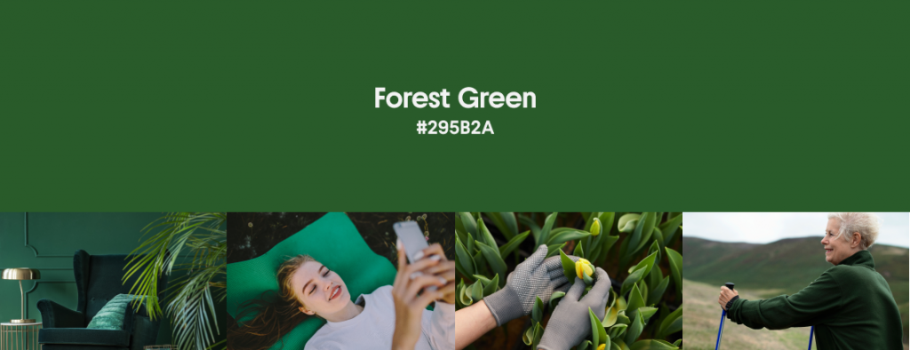
Capturing nature’s essence, Forest Green is an ideal color for designs that speak to sustainability, stability, and luxury. This shade acts as a harmonizing force among color palettes, effortlessly pairing with everything from delicate pastels to bold neons, anchoring designs with its earthy depth. As a grounding element, it works well in layering effects, adding visual interest and complexity to compositions. By creating a rich backdrop, Forest Green offers additional dimension to graphic designs and illustrations, bringing other colors to life.
Use it as a primary color in projects focused on outdoor activities, environmental conservation, or organic products to immediately communicate a commitment to the planet. This also makes it an ideal color for spring and summer seasonal campaigns.
Explore Forest Green CollectionWhen paired with warm yellows or oranges, Forest Green accentuates a lively, earthy palette and grounds designs with its natural depth.
Applying matte or textured finishes to Forest Green can amplify its connection to nature, enhancing the tactile experience of a design.
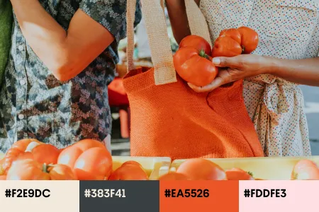
Spring color trends toolkit! Essential vectors & mockups for seasonal designs
Embrace the essence of spring with our specially curated collection of vectors and mockups, featuring the season’s most refreshing colors. This exclusive compilation is your key to effortlessly infusing your designs with the vibrancy of spring.
Designed to inspire and simplify your creative process, our collection provides thematic visuals ready to be integrated into any project. It’s not just a set of design elements—it’s a tool to give you the freedom to explore endless color combinations, breathe new life into your visuals, and stay at the forefront of design trends.
Check Out Trending Mockups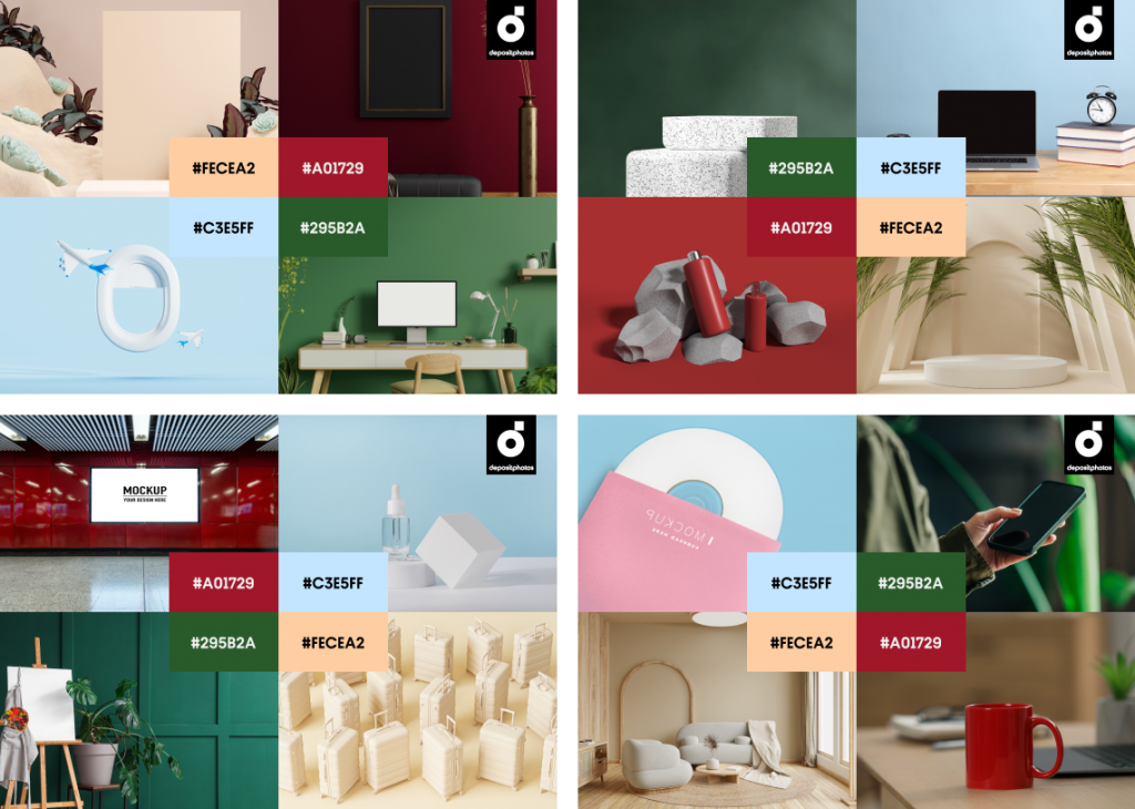
Embrace the season, and let your creativity flourish!
This spring, let Peachy Silk, Velvet Wine, Cloudy Blue, and Forest Green guide your creativity, and watch as your designs bloom into their full potential. From the soft allure of Peachy Silk to the profound depth of Forest Green, each color holds the potential to transform your seasonal campaigns, making them resonate deeply with your audience.
As we wrap up our journey through the Spring Color Trends of 2024, remember to embrace these hues and let them inspire designs that not only capture the eye, but also the spirit of the season. These colors are more than just trends—they are your tools to innovate, inspire, and impress.
Discover Color Trends Collection
.