Spring Color Trends 2026: Explore Optimistic Palettes and Collections in Four Striking Colors
Spring 2026 doesn’t tiptoe in like winter did. It turns up with a sharp point of view and no interest in “safe” design. Stop picking random swatches and hoping for the best. We did the thinking for you and curated a palette of four main shades showing up across design this spring.
The palette hits that sweet spot between bold and usable—built for brands juggling real-world deliverables: paid social, landing pages, product UI, packaging, decks, and print.
Up next: what each shade actually does in practice, plus pairing tips that make the whole thing feel deliberate.
Discover Spring Color Trends CollectionSpring 2026’s most wanted colors
Spring palettes often lean either “soft and safe” or “look-at-me loud.” This one does both, strategically. It’s backed by trusted color authorities like WGSN, Pantone, and Dulux, plus our own research across social platforms, design awards, and media.
Meet your four spring anchors:
- Electric Pink—expressive, high-impact, instantly modern
- Mint Blue—fresh, clean, universal
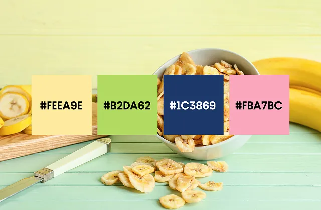
- Solar Yellow—warm attention without neon chaos
- Canvas Beige — the “let the idea breathe” neutral
You get two energy drivers (Electric Pink, Solar Yellow) that help performance creatives and hero visuals stand out, and two stabilizers (Mint Blue, Canvas Beige) that keep the system usable across long-form layouts, multi-slide decks, and UI components.
Think bold CTA moments plus calm foundations. The kind of balance that works when you’re designing for humans with short attention spans and high standards. Now, let’s break down each shade.
Discover Spring Color Trends 2026Electric Pink
#FC7CDB

Electric Pink is spring’s headline color: confident, playful, and impossible to scroll past. It does flirt with that Barbie-coded energy—bright, glossy, unapologetic. But it’s also easy to use in modern design. Think sharp, graphic, and made for high-contrast moments that read instantly.
Explore Electric Pink CollectionWhere Electric Pink works best
- Performance marketing and social ads: as a CTA color, sticker-style callout, price highlight, or background block behind short copy.
- Brand campaigns: as the “voice” color in a system—used consistently in accent shapes, icons, or typography highlights.
- Product launches: for limited drops, seasonal updates, collabs, event visuals, and anything that needs a built-in sense of momentum.
Electric Pink shines when it’s treated like a feature, so be careful with this striking shade. Use it with restraint, and it reads premium. Overuse it, and it turns into visual noise.
Styling tips
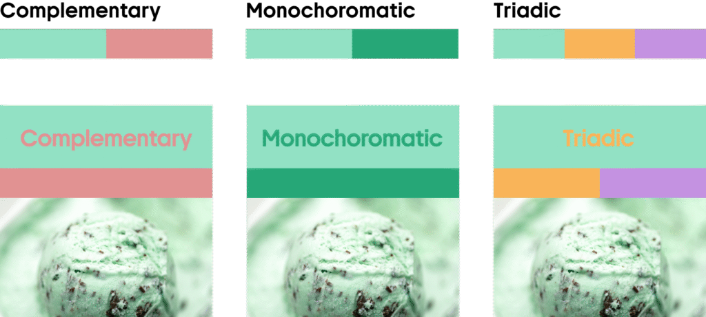
- Use Electric Pink as a high-contrast accent, not a full-page wash. Pair it with Canvas Beige for calm, editorial space—or with Mint Blue for a crisp, modern contrast.
- For bolder layouts, anchor it with dark typography. Charcoal/near-black text keeps Electric Pink from feeling too candy-like and helps it hold up in print and outdoor formats.
Examples of use
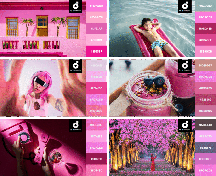
- Classic art, modern punch: Renaissance-inspired visuals get a contemporary edge when Electric Pink is used as the accent—turning “borrowed” classics into something that feels unmistakably current.
- High-contrast navigation and highlights: Electric Pink works as both a bold accent and a confident background block, helping key sections stand out without relying on heavy illustration or busy layouts.
- Emotion-first seasonal storytelling: As a secondary brand color, Electric Pink quickly signals love, warmth, and Valentine’s themes—ideal for campaign pages built around care, relationships, and gifting.
Pair Electric Pink with fresh greens for contrast, or build bold triads with sunny yellow and soft violet.
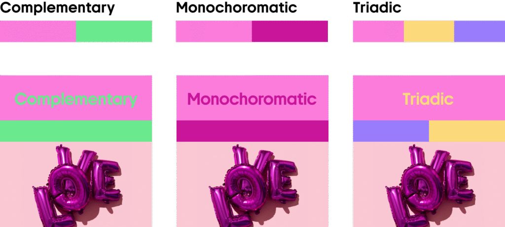
Mix Electric Pink with blush tones, deep berry shades, and warm neutrals for playful, high-impact visuals.
Mint Blue
#92E1C4

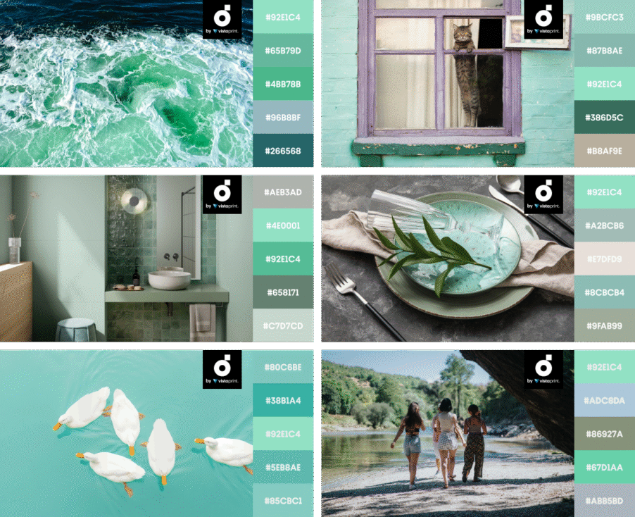
Mint Blue is the palette’s stabilizer. It’s fresh, airy, and quietly optimistic at the same time. Works great for brands that want to feel modern without screaming “startup.”
It also plays extremely well with interface patterns: cards, sections, UI panels, background gradients, and product screenshots. If your spring campaigns include any kind of product storytelling, Mint Blue will do a lot of heavy lifting.
Explore Mint Blue CollectionWhere Mint Blue works best
- Product UI and SaaS visuals: backgrounds, empty states, onboarding graphics, banners, feature sections
- Editorial layouts: blog headers, report covers, slide decks, case studies
- Packaging and label design: when you want “clean + friendly” rather than “clinical”
Mint Blue reads like a breath of air in a world full of over-saturated branding. It’s the kind of color that makes layouts feel organized.
Styling tips
- Pair Mint Blue with Solar Yellow for cheerful identity. This combo creates a “spring daylight” vibe that feels approachable and modern—perfect for marketing pages and explainer graphics.
- Add Electric Pink sparingly for a smart, playful system. Use pink as a punctuation mark: badges, micro-icons, highlights, and small shapes. Mint Blue keeps everything grounded.
Examples of use
- Optimistic, calming backgrounds: Mint Blue works as a dominant background color in large, playful web experiences—keeping cartoony visuals and gamified mechanics feeling light, friendly, and readable.
- Natural “sky and sea” cues in product design: It instantly evokes water-and-air freshness, which makes it a strong fit for product pages and packaging that lean into coastal, clean, or refreshing narratives.
- A full identity color or a UI tint: In a slightly muted version, Mint Blue can carry an entire brand system like logos, patterns, collateral, without feeling childish or overly “medical.”
- A clean accent that cuts through dark layouts: Used sparingly, it lifts moody portfolios and modern landing pages, adding clarity and contrast without breaking the vibe.
Contrast Mint Blue with warm corals, layer it in monochrome for calm clarity, or go triadic with peach and lilac accents.
Keep Mint Blue airy with light neutrals and sea-toned greens, or deepen it with darker teals for a more “grown-up” feel.
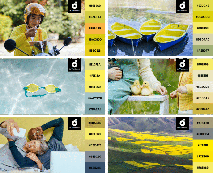
Solar Yellow
#F6EB69
Solar Yellow is attention delivered warmly. It’s not neon. It doesn’t look like a warning sign. It’s warm and bright in a way that feels human, which makes it ideal for marketing moments that need to feel energizing without looking aggressive.
Solar Yellow also performs beautifully as a supporting background color in print: it keeps pages bright and readable, especially for flyers, posters, product one-pagers, and branded inserts.
Explore Solar Yellow CollectionWhere Solar Yellow works best
- Marketing design: announcement blocks, promo highlights, feature callouts, CTA sections
- Content design: charts, infographics, stickers, labels, annotation elements
- Packaging and retail visuals: seasonal sleeves, tags, limited edition messaging
Solar Yellow is also a fantastic “anti-grey.” If your brand system has been living in monochrome, one controlled hit of this shade makes everything feel newly alive.
Styling tips
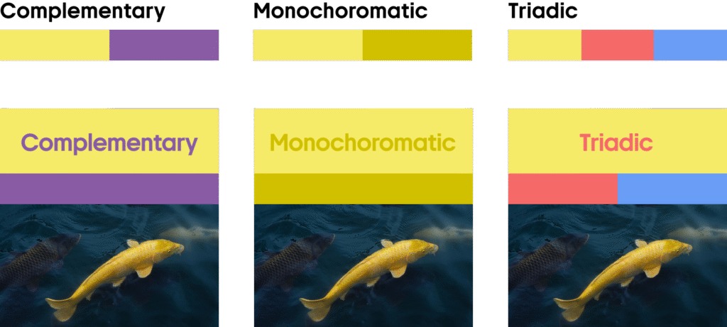
- Use it behind short copy, not long paragraphs. Solar Yellow loves micro-messages: 3–8 words, small callouts, and punchy headings. For long copy sections, switch to Canvas Beige to avoid fatigue.
- Balance it with Mint Blue for a calm, contemporary feel. Mint Blue cools the warmth, and the result feels clean and modern, great for product pages and brand explainers.
Examples of use
- Bright hero energy, grounded by dark tones: Solar Yellow takes the lead while deep browns and blues keep the layout anchored and sophisticated.
- Packaging-ready accent: Used as a secondary color or standout highlight, it adds warmth and shelf impact without overpowering the design.
- Wholesome brand storytelling: Solar Yellow supports a warm, heritage-driven identity—perfect for family-owned businesses that want to feel welcoming and established.
- A pop that cuts through dark palettes: Against a darker, moodier base, Solar Yellow becomes the optimistic detail that draws the eye to key moments.
Pair Solar Yellow with purples for sharp contrast, layer it with deeper yellows for richness, or go triadic with coral and blue.
Ground Solar Yellow with muted olives, warm grays, and earthy neutrals to keep it bright but not loud.
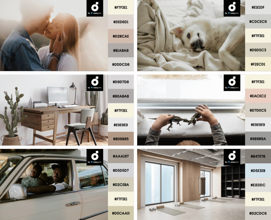
Canvas Beige
#F7F3E1

Canvas Beige is the smartest, most universal color of the palette. It doesn’t compete. It supports. It gives your layout room to breathe, and it makes everything else look more intentional. As Pantone predicts for 2026, this color “signifies our desire for a fresh start,” and there could not be a more perfect season for this shade than spring.
If you’re building spring campaigns across multiple formats, Canvas Beige is your consistency tool. It’s the base that helps the palette scale—from a single social post to a full landing page + email + deck ecosystem.
Explore Canvas Beige CollectionWhere Canvas Beige works best
- Brand systems: backgrounds, sections, templates, decks, guidelines
- Print collateral: brochures, packaging copy areas, product cards, menus, booklets
- Product design & UI: neutral panels, modals, content surfaces, typography-first screens
Canvas Beige is especially strong when your creative includes photography or mixed media (textures, gradients, illustrations). It stops the composition from feeling crowded.
Styling tips
- Treat it like paper: build structure with typography. Let type, spacing, and hierarchy do the work. Canvas Beige makes bold fonts and crisp grids feel premium.
- Use Electric Pink and Solar Yellow as “campaign markers”. Keep Beige as the base, then rotate the accents depending on the message: Pink for expressive moments, Yellow for announcements, Mint for calm product storytelling.
Examples of use
- Soft modern palette pairing: Canvas Beige teams up with Baby Blue and Wild Cherry tones to create a warm, lovey-dovey feel that still looks clean and current.
- Portfolio minimalism with a punch: A canvas base keeps the layout airy, while Electric Pink accents add sharp focal points. Simple and a bit “Kidulty” at first glance, but thoughtfully structured and developed.
- Nature-first storytelling backgrounds: This off-white beige works as a calm digital backdrop when you want to spotlight tactile elements—habitats, materials, and organic detail—without visual clutter.
Combine Canvas Beige with lilac for a modern contrast, keep it monochrome for a calm editorial look, or build a triad with mauve and slate blue.
Use Canvas Beige as a soft base for warm, tactile palettes—then add dusty pinks, cool grays, or muted greens to shape the mood.
Quick pairing recipes for your projects
A palette is only useful if it translates into repeatable systems. Here are four “grab-and-go” combinations that work across digital, print, and product design:
- Landing page / SaaS feature drop: Canvas Beige + Mint Blue + Electric Pink accents
- Promo campaign (ads, banners, email): Solar Yellow + Canvas Beige + bold black type
- Brand refresh visuals: Mint Blue base + Electric Pink signature shapes + Beige breathing room
- Deck / report design: Canvas Beige + Mint Blue sections + Solar Yellow highlights for data points
Instant styling pack for spring 2026 (mockups, vectors, layouts)
Spring 2026 is about optimism with intention and structure. Electric Pink and Solar Yellow bring the energy your visuals need to perform. Mint Blue and Canvas Beige make that energy usable across systems—so your work looks cohesive in a full campaign, not just in one lucky Instagram post.
If you want the palette to look truly current, don’t treat these colors as decoration. Treat them as roles:
- Energy colors for action
- Support colors for clarity
- Whitespace and hierarchy to make everything feel premium
Ready to put the palette to work? Download files or build your own collection from our curated spring kit so your team can move quickly and stay consistent across all communication touchpoints.
Check Out Spring-Ready Mockups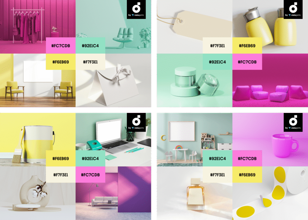
Read about the major Creative Trends for 2026 and explore the full report insights along with the FAQ to get a clearer picture of where design is headed next—and what audiences expect from your upcoming campaigns.
More about colors and what’s shaping creatives in 2026
Winter Color Trends 2025-2026: Collections and Palettes for Elevated Seasonal Projects
Fall Color Trends 2025: Cozy Up with Four Enchanting Colors, Mockups, and Collections
Summer Color Trends 2025: Steal our Collections, Palettes, and Hearts with Four Radiant Hues
Spring Color Trends 2025: Let’s Play! Ft. Bookmarkable Collections of Files and Palettes
Creative Design Trends 2026: Reality Strikes, The Tender Shift, and More