Spring Color Trends 2023: Palettes, Design Ideas, Stock Visuals, and Mockups
Stay connected with your audience using vibrant color solutions! Explore the 4 main colors of the upcoming season and learn how to combine them with your brand hues.
Go to Big Spring Color Trend Collection
Spring color trends 2023: The top 4 hues of the season
A Green Tea color similar to Japanese matcha or classic Chinese green tea. A Creamy white color reminiscent of milky dessert or a cup of latte in a cozy city cafe. And Bloom—a hue that creates anticipation for cherry blossom season. All of these colors may look like soothing springtime classics, but they’re not fully complete until joined by the striking Iridescent.
On the eve of spring, we recall Creative Trends 2023 and recent events in fashion, graphic and industrial design, art, and architecture. Then, we flip through key design and culture magazines and watch popular anime; all to deliver you a time-saving color trend forecast followed by curated collections of images, videos, and mockups that you can use in your projects right away.
Green Tea
#D7F0C4
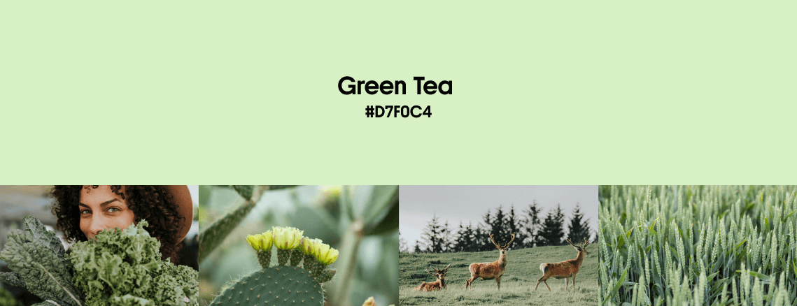
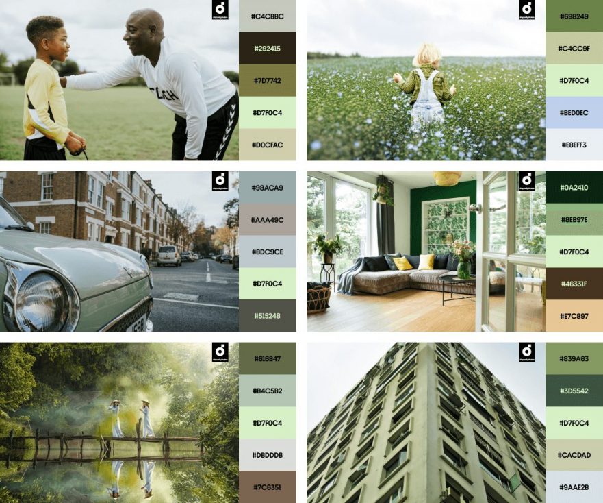
In most cultures, the tea green color is associated with the triumph of youth and nature. However, environmental challenges of recent decades add meaning to this hue, turning it into a symbol of nature protection movements, zero-waste initiatives, and eco-friendly approaches in marketing.
Nevertheless, this pastel mint color is not limited to nature-related projects. In 2023, we’ll also see it on the runway (examples: the recent collections by Fendi, Givenchy, and Bottega Veneta), in street style, and art projects that convey various optimistic messages.
Consider our Green Tea color if you are working on a thematic springtime project with a launch date in April or May. The light green color symbolizes rebirth and hope—And both concepts work well for the healthcare and beauty industries.
How can you create a vivid Green Tea color palette for your next project? Here are 3 ideas to follow:
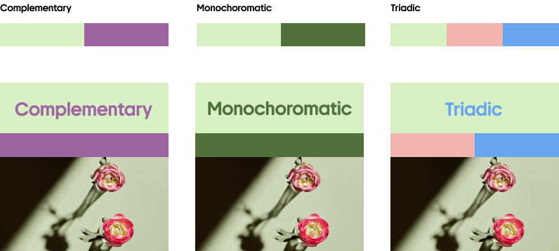
Green Tea is not just about ecology or comfort. Use the light green color to give things a unique twist:
Creamy
#FEFCEF
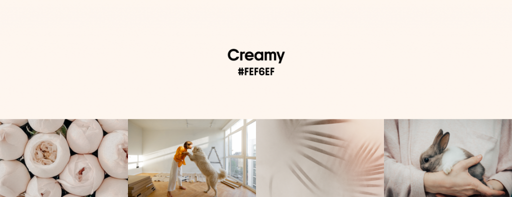
Creamy is a warm white color also known as a milk color. It is a traditional shade used for formal occasions. And since white is the color of purity according to Western traditions, Creamy is easy to spot in luxury wedding dresses, invitation designs, and traditional decorations.
In 2023, the latte hue will be widely used in interiors and outdoor venues designed to immerse visitors in an atmosphere of calmness and tranquility. To see it in action, check out these award-winning wellness center projects built recently, such as Clinique La Prairie resort for Amaala in Saudi Arabia or Open Hearts in Lisbon.
Creamy is also one of the most widely-used warm earthy hues on social media and in product packaging. Explore the Tribute to Outdoors trend in Graphic Design Trends 2023 by Depositphotos to learn more.
This trending white color works best as a background for project designs. Match it with darker colors to create contrast:
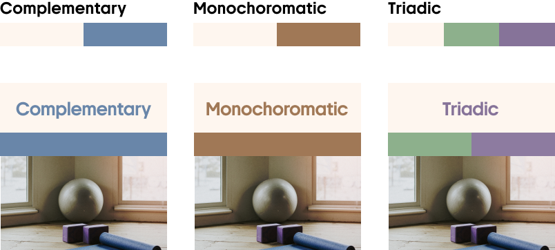
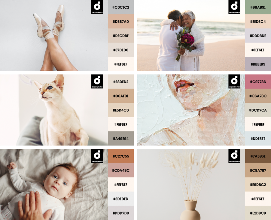
Creamy (sometimes considered an ivory color) looks natural and adds tenderness to your messages:
Bloom
#E4739C
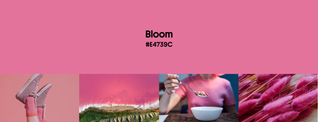
Scientists state that most people associate red and pink shades with love and romance. However, the vibrant version of pink we’re introducing is a bit more multifaceted—It also takes us on an imaginary Hanami voyage to Japan, where sakura trees are at their peak of blossoming.
For the Japanese, Bloom is a color of spring and renewal, and for the rest of the world, it has recently become a symbol of power, passion, and confidence—if judging by the Pantone Color of the Year and some Fashion Weeks shows that took place this year (like ones held by Gucci or Valentino).
This dragon fruit color often appears in anime backgrounds and foregrounds, and anime concepts and aesthetics are trending this year—Read about Anime Thrill in Creative Trends 2023 to explore more insights.
Energetic but never too much, this dragon fruit color adds a layer of emotion to your layouts:
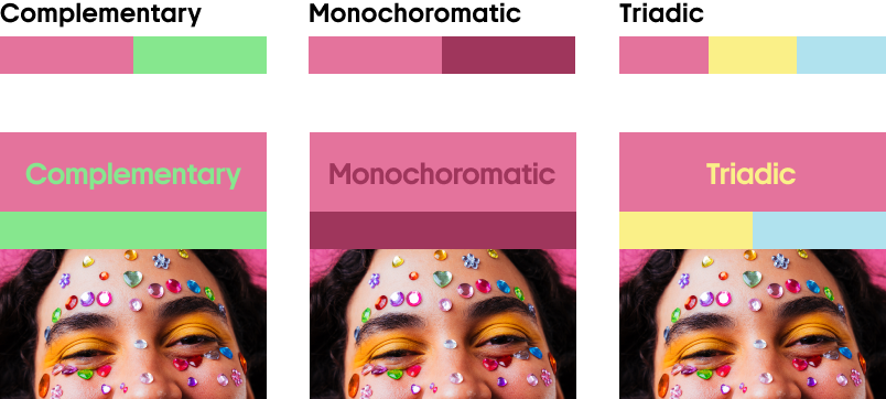
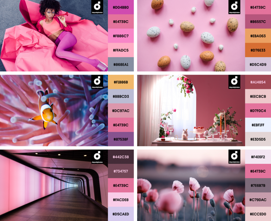
Interiors, nature, or fashion—wherever you see Bloom, it grabs your attention:
Iridescent
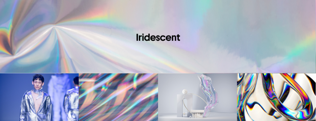
Our Iridescent color is not one particular color, but a texture featuring a rainbow color mix with or without a dominant hue. You will not be mistaken if you consider Iridescent a tool to generate optical illusions or a visual effect to highlight any color in your project.
There’s one big difference between chromatic (metallic) and opalescent color effects: chromatic textures consist of contrast monochromatic elements (read our article about the color gold). On the contrary, luminous colors are rainbow-like.
Iridescent textures in designs are a brilliant way to follow another graphic design trend of 2023 called Futuristic Gleam. You can use these textures to make your posters, industrial designs, or interfaces look innovative, cutting-edge, and even cosmic. To understand how powerful Iridescent can be as a visual solution—check out KWG M Cube by MVRDV.
Any opalescent color is tricky, so remember the rule of thumb—Don’t overuse it! Balance the holographic texture with soothing hues:
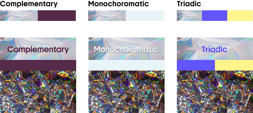
You’ll never go wrong with applying a luminous color as a design highlighter
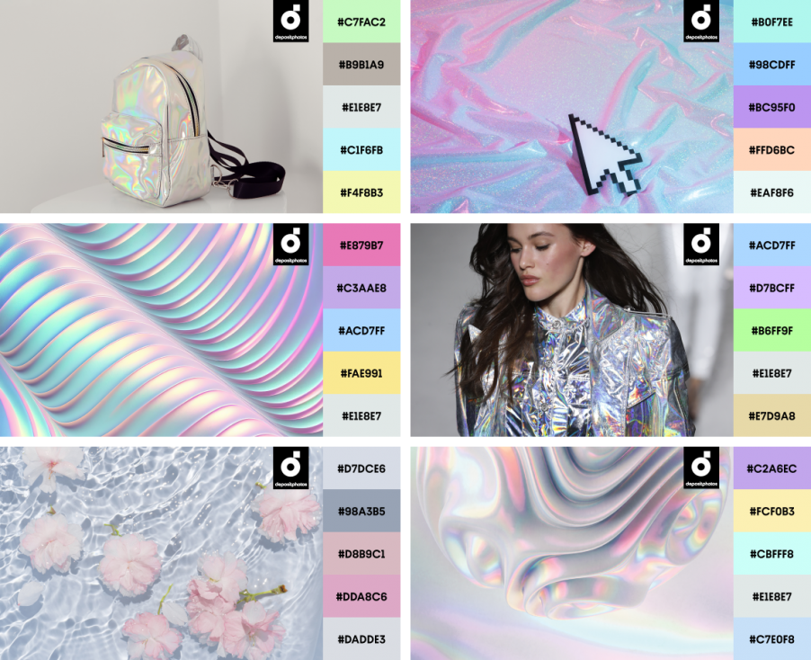
Save your time with design mockups featuring trending spring colors
Think our trending white color is the perfect match for your creative idea? Just download and adjust our ready-to-use mockups to check. Consider that metallic colors often turn your text or objects into dominant elements, so keeping your design minimalistic is essential.
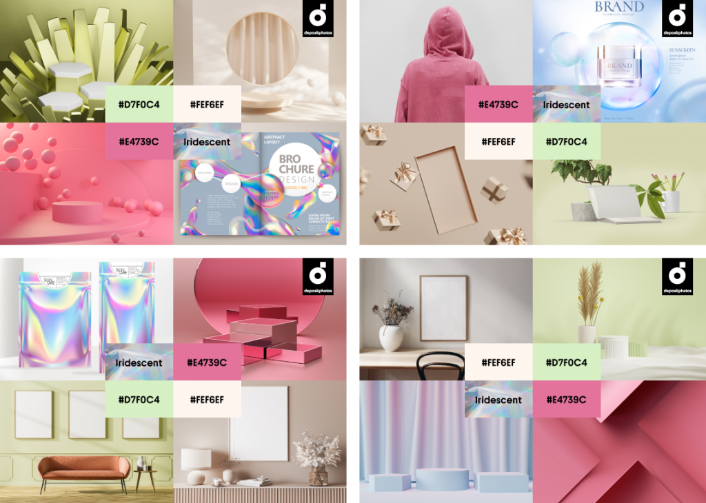
Another tip is combining two or more spring color trends, which is more manageable if you have a mockup. The pastel mint color (Green Tea) can be coupled with Bloom—The color mix will evoke spring associations in your audience. And an opalescent color can be mixed with our milk color, as well as dragon fruit color (Bloom) splashes.
What’s next? Last thoughts on Spring Color Trends 2023
Green Tea, Creamy, Bloom, and Iridescent. This spring, we suggest using each at least once to support, inspire, and energize your audience. For instance, with a gentle green hue associated with youth and a saturated dark pink symbolizing nature’s awakening, you can immerse clients in pleasant anticipation of sunny days and spending time outdoors.
Feel stuck creating annual holiday postcards for clients? Our latte color and luminous color solution will help you stand out and make your greetings more memorable. There’s always our curated collection to find images or videos that are in line with your brand’s vision.
More insightful articles for trending designs:
Graphic Design Trends 2023 [Infographic]
Retro Rewind: Design Trends of the 60s, 70s, and 80s Explained
Creativity: Inside & Out, a YouTube channel by Depositphotos on Trends, Modern Culture, and Creative Challenges

![Gradient Color Palettes for Your Next Design Project [Infographic]](https://depositphotos-blog.s3.eu-west-1.amazonaws.com/uploads/2019/08/Gradient-Color-Palettes-for-Your-Next-Design-Project-Infographic.webp)

