Achieving Harmony: A Guide to Balance in Art and Design
Balance is an elusive concept that can make or break any design or artwork. But why is it so important? Well, imagine a world without balance: from bridges collapsing to your morning coffee spilling over your keyboard. Similarly, a lack of balance in design and art can result in a confusing and chaotic visual experience, leaving viewers wondering what they’re supposed to be looking at.
Whether it’s symmetry, asymmetry, or a combination of both, balance plays a critical role in achieving a visually pleasing composition. Without it, a design can appear random and disorganized. Luckily, achieving balance is not rocket science. With a few simple tips, you can create visually stunning compositions that keep your viewers engaged.
If you’re ready to learn more about how to create balanced designs, be sure to keep reading. Let’s dive in!
What is balance in art?
Balance refers to the distribution of visual weight in a composition. It means the equal distribution of elements within a space so that no part of a design appears heavier or lighter than the other. Achieving balance is crucial for achieving order, which in turn creates a more pleasing visual experience. Yet, a balanced composition is not only visually attractive; it also strategically guides the viewer through a design, making it easier to understand the message. Since the distribution of visual weight governs how elements are arranged within a space, it plays a critical role in determining how the final product is perceived.
What is visual weight?
Visual weight is a concept in design that refers to the perceived heaviness or lightness of an object or element in a composition. It’s based on how much attention a particular element draws, and various factors, such as size, color, shape, and texture can influence it. For instance, a large, dark-colored object will generally have more visual weight than a small, light-colored one. Similarly, a complex, detailed shape can appear heavier than a simple, geometric one.
Visual weight is a subjective concept that varies from person to person. However, by considering balance, contrast, and proportion, designers can create visually cohesive compositions that appeal to the audience.
The four types of balance
There are four types of balance in design: symmetrical, asymmetrical, radial, and crystallographic (or Mosaic) balance. Each type has its unique characteristics and can be used to achieve different design goals.
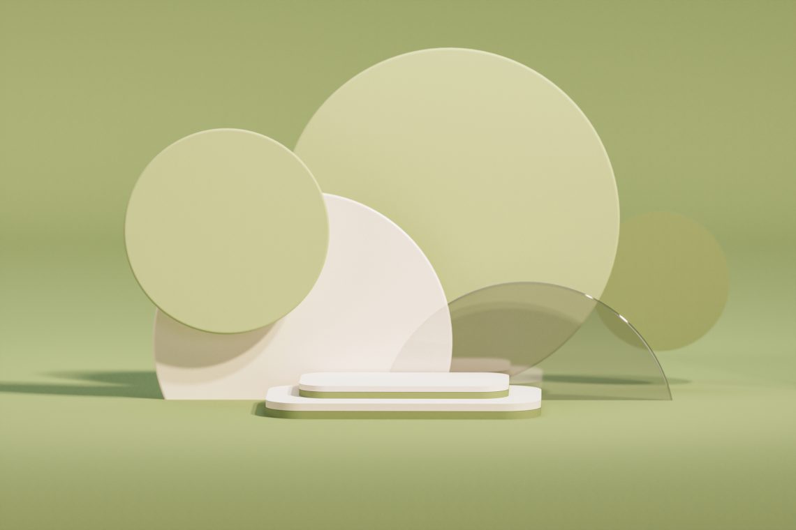
1. Symmetrical balance.
Symmetrical balance is achieved when elements are mirrored or repeated evenly on either side of a central axis. This type of balance is ideal for creating a formal and structured composition, as it gives a sense of stability and is often used in logo, architectural, and product design. When using symmetrical balance, ensure the elements are precisely mirrored or repeated on either side of the central axis. Try to use similar colors, shapes, and sizes.
2. Asymmetrical balance.
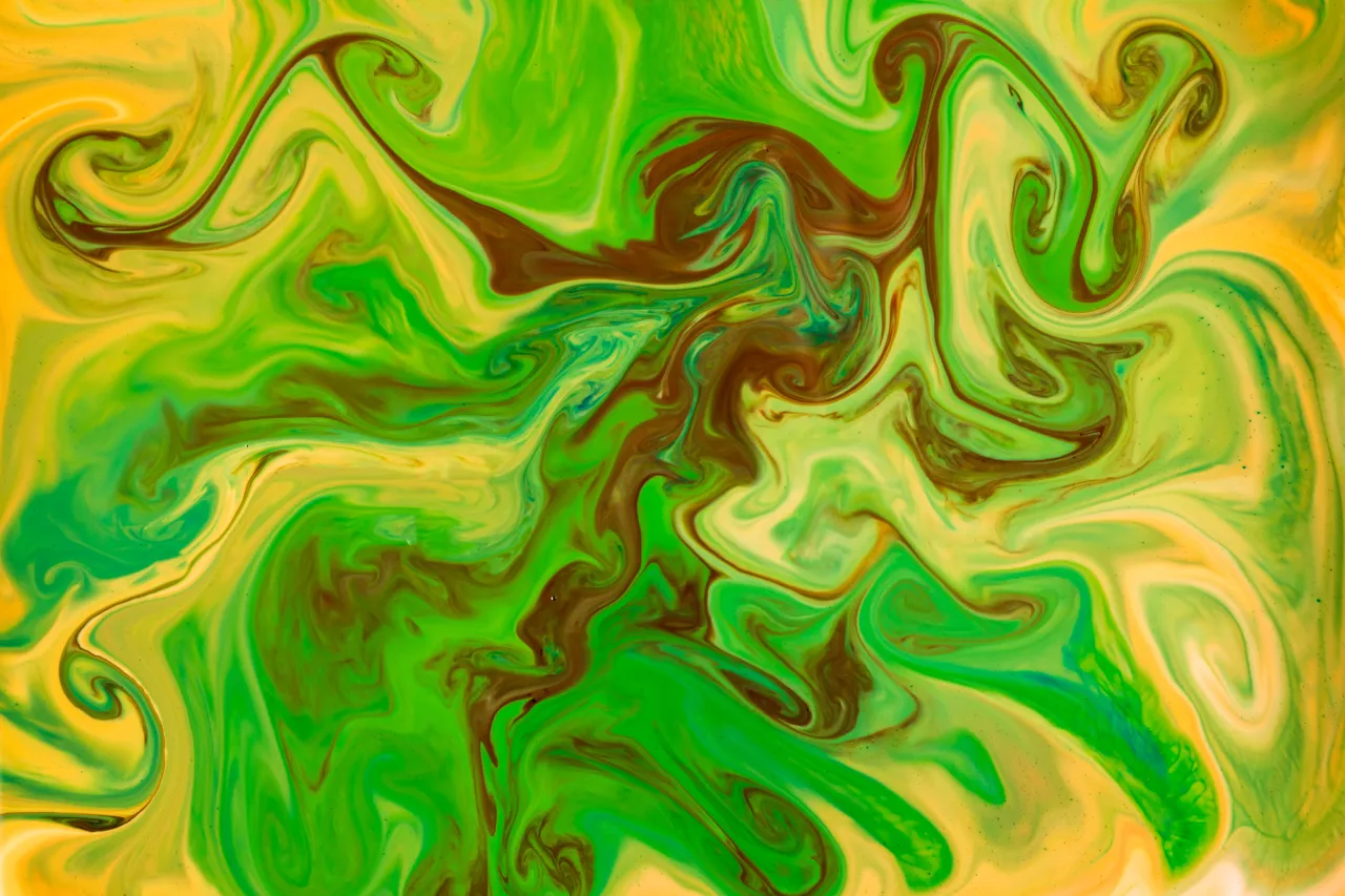
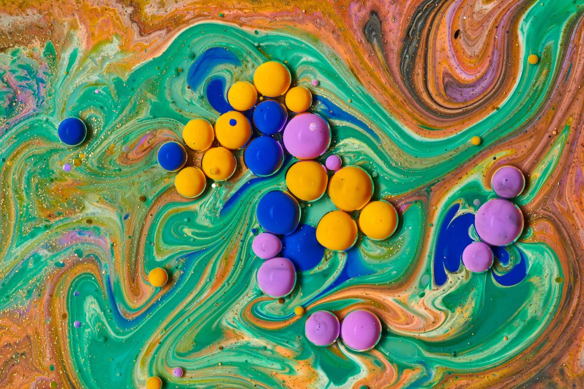
Unlike symmetrical, asymmetrical balance is a more organic approach to creating harmony in design. It is often used in more dynamic and informal compositions, as it allows for more creative freedom and flexibility. It’s also perfect for projects that require a sense of movement or tension. For creating asymmetrical balance, consider the visual weight of each element and how they interact with each other. Try to use contrasting colors, shapes, and sizes.
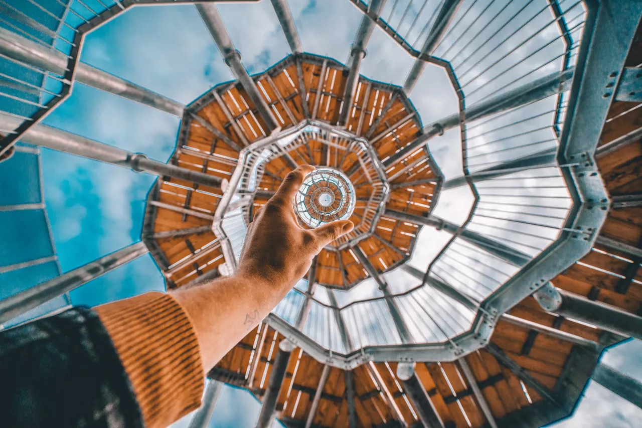
3. Radial balance.
Also known as circular balance, radial balance uses a circular or spiral composition that radiates outwards from a central point. This technique is commonly used in circular logos, mandalas, and other circular designs. It’s achieved by placing visual elements such as lines, shapes, and colors around a central point, with each element positioned at an equal distance from the center; this draws the viewer’s eye towards the center of the design. It creates a strong focal point, which can be especially useful in designs that require a clear and powerful message.
4. Crystallographic balance.
Crystallographic balance is characterized by a regular, geometric pattern that repeats throughout a design. It’s achieved by dividing the design into a grid of equal-sized shapes and then filling each shape with a different color or pattern. One of the benefits of Mosaic balance is that it adds depth and texture, as the repeating pattern can create an illusion of three-dimensionality. While creating a crystallographic type of balance, consider using similar shapes and colors.
How to improve balance in your designs
1. Use the Rule of Thirds.
Divide your design into a grid of three columns and three rows. Place your focal point at one of the intersections of these lines. This will help create proportion in your design.
2. Pay attention to color.
Use color strategically. Balance warm and cool colors, or use complementary colors to create visual harmony.
3. Use white space.
Negative or white space can be just as important as the elements in your design. Use it to balance heavy or bold elements or highlight lighter, more delicate ones.
4. Think about scale.
Vary the size of different elements in your design. This can help guide the viewer’s eye through a composition, emphasize essential elements, and create visual hierarchy.
5. Be mindful of color.
Avoid using too many contrasting colors simultaneously, as it can be confusing. Instead, use them sparingly to draw the viewer’s eye to important elements in your design.
To wrap up
Balance is an essential principle of design and art that can help you create visually appealing compositions. It ensures that no single element overshadows another and that each design component is given the right amount of attention. All four types of balance have unique characteristics and applications — no matter which one you choose, you need to understand how to use them effectively to create your designs more consciously and take your compositions to the next level.
Other articles you might find interesting
Your Essential Guide to Color Schemes: Definitions, Examples, and Tips
How to Design with Gold: Its Meaning, Symbolism, and Complementary Colors
Winter Color Trends 2022-2023: Inspiring Palettes, Curated Collections & Ready-To-Use Mockups