Parallax Scrolling Explained with 8 Dazzling Examples
Parallax scrolling allows you to create all sorts of web designs and breathe life into any visual story. It’s intricate yet harmonious. Even though parallax is not news, it has established itself as an irreplaceable design solution for achieving striking results. It enhances web aesthetics and engages users with a dynamic perspective as they interact with layered images moving at varying speeds.
This guide explores what is parallax scrolling and how it can benefit your brand. We will showcase how parallax design transforms digital narratives with dazzling examples of parallax scrolling websites, whether they’re portfolios, products, services, or NGOs.
Discover how to create a parallax scrolling effect that excites both beginners and advanced professionals!
What is parallax scrolling?
Curious minds pondering what is a parallax scrolling effect will find the answer in strategic design—a fusion of art, technology, and user-centered focus crafted to captivate with functional brilliance.
Picture a theater where the backdrop moves slower than the stage actors, creating enchanting depth. This theatrical effect mirrors how parallax animation works in a tech context. Background images trail behind swift foreground visuals, forming a parallax scrolling website.
Originating from traditional animation from the 1930s, parallax scrolling became super-popular in the 1980s thanks to 2D graphics and video games. It has been enhancing online environments and evolving ever since. Today, this elegant “dance” of layers weaves cinematic magic into 2D scenes, improving engagement without additional effort.
The genius and allure of parallax lies in its capacity to blend good-old storytelling with digital creativity, adding layers of interaction to web journeys. These range from simple parallax scrolling with vertical adjustments to sophisticated scenarios using a mix of vertical and horizontal parallax and parallax zoom scrolling.
With core mechanics understood, we’ll now turn to the countless benefits parallax offers web design and user experience, tapping into how it works across different platforms.
Benefits of using parallax scrolling
Web design has been remarkably reshaped by sophisticated techniques like parallax scrolling. Its multifaceted aesthetic appeal creates more than just websites—it creates adventures.
Engaged browsing
Dynamic, layered visuals attract users. This approach seamlessly navigates them through narratives, reducing bounce rates and encouraging thorough site exploration.
Visual storytelling
By mimicking real-world depth, designers craft experiences where stories unfold with each scroll, reflecting a cinematic style and offering cohesive content journeys.
Aesthetic fulfillment
The creativity threshold is expanded, offering elevated artistry that rejuvenates traditional web interactions and challenges conventional boundaries with virtual depth.
Branding mastery
Parallax techniques showcase technical skill, impressing visitors with sophistication and modern flair, reinforcing brand authority with each scroll.
Effective Call-to-Actions
Designers effectively guide users toward desired actions, using parallax elements as conduits to highlight important messages and build up conversion opportunities.
With these benefits in mind, let’s take a journey through some parallax effect examples and see the beauty in action.
? Discover 6 Key Principles of Visual Hierarchy for Impactful Design
8 stunning parallax scrolling examples
Explore our carefully curated parallax website examples to see how this animation technique captivates audiences with its dynamic storytelling. When content and images move at different speeds, it adds the depth and interactivity needed for dream engagement.
These examples of parallax scrolling websites showcase its versatility across industries. The technique’s growing popularity highlights its potential to create visually stunning and functional web designs.
#1 Moooi: A Life Extraordinary
Let’s begin with Moooi, a brand that immediately treats us to an extraordinary online experience. Their creative use of parallax effects is reminiscent of stepping into a vast, imaginative world where products present themselves.
Moooi invites users to scroll through layered narratives that slowly unfold. Products don’t just appear—they hover, glide, and jump, creating specific moods, values, and stories. This approach inspires the viewer’s exploration, perfectly illustrating what a parallax effect can achieve in forging emotional connections.
By seamlessly layering background images for parallax scrolling, Moooi delivers an experience that merges innovation with visual elegance. Understanding such techniques aids creators in exploring how to do parallax scrolling specifically for brand narratives.

#2 Collage Studio
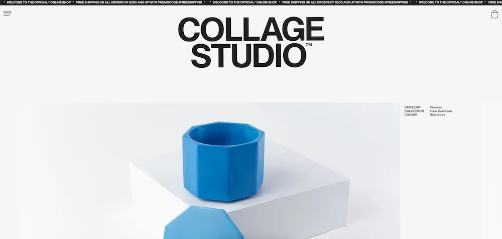
Next, let’s look at Collage Studio, which brings a meticulously crafted online store to its design-savvy clientele. Collage Studio masterfully applied parallax to highlight their collection of handcrafted items, from decor to unique jewelry.
Subtle details, often overlooked, finally gain the appreciation they deserve by being made virtually tangible. Each product introduction feels dynamic and alive, with well-thought-out layering that creates an artisanal flair.
#3 CANALS Amsterdam
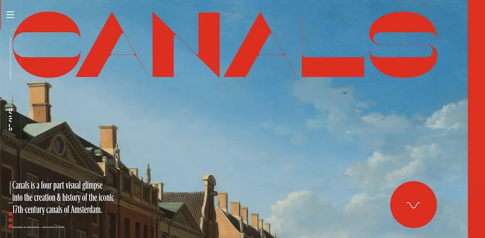
Moving forward, CANALS Amsterdam offers an editorial-style masterpiece that celebrates the city’s legendary 17-century canals. This parallax scrolling JS example illustrates how one can transform historical, heritage-focused content into a vivid tale.
Page by page, the story about early large-scale urban planning and innovation is experienced through visual artistry and scrupulously created scrolling effects—we navigate through layers of memories and architectural triumphs tied to these waterways.
#4 Denys Loveiko Portfolio
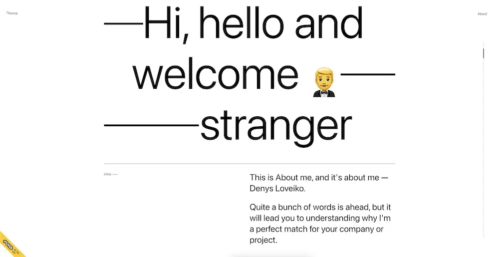
Denys Loveiko seizes parallax techniques to introduce their creative skills and work experience in a neatly designed portfolio. Their site blends simplicity with sophistication, using animated layers to amplify certain elements both subtly and profoundly. Layered visuals create dynamic movement, underscoring Loveiko’s talent for crafting compelling brand narratives.
#5 Vangarde Music
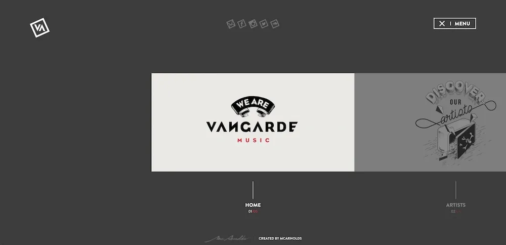
Belgian music label Vangarde Music refines web-surfing experiences through sleek parallax methods. They use just 3 colors for the interface, but this doesn’t diminish the impressiveness of their website, thanks to wonderfully implemented scrolling.
They expertly applied modern web design with a strategic blend of movement effects common for mobiles and tablets, but also perfectly working on desktops. This careful choice ensures superior performance across multiple devices, delivering an immersive user experience without compromising speed.
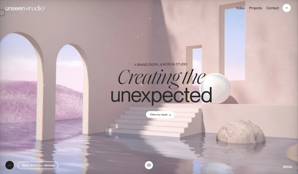
#6 Unseen Studio
Unseen Studio exemplifies the marriage of movement and brand expression through engaging visual techniques, offering audiences an innovative digital experience. They ingeniously employ layered images, transforming conventional web interactions into artistic effects that harmonize motion with brand messaging. By skillfully balancing aesthetics with purposeful design, Unseen demonstrates how effective digital crafting can forge deep emotional connections with viewers.
#7 Kitamura Makura
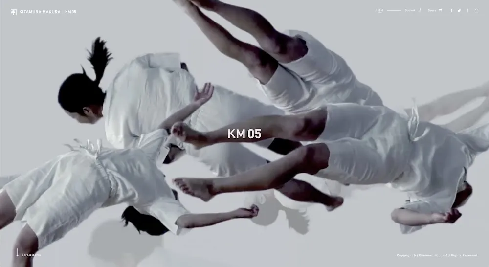
Kitamura showcases their artfully crafted pillows and sleeping accessories in a dream-like wonderland with a highly specific and inspiring idea: Everyone, 30 rotations, a Night. This digital spectacle uses background movements to encapsulate feelings of floating and tranquility, enticing visitors to linger.
The subtle moving elements simulate a serene sleeping environment, beautifully complementing the brand’s ethos of restorative rest. Kitamura breathes life into its product story by adjusting web layers, drawing users into a cozy retreat with uniquely designed pillows.
#8 Alliance to End Plastic Waste
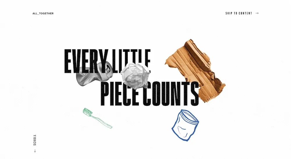
The final spotlight falls on the Alliance to End Plastic Waste, which harnesses parallax techniques to communicate their environmental cause.
Their approach creates a lasting experience by highlighting the ongoing battle against plastic pollution. Using design to narrate complex topics with the clarity and impact they deserve, these efforts emphasize awareness and urgent motivational action.
This is a perfect example of how parallax scrolling can efficiently convey compelling advocacy that resonates widely with the web’s global audience.
Implementing parallax scrolling: FAQ and best practices
Understanding how to make parallax scrolling opens vast avenues for creative content. You must balance creativity and technical skills to successfully integrate this browsing technique into your website design. Tools like design suites usually facilitate crafting such elements, especially if you’re willing to integrate JavaScript animations for great results.
-
How is parallax different from regular scrolling?
Parallax scrolling isn’t your average scroll. Unlike regular scrolling, where everything moves in sync, parallax shakes things up by making background and foreground elements move at different speeds.
The result? A 3D-like effect that pulls you deeper into the content. It’s a clever trick that turns basic scrolling into an interactive experience.
-
How to do parallax scrolling?
The approach varies depending on the platform you’re using, but the goal is the same—to create depth and motion that makes your site stand out.
If you want to do everything yourself, a strong foundation in technical components is crucial. CSS and JavaScript drive these digital effects. Start with CSS by fixing an element’s position, creating a seamless experience.
Address mobile compatibility issues arising from browser limitations by employing responsive designs—use media queries to adapt to screen sizes, ensuring functionality across various devices.
JavaScript empowers you to control the animation speed. This language enables the layering effect, gracefully achieving depth perception. Here’s a suggestion: use device motion detection to tailor interactive experiences for each visitor. This enhances immersion, captivating your audience.
As you explore platforms like WordPress, Squarespace, Wix, or Figma for creating parallax effects, recognize each one’s strengths. If you’re working in Figma, you’ll need to create multiple static layers to achieve the effect. Think of it like stacking images and content at different levels. Use the prototyping feature to animate your layers, making the background move more slowly than the foreground. It’s all about precise control and creative design, perfect for custom projects.
WordPress, Wix, and Squarespace allow for the insertion of custom scripts for tailored functionality. While WordPress offers ready-to-use themes and editing presets, it mostly runs on what you actually put into it. Wix and Squarespace, on the other hand, are both extremely user-friendly—no coding required.
You can enable parallax scrolling simply by tapping several page settings, and they do the heavy lifting for you, automatically adjusting background images and content blocks to create that smooth effect. You can tweak things like speed and image position to get just the right balance without worrying about the technical side—ideal for beginners honing these skills.
-
How does parallax scrolling affect website productivity, accessibility, and other metrics?
Despite the importance of visual appeal, paying attention to site performance is critical. Slow-loading pages defeat user satisfaction, highlighting the need for good practices.
Optimize images using formats like WebP or AVIF, compressing files without compromising quality. Embed responsive images through HTML to adapt to device resolution in real time, ensuring vibrant visuals while maintaining swift load times. Additionally, don’t forget about cookies! Preload essential resources to reduce waiting periods.
Another thing to prioritize is accessibility. Foster inclusive browsing experiences with the `@prefers-reduced-motion` media query. This simple alteration can significantly enhance the experience for those with motion sensitivities. Further, use semantic enhancements to design for screen readers, granting narrative access without reliance on visual elements.
Nevertheless, consistent testing is crucial. Tools and techniques empower creators, yet a vigilant eye must regularly assess how animations perform across devices and browsers. Technical audits can reveal unanticipated issues, paving the way for refinement until the online experience becomes a seamless navigation through visuals.
You may notice websites using parallax, often pairing it with music to tickle human senses even more effectively. Explore our library with millions of licensed music tracks for your creative projects, whatever they are!
Wrapping up
The captivating blend of layered images and dynamic content has revolutionized how websites engage with their visitors, demonstrating that innovation thrives in the digital world. Parallax effects, once reserved for major brands, are evolving into a necessity for those pursuing an immersive web journey. These effects extend beyond mere aesthetics, bridging storytelling and interactivity.
By adopting these animated layers, design professionals transform web engagements into multisensory experiences. Notwithstanding varying opinions, widespread use by tech giants cements parallax’s lasting popularity, ensuring it remains a design staple rather than a passing trend.
Consider taking your visual communication to unparalleled heights. Ready to captivate your audience and define your brand’s digital presence? ?
Read more about web design:
25 Top Web Design Trends 2025: From Neubrutalism to Dynamic UI
Best Personal Website Examples and Practices in 2024
Symmetrical and Asymmetrical Balance: How to Harmonize a Design
