6 Ways to Use Textures in Graphic Design: Resources, Tips and Examples
Textures in graphic design are used by designers to create illusions, altering the look and feel of an image or a design. Contrary to popular opinions, the use of textures in graphic design is not always a safe bet. Textures in graphic design can make or break your artwork. It just so happens that textures are also a very powerful tool in creating compelling design. The key is the right use of them.
Textures in graphic design work can quickly bring an extra layer of meaning to a previously static image. For instance, 3D textures can add more depth and visual interest if you show texture in paint rather than a flattened brush stroke. There’s a fine difference for when not to use and when to use textures which is what we’d like to focus on today.
Creating a texture-inspired artwork goes beyond the decision of “I want to use texture. Somehow.” You need to have a clear idea and resources you can turn to for inspiration. In this article, you’ll find a wide selection of textures from the Depositphotos library to use in your designs, as well as tips on using textures in design and examples of work that have mastered the art.
6 ways to use textures in graphic design
The topic of discussion is contemporary graphic design, and texture continues to play a leading role in the creation of designs this year and most likely for years and years to come. Understanding the different ways to apply textures to some of the simplest and complex designs gives you a competitive advantage in the creation of something memorable.
Here’s to creating graphic art with a purpose and meaning as opposed to with an afterthought. Let’s get to it.
1. Back to nature
Fresh grass, spring flowers, tree bark, and about a million other textures beautifully complement designs to add a soft touch. Using natural textures provides a very crisp look and adds an atmospheric touch.
Note how the example below perfectly illustrates the power of natural textures. Something as simple as leaves paired with a flat design creates the necessary contrast to quickly catch the eye. This kind of contrast and juxtaposition is what also creates a sense of drama and draws the eye.
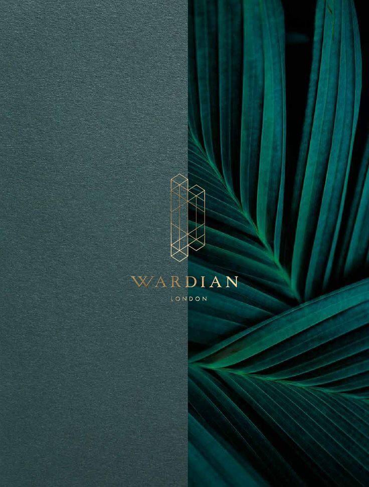
Wardian London brochure by Ballymore Group
Another tip with natural textures is to use illustrations. This watercolor leaf pattern not only provides a striking color contrast, but adds a refreshing touch and a juxtaposition in this context that draws the viewer in.
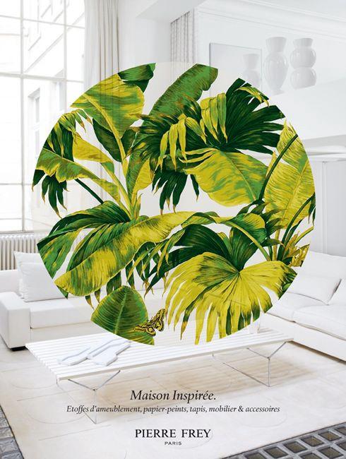
PIERRE FREY Campagnes publicitaires — Agence Simone
2. Paper and artificial textures
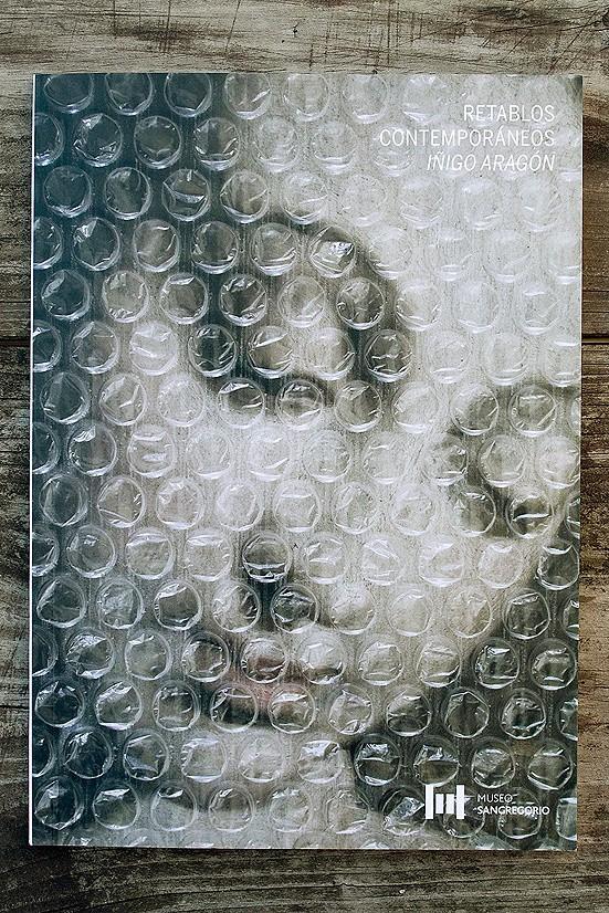
Artificial textures are simply patterns that have a 3D element such as textiles, crumpled paper, and other surfaces that can add visual interest in a subtle way. In our first example, the Tumblr artist used a paper-like effect to add a layer to a static image. The use of shadows illustrates that graphic designers are limited only by imagination because nowadays if you can’t find the right texture, you can create it.
Even something as simple as bubble wrap, in this example, can create an entirely new look and feel when placed on top of images.
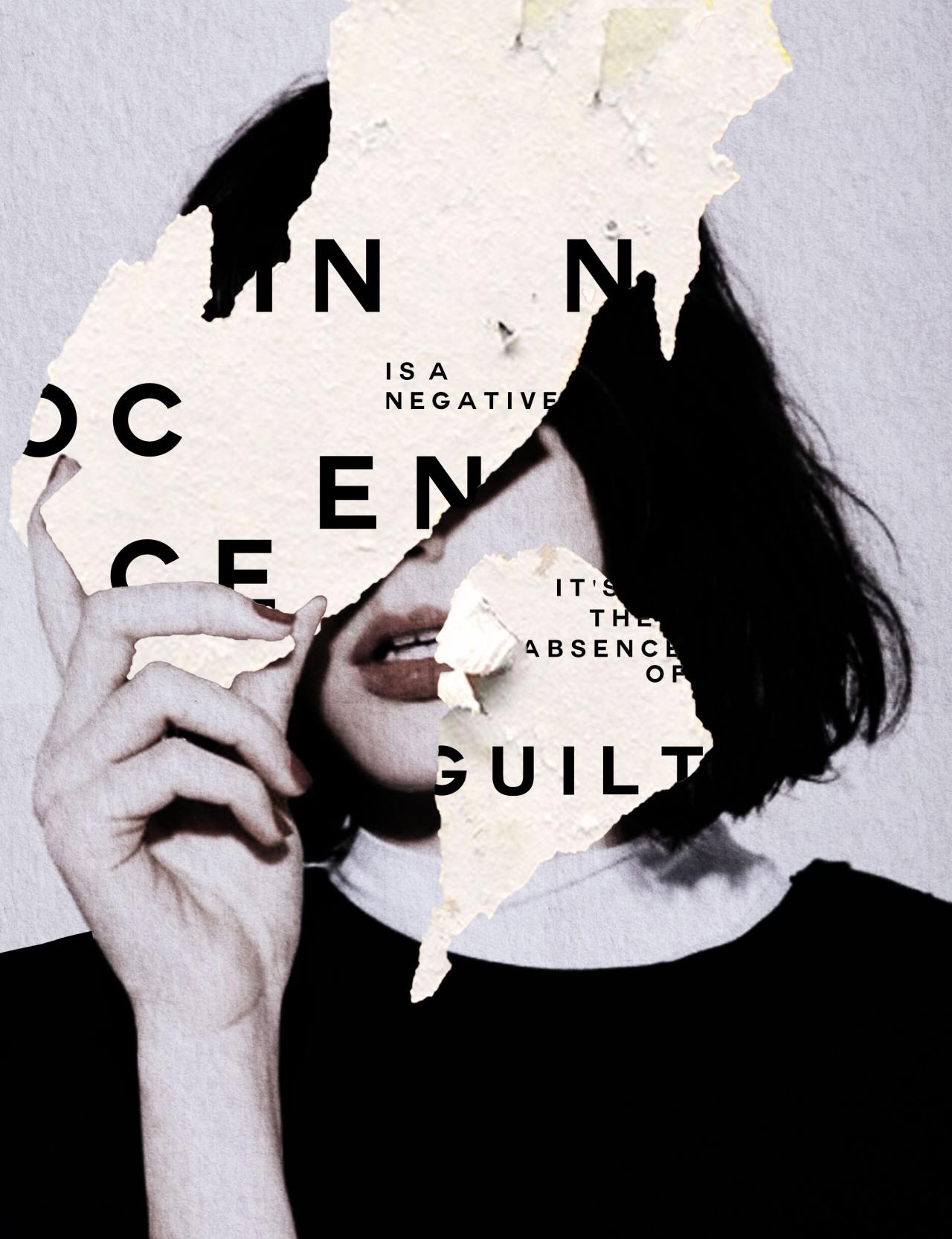
Typography for Empire Magazine by Andre Beato
3. Adding art elements as texture
Creating artistic brush strokes is another technique to use when experimenting with texture. Art elements such as brush strokes can be both dynamic and flat, depending on the desired effect.
Simple but effective – artificial brush strokes bring a hand-made element to compositions. The paint textures make the typography pop as in this example. The right dose of an artistic touch paired with crisp fonts is another way to draw attention.
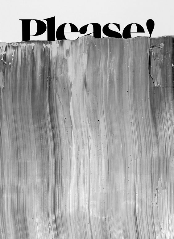
CargoCollective
Here is a poster that makes the most of color contrast and uses brush strokes that intervene with the design itself to create a striking impact. Not only do the colors scream for attention, but the intricate layering of textured paint and design elements in the middle of the image.

Inspirationde
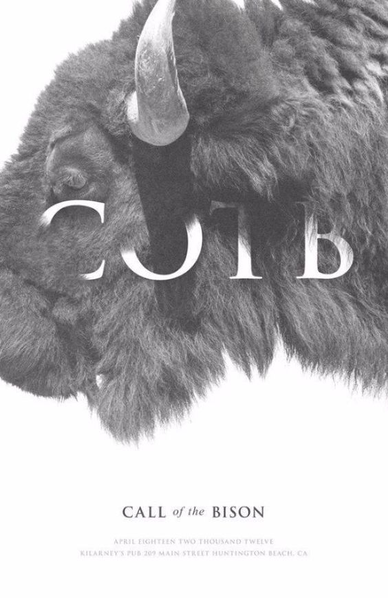
4. Photography as a texture
Visual interest can also be added to composition through the use of a photograph. Playing with transparency and color adjustment, photography can work wonders in helping create a sense of texture, all the while illustrating highly detailed sceneries.
A notable example of not just photography used as texture, but simple geometric patterns and the use of color to create visual interest and evoke curiosity.
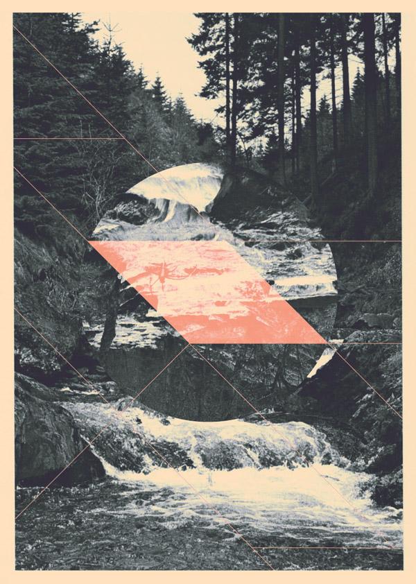
Purr by Jelle Martens
This textured graphic delivers not only a strong textual message but uses a photograph to add more depth. The bold color choices perfectly contrast the black and white photo, creating a (still) textured composition.
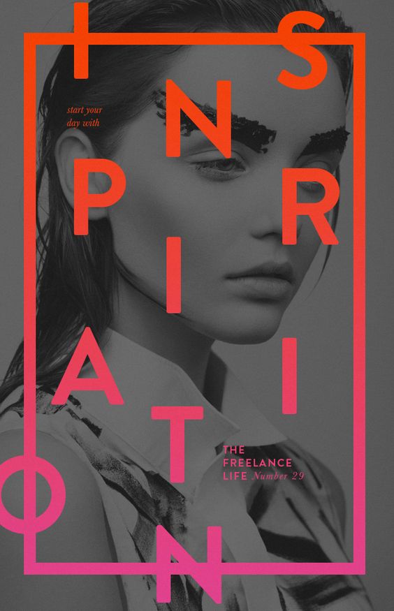
Weronika Kosinka
5. Taking the 3D route
We’ve covered a lot about static design, but using the background to create a sense of a 3D layered effect is a completely different technique. The key is combining opacity and transparency to create a sense of depth.
Here is a great example of this technique by a Behance artist. The artist used an advanced technique to make the letters ‘pop’ in this composition and photographed texture intervening with the design. The result makes one question how this project was made – is it a photograph, or another advanced typography technique?
Partee SCCL
The use of shadow and simple texture creates an illusion of depth in this composition. Sometimes even the simplest tricks can result in a desirable effect.
Style Bubble
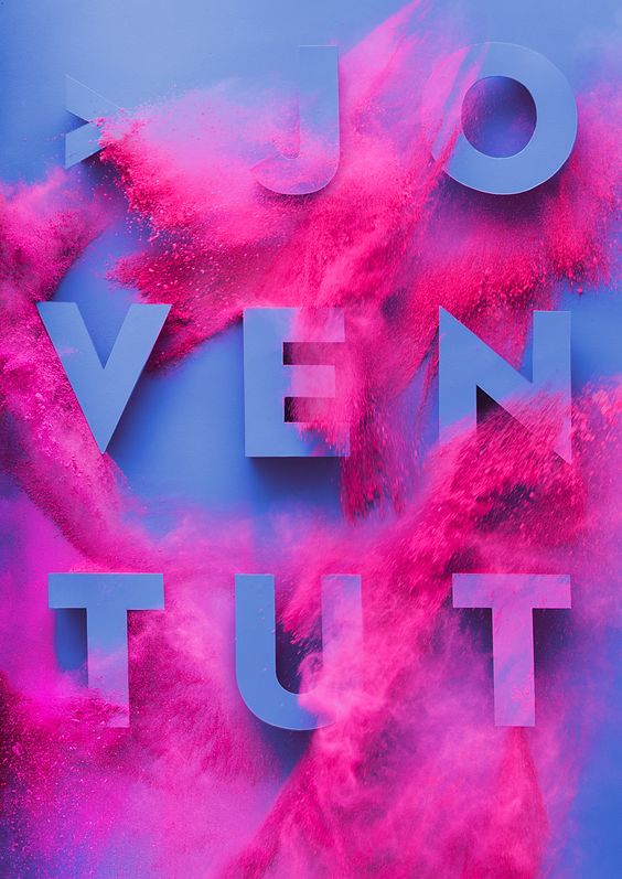
6. Applying texture to typography
Subtle texture combined with typography results in outstanding and memorable pieces. Because of the subtlety, designs like this add a modern twist to minimalist designs. Without having to be too complicated, the simple notion of texture paired with typography can be enough to be a memorable piece.
A poster for the Japanese Art Festival leverages the simplicity of type and photographic texture. This kind of marriage between the two techniques results in a texture effect that ultimately becomes the type in the end.
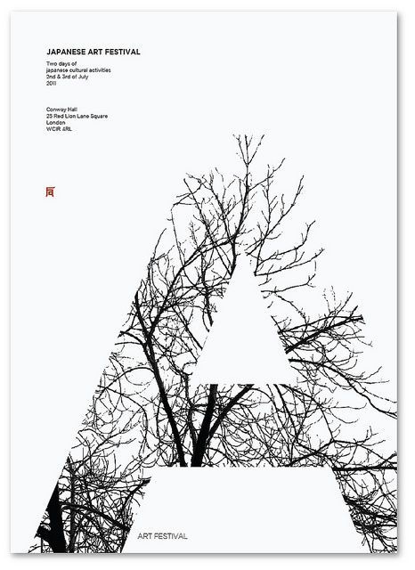
Márton Jancsó
A slightly different take on textures and fonts illustrates how font can integrate with texture to create a sense of coherence in a composition. Well-integrated texture can greatly influence type as seen in this example.
Keith Barney
These 6 ways to use texture in designs is just a preview of the possibilities. Another great way to use texture is to appeal to the sense and use tactile textures that appear three-dimensional using shadow. The applications of textures are many. Using textures helps you create a more inviting and visually luring composition with the use of that extra layer or depth.
For more visuals to use in your designs, see our photo collection of textures for designers. Find textures that will help you with your projects and show us how innovative designs can get with the simple application of textures and textured backgrounds.


![Graphic Design Trends 2021 [Infographic]](https://depositphotos-blog.s3.eu-west-1.amazonaws.com/uploads/2021/02/Graphic-Design-Trends-2021-Infographic-1.webp)