Symmetrical and Asymmetrical Balance: How to Harmonize a Design
In the business landscape, design goes far beyond creating appealing graphics. It’s a primary tool for communicating brand messages and engaging a target audience. However, to be effective, a design must follow key principles, and one of them is balance, the art of arranging elements on canvas to get a desired effect.
So, what is a well-balanced design? There is no single recipe for success. While every project requires an individual view, we’ll explore two of the most common types of balance in design—symmetrical and asymmetrical balance. Stay tuned to learn how to leverage them and make your marketing graphics more visually impactful!

What is the value of visual balance in design?
The principle of balance in composition is connected to the concept of visual weight. According to it, each graphic element has its own weight, which depends on size, color, shape, or texture. The more a particular object grabs viewer attention, the greater its visual weight. Simply put, larger, brighter, or darker elements are “heavier” than small and light ones.
The primary design elements that the principle of balance applies to include:
- Objects
- Colors
- Textures
- Space
- Movement
Balance in design suggests that graphic elements are located to equalize each other. Such distribution of elements within a composition is called equilibrium. It creates a well-organized, structured image that captures attention and guides viewers from the most essential parts to the secondary ones. In business communication, the importance of this feature cannot be underestimated, as only a balanced email, website, or packaging design can draw and hold the audience’s focus.
Symmetrical and Asymmetrical Balance: which is the best for your project
The principle of balance is crucial to ensuring a good user experience and high-quality interaction with your design, whether it’s a small app icon or a large presentation. That said, you are not limited to one approach. There are different types of balance in design that can help create cohesive and visually pleasing graphics. Let’s explore the most popular techniques for achieving harmonious composition—symmetrical and asymmetrical balance.
Symmetrical balance definition and examples
Symmetry is the most widely used type of balance in design. It’s achieved by the same arrangement of elements on both sides of the horizontal or vertical central axis. Symmetrical balance creates an image in which two sides have equal visual weight and seem to mirror each other.
Most people find symmetrical balance visually pleasing since it’s prevalent in the real world. Just think about flowers, leaves, buildings, or human bodies—symmetry can be seen everywhere. It conveys a sense of order and harmony. And while sometimes symmetrical balance can look a bit formal and dull, it’s a proven way to create a clean and aesthetic design.
Key features of a symmetrical balance:
- Ordered look
- Mirroring
- The same elements on both sides
- Stable appearance
Symmetrical balance examples in art
The Last Supper by Leonardo da Vinci

Source: Wikimedia
Taj Mahal
Infinity Mirror Rooms by Yayoi Kusama

Source: tate.org
Why choose symmetrical balance:
- To create user-friendly graphics. One of the significant advantages of symmetry is simplicity, which seems to be key when you need to make navigating a design as comfortable as possible for users.
- To improve understanding. Since the human brain perceives symmetry much more effortlessly, a symmetrical design can communicate messages faster and more effectively than an asymmetrical one.
- To boost recognition and consistency. People naturally recognize and appreciate patterns, so symmetrical compositions might feel more familiar and enhance brand identity.
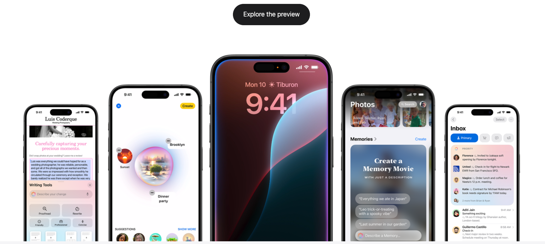
Symmetrical balance examples in design
Apple website
Starbucks logo
IKEA ad

Source: adsoftheworld
Asymmetrical balance definition and examples
In contrast to symmetry, asymmetry involves creating compositions with unequal visual weight on different sides. In this case, one side of the design will contain a dominant element, while the other side will balance it with a few “lighter” pieces. Instead of reflection, asymmetrical balance uses various sizes, colors, and shapes to bring visual harmony.
Creators choose this type of balance to produce dynamic and modern designs. Asymmetry usually creates visual interest related to the human nature of finding coherence in everything. With no evident balance, our eyes start looking for a counterweight. This way, asymmetry guides the viewers’ attention and adds a sense of movement to a composition.
Key features of an asymmetrical balance:
- Uneven arrangement of elements
- Different visual weight
- Versatility
- Dynamic appearance
Asymmetrical balance examples in art
Michelangelo’s frescoes in Sistine Chapel
Sydney Opera House
Le Reve by Pablo Picasso
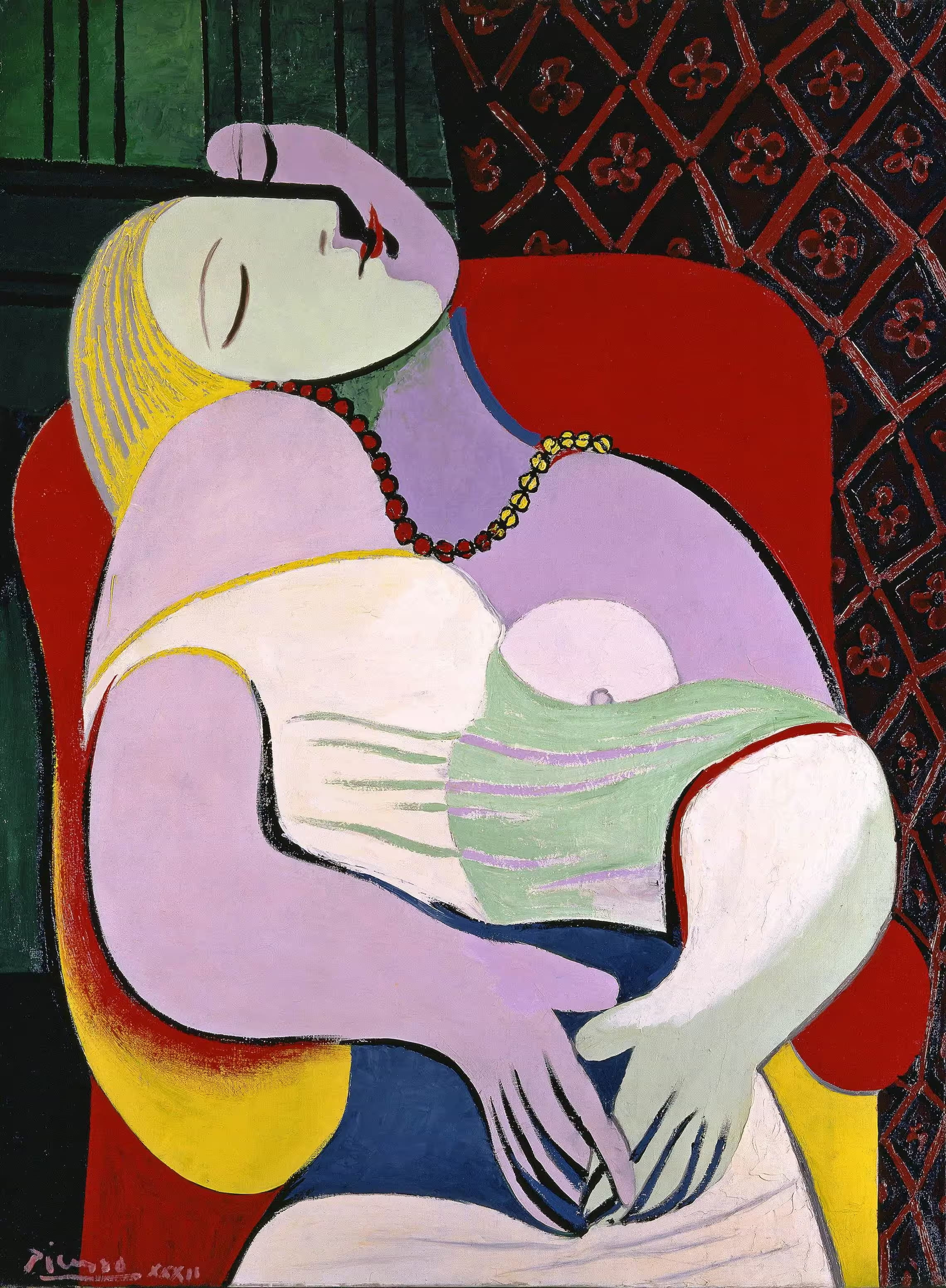
Source: Wikipedia
Why choose asymmetrical balance:
- To create visual variety. Asymmetry gives you much more creative freedom. You can experiment with various elements to create visual intrigue and draw viewer attention to strategic parts of a design.
- To add a sense of dynamism. Asymmetrical balance breaks the limits of predictable patterns, capturing the eye and guiding it through a design, which provides an immersive experience.
- To enhance engagement. By leveraging asymmetry, you motivate your audience to explore a design and actively interact with it, thus leading to better user engagement and satisfaction.
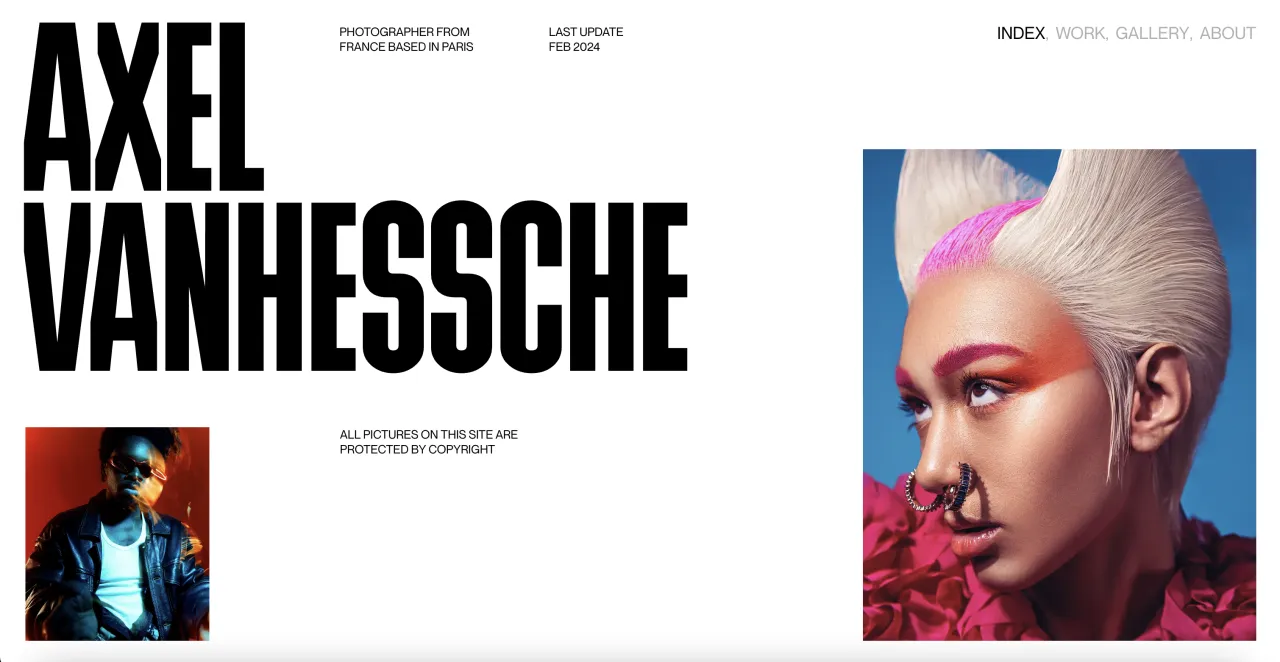
Asymmetrical balance examples in design
Pinterest Predicts 2024
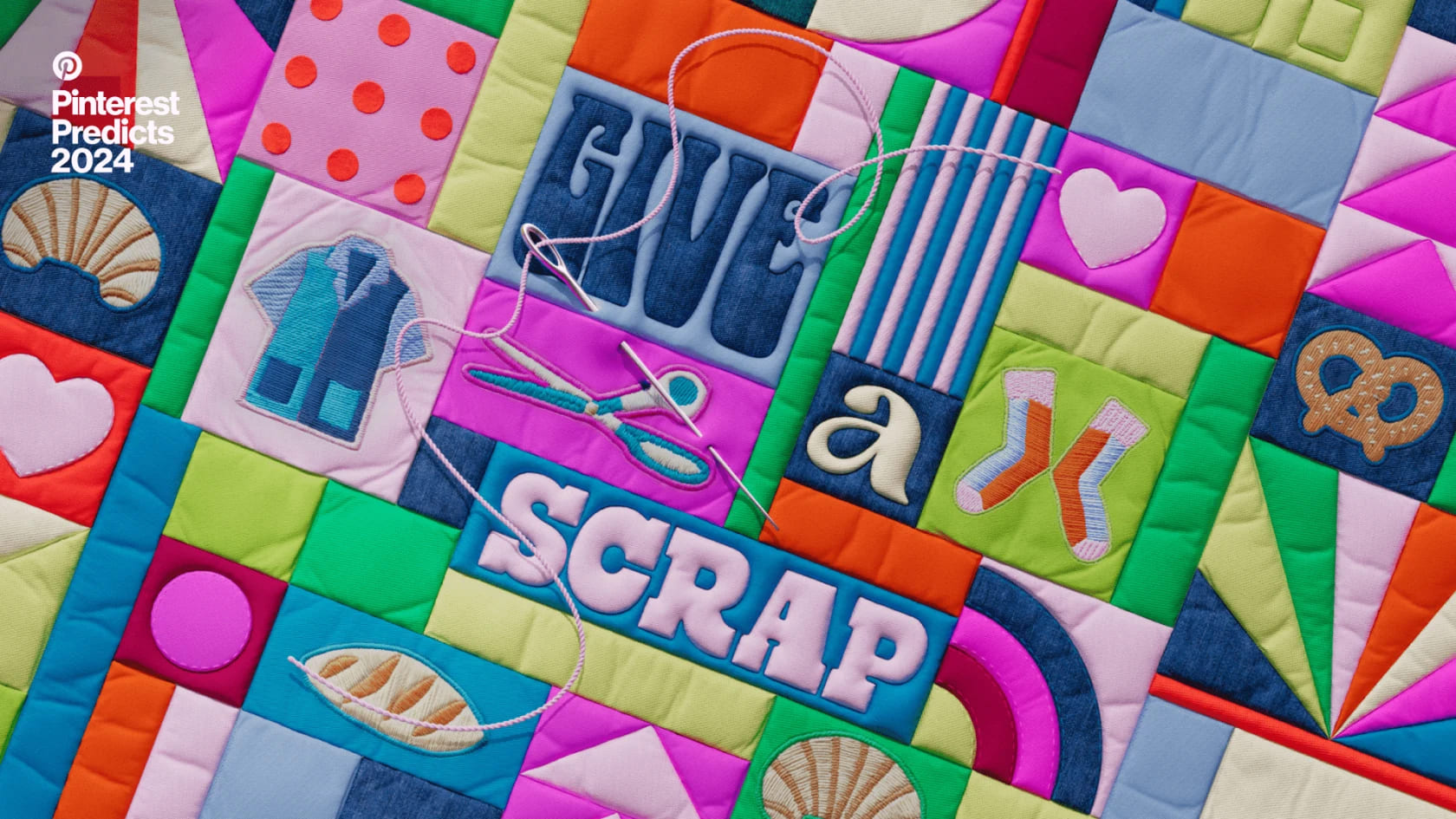
Source: newsroom.pinterest
Email campaign by Airbnb

Source: reallygoodemails
Image Upscaler by Depositphotos
The main differences between symmetrical and asymmetrical balance
- Simplicity vs. complexity. A symmetrical type of balance ensures a simple and easy-to-understand design with no distraction. In contrast, asymmetrical balance makes graphics more diverse and sophisticated.
- Stability vs. dynamics. Symmetrical balance creates a formal and orderly look, while an asymmetrical one adds a sense of movement and visual interest to compositions.
- Similarity vs. versatility. Symmetry uses similar elements in the same order, which is great for backgrounds and patterns. Meanwhile, asymmetry offers unexpected combinations of elements, catching the viewer’s eye.
What to consider when deciding between symmetrical and asymmetrical balance
1. Design goal
Start with what you want to achieve through your design. If you aim to convey a single message or several equally important ones, choose a symmetrical balance that won’t distract attention from what’s most important. However, asymmetrical balance will be a better option to highlight a certain point or part of the design. For example, a symmetrical template will work well for a homepage, while asymmetry is more beneficial for a creative campaign.
2. Target audience
Your choice of balance type can also be determined by the audience you are designing for. Older people will appreciate well-organized and refined symmetrical compositions. On the other hand, a dynamic asymmetrical design may appeal better to younger users who prefer unconventional solutions. Whichever balance you choose, make it easy for your target audience to recognize your brand by adding identity elements such as brand colors or a logo.
3. Desired emotion
Another thing to consider is what emotion you want to evoke in the audience. Balance can significantly affect the perception of design. Symmetry evokes a sense of order, stability, and harmony, while asymmetry communicates curiosity, excitement, and creativity. Therefore, symmetrical design can be more efficient in presentations or professional portfolios, and asymmetry is the best choice for social media graphics or printed materials.
Final thoughts
Modern design offers so many different approaches and tools that you can easily get lost in the variety. But there is no need to overcomplicate things. Your graphics should be based on fundamental design principles that never change.
Understanding symmetrical and asymmetrical balance principles allows you to choose the best option for your particular goals and create more appealing and impactful projects. Remember to consider visual weight, maintain a sense of equilibrium, and experiment with different elements to get a harmonious design that resonates with your audience.
Other articles you might find interesting
Color-Blocking: How to Mix and Match Bold Colors Like a Pro
6 Key Principles of Visual Hierarchy for Impactful Design
How to Design an App Icon: An Entrepreneur’s Ultimate Guide for Success


