Email Design Guide with Best Practices & Examples
Ever wondered how many emails the average Internet user receives each day? We’re sure you’ll be impressed by this number, too: according to the latest data, it’s 121 emails on average, and this number continues to grow. Moreover, most of the emails are offers and promotion announcements from brands. The competition for audience attention in email marketing is very high.
How do you make sure that your brand’s emails don’t get lost among numerous messages from other companies? The answer is thoughtful email design. In this article, we’ll dive into the best practices for email design that will make you stand out from competition and share your offers in the most effective way possible.
What is email design?
Email design refers to the visual design of marketing email messages. Its main goal is to create appealing emails that will capture the audience’s attention, convey the necessary information clearly, and motivate recipients to take desired actions. No matter how well-thought-out and favorable your offer is—if it is poorly designed, it just won’t be noticed. Thus, email marketing design is extremely important. Your task should be to create effective email design layouts using fonts, colors, and images.

Key elements of email design
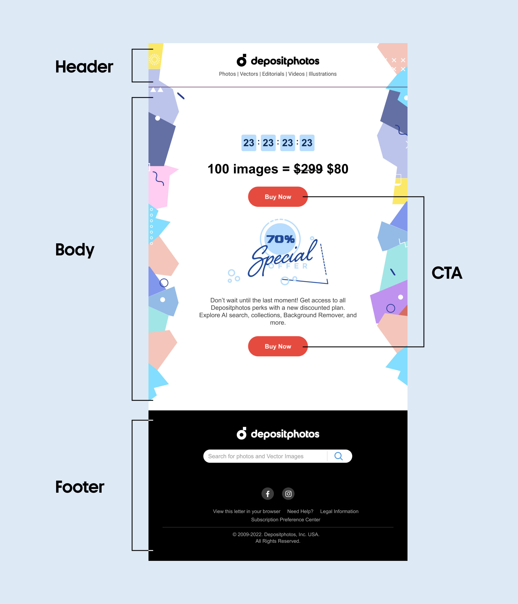
1. Header and preheader
The header is the upper part of an email located above the main image. It usually contains the brand name or logo, contacts, and a menu with links to website sections. A header helps the reader to identify the sender. Also, some emails have a preheader that goes before the header; it may also display a logo, date, or a “View in Browser” link.
The recommended size for a header is 600 to 800 pixels wide and 100 to 200 pixels high. This ratio ensures that the header is visible enough without distracting attention from the email body.
2. Email body
This part of the email design layout contains the main message you want to communicate to your audience, such as the benefits of your product, service, or offer. Here, in addition to text, you can use images, videos, and animations. The email body often starts with a greeting, a headline, or a short introduction, but these are not required. You are free to focus on your key message.
The email body can consist of several content blocks. This approach is especially relevant if you need to include a lot of different. With multiple blocks, the height of each block should be within 200–300 pixels, and the total height of all blocks should not exceed 800-1200 pixels. The width is standard and amounts to 600–800 pixels.
3. Call-to-action (CTA)
The email body usually leads readers up to a call to action (or CTA, for short). This is a button or banner with text and a hyperlink that redirects a user to a specific website. CTAs in email marketing design need to be formulated as clearly and unambiguously as possible, for example, “Buy”, “Use discount”, or “Download”. Readers should immediately understand what action is triggered by clicking the button. This increases the chance of a desired action being performed.
The size of the CTA banner should be 600-700 pixels wide and 100-200 pixels high. In some cases, banners are the main elements, so they can be up to 1730 pixels high. As for the CTA button, the best size is 200-300 pixels wide and 50-75 pixels high.
4. Footer
The footer is the bottom part of an email below the main message and the CTA. Most often, the footer contains the following elements:
- the company’s contact information;
- social links;
- link to the privacy policy;
- unsubscribe button;
- a phrase indicating that the recipient has agreed to receive the newsletter.
The optimal height of the footer is 100 pixels. But if you want to place additional elements there, such as links to your website or social networks, you can increase the footer height to 300 pixels. This will allow you to arrange all important information in a legible and noticeable way.
Different types of emails to design
Today, email marketing is still one of the most effective tools for business. According to statistics, every dollar spent on this promotion channel brings an average of $40 in profit. Another advantage of email marketing is a wide variety of email types that allow you to achieve different goals. Let’s take a look at the most popular ones and their key features.
1. Welcome messages
A welcome email is the first message a user receives when they subscribe to your newsletter. In the welcome email, brands usually thank subscribers for choosing them and then try to demonstrate their benefits and introduce their products and services. This is an important stage of interaction with subscribers that sets the tone for all further communication.
2. Promotional emails
Promo emails are one of the most important types of email campaigns aimed at driving sales. Brands usually use them to inform their audience about promotions and special offers. The key element of promo emails is a CTA that should lead subscribers to conversion. Therefore, it should be clear and convincing.
3. Transactional messages
Transactional emails are automated messages sent to a user in response to their interaction with your brand. For example, it can be an order confirmation, payment, or delivery information. They also include user account notifications such as subscription renewal or password change.
4. Informational messages
Brands use such emails to share news with their subscribers. For example, to announce the launch of a new product or service, or to inform about important updates. Also, this type of messages is used to notify them about changes in the terms of use.
5. Abandoned cart emails
These messages come in handy when you need to remind users that they left items in their cart, and to stimulate them to complete their purchase. On one hand, they help you show concern for customers who might have accidentally closed their shopping cart tab or forgotten to check out. On the other hand, it’s an efficient way to convert sales that your business might have missed otherwise.

Email design best practices with examples
We’ve explored the structure of emails, as well as the most popular email types that brands use in their business communication. Now, let’s move on to specific email design approaches that will help you create compelling newsletters and achieve your desired marketing goals.
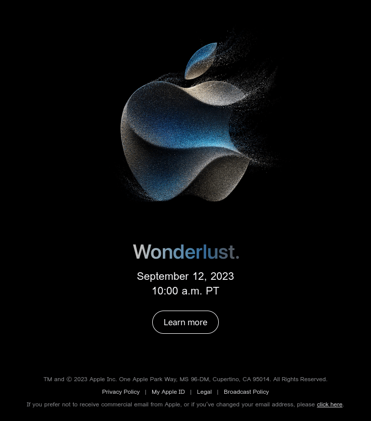
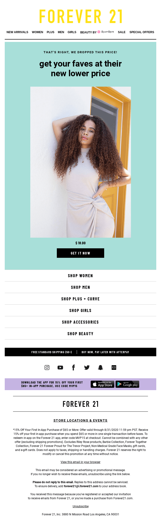
1. Simplicity and minimalism
Think about the huge amount of information people have to deal with every day. Our first tip is to keep your email marketing design simple, because you have only one chance to communicate your message to the audience. If your email looks cluttered with text and visuals, it might just get lost. According to research, readers usually scan emails and skip introductory sections. Therefore, your task is to design a layout with the main information and CTA highlighted. Go for minimalistic, one-column layouts that look equally good on both desktop and mobile.
You can create concise and stylish email layouts by following these principles:
- limited color palette. Minimalist design entails restraint in the use of colors. Ideally, limit yourself to two or a maximum of three shades. The background color should be neutral, such as white, gray, or black. You might want to use bright colors for accents, but do not overuse them.
- thoughtful use of visual content. Of course, nothing grabs attention and sets the right mood like eye-catching images. But if there are too many of them, they can distract the viewer’s attention. Besides, emails with a lot of visual content can slow down the recipient’s device. Therefore, the best choice is to use a single image, video, or animation.
- concise text. Just like with images, overloading your email with text can also make it difficult to convey your key message. Besides, keep in mind that most users open emails on mobile devices, where long sentences are uncomfortable to read. So, make sure your text is concise and easy to perceive.
- a single CTA. This point is closely related to the previous one. Using multiple CTAs can confuse subscribers. To convert them effectively, clearly state what you expect. You can repeat the button, but the CTA wording should remain the same throughout the email.
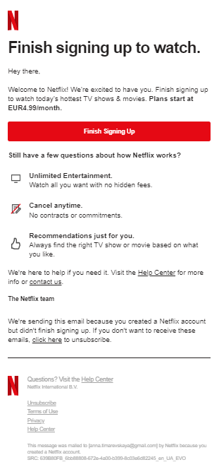
The welcome email from Netflix is a great example of a simple design. Here, we can see a one-column layout, a concise main message, and no graphic elements at all except for the company logo. The choice of colors is also very restrained; apart from the standard black text on a white background, there is a red accent color aimed at highlighting the CTA button.
2. Consistent branding
Branding consistency means that all elements—from messages to the company’s visual identity—are consistent across all platforms and channels of interaction. Such consistency is the key to creating a strong and recognizable brand image. In modern email design, this is realized through the following approaches:
- compliance with the brand book. The brand book combines guidelines on the company’s visual style and communication. It contains the best options for logo design and placement, corporate colors and fonts, examples of visuals for various purposes, etc. Having a brand book makes it much easier to create an email design because you have a certain set of elements from the very beginning.
- image style. If you need to maintain a consistent image, rely on visuals that both convey your brand’s personality and represent your target audience. This will help you build a stronger bond with your customers and show them you understand them well.
- unified design of email layouts. Using a consistent email design can significantly streamline the process. It also can improve your brand awareness and credibility with your audience.
- consistency of header and footer. Having the same header and footer across all your emails also ensures quick recognition and easy navigation by recipients. Make sure your header includes all important elements like your logo, company name, and social links, so that your subscribers can interact with you on other platforms.
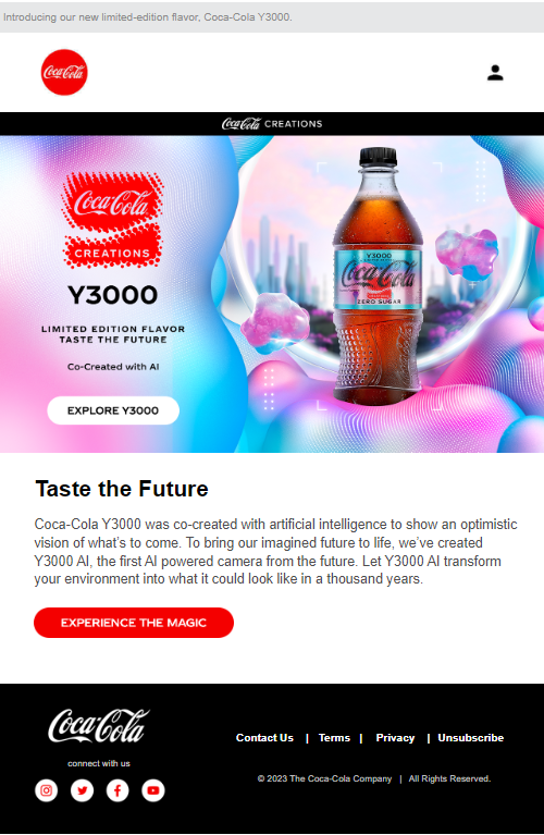
Coca-Cola’s email, in which the company presents a limited-edition new product, is fully consistent with the brand’s image. The consistent use of the company logo (it is repeated four times) and an actual image of the drink work in favor of the branding.
3. Effective use of white space
White (or negative) space is an element of design that can improve overall appeal and readability, highlight key elements, reduce visual clutter, and give the eye a break. With white space, you can also create a specific aesthetic that will perfectly complement and reinforce your messages. To use this tool to its fullest, follow these principles:
- visual balance. The potential of white space is best revealed when your design is not overloaded with too many elements. At the same time, it should not look too empty. It’s important to find a balance between negative and positive space to create a harmonious composition.
- contrasting colors. Contrasting shades help balance white space and draw attention to the most important elements of great email design. Use brand colors or trendy seasonal shades that will definitely resonate with your audience.
- focus on content. White space is great when you need to highlight the content. Put the most important information at the top of your email design layout and use negative space around it to draw attention to it. Thus, you will ensure that readers see it first and increase the chances of the desired action being performed.
- colored white space. White space does not need to be white. This term just means that a part of the design is intentionally left blank. But you are in no way limited in your color choices. Any background shade can play the role of a negative space. For example, delicate pastel colors will not overload the design and, at the same time, will make it more visually appealing.
In an email from the sustainable brand HNST Studio, it is a pastel shade that plays the role of white space. It highlights the image, the main message, and emphasizes the overall aesthetics.
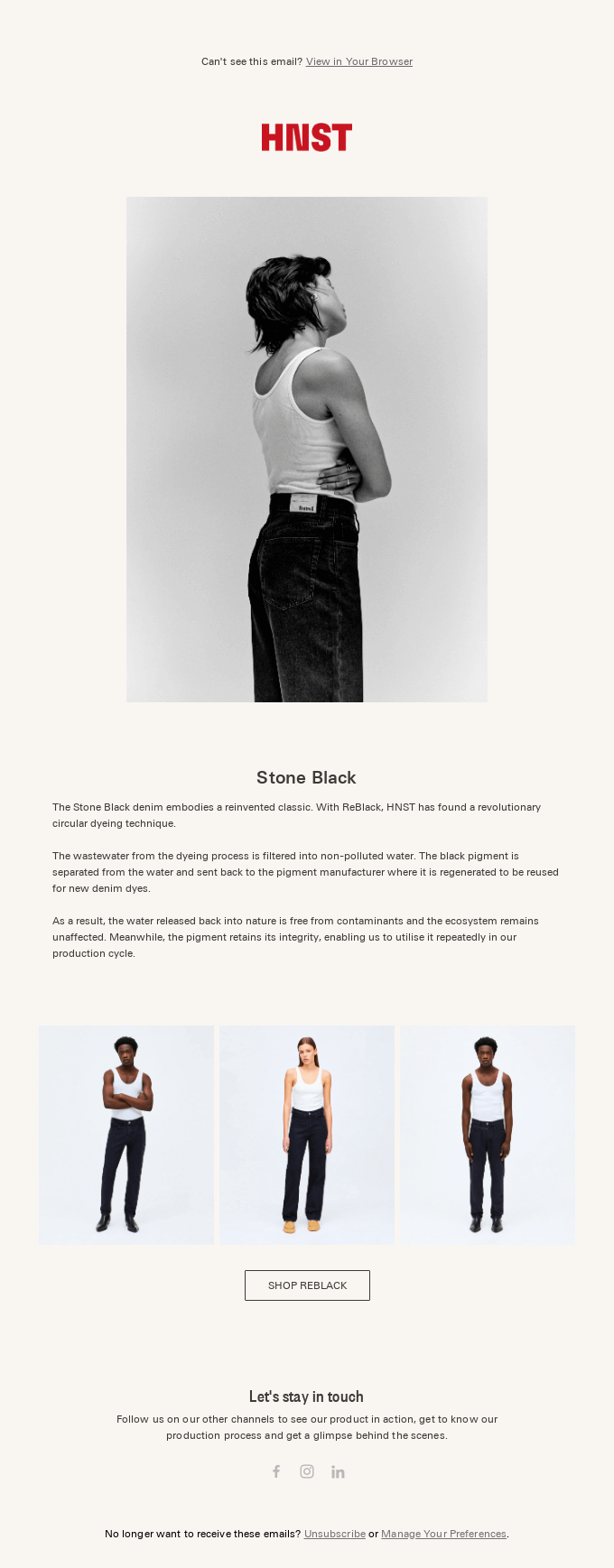
Source: reallygoodemails.com
4. Font choice and readability
No matter how impressive and engaging your email design is, if the text is difficult to perceive, readers will simply ignore it. Readability is one of the keys to a successful user experience in modern email design. Therefore, you should pay special attention to font design and choice. Focus on the following aspects:
- a minimum of fonts. A sure option is to choose one font family that includes font versions with different weights and styles. For example, grotesque for the body text and antique for the headline. You can also limit yourself to one font, using a larger point size to highlight important parts.
- uppercase and lowercase letters. Using uppercase and lowercase letters makes text easier to read, as this format is most common for readers. You can also capitalize certain phrases if you need to emphasize them. But for the main text, this is not advisable.
- font size. To make the text of the email body readable and easy to understand, you should use a font size of at least 14 pixels. However, when it comes to mobile devices, it can be increased to 16-18 pixels.
- line length and spacing. Try to keep email lines short to improve the readability of your text. In email marketing design, the optimal line length is approximately 39 characters, which is about six to eight words. As for line spacing, ideally, it should be 1.5 times the font size.
In its newsletter, the ILIA Beauty brand uses a classic combination of antique in the header and grotesque in the email body. We can also see that the lines are quite short, so the text is easily perceived.
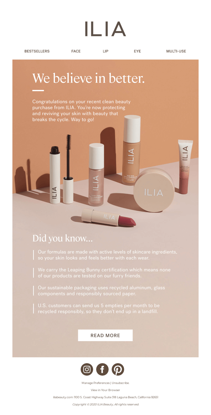
Source: reallygoodemails.com
5. Accessibility
Accessibility is key to good email design and a successful user experience. It ensures that all subscribers can easily read and understand your emails, regardless of their physical or mental limitations. This includes optimizing messages for people who use assistive technology to access their inboxes. To ensure that your email design is accessible, consider the following:
- color contrast. Choose contrasting shades for text and other important elements; they stand out well against the background and guarantee high readability. The optimal color contrast ratio for web content is 4.5:1. You can use a tool such as WebAIM to check the selected colors.
- alt text. Some people block images in their mailbox settings, for example, due to visual impairments, and use screen readers instead. So, we recommend adding Alt text that describes the content of images in case they are not displayed or the recipient cannot see them.
- responsive design. Responsive email design means that your newsletters will look the same regardless of the device the subscriber is using. Before you launch your email campaign, it’s important to check how it will be displayed both on desktop and mobile.
- visible buttons. Highlighting with color doesn’t always make your text stand out, as colorblind people may not be able to see it. To make buttons easy to identify, make them large enough. You can also use a hover effect to make the button move or show an information tooltip when you hover over it.
Spotify’s email is an example of good color contrast that ensures high readability of text. It’s also worth noting the highlighted CTA button that immediately captures attention.
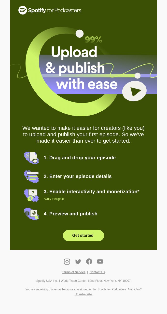
Source: reallygoodemails.com
6. Focus on the mobile format
According to statistics, 85% of users look through emails on their mobile devices. That’s why brands are focusing more and more on creating a user-friendly experience for smartphone users. Besides, mobile-first designs look great on other devices as well. The thing is, mobile design is much easier to adapt to desktop and tablet formats than vice versa. Its main principles include:
- vertical layout. To avoid problems with the display of content, use a one-column vertical email design layout as it scales well on any screen. If you add hotlinks, make sure to check whether they look right in the finished design.
- text optimization. Obviously, mobile design is intended for smaller screens. To ensure a user-friendly experience, the text should be large enough and legible (about 15-18 pixels for body text and 22 pixels for headings). Buttons should also be easy to click on.
- weight of images. Images should not slow down the loading of your message. This is crucial for the mobile format, because users may not always have access to high-speed Internet. The best solution is to use static images up to 200 KB and GIFs up to 1 MB.
- focus on call-to-action. Place the CTA button at the top of your email design layout. This is especially important for mobile design, as users spend an average of several seconds to visually scan your email.
Email marketing design trends
1. Interactive and dynamic elements
Over 50% of users want to interact with the content they receive in emails. And they get this opportunity in interactive emails containing dynamic elements. These can be videos, image carousels, polls, tests, games, and other experiences. This approach allows you to engage users effectively and increases the chances of conversion.
You have a wide range of interactive formats from simple polls that can bring valuable insights about your audience to well-thought-out gamification. Insert a discount roulette or a jigsaw puzzle. It’s a great way to get your subscribers excited and motivate them to interact with you further.
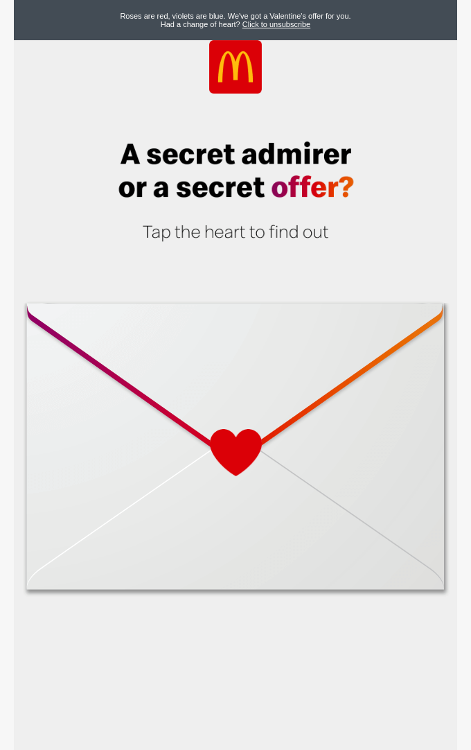
Source: reallygoodemails.com
2. Dark mode
Dark mode is a setting that users can turn on to make text on the screen appear white over a black background instead of the standard black-on-white look. This feature is quite common on text-heavy platforms like social media, as well as in email design. Dark mode has a lot of supporters because it reduces eye strain, especially in low light conditions, and thus can improve content perception.
Today, all key e-mail clients such as Gmail, Outlook, Yahoo, and Apple Mail have a dark mode option. However, enabling it or not is entirely up to the user’s preference. At the same time, you can adapt your newsletters to provide a good user experience for those subscribers who choose to turn on dark mode. For example, you can make the background of visual elements transparent and add a white outline to dark images and fonts.
Source: reallygoodemails.com
3. AI personalization
Email personalization involves using subscriber data to create more targeted messages. For this, you can use information such as age, gender, location, purchase history, etc. AI algorithms that quickly process a huge amount of data open up many opportunities for marketers including:
- creating automated newsletters based on user behavior;
- generating topics likely to attract subscribers;
- processing natural language from reviews and searching for key phrases that can be used to improve interaction;
- integrating chatbots for instant personalized customer support.
Source: reallygoodemails.com
4. Animation and transitions
Today, 65% of brands use animation in their marketing communications. It allows you to show your brand’s personality and attract users. This, in turn, increases the chances of them being interested in your offer and clicking on the CTA button. And you don’t have to create an animated video. Even a single animated element is enough to grab the attention of your subscribers. For example, you can use a dynamic background, animate text, or integrate cartoon characters. This will give your email design a playful mood and set a friendly tone for communication with users.
To wrap up
A well-thought-out email design is a sure way to communicate your brand’s message effectively. It helps you build a stronger, more personal relationship with your audience and also gain their trust. Follow our email design tips and watch your subscriber engagement rates start to grow.
FAQ
How do you create a professional email layout?
When designing your email layout, you should start by filling in the key elements of your email: the header, body, and footer. You can optimize the design process by designing a single header and footer that you will use in all your email communications. This will save time and strengthen your brand consistency.
The only changeable element will be the email body. In it, you need to communicate your main message in a clear and convincing way, and lead your readers to a call to action that stands out and clearly describes the desired action.
What is the role of design in email marketing?
The key tasks of email design include:
- informing subscribers;
- attracting attention;
- active engagement;
- directing readers (for example, to a website);
- lead conversion.
How do you create graphics for email marketing?
If you need visuals for your email design, you don’t have to spend time creating them. You can always find authentic, high-quality photos, videos, and illustrations on any topic in the Depositphotos library. Discover exclusive collections by our content curators, as well as handy AI tools that allow you to upscale images and remove backgrounds for free in seconds.
Other articles you might find interesting:
Types of Visuals Every eCommerce Brand Needs
7 Types of Graphic Design to Promote Your Business
Your Essential Guide to Adaptive Design: Key Principles and Techniques
Graphic Design Trends 2023 [Infographic]