Basic Typography Rules: What Every Designer Should Know
What is your first thought when it comes to typography? Fonts, perhaps? In reality, this concept consists of various elements of design and determines how harmonious and effective a design will be. By ‘effective’, we mean that graphic materials should perform several tasks: attract an audience’s attention and convey a necessary message.
When you only start mastering a certain discipline, it’s easy to get lost in the amount of information available online. Do not rush to understand everything at once. Start with basic concepts such as typography. And to help you understand the essence and principles of typography, we collected key design rules for working with text for beginners.
What is typography
Typography is an area of graphic design and a system of printed text design. It includes the choice of typeface, type size, line length, line spacing, and character spacing. The aim of typography is to make text legible and appealing because maintaining a viewer’s attention in a world full of visual content can be quite a challenge.
The main aspects of typography are clarity, readability, and aesthetics. Clarity determines how easy text is to perceive. Readability is more about ease of understanding, and aesthetics are responsible for the overall appeal of a font or a font combination.
Basic typography concepts
Before moving on to the typography rules, you need to understand what you will have to deal with. So, let’s examine the main elements of text design and find out the differences between font and typeface, and kerning and tracking.
Font
By font, we mean a graphic representation of the glyph outlines of letters and characters that create a single stylistic and compositional system. Fonts differ in slope (straight, oblique, italic), weight (light, regular, semibold, bold, etc.), width (extra-condensed, condensed, regular width, extended, and extra-extended), and more.
There are a lot of font classifications but according to the most common one, there are four main font types:
- serif fonts, or antique fonts (Times New Roman, Courier New, Garamond, Baskerville, Georgia);
- chopped sans serif fonts, or grotesques (Futura, Helvetica, Arial, Verdana, Roboto, Open Sans);
- handwritten script fonts (Snell Roundhand, Vivaldi Regular, AmadeusAP Regular, Hamiltone Signature, Alana Regular);
- display, or decorative fonts (Marvin Visions, SK Primo, Postertoaster, Pitcrew).
Designers usually work with the first two types. Script and display fonts are used for accents and headings since they attract attention with their authentic design.
 Above is an example of a sans serif and serif font.
Source: Zety blog
Typeface
A typeface is a set of fonts that have the same glyph style, but differ in size and outline. Sometimes, a typeface has only one style. In the case where there are several of them, there’s the main style, designed for typing the main text, and additional ones — for headings and highlighting fragments in the text. A good example is Verdana Regular font and its variants: Verdana Bold (bold), Verdana Italic (italic), Verdana Bold Italic (bold italic).
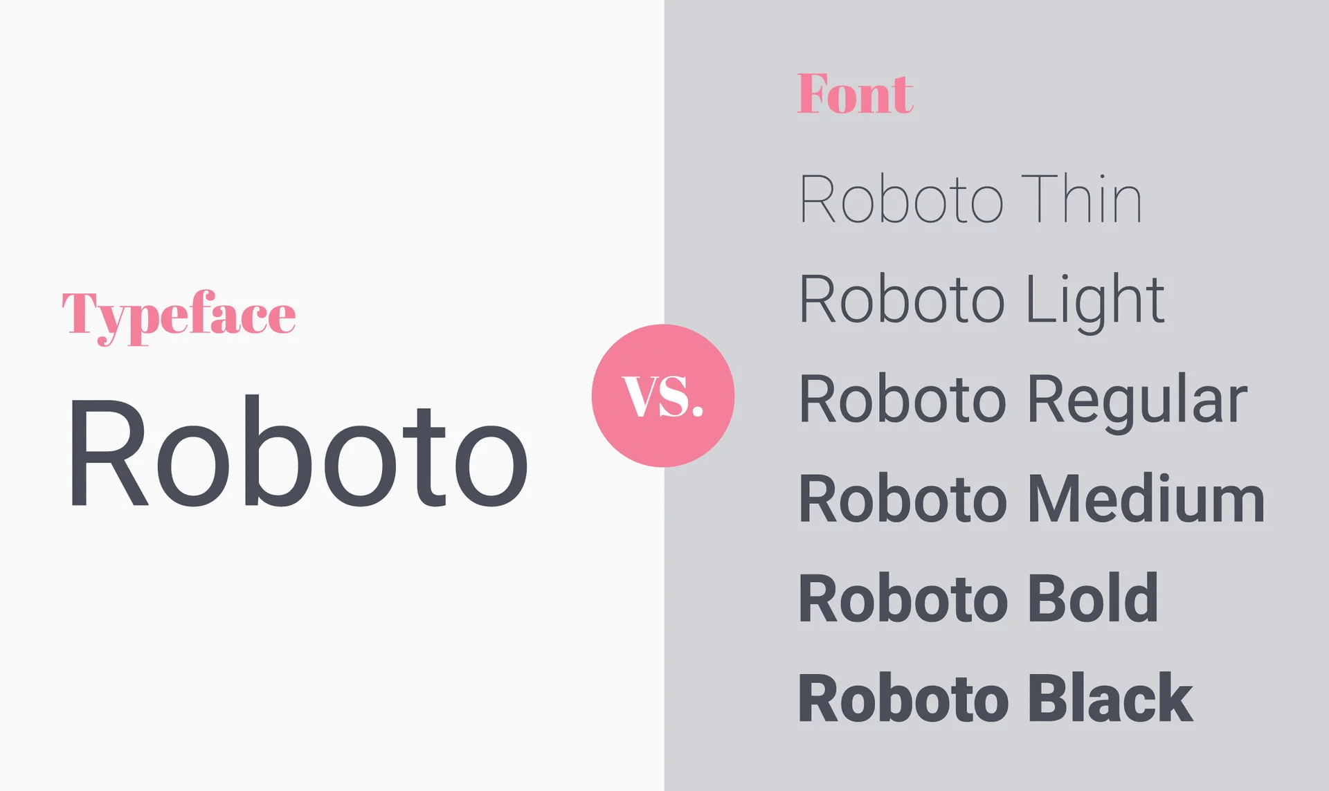 Roboto font typeface and its font variants
Source: Snowball Digital blog
Type size
The type size determines the size of a font and is measured in typographic points. One point equals 0.352777 mm. Fonts with size from 3 to 12 points are called body copy fonts, from 14 to 64 points are headline fonts, and from 72 points are poster fonts.
Line spacing
Line spacing (also called leading) is the vertical distance between two lines. It is also measured in points and depends on the type size and line spacing.
Letter spacing
As the name implies, it is the distance between adjacent letters or other characters. This element is also related to the concepts of tracking and kerning. The first one involves setting the spacing between all characters within one word and is often used in headlines and logos. In the case of kerning, you can change the distance between separate pairs of letters to avoid text heterogeneity.
Grid
Grid is the main tool for structuring design elements. It usually consists of several straight lines that create some sort of frame for arranging all the components. Grids allow arranging elements evenly and proportionally. The result is a balanced and harmonious design.
Typography rules beginners need to know
We have explored essential typography components, so it’s time to move on to the basic rules that will help you avoid common beginner mistakes.
1. Use minimum fonts.
Each font has its own character. For instance, Antiqua creates a sense of trustworthiness and reliability. That’s why it is often used in legal, insurance, or construction advertising campaigns. Luxury brands also opt for serif fonts for their classic and elegant look. Grotesques are more modern and bold options, they are also extremely functional and legible. So today, we see them literally everywhere. Script and display fonts are a great option for creative projects or accents in a design.
The golden rule of combining fonts: limit yourself to two or three options depending on the task. A larger number will be quite difficult to bring into accord with each other. Use classic combinations – antique in the headline (e. g, Garamond, Bodoni, or Georgia) and grotesque in the main text (e. g., Helvetica, Roboto, Open Sans), or vice versa. You can also just use different fonts of the same typeface. Here is an example with the already mentioned Verdana: Verdana Bold for the header and Verdana Regular for copy.
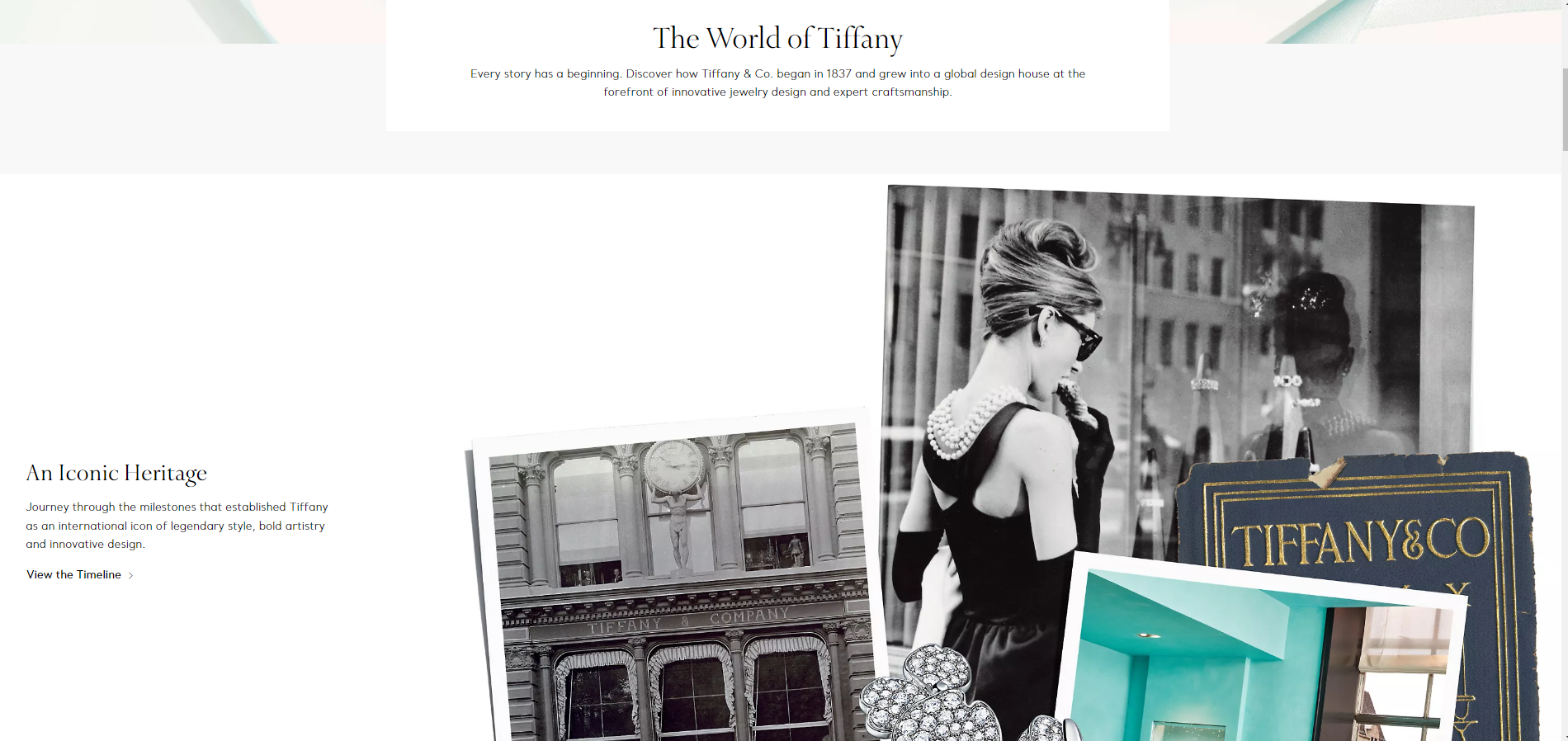 Subheadings are typed in antique and the main text is grotesque.
Source: Tiffany & Co. website
2. Calculate type size using the “golden” number.
According to the hierarchy principle, the more important the information is, the bigger the point of the font. Since the task of the headline is to draw attention to the message it should be the most noticeable element in the text. The body text is typed using a medium type size, while a small type size is used for notes and comments.
How do you choose the best type size for a headline? There is a special formula that allows calculating the optimum ratio: body text size * 1.6. That is if the main text is typed in 18-point font the headline size should be 28. 1.6 is the so-called “golden” number that corresponds to the golden ratio rule. It is believed to create ideal proportions that look as harmonious as possible and easily perceived.
3. Set a convenient line spacing.
Line spacing allows you to make text readable. After all, if the lines are too close to each other it is quite difficult to perceive. When the distance between the lines is too large it is also inconvenient to read.
Luckily, there is a standard according to which the optimal spacing constitutes 120% of the font size. If we use size 18 the line spacing should be 22. The line spacing value should be the same throughout the entire text so as not to break the reading rhythm. In the case of a heading design, the upper line spacing should be larger than the bottom line spacing to make it clear that the heading refers to a specific paragraph.
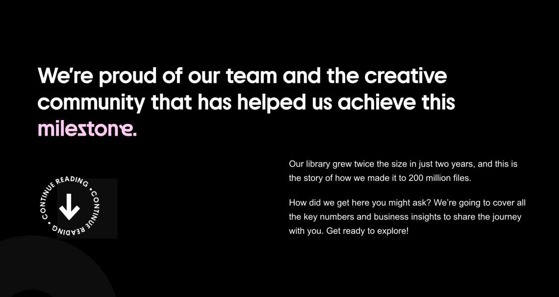 An example of a good line spacing choice
Source: Depositphotos project dedicated to the 200 million files milestone
4. Choose the best possible line length.
Your goal is to do your best to make text easy to read for viewers. Lines that are too long can be tiresome, scattering viewer attention. And lines that are too short will make the reader return to the beginning of the line all the time, which also does not contribute to convenience.
We recommend you take your lead from the ideas of famous Swiss typographer and graphic designer of the last century Emil Ruder, who defined that the optimal line length should be 50-60 characters with spaces. In some cases, particularly in web design, it can be increased up to 80 characters. For mobile, the convenient length should be half as much. The length also determines the height of the line. There is a direct correlation here: the longer the line, the larger the height.
5. Remember the importance of colors and contrast.
The main rule you should follow when choosing a font color: it must be legible. It is obvious that a black font on a white background is much easier to read than, for example, blue. And it’s all due to the contrast: the higher it is, the better. Therefore, black on white is the golden standard. Of course, you don’t have to limit yourself to this option. But you should not overuse colors either, since colorful text will distract attention from the subject.
Important note: it is better to avoid reds and greens in text because some people cannot distinguish them due to color blindness. It affects 1 in 12 men, but among women, this diagnosis is less common.
6. Stick to left alignment.
Alignment is intended to make all text elements equally spaced. There are four types of alignment: left, right, center, and justified. The last option is the least suitable because it aligns the text simultaneously with both the left and right edges. As a result, you get different-length spaces between characters, which breaks the integrity of the text.
The best choice is left alignment. Text arranged this way is perceived best. After applying the alignment, ensure you’re not leaving a single word or punctuation mark on a line. If this happens, you can change the type size or use the already mentioned tracking to make the text look neat.
7. Create visual hierarchy.
Visual hierarchy is the structuring and subordination of elements in a design. It defines what primary, secondary, and how they are combined into one system. Visual hierarchy is extremely important because it determines a user journey, focusing attention on the key points.
In particular, hierarchy can be created using the type size (the larger the text, the more important it is), color (an example is the colored highlighting of words or text fragments that need to be accentuated), or negative space (it can serve as a frame). To make your work easier, use a simple grid. It will allow you to group and align elements and eventually get a consistent design.
Summary
Typography does not have clearly defined laws; on one hand, this gives great creative freedom, but on the other hand, it can cause a dilemma. Use our tips as a basis and learn to design text to attract attention. And don’t forget to follow three main principles: clarity, readability, and aesthetics.
Other articles that may interest you:
Your Essential Guide to Color Schemes: Definitions, Examples, and Tips
Graphic Design Trends 2022 [Infographic]
How to Make a Moodboard. Tips and Tricks for Designers