6 Key Principles of Visual Hierarchy for Impactful Design
Whether the aim is to enhance user experience, improve communication, or motivate specific user actions, visual hierarchy plays an essential role in steering the design process. It significantly impacts the speed and effectiveness with which users can navigate and understand information, regardless of the platform—be it a website, an app, or any other visual medium.
Explore the fundamental principles of effective visual hierarchy to engage your audience and clearly deliver your messages.
How visual hierarchy shapes user experience
Visual hierarchy is a fundamental principle in the field of design that organizes elements in a way that naturally guides the viewer’s attention according to their level of importance. It employs techniques such as varying sizes, contrasting colors, strategic placement, and the use of space to create a clear path for the eye to follow. It ranks design elements in order of significance based on visual cues that influence where and how attention is allocated. Here are some reasons underscoring the significance of visual hierarchy:
- Enhances usability. A well-implemented visual hierarchy makes interfaces intuitive. Distinguishing elements like buttons, links, and navigation bars through size, color, or weight helps users navigate the page without conscious effort. This not only improves the user experience but also boosts accessibility, ensuring that information is digestible for a wider audience.
- Strengthens communication. By aligning the design’s visual flow with the message’s intended order of consumption, visual hierarchy streamlines communication. It ensures that the primary message is immediately apparent, supporting details follow logically, and calls to action are unmistakable.
- Encourages engagement. Visual hierarchy creates a narrative for your viewers, making the interaction with the design more engaging. By guiding them through content in a predetermined sequence, it increases the likelihood of engagement.
- Supports branding efforts. By using recurring themes, colors, and typographies, visual hierarchy reinforces brand identity. This consistency across various platforms and materials helps build recognition and trust with the audience, as they associate specific visual cues with the brand.
See the future of design. Check out our latest Graphic Design Trends in our annual report. Explore our curated collection to bring these trends to life in your next project.
6 Key principles of visual hierarchy for impactful design
Principle 1: Size and scale
The principle of size and scale in visual communication serves a dual purpose: capturing attention and signifying importance. This principle operates on the fundamental premise that larger elements within a composition naturally draw the eye. This factor can be leveraged to prioritize information, guiding the viewer’s gaze to what is most crucial in the visual hierarchy.
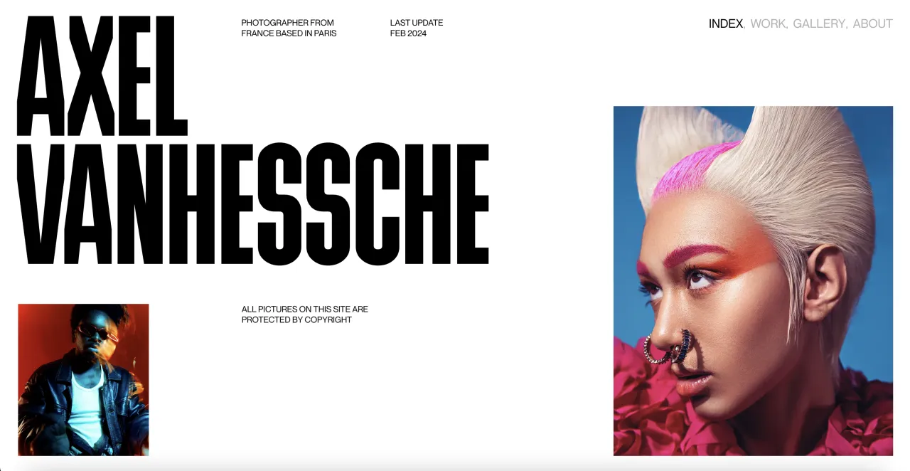
Yet, the change of size means more than just simple enlargement of elements—deliberate scaling can dictate the focal point of a design, leading the viewer from the most significant element down to the least important. An oversized headline in an advertisement, a large call-to-action button on a website, or a significantly scaled-up logo in branding materials are all practical applications of this principle.
In practice, employing size and scale requires an understanding of visual weight and balance. Any enlarged element, while effective in capturing attention, must be balanced within the overall composition to prevent it from overwhelming the design or creating a visually discordant experience.
Principle 2: Color and сontrast
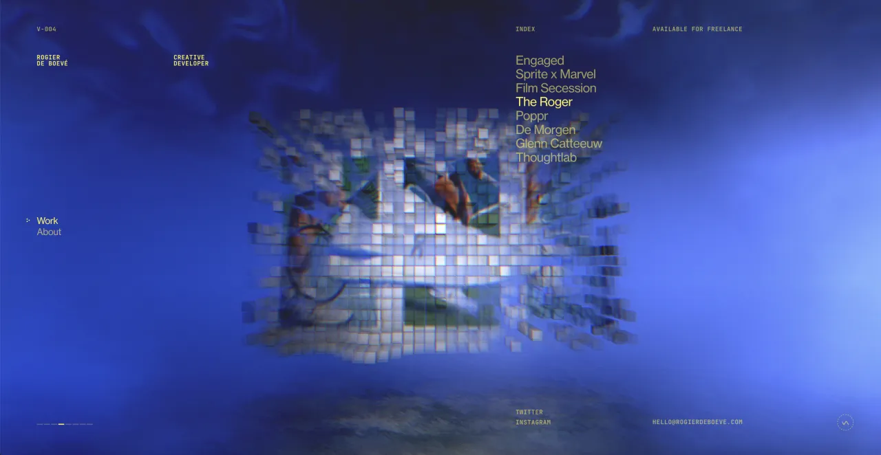
Color serves as an intuitive signal for categorization, delineating different sections, ideas, or functions within a single design. Through varying hues, saturation, and brightness, you can easily segment information. For instance, warm colors can highlight action items or key points, while cooler tones might background context.
Moreover, high contrast between text and its background significantly improves legibility so that the message is accessible to the audience. This principle applies not just to text but to any critical element within a design that requires emphasis. However, contrast is not limited to color differences alone, encompassing a variety of design elements, including size, shape, and texture.
Principle 3: Typography
Different fonts can signal various levels of importance and function within a design. For instance, a bold, sans-serif font might be used for headlines to grab attention, while a serif font provides a comfortable reading experience for longer or more detailed text. This differentiation helps users intuitively understand the hierarchy of information within your design. Font size further contributes to this organizational structure, with larger sizes drawing attention to primary information or headings and smaller sizes used for secondary details.
Through the use of contrasting fonts, weights, and styles, you can highlight specific points that require attention. For example, italicizing a word or varying font weights from thin to bold within the same font family can create a hierarchy, drawing the eye to the most critical information first.
Principle 4: Alignment and spacing
Alignment refers to the orderly arrangement of elements within a design. It eliminates randomness in placement, ensuring that each component has a visual connection to something else on the page. This principle can be applied to text, images, icons, and other design elements.
There are several types of alignment—left, right, center, and justified—each serving different purposes. Left alignment is often favored for text as it mirrors the natural reading direction, making it more comfortable for the eye to follow. Center alignment is useful for titles and short pieces of text that require emphasis, while right alignment and justified text can create a formal appearance.
Spacing, particularly white space, is the area of a design that is left unmarked. It’s not merely empty space but an active element of composition, as it helps to separate disparate elements, ensuring that the design doesn’t feel overcrowded. This separation creates a hierarchy of information, making it clear to the viewer which elements are related and which are distinct.
Principle 5: Repetition and consistency
Repetition and consistency are crucial for reinforcing the organization of content and ensuring that the design communicates its message with clarity. Repetition involves the strategic use of similar elements throughout a design, including repeating shapes, colors, textures, or typographic details. In terms of visual hierarchy, repetition can be used to indicate relatedness or signify different levels of importance. For example, consistent typographic styling across all headings suggests that these elements share a common level of importance, separate from the body text or captions. Similarly, repeating a specific color for all call-to-action buttons throughout a design signals to the viewer that these elements have a similar function.
While repetition focuses on the repeated use of specific elements, сonsistency across visual elements like fonts, color schemes, and layout structures ensures the overall coherence of the design. It’s especially important in multi-page documents and websites, where it helps to maintain visual continuity across different contexts and foster brand recognition.
Principle 6: Layout patterns
The Z-pattern and F-pattern reflect how viewers typically scan content. The Z-pattern layout is observed in the way the eye moves across the page in a “Z” formation. This pattern is particularly effective for designs with a minimal amount of content or where simplicity and directness are prioritized, such as landing pages or advertisements.
It starts at the top-left corner (point of initial engagement), moves horizontally to the top-right (capturing key information or navigation), diagonally down to the bottom-left (providing a visual break and transition), and finally, horizontally again to the bottom-right (where calls to action or final information often reside).
The F-pattern layout acknowledges that when faced with dense content or text-heavy pages, viewers tend to scan in a pattern that resembles the letter “F.” They start by reading horizontally at the top, then move down the page and read across in a second horizontal movement that covers a shorter area than the first before finally scanning vertically down the left side of the content. This pattern is most commonly observed on websites, articles, and other informational content.
Final Take
Visual hierarchy is not merely an aspect of design aesthetics but a fundamental principle that underpins effective communication, enhances usability, fosters user engagement, and strengthens brand identity. It leverages aspects such as size, color, contrast, and positioning to differentiate between items, ensuring that key messages are apparent and secondary information follows logically. Experiment with visual hierarchy in your projects to engage users and better meet their needs.
Check out similar articles
7 Creative Design Trends Coming in 2024
How to Create a Poster Design in 2024: Pro Tips & Inspiring Examples
Spring Color Trends 2024: Curated Collections, inspiring Ideas, & Ready-To-Use Mockups


![Graphic Design Trends 2021 [Infographic]](https://depositphotos-blog.s3.eu-west-1.amazonaws.com/uploads/2021/02/Graphic-Design-Trends-2021-Infographic-1.webp)


