How to Create a Poster Design in 2024: Pro Tips & Inspiring Examples
Posters are one of the oldest and most popular types of graphic design visuals. Beginner creators learn design by crafting posters, while experienced ones utilize their skills to invite people to an event, promote a product or service, and even showcase their creativity with the help of poster design.
To learn how to create appealing posters and utilize the latest trends for poster design in 2024, read further. This article will offer you some valuable insights and appealing visuals for your inspiration.
Poster design for 2024: inspiring trends to follow
Knowledge of graphic design trends can help you create visuals that look modern and relevant to your target audience. While the design industry is generally very dynamic and diverse, most trends are around for at least a year or two. So, consider the following tendencies for 2024.
#1. Bold minimalism
Minimalism is a truly timeless trend that has been relevant since the Bauhaus movement and their “less is more” philosophy. This approach means that you should use every design element consciously, choosing only the ones that are necessary to convey a certain message and serve a purpose. In poster creation, minimalism often requires sticking to a limited color palette and a small selection of fonts.
Bold minimalism is all about adding accents to an otherwise simple and uncluttered design. For instance, you can use bright colors or distorted and distinct fonts to make your posters look visually interesting. This trend helps make design communication more efficient and is especially useful for visuals that need to present lots of information. In this case, design can help support the main message and help the audience process data more efficiently. As the modern world is filled with informational, emotional, and visual noise, simple yet efficient compositions can stand out and deliver ideas more powerfully.
Bold minimalism posters are often used for product launches, product ads, corporate events, and conferences.
Source: Behance
#2. Anti-design
Design has lots of rules regarding color combinations, font usage, compositions, and other essential factors to keep in mind. However, a good design can violate those principles and still look visually appealing—that’s what creators have proven by supporting anti-design trends.
Anti-design is a conscious violation of design rules, but in an aesthetically pleasing way. It can include overlapping texts, distorted visuals, sideways compositions, mismatched colors, and fonts of different sizes and weights.
Due to its rebellious spirit, this style is commonly used in posters for culture and art events: festivals, gallery openings, and concerts.
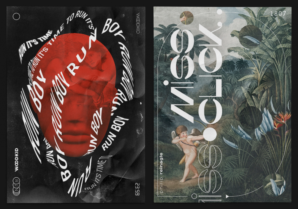
Source: Behance
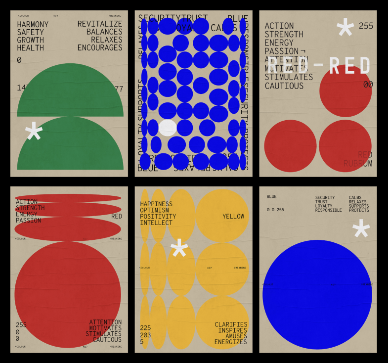
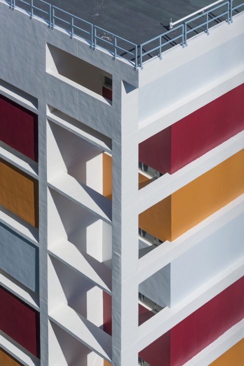
#3. Geometry design
Geometry is one of the timeless trends that has become particularly relevant in the last few years. This style uses shapes, lines, and patterns to create visually appealing compositions with a modern look.
In poster design, geometric elements can help create a sense of order, modernity, and structure. Such visuals look clean and organized and can be used to promote tech conferences and educational workshops.
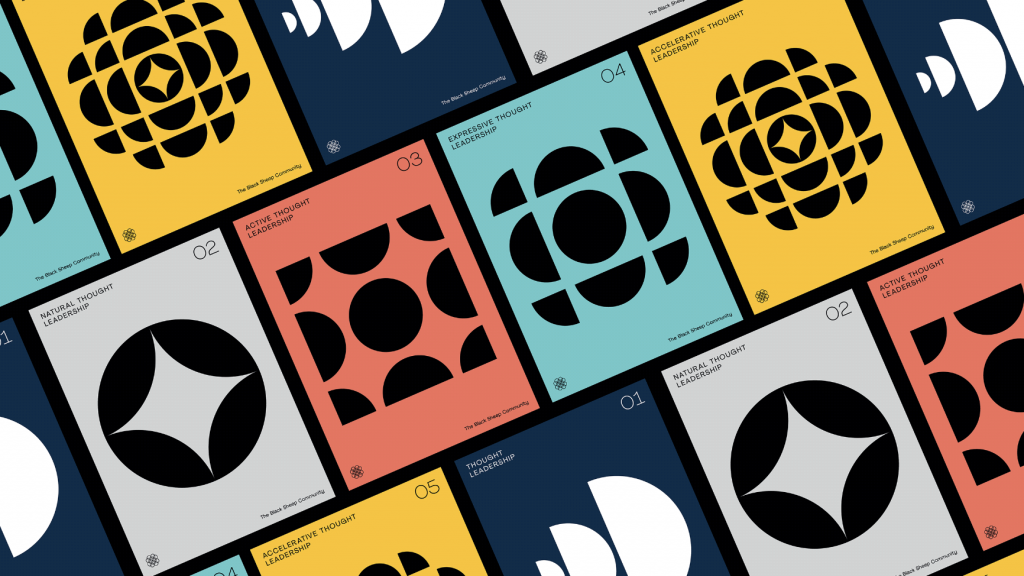
Source: Behance
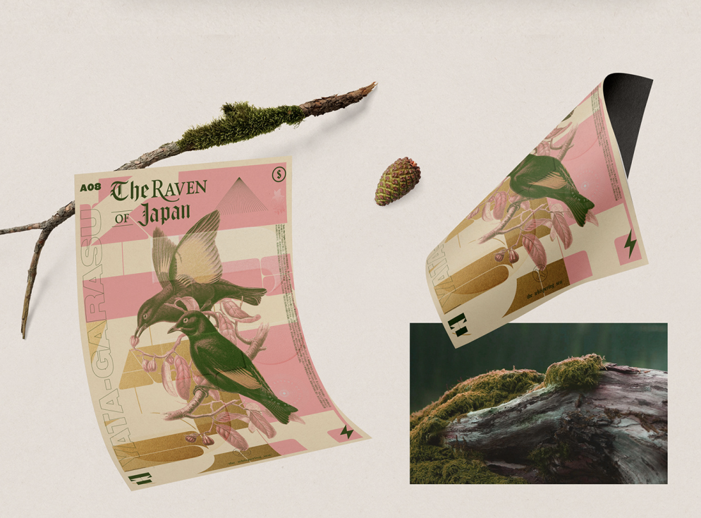
#4. Collage
The collage technique is one of the most interesting and creative ones. It is all about using a mix of images, textures, and fonts to create a visually rich and layered composition.
This style can be used as a separate trend and as a part of other tendencies. For instance, anti-design posters can include collage elements. Another interesting thing about this technique is that it can look very different. These days, you can easily find a retro collage poster as well as a collage design that looks very modern.
Due to that, collage posters can be used for various cases. However, they are most often created for art and fashion shows.
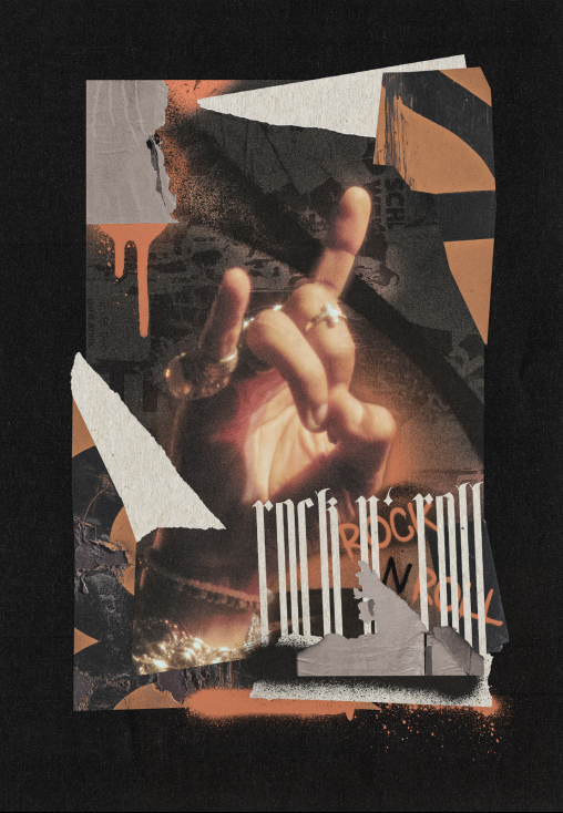
Source: Behance
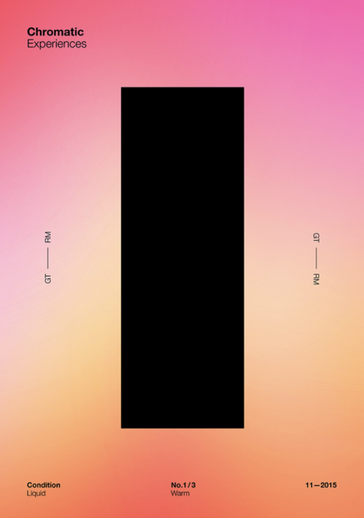
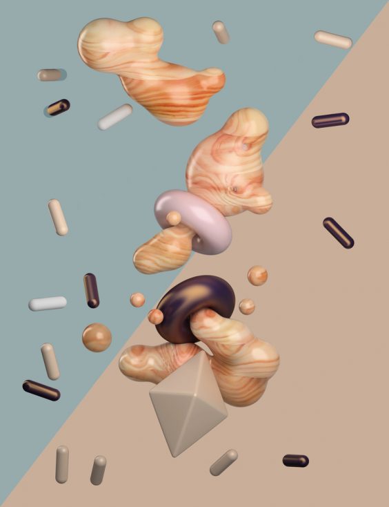
#5. Abstract gradients
Gradients have been used in graphic design for a long time. However, recently, they started becoming more complex, bright, and are often used as main objects in a composition.
If you want to use abstract gradients for your poster design inspiration, make sure to not overwhelm viewers with too many colors. Often, 2-4 colors that complement each other are enough to create a visually appealing and interesting gradient, especially if you are new to color combinations. You can start with simpler and safer options and continue to add more colors once you become more proficient in design.
Abstract gradient posters are often used for health and wellness niches and to promote various youth events.
Source: Behance
#6. Pixels
One of the most interesting things about this trend is that it’s both retro and futuristic. Some of us associate pixels with old video games, while some see designs with these tiny square blocks as something modern and innovative.
This means that you can use pixels to create posters with different looks and feels. What’s more, following this trend doesn’t mean turning all your poster visuals into pixel art. Instead, you can simply add pixels of different sizes to your composition or opt for pixel-based fonts for a modern look.
Pixel posters can be used for various occasions, including gaming events and digital exhibitions.
Source: Behance
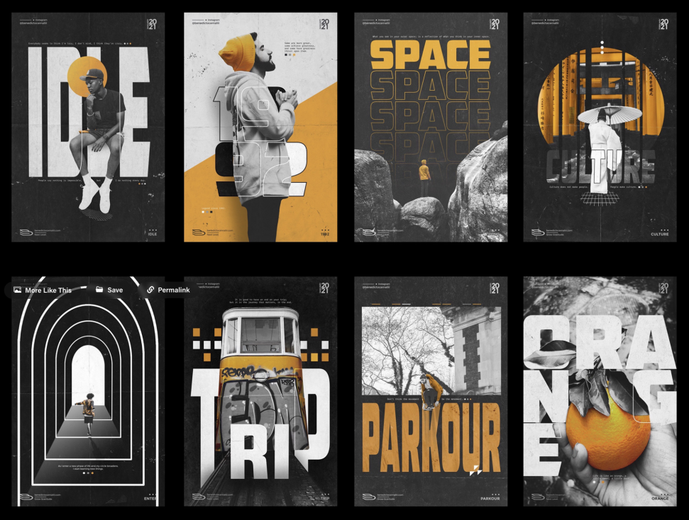
#7. Typography with character
Typography alone can be enough to create stunning visuals. A smart choice of fonts and text alignment can help you not only convey a message, but also make this message eye-catching and unusual.
That’s what the expressive typography trend does. It is all about using interesting, quirky, and sometimes even handmade fonts in your designs. To follow this trend, use fonts with intention, adding some personality to your message or emphasizing a certain statement.
These days, font creation software has become more user-friendly and easily accessible, and many designers have started creating their own fonts. Therefore, this trend will most likely only grow larger as time goes on.
Typography posters are often used to promote various events and workshops, especially those related to art, music, and literature.
Source: Behance
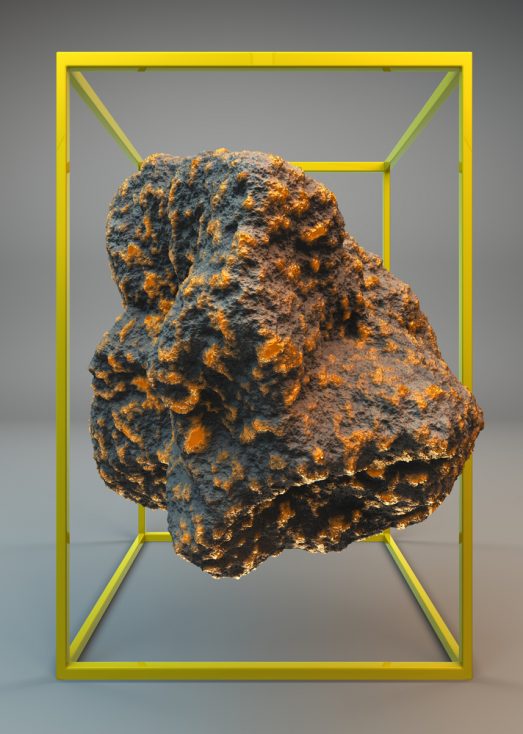
#8. 3D design
For years, 3D design was eye-catching, but difficult to create. One had to be an experienced designer with professional (and quite pricey) software to create 3D visuals.
Luckily, this also changed with time. These days, we have so many simpler and more affordable tools, starting with Blender and ending with Spline. They don’t even require installation and can be easily accessed from a web browser of your choice.
So 3D design is trending again, and this time, even beginner designers can create such visuals and use them for their poster projects. Most likely, this tendency will grow further as design tools continue to develop and become more user- and beginner-friendly.
3D posters are often used to promote art installations and tech-related events.
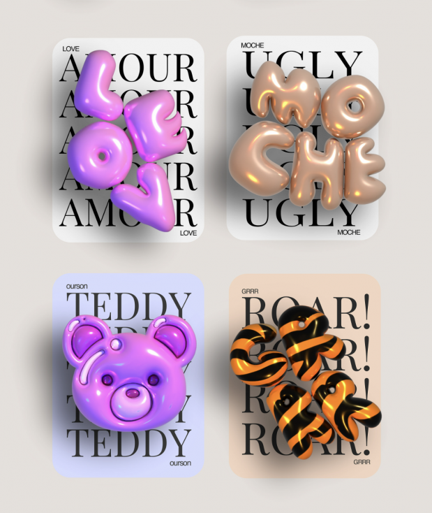
Source: Behance
#9. Inspired by nature
Sustainability is not only a trend, but a necessity for many industries. As more and more people become aware of the challenges caused by climate change, companies and individuals that address this issue gain recognition and appreciation from their audience.
Promoting sustainability in graphic design can be achieved in two ways. First, you can create eco-friendly poster designs using recycled paper, choose environmentally friendly ink for print, and work on laptops with powerful batteries to reduce electricity consumption.
Second, you can raise awareness by using nature-themed motives such as flower or animal prints in your designs. Such posters look original and can help promote various events, including environmentally-themed ones.
Source: Behance
With a rich collection of diverse visuals, the Depositphotos library can help you find creative poster ideas and elements to use in your designs. If you need to create an appealing visual quickly, you can also download vector files to help you speed up work and focus on the creative process.
Find your visual inspiration!
Step-by-step guide to creating a poster
How do you make a poster that looks appealing and delivers your target message? You can do this by following these simple poster design tips.
#1. Define the poster’s purpose and audience
Posters can look very different, depending on their target audience, purpose, and key message. For instance, a poster promoting animal adoption will most likely differ in mood and look from one inviting people to come to a fashion show.
That’s why, before you even start designing it, you need to understand the poster’s primary goal. This can be product promotion, raising awareness about something, inviting people to attend an event, and more.
The audience’s preferences should also be taken into account. For instance, designing a retro poster for a younger audience who doesn’t have any nostalgic associations with a particular time period most likely won’t be efficient. Therefore, invest some time into researching their background before moving on to the design process.
#2. Gather the information
It’s always a good idea to prepare necessary information in advance so that nothing will distract you later. That’s why, at this step, you should focus on collecting all the data that you’ll have to include in a poster. For instance, if you’re creating a poster related to a certain event, ensure that you have the event’s name, time and date, location, and list of participants.
This will help you plan the poster’s layout efficiently. You will have to ensure that all the essential data fits on a poster. Also, you will be able to come up with some initial ideas about structuring this data, such as creating text blocks or maintaining text hierarchy by using different font sizes.
#3. Choose a poster layout and size
Poster layout ideas and sizes depend on several things—the amount of information that you need to put on a poster and where it will be displayed. The display directly affects the preferred size of a poster. For instance, if you’re creating a small poster for a local cafe, A3 could be enough. But if this poster will be placed on a billboard, you’ll need to opt for a larger size.
As for the layout, it should be planned to fit in all the necessary information. If there is a lot of text to put on a poster, you’ll most likely have to limit the number of visual elements, make them less distracting, or come up with smart text structuring. If, on the contrary, there isn’t much text, you can make it bigger and, therefore, more attention-grabbing. Or, you can focus on visual creation, using either lots of elements or focusing on fewer eye-catching ones.
#4. Select a color palette that aligns with your message and audience
At this step, it’s important to take several things into account—color trends in poster design, your poster’s purpose, and the way your target audience perceives colors. All these things need to align if you want to create a poster that not only looks modern, but also conveys a certain mood and message to viewers.
To achieve this, keep common color psychology in mind, as well as the individual preferences of a target audience. For example, vibrant colors can be a great fit for energetic events, while calm hues can benefit informational posters—but only if your audience also finds it true.
Keep in mind that associations with specific colors and their combinations can also vary depending on a country or cultural context. For instance, red and green are often associated with Christmas in the US. In China, however, traditional Christmas colors are red and gold.
White is a wedding color in the US and Europe, but it is also a mourning color in Asian countries. Considering such nuances is important to make your designs not only visually appealing, but also mindful and respectful.
#5. Choose the right fonts
Poster fonts might not necessarily be easy to read if they have a decorative purpose. However, if you need to include important information, make sure that it is written in readable fonts.
The general design rule is to limit the number of fonts for a poster to 2-3 to avoid overwhelming your audience. You can also use different font styles for headings and body text to create hierarchy and help viewers easily distinguish the main message.
#6. Create or collect visual elements for a poster
You can work with elements that you create yourself or download from stock websites. For instance, Depositphotos has lots of premade vector images and elements that can be used for poster creation. You can also use AI in poster design to generate certain visual objects or abstract art.
In any of those cases, it’s important to think about the number and quality of the visuals used. It’s okay to use only one visual element for a poster if it already contains a lot of written information. It could also be appropriate to use medium-quality visuals if your poster size is relatively small. However, for bigger posters, HD visuals and scalable vector elements are a must.
If you cannot find a desired image in high quality, consider using smart online upscalers to enhance it. Keep in mind that smart enhancement only works to a certain extent, depending on the initial quality of the picture.
If you’re using stock photos and vector files for your posters, be mindful of copyrights, especially if you’re designing visuals for commercial use. Each stock website has its own restrictions regarding image usage, so you have to check them separately just to be safe. Also, while some pictures cannot be used for commercial purposes as they are, you are allowed to add them to your posters after extensive modifications. This could be cutting out part of a photo and adding it to a collage.
#7. Create the poster
Now that you have the layout, information, fonts, and visuals prepared, it’s time to design your poster. You can do so using any of the best poster design software, such as Figma, Adobe Suite, or Fotor. Pick a tool that seems most convenient and familiar to you, and start creating.
Arrange all your elements according to the chosen layout. Pay attention to details, alignment, spacing, and overall aesthetics. If you have enough time, try creating different versions of the same poster to have more options to choose from later.
If you are a beginner designer, try creating your poster in black and white first. Colors can distract you, especially when you don’t have much experience. So, avoiding them can help you focus on more important things, such as composition. Once you’re satisfied with the way your poster looks in black and white, try adding colors and see how they work together.
#8. Review and revise
Once the first draft of your poster is complete, put it aside for a while. Even if you need to deliver the final result today, try to make at least a half-hour pause before you start reviewing your design. Sometimes, stepping away from our work and returning to it later allows us to spot flaws quickly.
Once you return to your poster, thoroughly review it. Pay attention to design principles such as composition, font size, and color combinations, but also to any inconsistencies or errors. Check spelling, grammar, and the overall visual harmony.
If you have enough time, show your creations to others and ask for their feedback. This will help you gain different perspectives and use this knowledge for revisions.
#9. Finalize and save
At this step, you need to make final adjustments based on the feedback received. Once you are satisfied with the result, save your poster in the appropriate format for its intended use. This could be a PNG file or a printable PDF.
If your poster will be printed, invest some time in the pre-print preparation. This includes:
Choosing the right color profile (CMYK instead of RGB).
Outlining your fonts by converting them into curves (this step is not necessary if you’re using PDF format).
Adding bleeds—indentations that go beyond your poster. This will ensure that no essential parts of your design are trimmed in the printing process.
#10. Present the poster
If you need to present your poster to a client or showcase it in your portfolio, use mockups for that purpose. Mockups are pre-made files that allow you to demonstrate how your design looks when printed on a city street or, for instance, on a billboard.
Using mockups is not always necessary, but it is recommended if you want to make a lasting impression. While your poster might look good as it is, adding mockups allows viewers to see what it would look like in real-life surroundings.
To make the most out of this presentation, choose mockups that fit the context most. For example, if you’ve created a futuristic poster, it would look best in urban surroundings. A retro poster, on the other hand, would benefit from old city views more.
Bottom line
Poster design can be used to promote products or events, raise awareness, deliver certain messages, and create appealing visuals for your creative portfolio. These days, posters can look very different and vary from retro-themed to futuristic ones, depending on the trend that you choose to follow. Follow the step-by-step instructions listed in this article to create high-quality, visually appealing posters for personal or professional purposes.
Other articles you may find interesting
Doodle It! A Big Guide to Quick Sketching with Tips, Examples & Collection
The Art of Collage: Tips for Creating Unique Graphic Compositions and Collection [+Free Files]
Exploring the Different Types of Graphic Design with Examples


![25 Graphic Design Portfolio Examples [+ Pro Tips] - Depositphotos Blog](https://depositphotos-blog.s3.eu-west-1.amazonaws.com/uploads/2022/05/25-Examples-of-Graphic-Design-Portfolios-and-Useful-Tips-On-How-to-Create-Your-Own-scaled.webp)