Beata Śliwińska on Design, the Art of Collage, and Her Work With Spotify and Adidas
Talent is just a part of a much bigger picture, claims Beata Śliwińska, a Polish graphic designer, illustrator, and a fan of collages. She believes that hard work and curiosity about the world help you build a career and develop your signature style in design. And it is undoubtedly true as this is reflected in Beata’s portfolio.
Among her clients are world-leading brands such as Spotify, Adidas, Levi Strauss, Vogue, Forbes, and Reserved. Beata is gifted with a large spectrum of skills that she got during her studies and because of her interest in modernity and computer technology. She draws inspiration from everything that surrounds her and gladly shares her sources and workflow in this interview.

Going on an adventure with graphic design
My adventure with design began during my architecture studies. Students were required to have graphic and drawing skills along with the 3D modeling theory. I studied at the Faculty of Landscape Art in Warsaw, Poland, where I had to do a lot of drawing, sculpture, and design. I also got a chance to dive into graphic design and advertising studies. That’s how I learned such a wide spectrum of skills.
I’ve always liked to mix handwriting, handmade stuff, cut-outs, and contact with paper. That direct contact with different materials – it totally captures your imagination. At the beginning of the studies, we had to work in “analogue mode” (even in architecture classes), to learn accuracy and meticulousness in design. My passion for graphic design got me deeply attached to so-called graphic pop culture which played an important part in building my own style with a strong focus on the art of collage.
Soon after graduation, I got a job as a graphic designer in an agency, polished up my digital design skills, and developed a passion for the art of collage after work hours. My style as a mixture of digital and analogue work originated from that period.
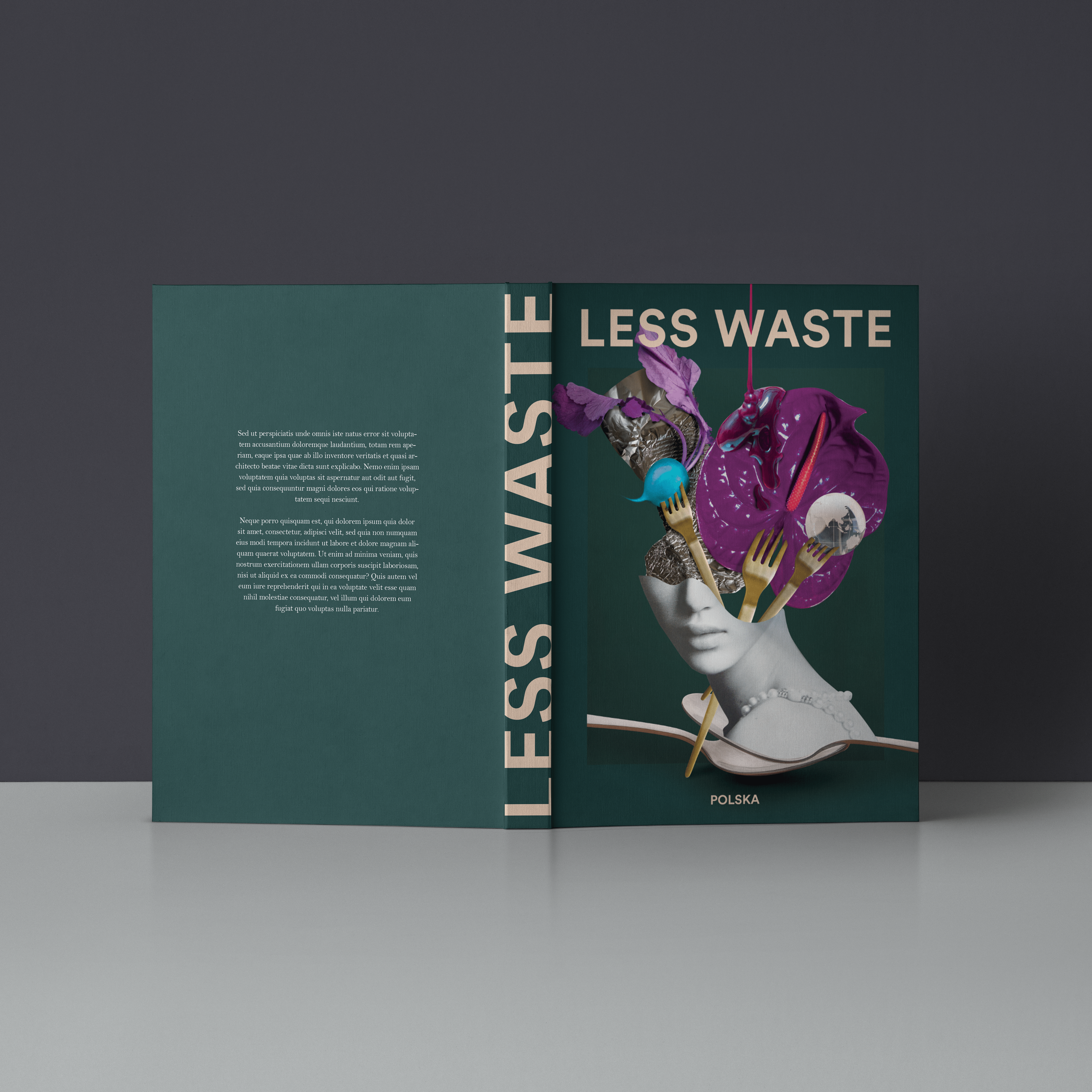
Collage as the starting point of making a flat picture more dimensional
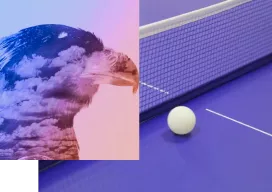
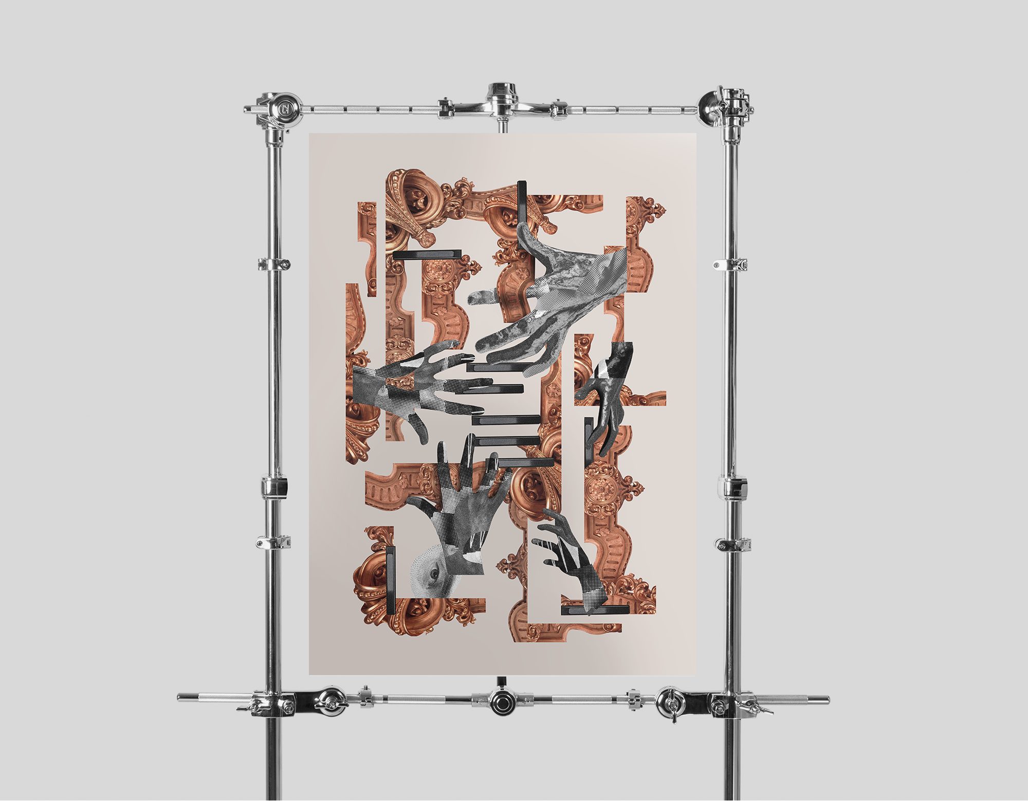
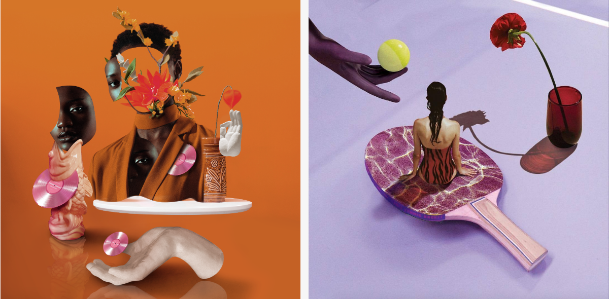
I think that interest towards paper collage is on the rise at the moment. Personally I prefer to use handmade-based materials in my digital projects that are scanned and digitally processed on the computer afterwards. I don’t retouch them entirely. I believe that the paper texture, imperfections, and raster resulting from scanning are incredible assets that no Photoshop filter can get you.
However, I am an even bigger fan of digital collage. Simply because I love modernity, futurism, computer technology, and all that potential that software currently has to offer. That is why I would never call myself a collage maker. Collage is only a starting point for the technique I work with.
My main goal as a designer is to make a flat picture more dimensional. I want every project to look light despite its many components so that the “feeling of airiness” could be noticeable. This works perfectly fine both in artistic projects and those that are sought-after by big brands. You can see it in my work for Adidas Originals, dedicated projects for KOMONO from Belgium, or the most recent campaign for Spotify.
The magic of spontaneity in design
I never thought about my work in the context of the recipient. I would like my projects to reach a wide audience, people who share my vision of the world, my love for similar things, music, and books.
In my work, I emphasize authenticity; projects are often created as a result of rapture or turbulent moments; they involve love and spontaneity.
Work means development and development equals curiosity. With such qualities and consistency, we can get really far.
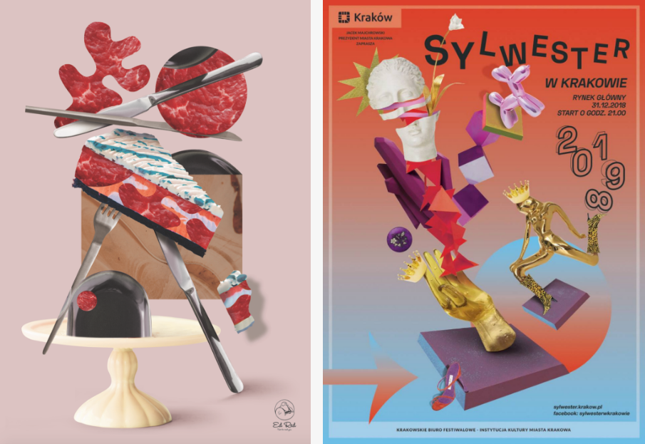
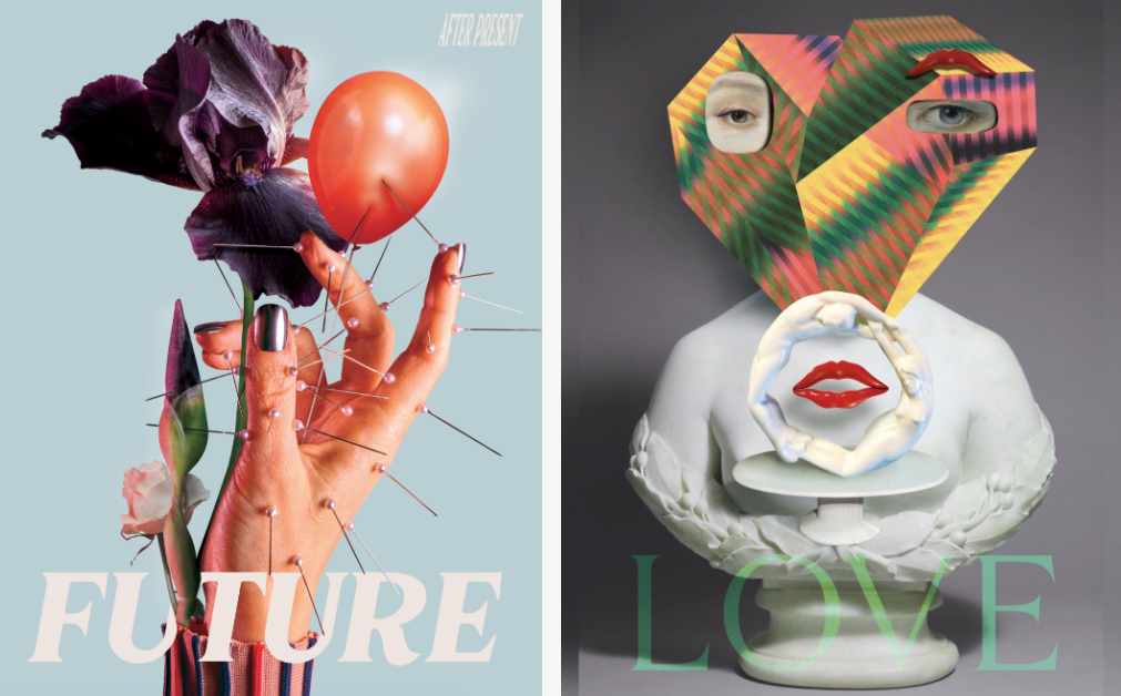
My style is quite conspicuous and recognizable. I try to use the whole spectrum of functions that Adobe Photoshop has to offer. I use cutting shapes, free-form selection, add chiaroscuro, and then apply new modes of overlay. I also use attributes and form shapes, play with them – that is the most essential part of the work. Whether the projects are extensive or more minimalistic, each project is a multi-stage process.
The research phase is very often ignored and overlooked by creators and designers. In fact, in graphic design and modification, the core content is photos or drawings. I edit them and assemble them together, giving them a new look that makes for the basis of a brand new work! At this point, I am halfway through the creative process.
Having done that, I move into the phase of conception and proper design, which is the second stage of the project – a tedious one. It’s all about attention to detail, shadows, and light.
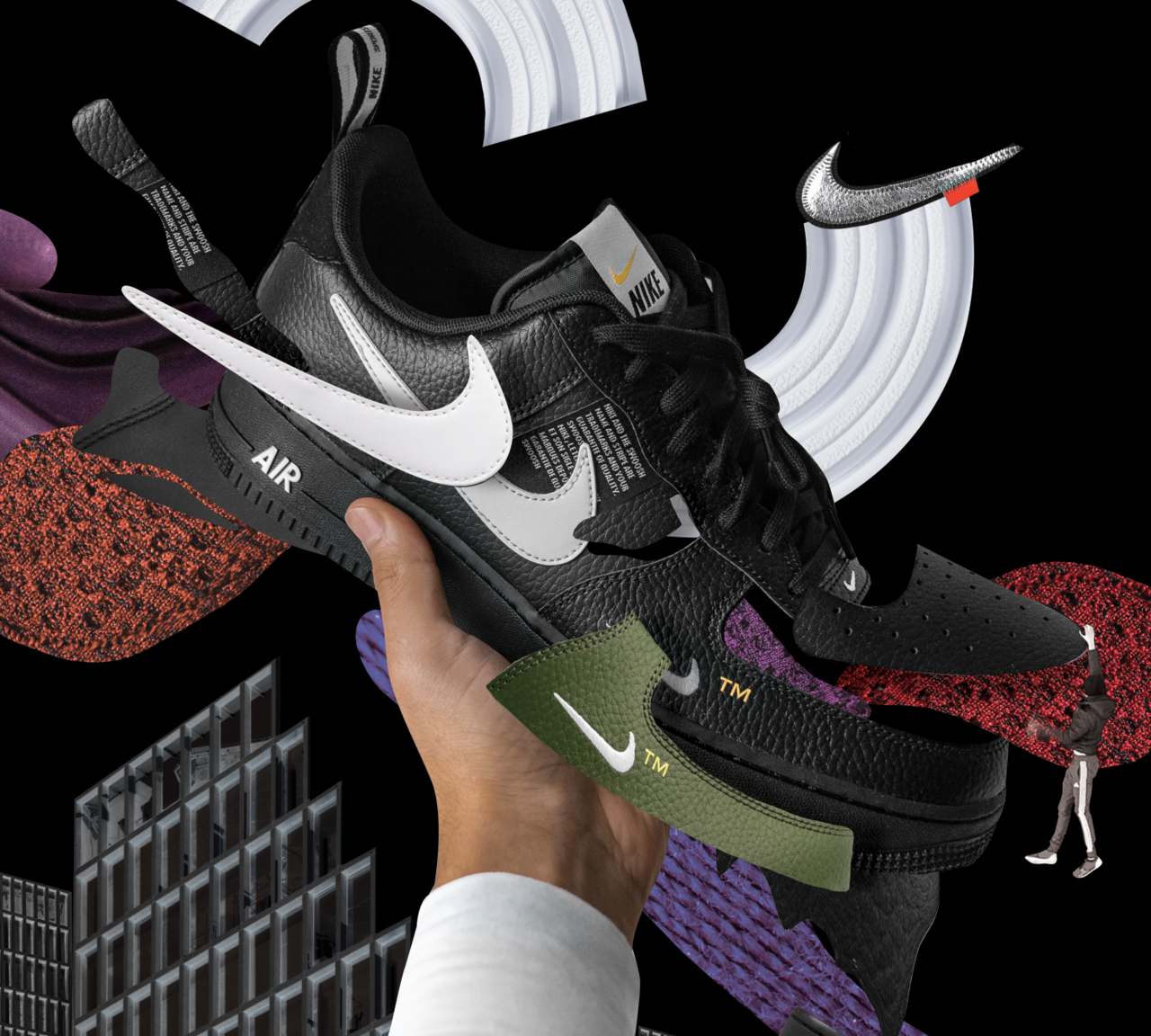
As I already mentioned, I often give in to spontaneity. Very often, when creating posters, illustrations, or key visuals for campaigns, I inform my clients that there is no such thing as a concept of sketch in my work. I do not sketch a collage, nor do I attempt to combine materials. Everything is tentative. That is the magic in it.
Creativity in the time of the pandemic
A lot of things have been put on hold because of the quarantine. Larger clients are freezing their budgets because they don’t know what is going to happen in the near future. But you have to accept that.
Take care of yourself, do things for yourself. I took part in several pro-bono projects, I also created a project for an infectious hospital in Warsaw. Maybe this is the best time of year for such activities?
I am a doer – I like to work, I like to be useful. That’s why at first, I felt sad that everything slowed down. Now, I’m very glad that this is happening. I spend more time on things that have always been somehow overlooked. I appreciate the simplicity of life, I look after plants, listen to music, visit my family, and take care of my inner peace.
Besides, I stay focused on visual culture, which is at our fingertips – movies in streaming channels, documentaries, or books – all that has an amazing effect on our brains and inserts new images into these small compartments in our heads. I try to get out of Warsaw as much as I can – the proximity of nature is essential for me to function.
Daily inspiration and passion for visual arts
The smallest things make us the happiest. I can find inspiration in someone’s smile or in the afternoon sun, floating in the apartment, or even a funny online meme. I do not categorize – I build from small things up.
My passion and inspiration derive from many fields and people. At first, there were artists mainly associated with the art of collage such as Matthieu Bourel and Joe Castro. I love designers who interact with this stalled world like Eike Konig. I admire the creative process of Sasha Lobe from Pentagram. Jessica Walsh and Leta Sobierajsky invariably introduce me to the colorful world. I am a fan of Camille Boyer’s style and the divine cut-outs of Quentin Jones.
Talent is just a part of a much bigger picture.
Typographically and conceptually I am fond of Raoul Gottschling, JAPPARII, and Hassan Rahim. As for design, my source of inspiration is the creators of modernism, Arne Jacobsen, Le Corbusier, Mies van der Rohe, and all that order and modularity that transpire from their work.
In fashion, I love Dries Van Noten’s approach and Alexander McQueen. I could go on and on due to my broad interest in visual arts.
Working with Spotify, Adidas, Levi Strauss, Vogue Italia, Reserved, and other world-famous brands
Every collaboration has brought a new quality to my life as a designer. Each project was unique in terms of its diverse complexity and distinct narrative.
My cooperation with Adidas was a stepping stone and a wonderful start to my design career. I realized that what I do has a deeper meaning. I have very fond memories of the Spotify project, which turned into a few months of adventure and cooperation on a global level. The more challenging the project and the objectives, the more committed I am to it. I know how much work and time I contribute to it and how many people are involved. That’s why it’s not just one person’s work. I am grateful to people for all the collaboration on the projects!
When you work with a major client, the model of cooperation between the designer-artist and the brand is certainly of great value. The fact that a given brand approached you may prove that you do cool things. You have been noticed. You work with many people and meet the requirements of the client’s brief. You can’t do what you want from the beginning to the end then.
Thanks to my previous experience gained in an advertising agency, I find it easier to work on client briefs now. I discuss, negotiate, and this way I understand what is required from me. But it is important to know that such projects have a multi-level acceptance process so I frequently deal with lots of adjustments and modifications. I think, humbleness and implementation of new solutions are important tips when engaging in similar projects.
Hard work will help you build a career in design
My advice to those who are just starting out in design is to look for ideas and boost creativity in every area of life. Do not bring it down merely to the area of design. Being PERCEPTIVE is the golden rule of design. And what’s essential – get some good sleep.
Work hard. Nothing in this job comes easily. You have to gain your own experience before you find your place and moment in time. Work means development and development equals curiosity of the world. With such qualities and consistency, we can really get far.
Engage in projects for student magazines, show your work in galleries, on Instagram, take part in contests. Travel, discover new places, visit museums and galleries. Take millions of pictures, capture these fleeting moments on the film. I do it all the time! All that defines us as creative people and allows us to make a rich portfolio is that we can then show it to someone who may one day help us make our first bigger commercial project. Talent is just a part of a much bigger picture.
My list of must-read books on design and creativity
- “Women Design” by Libby Sellers
- “Interactions of Colors” by Josef Albers
- “The Age of Collage” by Contemporary Art Collage in Modern Art part 1 & 2
- “Photography is Magic” by Charlotte Cotton
- “Cut & Paste” by Richard Brereton
- “Experiencing Architecture” by Steen Eiler Rasmussen
- “Grid Systems in graphic design” by Josef Muller-Brockmann
