Design Lessons from 5 Great Movie Posters
When you’re just starting your design career, you are eager to better your skills and knowledge rapidly. You’re attending workshops and lectures, reading books, networking, watching movies, taking online tutorials, and doing many more self-educating activities that bring you closer to the dream of becoming a seasoned professional.
Another thing you can do to get a well-trained eye on design is to analyze movie posters. Rules of visual hierarchy and alignment, color and font choice — all these things you can discover on both movie posters that have been hand-drawn a century ago or recently created with the help of the modern editing apps.
In addition, movie posters are simply a great source of inspiration. In this article, we’d like to pay attention to those that have stood the test of time and can unconditionally be called great movie posters.
3 things great movie posters should do
The important remark is that movie posters are not created solely for artistic and aesthetic purposes. Their goal is to become a smart mediator between an audience and production company that would grab attention, incite curiosity and, eventually, sell the movie.
Grab attention
Grabbing attention does not mean that the poster should be provocative until it is the ambience of the movie. On the contrary, it has to focus on visual elements that work for the specific target audience. For example, fans of comics will be captivated if they see a superhero on the poster. Drama lovers will look for something emotional and personal, while those who admire horror genre have to be thrilled by a movie shot.
Make people curious
Posters should also incite curiosity and give a very brief overview of a genre of the movie. There’s also an option of revealing a sneak peek that will leave an audience with curiosity to find out what’s next.
Sell the picture
Although the choice of visual elements is extremely important, you shouldn’t forget that a poster is a vital sales tool. Based on it, the audience will decide to watch a movie or not. Accordingly, the message (textual or visual) should also be catchy and relevant.
With all these things in mind, let’s have a look at 5 great movie posters that have stood the test of time.
Design lessons from 5 great movie posters
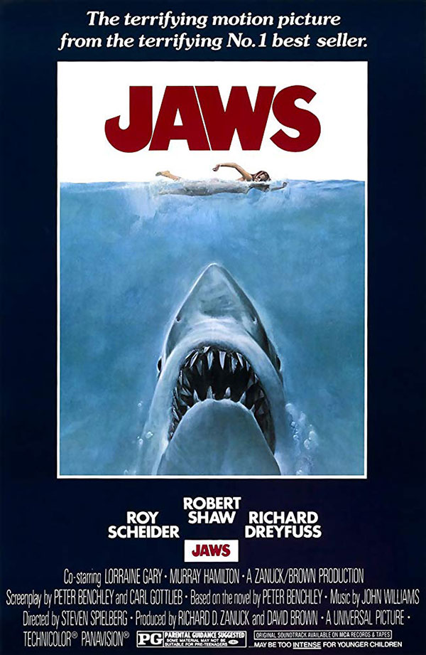
Jaws
This is the example of a movie poster that incites curiosity from the first glance. These exaggerated shark jaws look so realistic and impressive that you can’t help but think of what’s going to happen next. Moreover, you unwittingly put yourself in the shoes of a woman at the top of the poster.
And talk about the scale! You know immediately that this is going to be about a giant killer shark of unimaginable sizes to really scare anyone of deep waters for the rest of their lives.
Red letters for danger, “J” for a fish hook, and muddy blue for restless ocean waters. All objects on the poster perfectly work together. They evoke immediate emotions and appeal to those who are interested in thrillers.
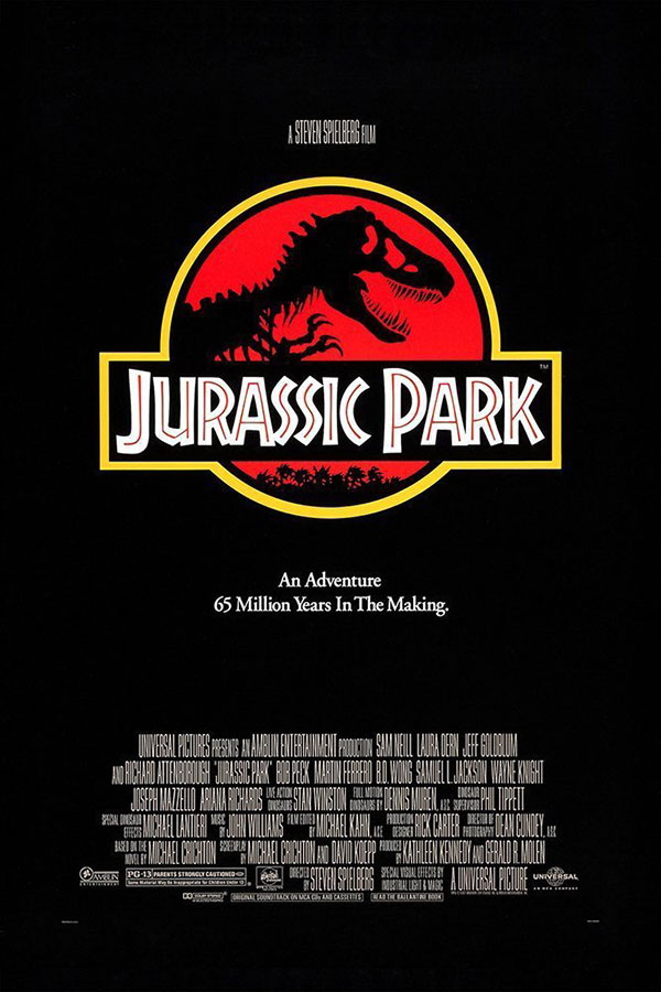
Jurassic Park
Less is more. This statement works for movie posters, too.
The designer who created this poster definitely had two paths: either to use a saturated movie shot to reveal the plot or to graphically design it. In the case with “Jurassic Park”, the first option could have scared a wider audience away, while the second one appeared to be an ideal one. It gives a hint about what the movie is about, making the poster look pop and stylish.
The lesson you can learn from this movie poster is that a designer should also be a psychologist who can predict people’s behaviour. Having taken a wise approach of not scaring everyone off from the first glance, the poster of “Jurassic Park” became iconic and the movie is considered to be the world’s classics.
It’s also interesting to note that the Jurassic Park movies took the unconventional route to create a kind of logo design for the poster, as a way to tie the franchise together. One can say, they’ve branded their posters in a very clever way.
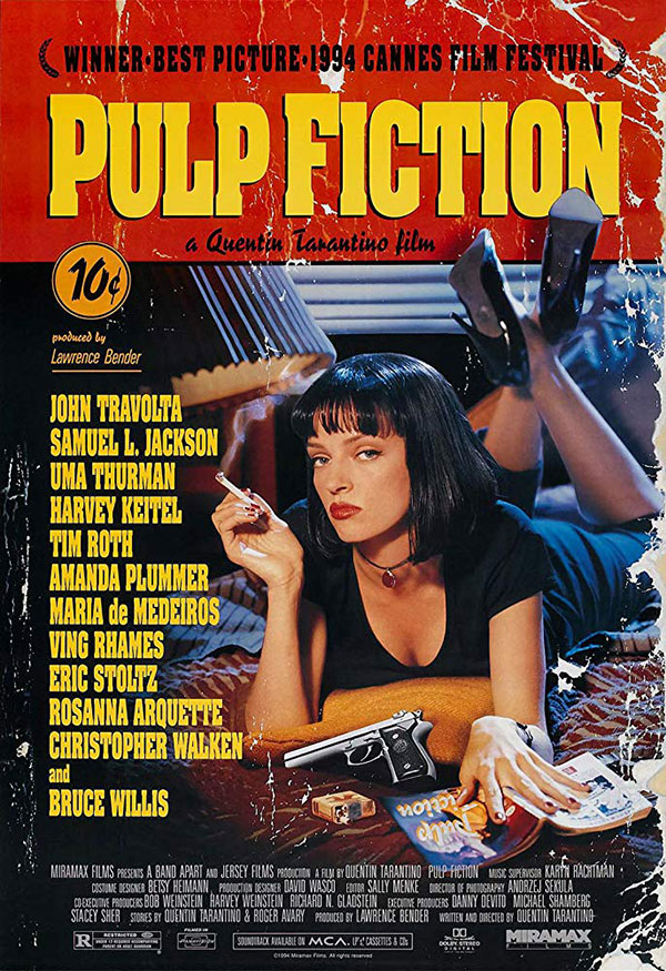
Pulp Fiction
Although the “Pulp Fiction” poster does not tell a viewer anything about the plot, it is an amazing example of how to create an ambient poster applying common design rules.
The first thing your attention is drawn to is, of course, the name of the movie. It is designed as a book title, observing the rules of visual hierarchy and contrast. They both indicate the most important elements on the poster and highlight the typeface people usually see in this kind of literature.
Note that all the details on a poster create a particular nostalgic atmosphere. 10 cent sticker, mixed typefaces, dark colors, and a provocative illustration — a photo of Uma Thurman with a gun and a cigarette — these things also make the poster look as cheap as pulp fiction usually is.
This is another interesting approach – to pitch a cover as a book cover. This immediately tells you it will be a long story that involves many people, and judging by the gun in focus in the foreground, most likely dramatic and fatal.
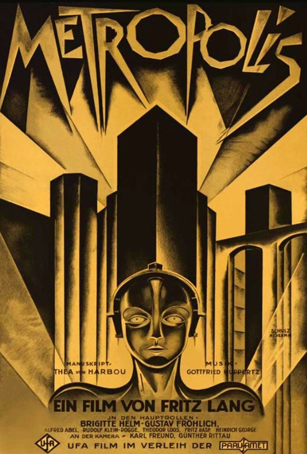
Metropolis
We couldn’t help but mention one of the world’s most valuable movie posters — “Metropolis”. It has a sophisticated design that precisely transmits the story. Being a symbol of both hope and caution, yellow color delivers the message of the plot’s complexity, especially being highlighted on a black background.
From the industrial and brutal style of drawings, a viewer understands that the movie is a science-fiction. These details are actually enough for an audience to decide whether to watch a movie or not. Thus, the “Metropolis” poster is a bright example of how a designer can create a poster that can pass the centuries and still remain relevant in 2019.
In this movie poster, stylistic choices about the art deco styling of the lines and colors (for those times) certainly hinted at futurism. Today, we look at it as a treasure from back in the days about a future, as seen by the imaginative minds of those times. It is to say that the concept still works decades later.
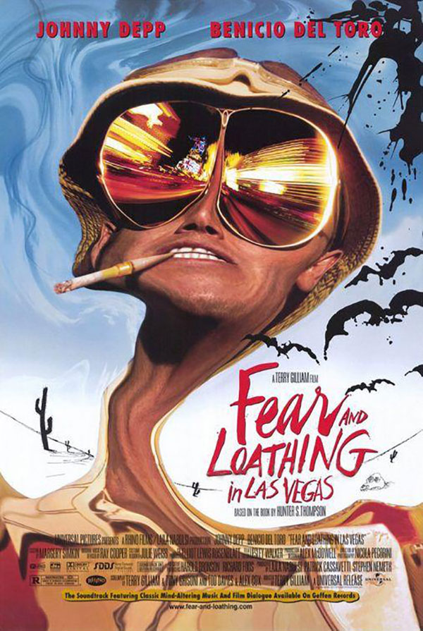
Fear and Loathing in Las Vegas
Wondering how a poster design can submerge an audience into the plot? “Fear and Loathing in Las Vegas” proves that it is easier than you think. Surreal illustration hints that the main character will have adventures because of drugs. The colors used on the poster reflect the careless spirit of the movie.
Another trick is to use a different font for the title so that all visual elements stylistically match together and create a particular movie ambience. The skewed image of the main character, and the irregular font used for the title, tells us that something very trippy will likely happen, and we want to know!
Every single visual element from these movie posters can provide you with inspiration and serve a starting point when you’re planning your own projects. You can also get some insights on the approach you should take: to share a movie shot or incite curiosity by means of graphics.
This kind of analysis can give you more ideas and room to experiment with your own projects. Keep track of the kind of graphic design styles you like, and take inspiration from the things that you’re interested in, be it movie posters, magazine ads, or simply photographs. Inspiration is all around, and you know best what your eye falls on. Make the most of your fascinations by researching for in depth analysis on things that catch your eye.
Just as important as it is to have inspiration at hand, it’s important to understand why some things inspire you and what stylistic and artistic choices make different media appealing to you as a creative.