Brutalist Website Design Inspiration for Your Upcoming Projects
When your clients trust you and give you the freedom to create website designs that you think could help them achieve their business goals, it’s precisely the moment when you might freak out. Creative freedom is hard to come by nowadays. It’s also common that with loose rules, a creative block might take you by surprise and looking for inspiration on the internet might overlap with a burning deadline.
At times like these, you can turn to our annual visual trends project and seek ideas, themes, and new aesthetics. You can also choose one trend and dive deep into research. Explore the origins of the trend, delve into the new aesthetics, and analyze already existing works inspired by some movements. By doing this, you might find one or a couple of insights for your upcoming project.
For website design inspiration, the “Brutalism and Digital Decay” trend is a perfect fit. It has a long history worth exploring, urges you to step outside your comfort zone, as well as provides you with the most daring design ideas ever. So get ready to explore it as we’ve done all the research and found some of the best design references.
Brief history of brutalism and its revival in 2020
The roots of brutalism lie in the mid-20th century architecture. Right after the Second World War, it was appreciated for being functional and utilitarian, as well as for showing strengths and power with its rough and massive forms. The architectural style also looked towards socialists’ ideas, not surprisingly, the aesthetic became central when constructing educational and governmental buildings.
In 1970 and 1980, symmetrical, proportional, and grandeur constructions of postmodernist style replaced brutalist architecture that quickly became a sign of bad taste.
40 years later, brutalism is making a bit comeback. However, the style extends beyond symbolic architecture. It pops up as a response to pretty designs (both physical and digital), challenging perfect compositions and modest artistic solutions. The use of brutalist design in the new decade works well to attract attention and revive a style that is unconventional, bold, and a bit daring.
In short, brutalist websites can be described as:
- raw
- unconventional
- rough
- distorted
- industrial
- provocative
However, this does not mean that brutalist websites or graphic design works are tacky and tasteless. In contrast, they are more visually demanding and complex that they seem at first sight.
As the popularity of brutalist designs was growing in 2019, there are already a lot of website designs created in this style. A wide collection of brutalist websites can be found at the brutalist websites directory that inspired us to make a shortlist of platforms that stand out and look trendy.
13 brutalist website designs for your inspiration
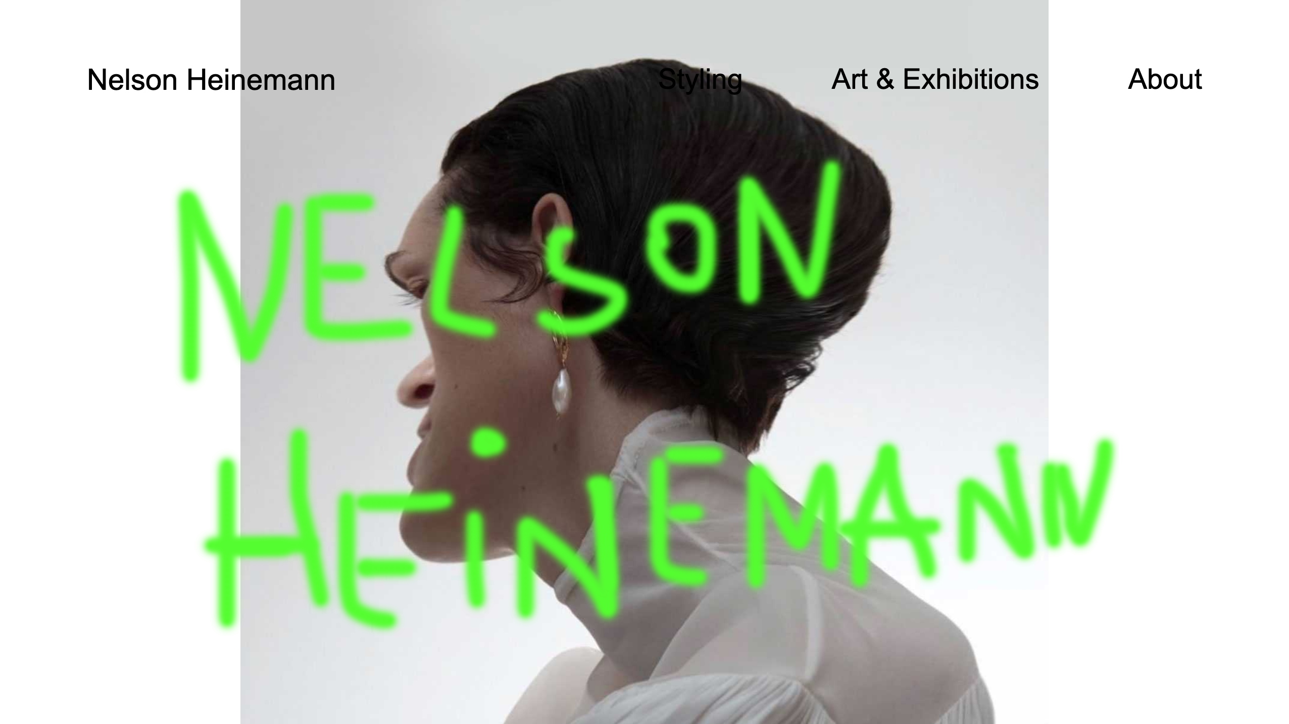
Nelson Heinemann
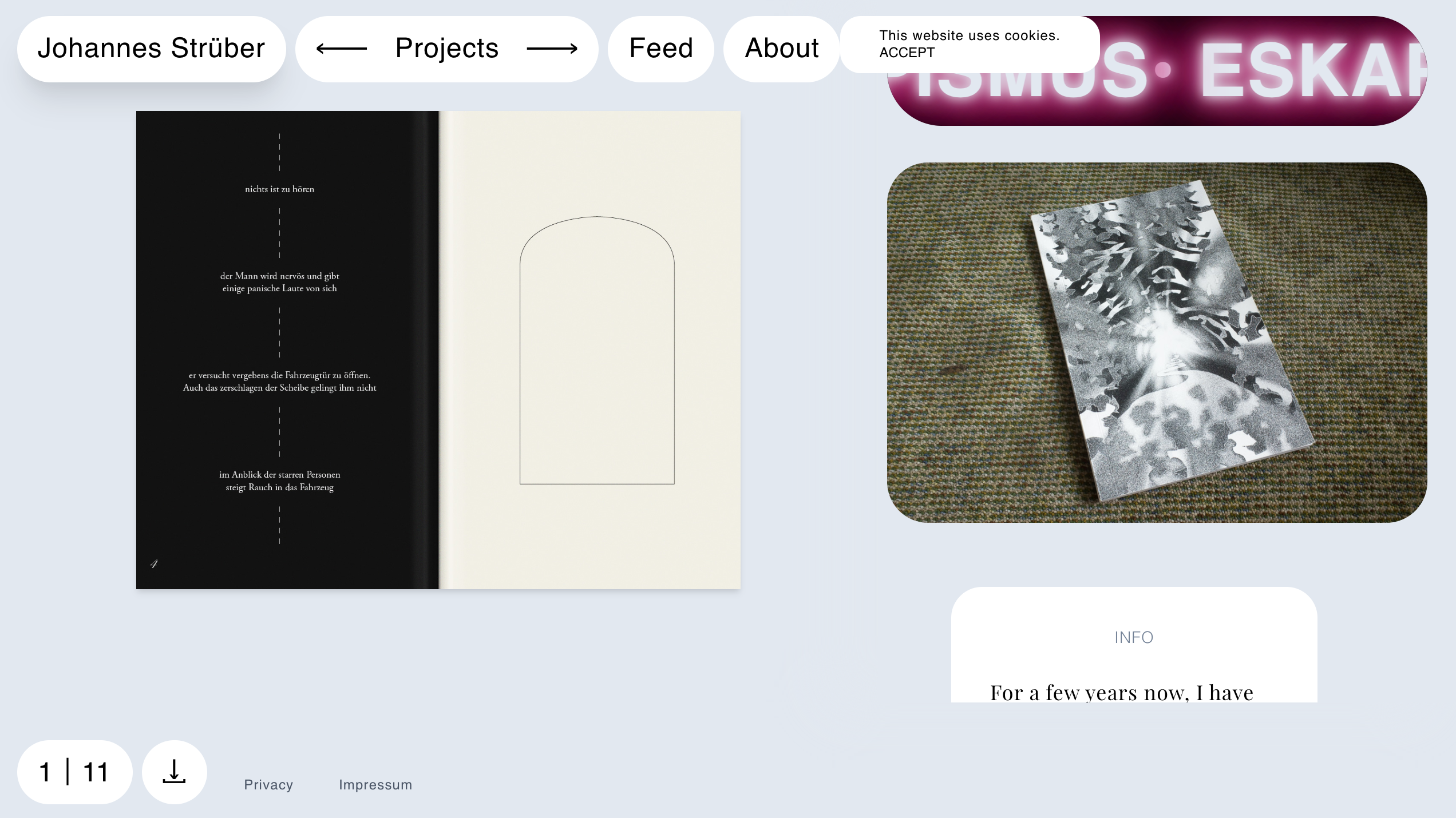
Johannes Strüber
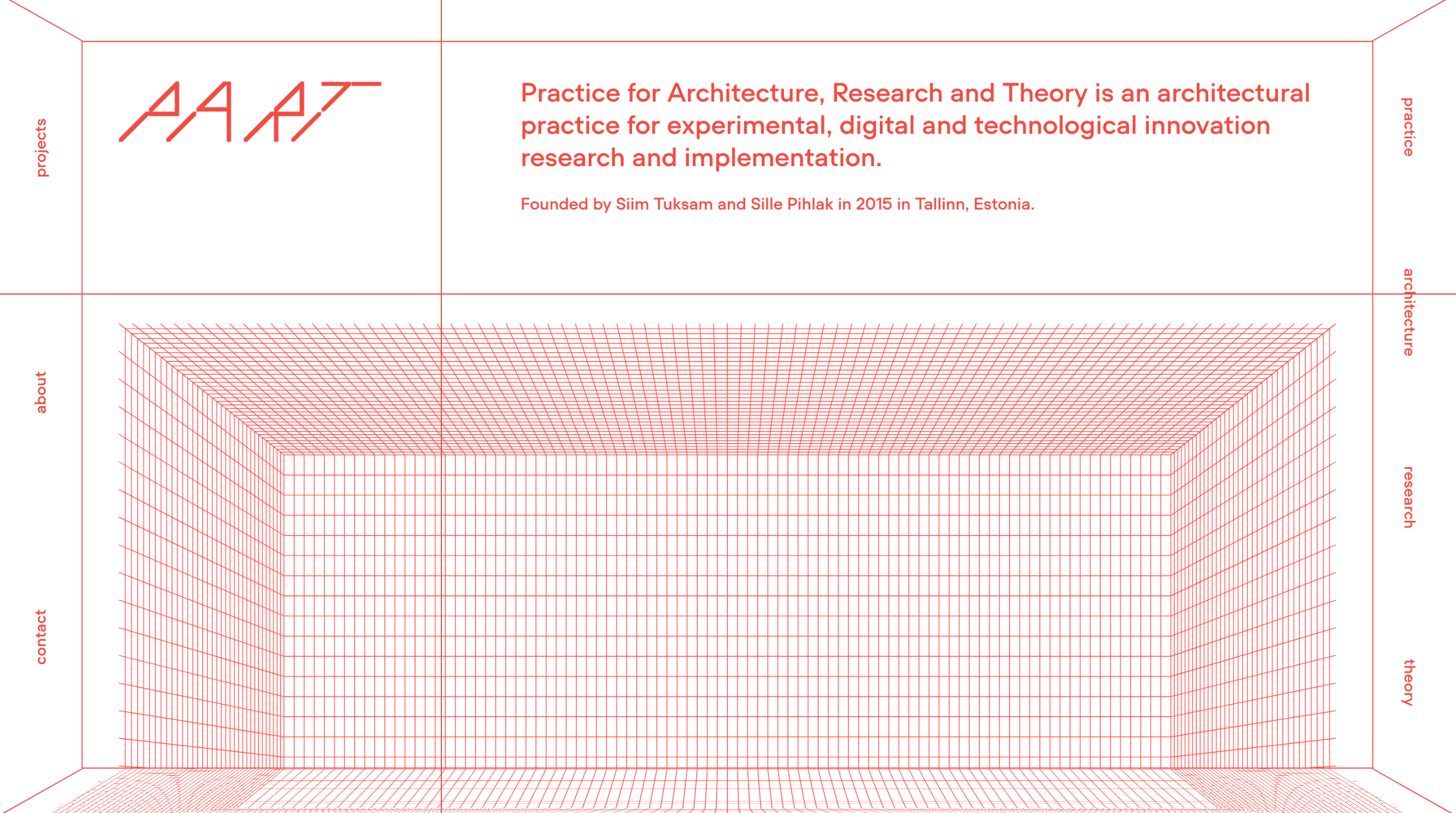
PART Architects
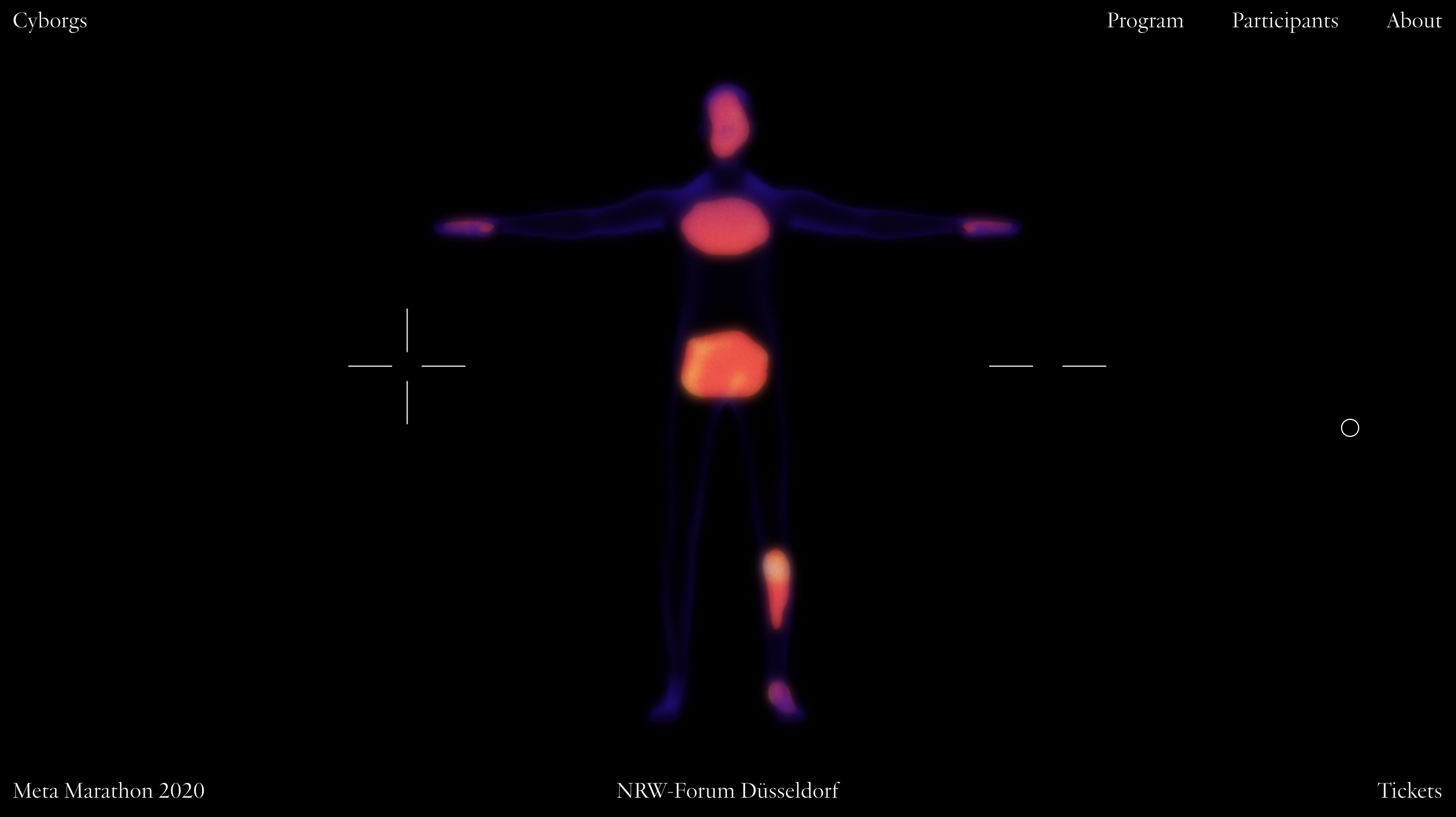
Meta Marathon
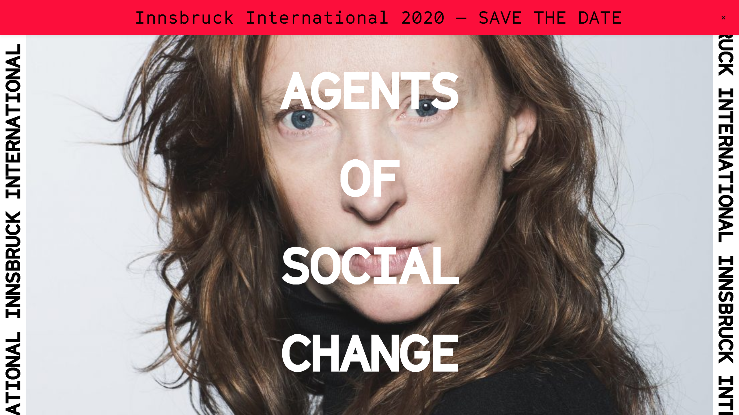
Innsbruck International
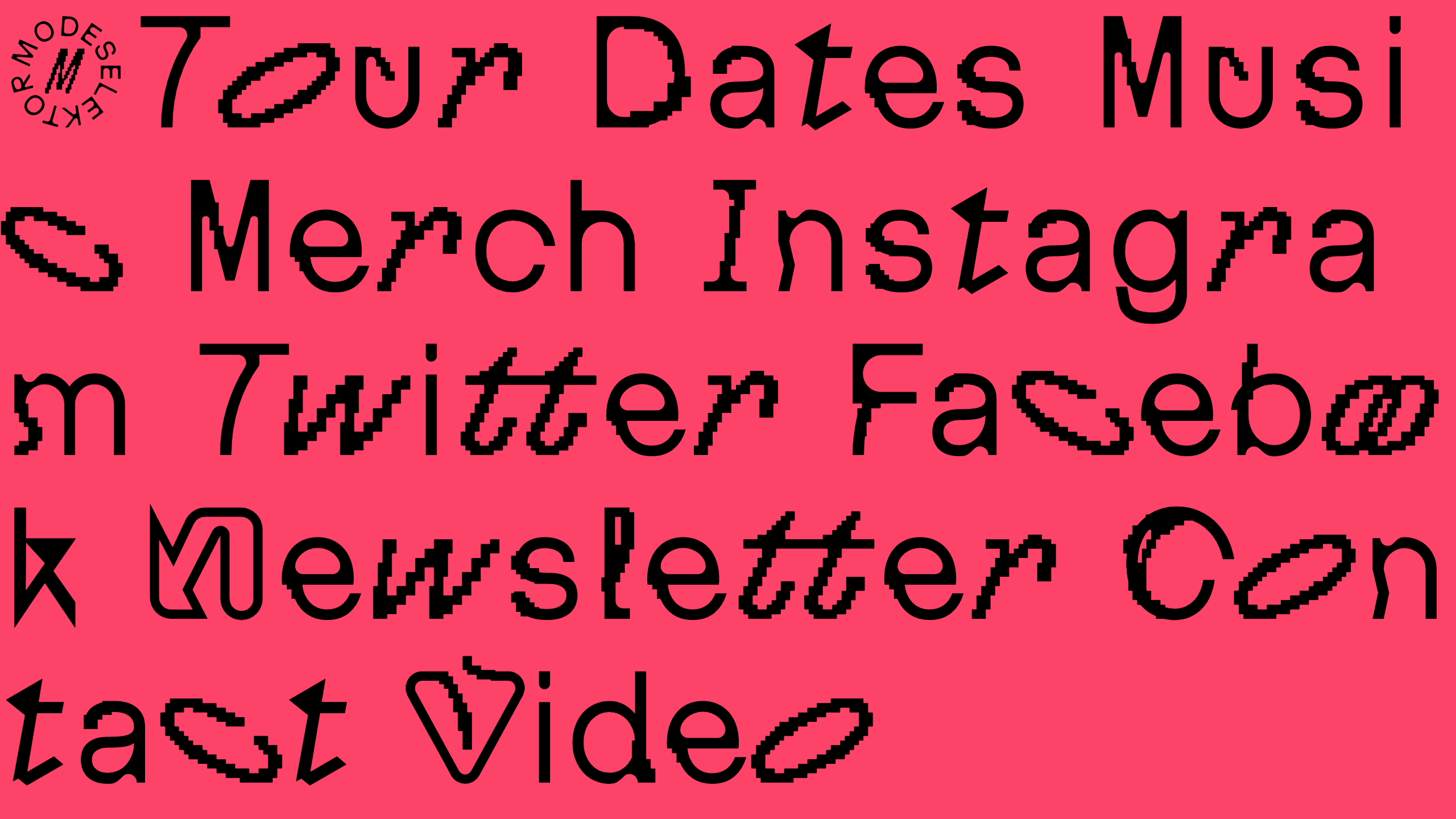
MDSLKTR
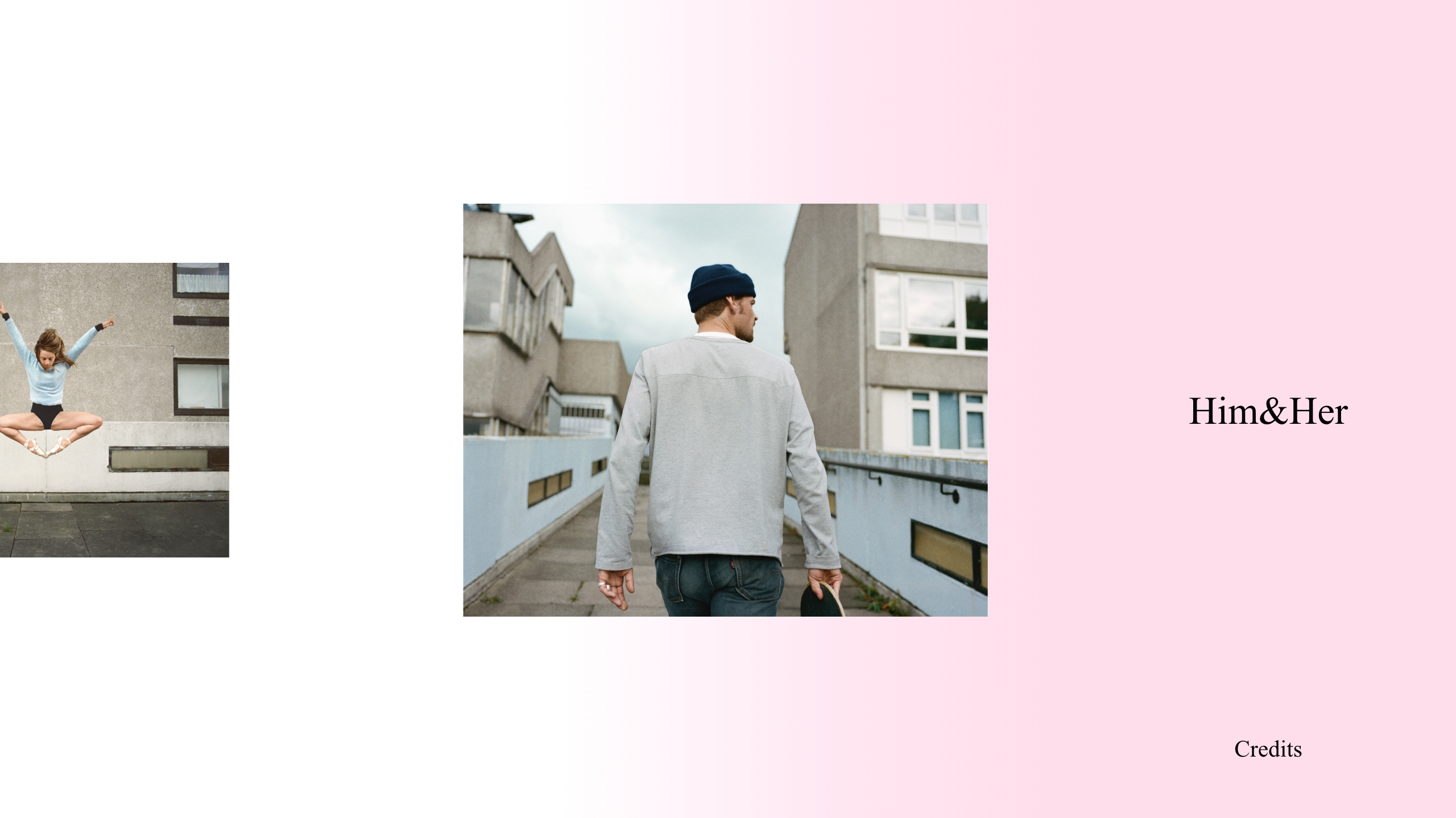
Him & Her by Sophie Ebrard
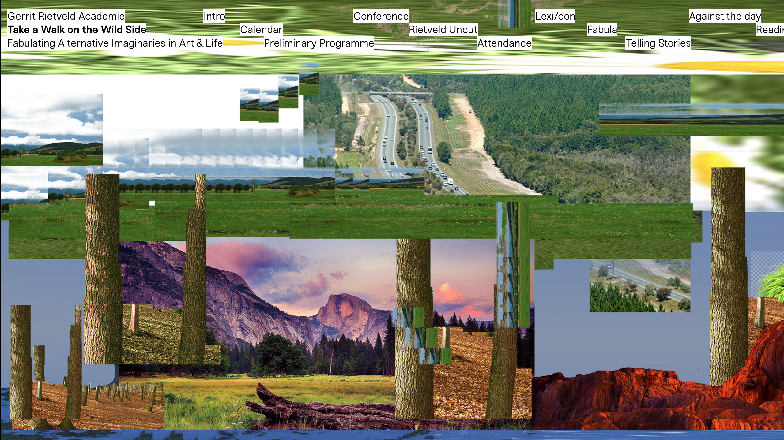
Take a Walk on the Wild Side
Ashley Cook
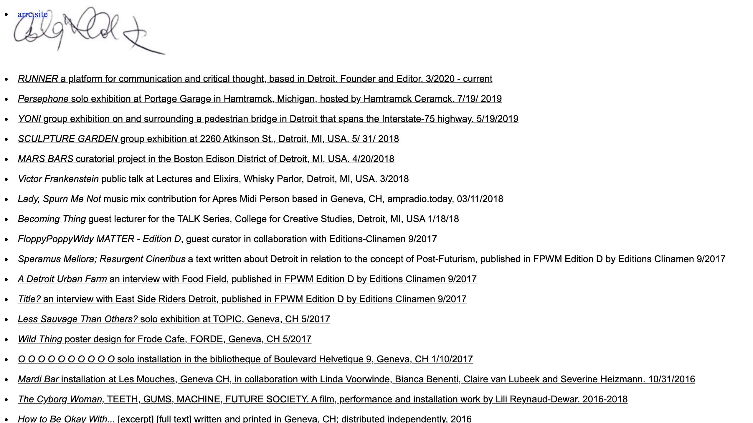
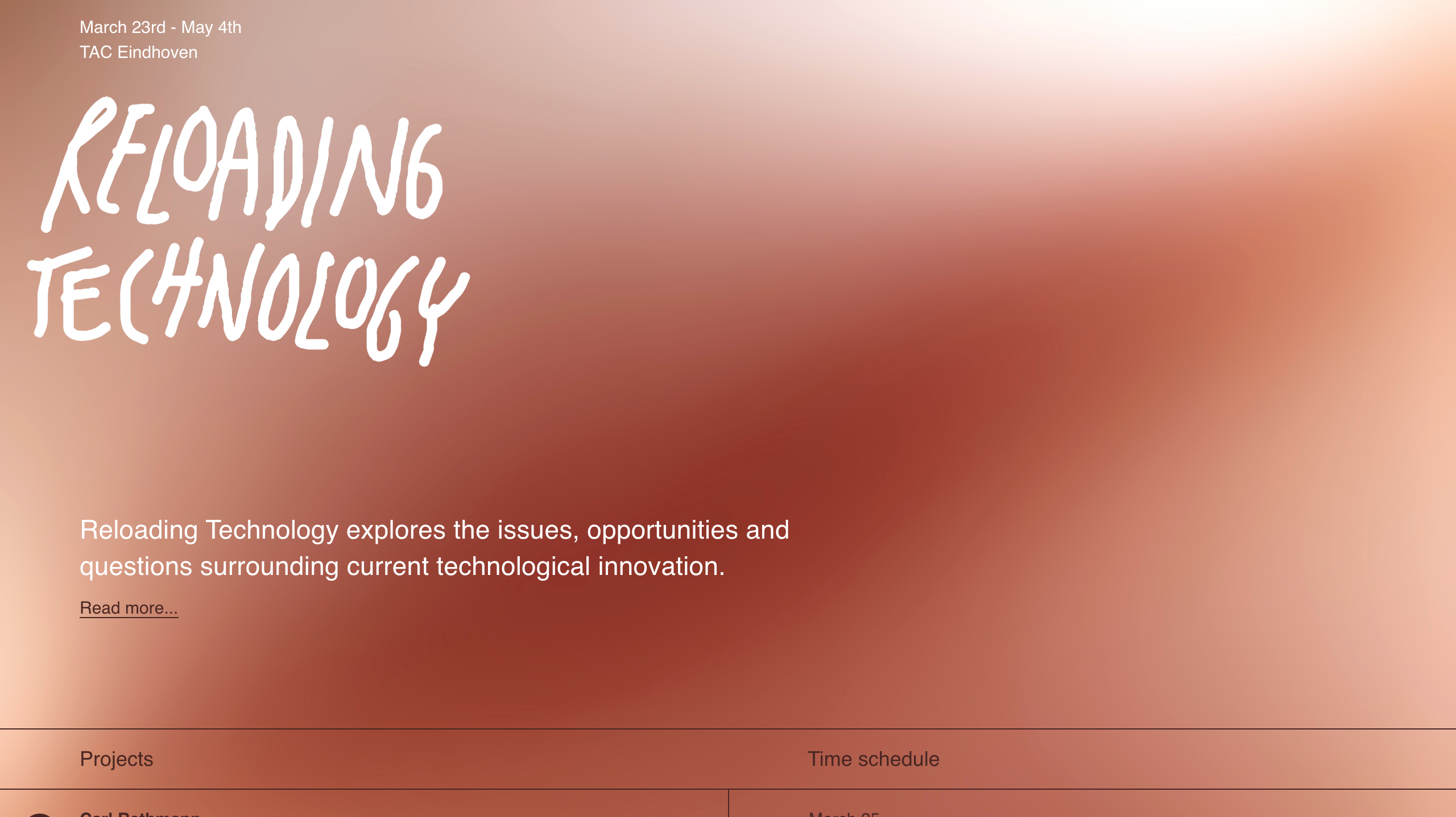
Reloading Technology
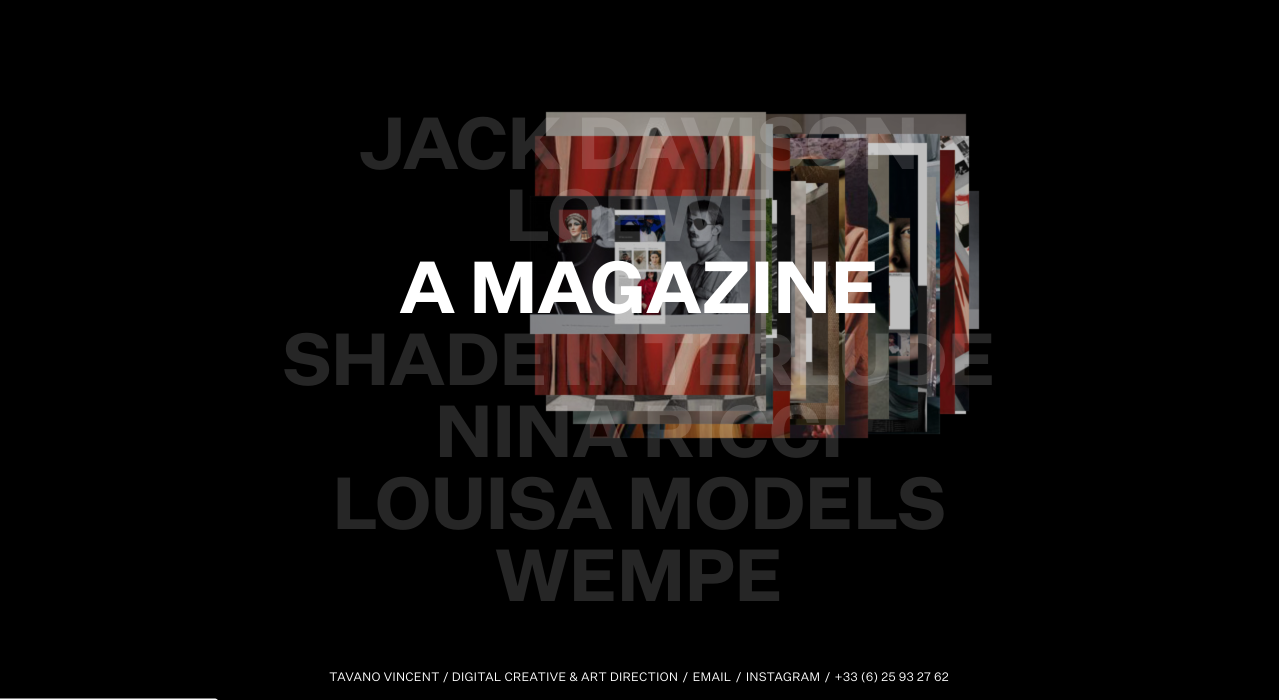
Vincent Tavano
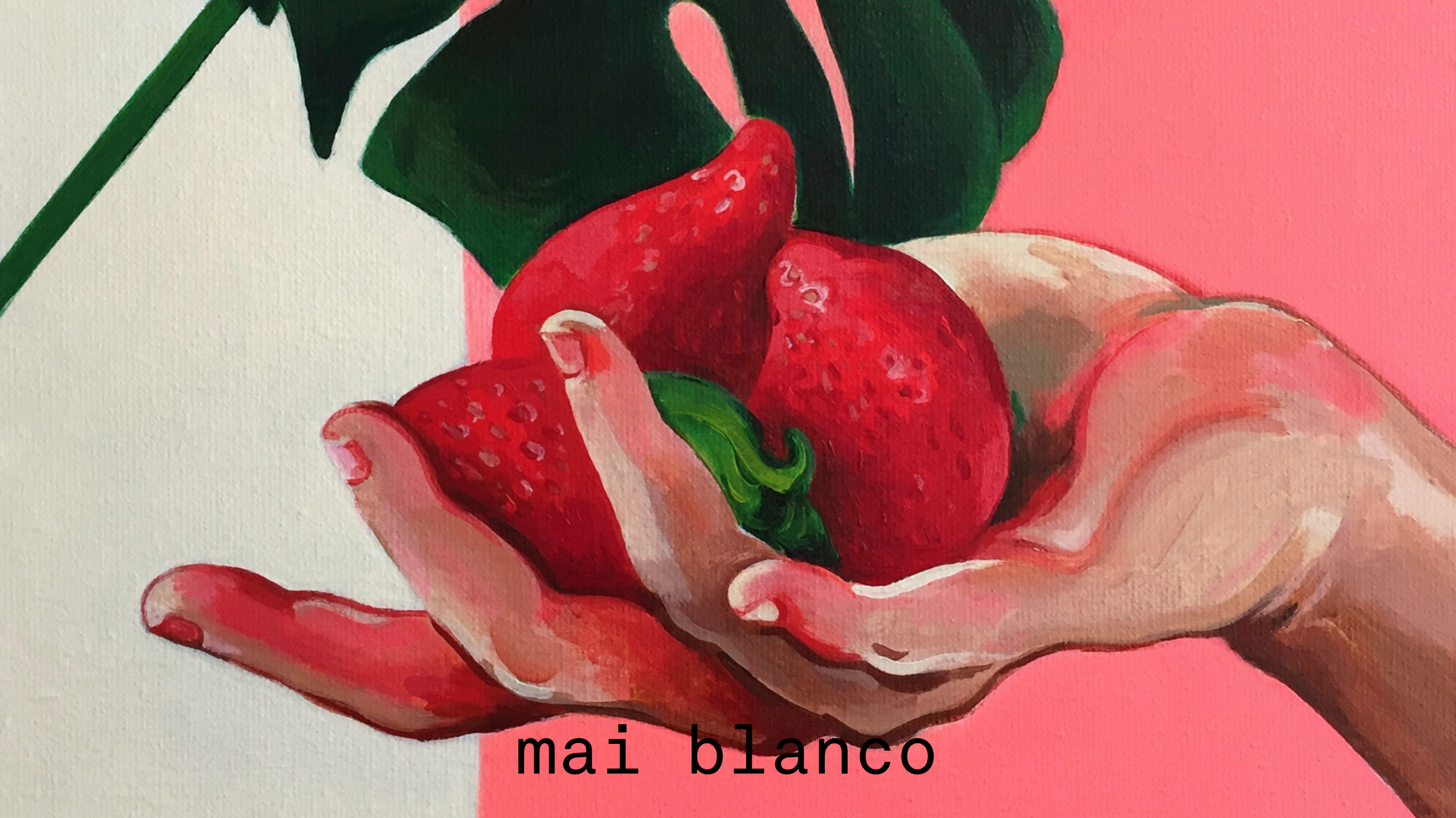
Mai Blanco
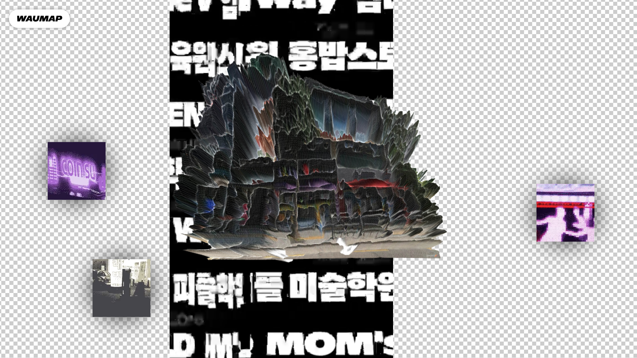
WAUMAP
Need more inspiration? Explore the full collection of brutalist website designs at brutalist websites directory. Also, feel free to break the design rules and step outside your comfort zone when coming up with a website wireframe or aesthetic.
