Inspiration for Swiss Style Poster Design
In light of Friday, or as some will have it – “Friyay”, we look for inspiration in a not so far away place where Swiss Style prevails. It came to light that Swiss Style graphic design was never a direct product of Switzerland. It’s amazing what 3 hours of research brings to light. So who deserves the accolade?
This style came to be known as an ‘international’ style thanks to some talented Swiss graphic designers and originated as a style in art, culture, and architecture in the 50s. That’s not all. If we dig deeper, the original style emerged in Germany, Netherlands, and Russia in the 20s. People still refer to the style as the Swiss Legacy (or Swiss Style), but now we know the real story.
Now that the mystery is solved and we give the right proportion of praise to Switzerland, we can get down to the details that make Swiss Style posters more of an international aesthetic with a lesson or two for graphic designers today.
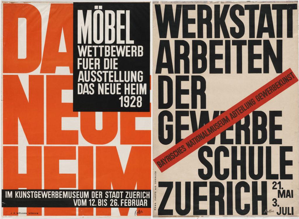
Ernst Keller 1927-1928
Traditional characteristics of Swiss Style graphic design
If I were to describe Swiss Style graphic design in less than a sentence, I would say it’s the marriage of functionality and a refined aesthetic that produces the brainchild of loud minimalism. Defining elements of Swiss Style include:
- “Form follows function”
- Grid system
- Asymmetrical layouts
- Sans serif type (alright, Helvetica)
- Photography
- Precision
- Geometric abstraction
- Simplicity
- Objectivity
Get rid of the unnecessary clutter
The iconic crispy and mathematically-correct layouts, paired with sans-serif typography, and a very minimalist design are hard to miss when paired together to produce art. It’s these characteristics that scream sophistication because removing the unnecessary elements to emphasize the drama of what’s really important was (and still is) the classy way to go.
The overused “less is more” phrase is perhaps the most fitting one to apply to Swiss-style design. Remove everything until you’re left with a design that speaks for itself.
Let’s get to the inspiration
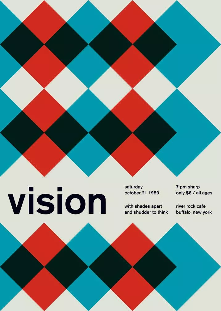
Swissted: The Rock Posters of Mike Joyce
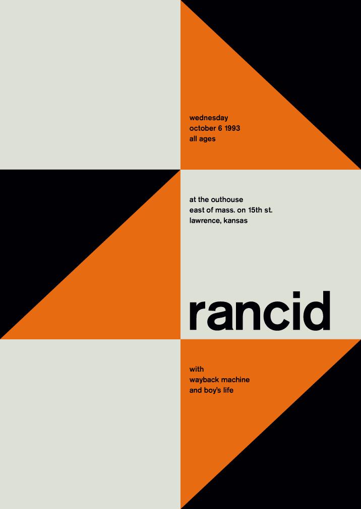

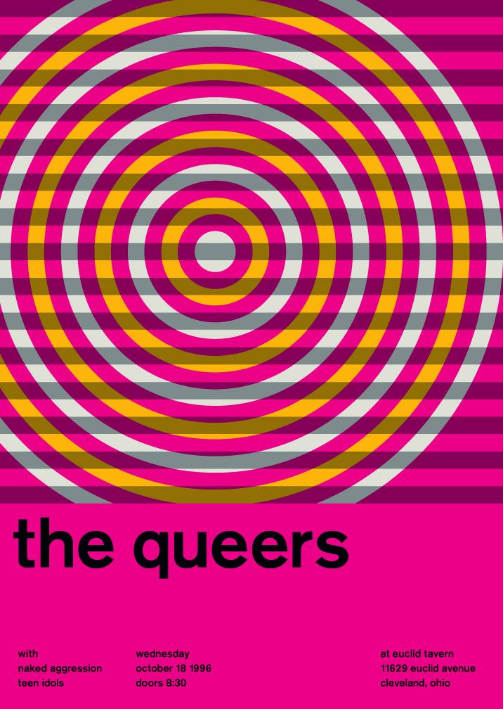
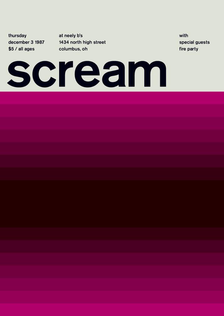
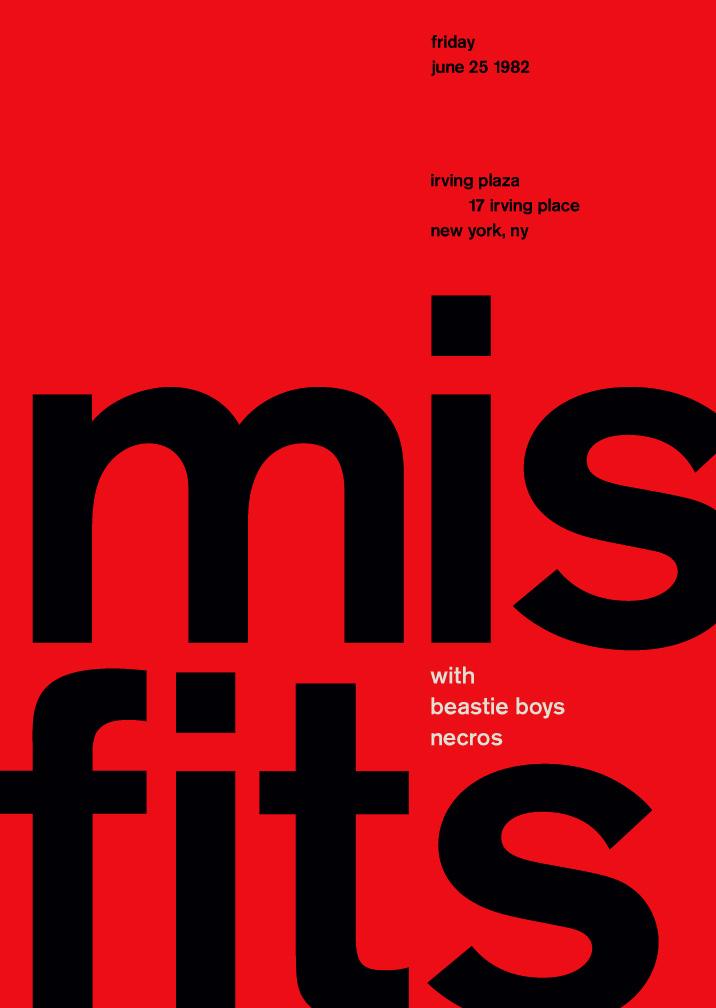
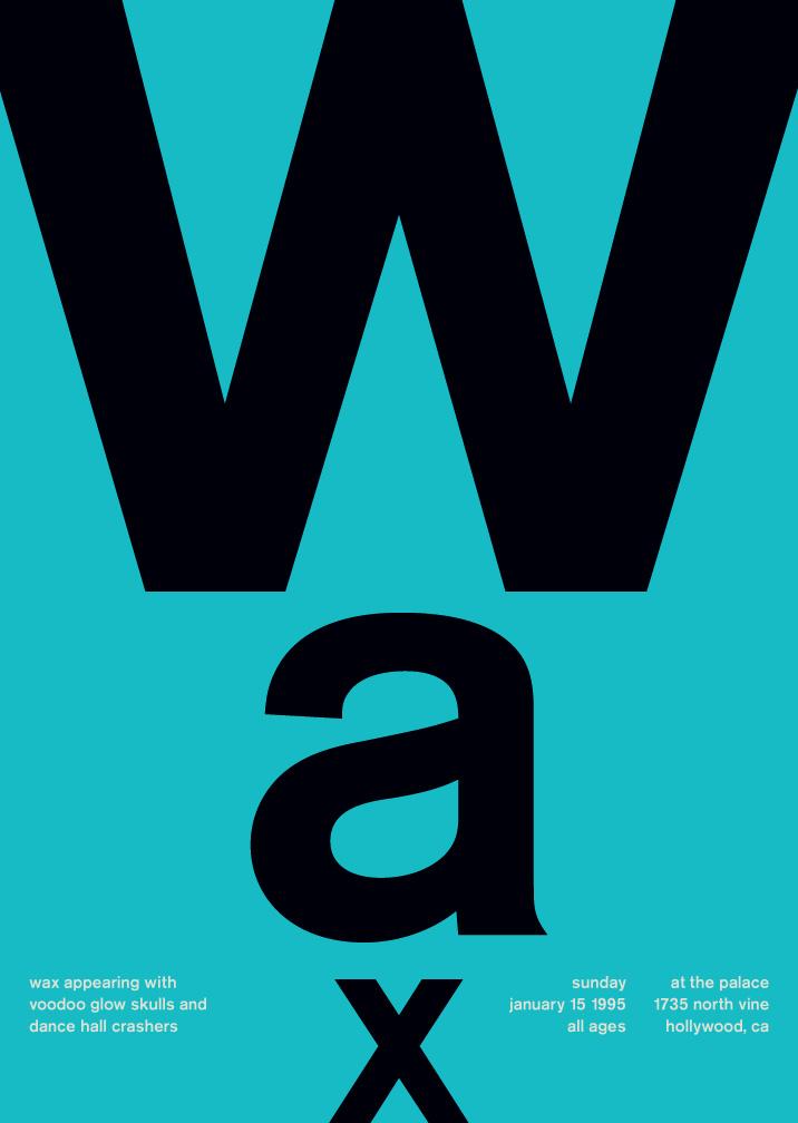
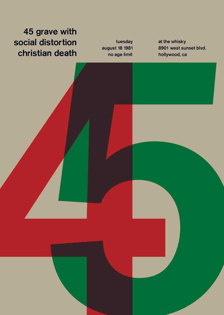
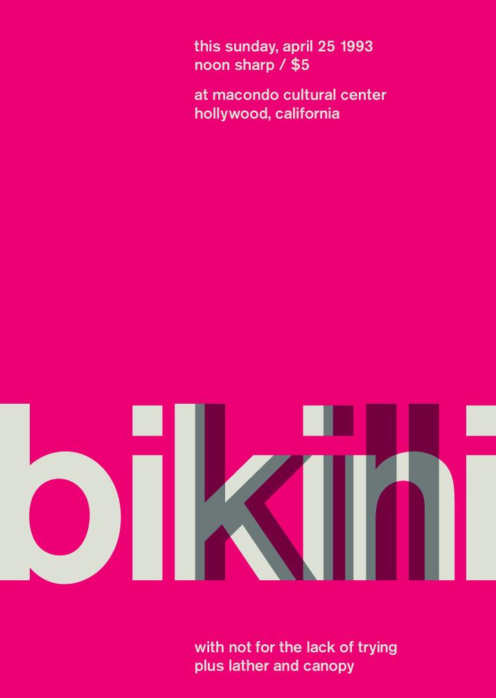
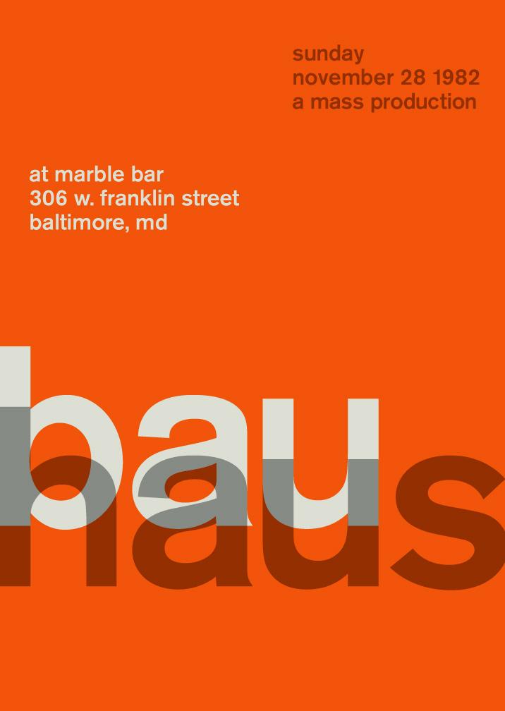
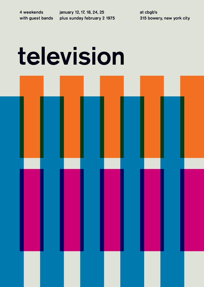
Image credits: Mike Joyce
The same principles and elements can be used to design your own posters. This kind of inspiration should ideally push you to get into the mindset where less is more, and you could do so much more with a few elements to highlight what’s important in your design. It’s about placing the right accents, while carefully weighing composition with a laser-sharp editing eye.
5 ways to integrate Swiss-style graphic design to your own posters
1. Form follows function
Make your composition’s design aspect literally invisible. Think about your audience and make sure that there is a very clear point for emphasis with no distractions. This ensures that your content can be easily grasped. In a sense, this throws out the window the concept of visual hierarchy that we often talk about but if you’re breaking some rules and using Swiss style graphic design work for inspiration, by all means do it. It’s about drama – so don’t look back.
2. Use a very distinct grid system
You’ve probably noticed that these Swiss style posters all have one thing in common from a first glance – very pleasing to the eye compositions. The grid helps bring order and logic to your designs. This kind of approach to structure, with a clear grid system helps separate or integrate elements. Stick to the grid if you want to include more elements, but remember to polish up the overall look to avoid clutter.
3. Asymmetrical layouts
We get to more graphic design rules you can break. Asymmetrical layouts have focal points and include off-centered elements. This kind of an approach in design can give your posters more character and add that distinguishing Swiss Legacy look with the right elements in balance.
4. Staying loyal to one type of font, and one type of font only
Sans serif fonts are very characteristic of the Swiss Style designs. They’re simple, very legible, and hit all the right requirements for a more sophisticated design. Make your content shine by being creative with typography that’s a classic. You can experiment with weight and size, but limiting yourself to one type of font is actually what can help you focus and produce a design that’s both loud and minimalistic.
5. Photography over illustrations
In Swiss style designs, photography is prefered over illustration. There is a very specific reason for this, because photography is more in line with portraying reality. Make the most of the more objective medium and use elements of photographs to add meaning to your designs.
Ready to go?