Balance in Design: What it is And Why You Need It
While researching more on balance in design, I stumbled on an image that beautifully summarized the lack of it in a minimalist illustration, thereby relieving me of the pressure of writing an elaborate introduction:
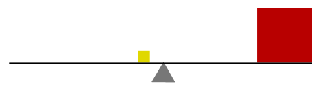
You know something is off about this image, the scale will clearly tip. It’s not just the size of the squares that communicate this, it’s the colors as well. Although this is an obvious example, balance is sometimes hard to achieve in both design and photography because it’s a fundamental principle that needs more exploring.
In this article we’ll cover all the basics of balance in design, and more importantly elaborate on why there is such an emphasis on maintaining it in your art works and images. Visual balance is, afterall, the most obvious place to start if you’re looking to improve your compositions.
What influences visual weight?
This list is based on the works of Rudolph Arnheim, who was an author of the psychological principles of art.

Size of objects: Bigger objects will always tip the scale
Shape: Regular vs irregular shapes
Form and space: Positive forms weigh more than negative space
Isolation: Isolation in space also impacts balance
Density: Many small objects can balance one big one
Color: Warmer colors are heavier than cooler ones
Value: Darker objects will always be heavier than light ones
Intrinsic interest: Complexity adds more visual weight
Texture: Objects with textures scream for more attention
Depth: More depth of field means more visual weight
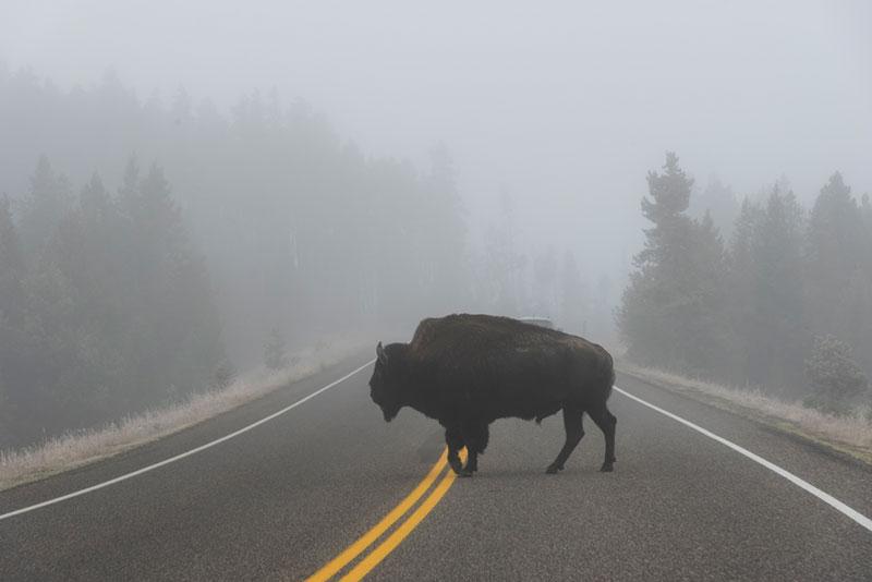
Perceived physical weight: Think car vs feather
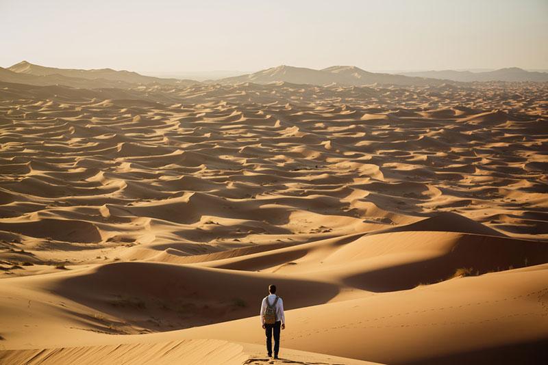
Location or position: Visual weight increases the further away an object is from the center
Orientation: Vertical is heavier than horizontal. Who knew?
3 types of balance in design
1. Symmetrical balance
This is perhaps the most common and easily interpreted types of balance where the visual weight of a composition is distributed evenly in every direction. You can draw a vertical or a horizontal line through the design and the visual balance will still be perfectly symmetrical. This type of composition is very well balanced, and gives off the sense of the ‘perfect’ composition.
It’s worth noting that symmetrical design isn’t necessarily the most interesting one. Although the human eye is drawn to this kind of symmetry, it can be perceived as boring due to lack of a solid focal point. It’s also interesting that something as small as changing colors in the composition of asymmetrical balance can throw off the composition making it heavier on one side.
2. Asymmetrical balance
Asymmetrical balance is the intentional gesture to create a sense of tension and movement in a design or photograph. Usually this means that different elements or focal points are not distributed evenly like in a symmetrically balanced composition. With one sight outweighing the other, you still get a sense of balance.
This type of balance is best described as one many small objects balancing one big one. It’s not balanced, but your eye interprets it as such. This type of composition creates a visual interest that is a bit more appealing because it is unexpected.
3. Off-balance
Following our rebellions theme this week, skilled designers take balance one step further to embody no sense of it (yet still appear appealing to the eye). Discordant artwork or photographs suggest motion and action. The viewer is a little uneasy and many even uncomfortable because something doesn’t fit, yet he or she is drawn to the design because it is so unusual.
This type of balance in design and photography is really meant to challenge the conventional rules. It definitely catches the eye and makes the viewer think. However, this balance in design is the hardest one to achieve because things can quickly go wrong and just look like a mess.
Ending on a good note
We covered the basics, and if you’re interested in more information on this topic of design principles, see our article on design fundamentals for photographers. There’s much ground to cover, but mastering balance in design takes you to new realms with things to experiment with and a way to look at your work in a new light. Every element you include has a sense of weight. How you balance those elements is what will make or break your compositions.