Summer Color Palettes for Vibrant Designs
During the lockdown, many of us have created new rituals that make our routine more diverse and joyful. For instance, some started drinking morning coffee from fine crockery on a balcony instead of a paper cup on the go. Others have decluttered their flats to equip ergonomic and aesthetic workplaces. In short, this spring, we did absolutely everything to surround us with things that bring us joy and marvel the eye.
This summer, the approach won’t change. People will choose slow living over hustle culture, and once again we’ll all return to the fine details in everyday life as we observe nature changing around us. To celebrate the approaching summer, we share summer color palettes that will be in trend this year.
The trendiest summer colors in 2020
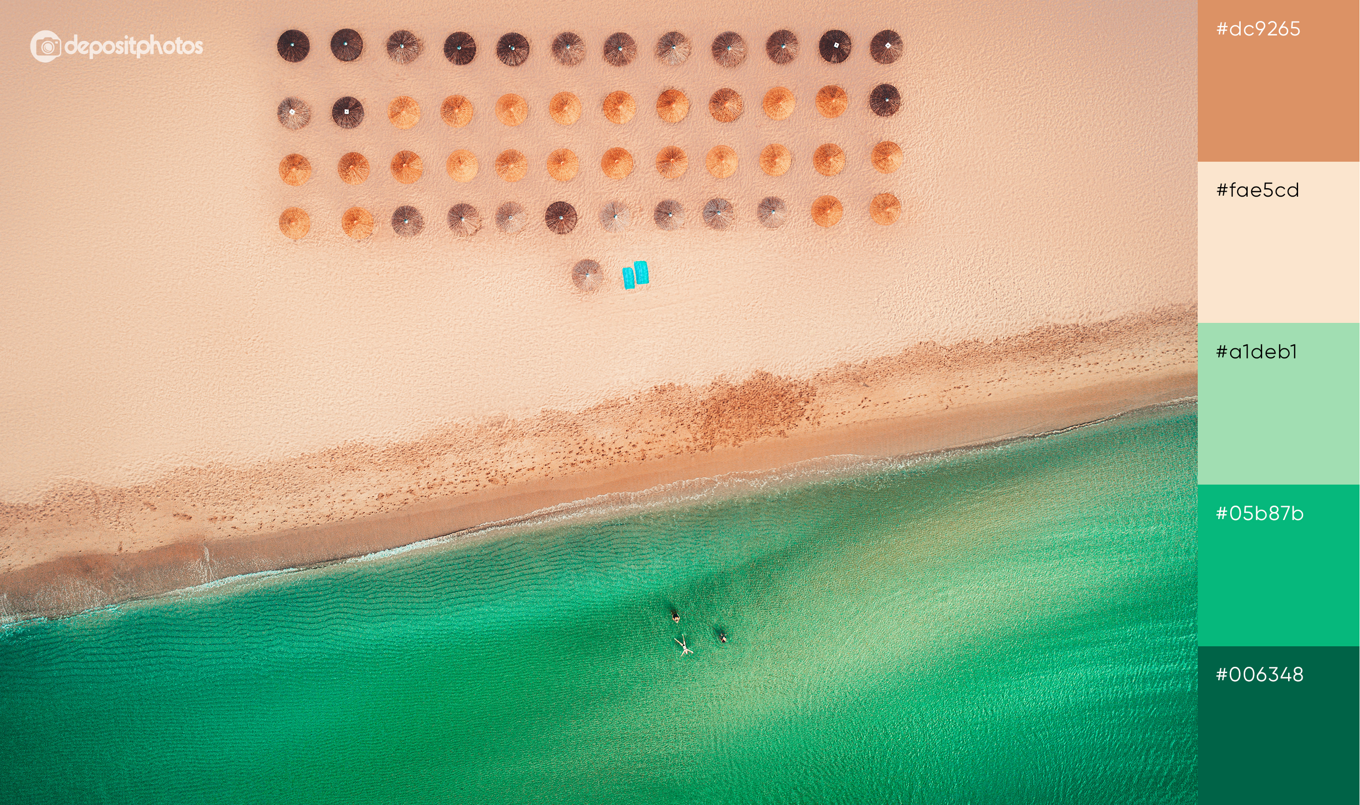
To come up with colors for these palettes, we explored Pantone’s Color Trend Report and our Graphic Design Trends for 2020. We also got inspired by simple things such as relaxed picnics, refreshing sea water, and feet-burning sand. They will definitely be equally desirable this year for people from different corners of the world.
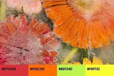
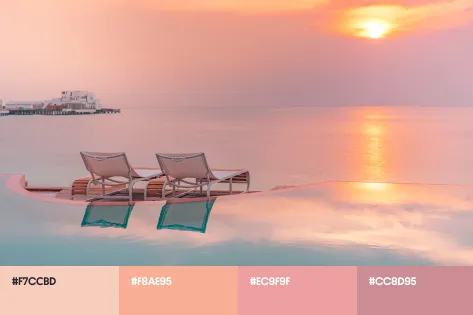
Having analyzed the latest design trends and considered the state of current affairs worldwide, we share four main colors of the season.
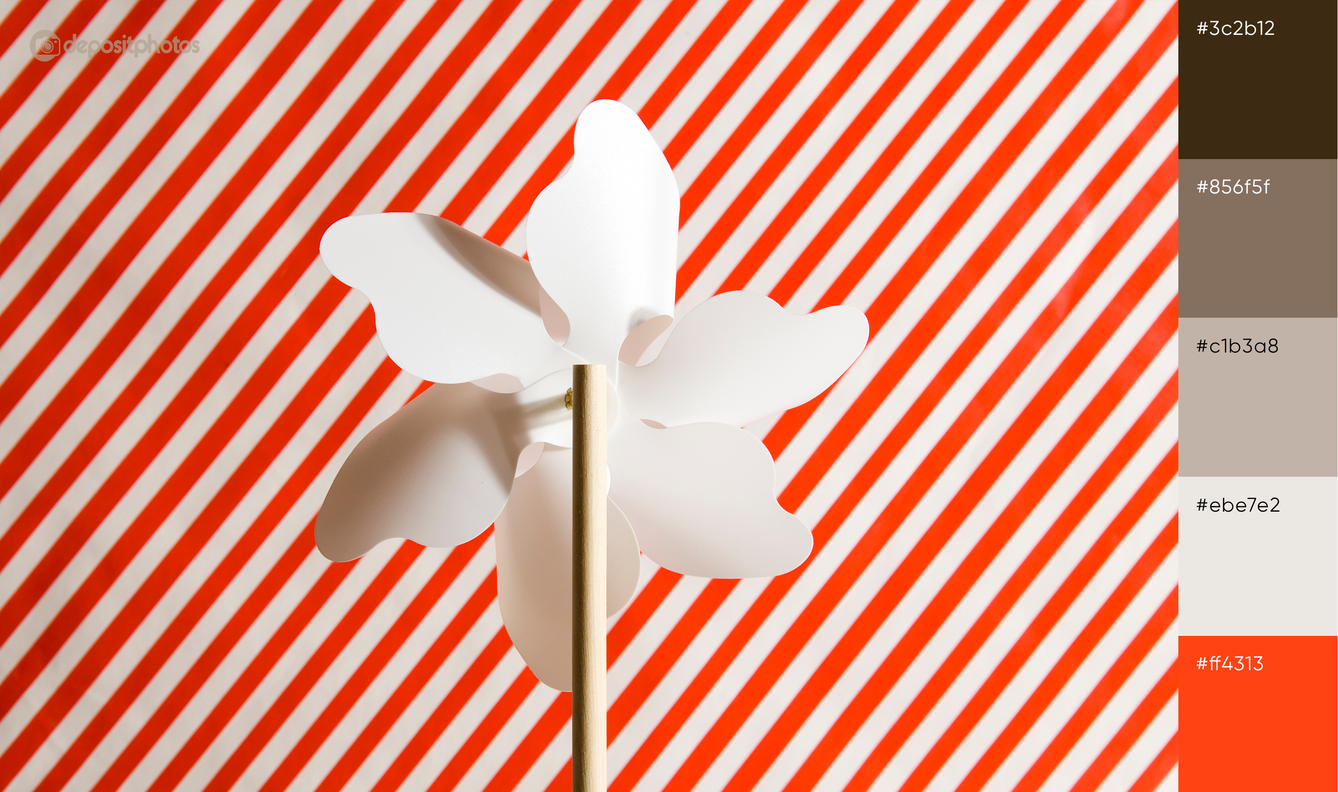
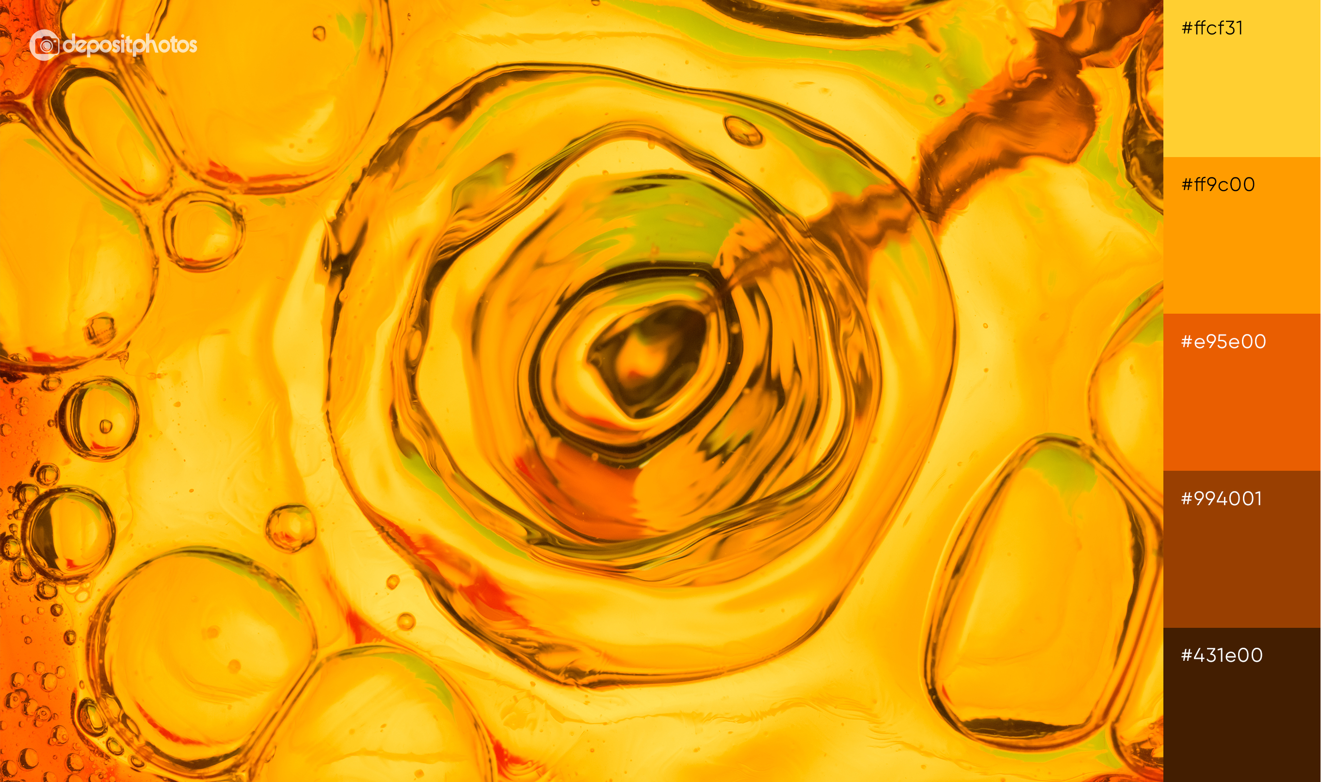
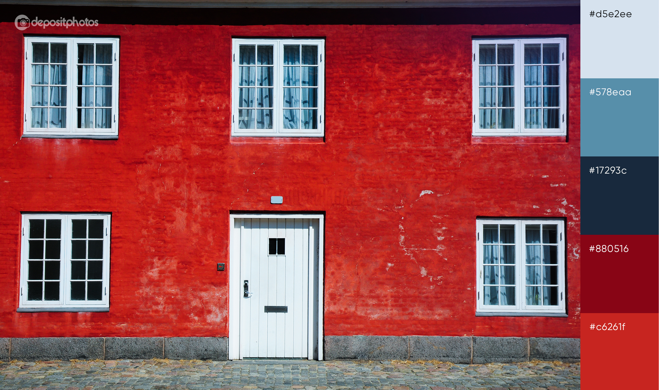
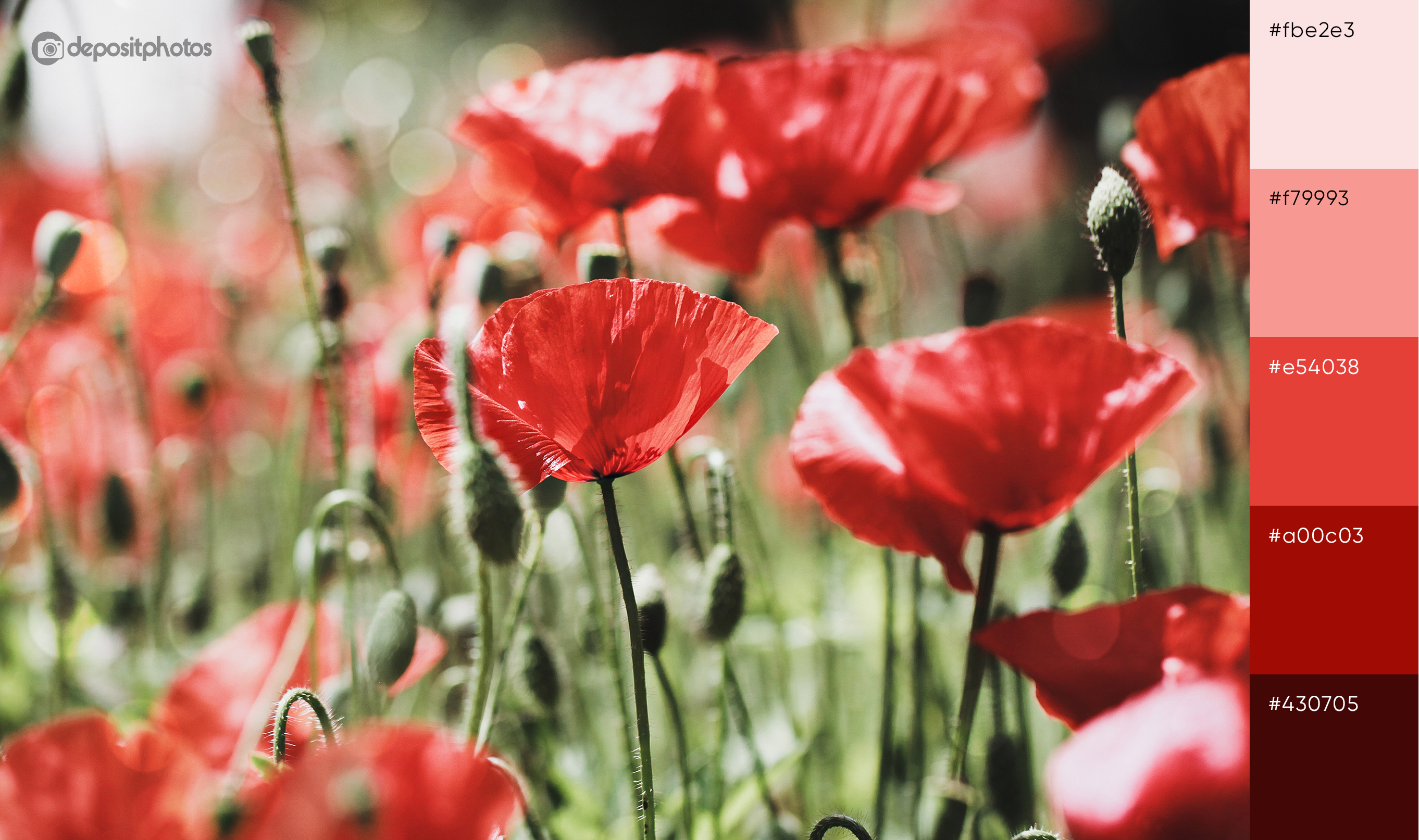
- Flame
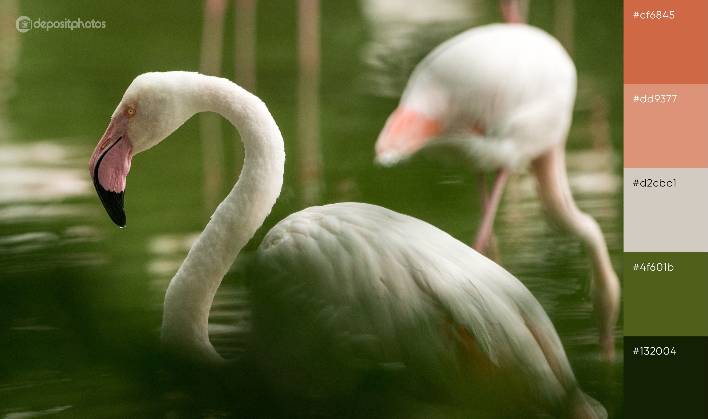
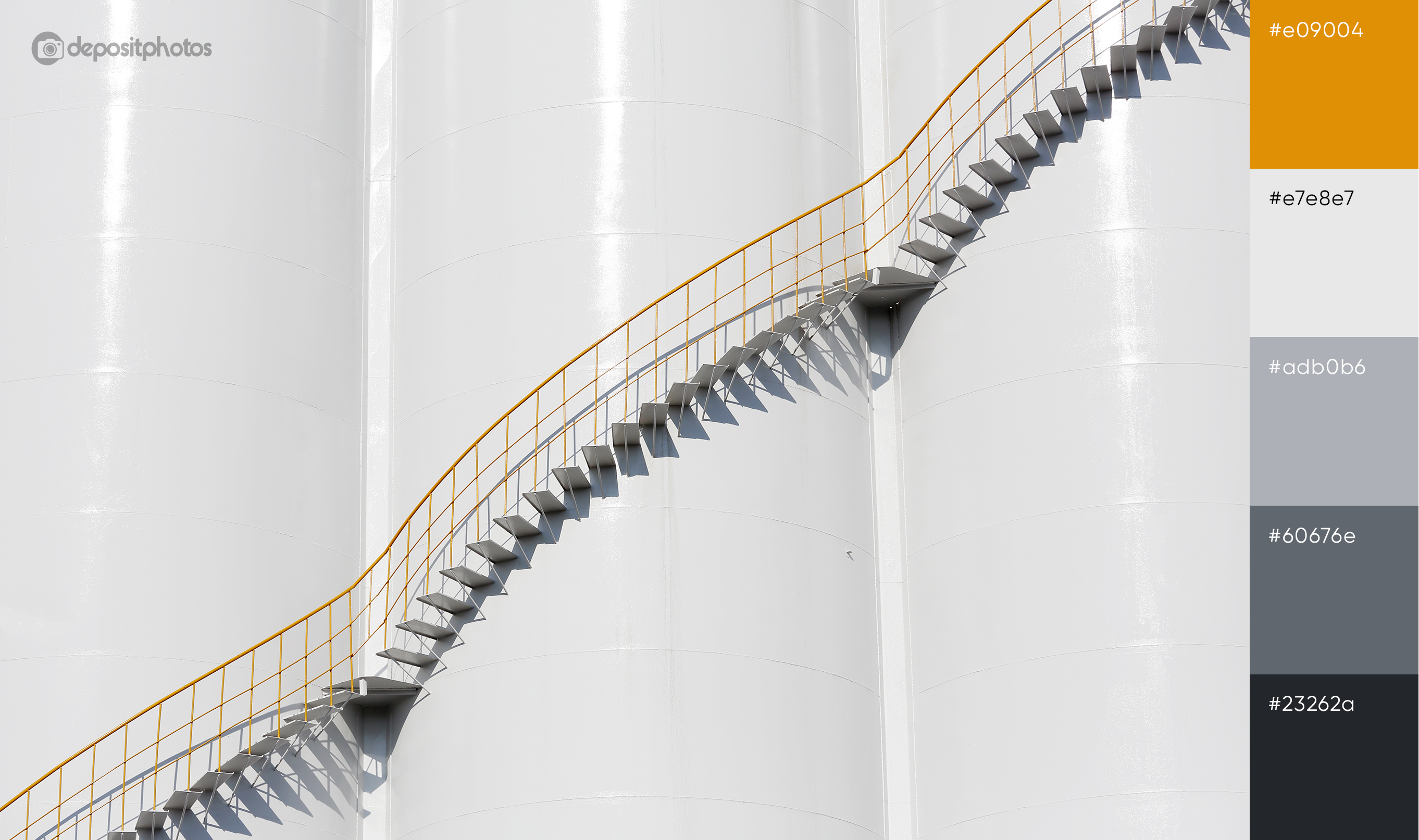
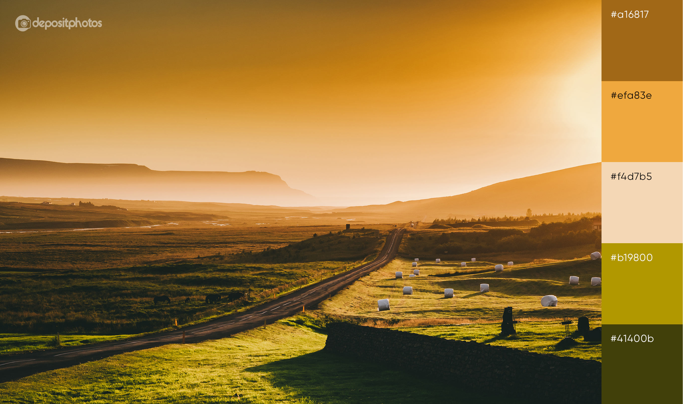
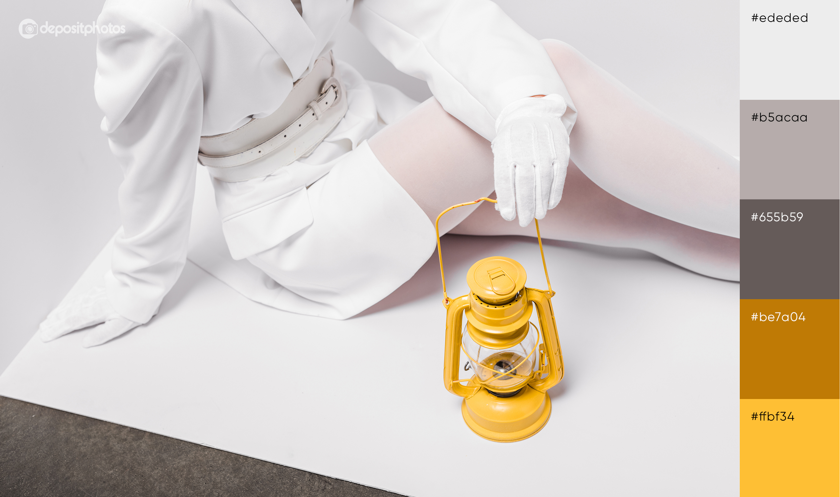
- Saffron
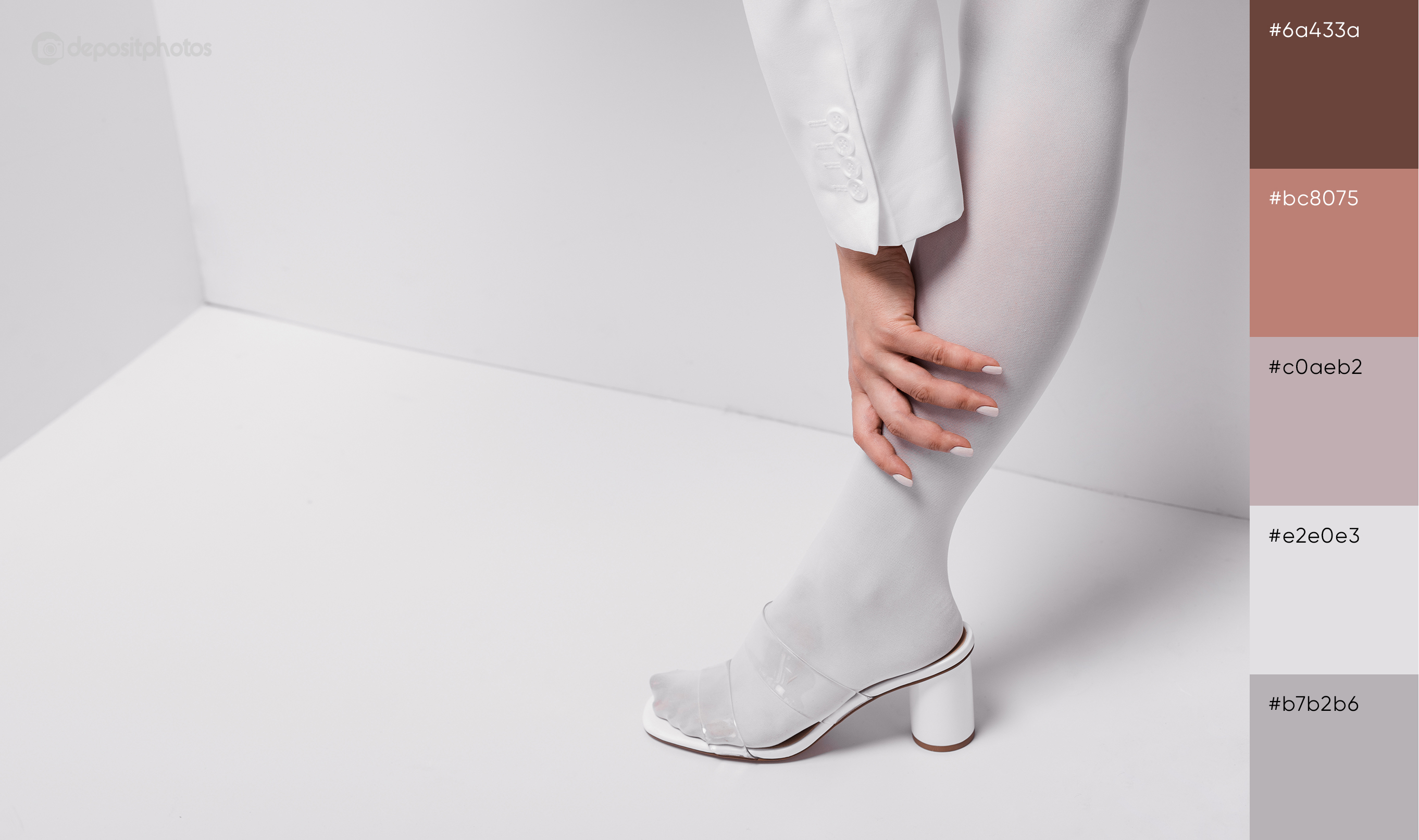
- Crystal white
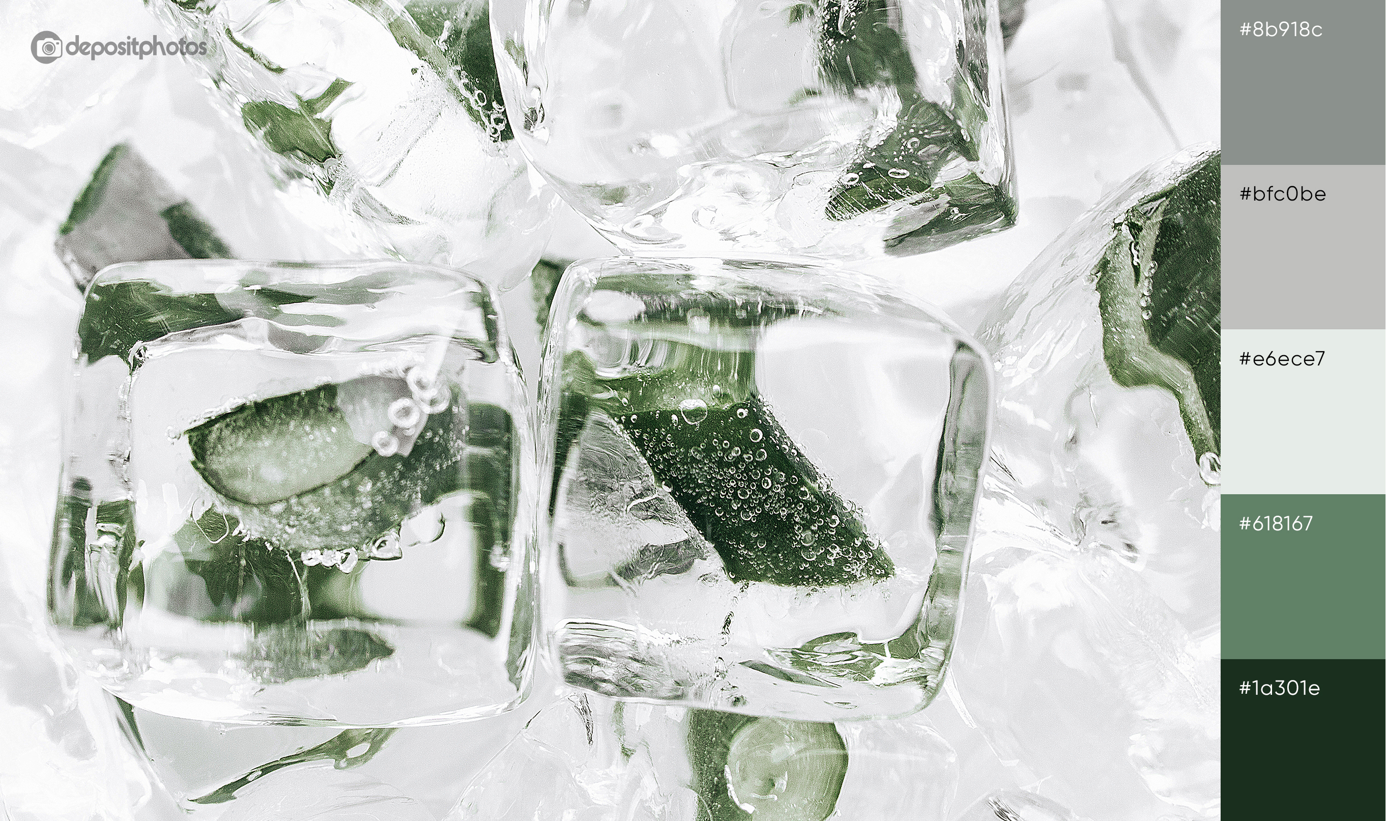
- Refreshing green
Flame, shaffron, and refreshing green are vibrant and bold colors that perfectly match crystal white and get nicely highlighted by its cool tones.
Ways you can use these summer colors for your designs
Keeping the trendiest summer colors in your arsenal is just half the battle. You should put effort into finding appealing combinations that look trendy as well. Depending on your goal, you can choose a way that suits your message and steals the attention of your target audience in the oversaturated feed.
1. Be bold and daring
The colors of this season are extremely vibrant. What this means is that if you combine more than three colors in one design, you’ll make your project look bold and daring. Design rules say you should use just three main colors but why not include one more to highlight the others?
2. Use different shades for smooth experiences
If you don’t like flashy colors like the flame or need to underline a message, you can stick to the simple monochrome color scheme. For example, you can choose refreshing green or saffron and combine together different shades of one color. This approach to design will make your message more legible but also your design will look elegant.
3. Turn to classics to break the rules
Although the summer season is usually associated with vibrant colors, you can defy the well-established canons and opt for white. According to Pantone, crispy and clean white will be a trendy color this summer. For you, it’s an opportunity to experiment with cold tones (which is unusual for summer designs) and make your projects look even more interesting and eye-catching.
Finally, you can simply get some inspiration with these seasonal colors and come up with your own solutions that will make your designs stand out.
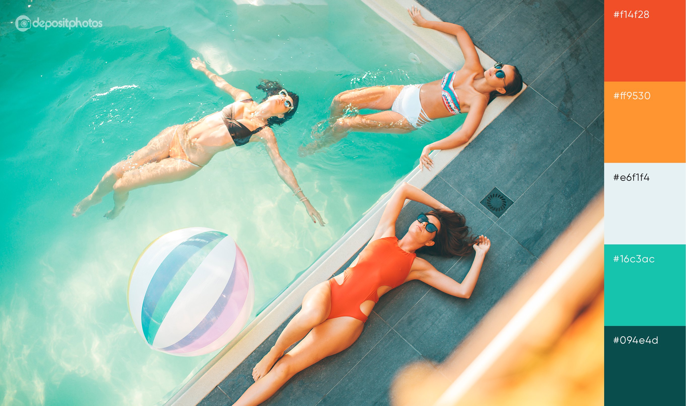
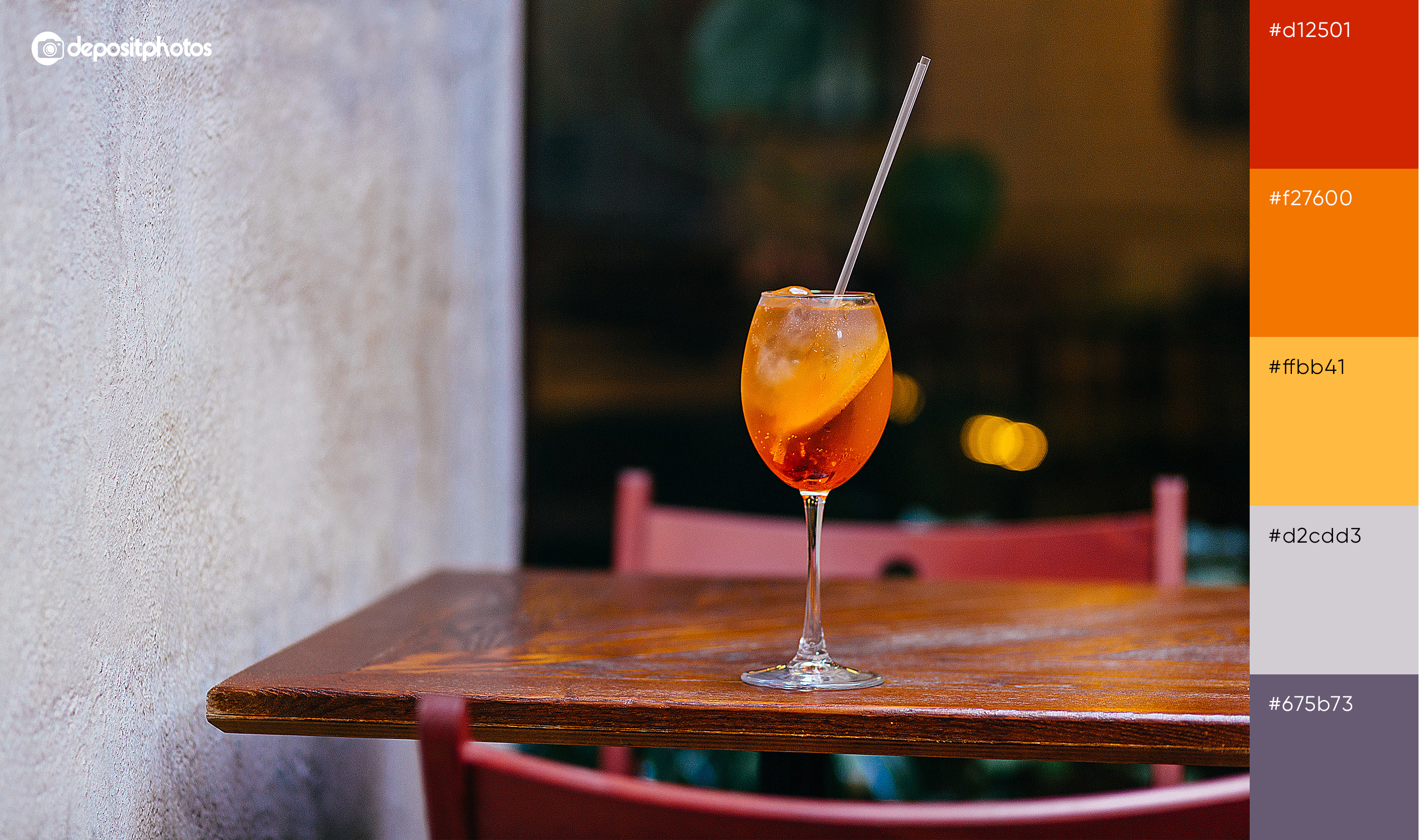
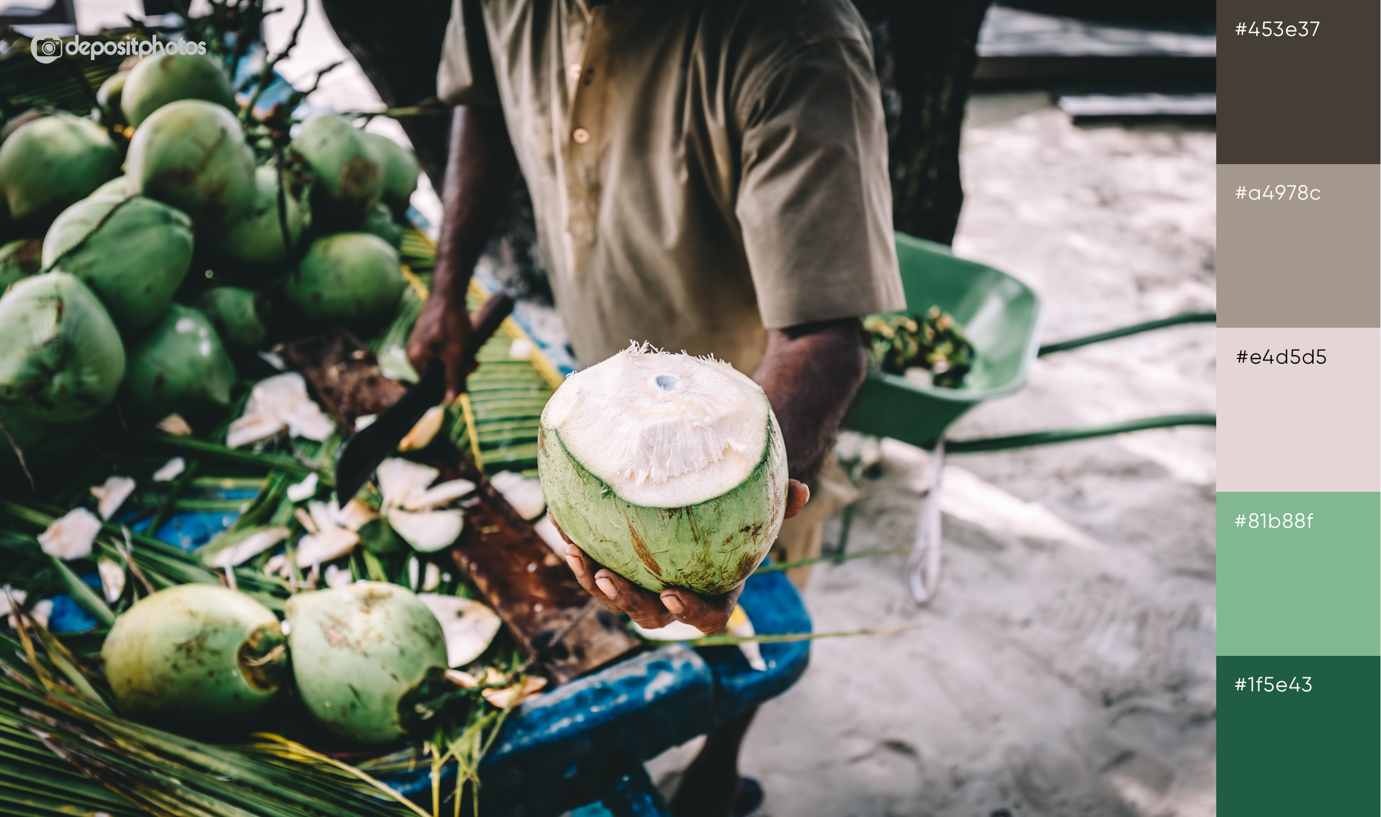
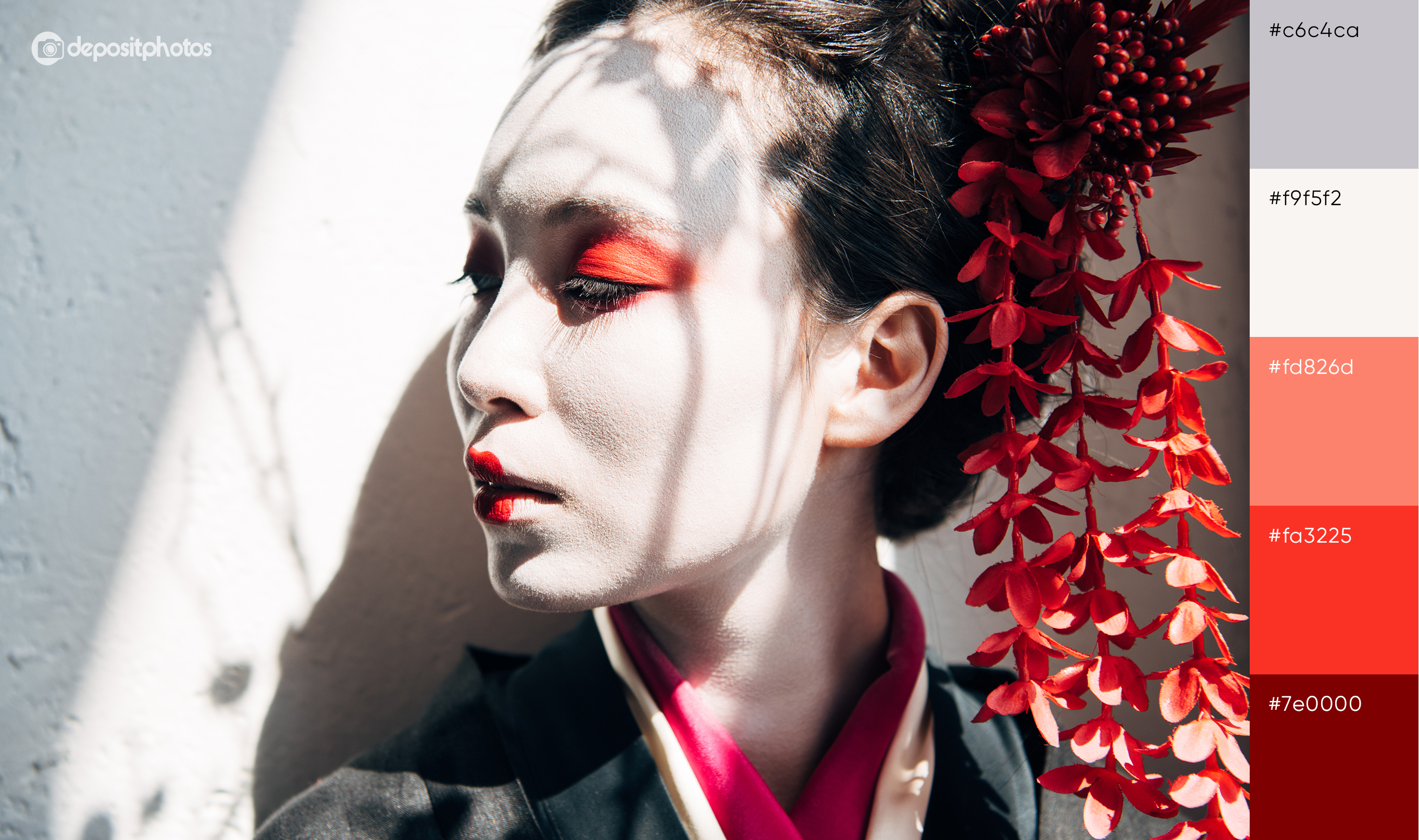
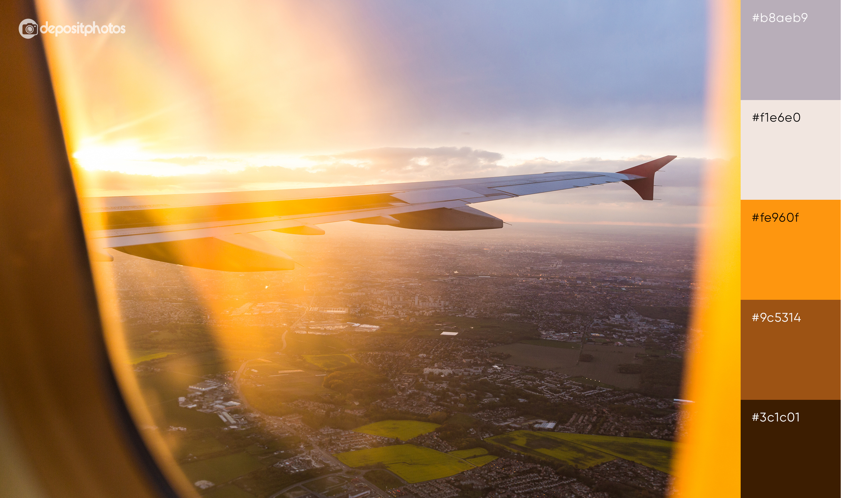
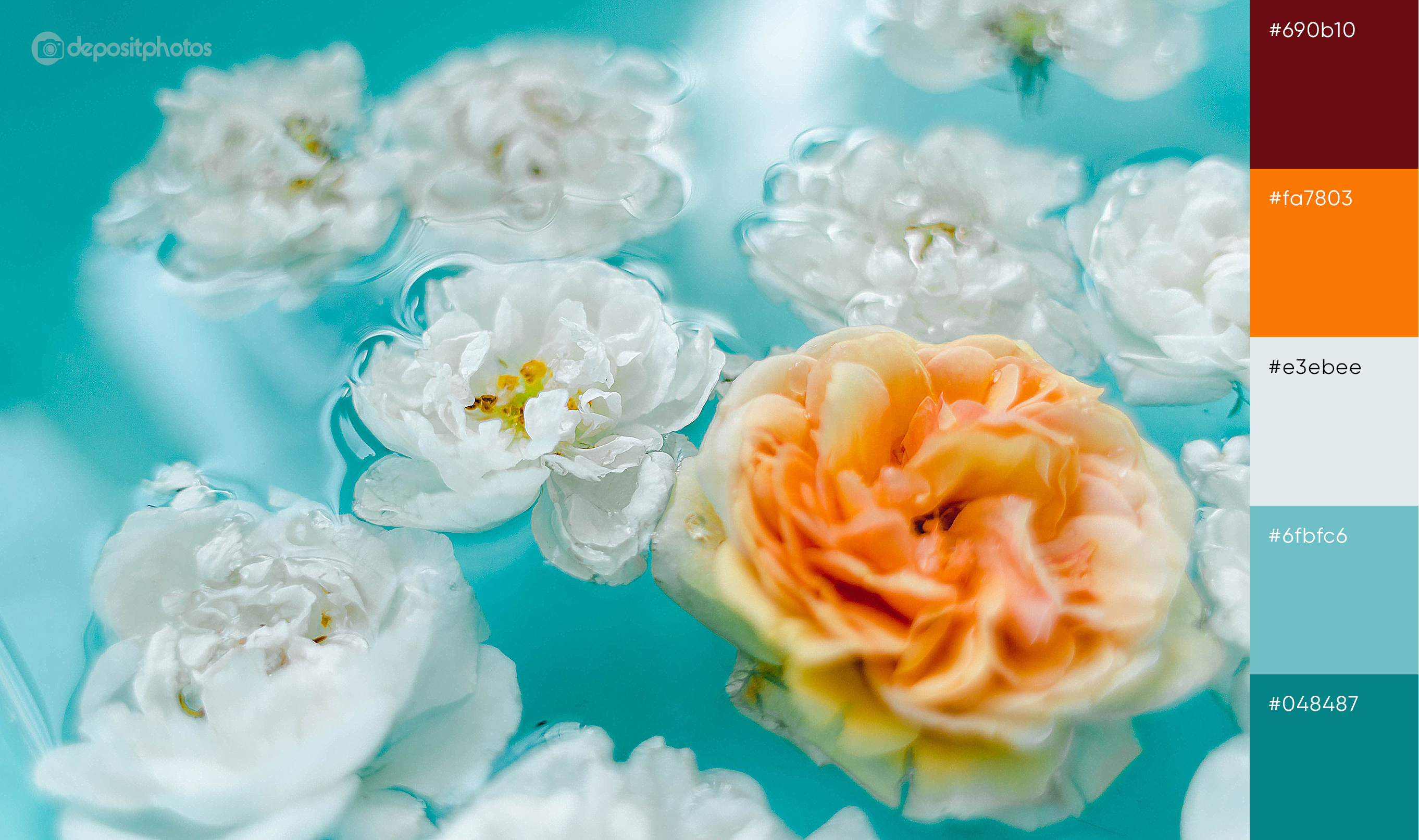
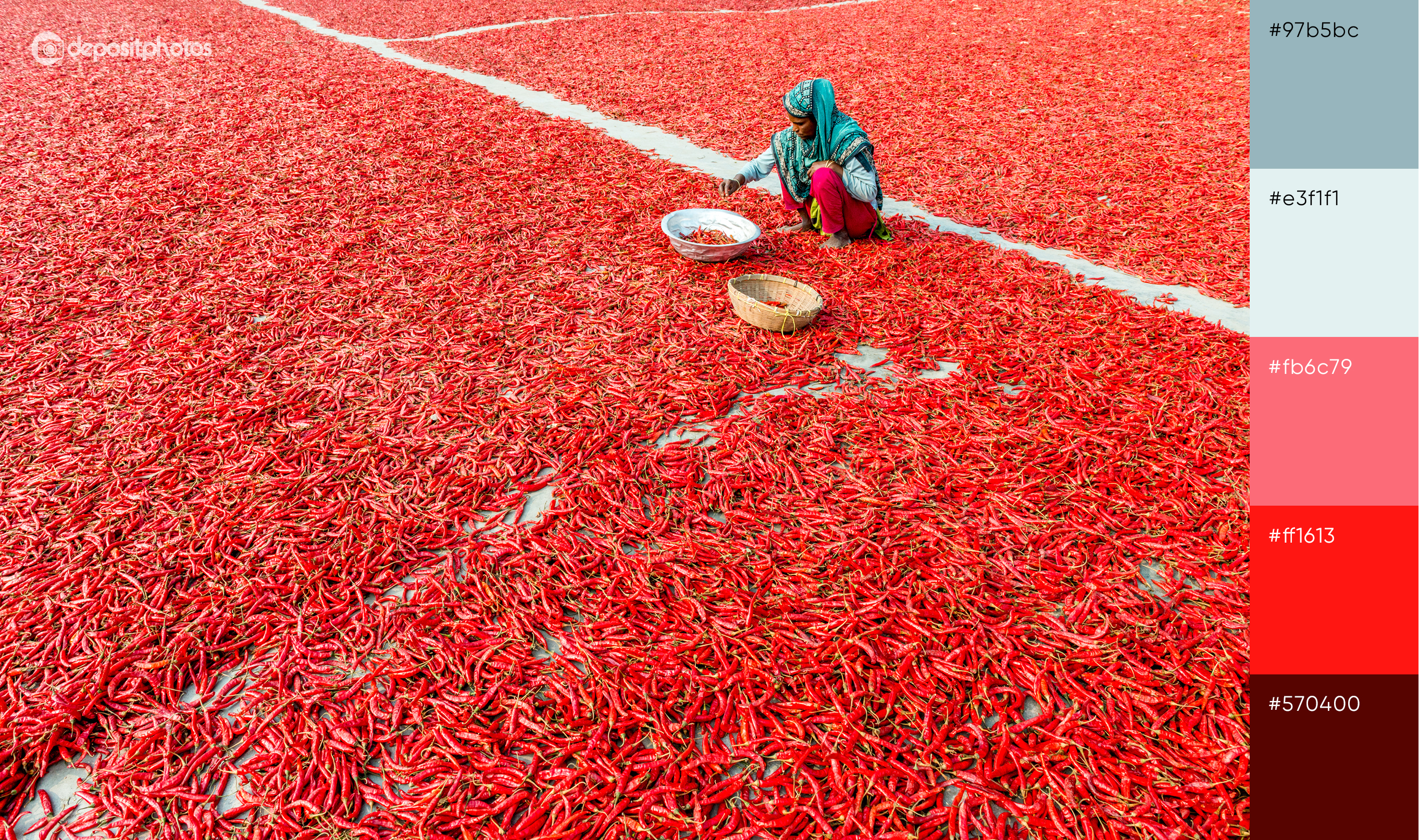
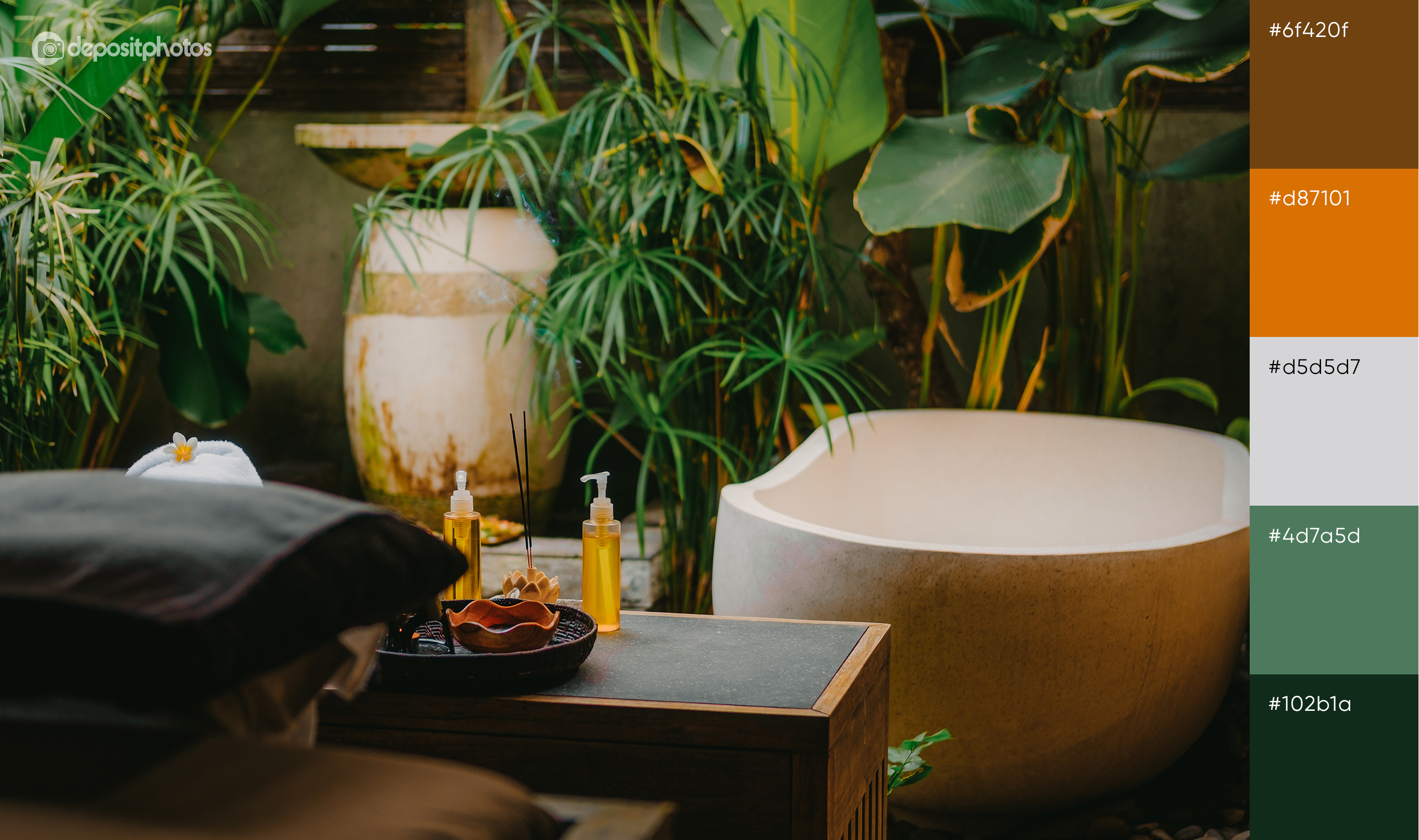
Summer color palettes for vibrant designs this season
*We included hex codes to every color palette for your convenience.
Hope this advice and summer color palettes will encourage you to experiment this season. Whether you choose to create monochrome designs or combine all the colors together in one project, you’ll notice that your approach is in line with the mood of the coming season.
Those that have stayed at home for a while and have had to transform their lives in many ways are now ready to look on the bright side of things and appreciate vibrant designs to fit the optimistic outlook on the summer of 2020.


![Gradient Color Palettes for Your Next Design Project [Infographic]](https://depositphotos-blog.s3.eu-west-1.amazonaws.com/uploads/2019/08/Gradient-Color-Palettes-for-Your-Next-Design-Project-Infographic.webp)

