Summer Color Trends 2021: Explore Lively Color Palettes and Thematic Photo Collections
Summer is a favorite season for many. It’s finally warm outside, and it’s the perfect time to start vacationing. While everyone leaves the city to relax and enjoy themselves, content creators are challenged to grab the audience’s attention with their projects.
How do they achieve this? By using trendy colors in the brand’s visual communication. Whether you’re creating new packaging for a product, redesigning a website, or planning a seasonal campaign, palette choice is always of great importance. It allows you to evoke emotion, better translate the ambience, and strengthen your message.
Curious to find out the summer color trends for 2021? Here are the four main shades, accompanied by bright color palettes, thematic photo collections, and useful marketing ideas for the season.
The 2021 Summer Color Trends From Depositphotos
Brands and other content creators often underestimate the power of colors. However, it is an effective tool that can help you stand out with your projects and better connect with your audience. Color choice requires particular attention, as it can make your project look either appealing or boring. You will hardly choose the latter, so here’s a guide to the trendiest colors of this season.
To come up with the main colors, we analyzed recent submissions to the Depositphotos library, turned to the Visual Trends Report 2021, and explored the predictions made by Pantone Color Institute. As a result, we identified the four main colors that will be in trend this summer:
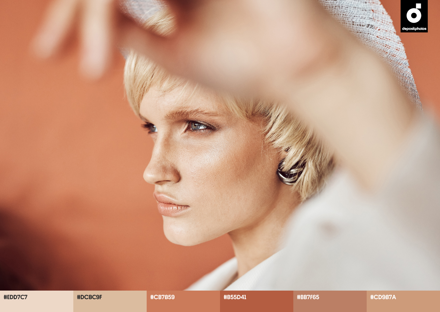
- Tangerine
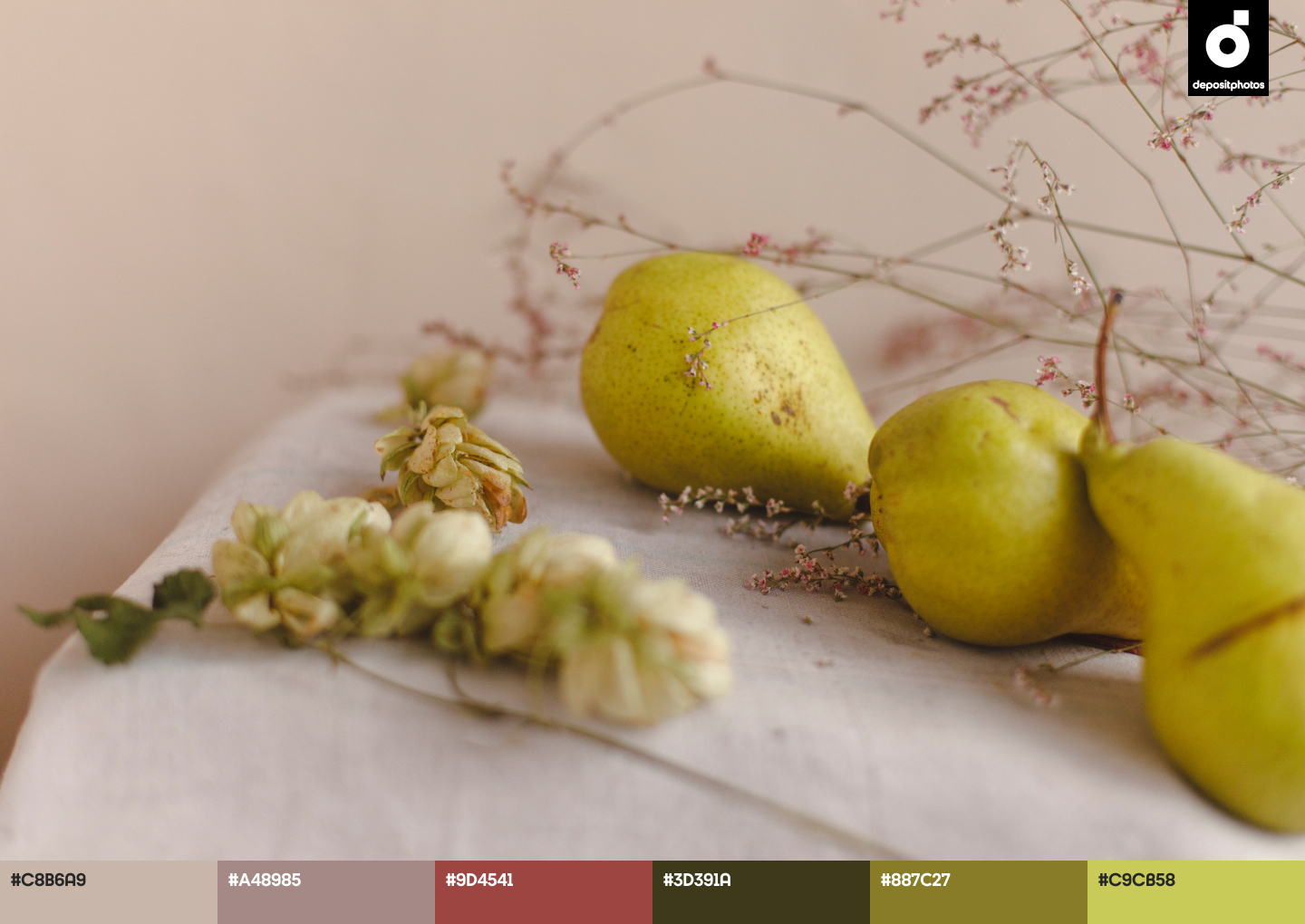
- Soft Linen
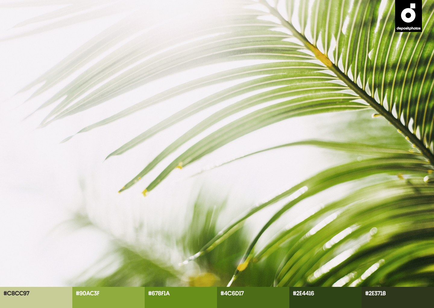
- Lime Green
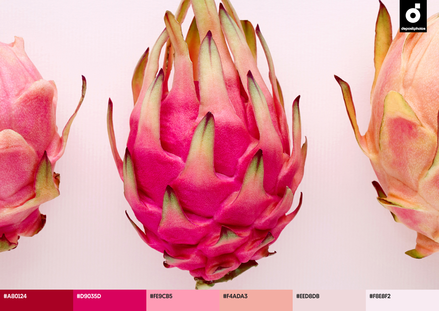
- Bubble Gum
These shades are bright, cheerful, and refreshing. Isn’t that what a perfect summer looks like?
A closer look at the trending colors
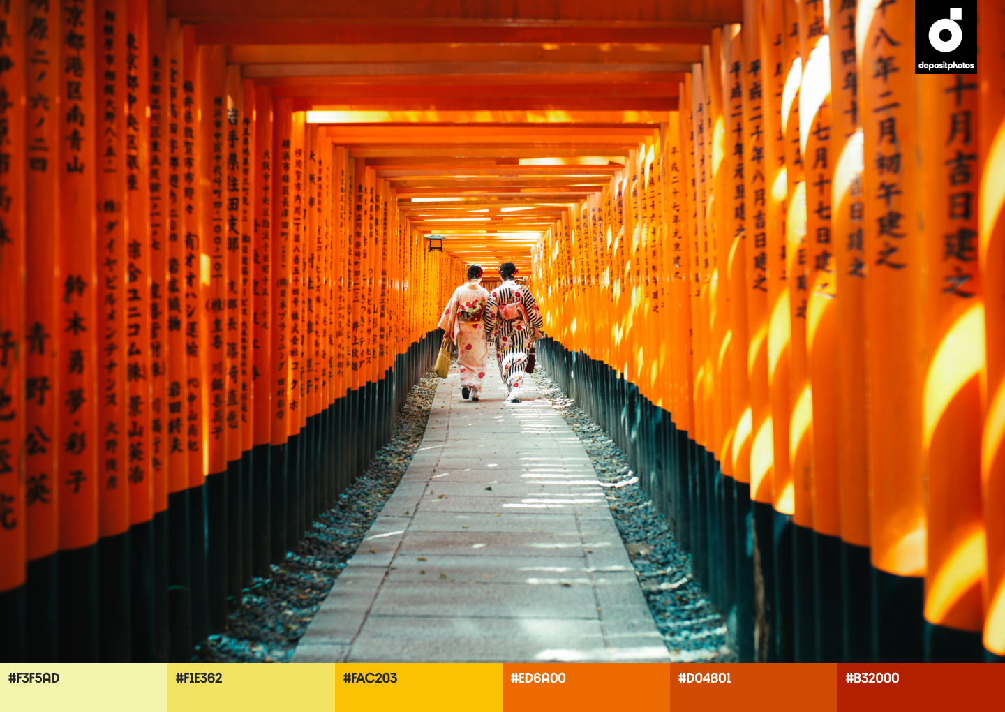
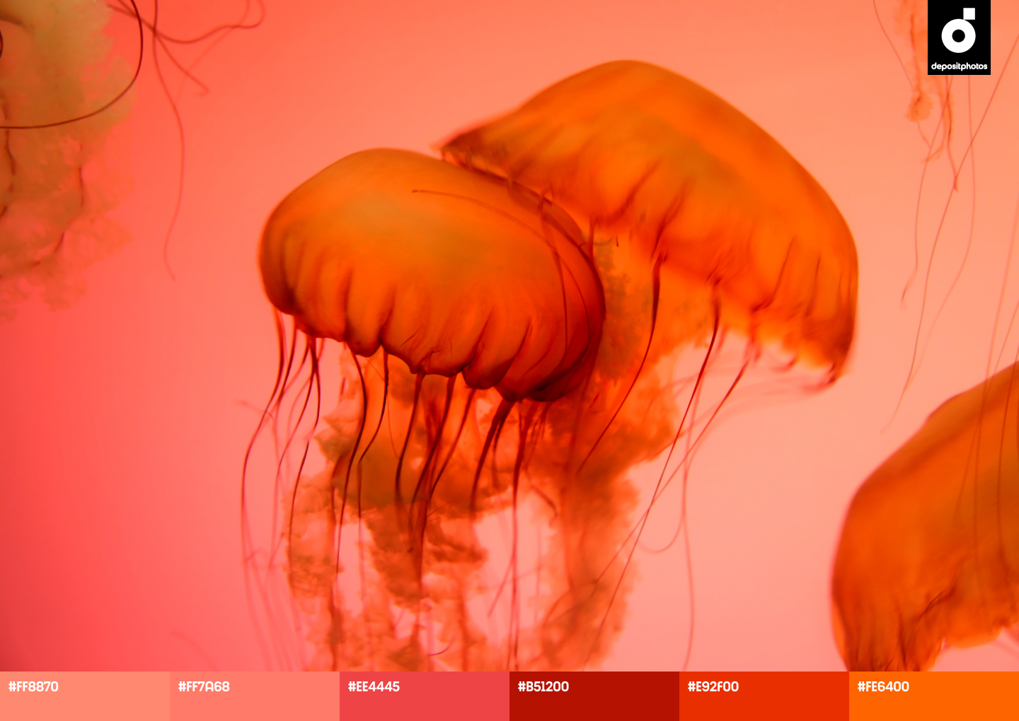
Tangerine (#EF7C46)
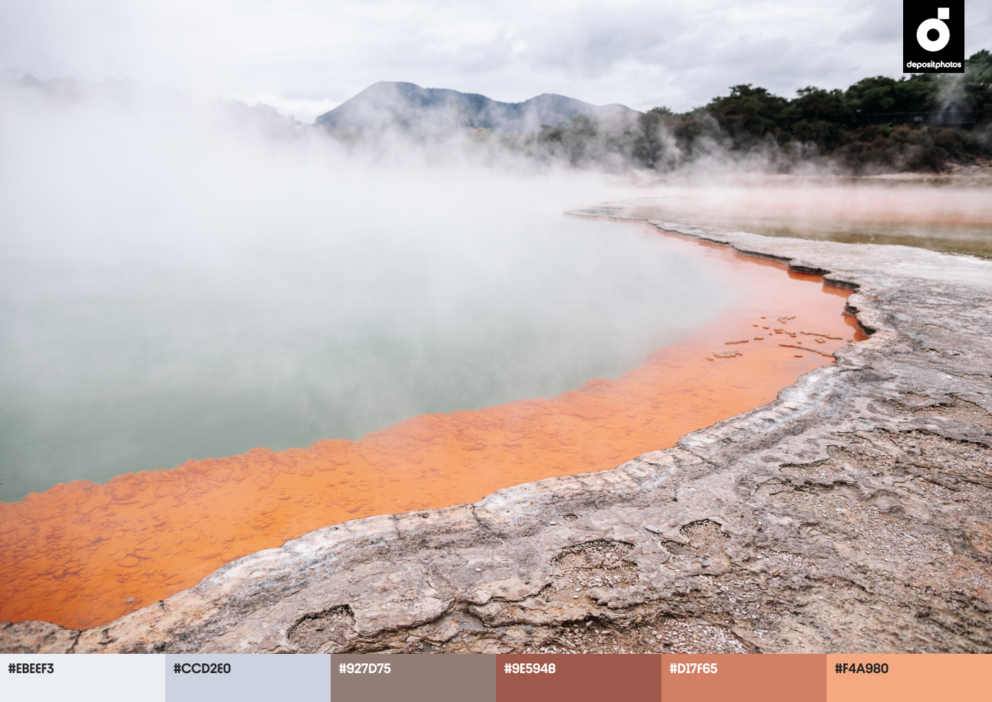
In light of the latest world events, consumers are paying attention and staying loyal to brands that translate positive messages in their creative campaigns. This concerns not only verbal communication, but color choice as well.
According to color theory, all shades of orange (including Tangerine) have uplifting vibes. Being a combination of yellow and red, this color looks friendly and inviting. It can be used for projects that aim to translate a cheerful ambience and encourage an audience to look on the bright side of things.
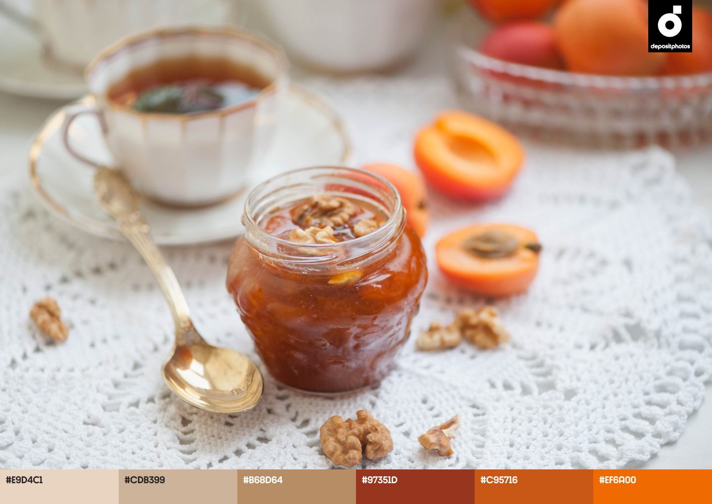
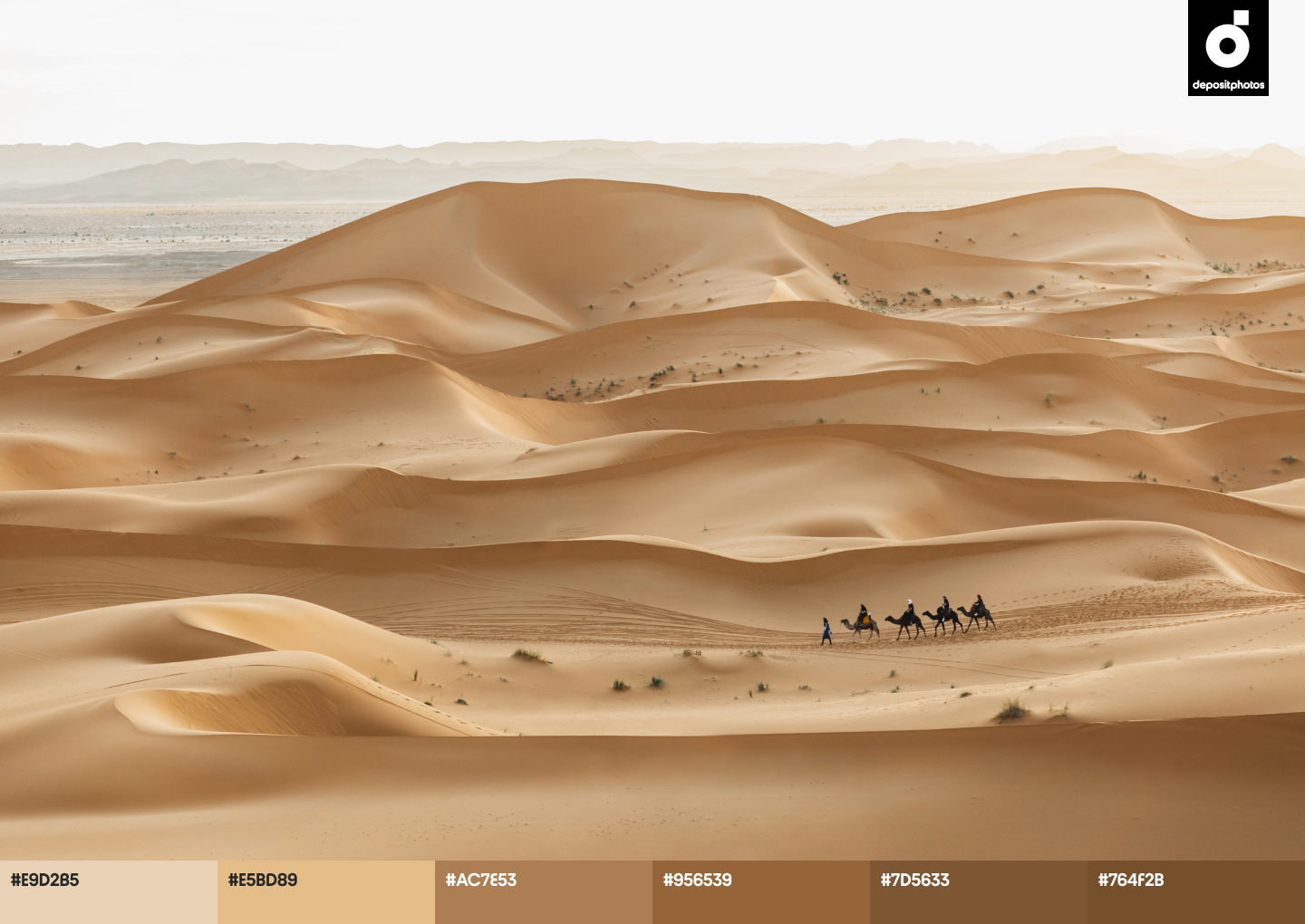
Soft Linen (#E9D4C1)
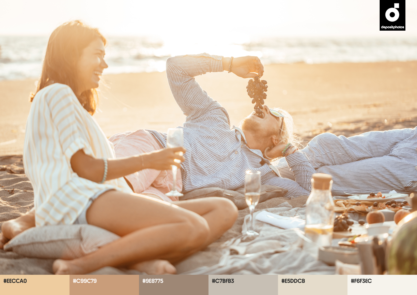
Audiences in different corners of the world opt for light fabrics like linen for everyday fashion. This material turned out to be so trendy that many started associating it with summer.
Moreover, colors such as Soft Linen are popular among brands this season, because they look calming and relaxing. They don’t demand attention and are perfect as background colors for apps, websites, and even packaging. Soft Linen is also a go-to shade for promotional material, such as menus and invitations. The warm tones of this color create a reliable and trustworthy appearance, without depriving projects of light summer flair.
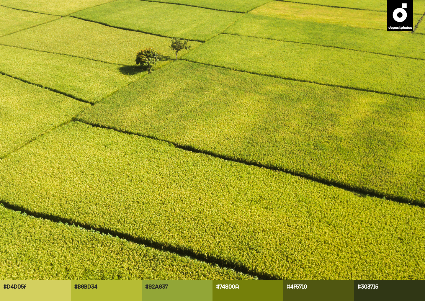
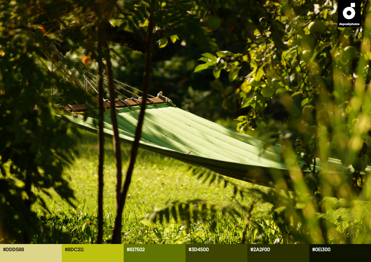
Lime Green (#C5D54E)
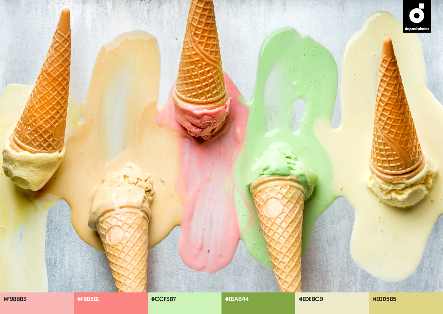
Nature-inspired color palettes continue gaining momentum in 2021. While trending shades of green were deeper and darker this spring, trending summer color palettes are bolder and brighter. They empower consumers to seize the moment and spend more time outdoors with family and friends.
If you aim to create lively projects, then Lime Green is the right color choice. It looks refreshing, and it perfectly matches consumers who prefer an outdoor lifestyle during warmer months. Also, this hue looks particularly optimistic, playful, and bold in combination with other bright colors.
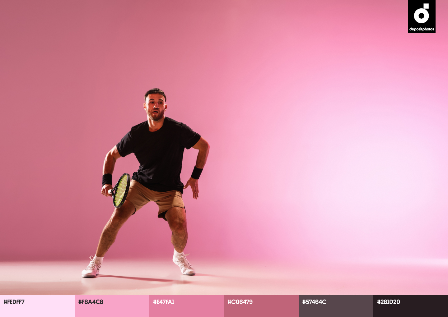
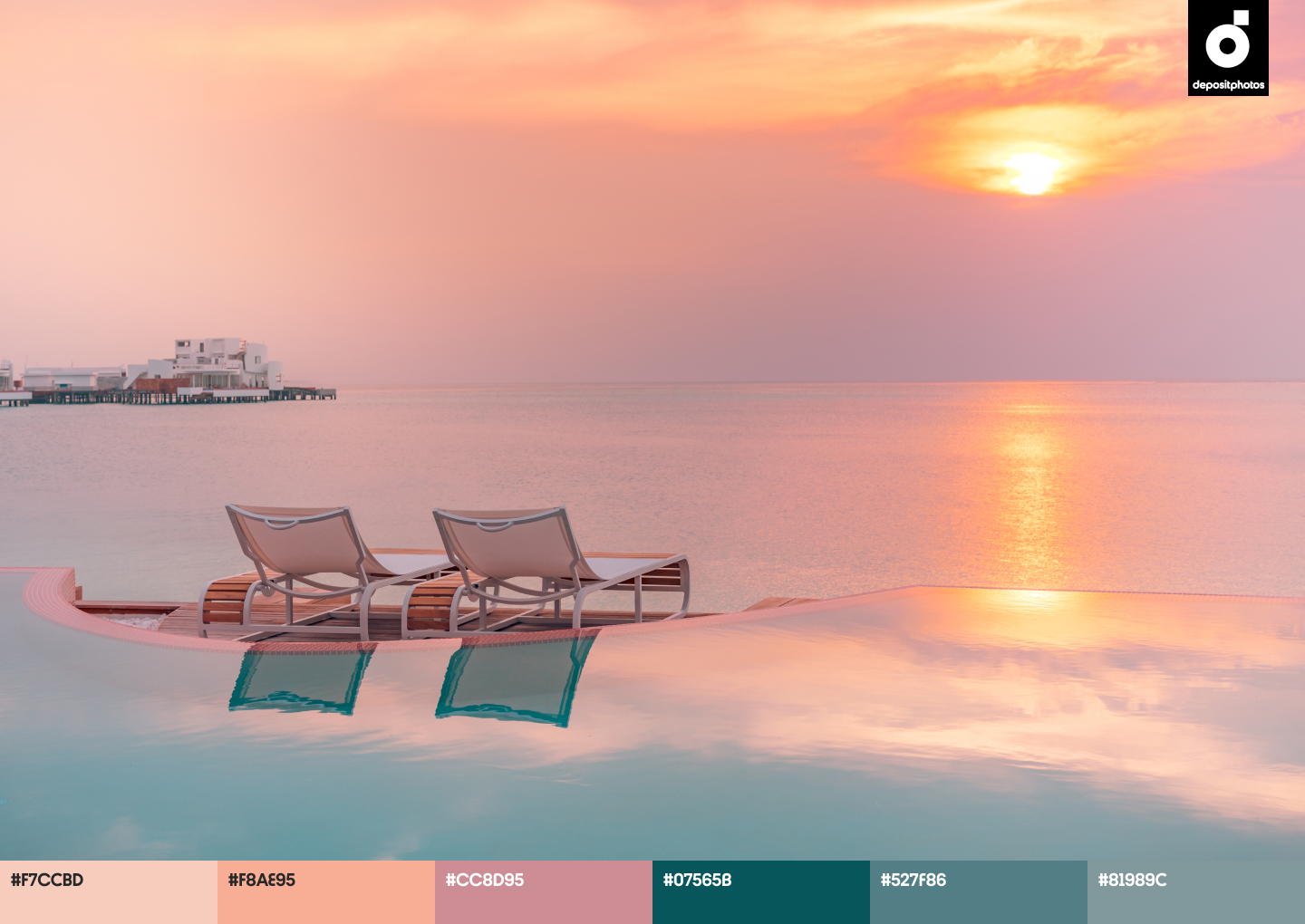
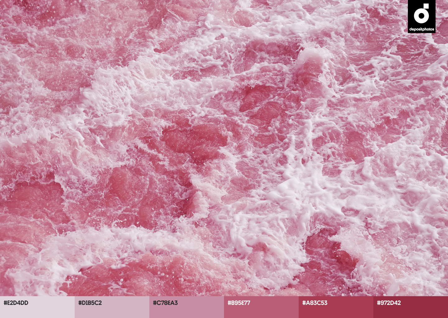
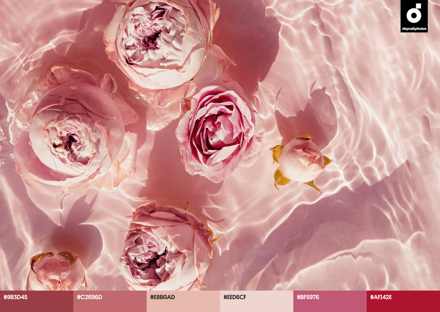
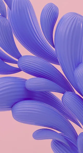
Bubble Gum (#ED95A3)
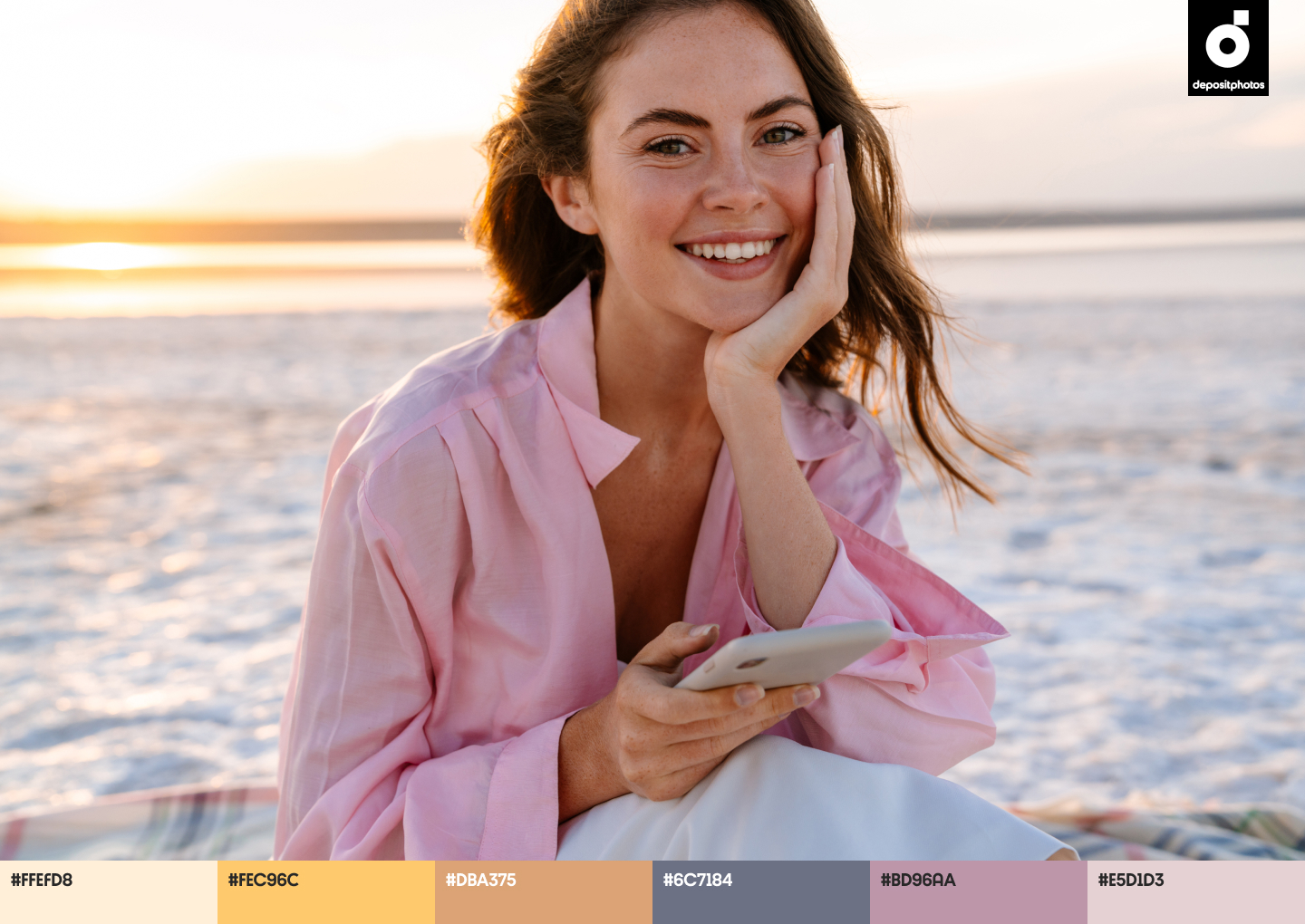
This season, consumers are attracted to colors that impact their mood in a positive way. They want to emphasize change for the better, and pay more attention to projects that feature romantic shades, instead of dark ones.
The Bubble Gum hue fascinates audiences, as it makes them feel confident and happy about the future. This shade of pink symbolizes childhood, serenity, and empathy, and looks harmonious with both muted and bright hues. Whether you’re working on a graphic, product, or any other design project, definitely give Bubble Gum a try.
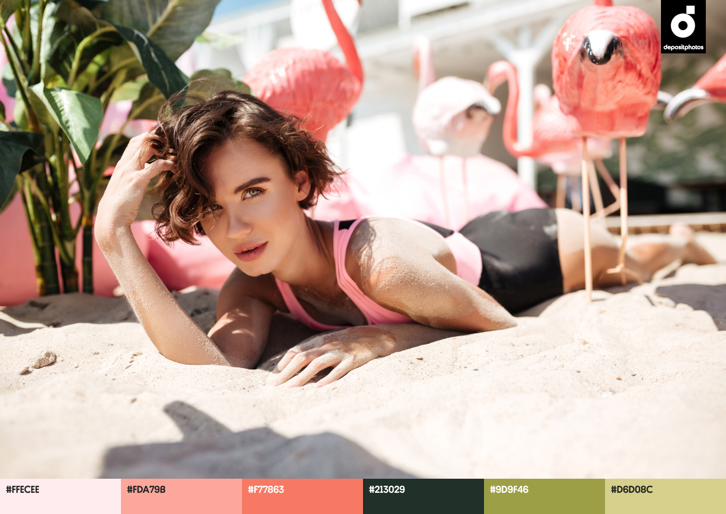
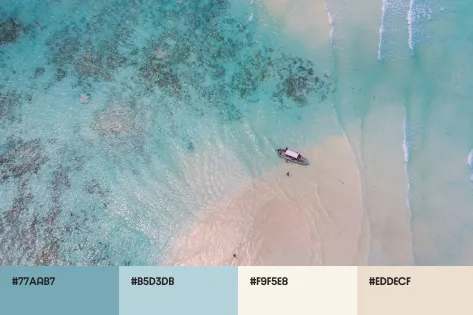
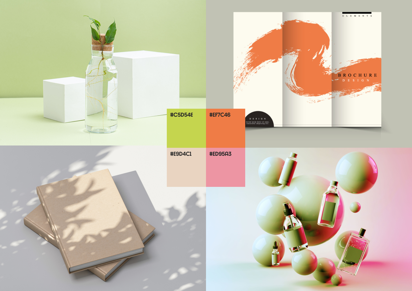
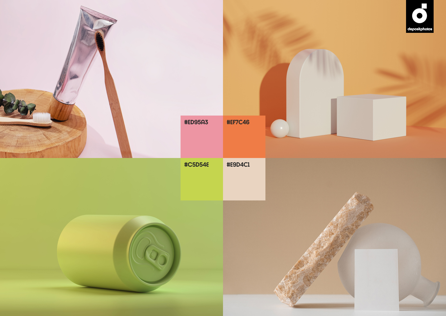
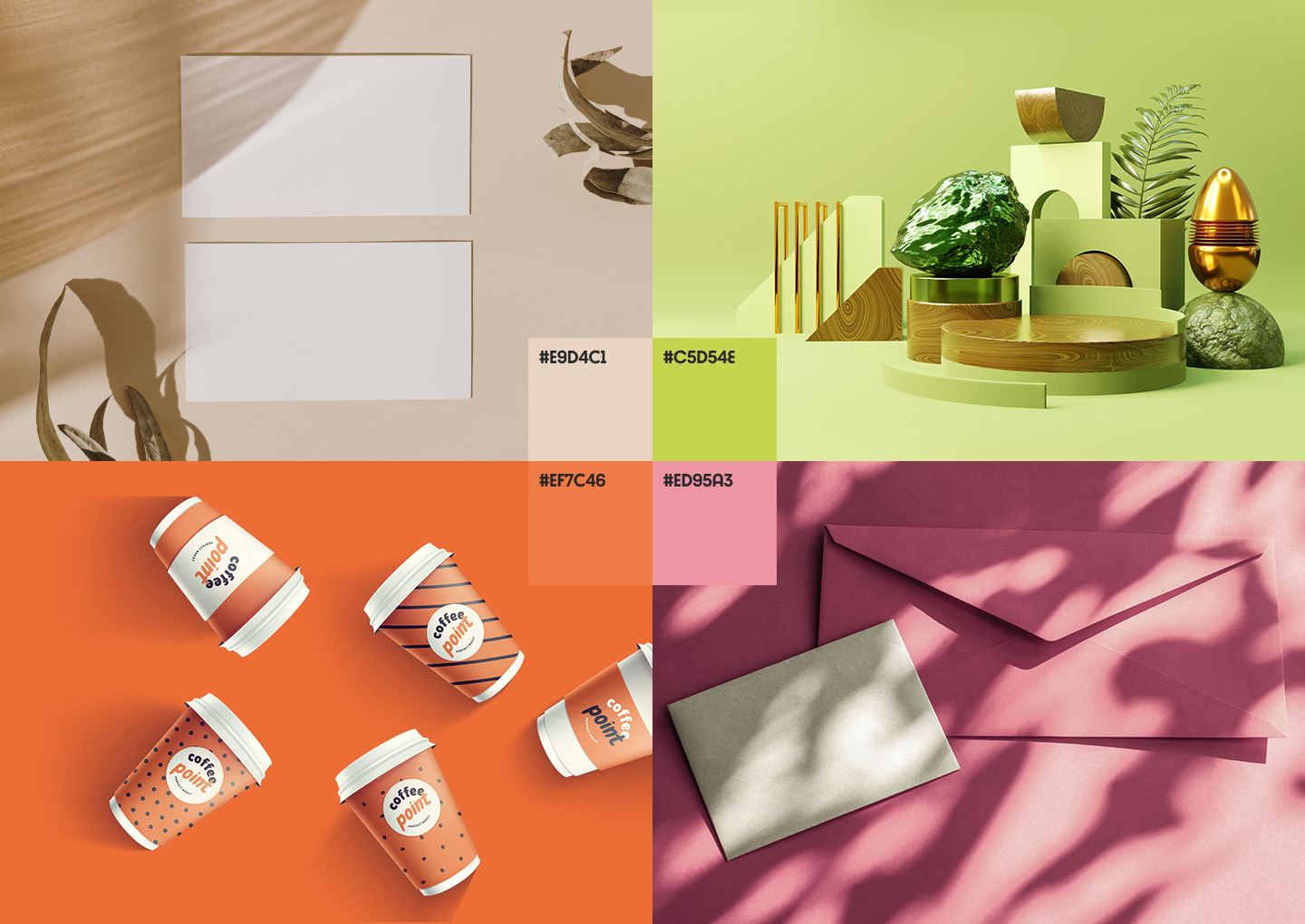
The best thing about these trending shades is that they look great together, and allow you to create appealing designs with summer vibes. Check out these summer color palettes to find out how you can mix and match them in your projects.
Summer color palettes for ambient designs
Design inspiration for your summer-related projects
To give you a better idea of how the four trending colors look on packaging, merchandise, and other promotional material, we’re sharing thematic mockups from the Depositphotos library. Draw inspiration from these ready-made mockups and create your own designs to stand out with your projects.
Wrapping up
Whether you’re planning a social media post or working on a massive email marketing campaign, color choice makes a difference. Appealing messages, paired with the right color solutions, can help you create campaigns that demand attention and inspire clients to interact with your brand more often.
There are many benefits to choosing the right colors for your projects. Keep this guide at hand, and stay on top of the latest trends with Depositphotos.
