Fall Color Trends 2025: Cozy Up with Four Enchanting Colors, Mockups, and Collections
As the air cools, design warms, and this fall, let’s lean into this intentional softness together. Let’s be kind and caring, but smart and confident at the same time, guided by the four main colors of the season. The tradition calls: we’ve tracked the pulse of the creative world, so you don’t have to. We’ve dug across product drops to digital campaigns, art direction to moodboards, awards to social media.
Ready to see our findings? Read about the season’s most directional hues and explore how to use them in your own projects. Here’s our trend breakdown, along with handpicked collections of high-quality files to download and use in your creative campaigns.
Discover Fall Color Trends Collection
This fall, design speaks in four inspiring shades
The palette of the season is… drumroll:
Cranberry, Blue Haze, Burnt Wood, and Rosewater.
Thanks to the strong contrast between shades, this palette feels lighter than you’d expect for autumn—the season so often associated with rain, melancholy, and drama.
These colors are bold yet quiet, rich yet breathable. They bring nostalgia and emotional resonance to visuals, which is exactly why creators around the world are choosing them. You’ll spot these hues in web design, branding, packaging, product photography, and interior styling across industries.
Now, let’s take a closer look at them.
Cranberry
#A13140
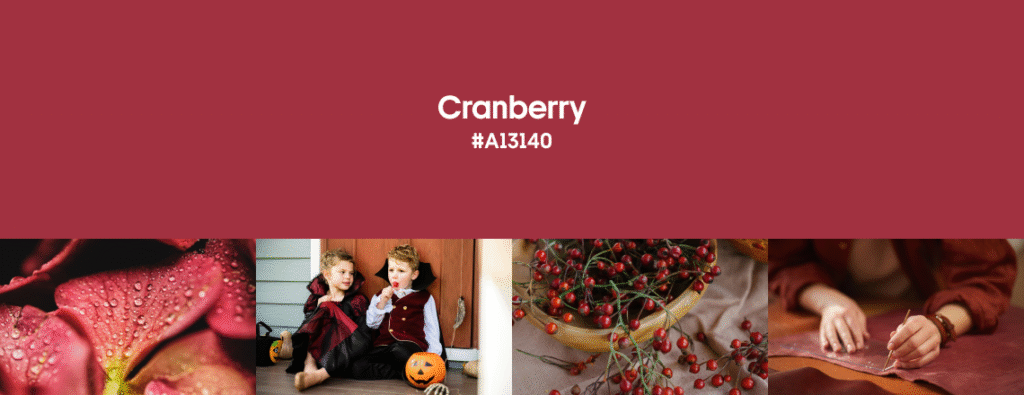
What could feel more like autumn than red, yellow, and brown leaves on deciduous trees? Cranberry red is one of the most prominent shades this fall. A ripe, somewhat cool-leaning red, depending on the colors you pair it with. Less dramatic than Aged Wine, deeper than Coral, this shade sits in the space between sensual and serious.
In digital design and branding, Cranberry is often mixed with other popping colors to intensify the visual experience and bring maximum attention. If you want to signal taste, confidence, and craftsmanship, don’t hesitate to use red as the main color or as a backdrop in photography. To achieve timeless chic, use deep red against classic black and white, just like Cartier has done for decades.
Interiors truly thrive with this shade in the mix. Take, for example, a little girl’s bedroom in Locust Valley by AREA Interior Design. The space subtly weaves Cranberry accents throughout. Delicate trim lines the walls, while a canopy in beautiful fabric crowns a regal-style bed, creating a space that’s both playful and poised. All-red? According to Veranda, interior designers do it with confidence, but thanks to its saturated nature, balancing this shade is key.
When it comes to fashion, this shade of red is as versatile as it gets, giving us endless possibilities to experiment. It could serve as a pop of color in your predominantly neutral outfits or bring all eyes on you if used as the main shade. Pantone forecasted red in multiple variations in its Fall-Winter ’25/26 palettes for New York FW and London FW. Cranberry and its sibling shades, indeed, were boldly represented on the Fall ’25 catwalks—for example, by Roberto Cavalli, Saint Laurent, Emporio Armani, and McQueen.
Pair Cranberry with cool greens, muted reds, or dark yellows and blues for contrast.
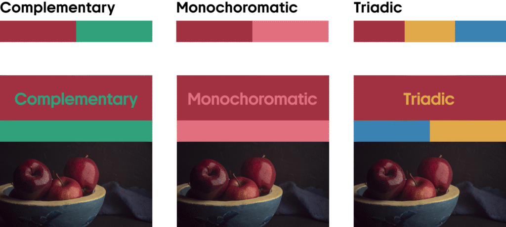
Create depth and richness by layering Cranberry with other red tones and browns.
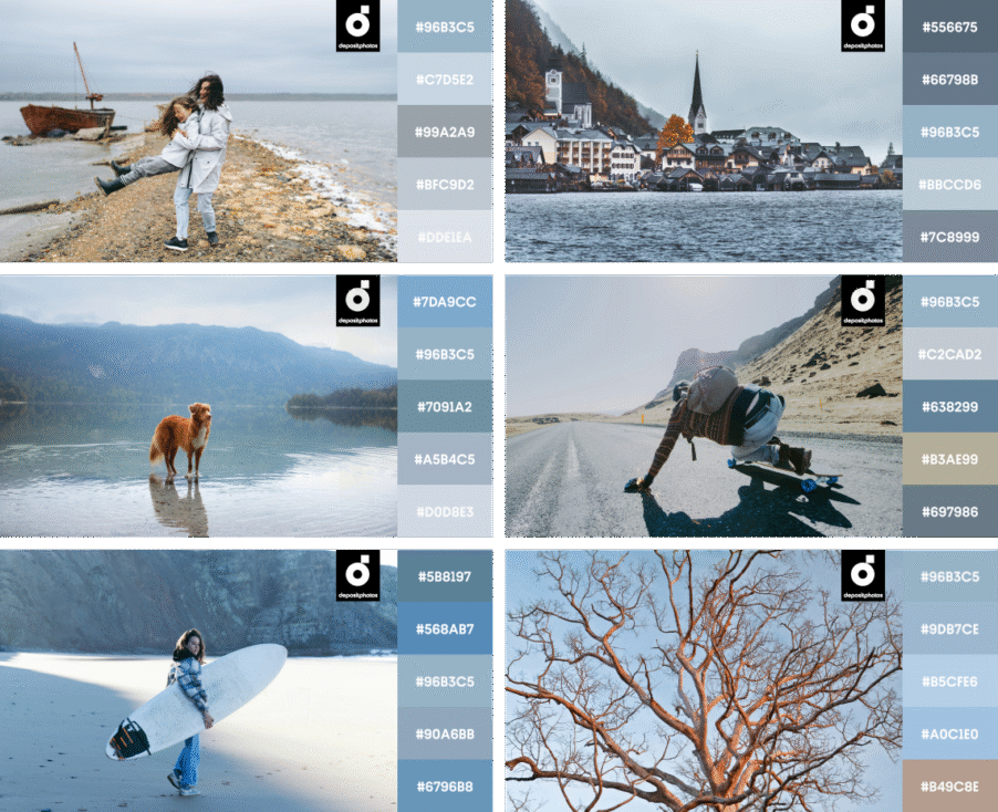
Blue Haze
#96B3C5
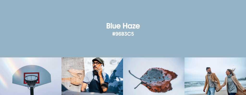
It seems like blues just don’t want to leave the pedestal of the most-used shades across industries. Blue has held top color positions through seasons. Recall Baby Blue or Navy Blue from our previous trend forecasts? Well, this misty pastel blue with a silver-gray undertone is back.
Blue Haze is the color of foggy skies, worn denim, and frozen morning air. It’s familiar, yet refreshing, and neutral enough to fill the space without overtaking it completely. Blue Haze offers calm and clarity as the perfect cool-down after summer’s saturated palette. It aligns with a trend toward wellness-first interfaces and emotionally intelligent branding.
Use Blue Haze in your web designs and advertising as a background to keep it minimal and evoke associations with calm, cleanliness, clarity, hydration, and more. Designers are leaning into quiet blues to create space around a product rather than letting it compete for attention. Blue Haze complements earthy product tones, especially ceramics, skincare, and artisan goods, bringing a sense of ease to the visual experience. For example: Supermart by LAT, WIIUKA by Studio Shapeaux, or 321 boom by Studio le_m.
Thanks to its lightness, Blue Haze finds wide and versatile application in interior design and architecture projects, with great examples like full interiors, central pieces, or décor elements in the Montclair House, the Union Residence by Beth Diana Smith, Lamat House by Objekt Architecten, or the Loft in Poblenou by NeuronaLab.
This heavenly color was represented in multiple Fall ’25 fashion collections, for example, in looks by Issey Miyake, Coperni, and Prada.
Light blue shade works wonderfully with bright and creamy yellows, contrasting reds, and deeper blue shades.
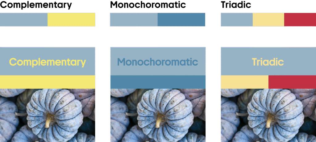
Layer lighter and deeper shades of blue and gray for a harmonious, cool-toned palette that feels easy on the eyes.
Burnt Wood
#3D2F2B
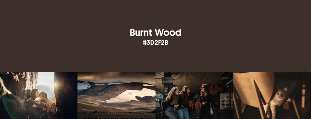
Burnt Wood certainly deserves a top-four place on our autumn palette, thanks to its wide use across design domains. A deep, rich brown bordering on black, it’s less glossy than the Espresso we had last winter.
Black didn’t go anywhere, and the search for alternative dark basics always continues as we progress with new design tendencies and challenges. Burnt Wood gives us that much-needed depth without defaulting to grayscale. This is why designers recognize and praise this color so much this fall. It’s cozy but never cliché, elegant without being cold.
In graphic design, Burnt Wood replaces pure black to reduce contrast strain and increase sophistication. It works perfectly both as an accent color and a background color. It’s also a great choice for brand identity, like Diro Soares did for Oficina. Dark browns are complementary to blue shades and pair well with many lighter hues like yellows and pinks. It’s always the pairing that does the job of balancing darks out with pops of brighter shades and making them look even deeper.
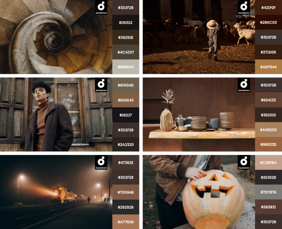
Interestingly, interiors treat us to even bolder choices when it comes to Burnt Wood. It’s a color derived from nature, so it’s dominating leather, wood, and wool choices. Architectural Digest says that dark woods are coming back, and this is a sign that brown will be everywhere soon: on the walls and in decor, as contemporary designers often exaggerate on purpose and bring color to the extremes for the immersive atmosphere it gives. Having a room with low access to light? Surrender to this naturally induced darkness: paint the room dark brown and put dark wood furniture in it.
Burnt Wood, as one of the prominent fall colors in fashion—especially in big pieces like outerwear, coats, jackets, suits, and pants—was heavily present at Fall ’25 fashion shows like Gucci, Chloé, Emilia Wickstead, Fendi, Jason Wu, and Dries Van Noten. No surprise: this shade is indeed magnetic, creating the perfect dark canvas for bright colors to pop, or bringing warmth and chicness in monochrome variations. Glossy textures give Burnt Wood the sleek look it deserves, reminding us of melted dark chocolate with over 90% cocoa content.
Combine Burnt Wood with a cool blue or lighter brown for drama, or play with yellows and other light shades for a contemporary look.
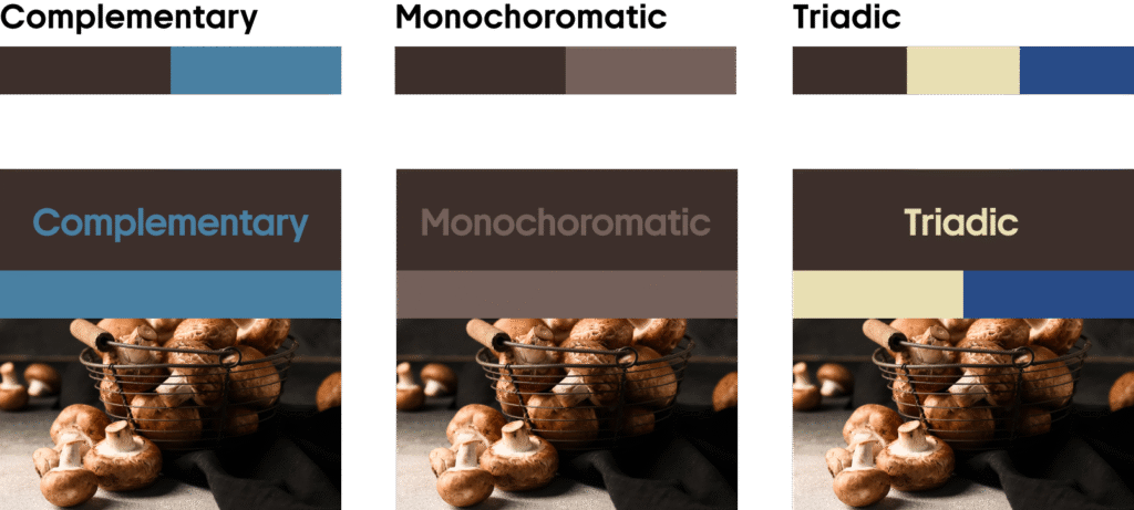
Pair dark browns with grays, beiges, dark greens, and lighter browns to achieve a natural, sophisticated look.
Rosewater
#FBA7BC
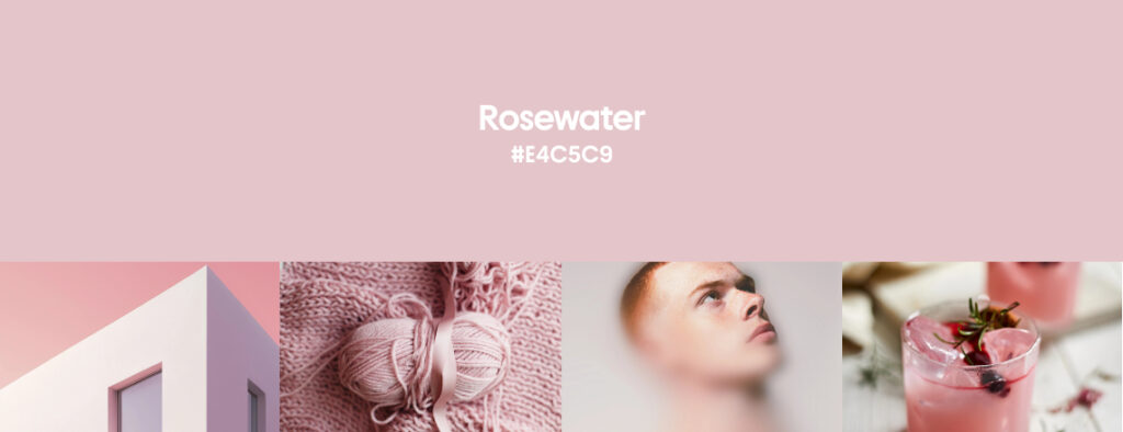
Design always fluctuates between tender and bold phases, and soft pinks like Rosewater are its visual love language. Rosewater pink is a delicate blush with beige undertones. It speaks to emotional sensitivity and softness. With rapid AI tech progress, designers are leaning towards more human, tactile visuals, and this shade perfectly embodies that mood.
Pink is not just kiddie territory, at least not in this era of ultracontemporary design. Contemporary designers use light pinks as the new neutral. It’s easy on the eyes, just like Blue Haze, and especially suitable for beauty and wellness brands looking to lean into trust and calm. Go for it if you want to refresh your branding colors or create a new campaign that resonates with people of all ages. Rosewater creates a sense of urgency and grabs attention when paired with red, fits all sorts of creative projects, evokes nostalgia and playfulness when combined with pastel blues and purples, and builds a sense of belonging for younger audiences.
Rosewater does wonders for interiors too! It appears in paints, textiles, decor, and other mood-lighting implementations. When combined with white, it creates a subtle but persistent pop of color, resulting in a cozy and playful space—like in this Parisian apartment by Labopop, or in the examples by Farrow and Ball.
Fashion shows by Kenzo, Chloé, Giambattista Valli, Stine Goya, and more designers consistently treat us to this soft pink shade, where it combines with dark browns, blues, and greys. Interestingly, this light pink is not very common in fall collections, but this season it was a true feast for the eyes and souls of fashionistas. Pink is unisex, often present in both women’s and menswear collections.
Combine Rosewater with fresh greens for contrast. Mix it with deeper pinks and soft pastels for a whimsical, dreamy palette.
Whether paired with deep reds, muted neutrals, or tender grays, Rosewater brings an effortlessly modern edge to your visuals.
Ready-to-use mockup kit in fall colors for your creative projects
Want to use these fall shades in your creative work? We’ve prepared a collection of on-trend, ready-to-use visuals. They include mockups, vector sets, photo backgrounds, and design files, featuring Cranberry, Blue Haze, Roasted Coffee, and Rosewater.
Whether you’re updating your eCommerce visuals, working on a campaign, or just need moodboarding material for client presentations—this pack will give you a solid creative head start.
Save the collection, and let these four versatile shades color your next idea!
More than fall colors: read about creative trends
Summer Color Trends 2025: Steal our Collections, Palettes, and Hearts with Four Radiant Hues
Creative Design Trends 2025: From Wabi Sabi to AI-fueled Art
Recalling All Creative Trends Ever: The Legacy of Flagship Reports
Inside Depositphotos’ Creative Universe: Top Projects You Can’t Miss