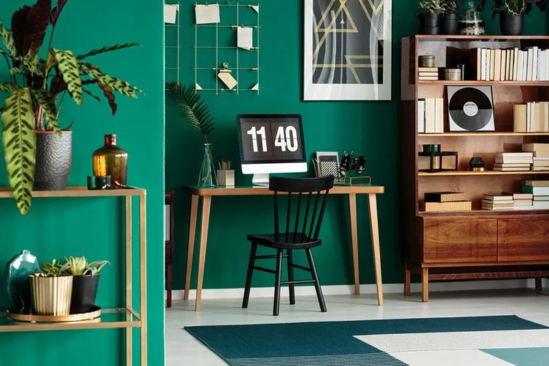
5 Things All Great Podcast Logos Have in Common
Podcasts have become a global phenomenon, with millions of listeners tuning in to their favorite shows every day. As the podcasting landscape continues to grow, it’s important for podcasters to establish a strong brand identity, and a well-designed podcast logo plays a crucial role in this process. But what sets apart great podcast logos from mediocre ones? What are the key elements that make a podcast logo truly exceptional?
In this article, we will delve into the world of podcast logos and uncover five crucial elements that all great podcast logos have in common.

Why does a good podcast logo matter?
First impressions matter, and your podcast logo is often the first visual representation of your show that potential listeners encounter. A well-designed podcast logo can instantly convey the tone, genre, and personality of your show, creating a memorable image that sets your podcast apart from the others. It’s not just a mere accessory, but a crucial element in building a strong brand identity.
A great podcast logo can leave a lasting impression on your audience by making it stand out in a sea of available podcasts, and serve as a strong visual anchor for your marketing efforts across various platforms. It sets the tone for what listeners can expect from your podcast, and can even evoke emotions or create a sense of anticipation.

Podcast logo vs Podcast cover art
Let’s clarify the difference between a podcast logo and podcast cover art. Although these terms serve different purposes, they are often used interchangeably. A podcast logo is a visual representation of your show’s brand identity, typically used across various platforms and marketing materials, such as your podcast website, social media profiles, and promotional materials. On the other hand, podcast cover art is the specific image that accompanies each episode of your podcast, usually displayed on podcast directories and platforms.
While both the podcast logo and cover art should be consistent in terms of design and branding, they serve different functions and require distinct design considerations. They both are important—a podcast logo is more overarching and serves as the foundation for your show’s visual identity, while podcast cover art is more episode-specific and can vary for each episode.

5 Things all great podcast logos have in common
A great podcast logo has the ability to convey the essence of your show in a single glance. Let’s find out what other features they have in common:
1. Simplicity.
The old saying “less is more” holds true for podcast logos as well. Great podcast logos are simple and easy to recognize at a first glance. They typically feature clean lines, minimal colors, and uncluttered designs that are not overly complex. Avoid cramming too many elements into your logo, as it can create confusion and make it difficult for listeners to remember. A simple and memorable logo is more likely to stick in the minds of your listeners.
2. Relevance.
A great podcast logo should be relevant to the content and tone of your show, reflecting its genre, theme, and personality. It should give your listeners a clear understanding of what they can expect from your show. For example, if your podcast is about true crime, your logo could incorporate elements such as a magnifying glass, handcuffs, or a silhouette of a detective to instantly convey the nature of your content.
3. Uniqueness.
A unique podcast logo not only helps your show to be easily recognizable, but it also reflects the individuality of your content. Avoid generic designs or clichéd symbols that are commonly used in other podcast logos. Instead, strive for originality and creativity. Consider incorporating elements that are distinct to your show, such as a catchphrase, a signature prop, or a memorable character.

4. Versatility.
Your podcast logo will be displayed across various platforms, including social media profiles, website banners, promotional materials, and podcast directories. That’s why it should be versatile and adaptable to different formats, sizes, and color schemes. Test your logo in different options to ensure it remains visually appealing and recognizable, regardless of where it is displayed.
5. Memorability.
A memorable logo is one that leaves a lasting impression in the minds of potential listeners, making it easier for them to recall and recognize your show. To create a memorable logo, focus on using unique and distinctive elements, bold and contrasting colors, and a design that visually resonates with your audience. Avoid using overly complicated designs or generic symbols that can easily be forgotten.
To wrap it up
All in all, a great podcast logo goes beyond just aesthetics—it’s a strategic tool that helps you build your brand identity, connect with your audience, and reach new audiences. So, invest time and effort into creating a well-designed logo that reflects its unique voice and resonates with your listeners. By following these simple rules, you can create a logo that will make your podcast stand out.
Other articles you might find interesting
Spring Color Trends 2023: Palettes, Design Ideas, Stock Visuals, and Mockups
Achieving Harmony: A Guide to Balance in Art and Design
The Color White: Symbolism, Theory and Design Tips


![Gradient Color Palettes for Your Next Design Project [Infographic]](https://depositphotos-blog.s3.eu-west-1.amazonaws.com/uploads/2019/08/Gradient-Color-Palettes-for-Your-Next-Design-Project-Infographic.webp)
